Soft ground etching 28.5 x 38 cm
Exploring the natural lines of the leaf.
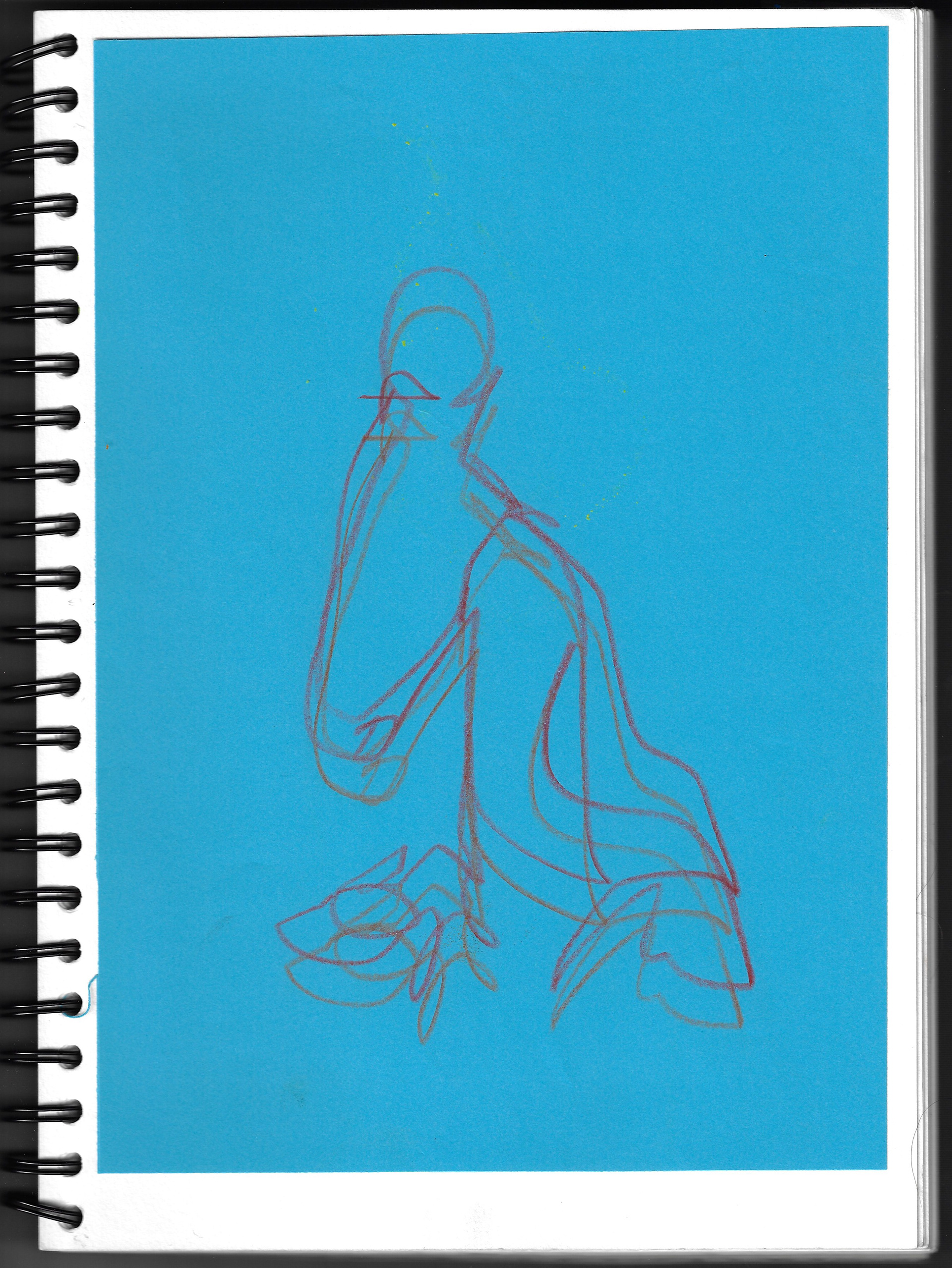
Sketchbook page 21 x 29.7 cm

Sketchbook page 21 x 29.7 cm
Sketchbook page 21 x 29.7 cm

Sketchbook page 21 x 29.7 cm
Sketchbook page 21 x 29.7 cm
Sketchbook page 29.7 x 42 cm
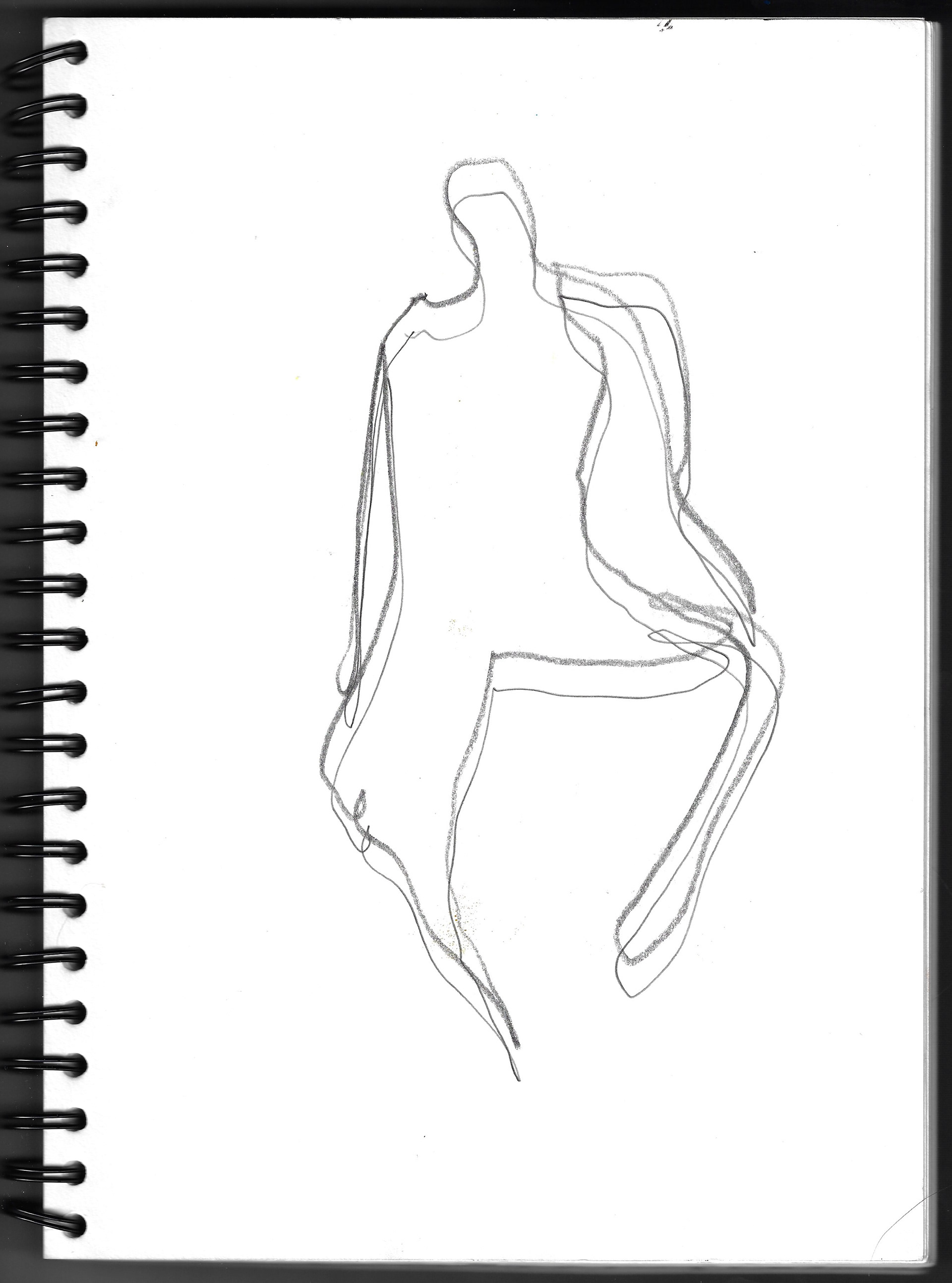
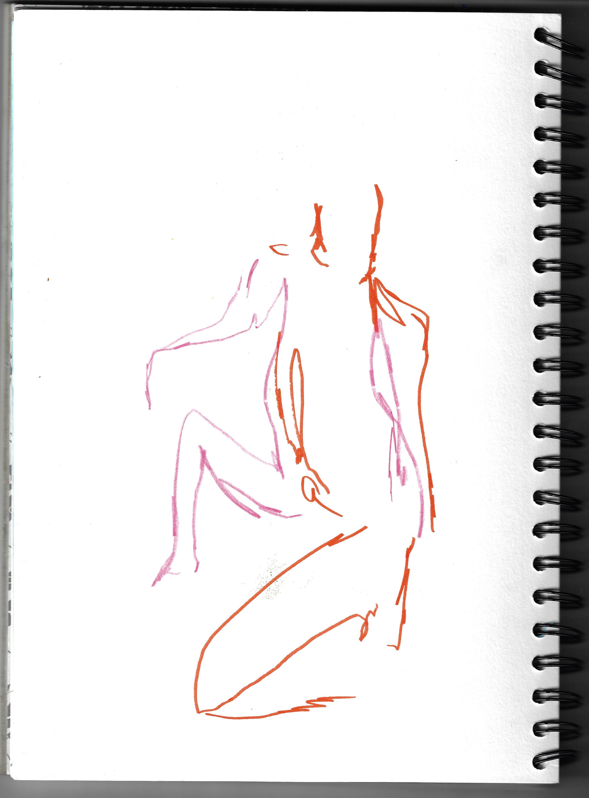
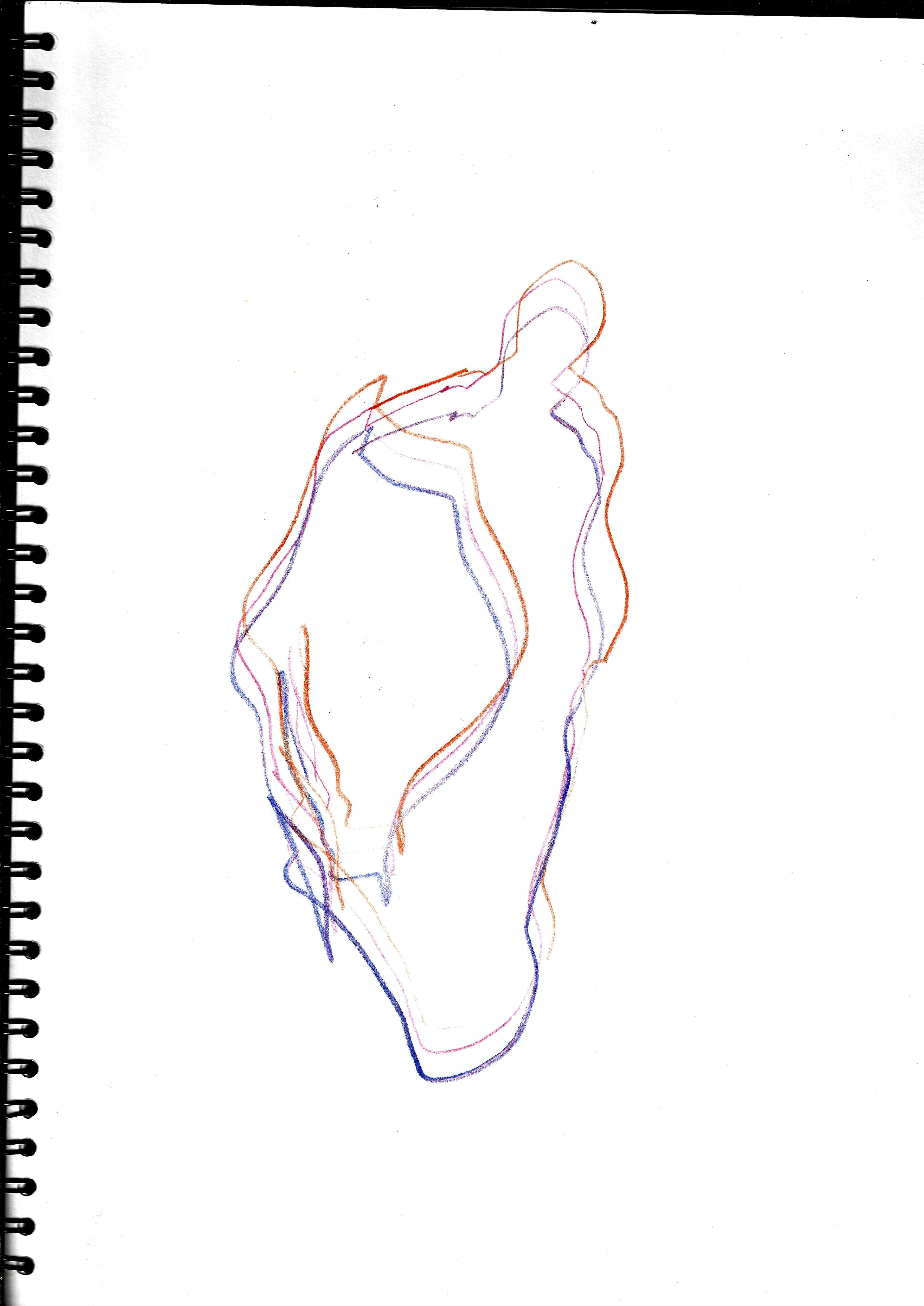
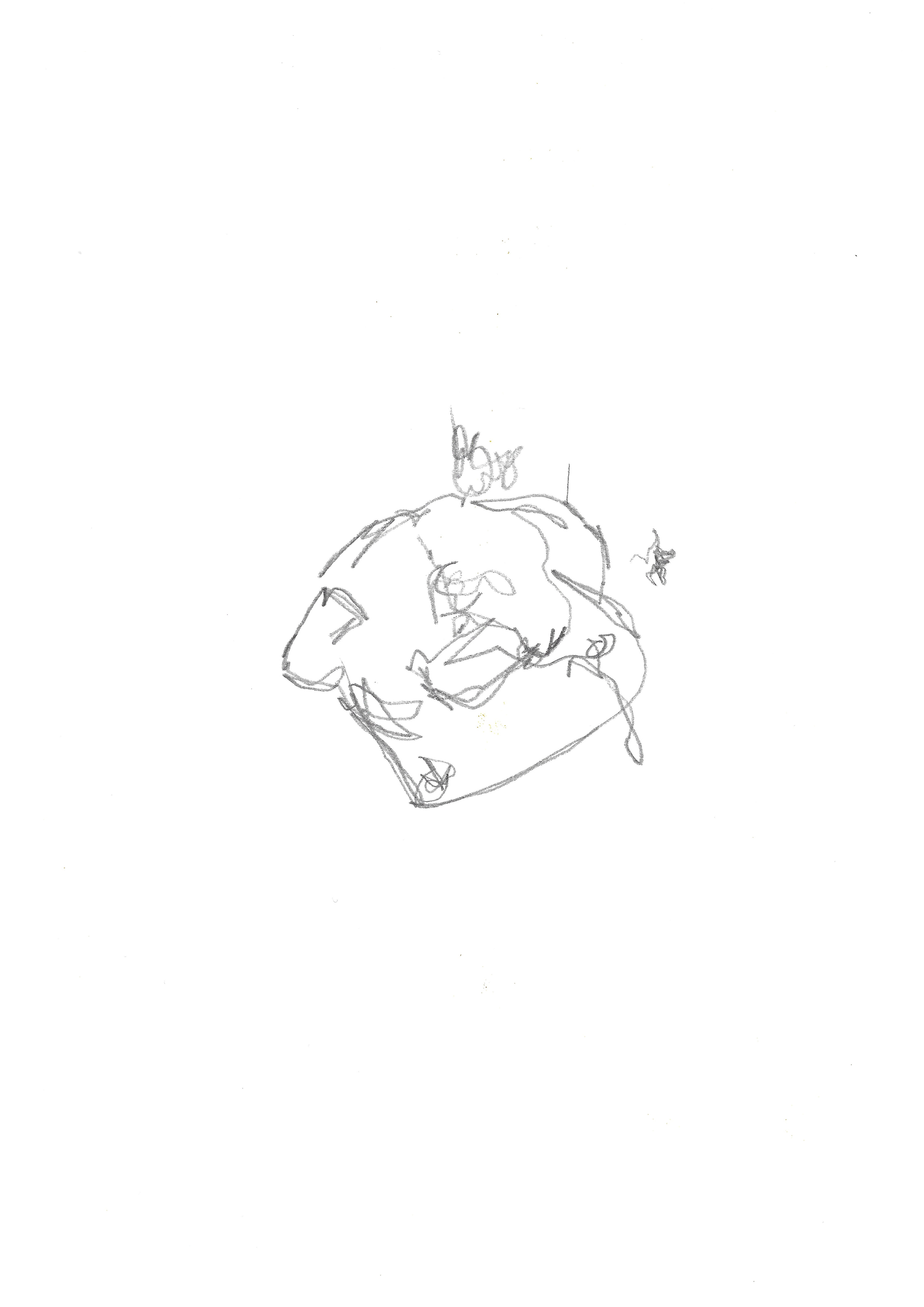
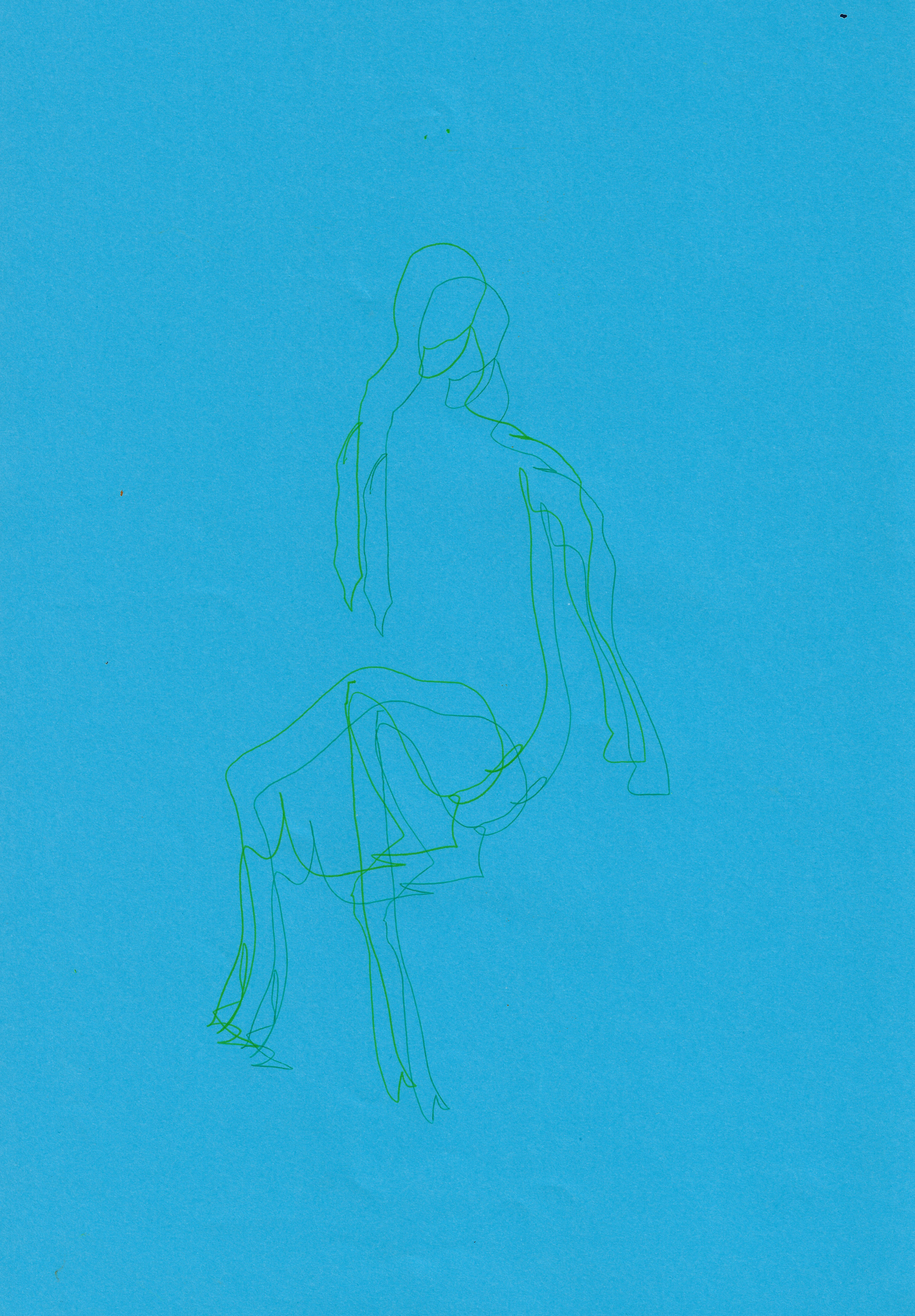
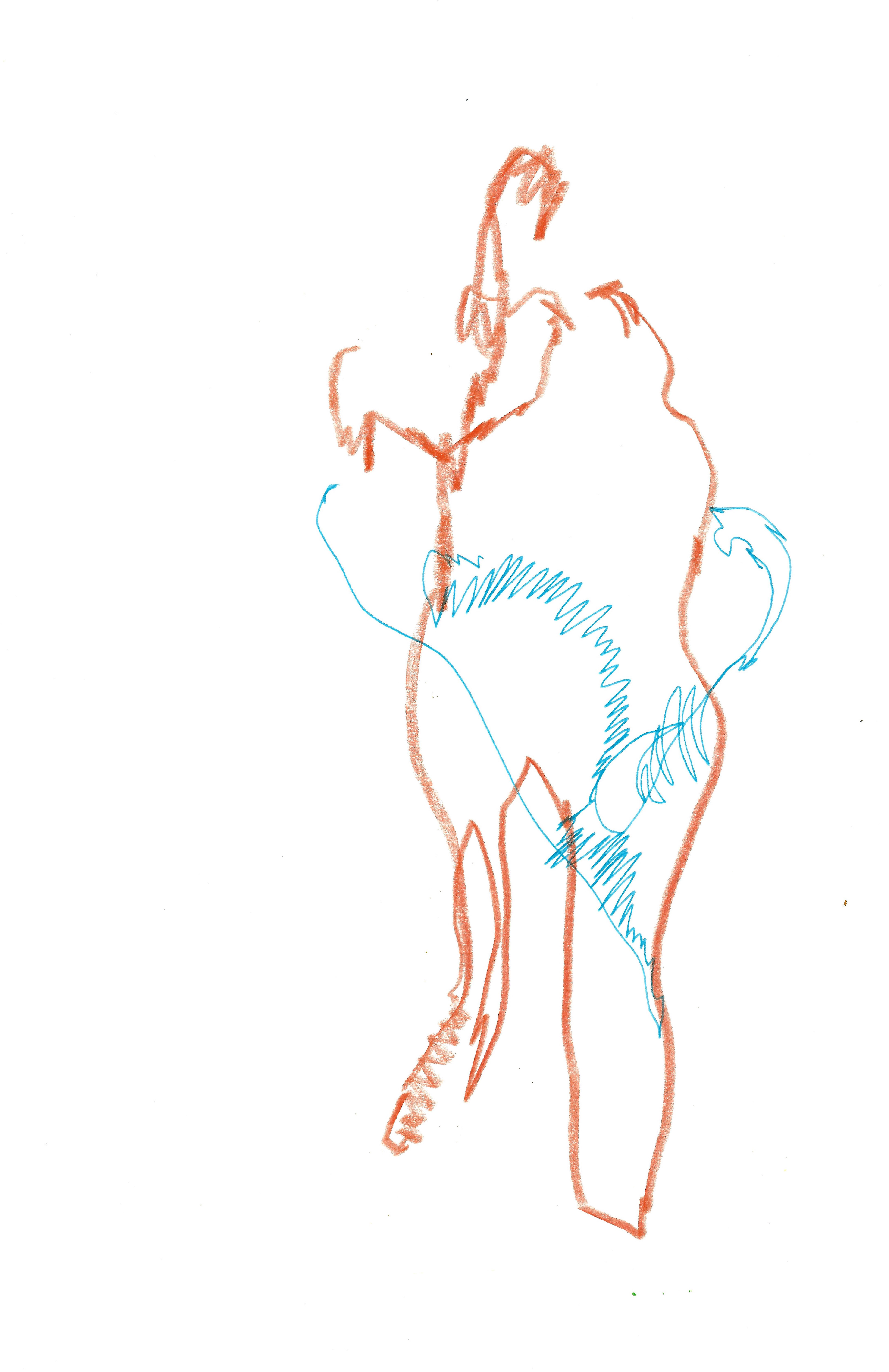
I attend a life drawing class, called 'drawing in motion'. The figure is constantly moving, or only pausing for a short amount of time before moving on. In the first three images I have used three pens at once to emphasise the non-static element of her pose.
Screenprint 41.5 x 59.5 cm
Screenprint 43.5 x 61 cm
Screenprint 35 x 50 cm
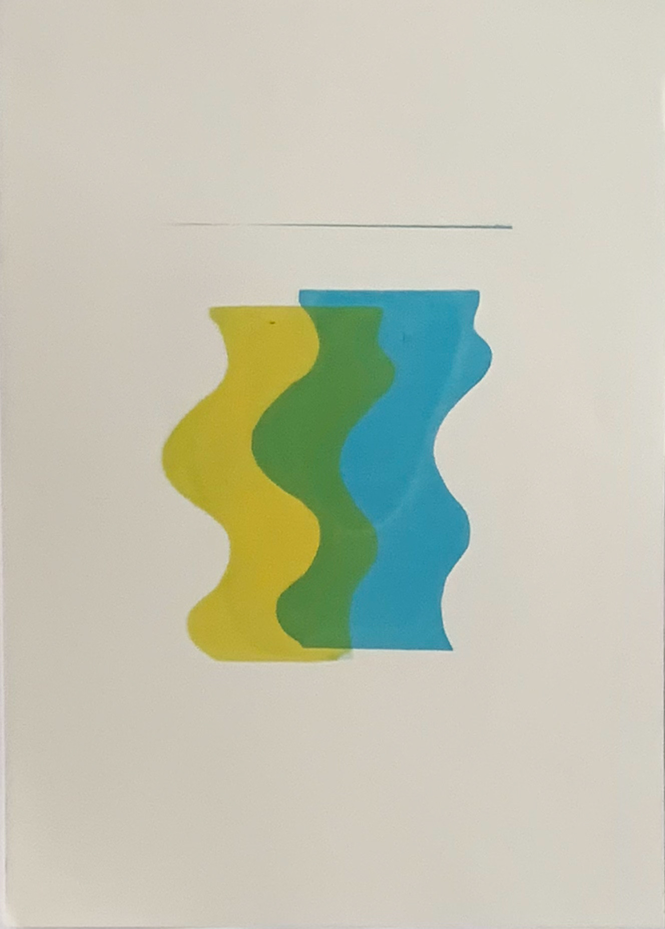
Screenprint 35 x 49 cm

Screenprint 35 x 50 cm
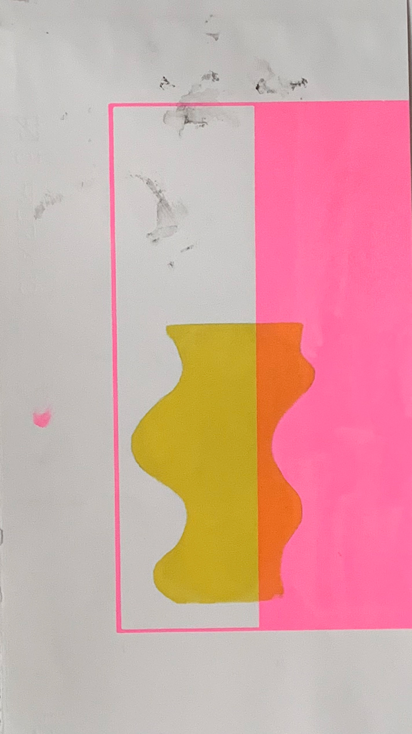
Screenprint 28 x 50 cm
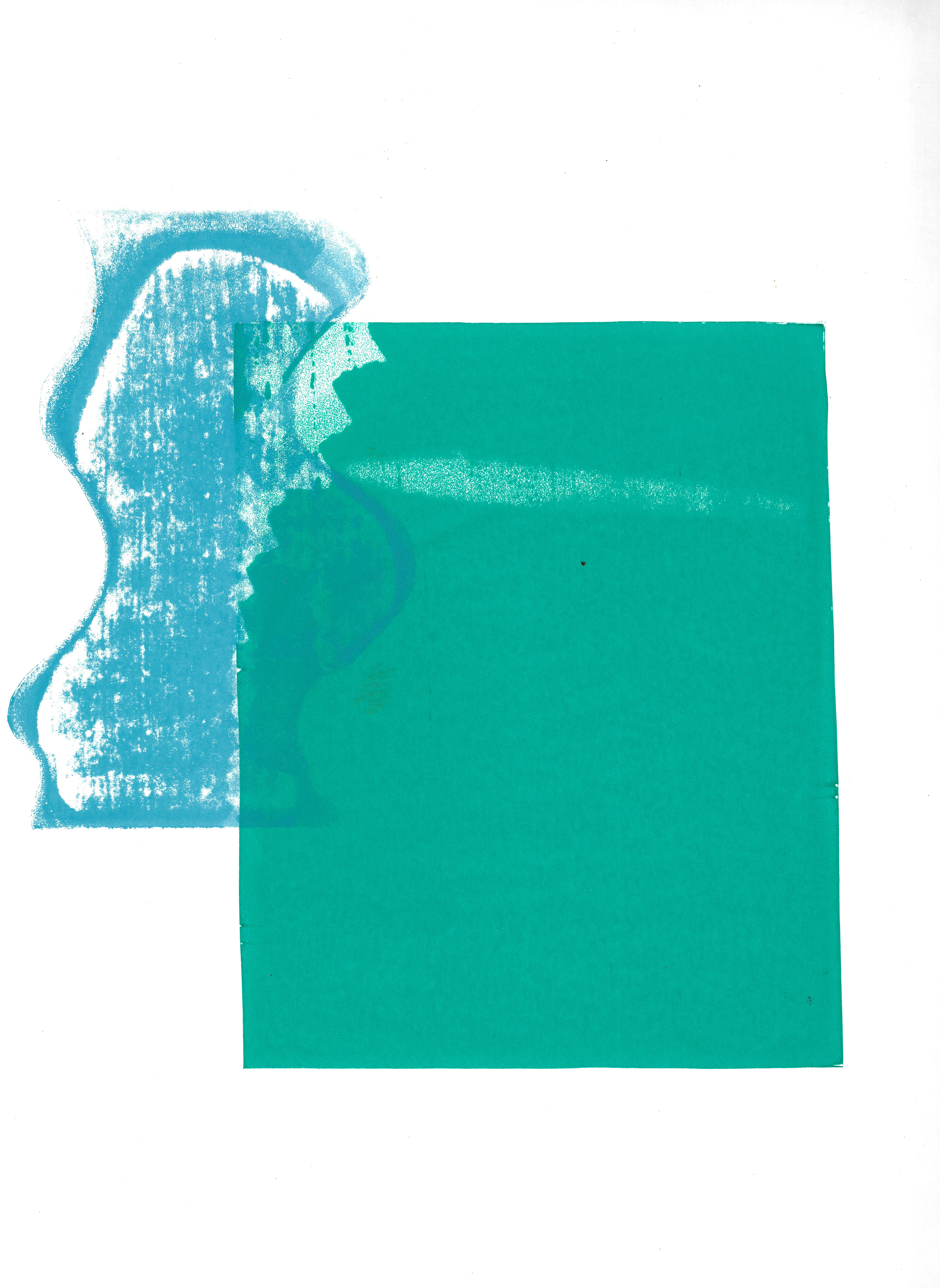
Screenprint 35 x 50 cm

Screenprint 35 x 49 cm
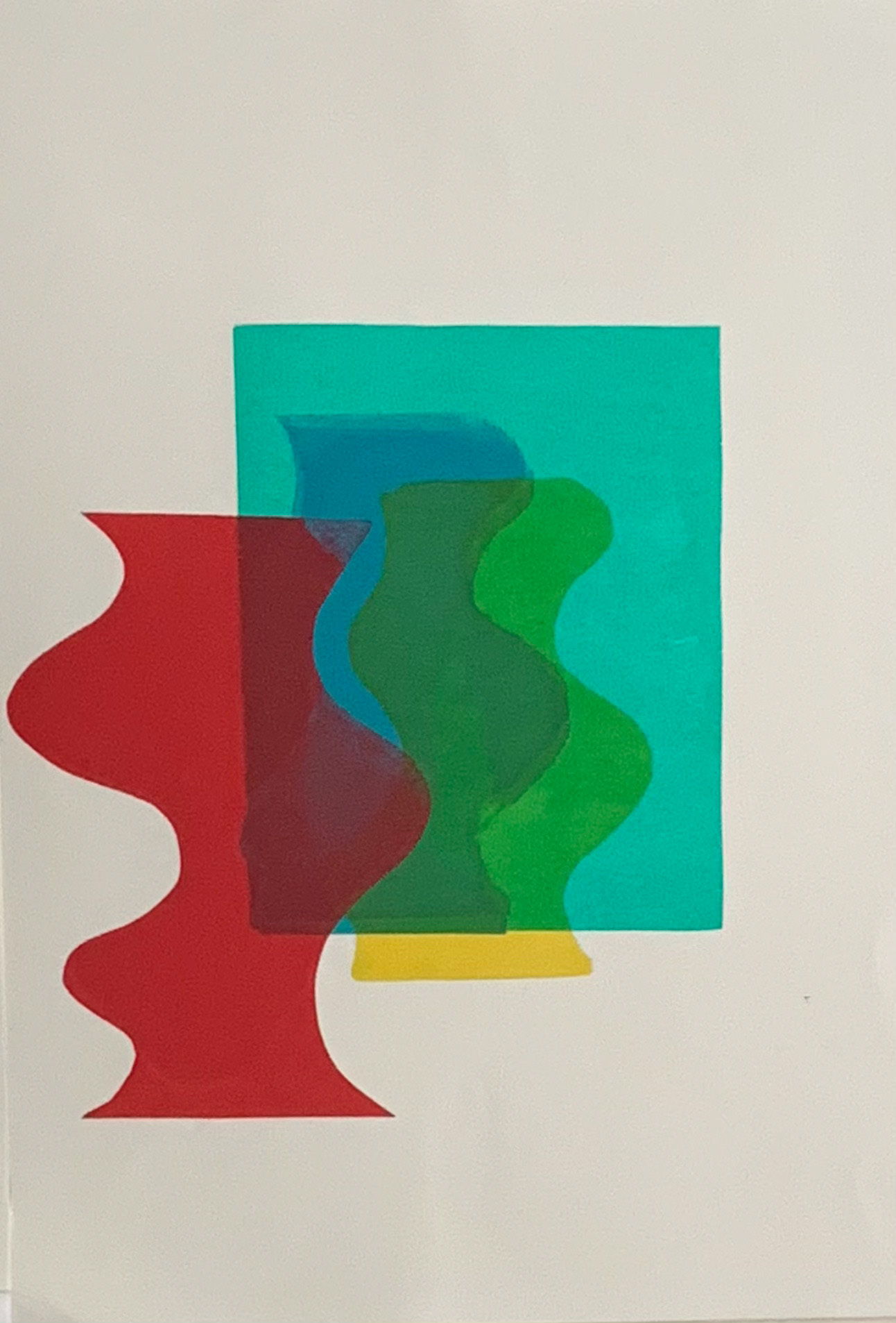
Screenprint 35 x 45 cm
Screenprint 34.5 x49 cm
Screenprint 35 x 50 cm
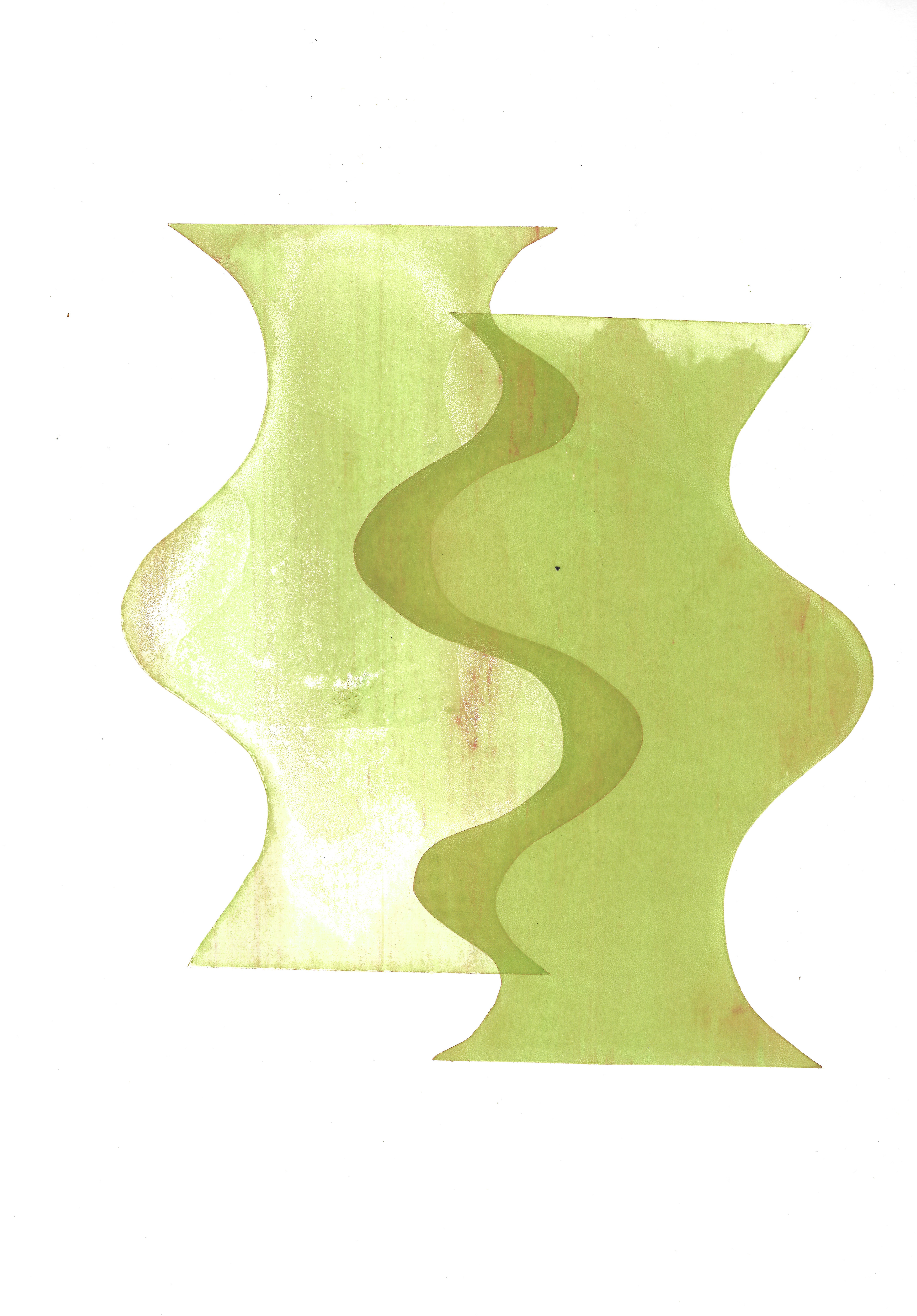
Paper stencils have been used (as exposure unit is not working in screenprinting) to make block shapes of flat colours. Thought has been given to creating dialogue between the different colours used and the perceptual depth between the different shapes, layered on top of each other in different colours. There is also dialogue between the form and colours; they work in unison. The background of the paper is also seen as a colour; thinking about how the shape of the paper also lends itself to a dialogue with the three other shapes on the paper.
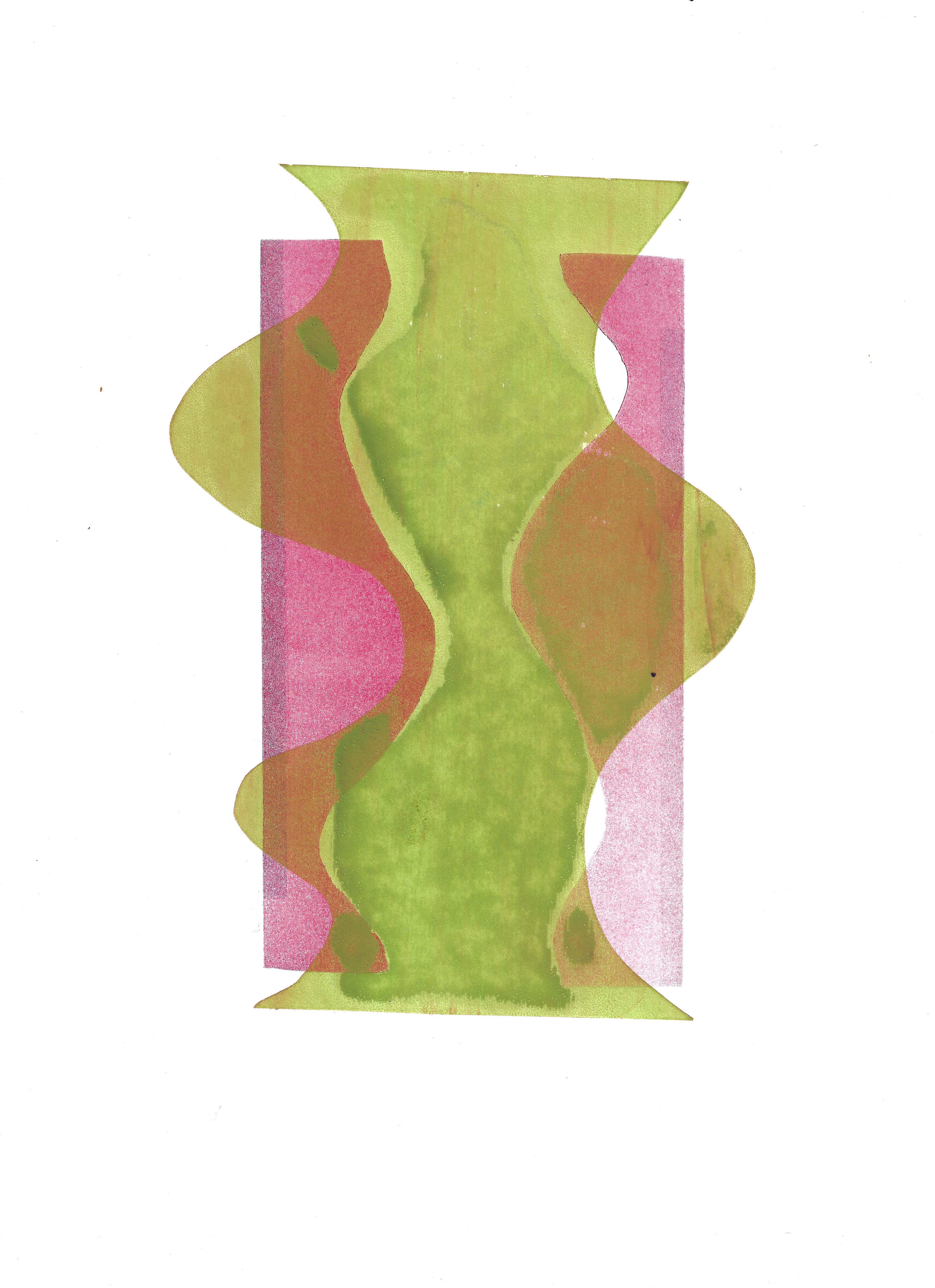
Screenprint over a Lino print 26 x 34 cm
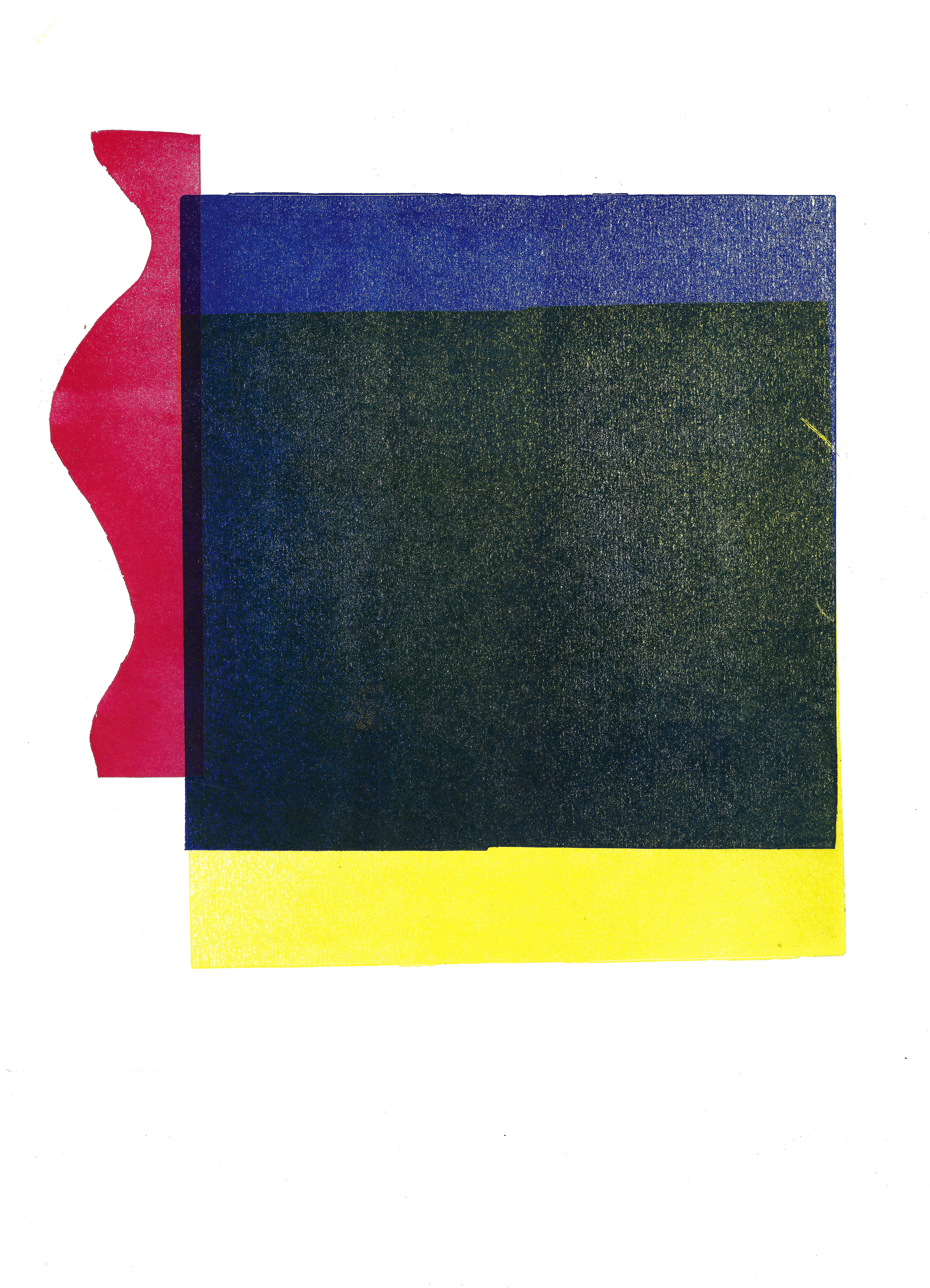
Lino print 29.5 x 33.5 cm

Lino print 29.5 x 34 cm
This is an exploration of using lino printing to create the block forms which is not as effective as screen printing in creating a clean cut print as there is still some feedback. It is better suited for more detailed line drawings.

Sketchbook page 29.7 x 42 cm
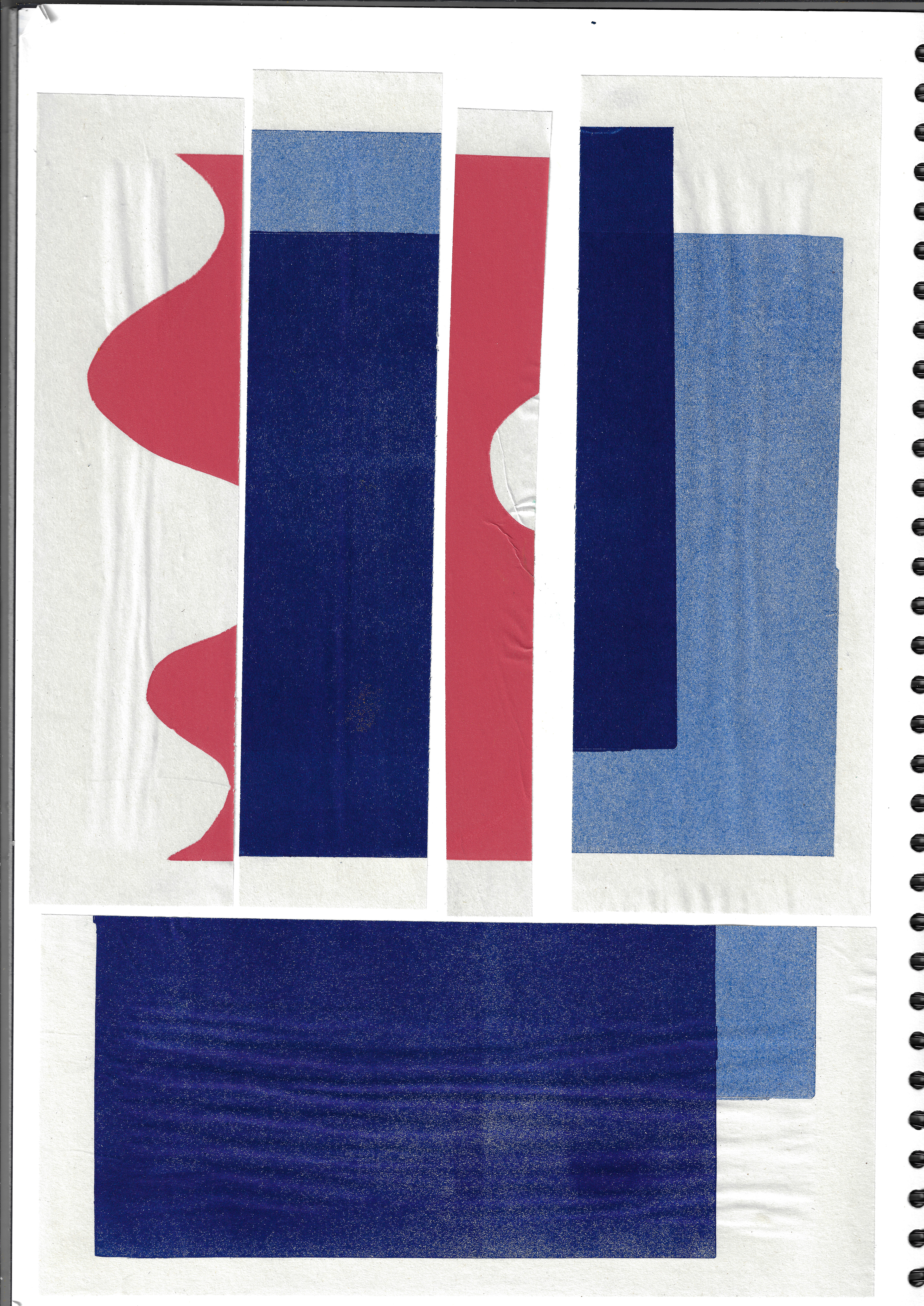
Sketchbook page 29.7 x 42 cm
A collage of newsprint screenprints and lino prints investigating the dialogue between broken forms and colour.
Lithograph, 38 x 56.5 cm
An exploration of how to draw using different lithographic mediums on stone. Experimenting with different markings and intensities of the line drawn.
Screenprint 46.5 70 cm
Screenprint 35 x 45 cm
Screenprinting using a positive and negative image of a life drawing that was drawn earlier in the week. Using contrasting colours and slightly offsetting the positive and negative layers creates more depth. The flat block colour background has a tonal value, adding more depth.
Lithograph 29.7 x 42 cm
Lithograph 21 x 29.7 cm
Drawing and exploring the texture of a stone on a stone in stone lithography. This explores the textures of my memories of stones, translating how it felt to touch and translating this to drawing the image in my mind onto stone. A probing of the different lithographic drawing materials to create different textures and depth.

Sketchbook page 21 x 29.7 cm
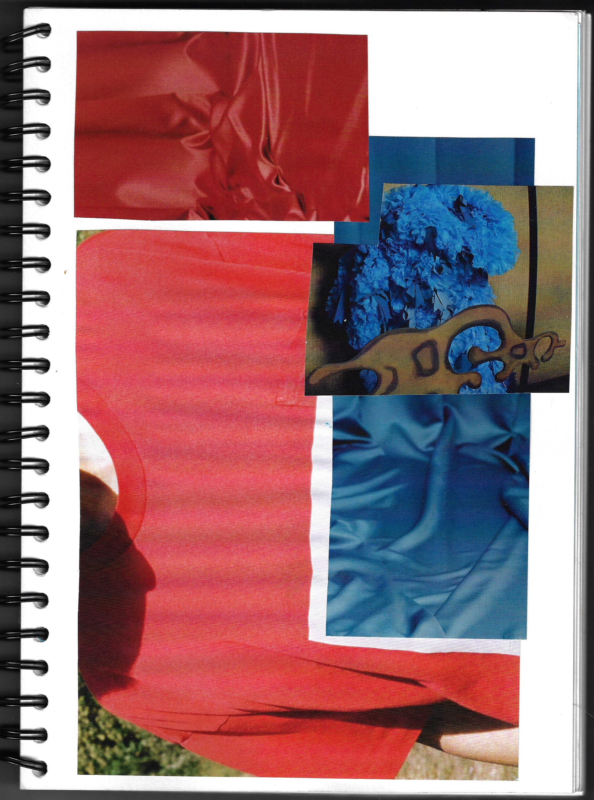
Sketchbook page 21 x 29.7 cm

Sketchbook page 21 x 29.7 cm
A collage of some magazine images of different fabrics in my sketchbook, exploring the dialogue between textured forms, and the communication between different shapes.
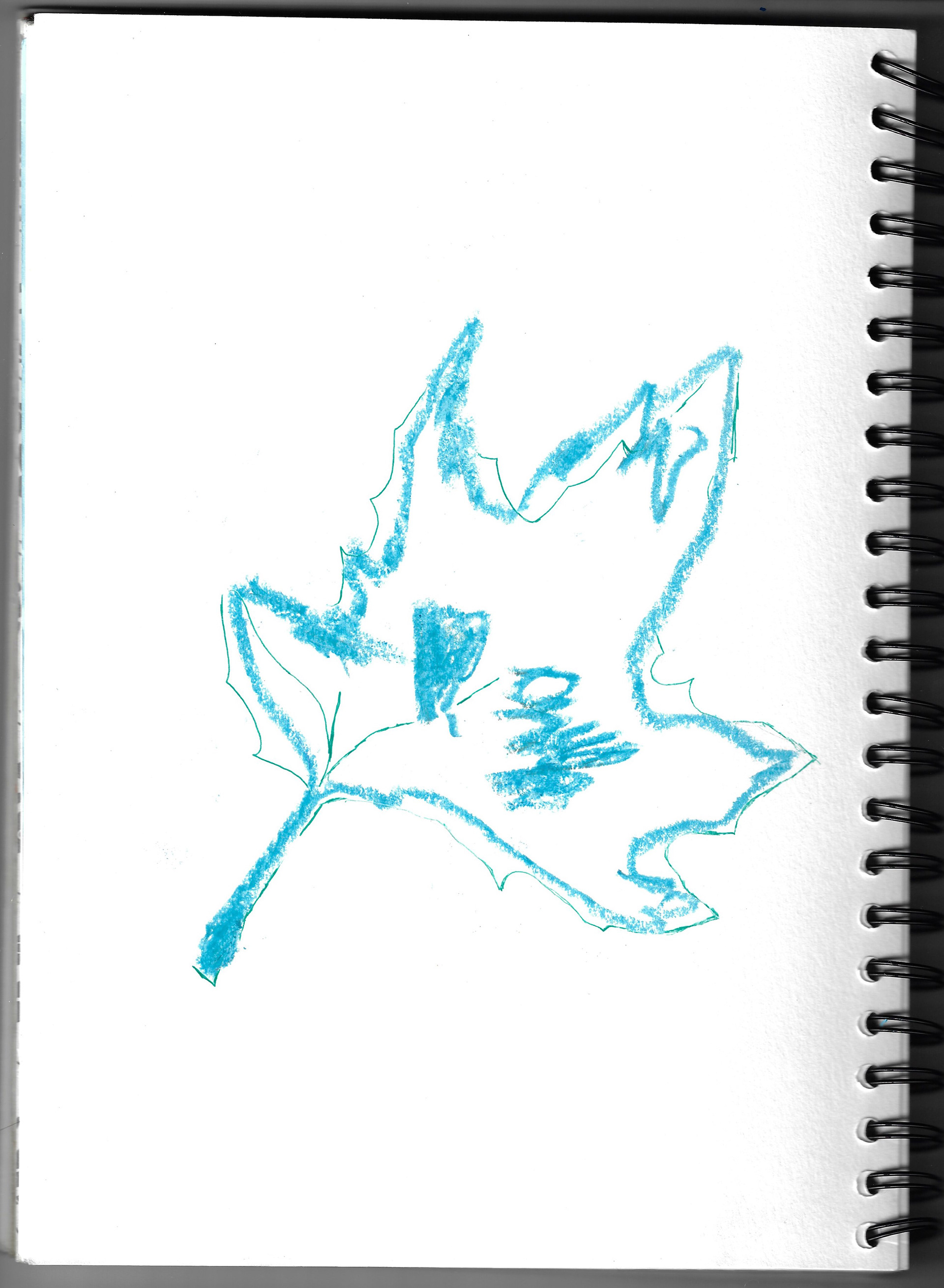
Sketchbook page 21 x 29.7 cm

Sketchbook page 21 x 29.7 cm
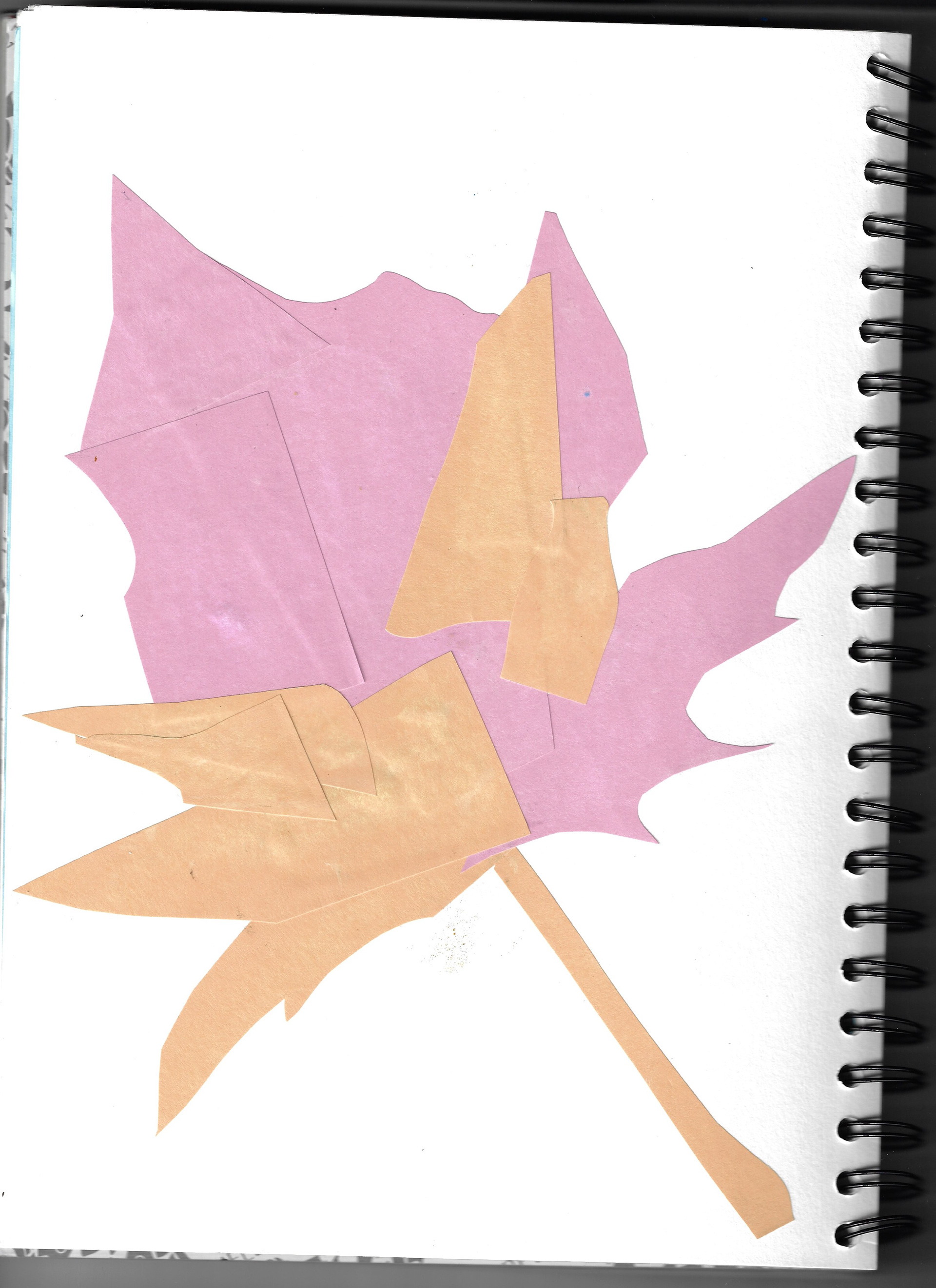
Sketchbook page 21 x 29.7 cm
I made a collage using block colours of oak leaves found in the street, exploring the shapes and natural lines followed by some drawings of the leaves, using a combination of pastel and pens creating tension in the different lines and colours of different materials.

Monoprint 57 x 75.5 cm
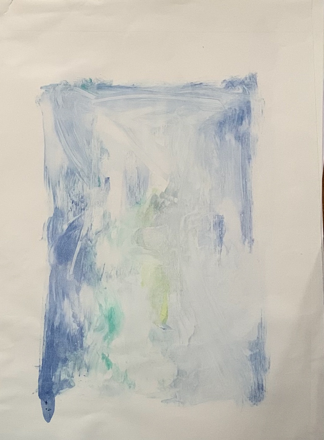
Monoprint 52.5 x 71 cm
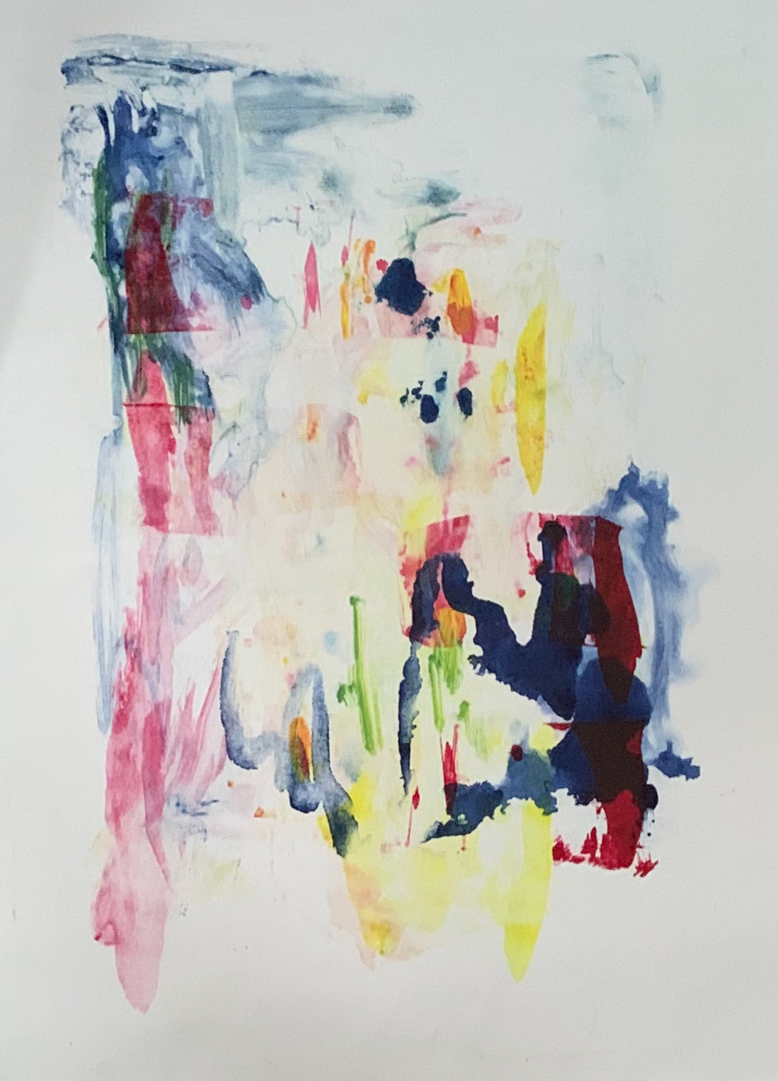
Monoprint 51 x 71 cm
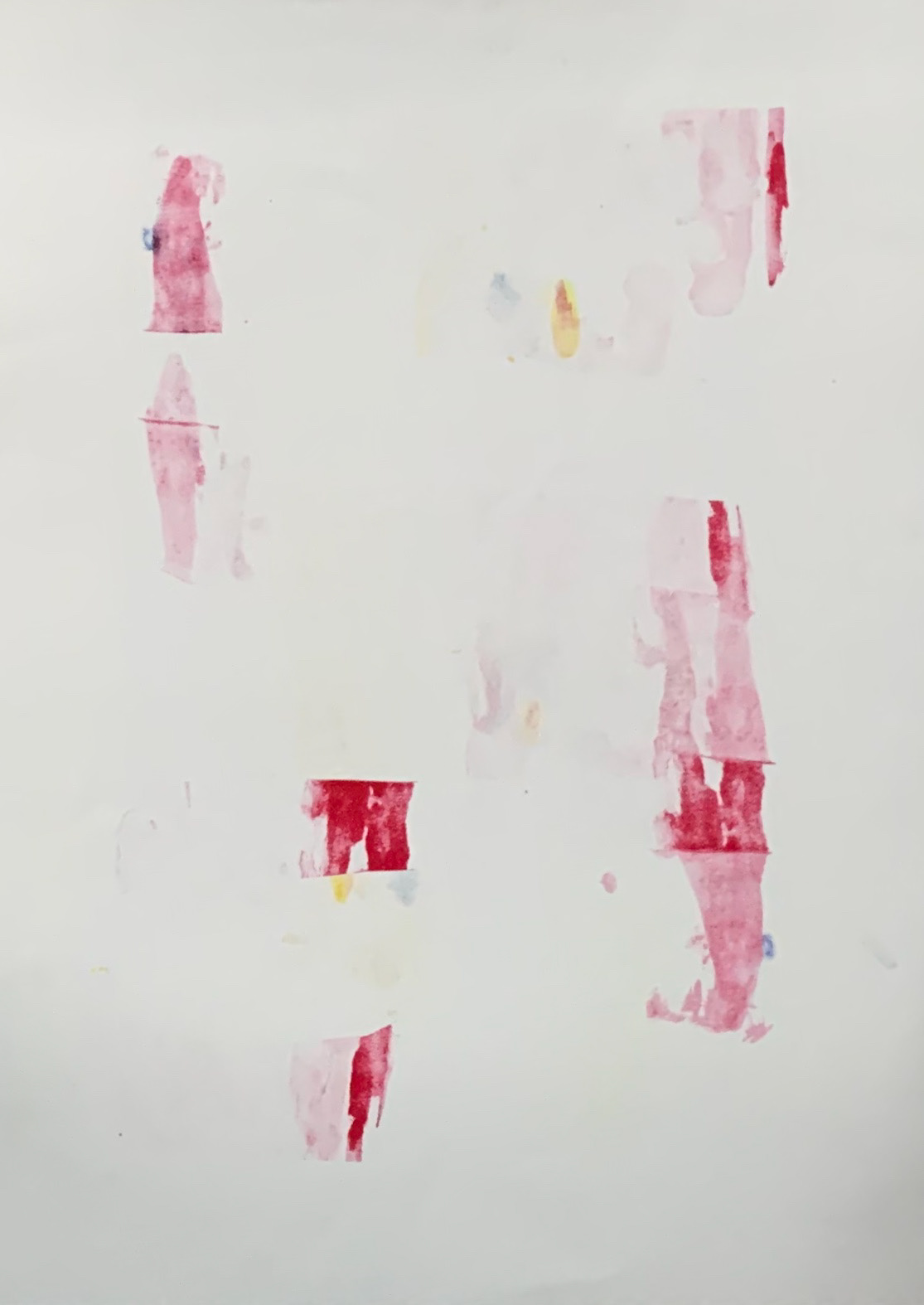
Monoprint 51.5 x 71 cm

Monoprint 41 x 58 cm
This was the first time using the monoprint press, learning how the press works and its sensitivity to different pressures. Techniques included layering up prints using stencils to create depth within an image, experimenting with the viscosity of the paint, adding white spirit to the paint to create more fluid textures, then contrasting this with areas of high density. The more the viewer looks the more is discovered, revealing layers that are not apparent at first glance.
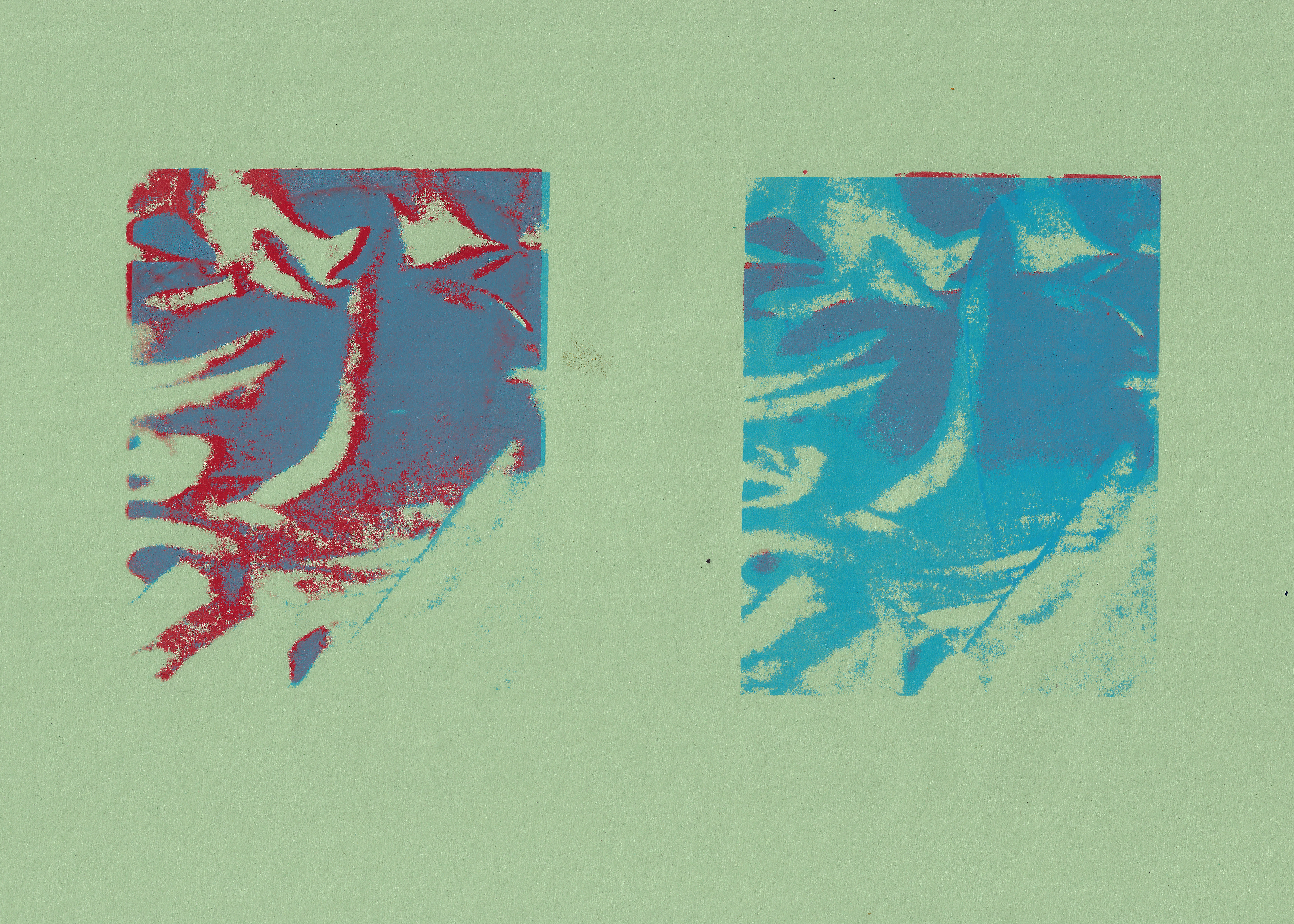
Screenprint, 29.7 x 42 cm
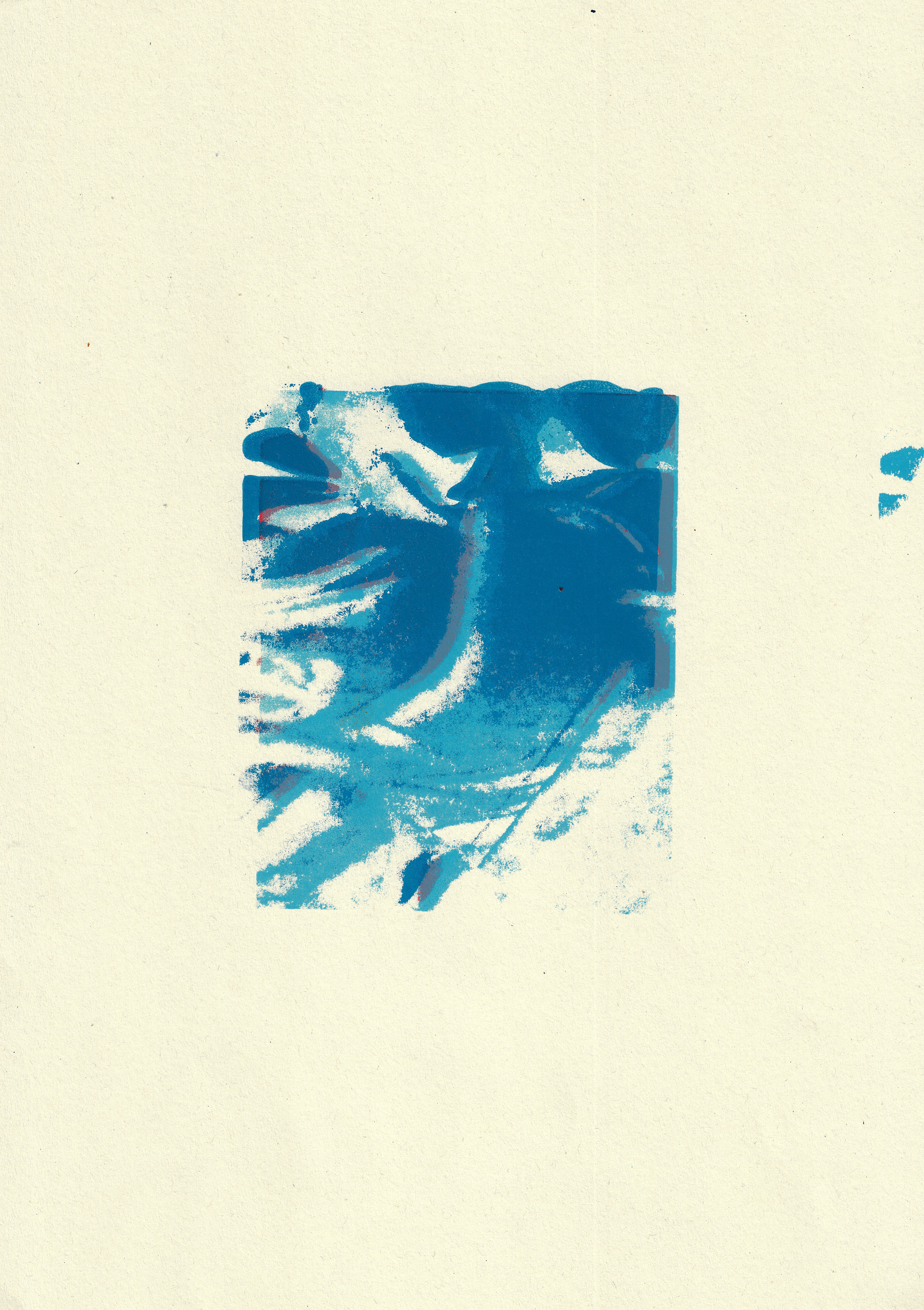
Screenprint 29.7 x 42 cm

Screenprint 21 x 29.7 cm

Screenprint 21 x 29.7 cm
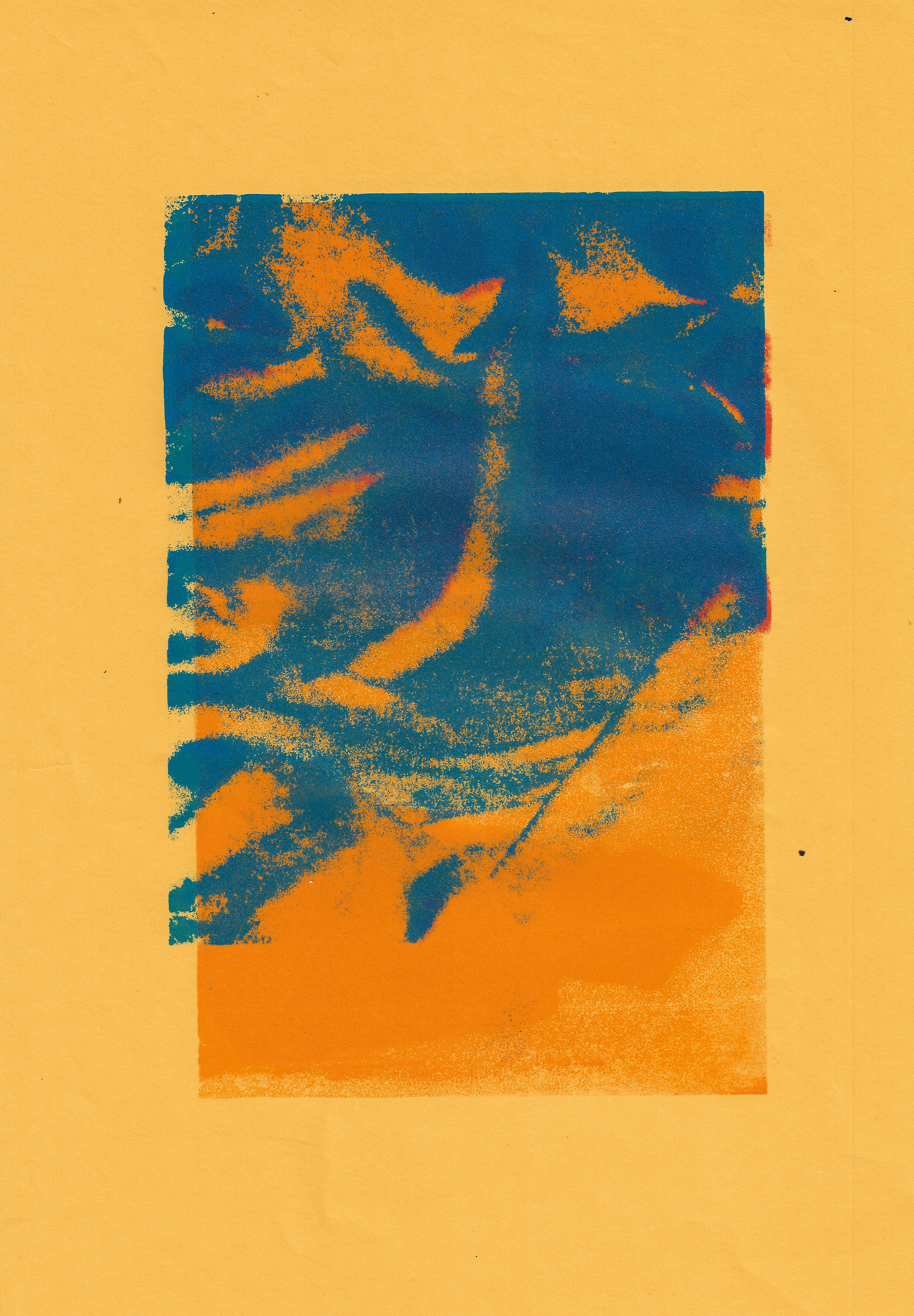
Screenprint 21 x 29.7 cm
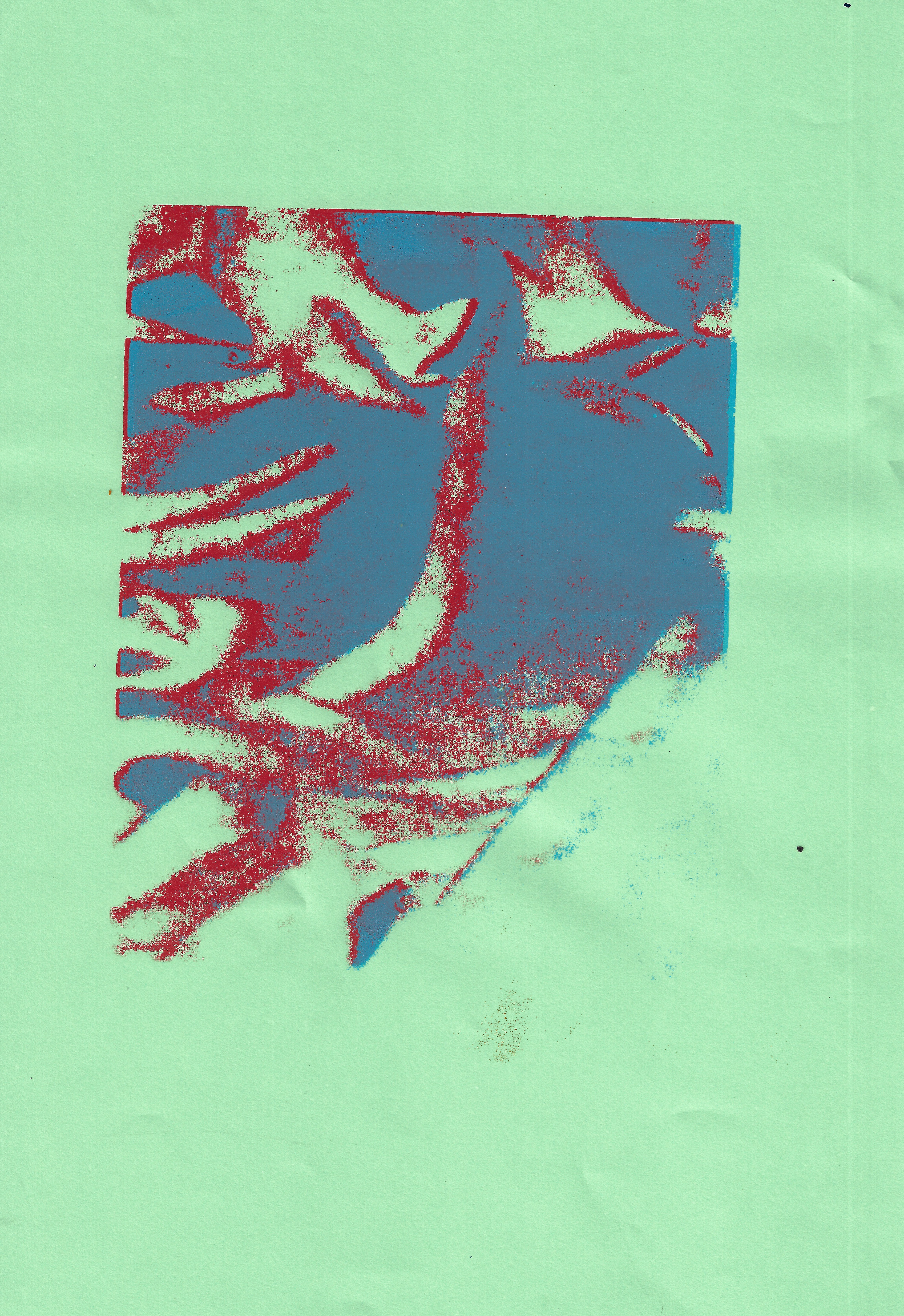
Screnprint 21 x 29.7 cm
Screen-printing of a photograph of crumpled fabric from an earlier collage in my sketchbook. The image was split into cmyk on photoshop and only screenprints were done of two of the layers. Using the colours blue and red created layers and depth by slightly offsetting them. Thought was given about the symbolic value of the two colours and experimenting with offsetting the different layers of cmyk.
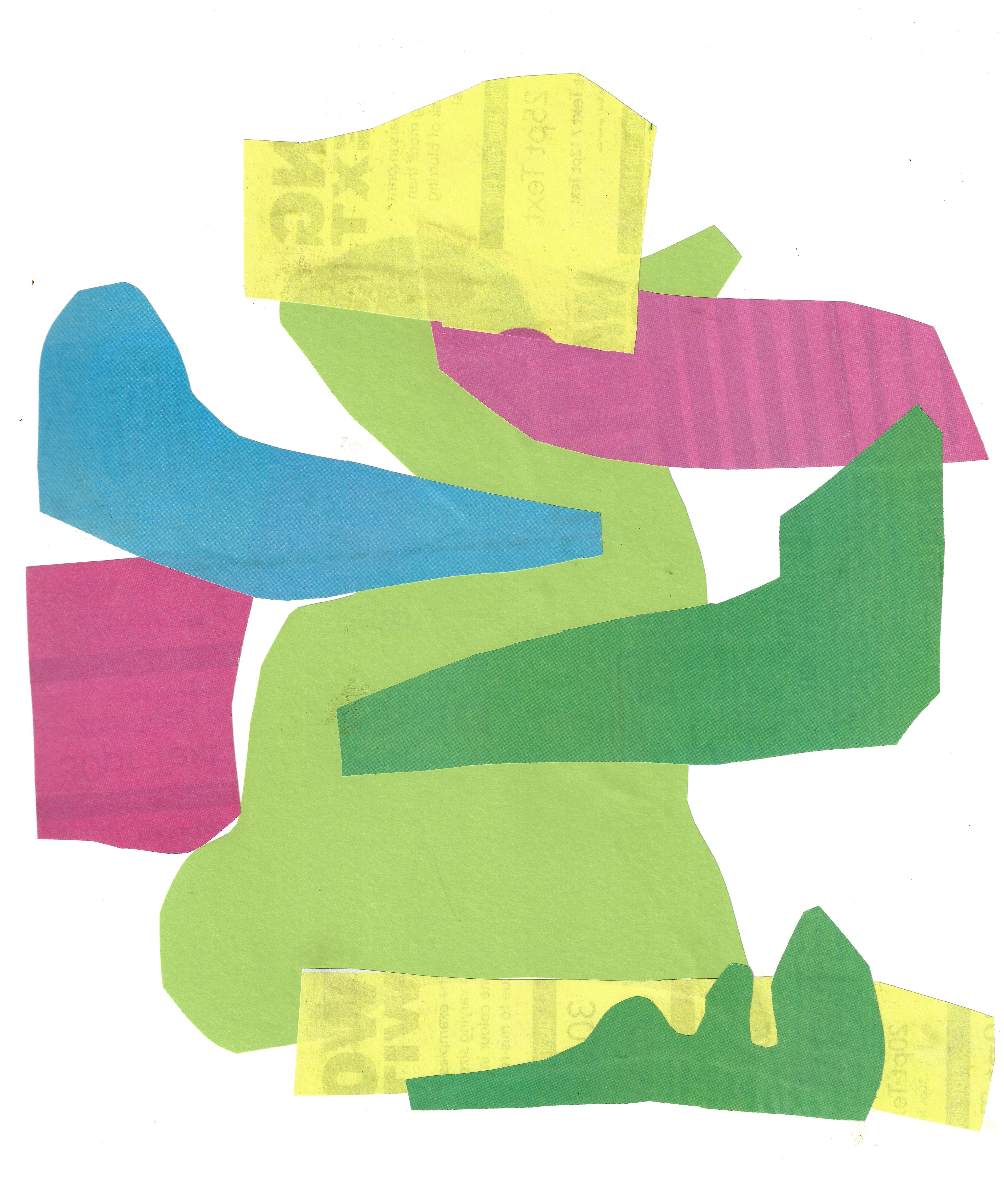
Sketchbook page 29.7 x 42 cm
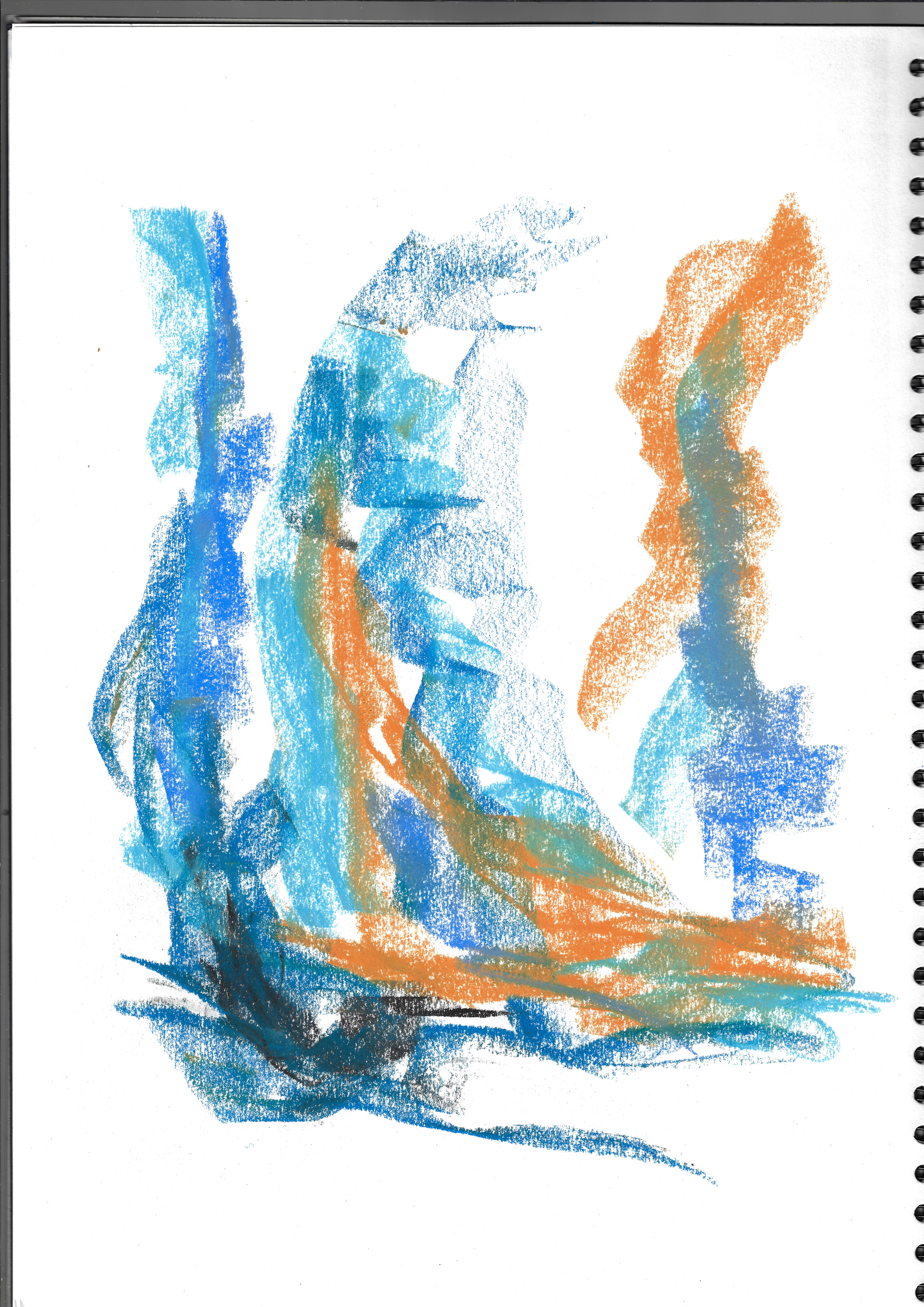
Sketchbook page 29.7 x 42 cm

Sketchbook page 29.7 x 42 cm
Drawings taken from my sketchbook of fabric using different materials, exploring how to evoke the texture of the fabric through sight.

Sketchbook page 21 x 29.7 cm
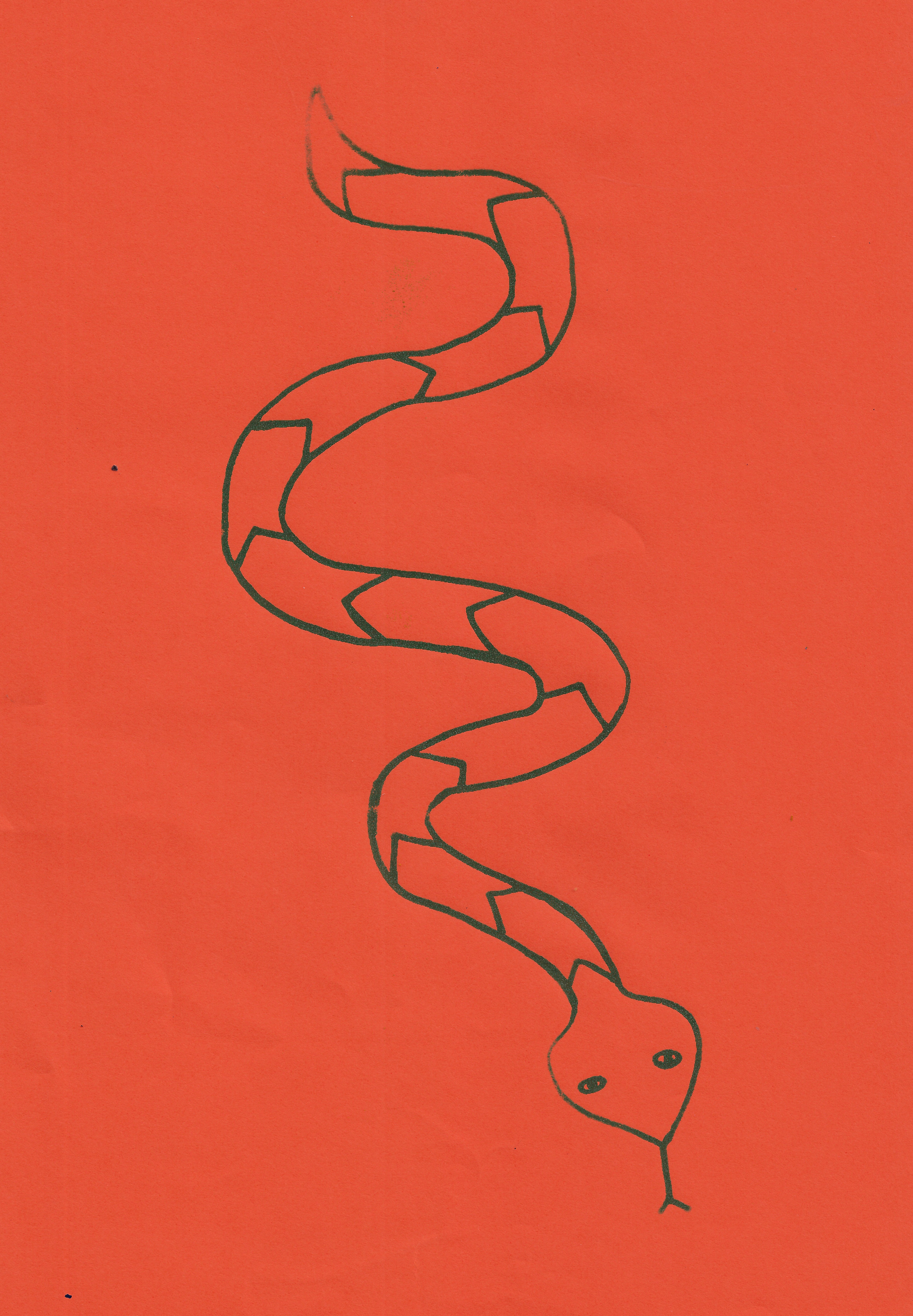
Screenprint 21 x 29.7 cm
Screenprint 21 x 29.7 cm
Screenprint 21 x 29.7 cm

Screenprint 21 x 29.7 cm

Screenprint 21 x 29.7 cm

Screenprint 29.7 x 42 cm
Screenprint 29.7 x 42 cm
Screenprint 35 x 50 cm
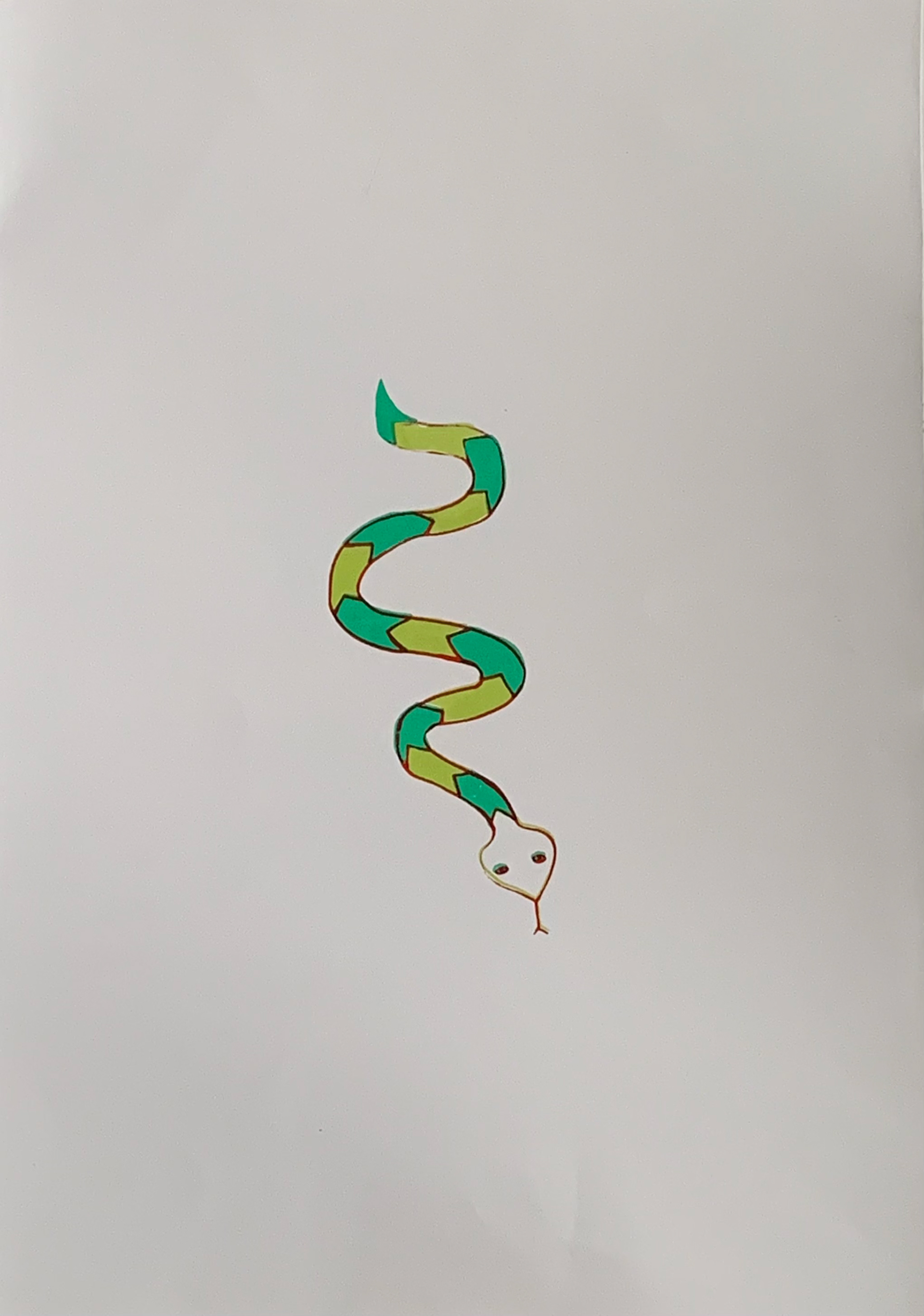
Screenprint 41.5 x 69.5 cm
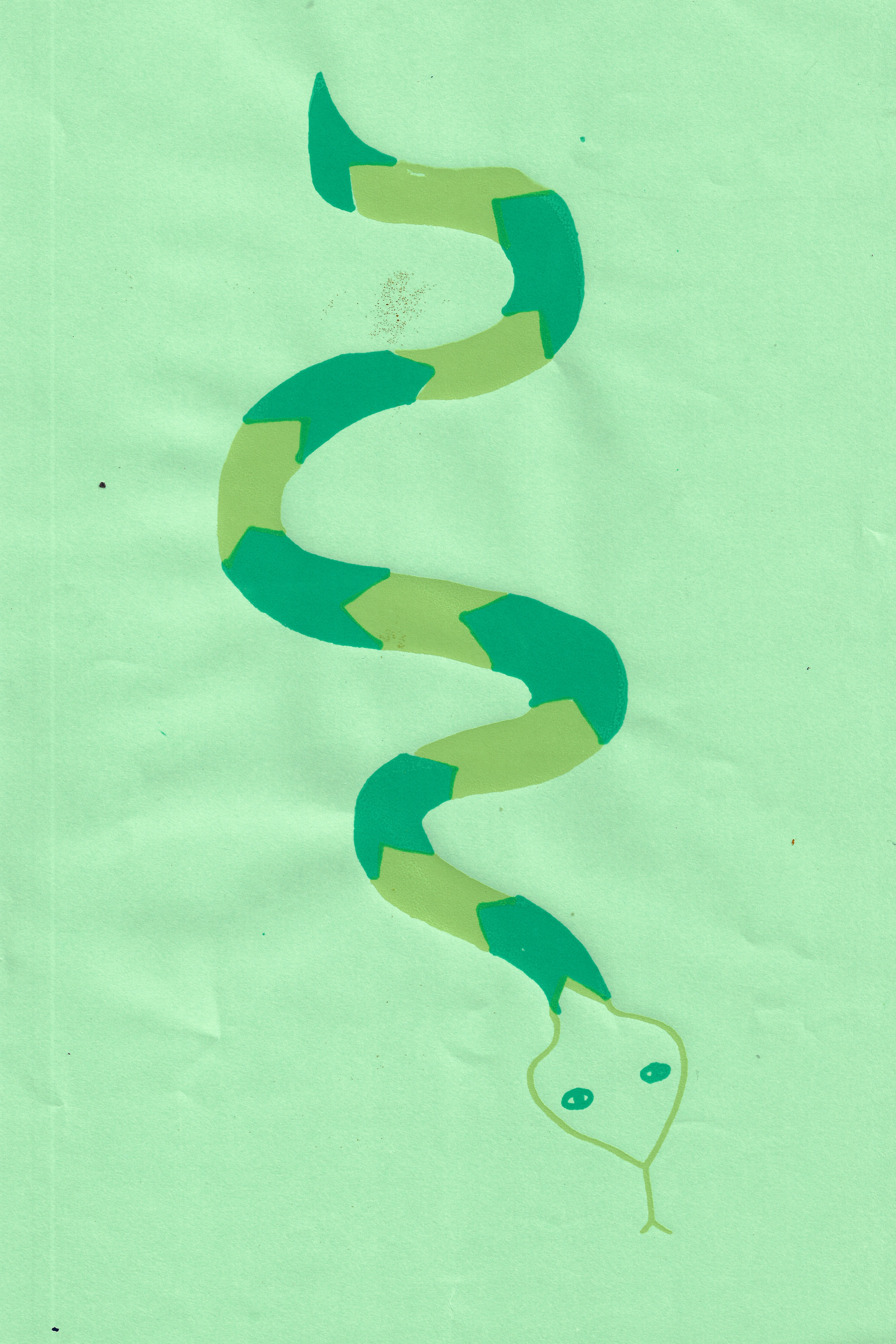
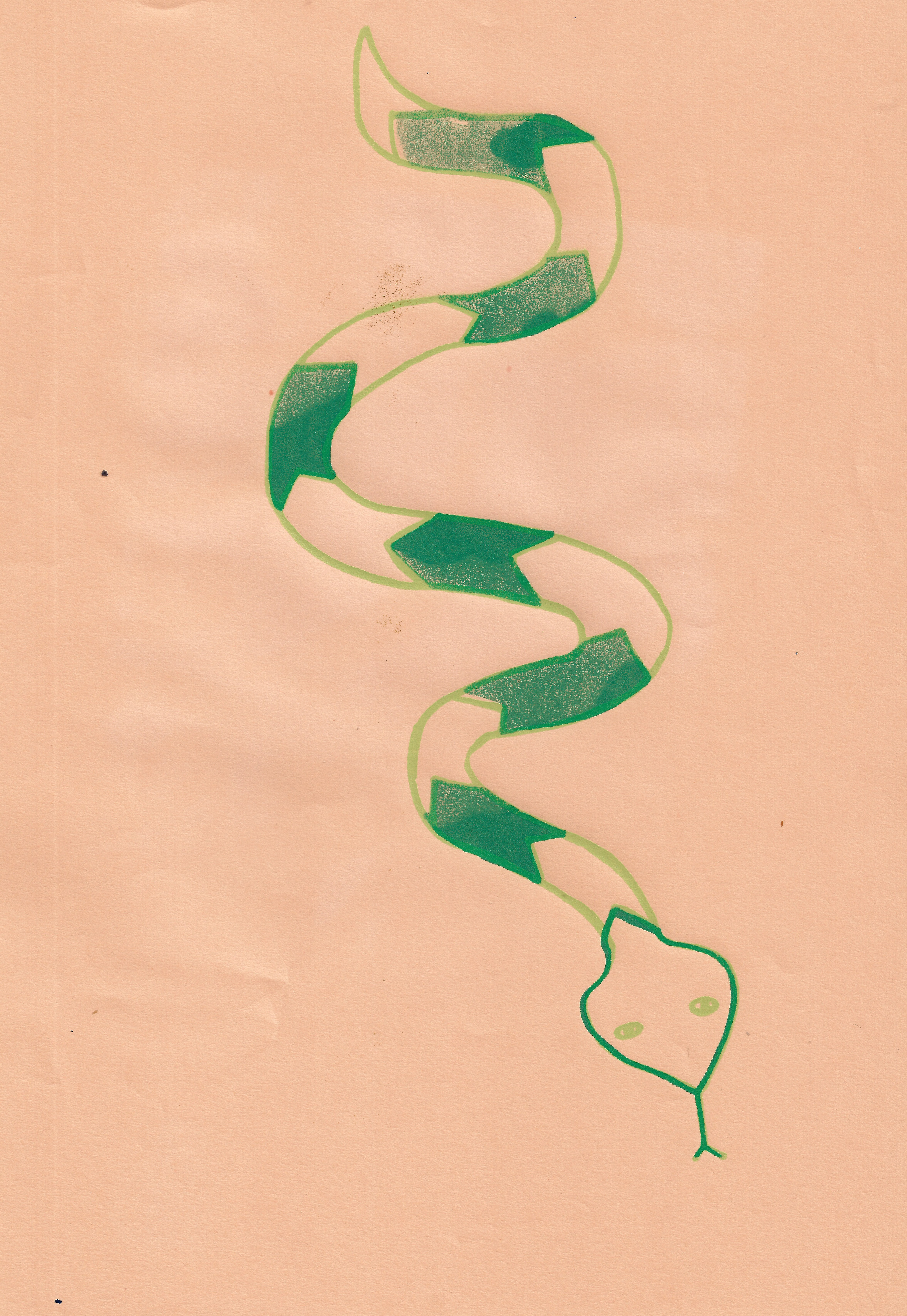
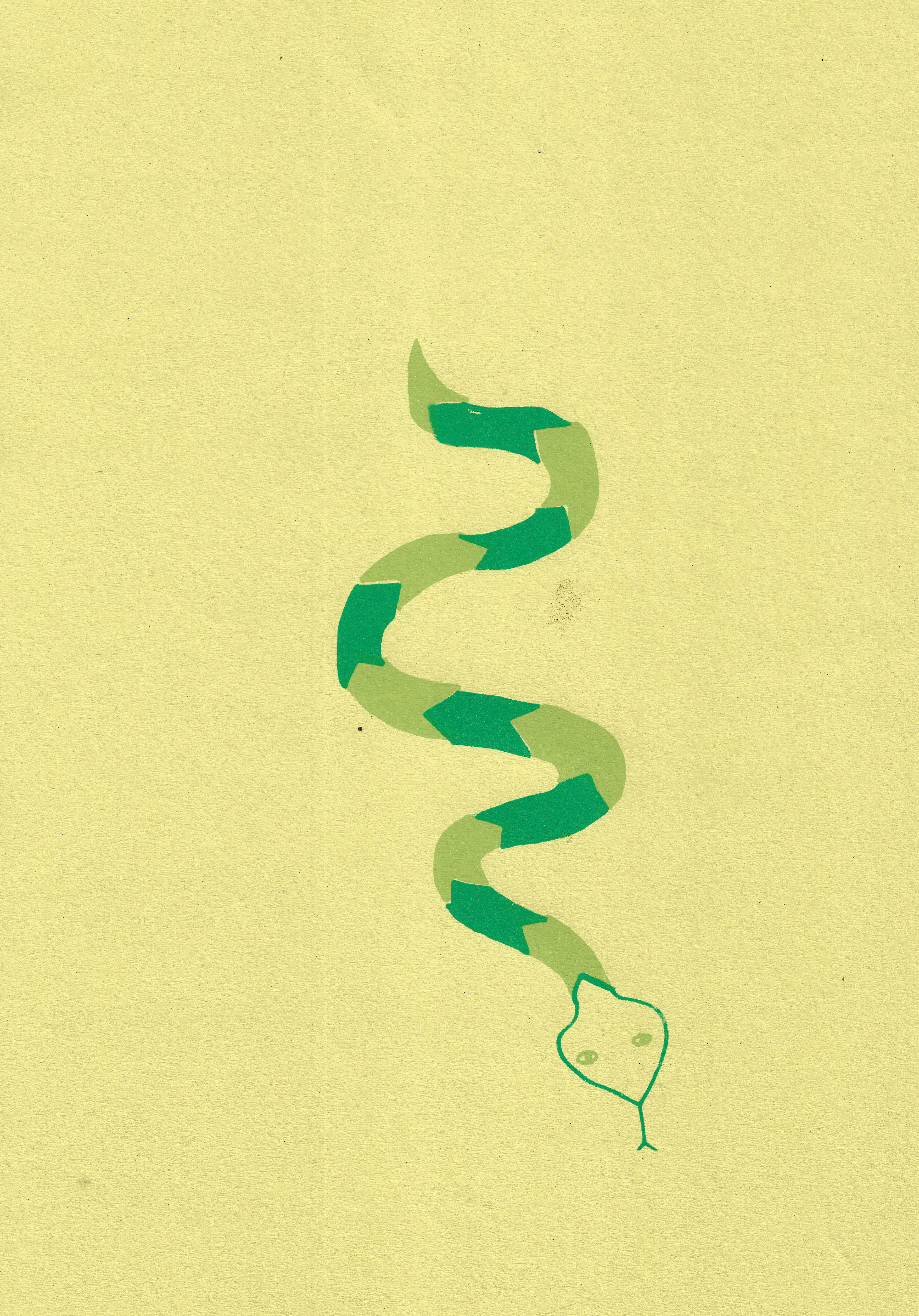
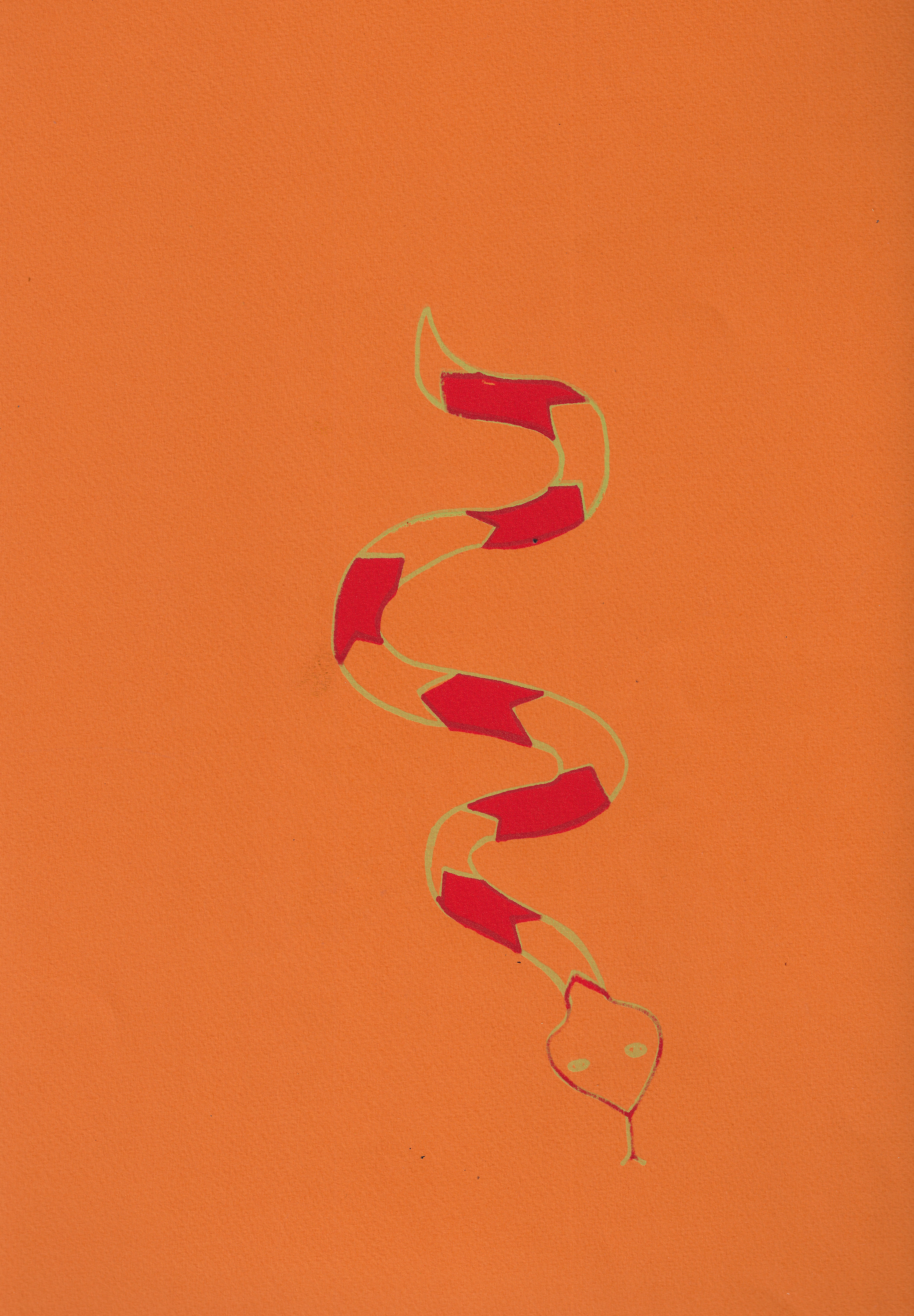
Screenprinting an image of a snake I drew in my sketchbook, inspired by my scarf which I was wearing a lot at the time I made this print. A sheet of acetate was used for the first time to layer the different colours on the same image accurately. This enabled me to learn how to use the acetate in order to create slightly offset images more accurately.
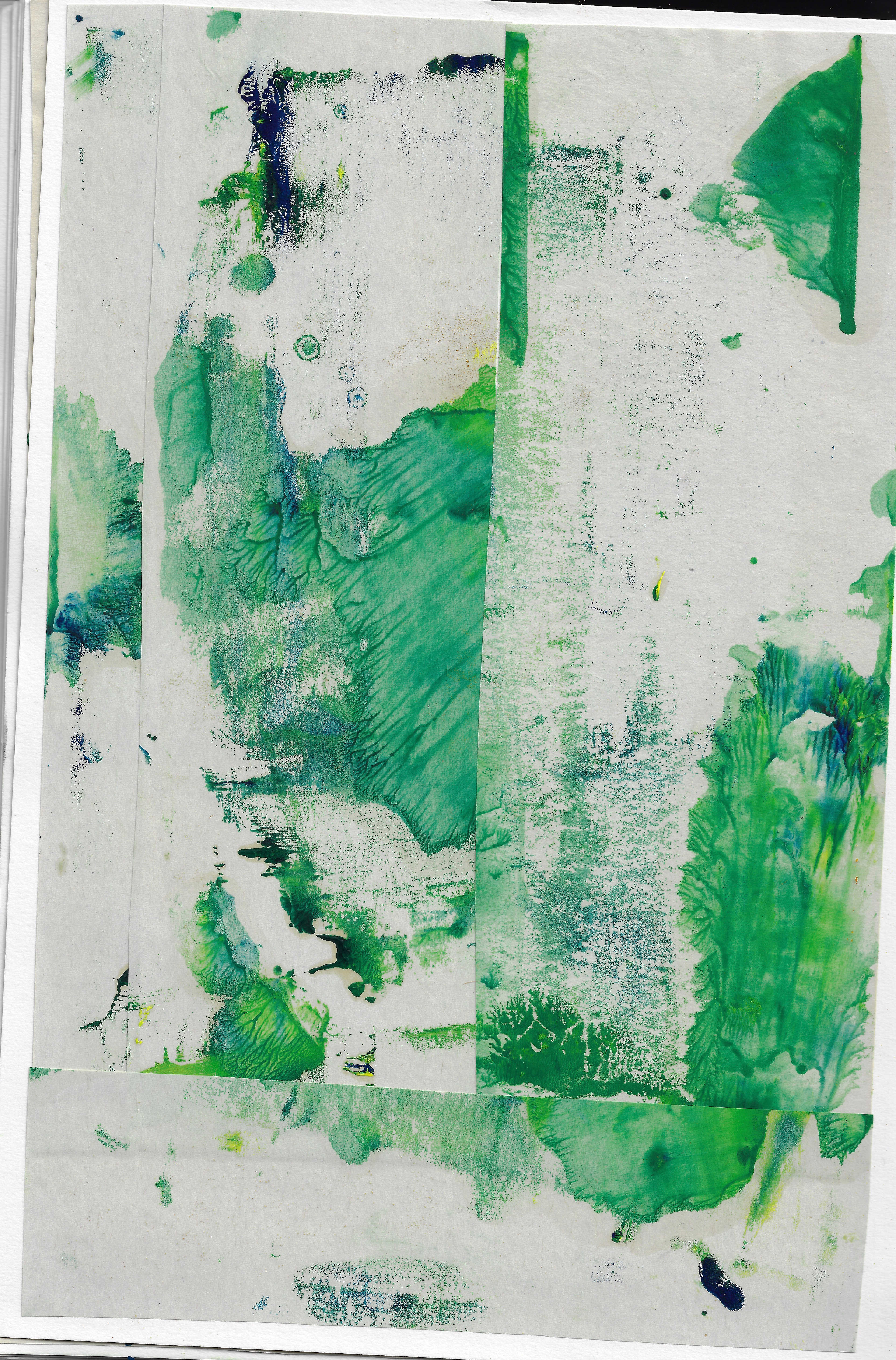
Original monoprint that has been collaged 21 x 29.7 cm
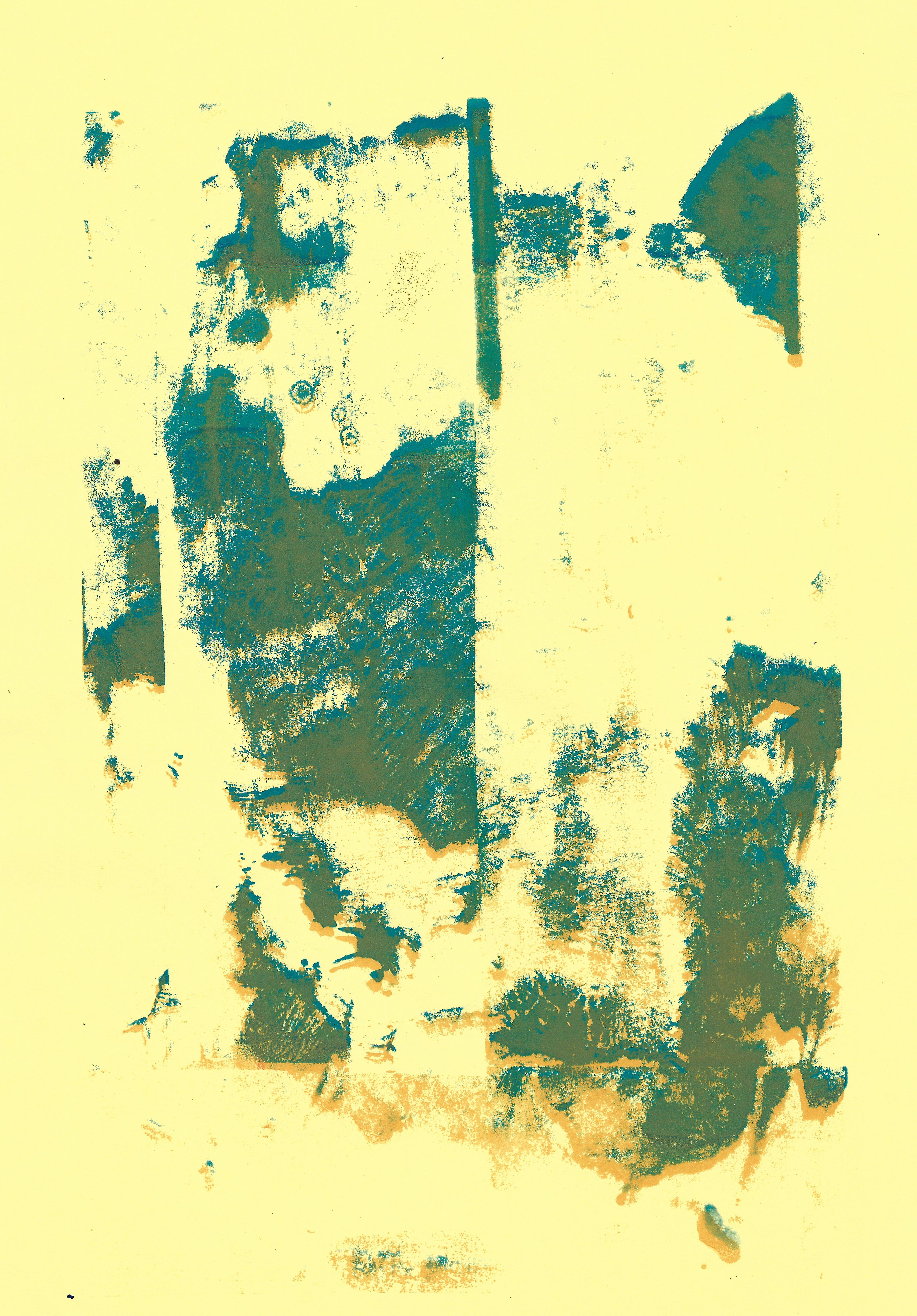
Screenprint 21 x 29.7 cm

Screenprint 21 x 29.7 cm
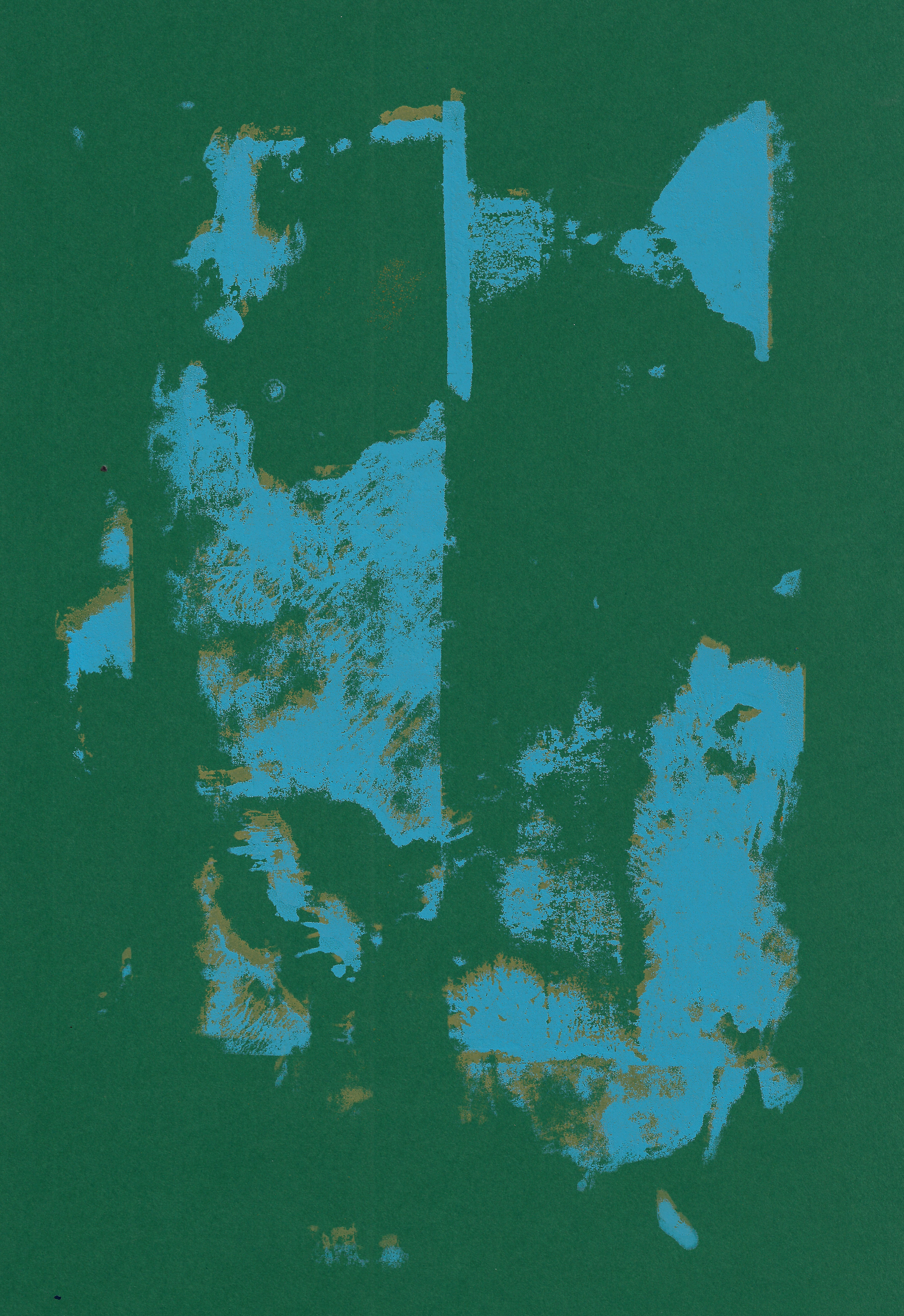
Screenprint 21 x 29.7 cm
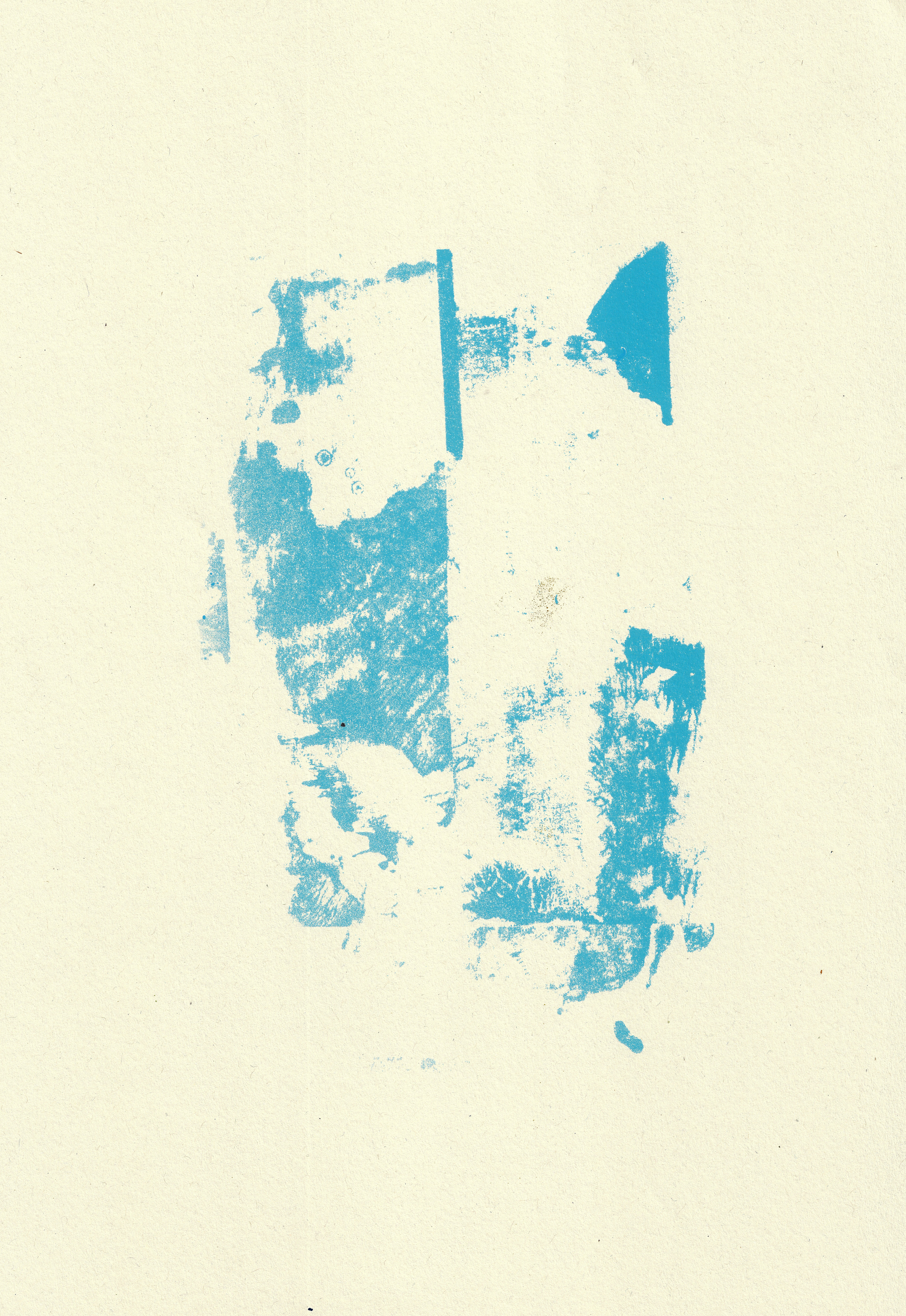
Screenprint 21 x 29.7 cm
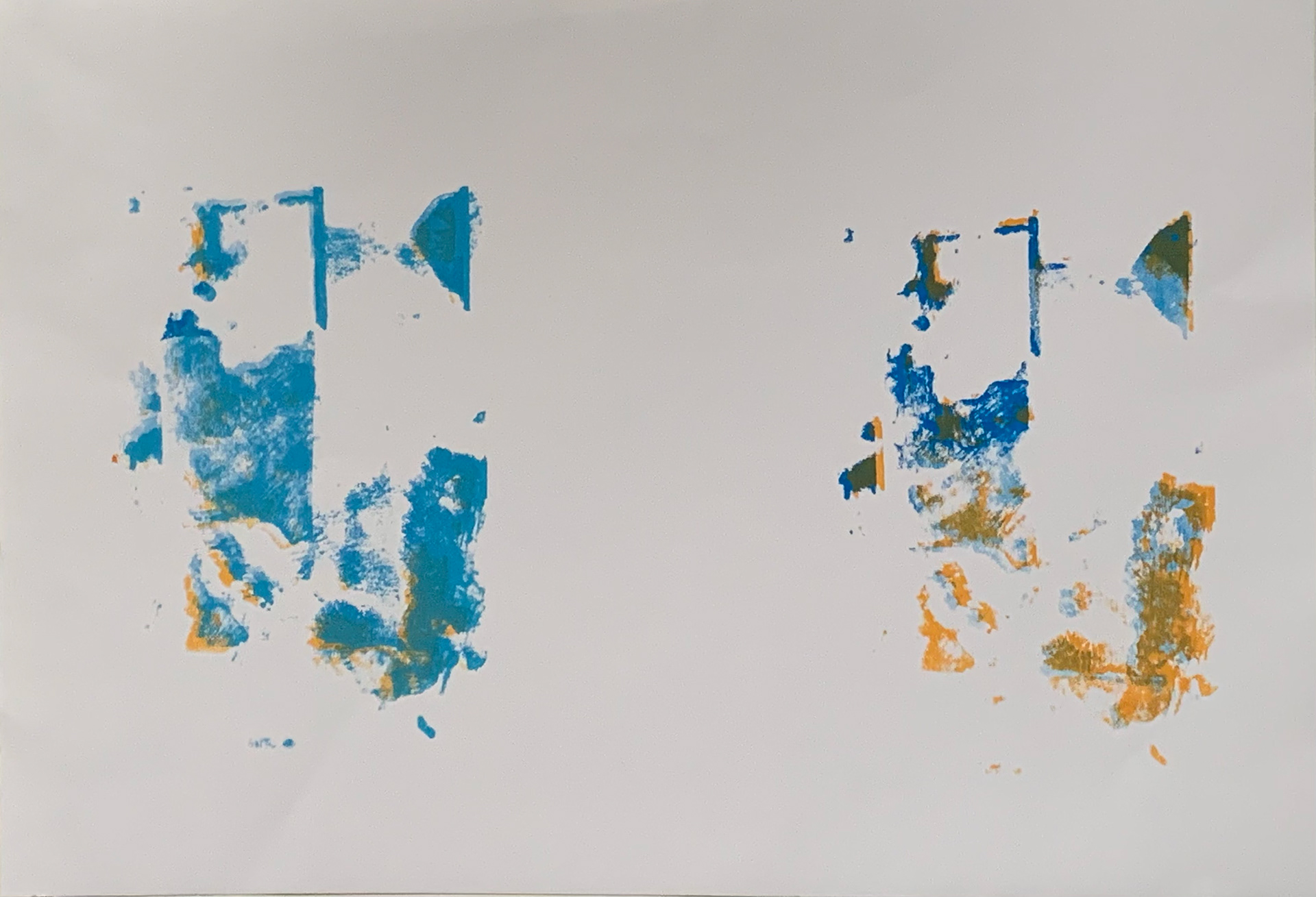
Screenprint 41.5 x 59.5 cm
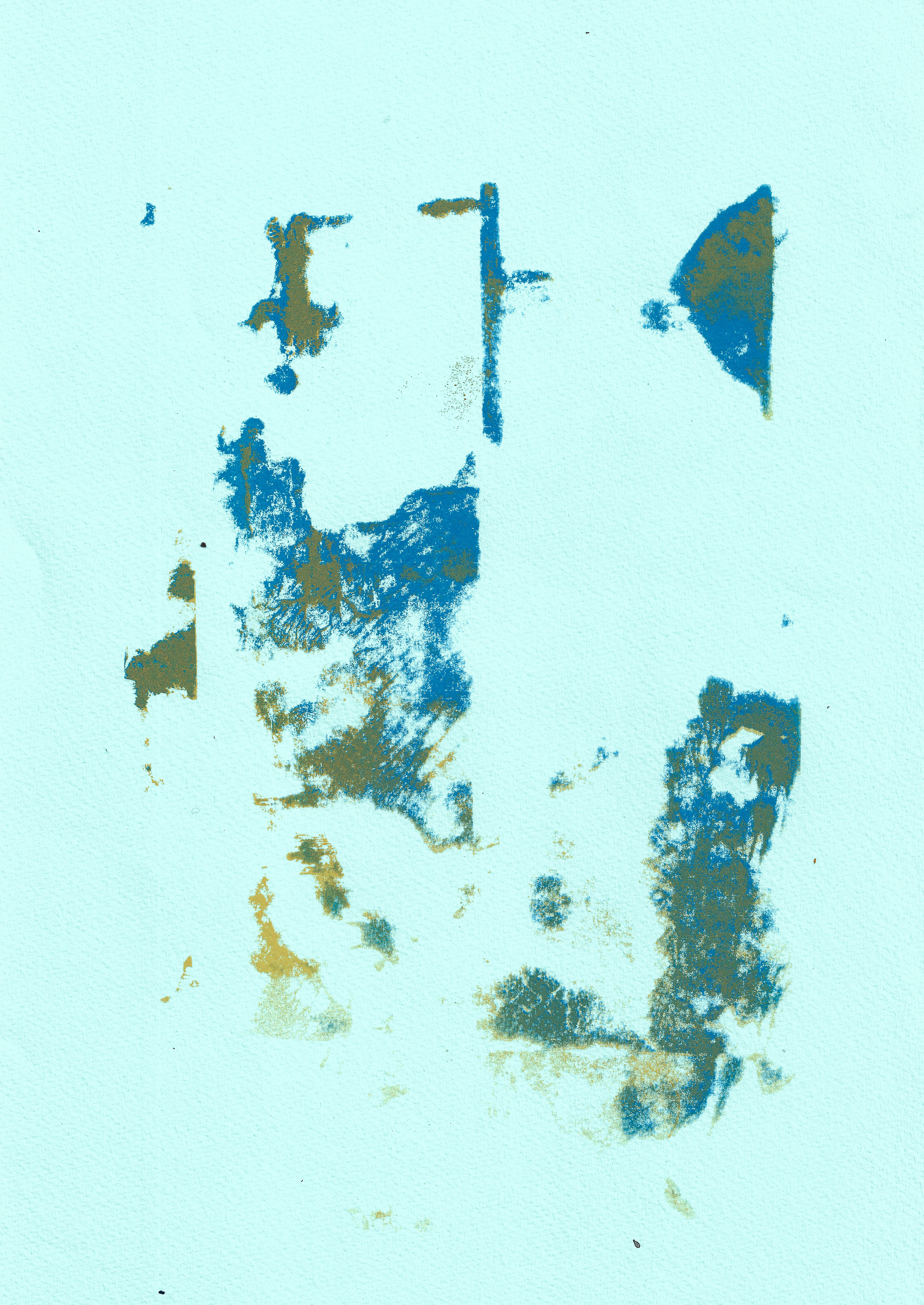
Screenprint 23 x 32.5 cm
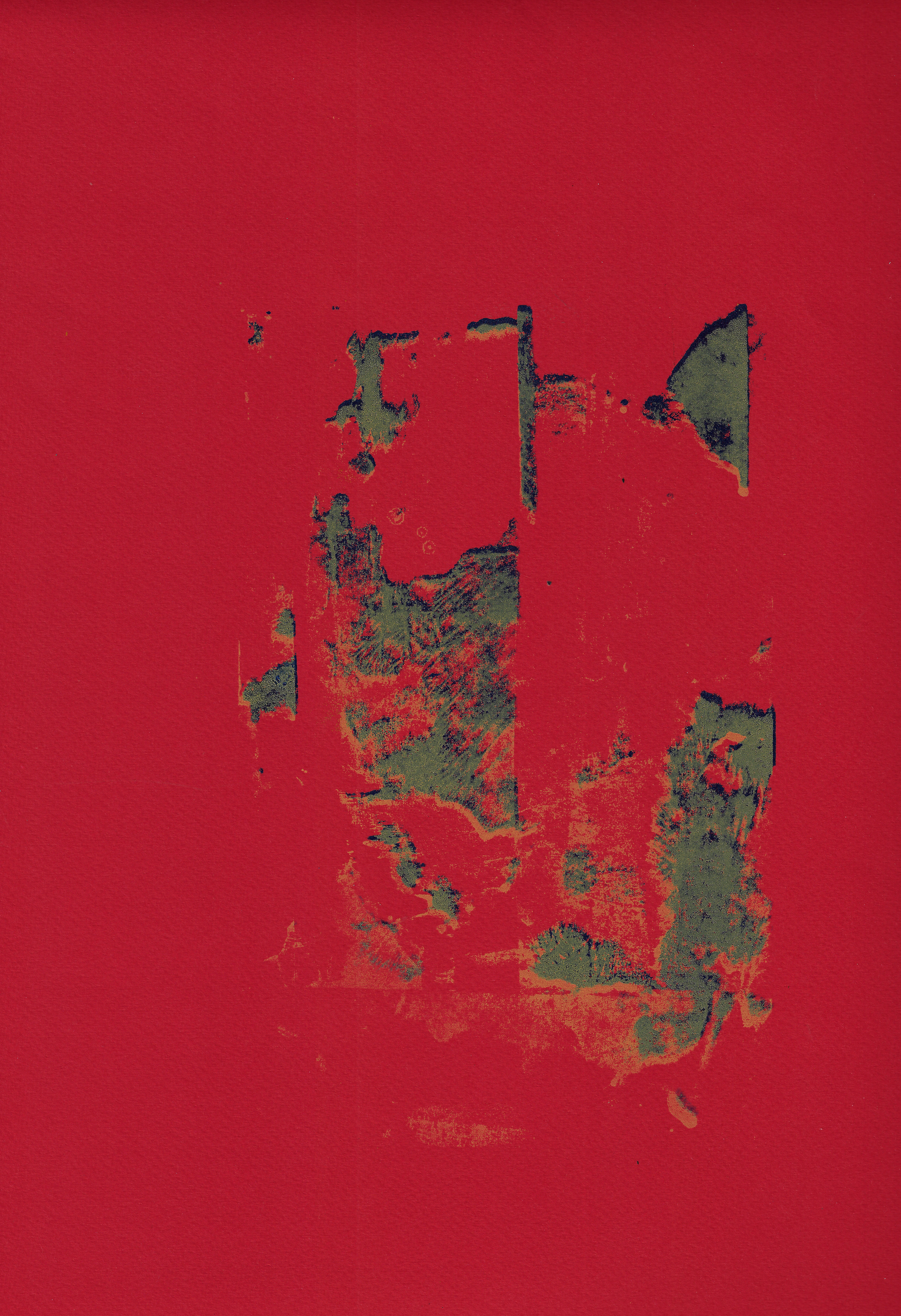
Screenprint 32.5 x 50 cm
This is screen-printing a collage of a colour-surface monoprint, which I had earlier split into cmyk on photoshop. Again, slightly offsetting the layers creates depth. This explores the concept of offsetting the layers in an image to emphasise the different layers and also the different colours used. As the colours mix to create a new colour when laid exactly on top of each other, so by slightly offsetting them this allows the two colours to be separate but also through overlaying them they mix when they are laid directly on top of one another.


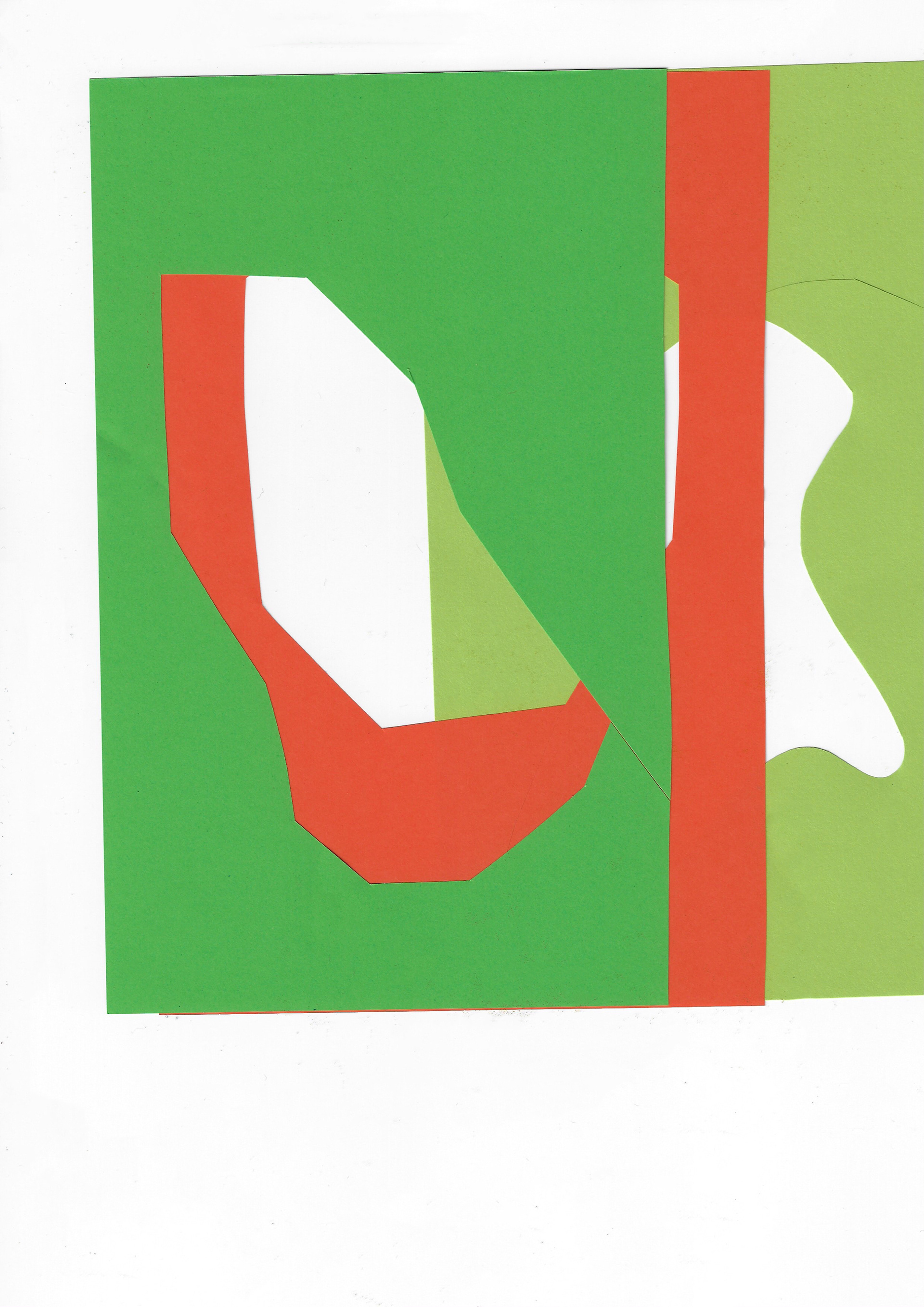
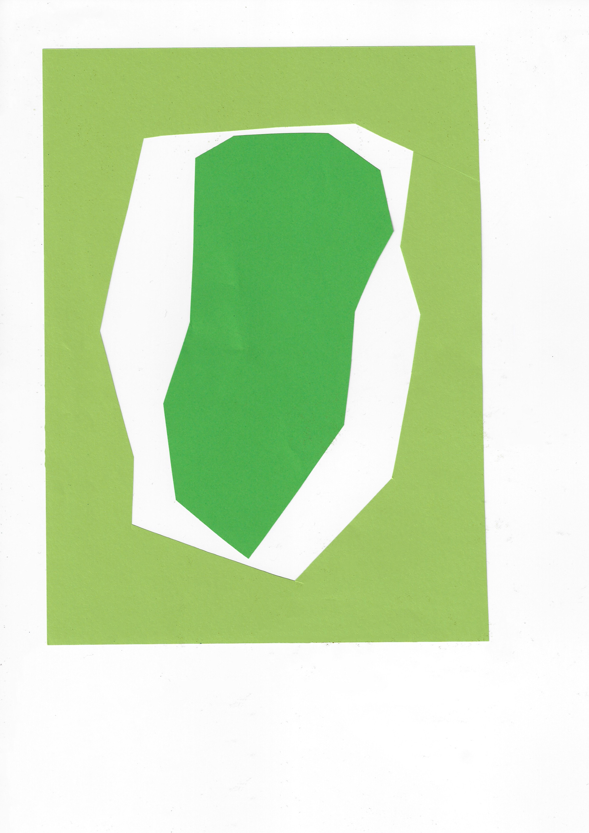
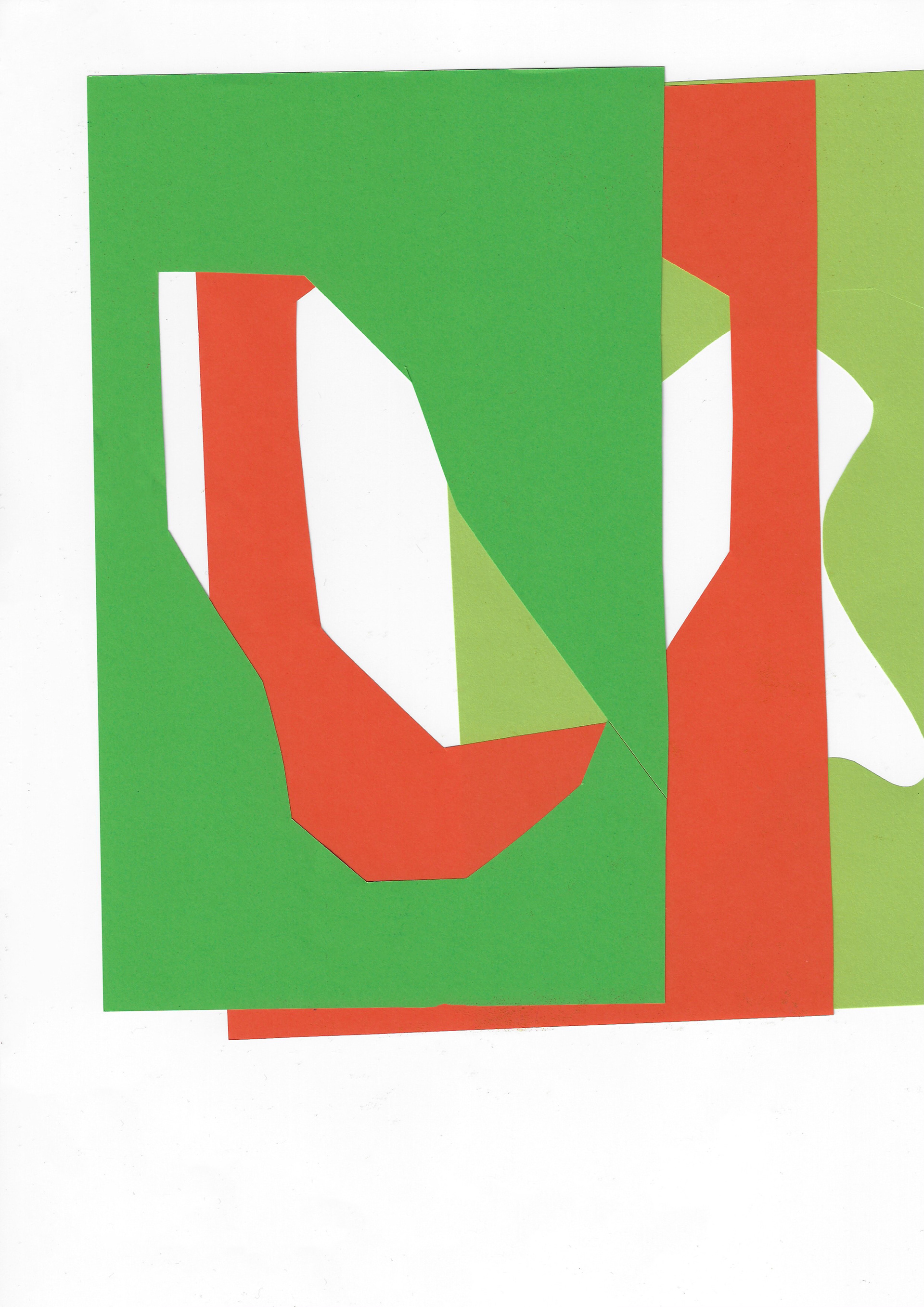
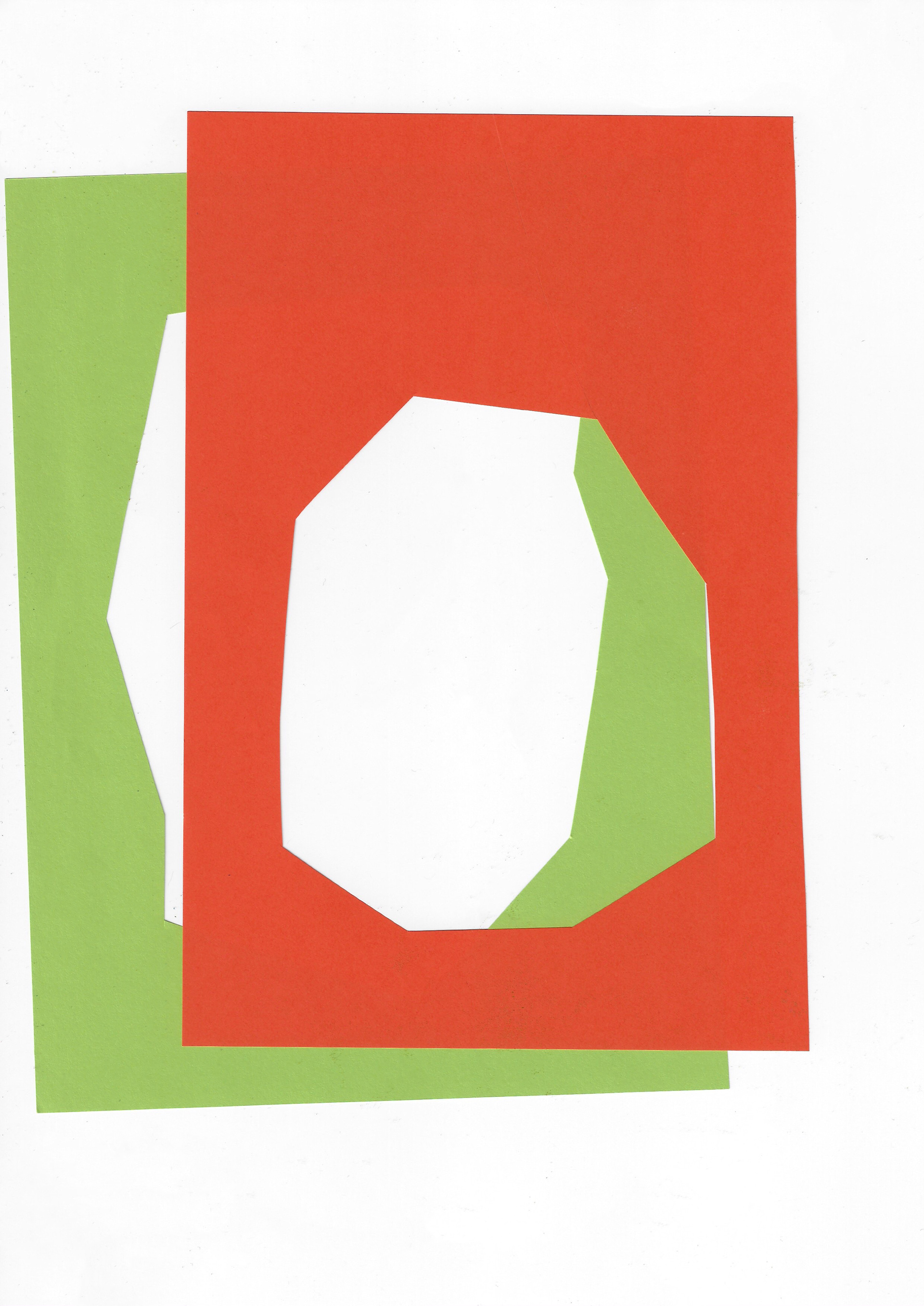


Various arrangements of block colour forms on a flatbed scanner. These are not permanent images; playing with the idea of an impermanent image, like a leaf before it is whisked away by the wind.
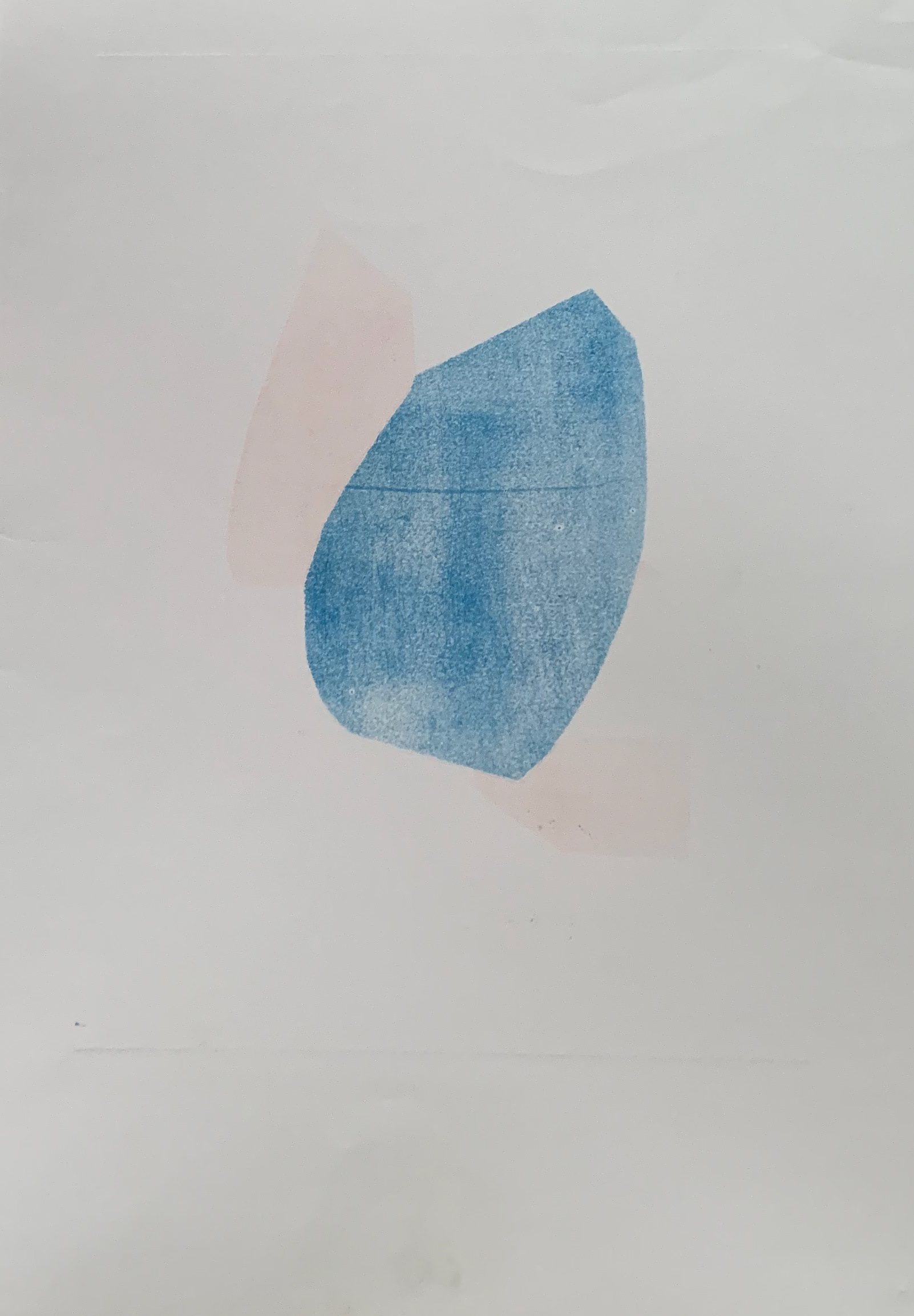
Monoprint 42 x 59 cm

Monoprint 42 x 59 cm
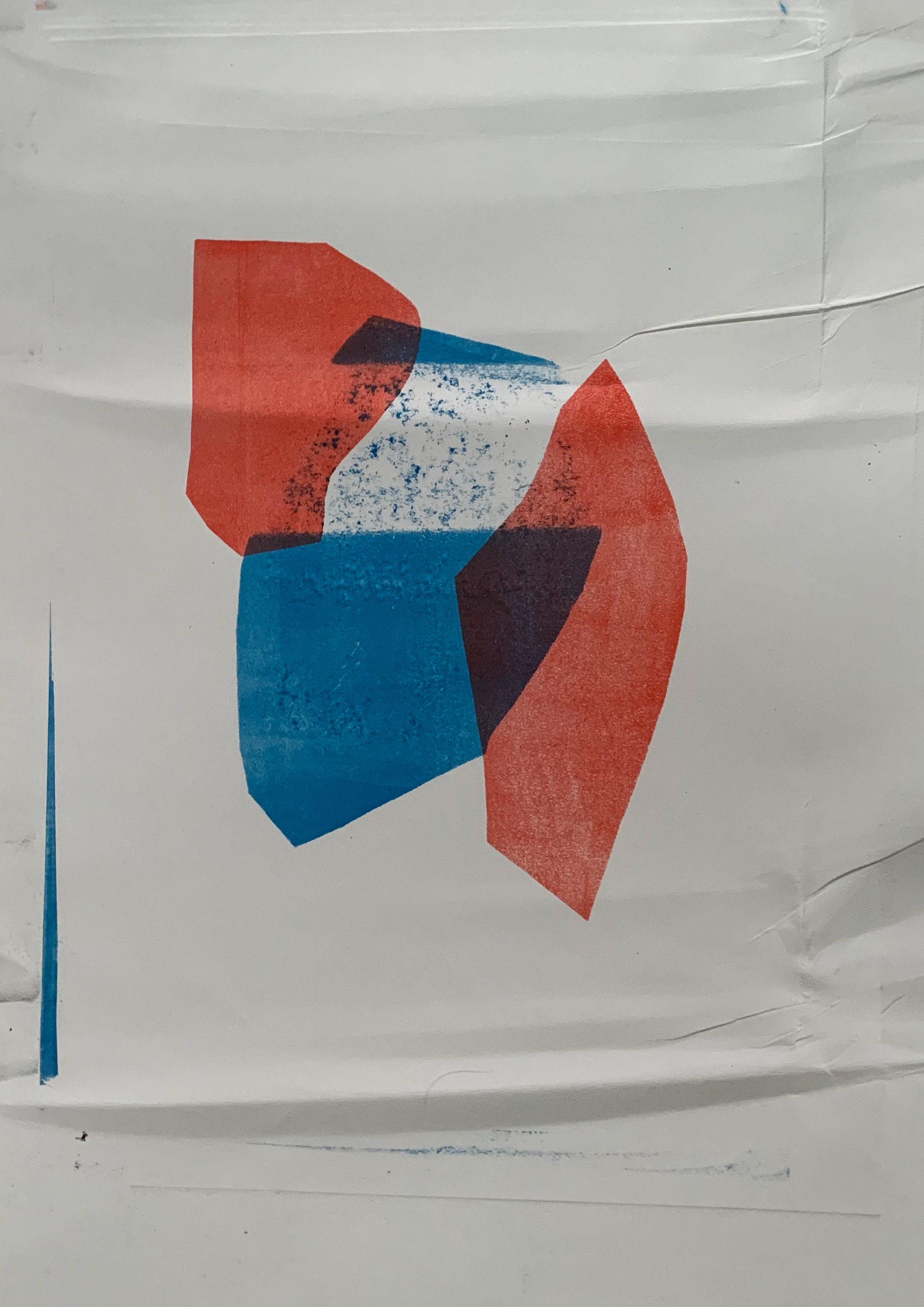
Monoprint 42 x 60 cm
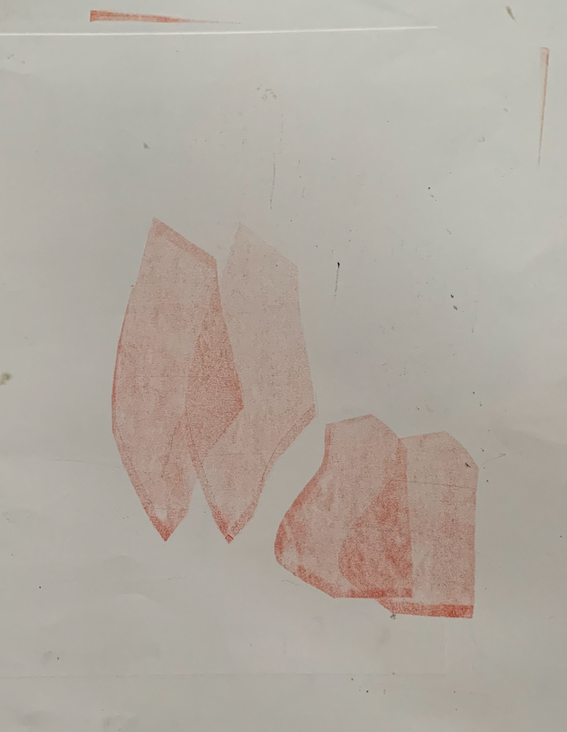
Monoprint 47 x 57 cm
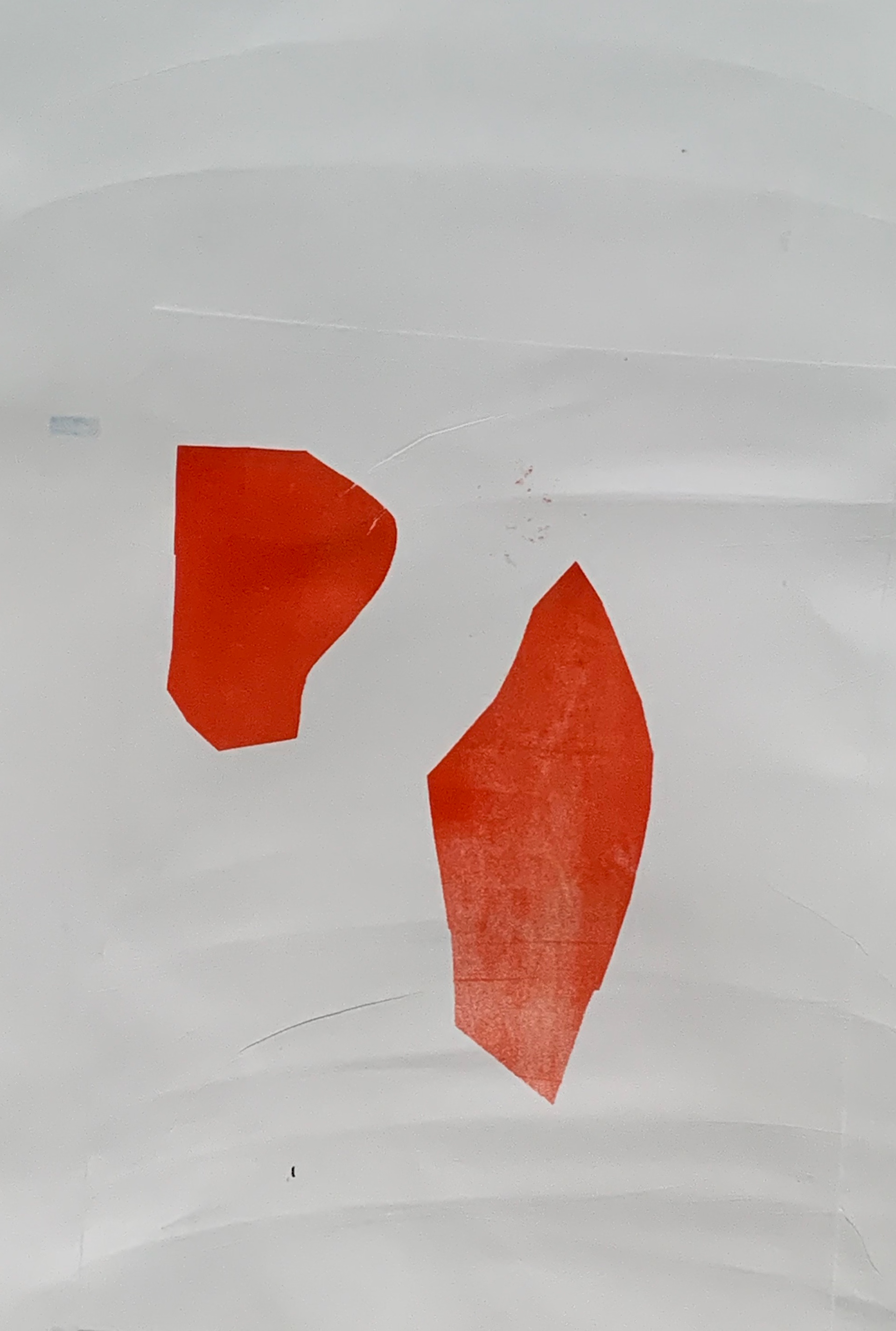
Monoprint 41 x 59 cm
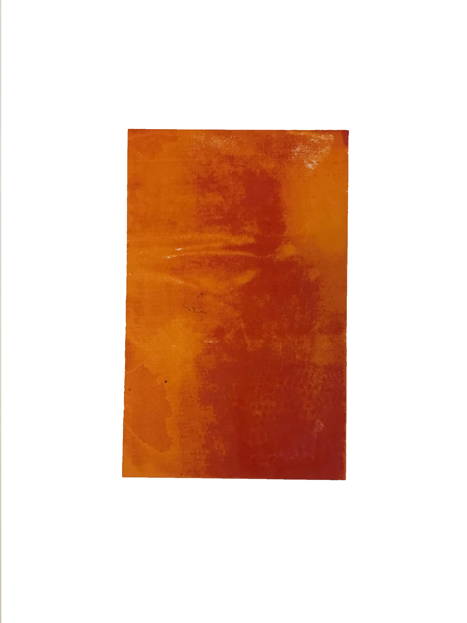
Monoprinting using a stencil; having difficulty learning how to judge the correct pressure of the press. The image was layered up successfully, but then on the final layer of my image the pressure is too much. This is because as the blanket was turned around the image became crumpled due to the different pressure. It will be necessary to get to know the press and print more samples, before overlaying as there is more of a risk of ruining the work with the more layers that are added.
My preference is in using oil-based inks in monoprinting compared to screenprinting as they are richer and mix more- resulting in a third colour produced from two. Also there is an unpredictable element and one -off effect with monoprinting, compared to screenprinting. With screenprinting, it is possible to align and slightly offset images more accurately, making many of the same edition. However, with monoprinting you can never be quite certain how the final image will turn out when overlaying stencils.


Photographs taken whilst exploring moving the stencil (used for the monoprints) around with a black and white image of the crumpled fabric underneath.
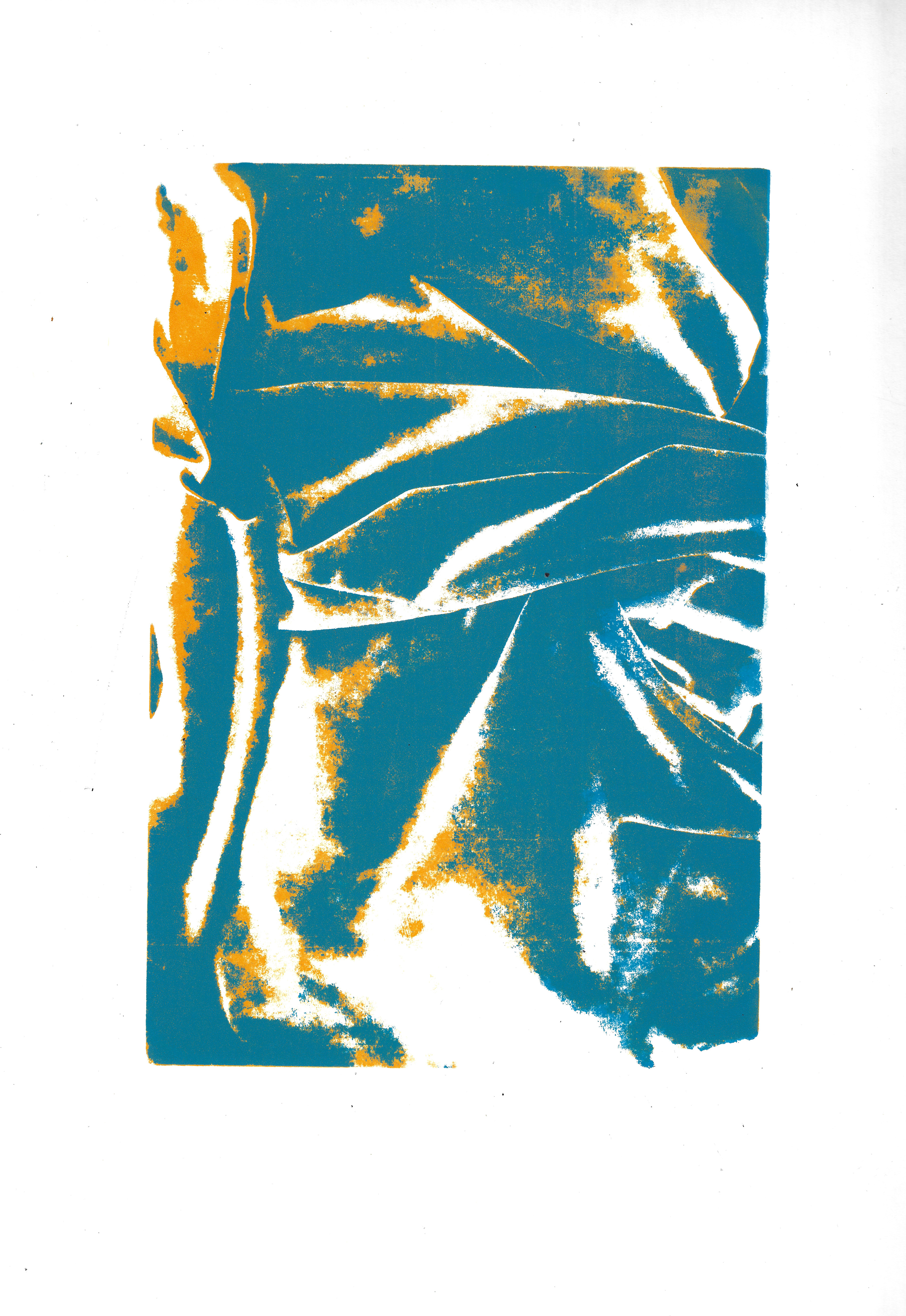
Screenprint 35 x 50 cm
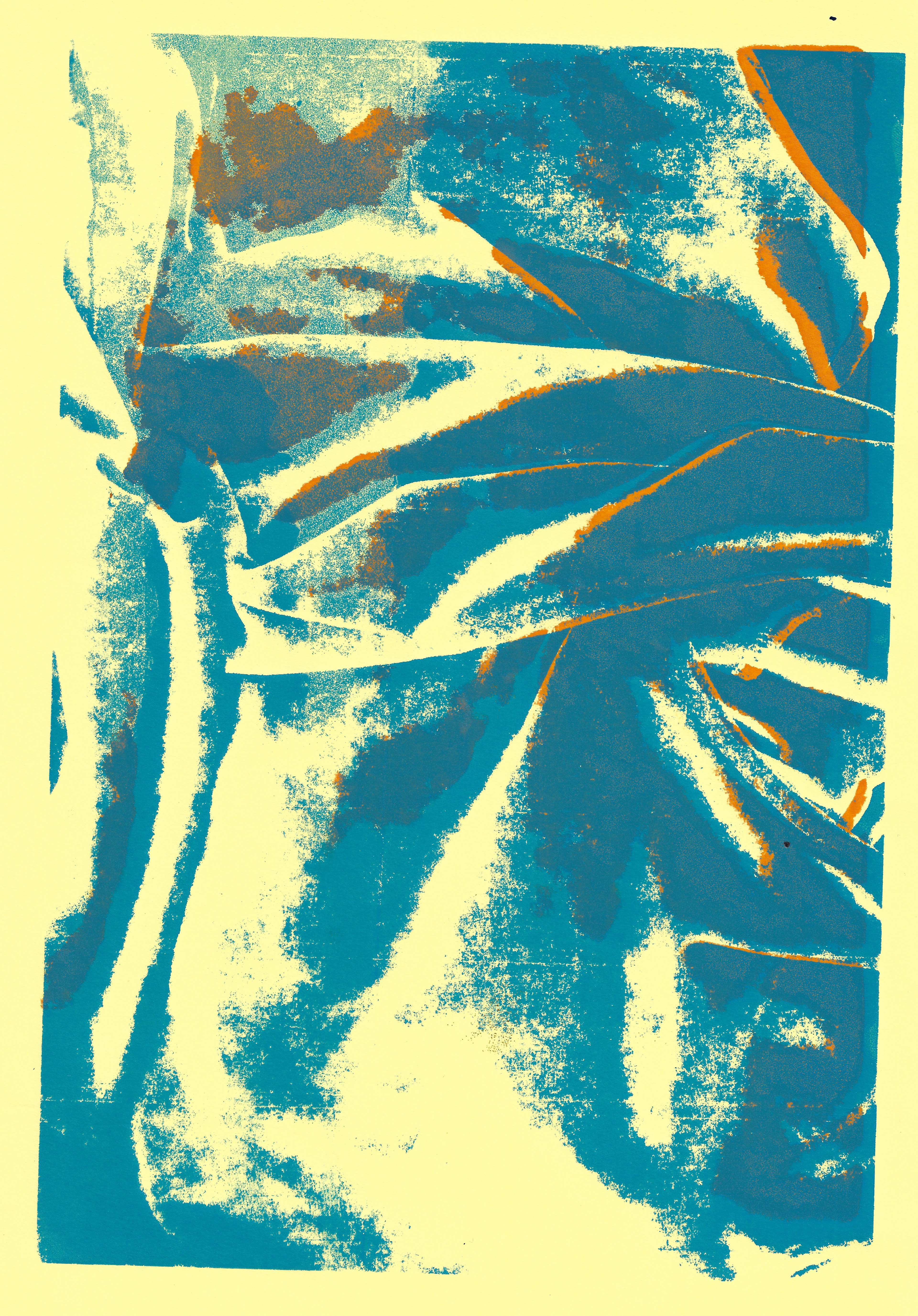
Screenprint 21 x 29.7 cm

Screenprint 21 x 29.7 cm
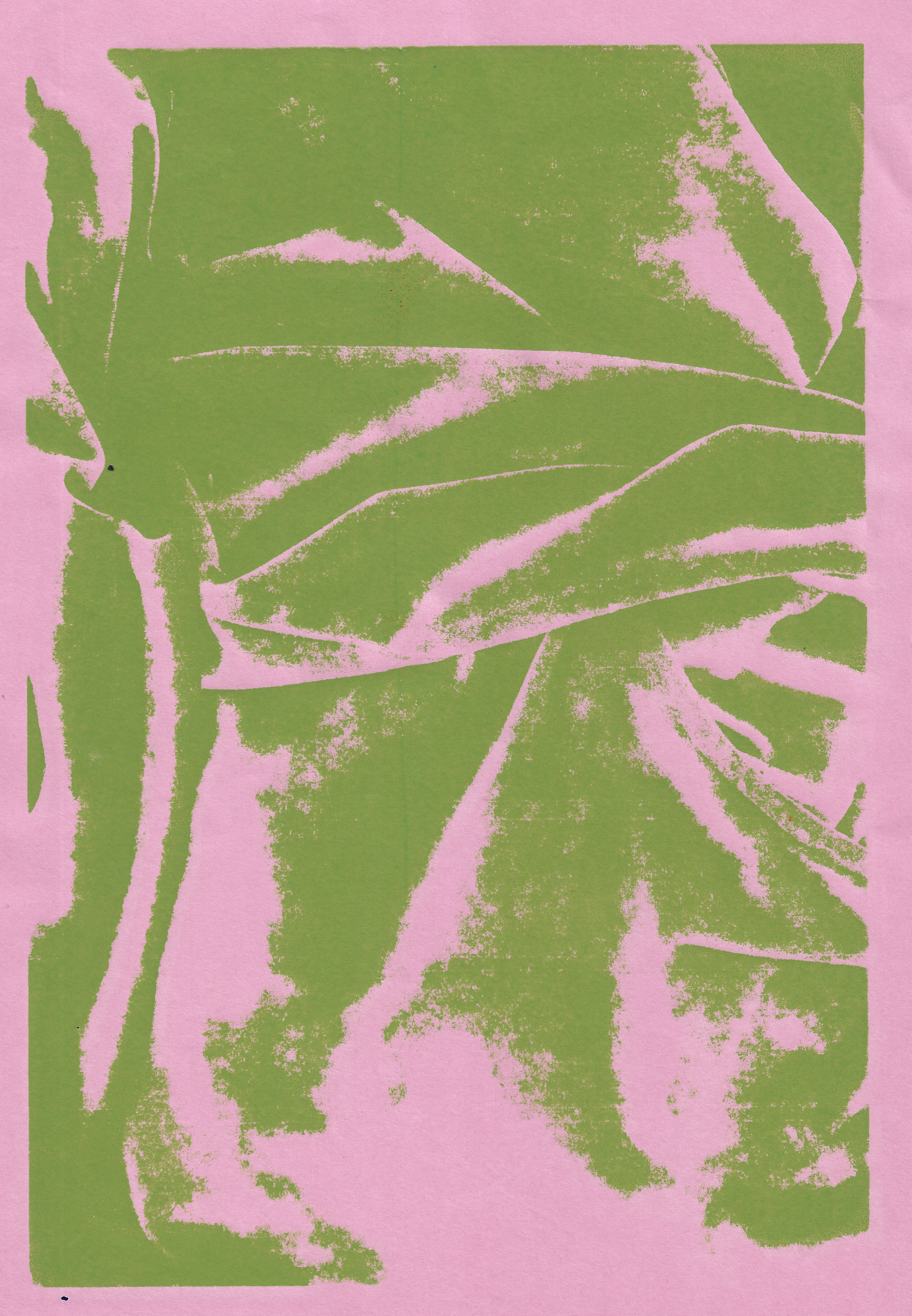
Screenprint 21 x 29.7 cm

Screenprint 21 x 29.7 cm
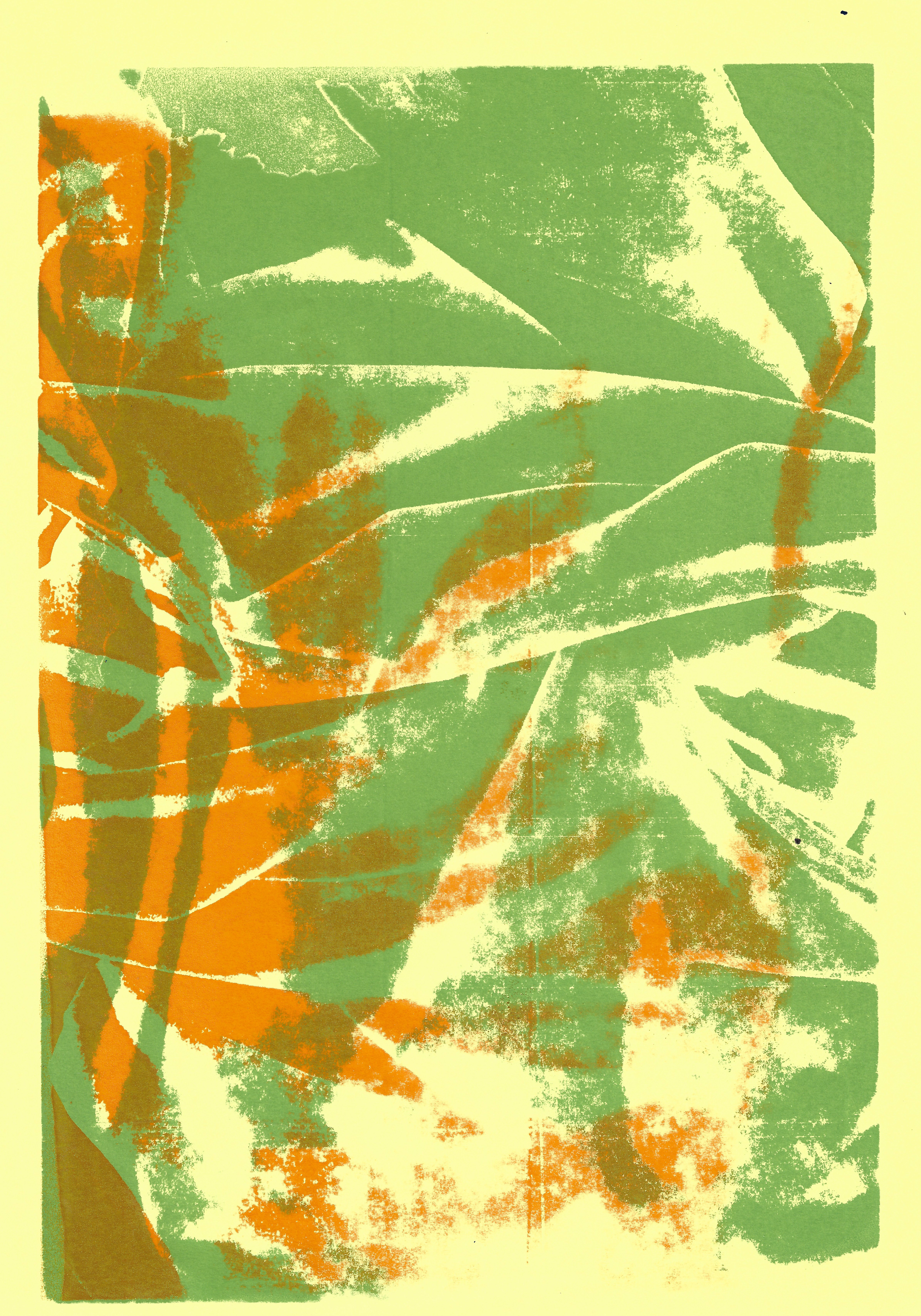
Screenprint 21 x 29.7 cm
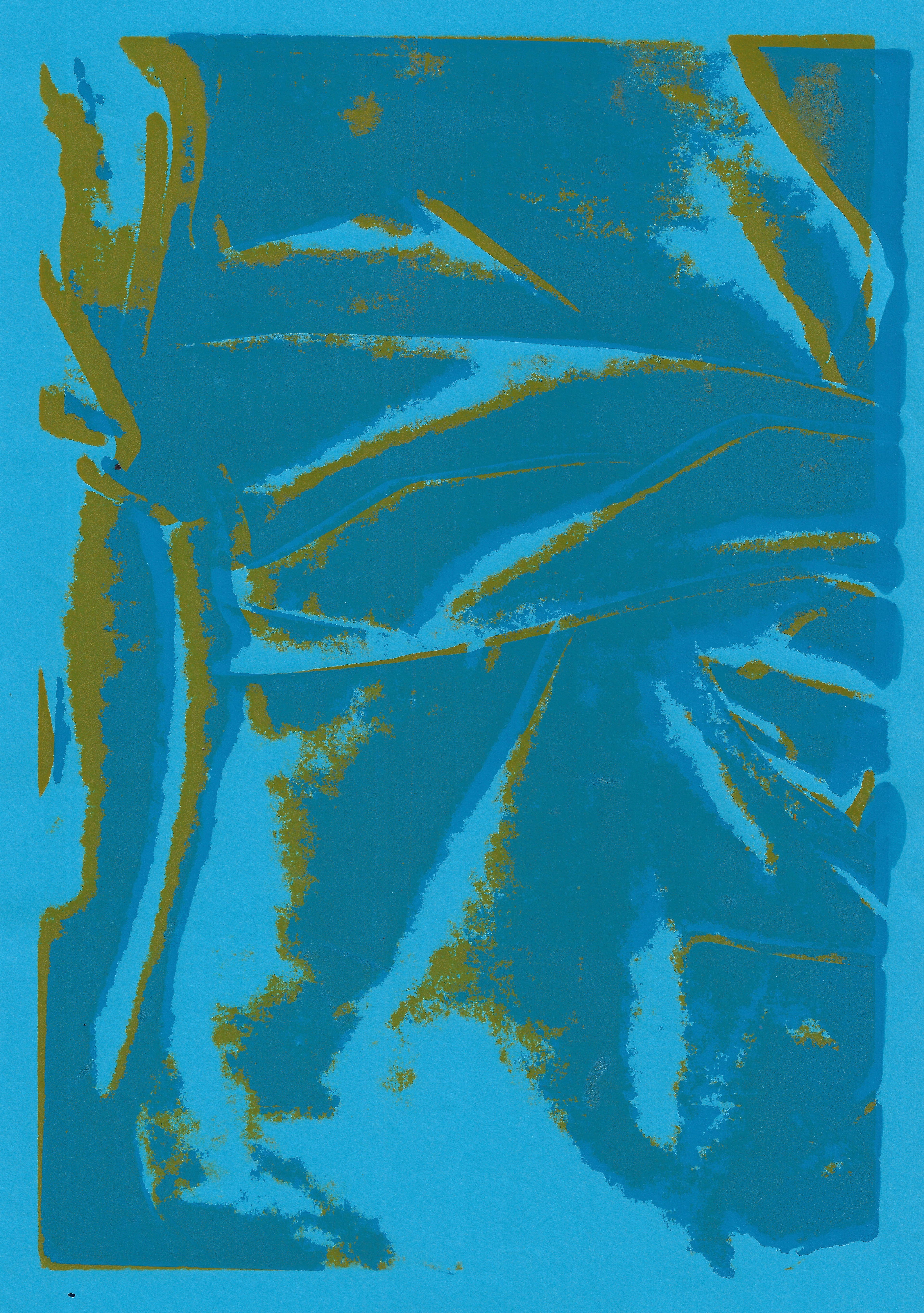
Screenprint 21 x 29.7 cm
Screenprint 35 x 50 cm
Original Photograph
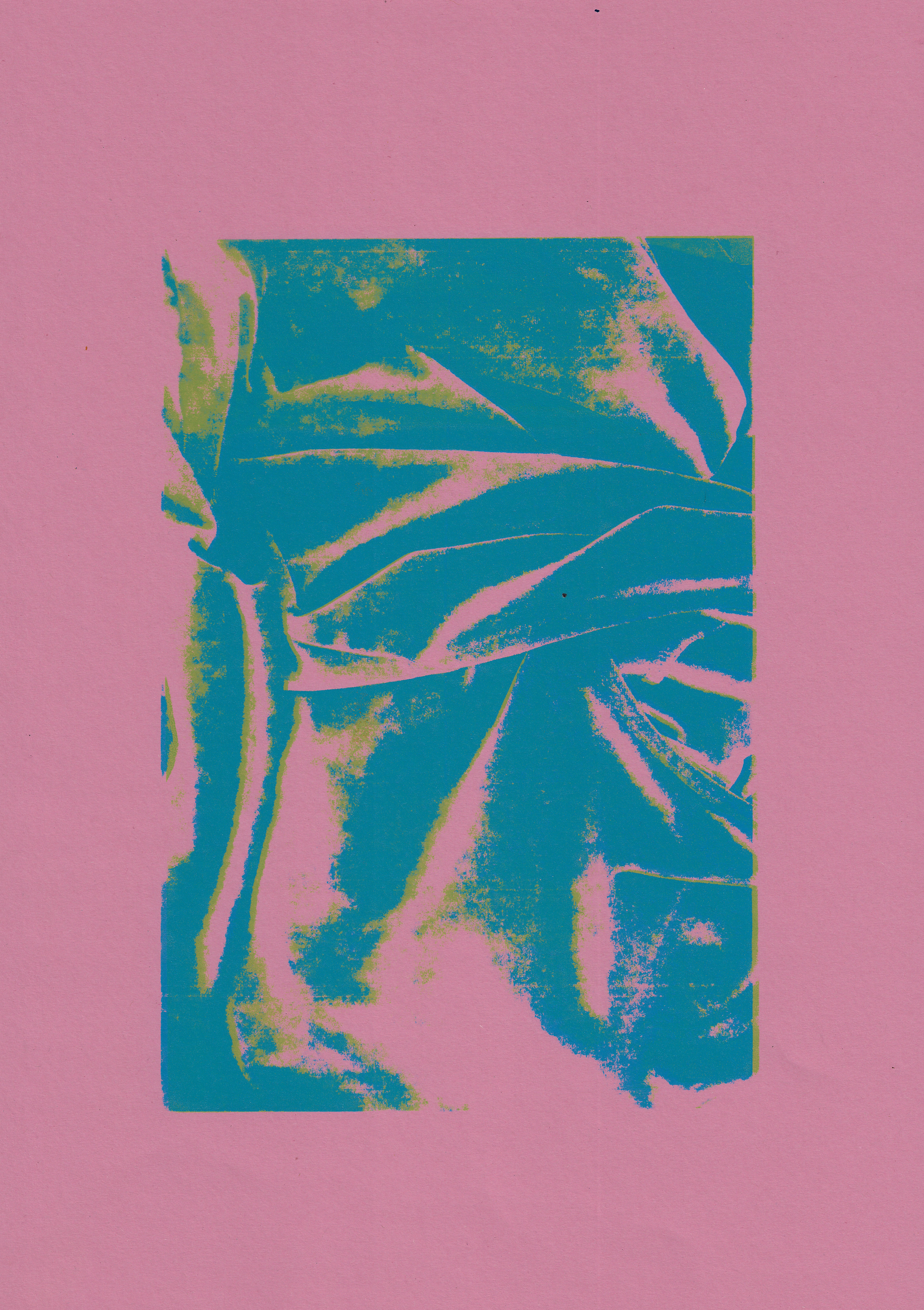
Screenprint 29.7 x 42 cm
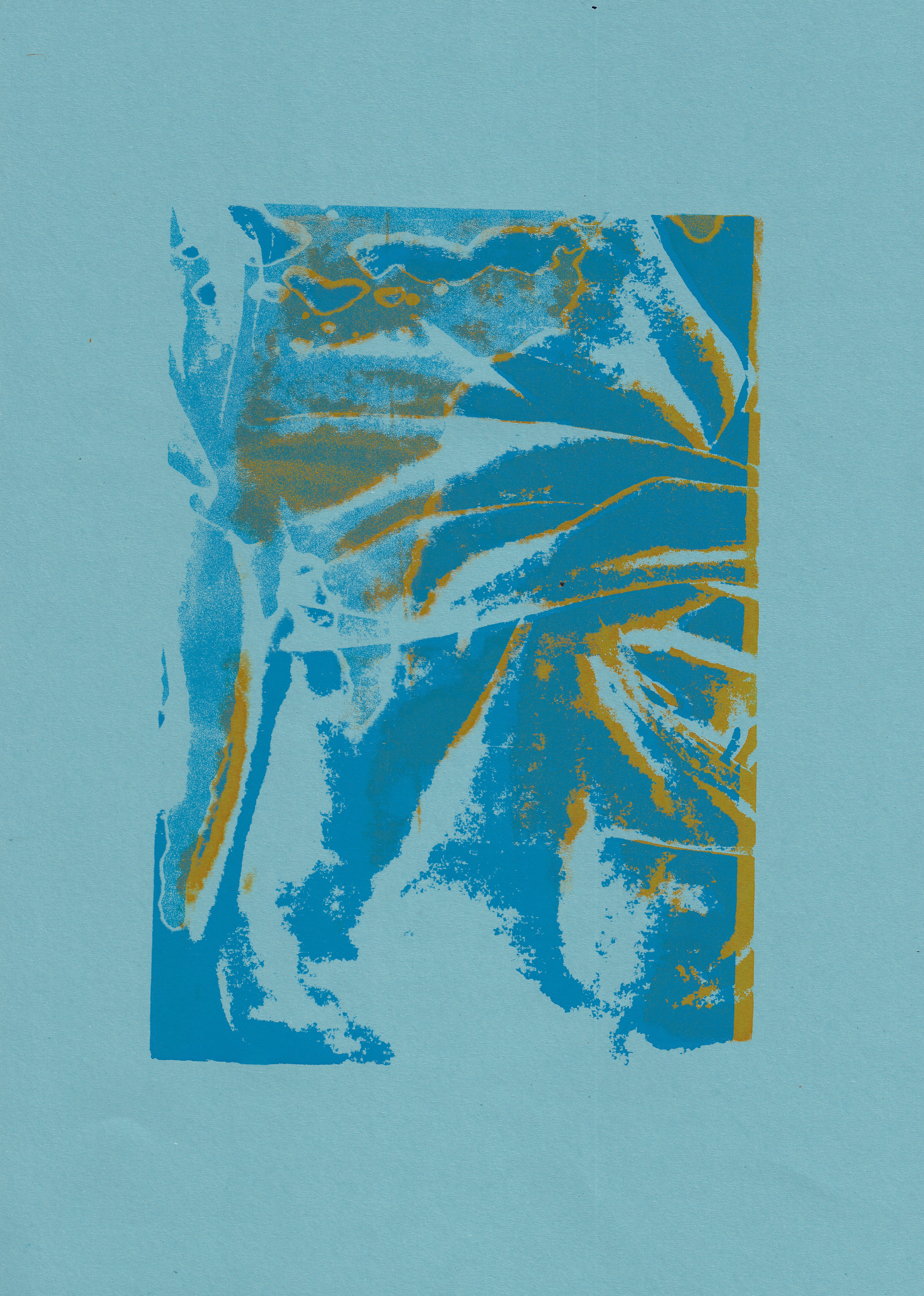
Screenprint 29.7 x 42 cm
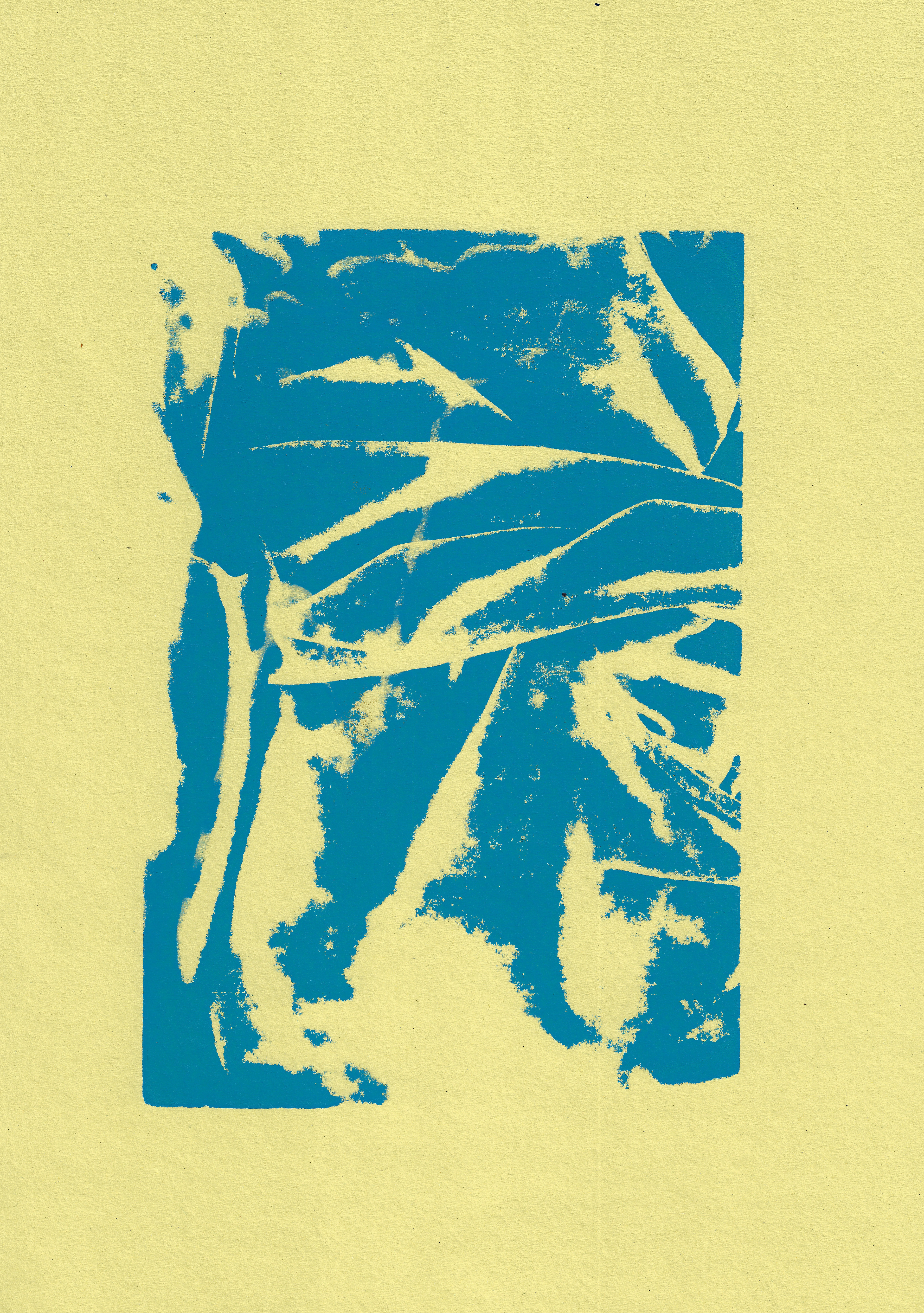
Screenprint 29.7 x 42 cm
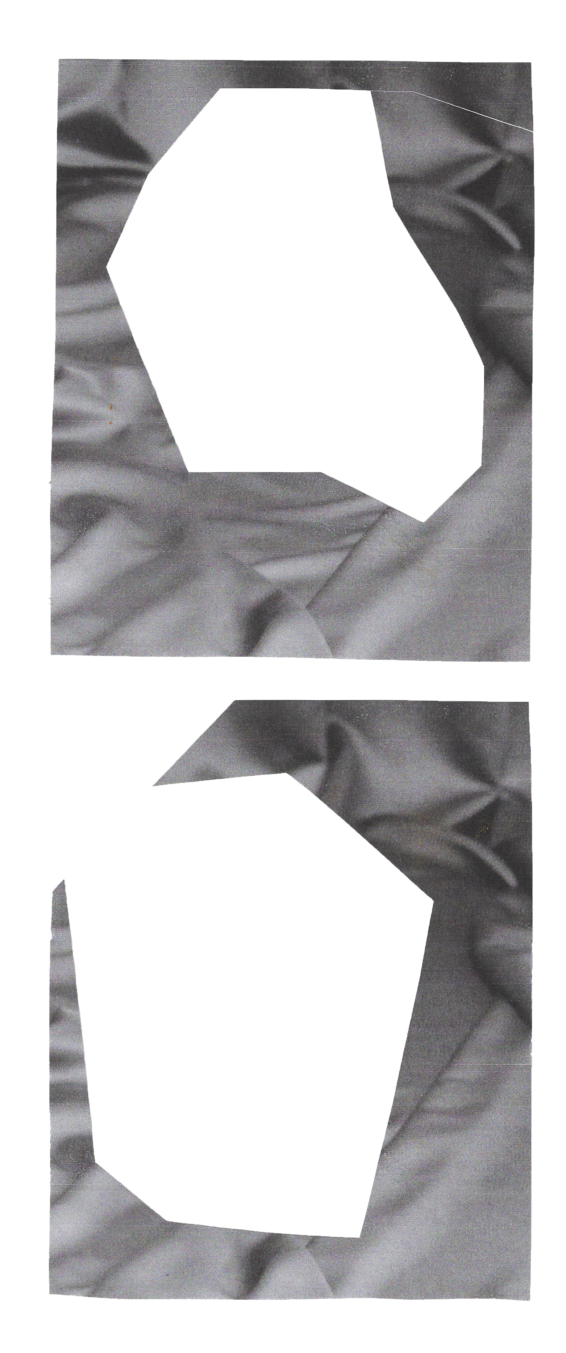
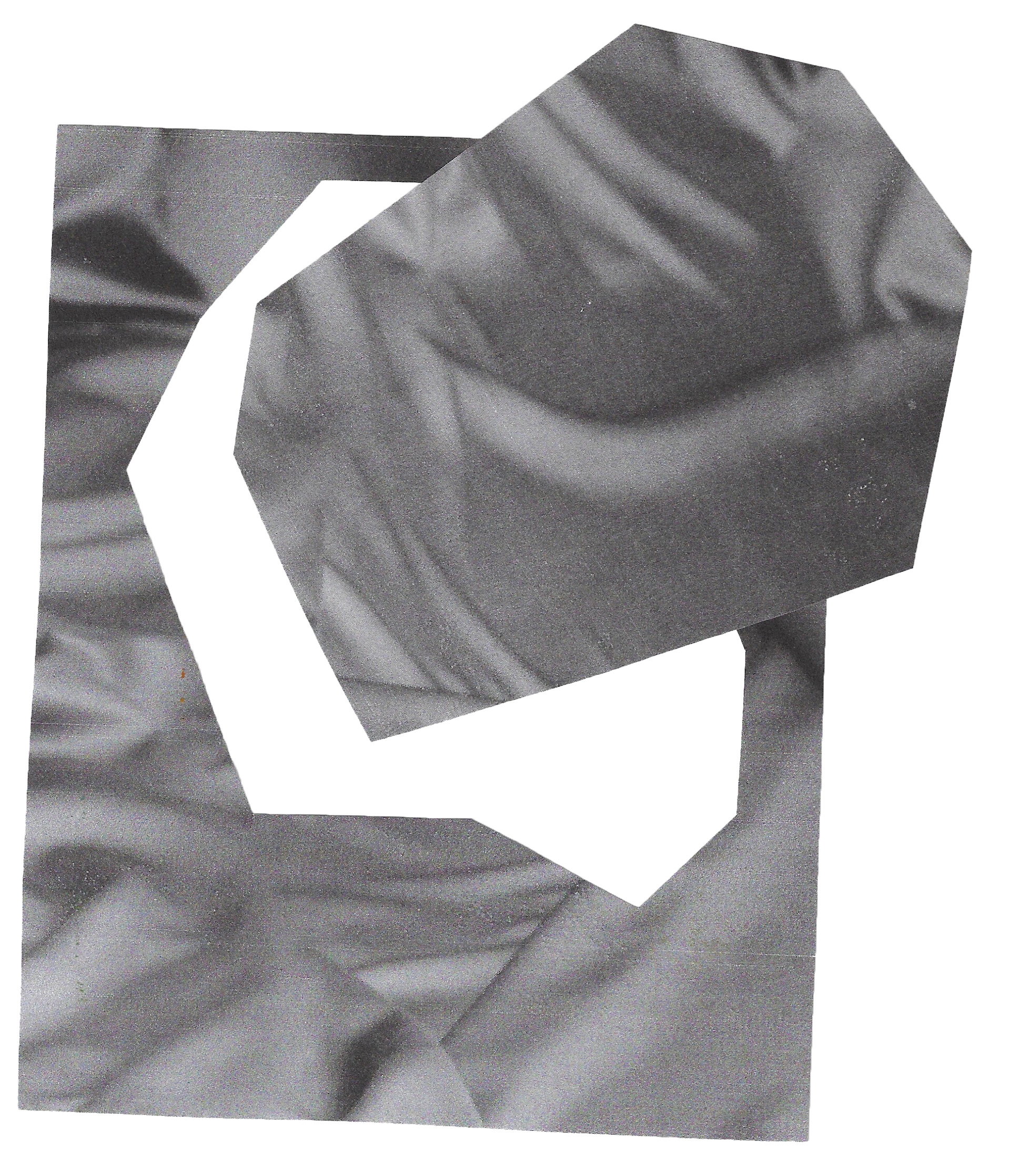
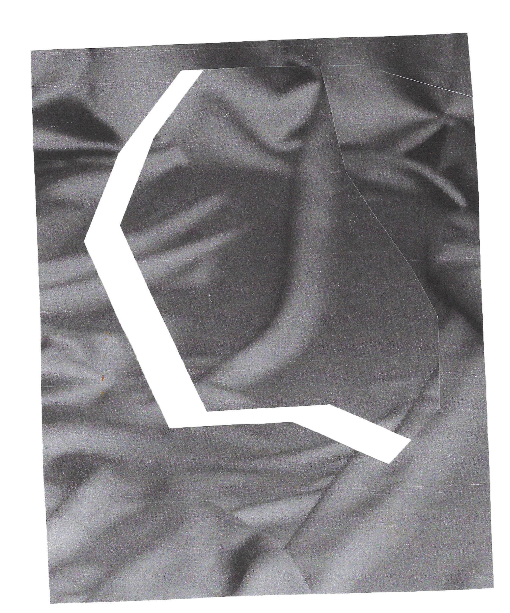
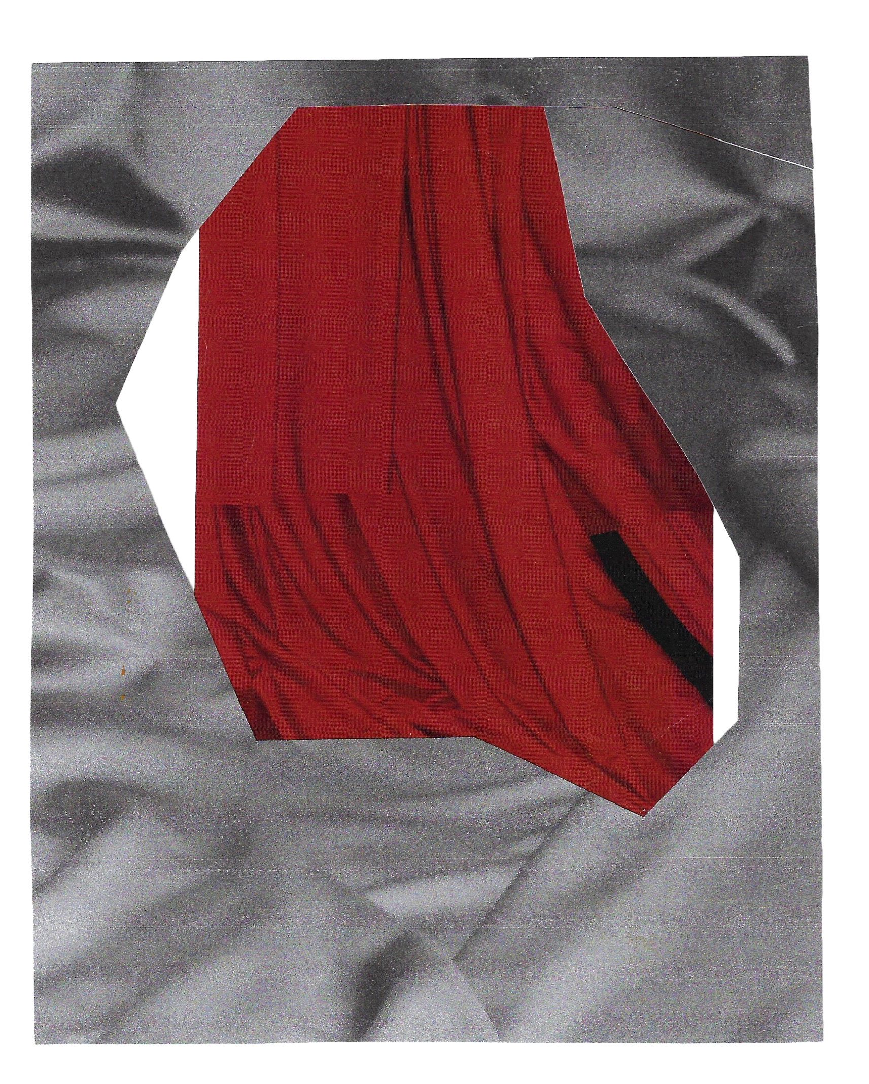
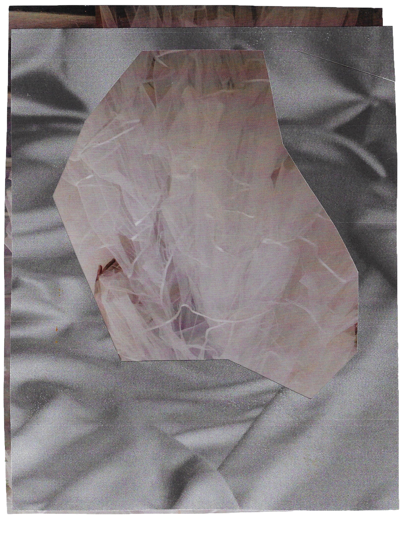
This is a screen print of a photograph taken earlier of some crumpled and folded velvet, playing around with the different shapes, exploring the tactile quality of the fabric and the translation of this through the photograph. The photograph was split into into cmyk on photoshop, and only two of the channels were printed. This demonstrates experimenting further with slightly offsetting and using contrasting colours to emphasise each other and also exploring what order to layer the colours.


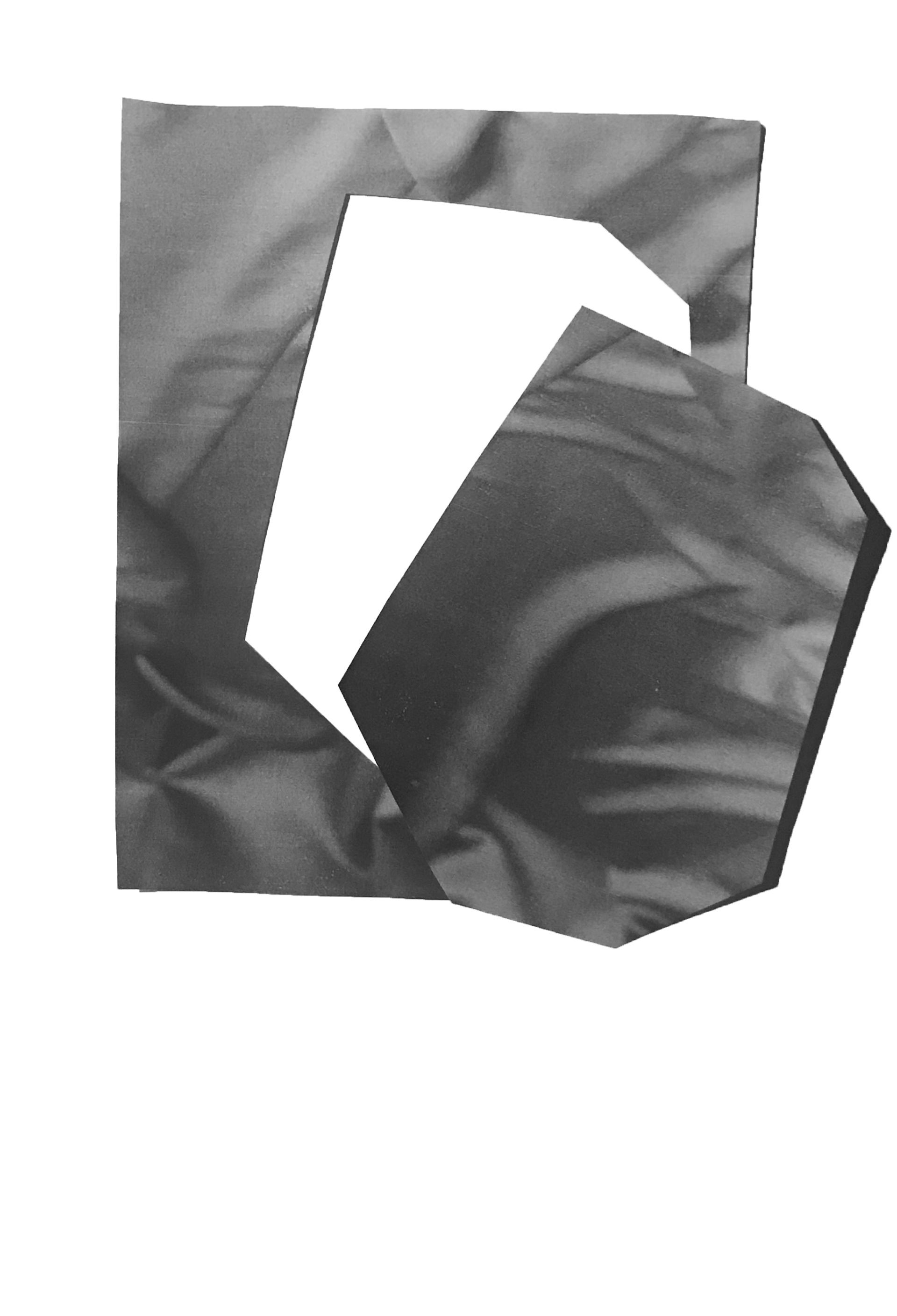

Sketchbook page 21 x 29.7 cm
Sketchbook page 21 x 29.7 cm
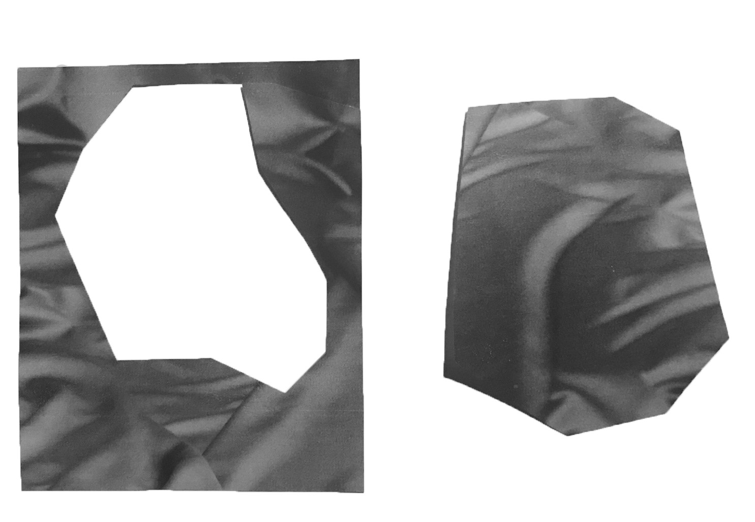
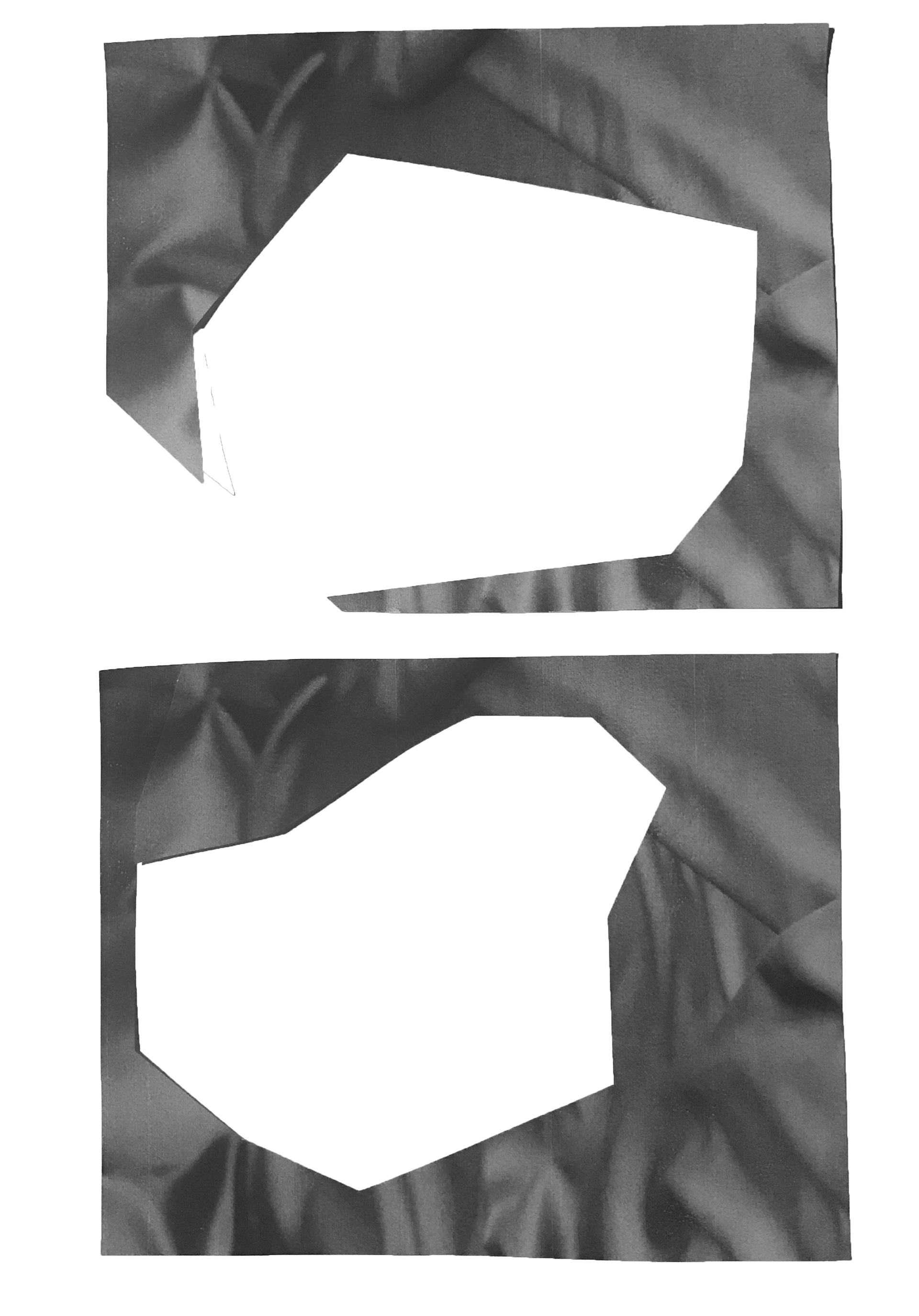
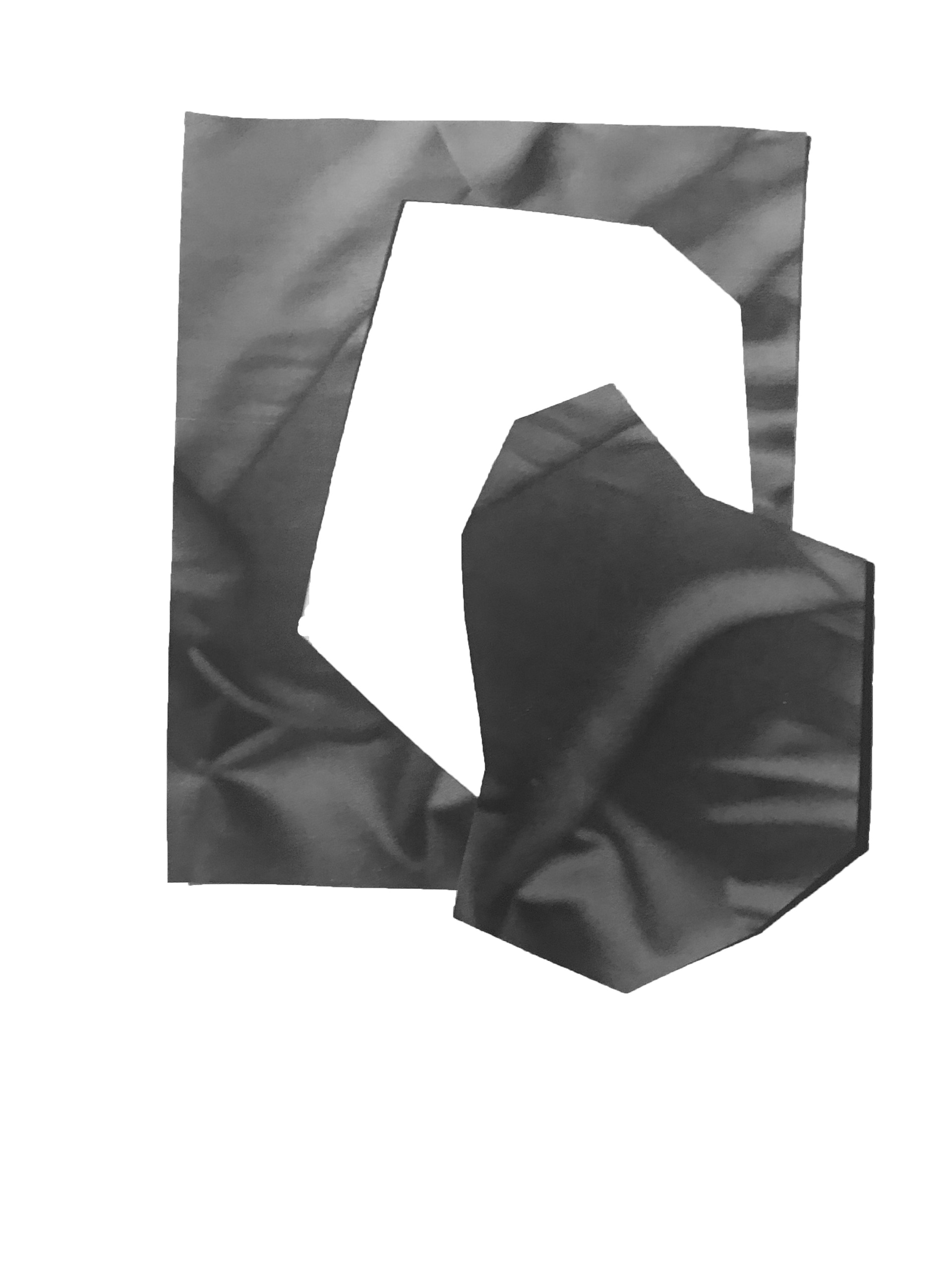
By using the flatbed scanner to play around with alternative compositions, it was possible to create different arrangements of shapes, using cut outs from the photographs of folded fabric.
This looked at the link between the conscious and subconscious mind, not only in the uptake of certain information (in relation to colour theory) but in terms of engaging of senses, thus exploring the sensation of touch, and how this sense evokes the conscious and the subconscious, especially in relation to the tactile quality of fabric.
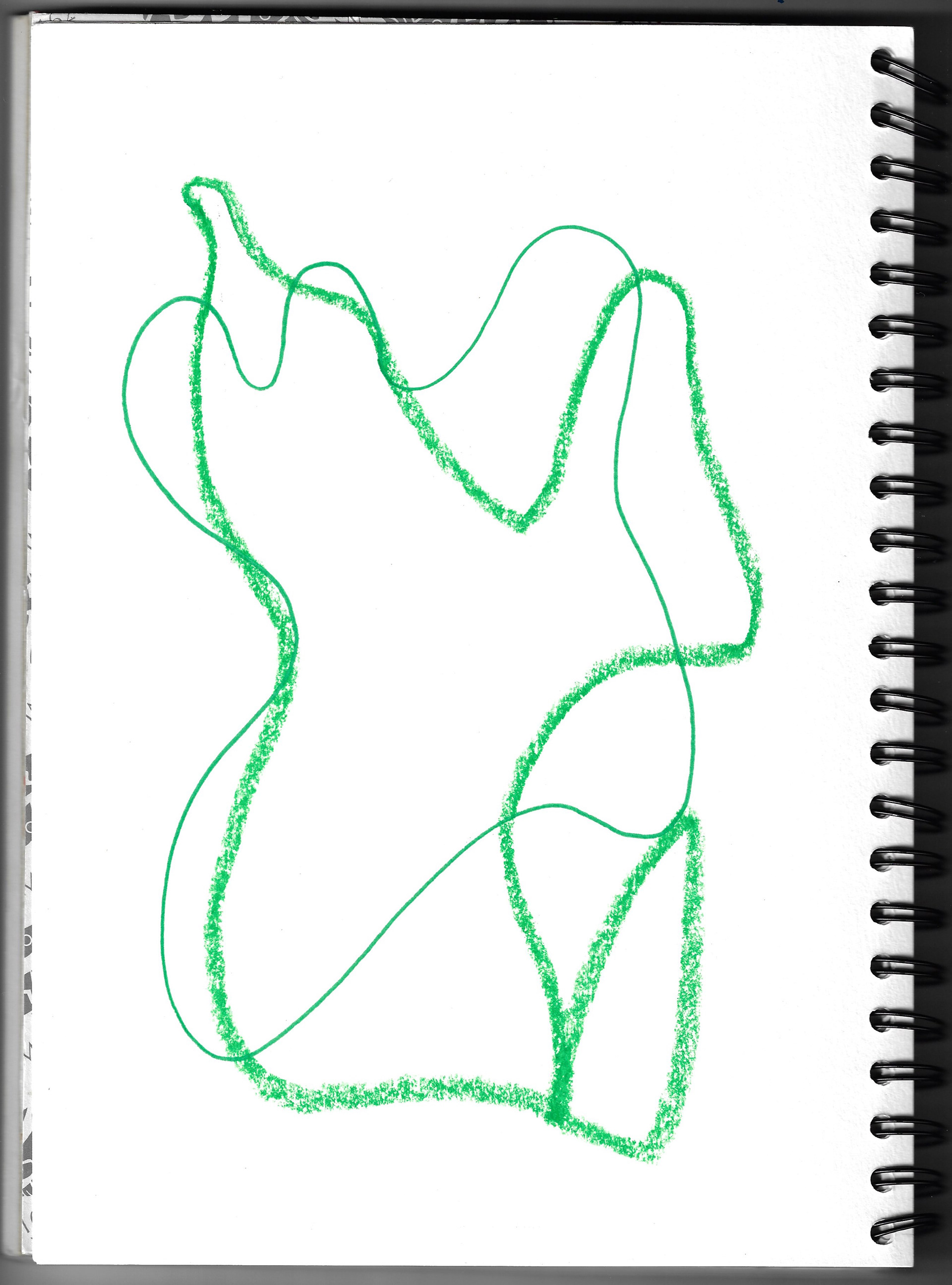
Sketchbook page 21 x 29.7 cm
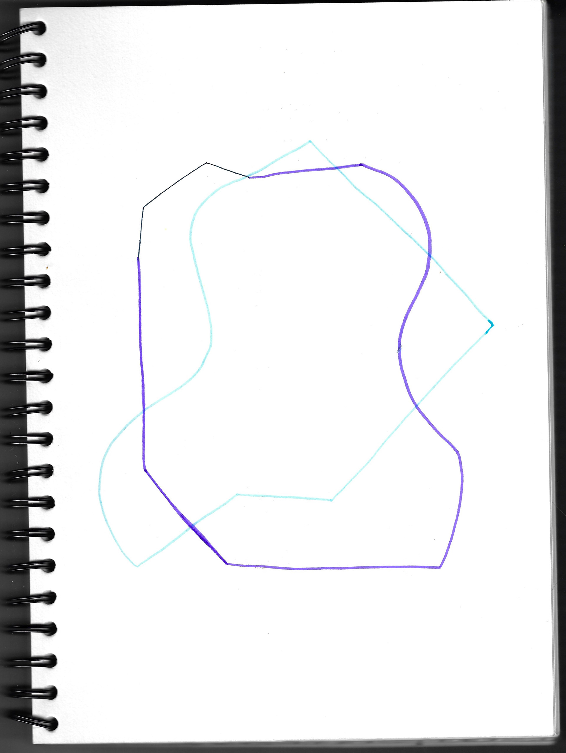
Sketchbook page 21 x 29.7 cm
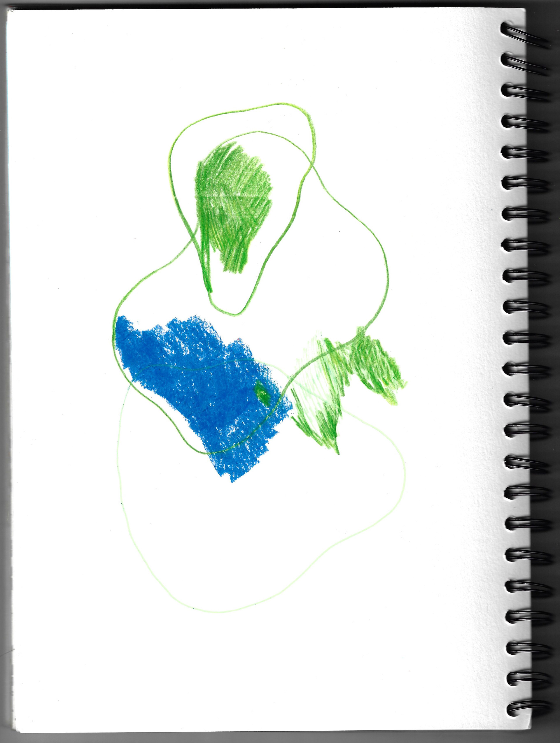
Sketchbook page 21 x 29.7 cm
Drawings taken from my sketchbook exploring the dismantled forms and lines of the fabric compositions.
Utilising lithography, it was possible to successfully transfer a black and white image onto a stone. The image was of a cut out of the crumpled fabric that had been taken earlier. The same image was printed on true grain using an inkjet printer to then use in photo lithography, but the printer needed to be a laser printer. The image has printed but the ink has run and has created an unusual image of varying depths and textures. It is intended to use this image in photo lithography but this is still on the drying racks in the workshop since I have been unable to enter.
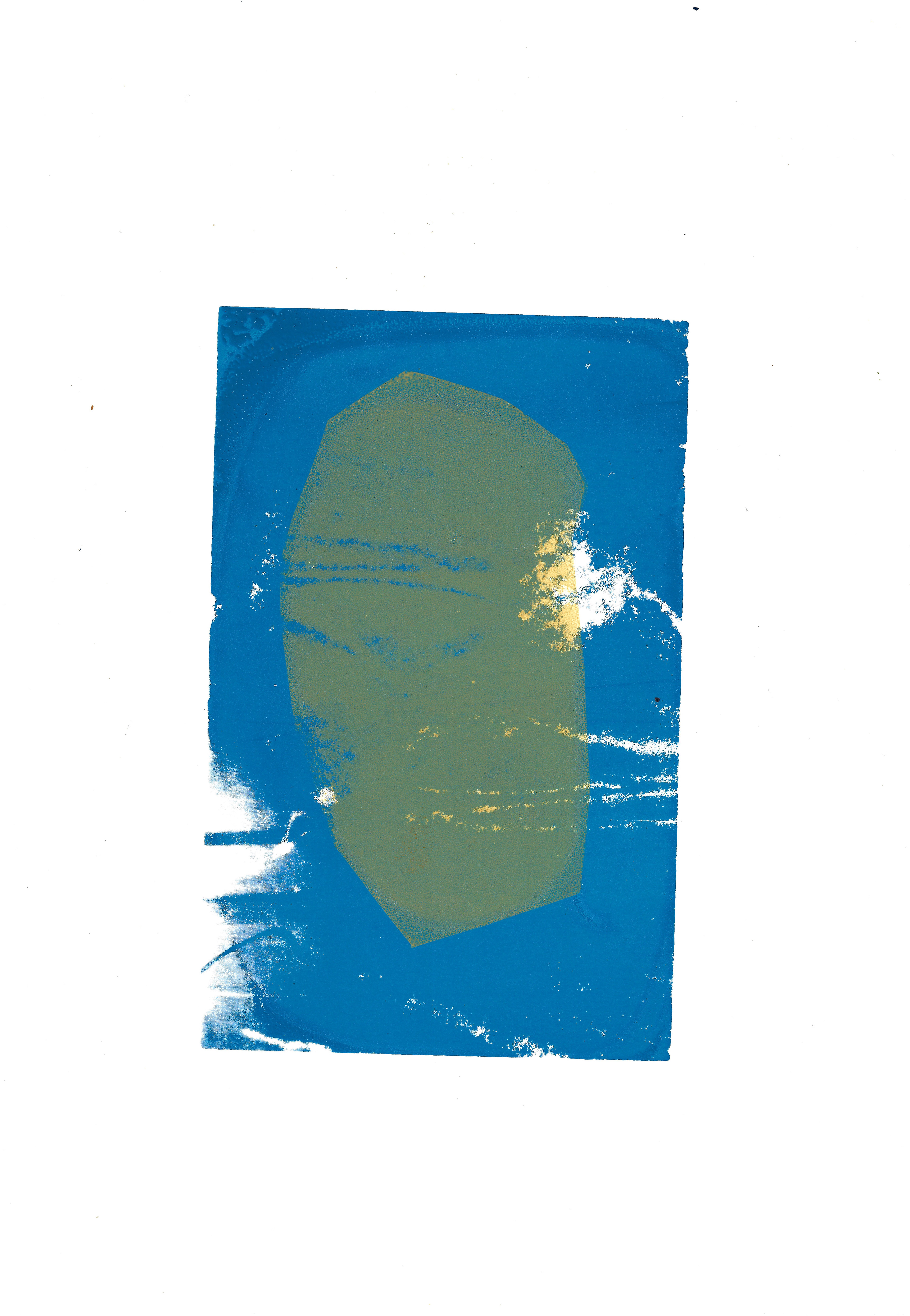
Screenprint 24.5 x 35 cm

Screenprint 24.5 x 34.5 cm

Screenprint 24.5 x 34.5 cm
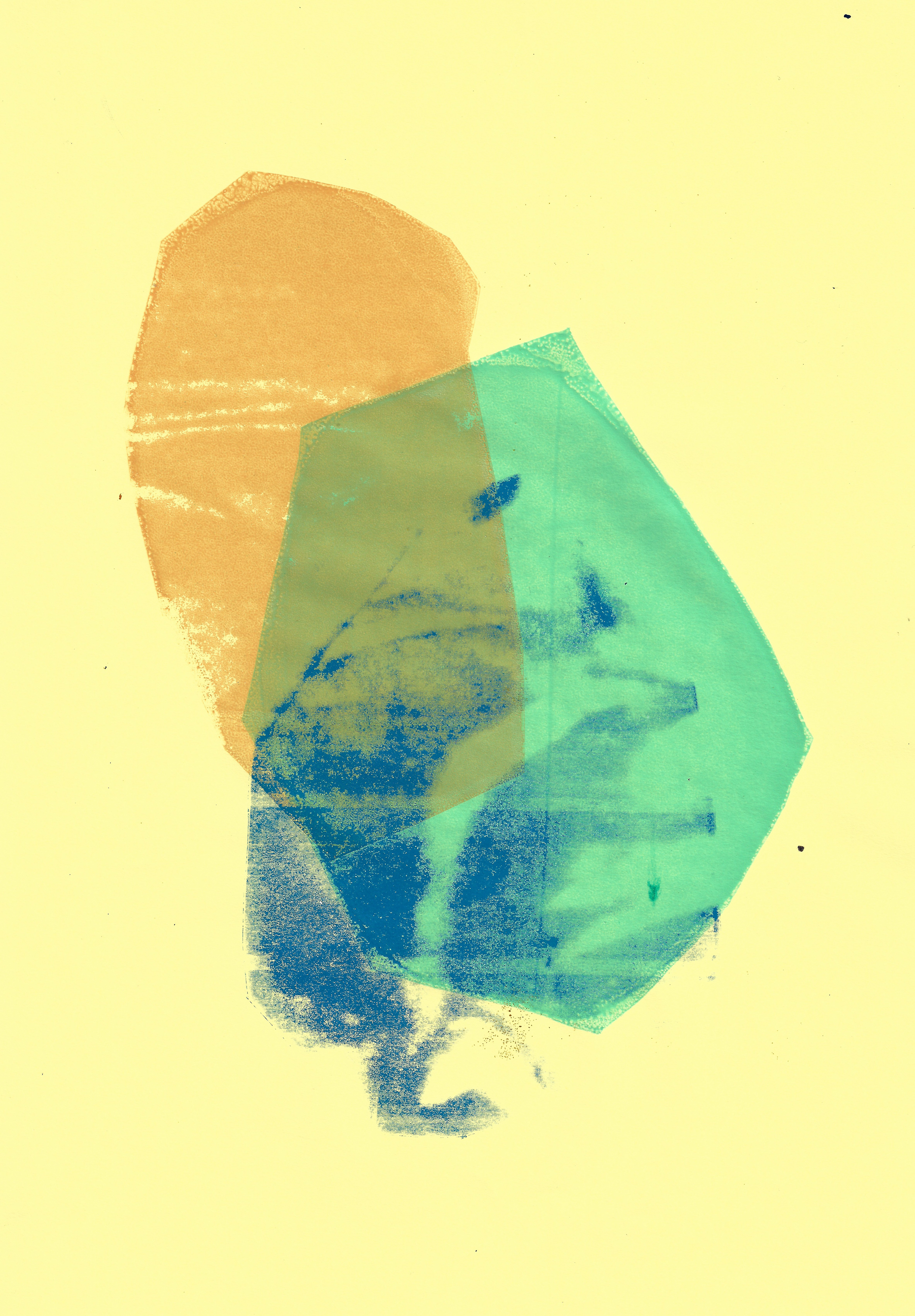
Screenprint 21 x 29.7 cm
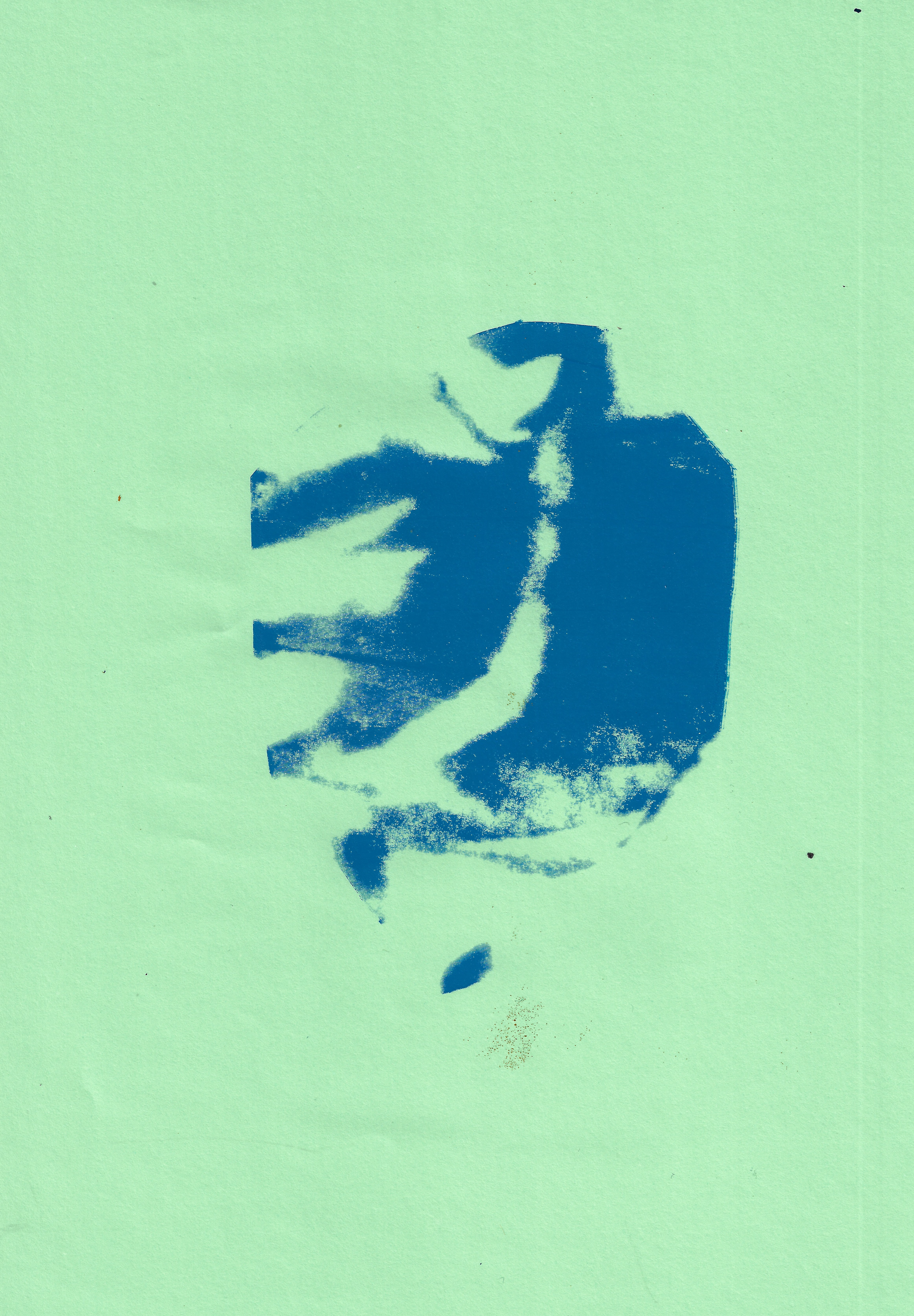
Screenprint 21 x 29.7 cm
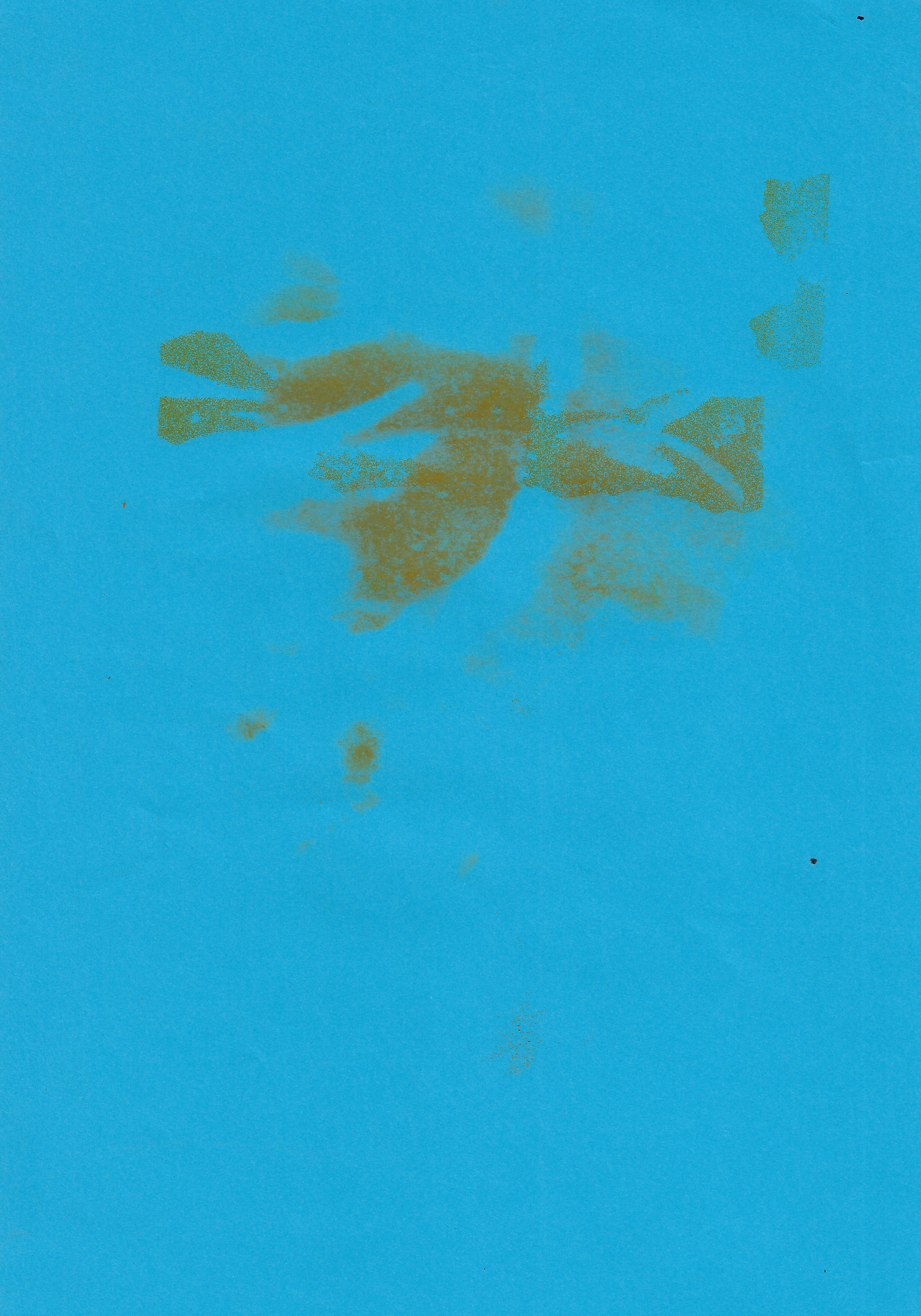
Screenprint 21 x 29.7 cm

Screenprint 39 x 57 cm
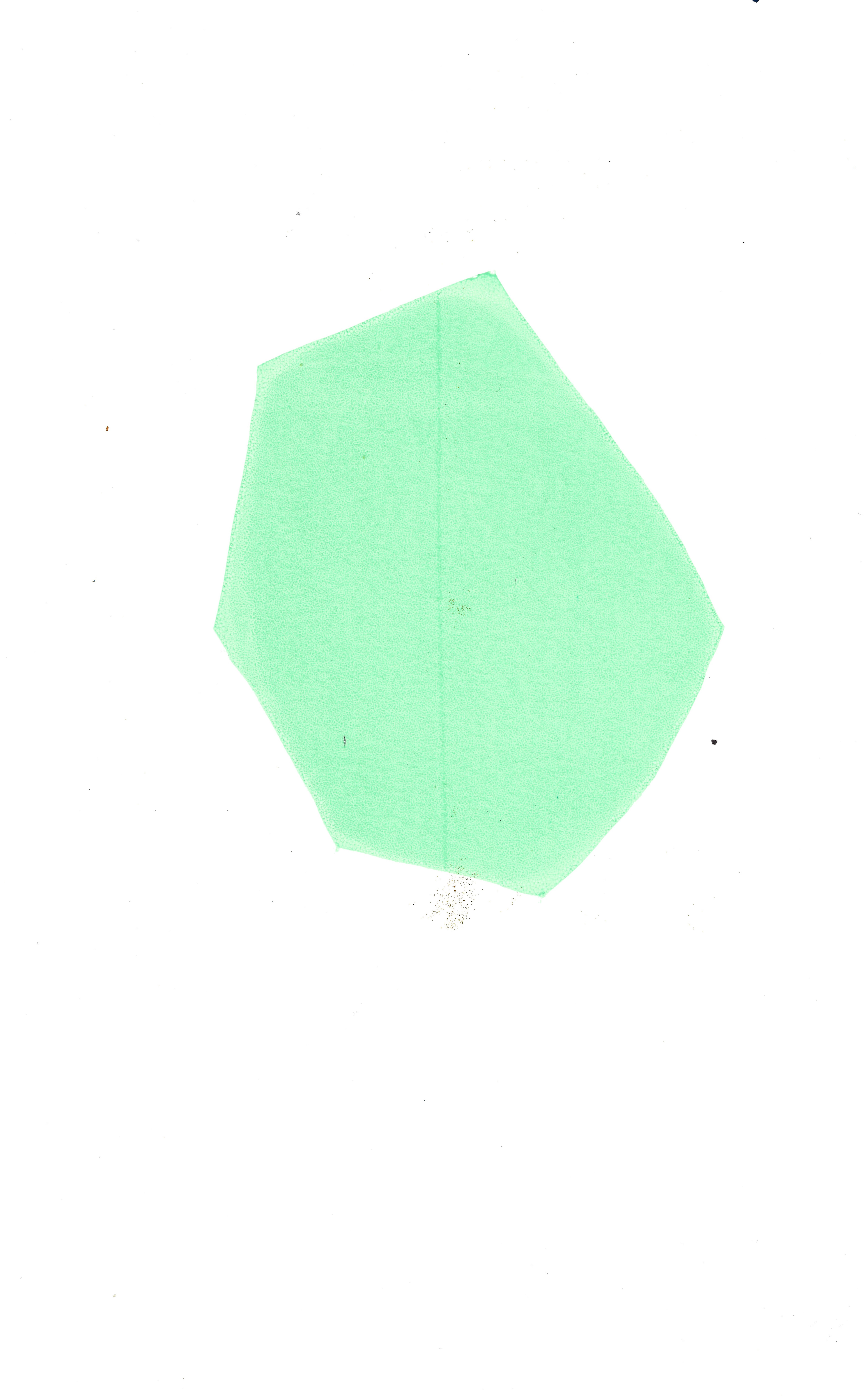
Screenprint 21 x 29.7 cm
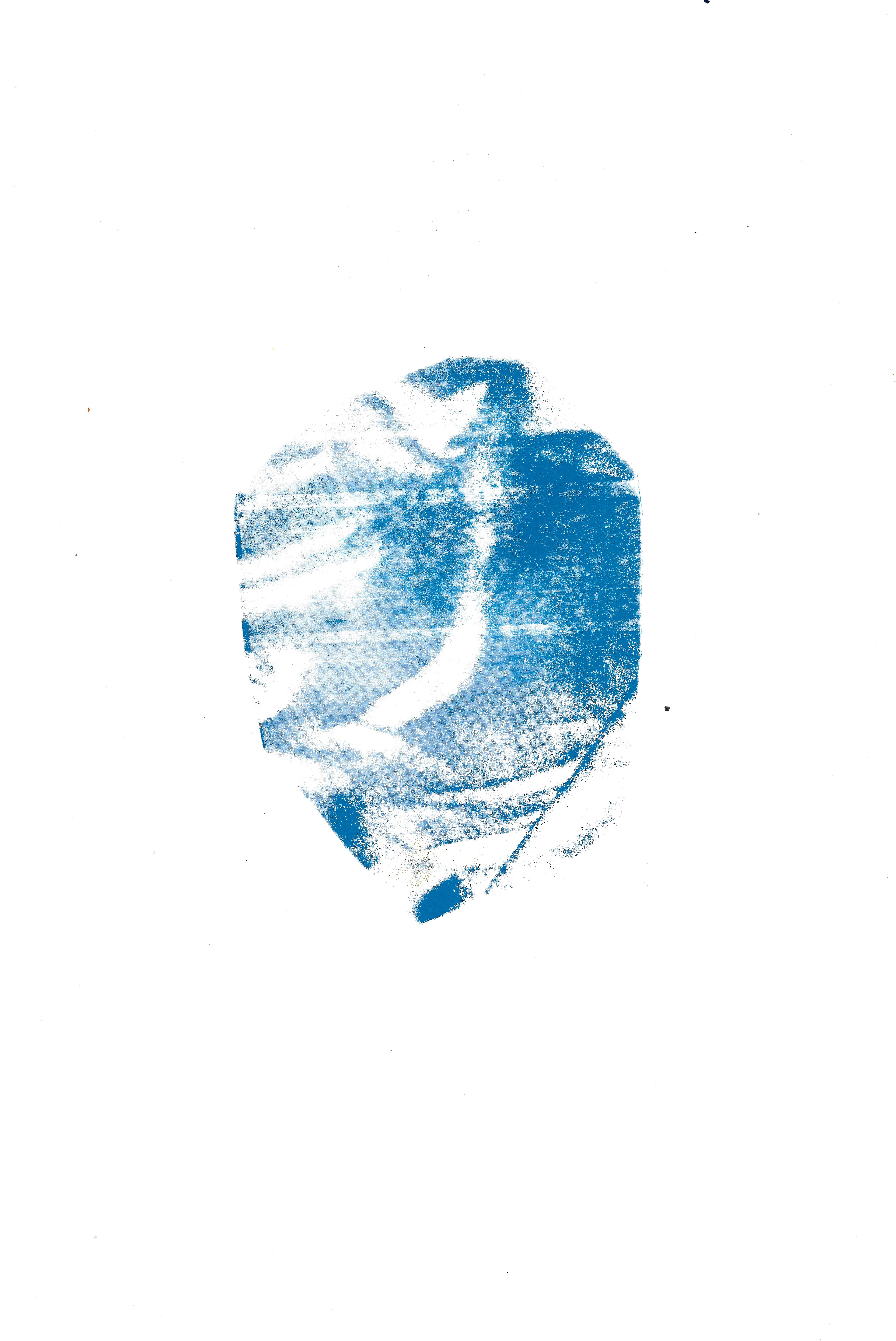
Screenprint 22 x 35 cm
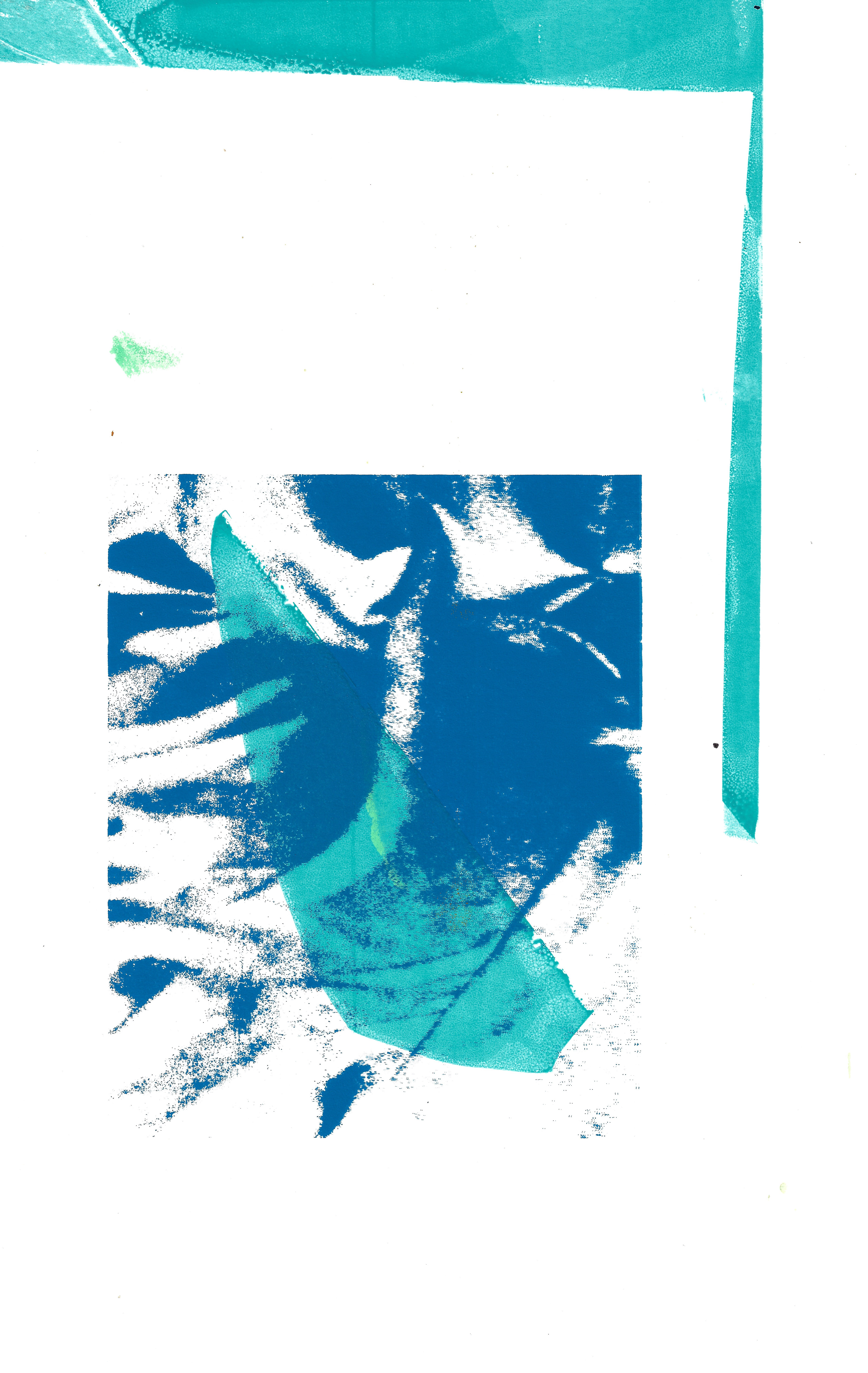
Screenprint 24.5 x 35 cm
Screenprint 22 x 35 cm
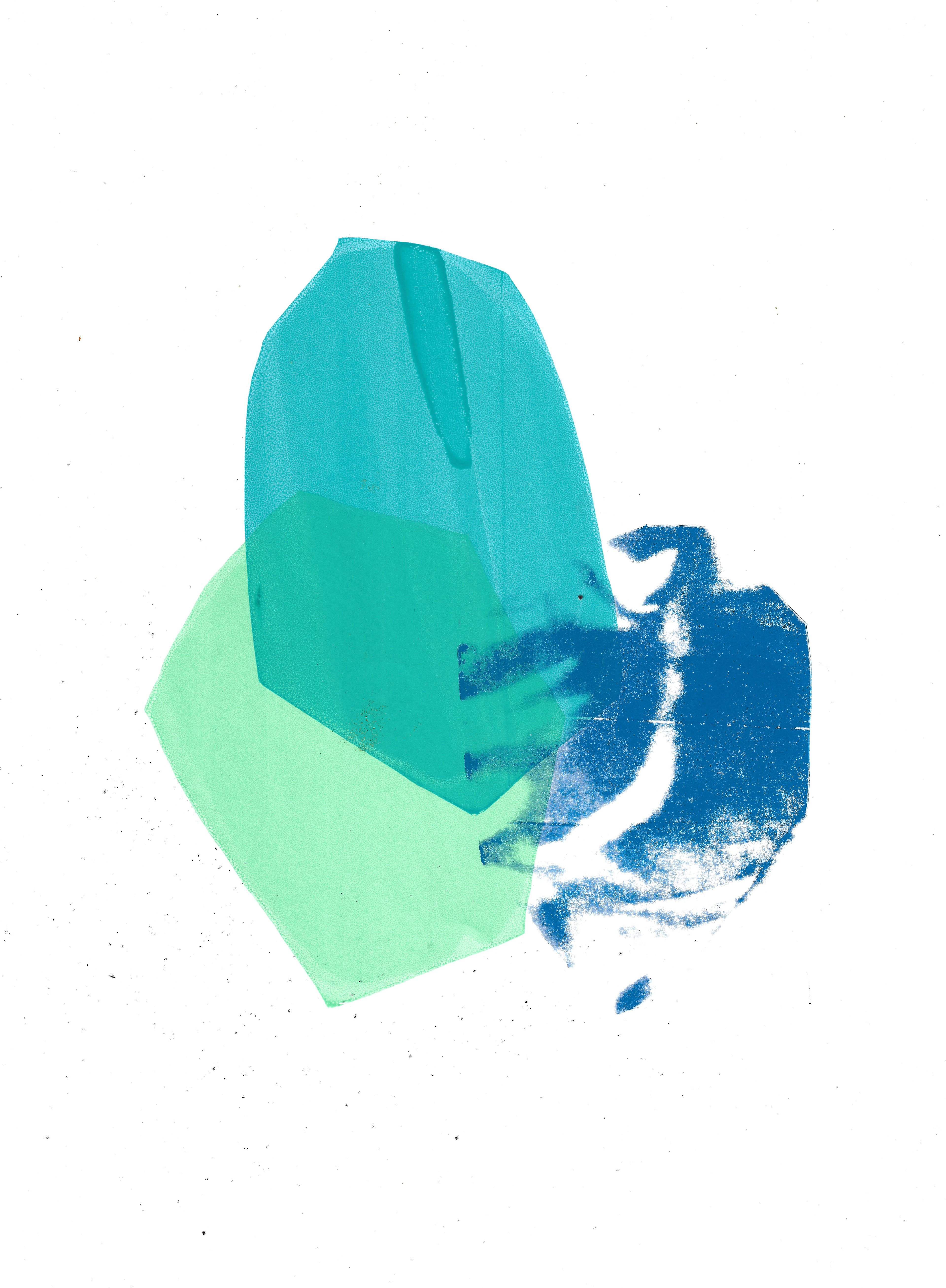
Screenprint 29.5 x 42 cm
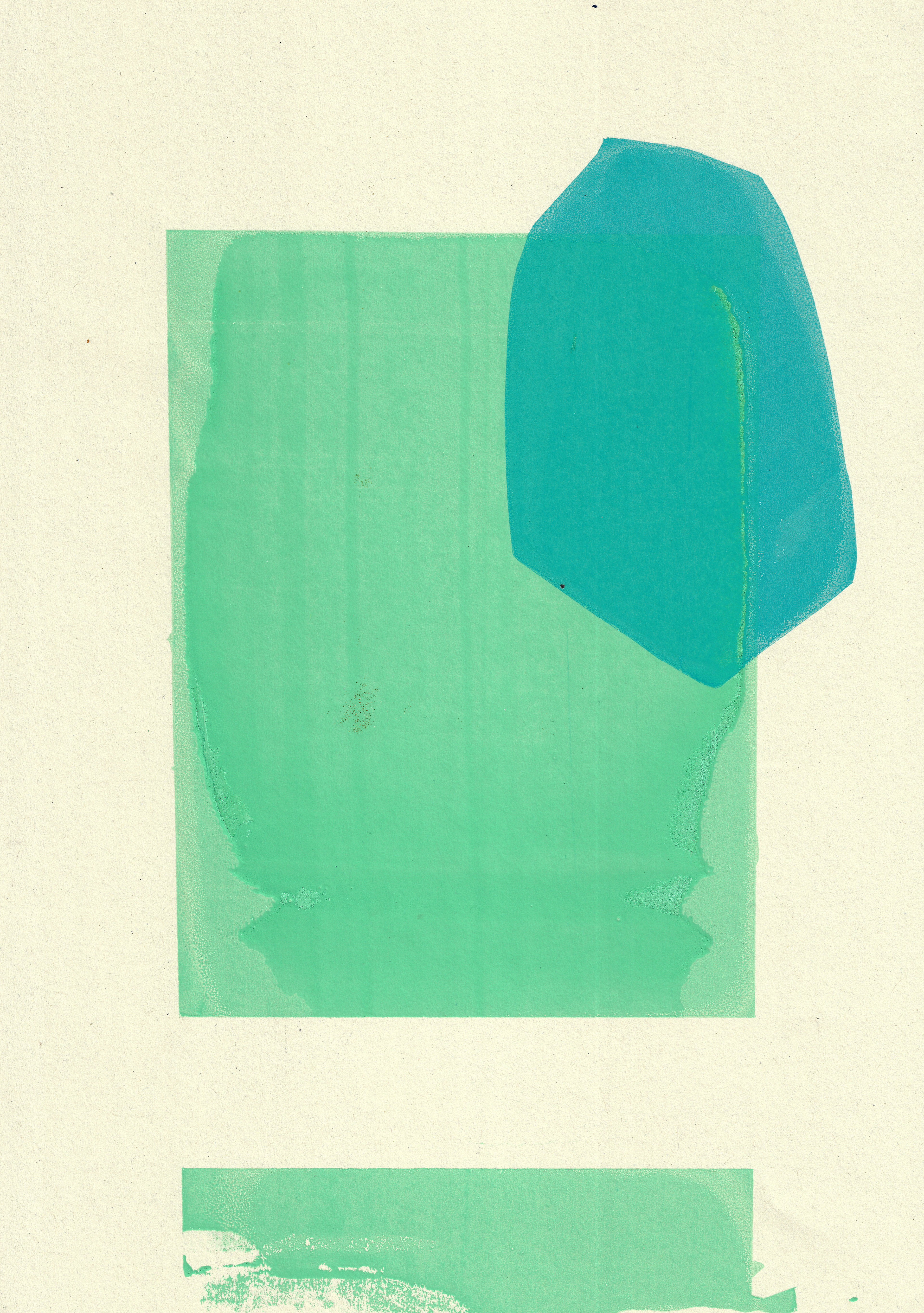
Screenprint 29.7 x 42 cm

Screenprint 29.7 x 42 cm
The technique of screenprinting different layers of a cmyk split image of fabric utilised a stencil on the image of fabric to explore creating different tensions between the shapes, varying in density of colour. A stencil was used on the screen to create an irregular shape (not the conventional rectangle that the image was originally in) to then layer, creating depth and tension between the different shapes of varying textures.
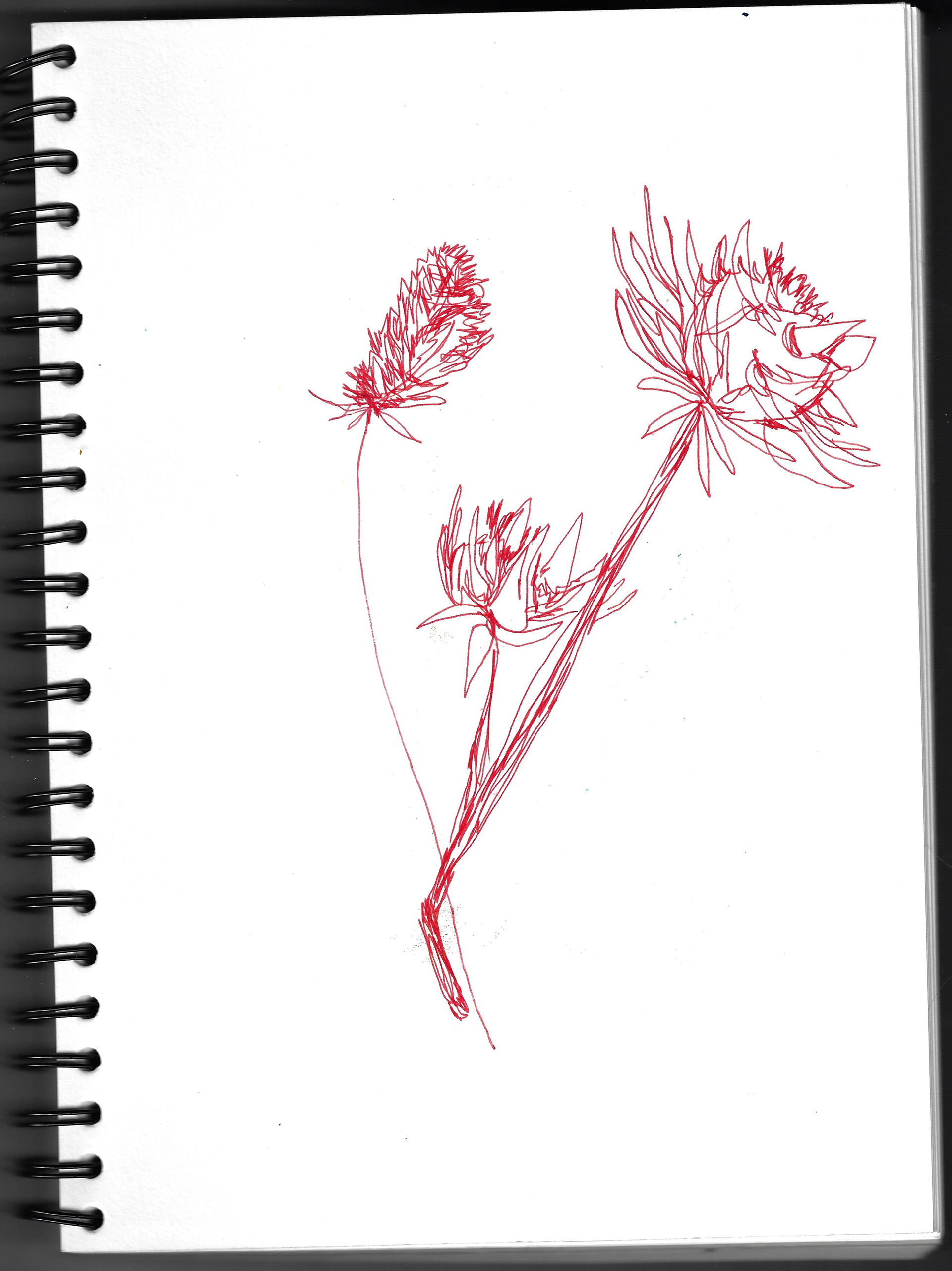
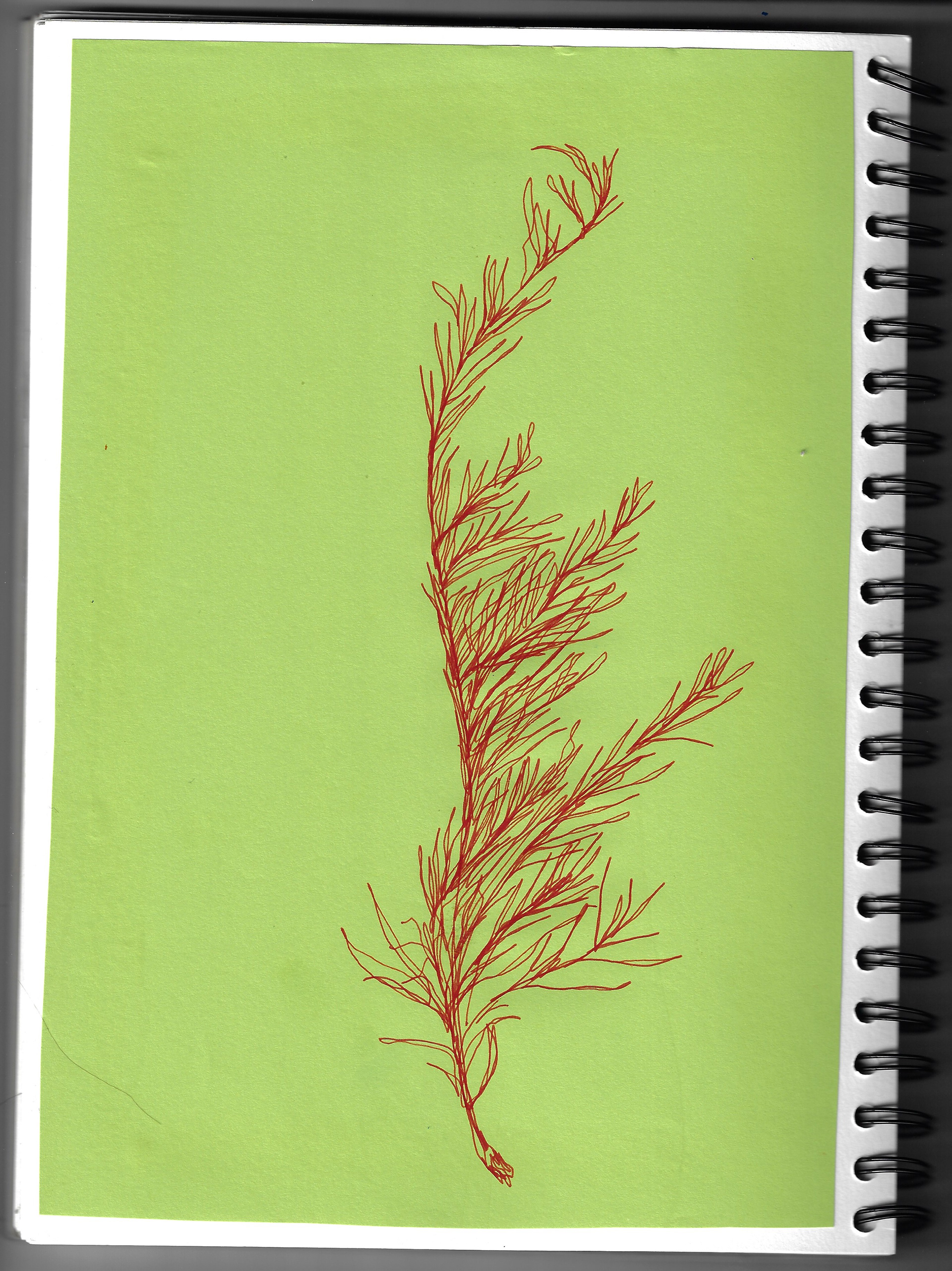
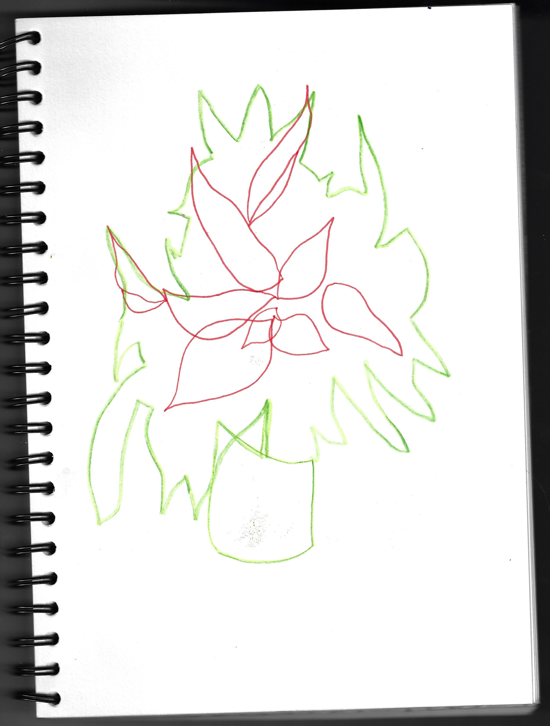
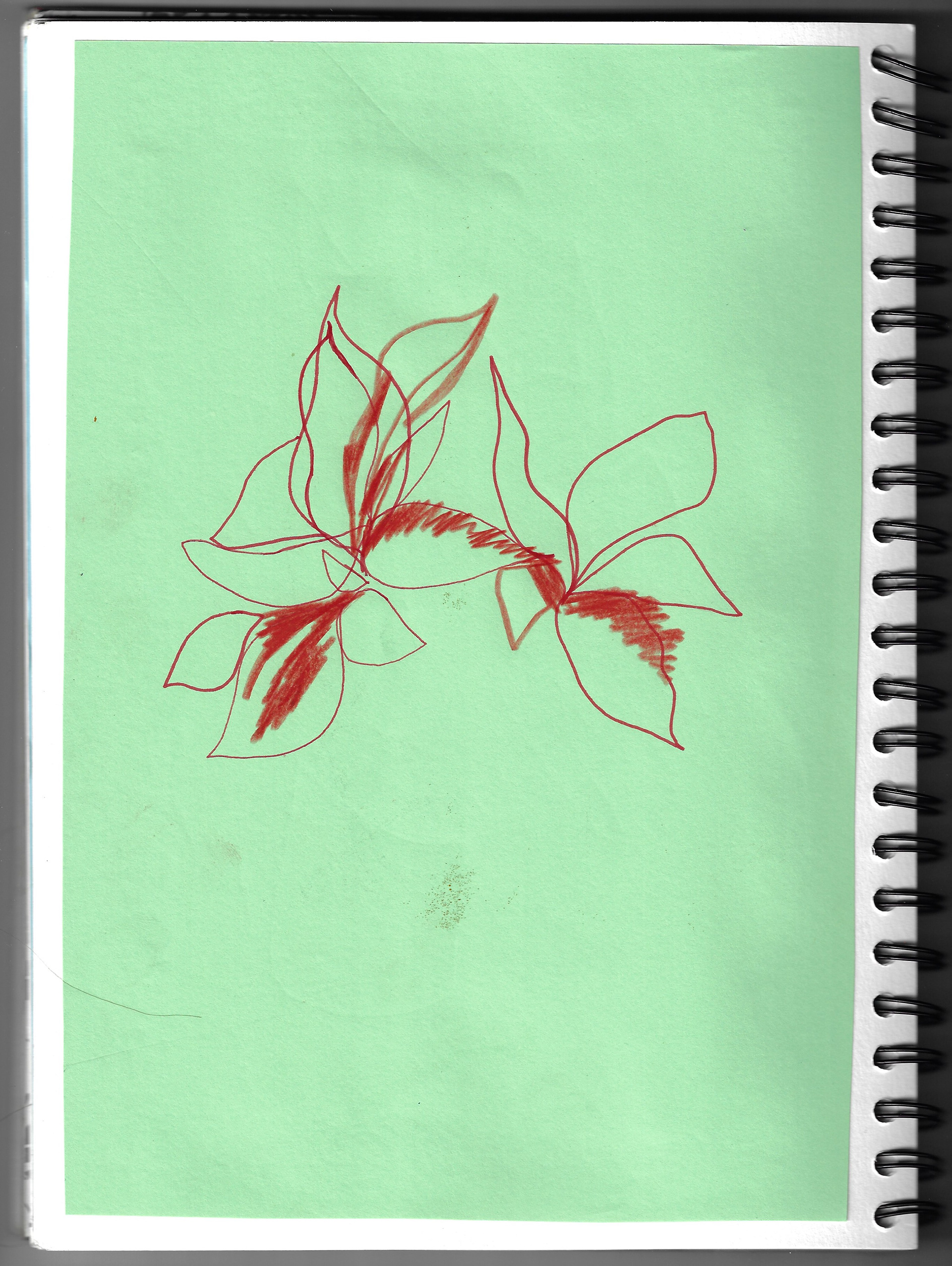
Drawings of a poinsettia, rosemary and artichoke explored using different drawing materials- the lines they create and different colours used against different coloured paper background.
Sketchbook page 21 x 29.7 cm
Sketchbook page 21 x 29.7 cm
Creation of a collage using block coloured shapes and life drawing. This shows a mixture of block forms with line.
Screenprinting block images on paper, overlaying the images on top of each other. These prints are still in the workshop.
Lithographic printing of my images that had earlier been transferred onto the stone and subsequently printed using a mixture of green and blue ink. The image is printed onto various coloured papers. The result of the print on orange paper is too jarring set against the subtle green and blue ink. On softer beige toned paper the image is more sensitive as the tonal range is more subtle. These prints are still in the workshop.
A variety of monoprints using various previously prepared stencils. This explores different thickness of paint and the various textures made using different types of paper, looking at how the grain is more visible on different types of paper, compared to others. These prints are still on the drying rack in the workshop.
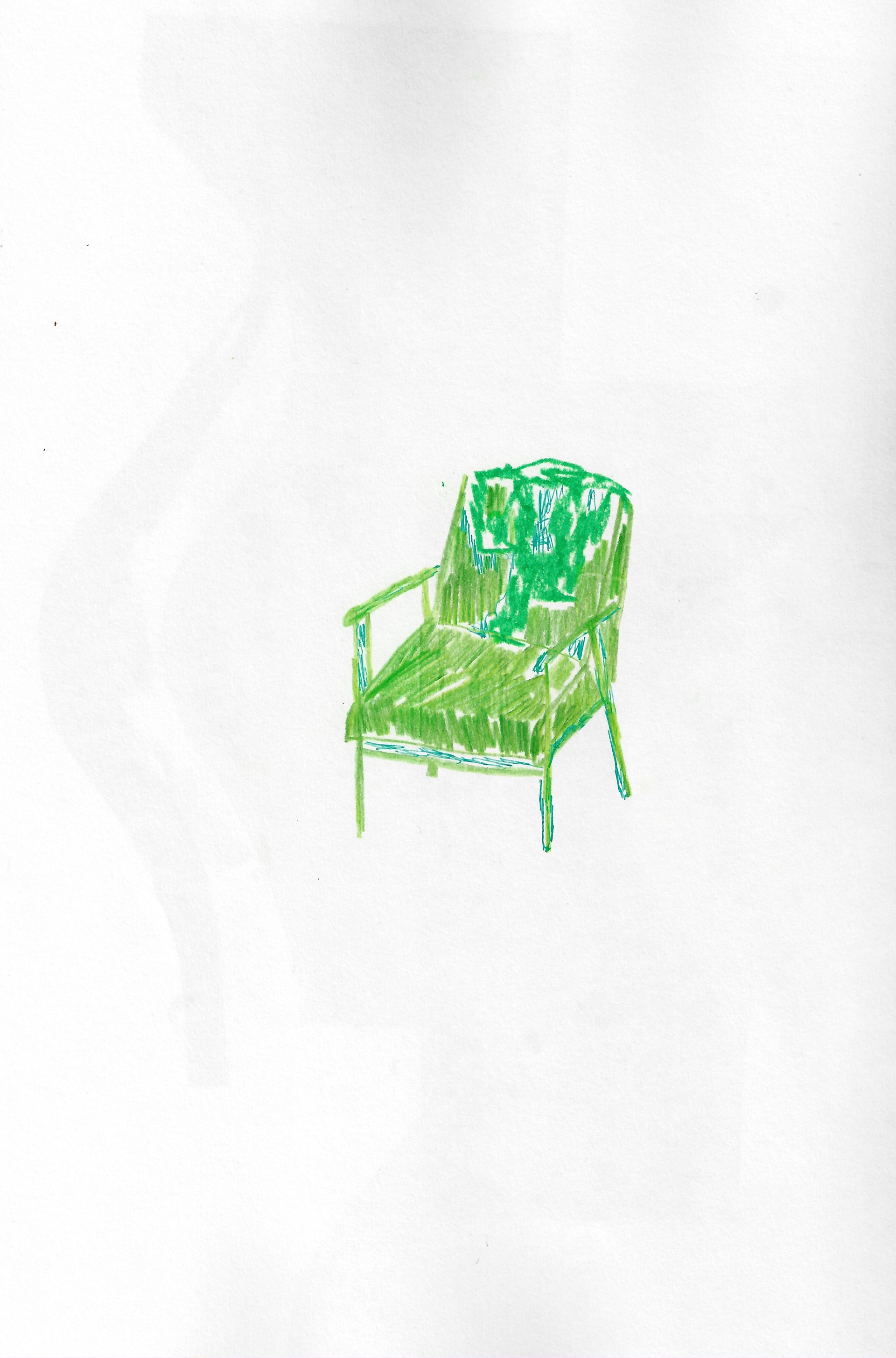
Sketchbook page 29.7 x 42 cm
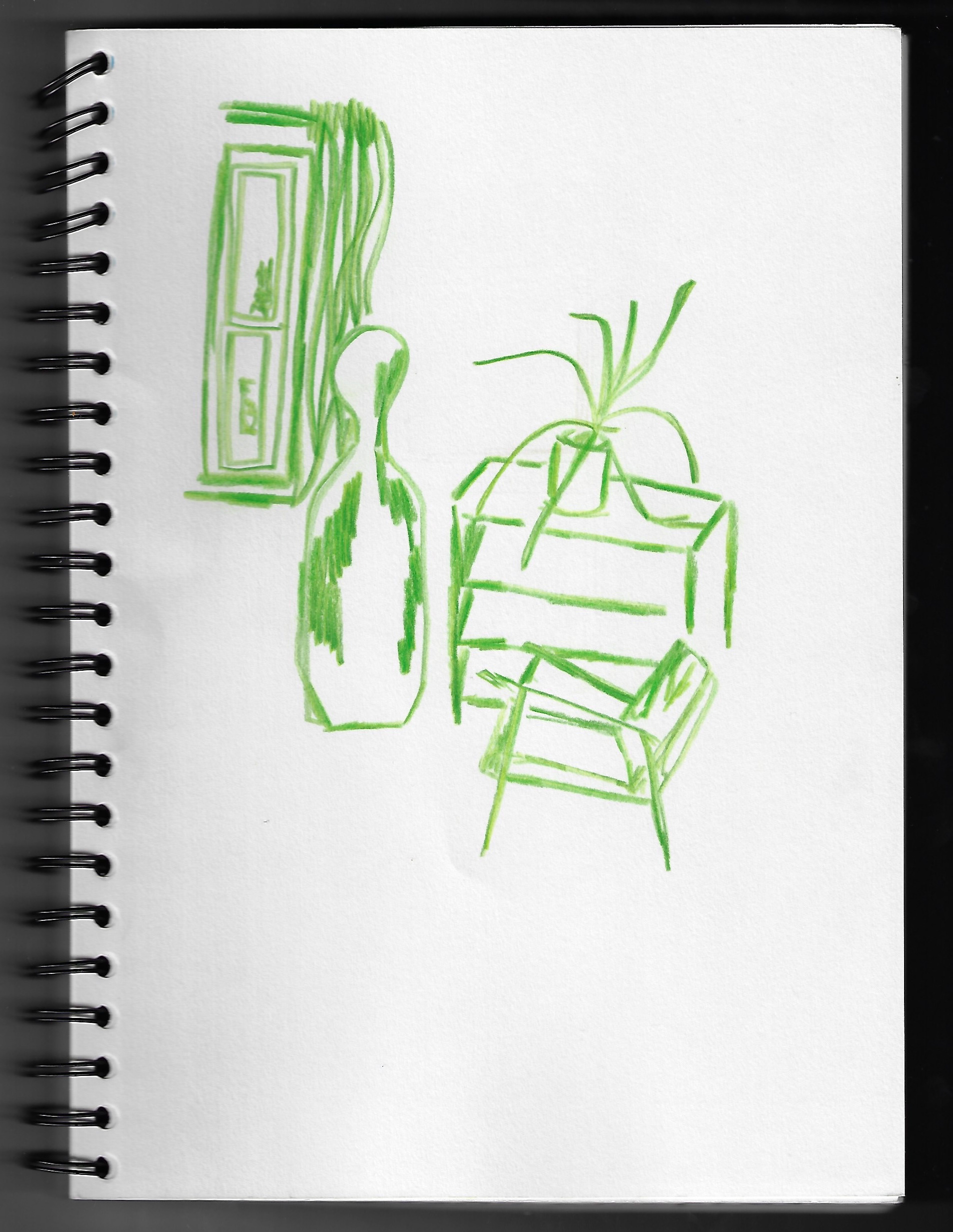
Sketchbook page 21 x 29.7 cm

Sketchbook page 21 x 29.7 cm
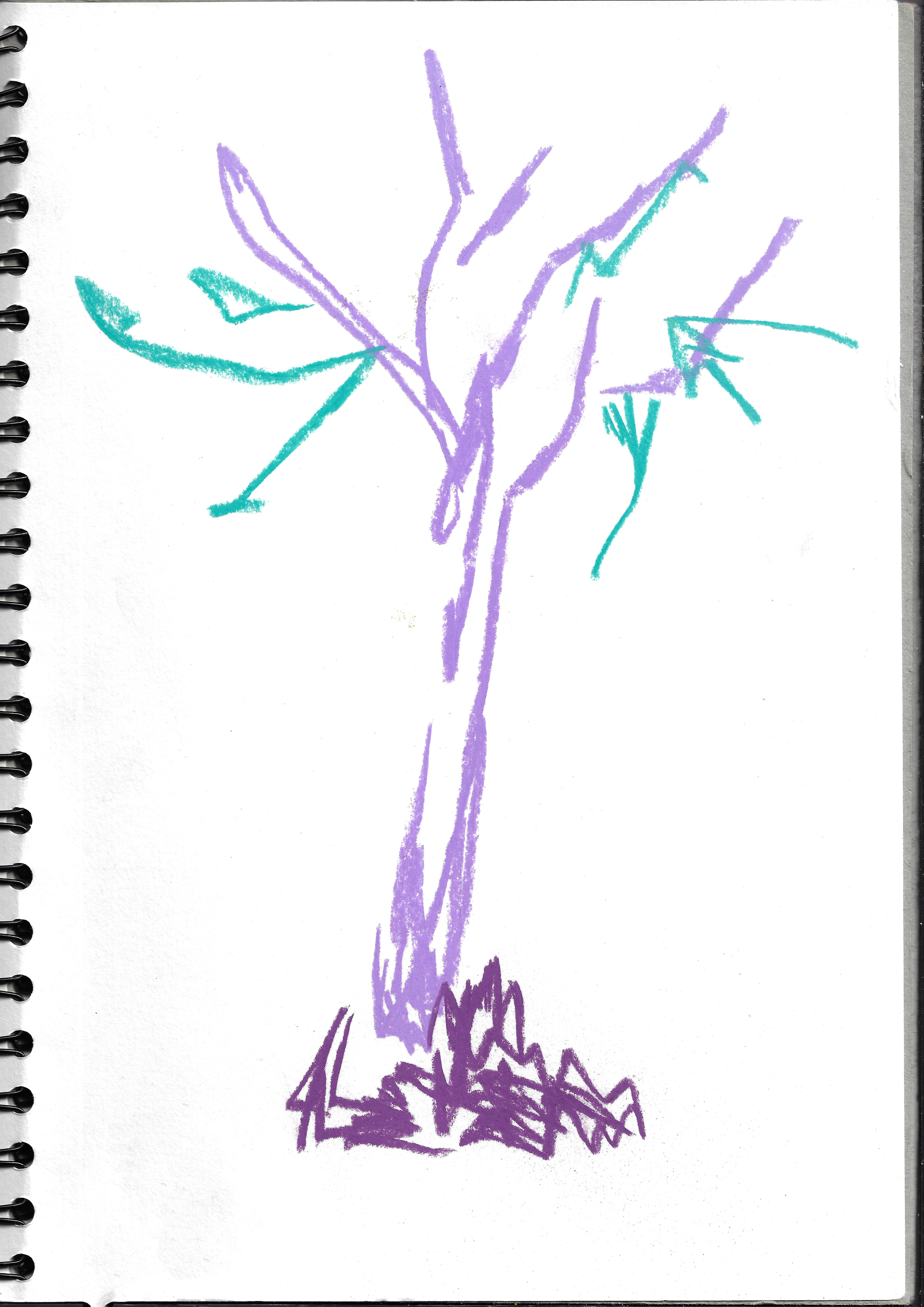
Sketchbook page 21 x 29.7 cm
Sketchbook page 29.7 x 42 cm
Sketchbook page 29.7 x 42 cm
An observational drawing of and from my room. One drawing is in marbled green pencil and then adapted using various different media. This explores the use of different textures of various surfaces within my room and experimenting with these made by various alternatives in drawing media.
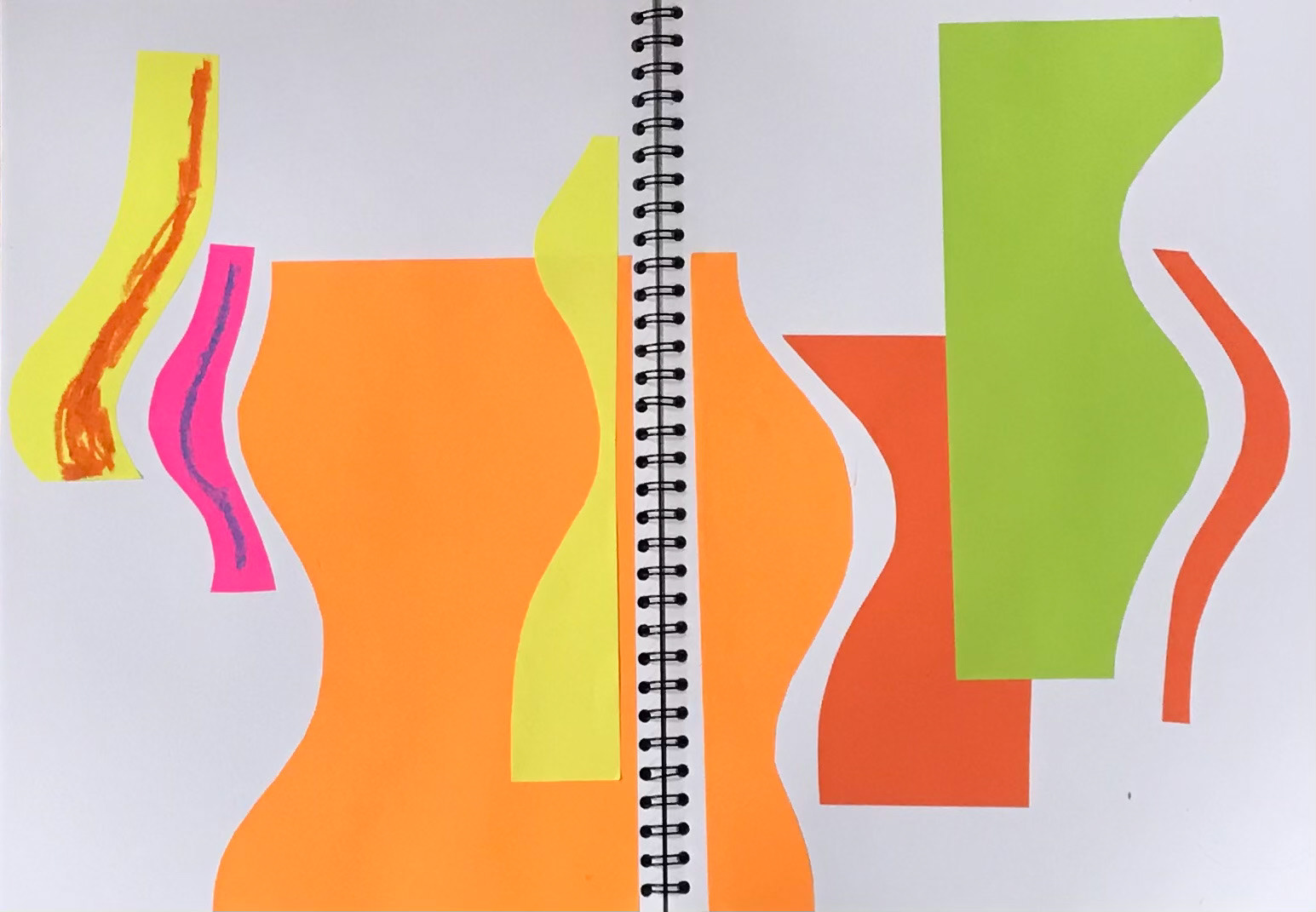
2 x sketchbook pages, each 29.7 x 42 cm

Sketchbook page 29.7 x 42 cm

Sketchbook page 21 x 29.7 cm
A collage of block colours using various geometric shapes. Earlier experiments were works with different angular forms, but now have progressed to using using curved lines to explore creating texture within these compositions by using drawing materials on top of the cut forms.
This image is an arrangement of cut forms that was photographed then manipulated in photoshop to regulate and flatten the colour and forms.
Sketchbook page 21 x 29.7 cm
Sketchbook page 21 x 29.7 cm
Observational drawing of my dog, Bambi, particularly focussing on the texture of her fur and the blanket surrounding her.
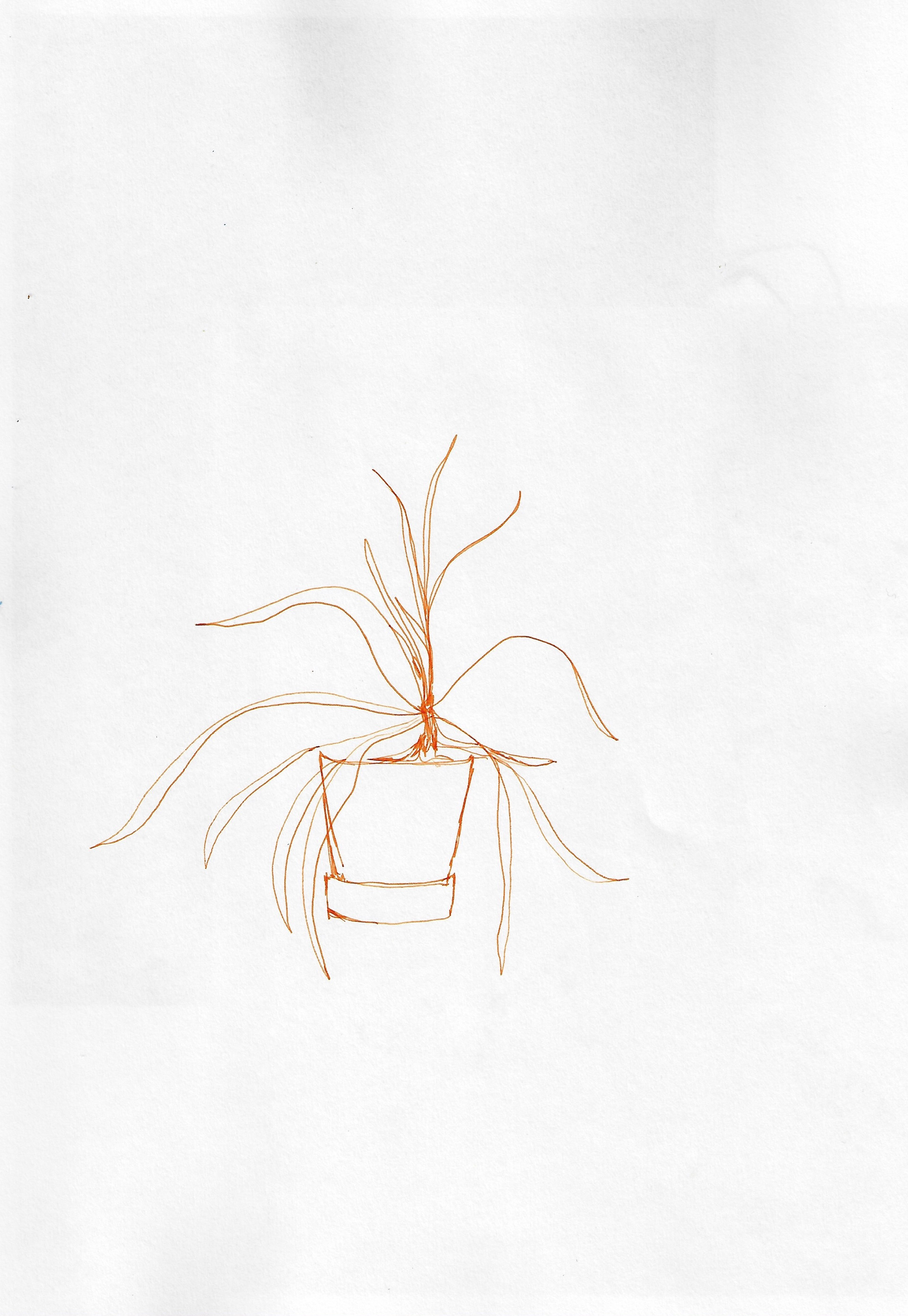
Sketchbook page 29.7 x 42 cm
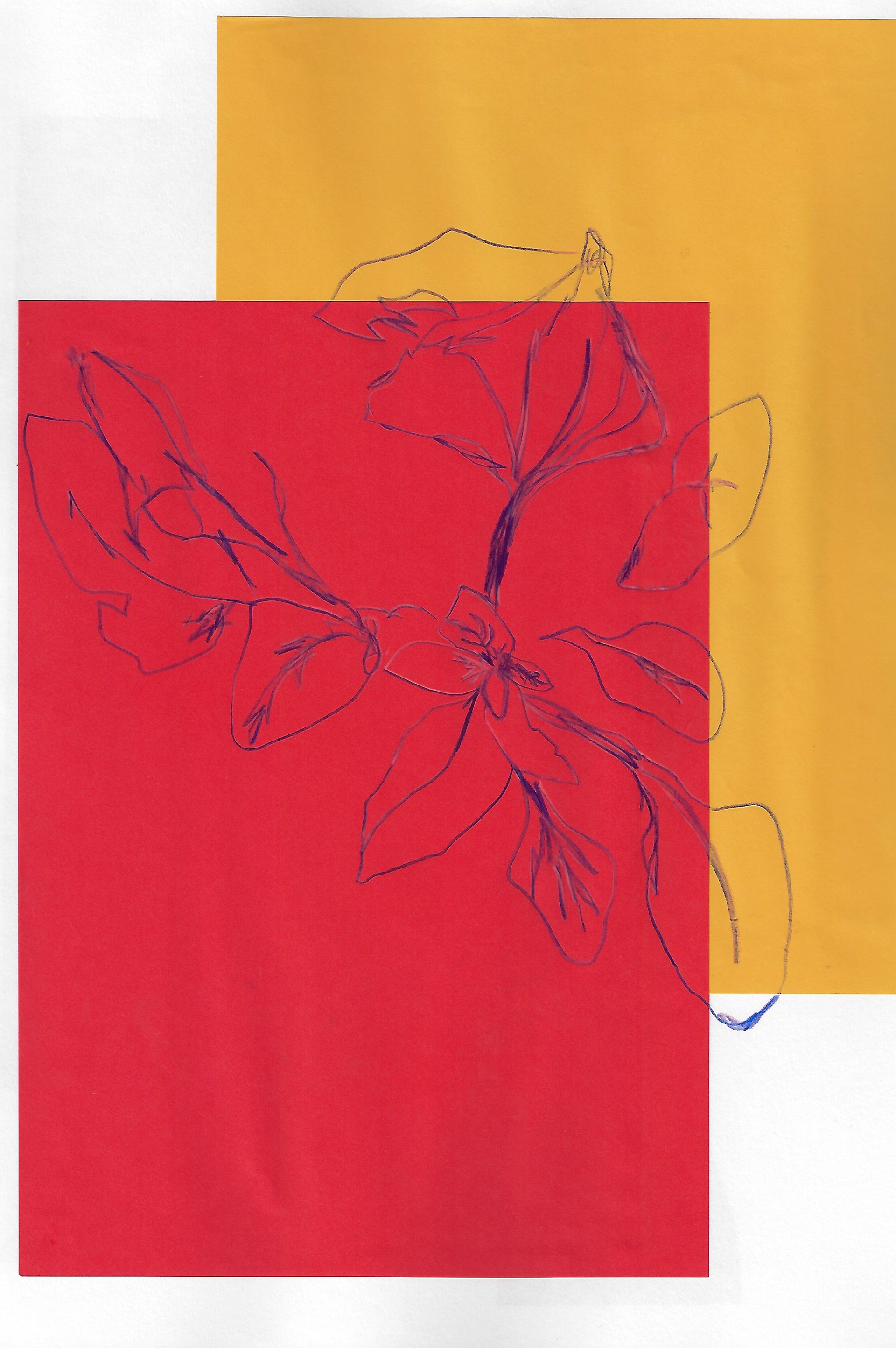
Sketchbook page 29.7 x 42 cm
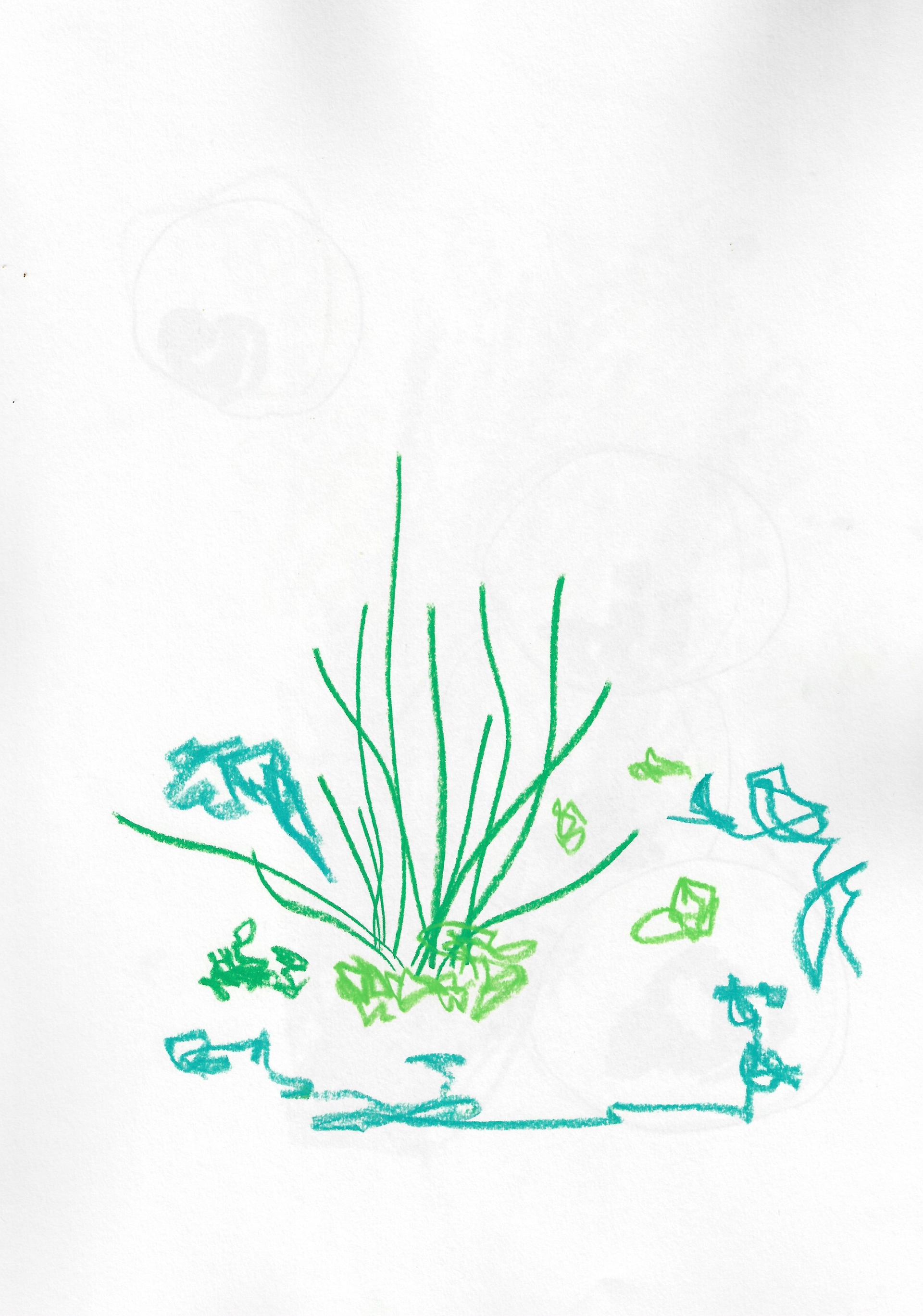
Sketchbook page 29.7 x 42 cm

Sketchbook page 29.7 x 42 cm
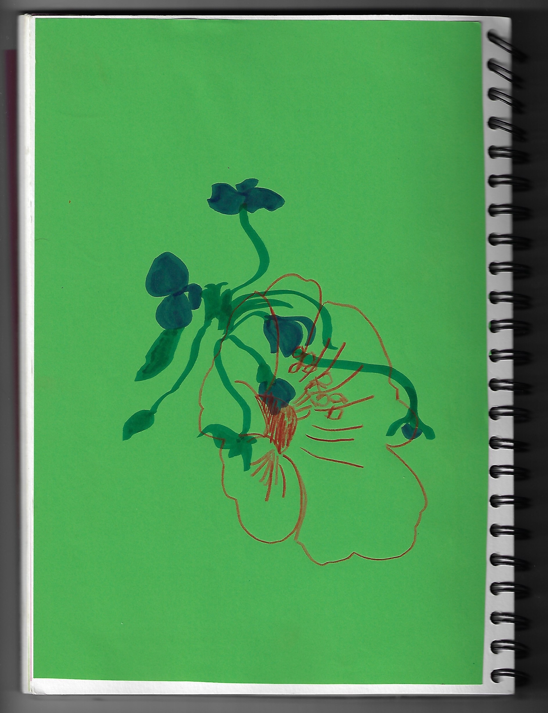
Sketchbook page 21 x 29.7 cm
This is an observational drawing of my environment. The previous image explored overlaying colours and different mediums, whereas this creates a contrast between the layers and a visible tension between them through the different colours and mediums.

10.5 x 14.85 cm
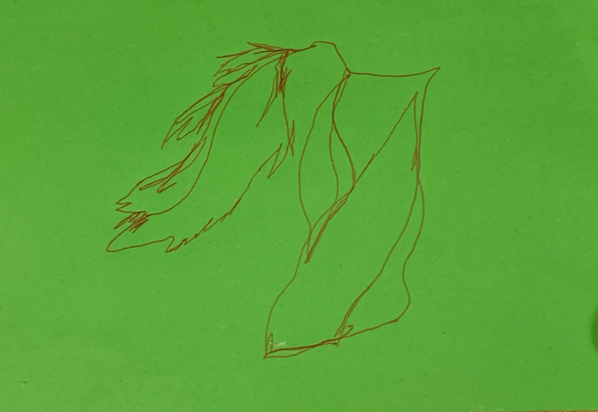
10.5 x 14.85 cm

10.5 x 14.85 cm
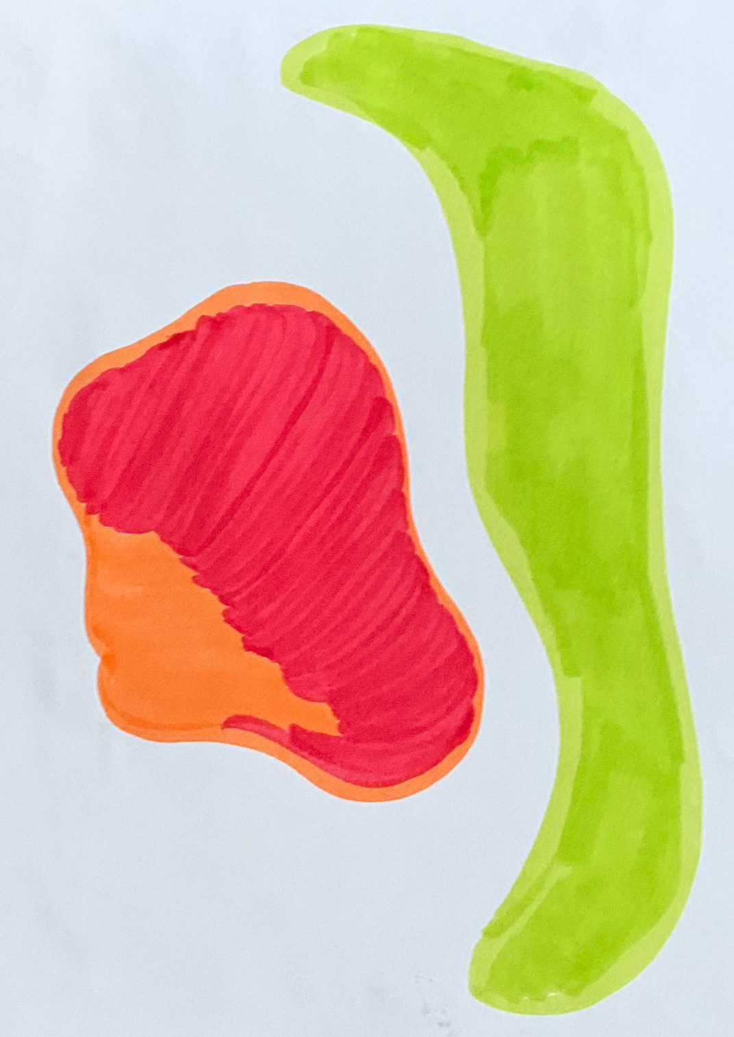
10.5 x 14.85 cm

10.5 x 14.85 cm

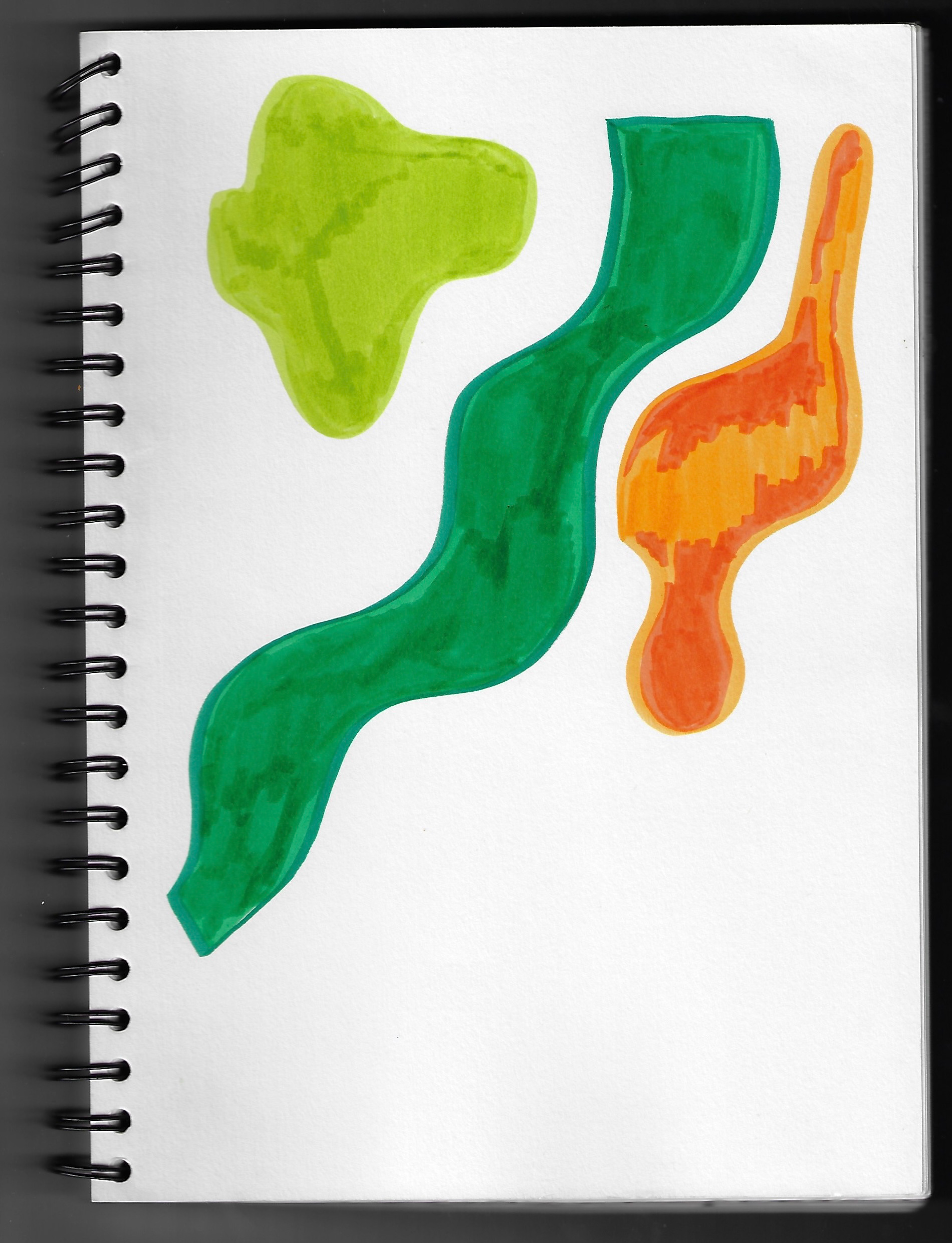
Sketchbook page 21 x 29.7 cm
Sketchbook page 21 x 29.7 cm

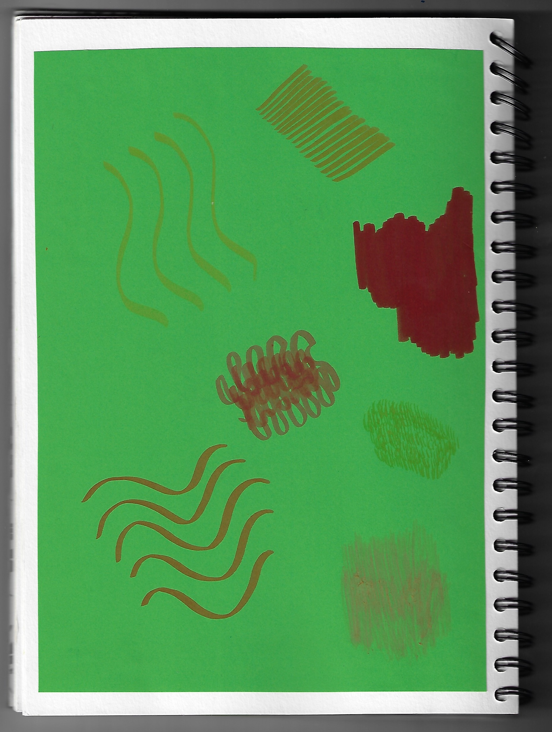
Sketchbook page 21 x 29.7 cm
Sketchbook page 21 x 29.7 cm
An exploration of various mark making techniques in sketchbook. Felt tips were used to draw various textures in a variety of different techniques to evoke tactile quality from 2D flat surface, particularly using felt tip pens with different nibs/ends to experiment filling colour in, in a variety of different ways.

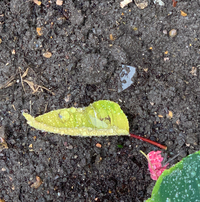
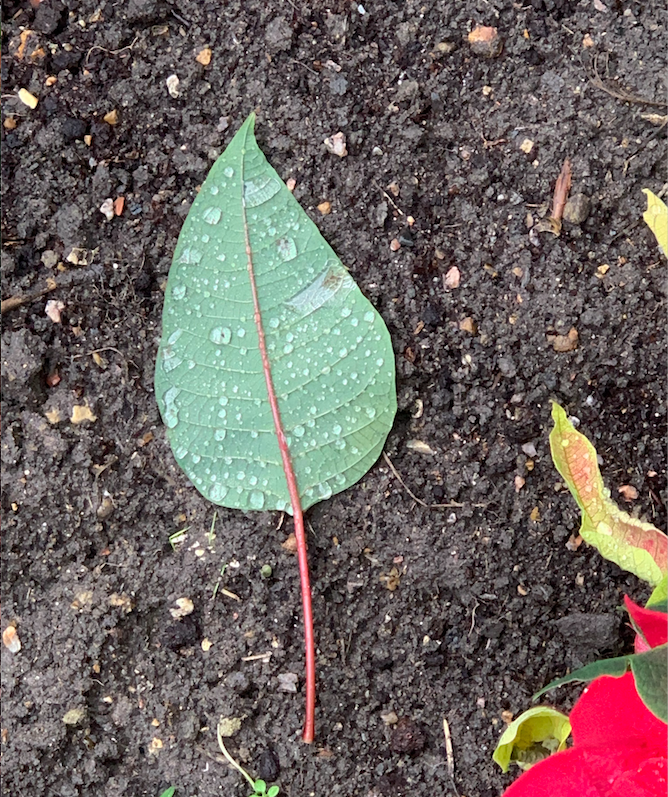
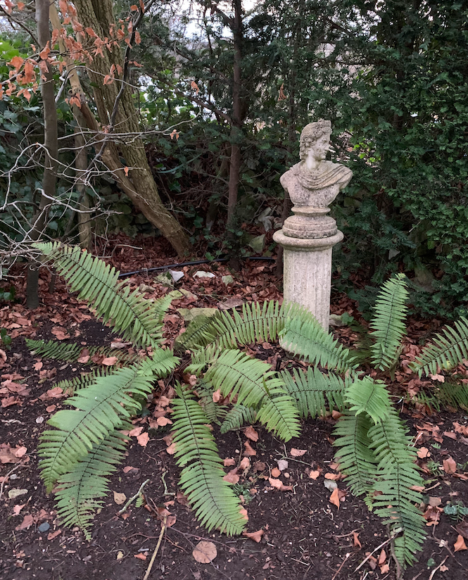
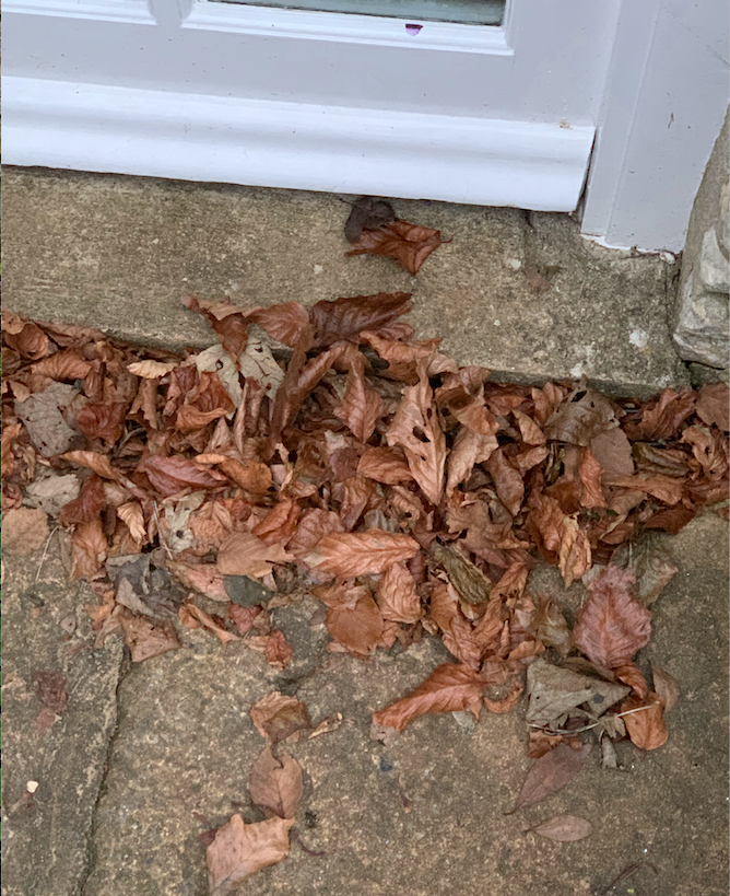
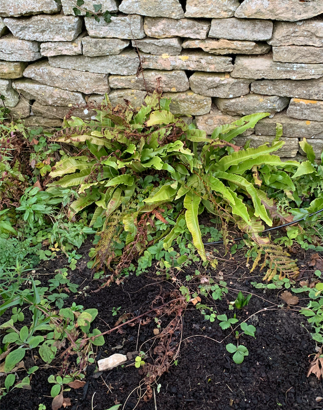

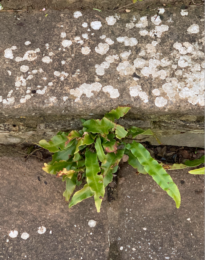

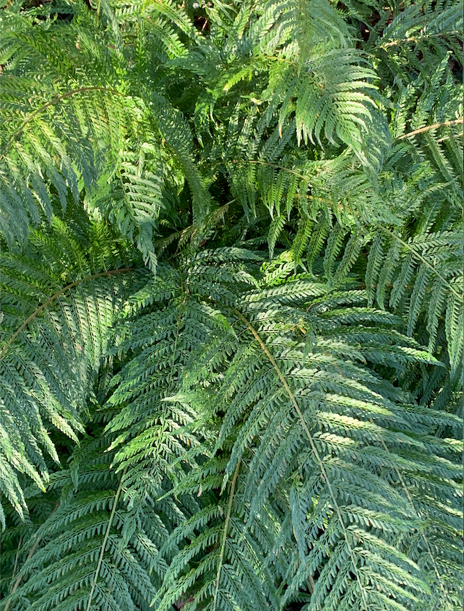
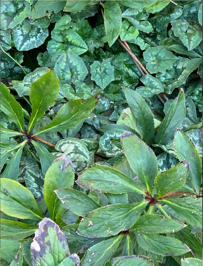
A variety of types and textures of leaves in different states are documented through taking photographs. My preference observational drawing to drawing from a photograph because it is not about being able to accurately draw the leaves but to give a feeling of the light, texture and overall sense of the image in its environment; imparting an individualistic translation of the encounter.
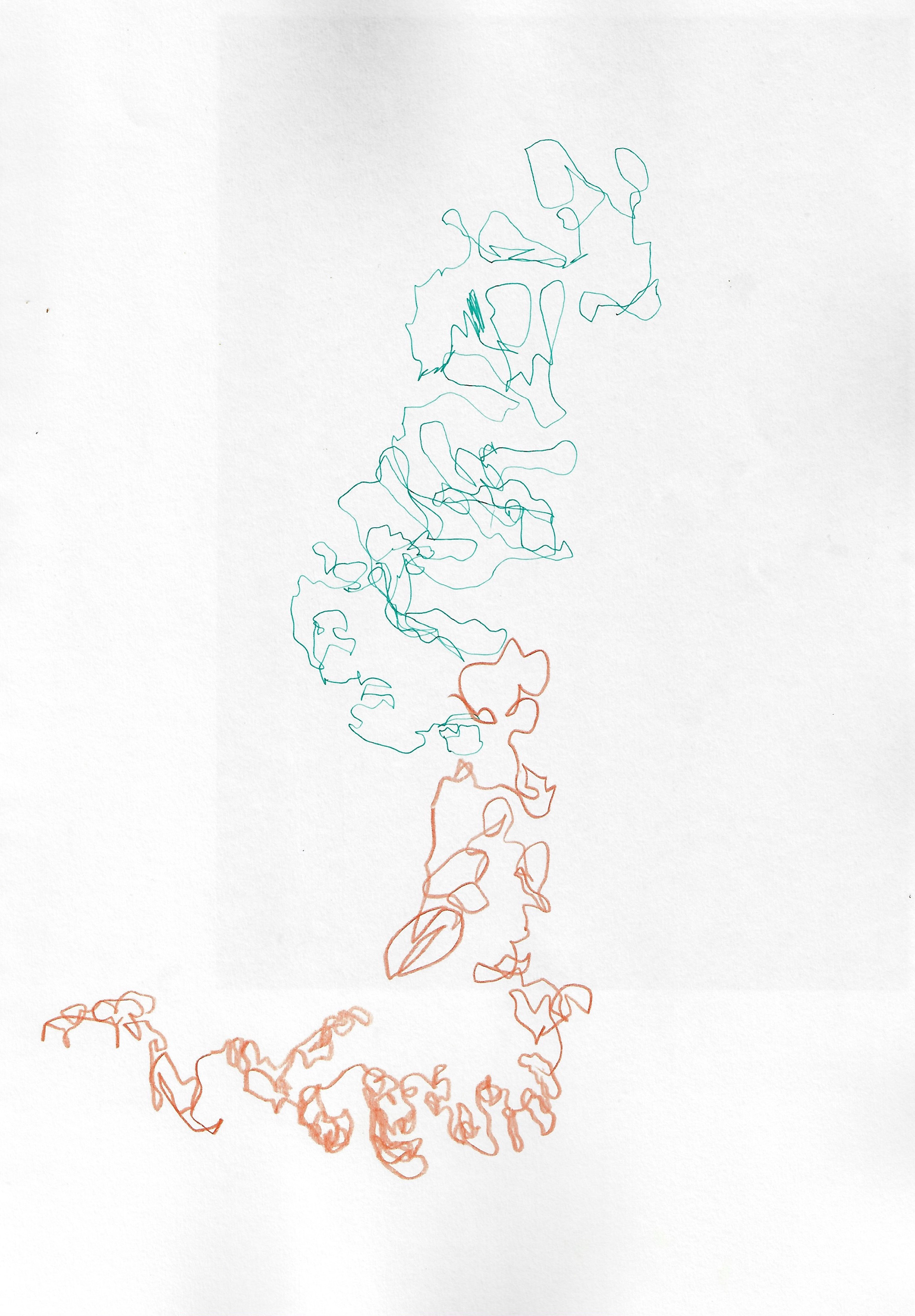
Sketchbook page 29.7 x 42 cm

Sketchbook page 29.7 x 42 cm

Sketchbook page 21 x 29.7 cm
This discipline highlights the drawing of plants without looking at the paper, focusing on other senses (apart from sight) when interacting with the plant and translating this into a drawing. Drawing on top of a photograph without looking at the image, eyes shut, from memory expresses in some way the sensation of the plant.

10.3 x 14.7 cm
10.5 x 14.85 cm

14.9 x 10.4 cm
10.5 x 7.7 cm
10.5 x 14.85 cm
10.2 x 14.7 cm
9.85 x 9.8 cm

7.65 x 10.5 cm
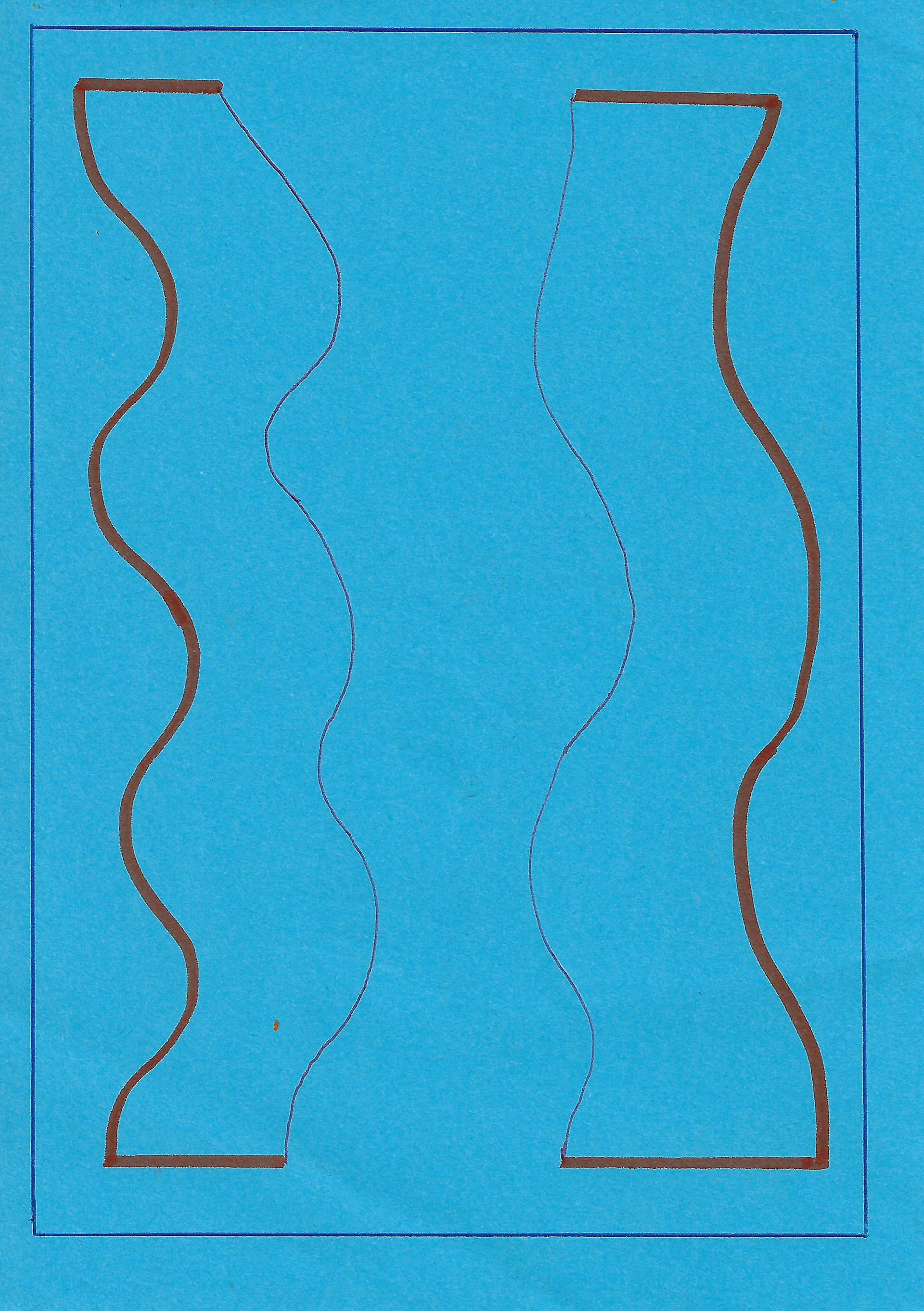
14.7 x 10.9 cm
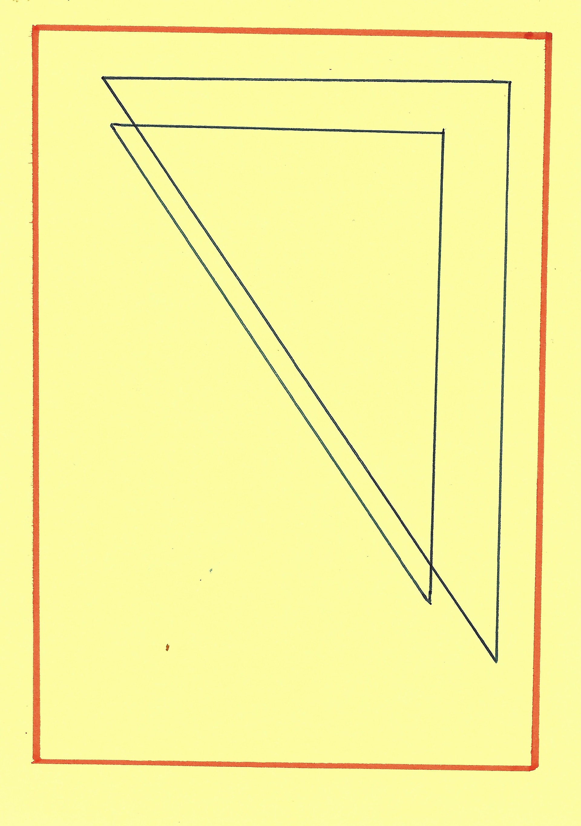
10.4 x 14.7 cm
This exercise demonstrates the drawings of plans for different stencils to use in monoprinting.
A collage of a drawing of curved lines, exploring the variation in coloured lines and how the interacting relationship between the lines changes over the block blue compared with the white. This emphasises the relative nature of the use of colour, even when reduced to a line; it still has an impact.

Sketchbook page 21 x 29.7 cm
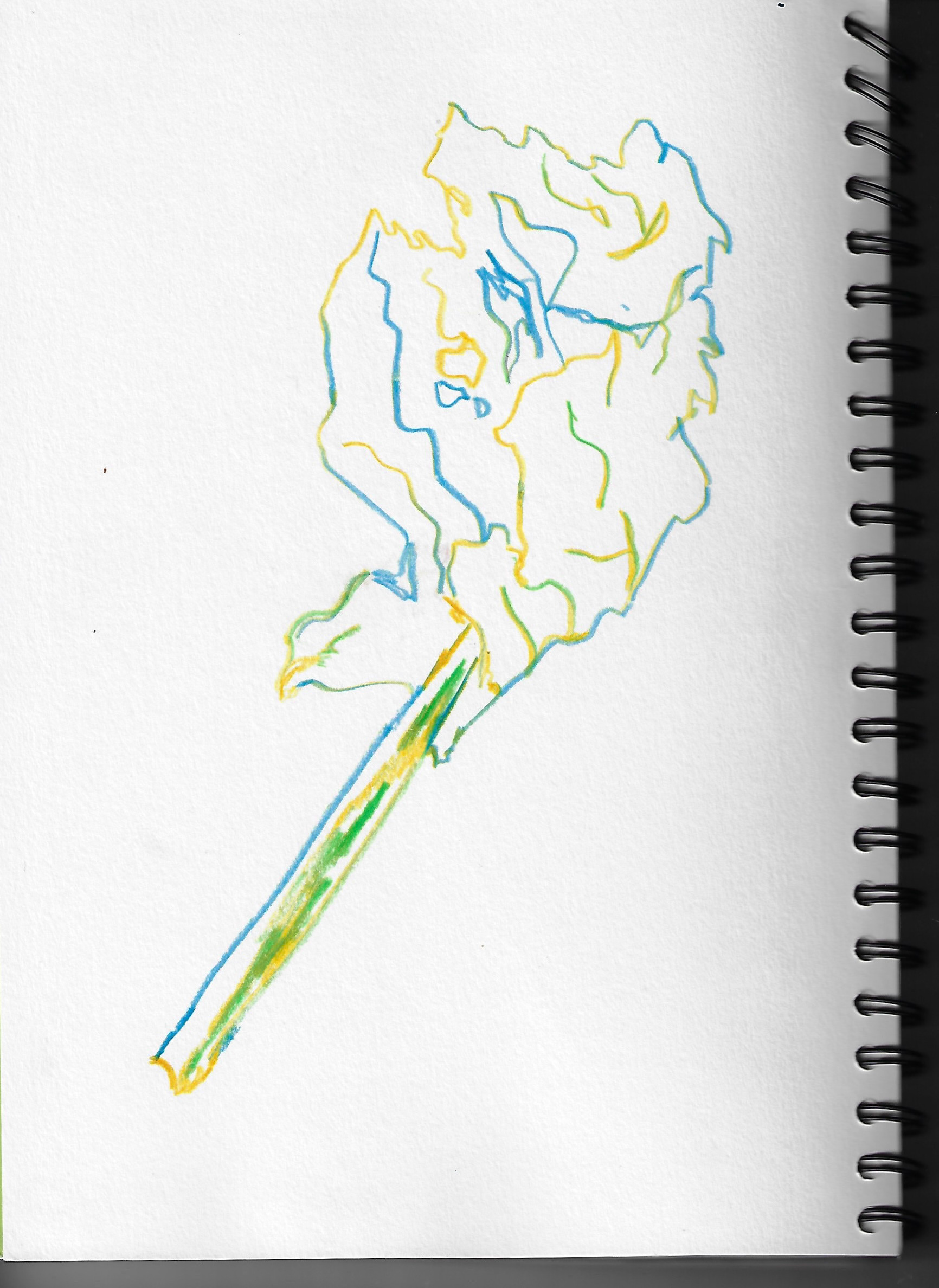
Sketchbook page 21 x 29.7 cm

Sketchbook page 21 x 29.7 cm
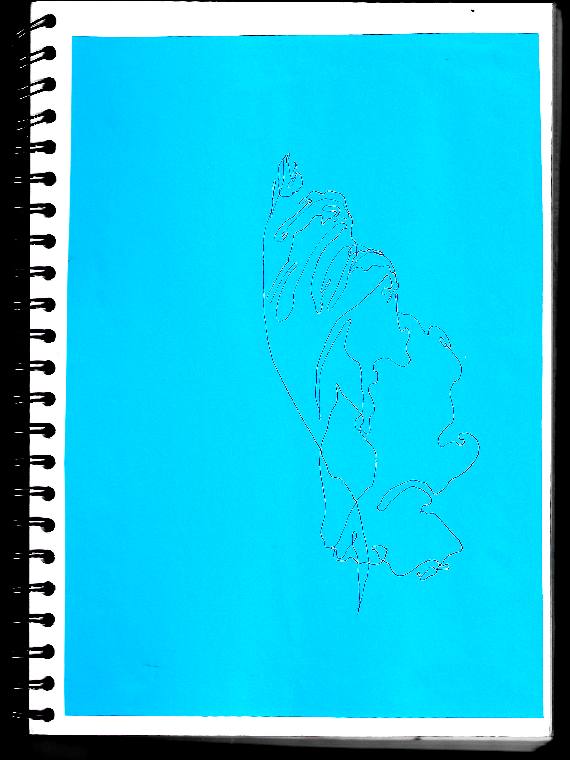
Sketchbook page 21 x 29.7 cm

Sketchbook page 21 x 29.7 cm
A variety of leaf drawings using different techniques to emphasise texture.
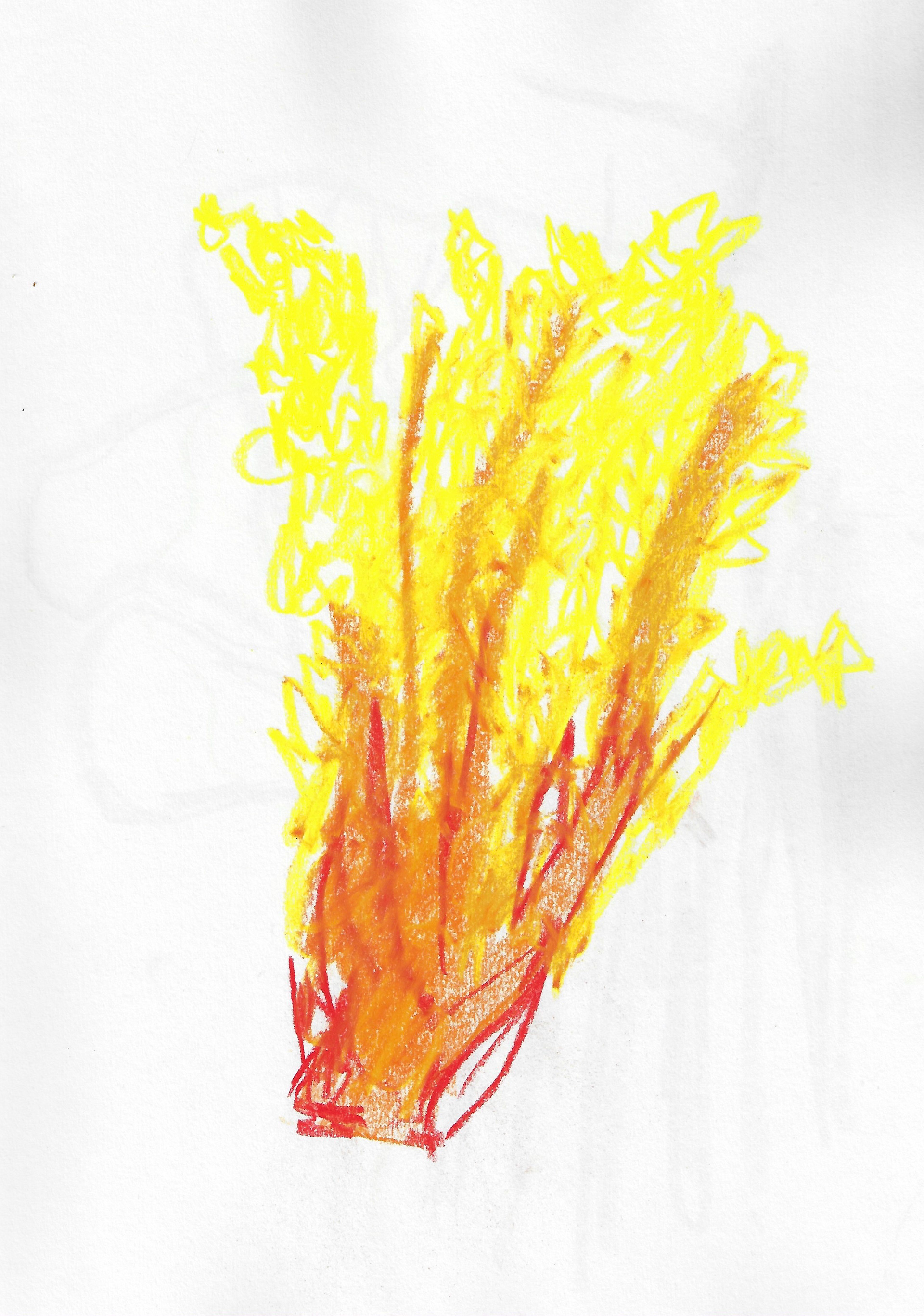
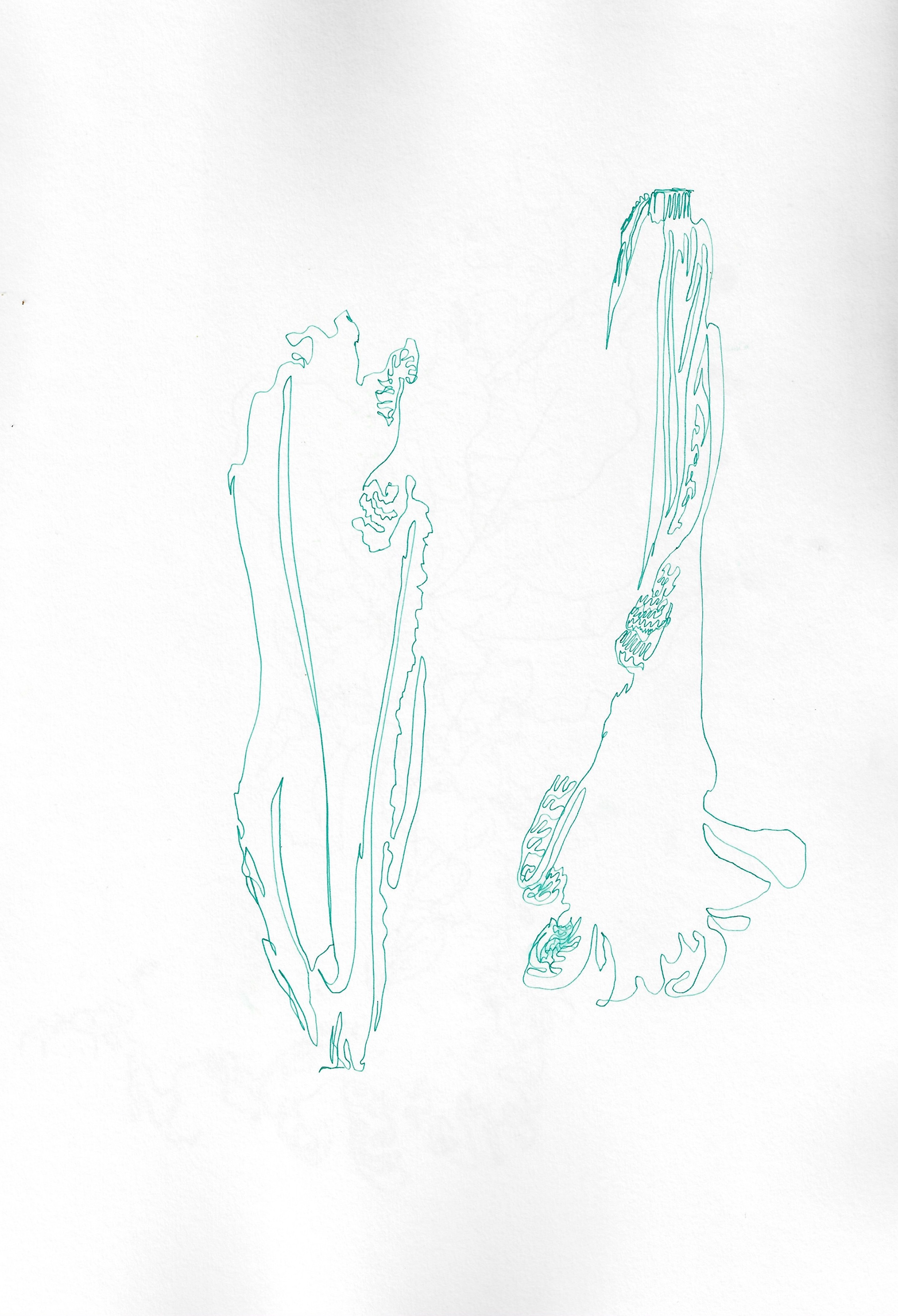
These techniques include continuous line drawing, building up the different contours of the leaf, alternating between three different colours, red, yellow and orange, building layers, looking at the organic shapes created in my drawings and isolating them and finally looking at how can isolated shapes still convey texture through the use of layers.
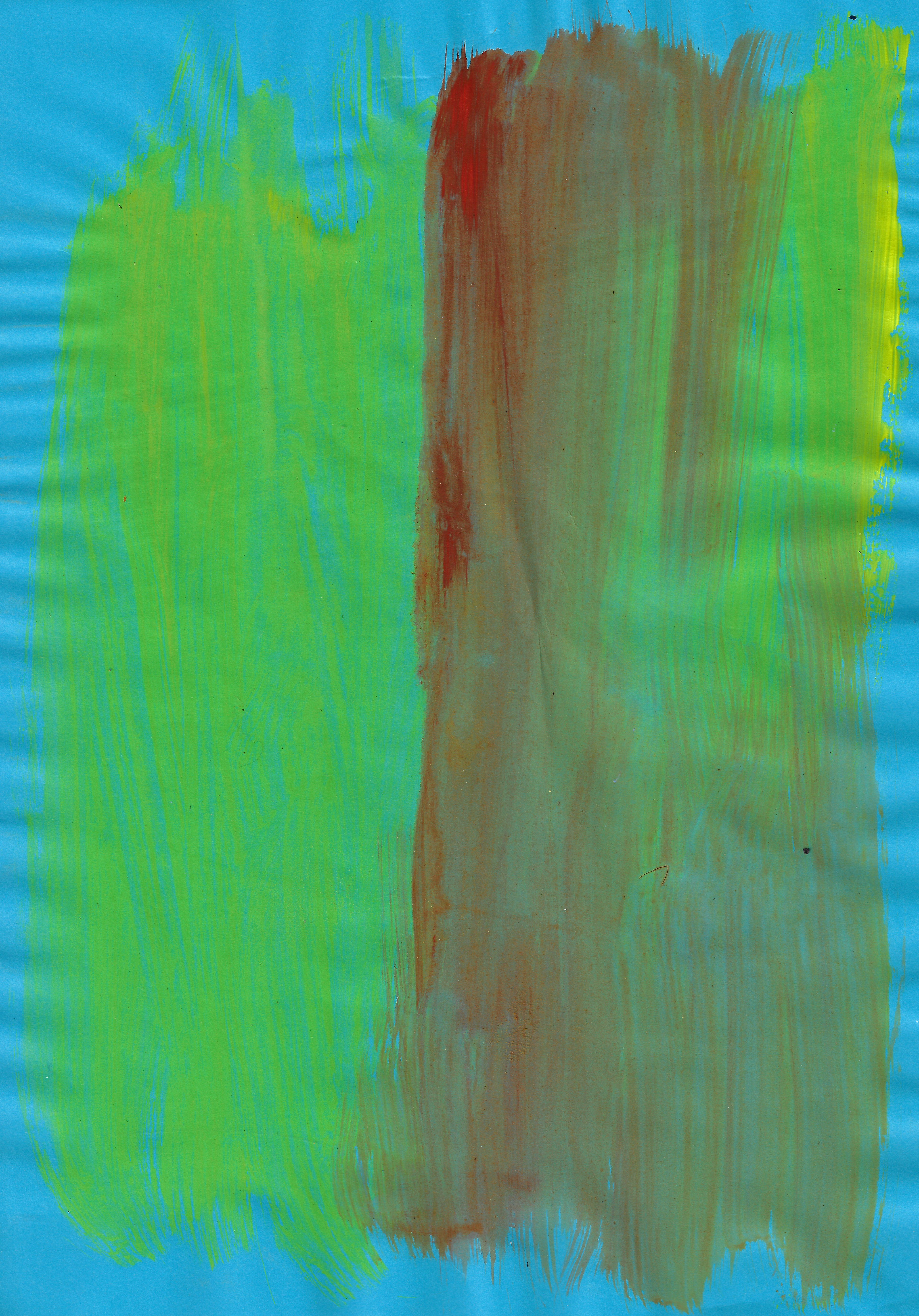
Acrylic on paper 21 x 29.7 cm
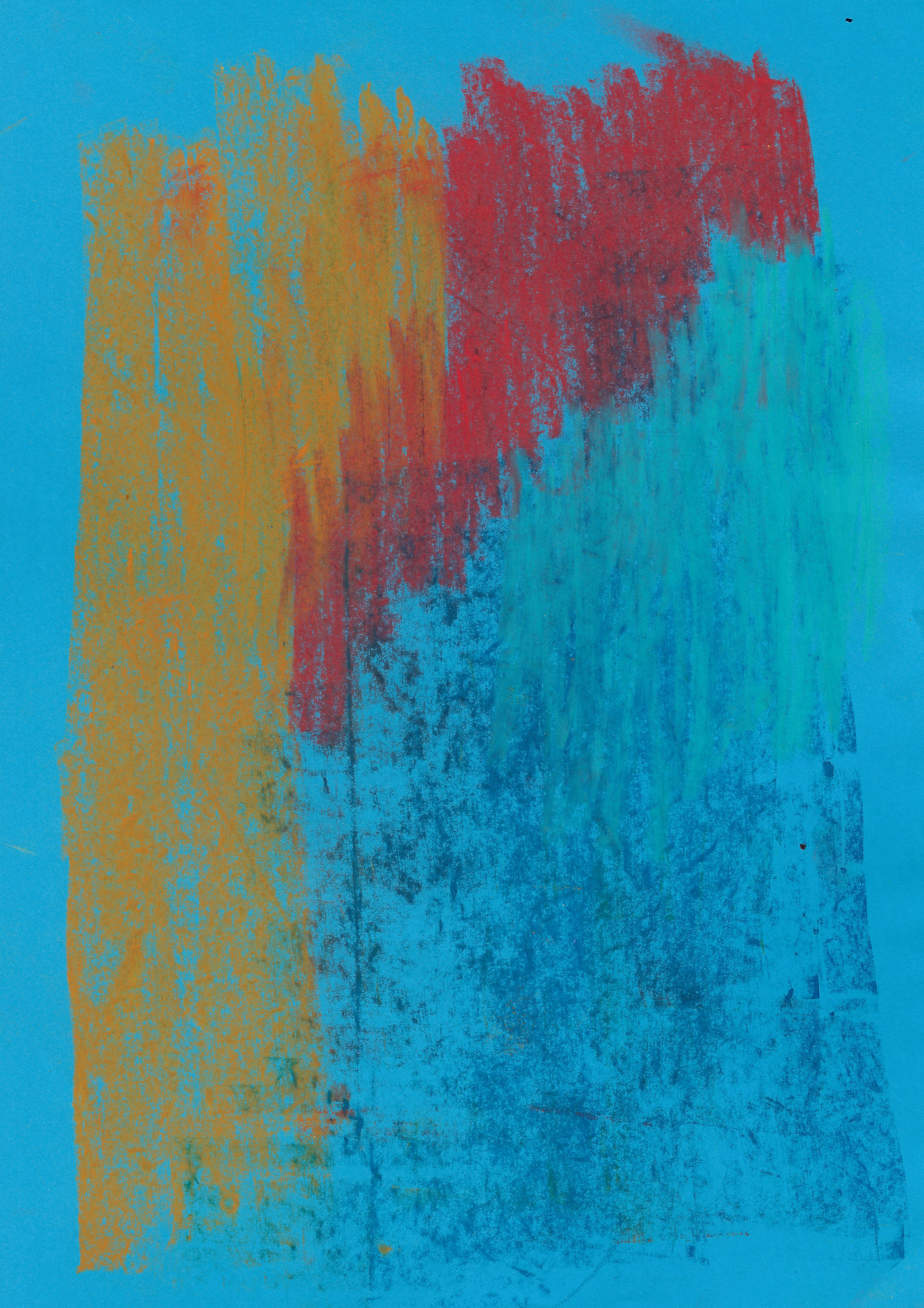
Chalk pastel on paper 21 x 29.7 cm
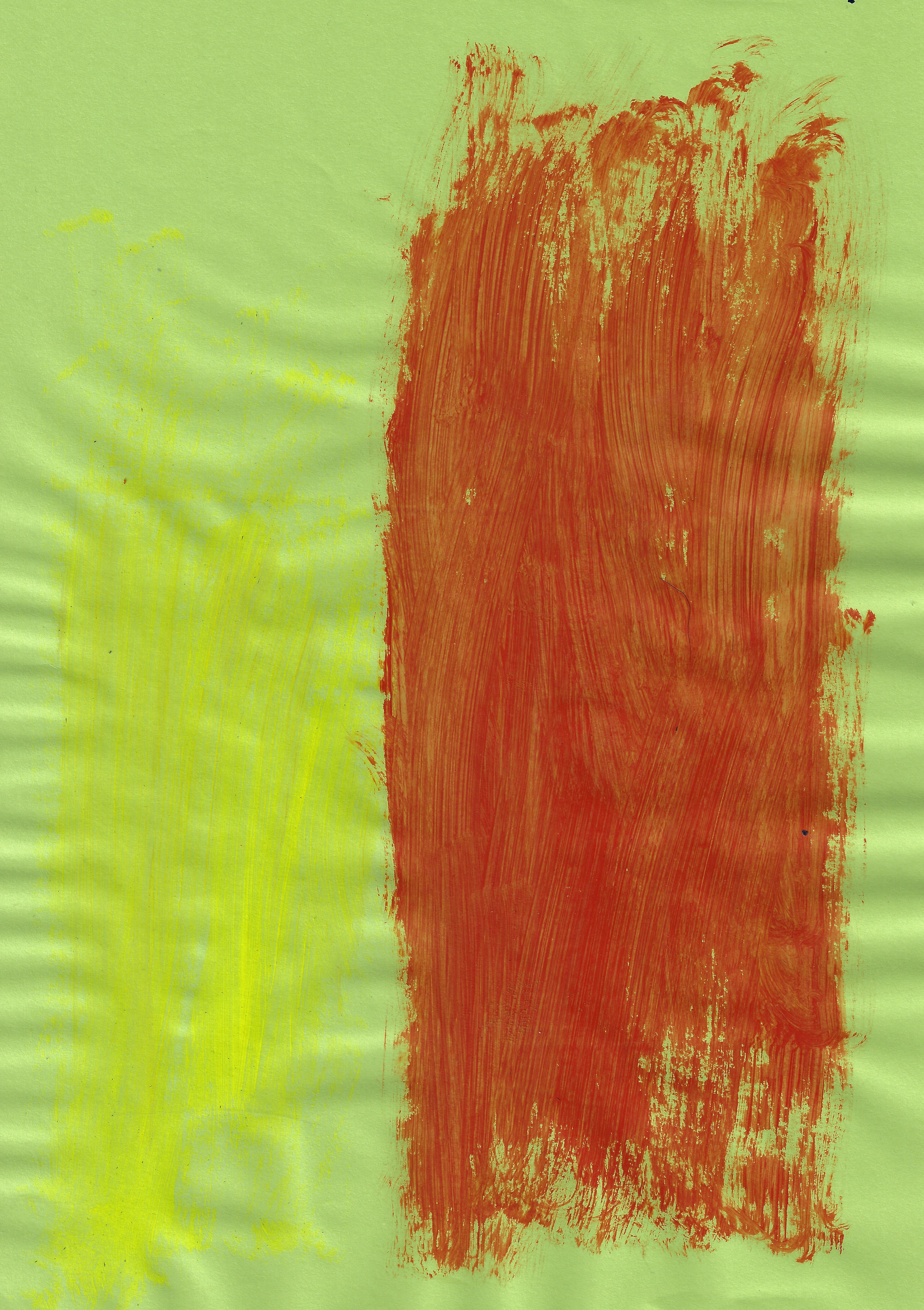
Acrylic on paper 21 x 29.7 cm
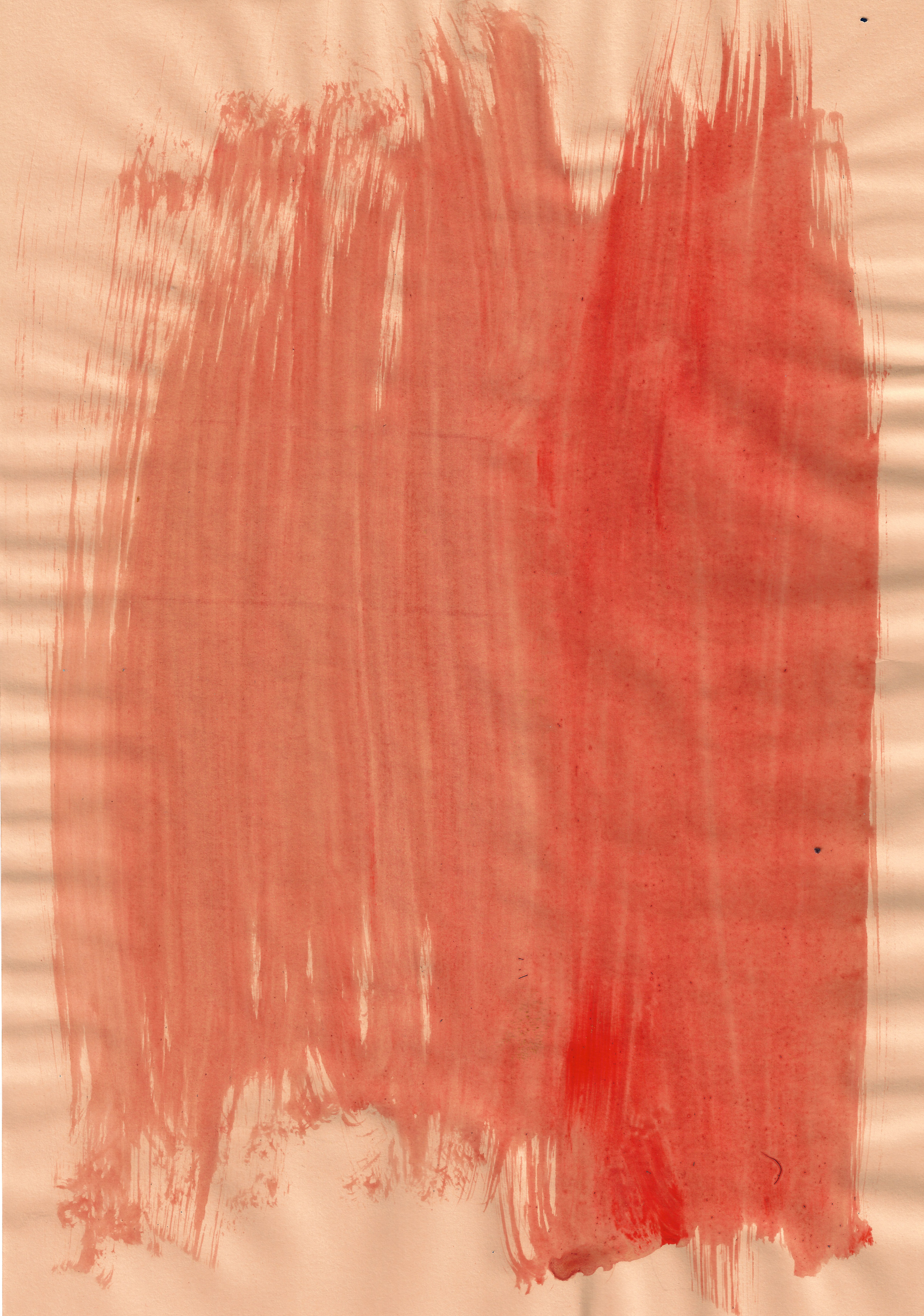
Watercolour on paper 21 x 29.7 cm

Chalk pastel on paper 21 x 29.7 cm
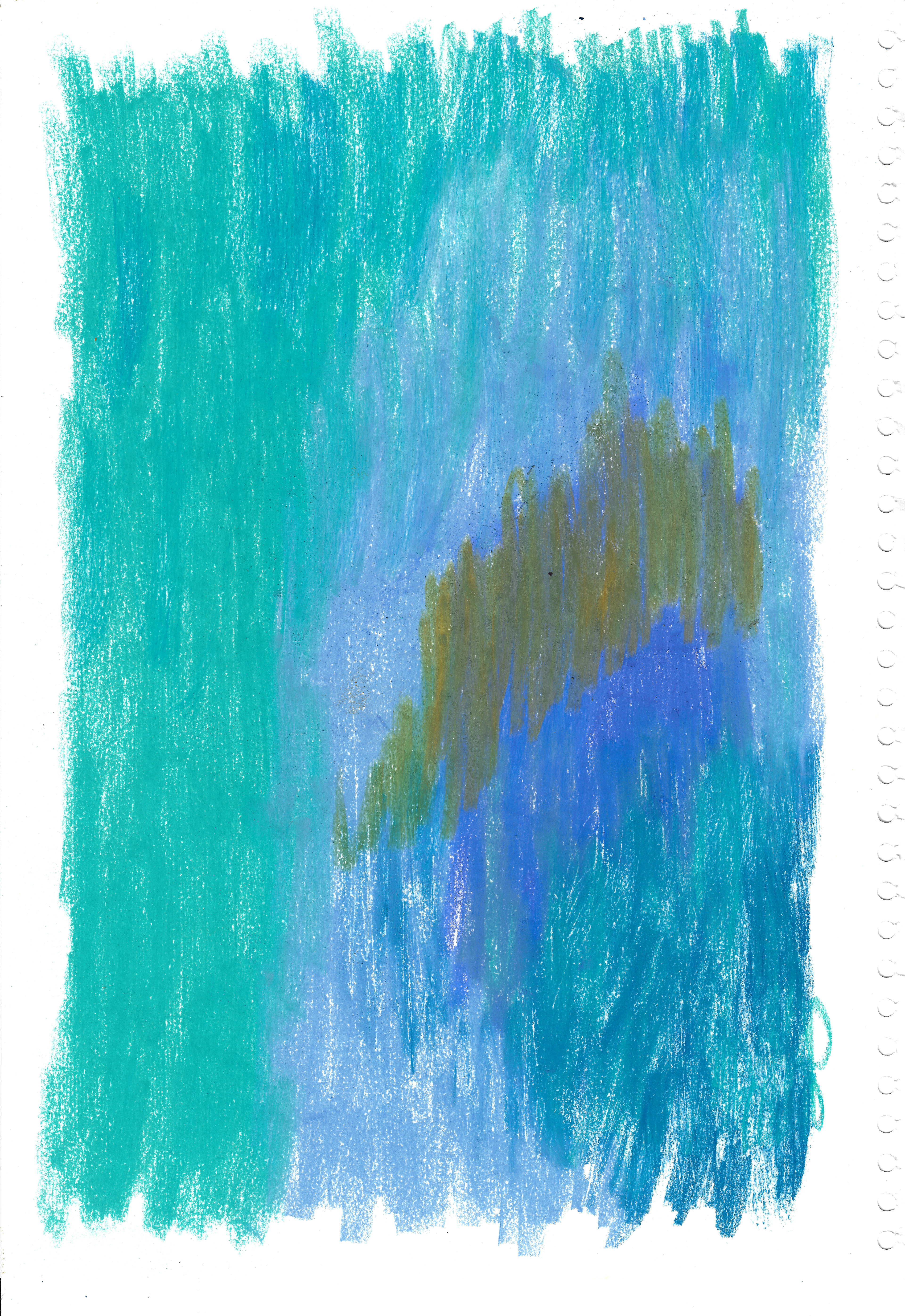
Chalk pastel on paper 29.7 x 42 cm
This exercise uses chalk pastels, acrylic and watercolour to paint paper in a variety of colours, exploring the variety in depth to suggest a textural quality.
Using a medium like watercolour or pastel will not just create a flat colour but will emphasise the variety of depth in the different tones and will add a textural element to the application of colour. Here I am exploring the degree of variation and gradient use of colour, imitating to an extent the earlier photographs I took of the velvet.
Typically, I feel this adds more of a personal dimension to my work through my direct variation in the use of colour through different mediums, whilst flat, regulated colour does not have the personal element of direct variation. It seems that there is a happy medium to be drawn between using standard flat colours and using a varying, tonal range to emphasise the degree of personal influence. From my research it is clear that a personal influence on the use of colour in my work is not only limited to the direct variation in depth but also the colour combinations. Even if standard colours are used this does not remove the personal dimension of my work, as there can be variation in the tone and hue on more of a regulated level, without direct application of mediums such as watercolour or pastel.
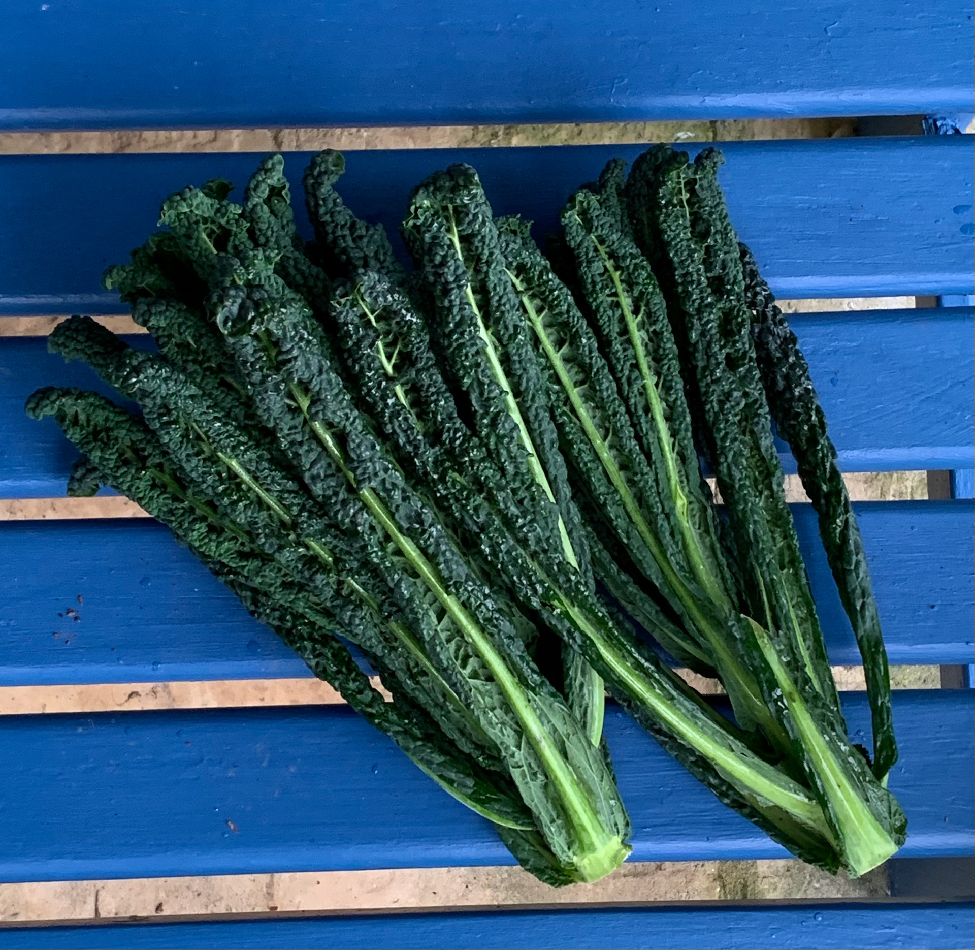
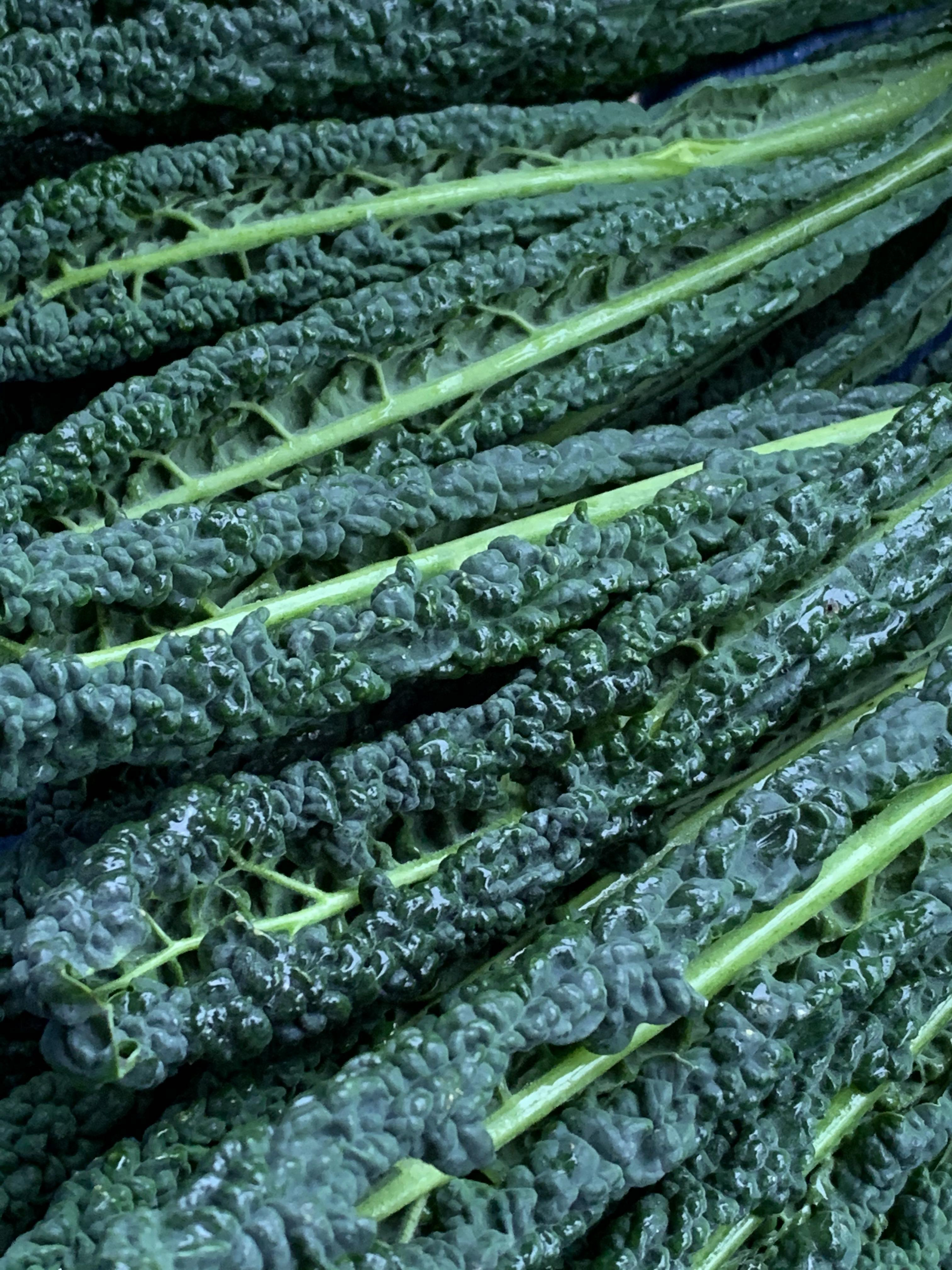

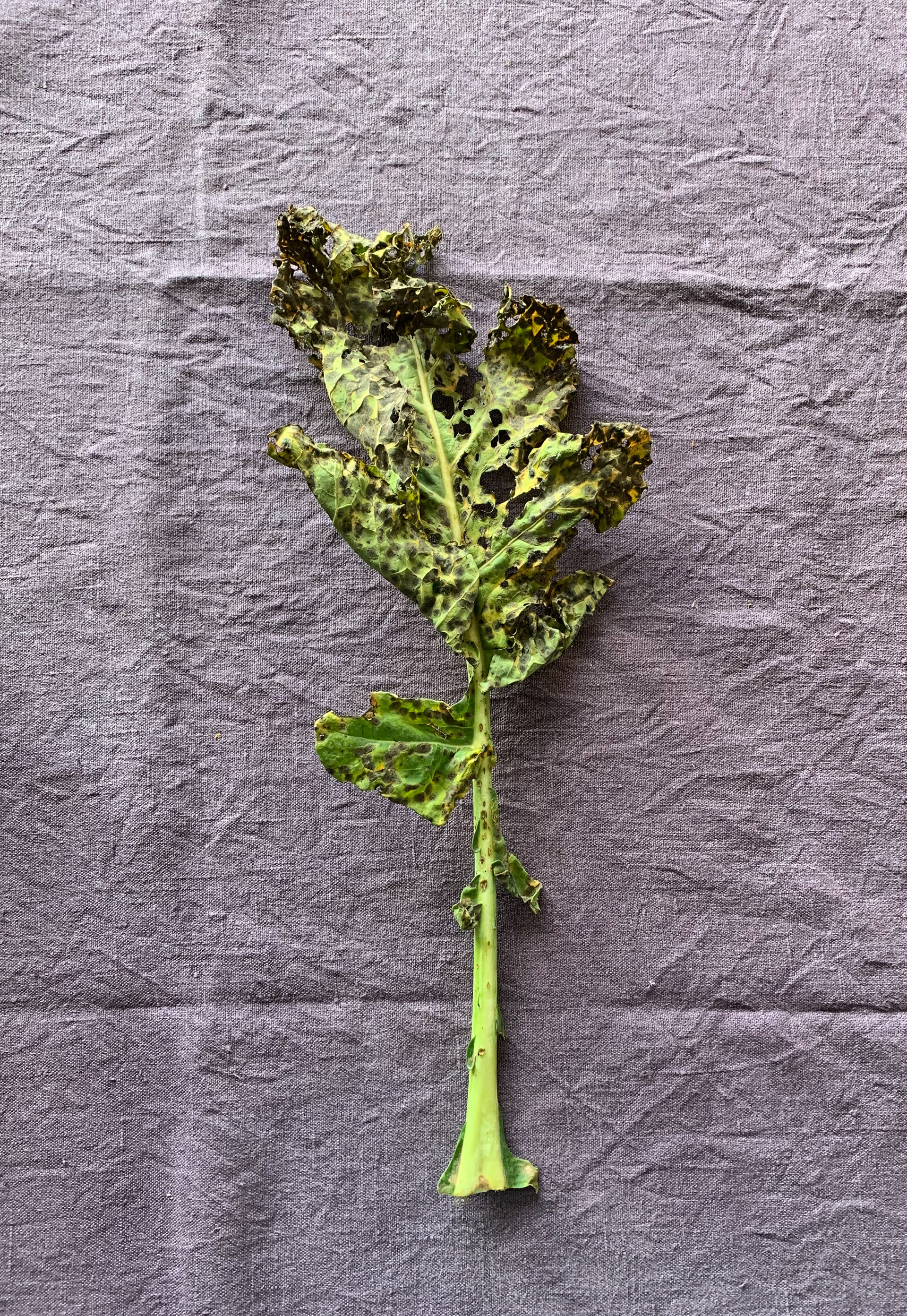
Sketchbook page 29.7 x 42 cm
Sketchbook page 29.7 x 42 cm
Sketchbook page 21 x 29.7 cm
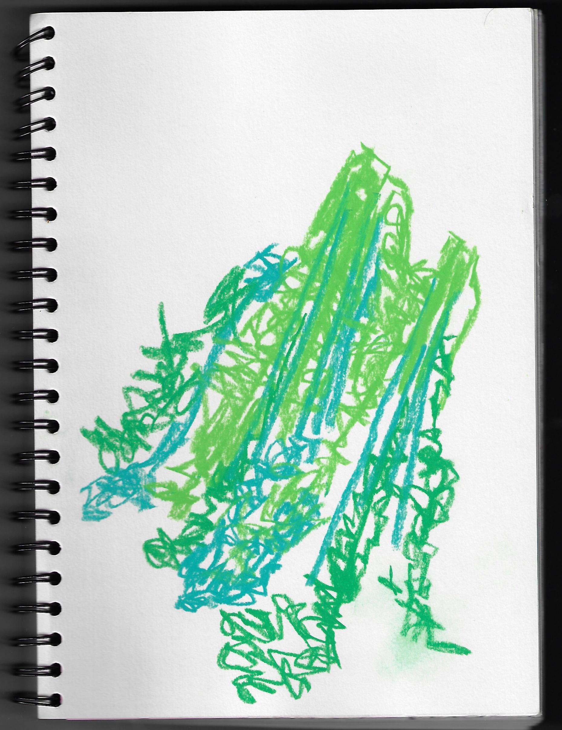
This depicts observational drawing of leaves of different textures using chalk pastels, substituting different colours, exploring how colour shows up reality in the image and how substituting in a completely different colour can transport the image into a completely different reality.
Sketchbook page 21 x 29.7 cm
Sketchbook page 21 x 29.7 cm
These are more observational drawings of kale, further exploring the translation of texture through different drawing techniques and mediums. This study isolates shapes on kale leaves and just outlines the isolated shapes on the kale leaf and shapes within these.
Sketchbook page 29.7 x 42 cm
Sketchbook page 29.7 x 42 cm
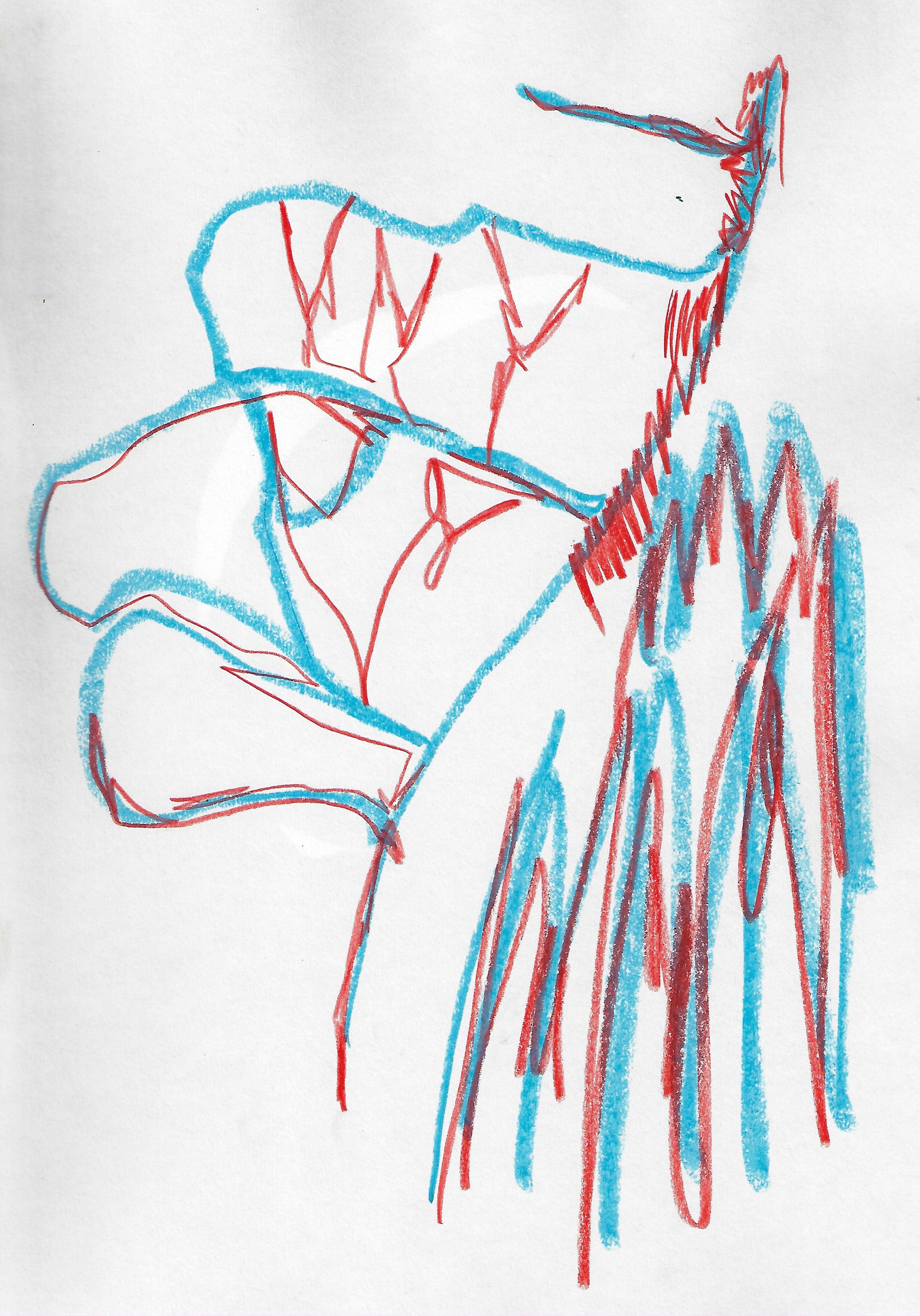
An observational drawing of oranges, using different colours to illustrate different elements. Overlapping felt tip strokes slightly thickens the colour, giving it an opaquer version with just one stroke of the felt tip pen, producing a variant of the original colour. Here is also an observational drawing of a lily, using different colours for different textures and elements of the lily.
Sketchbook page 29.7 x 42 cm
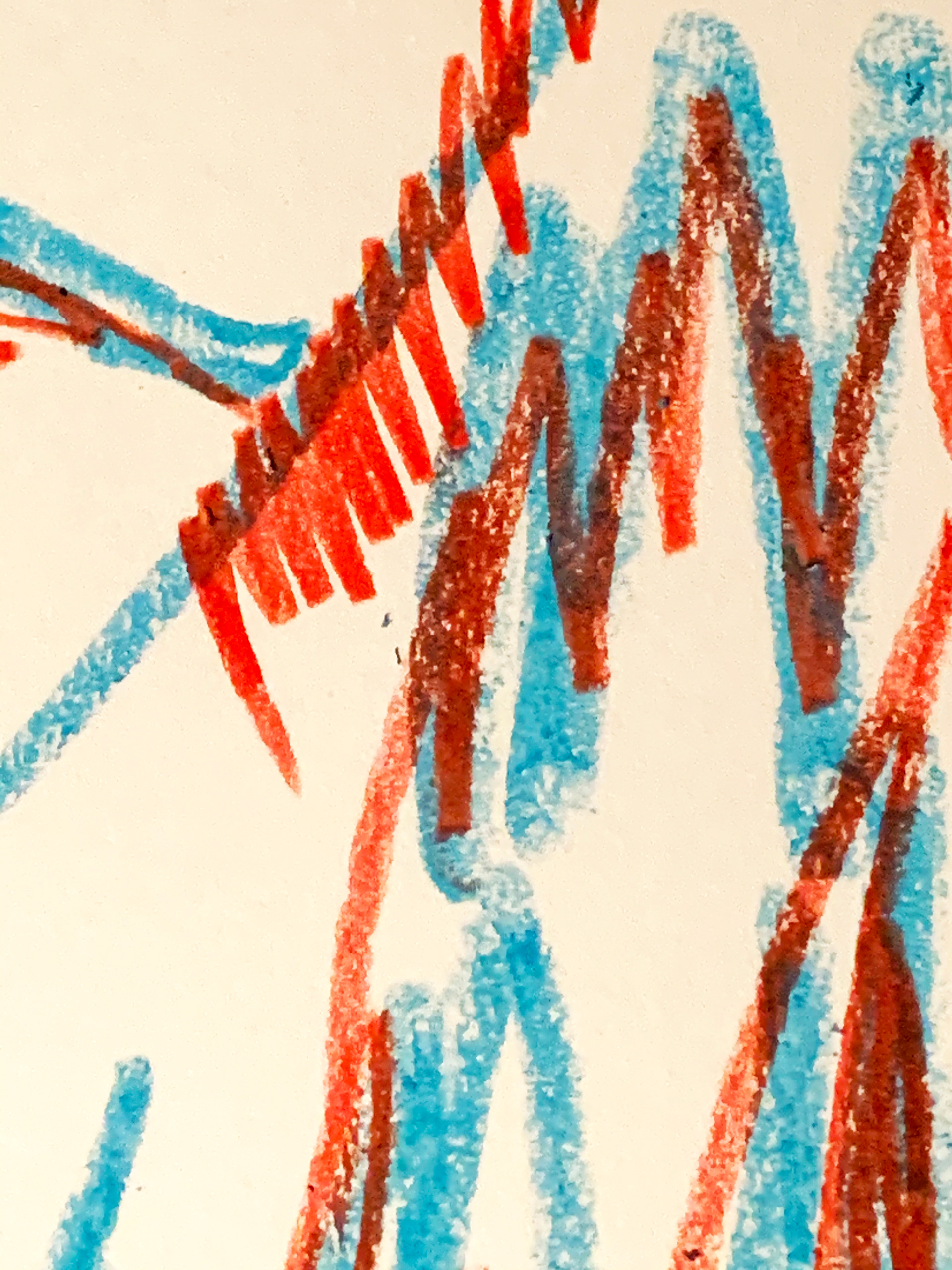
Detail of sketchbook page
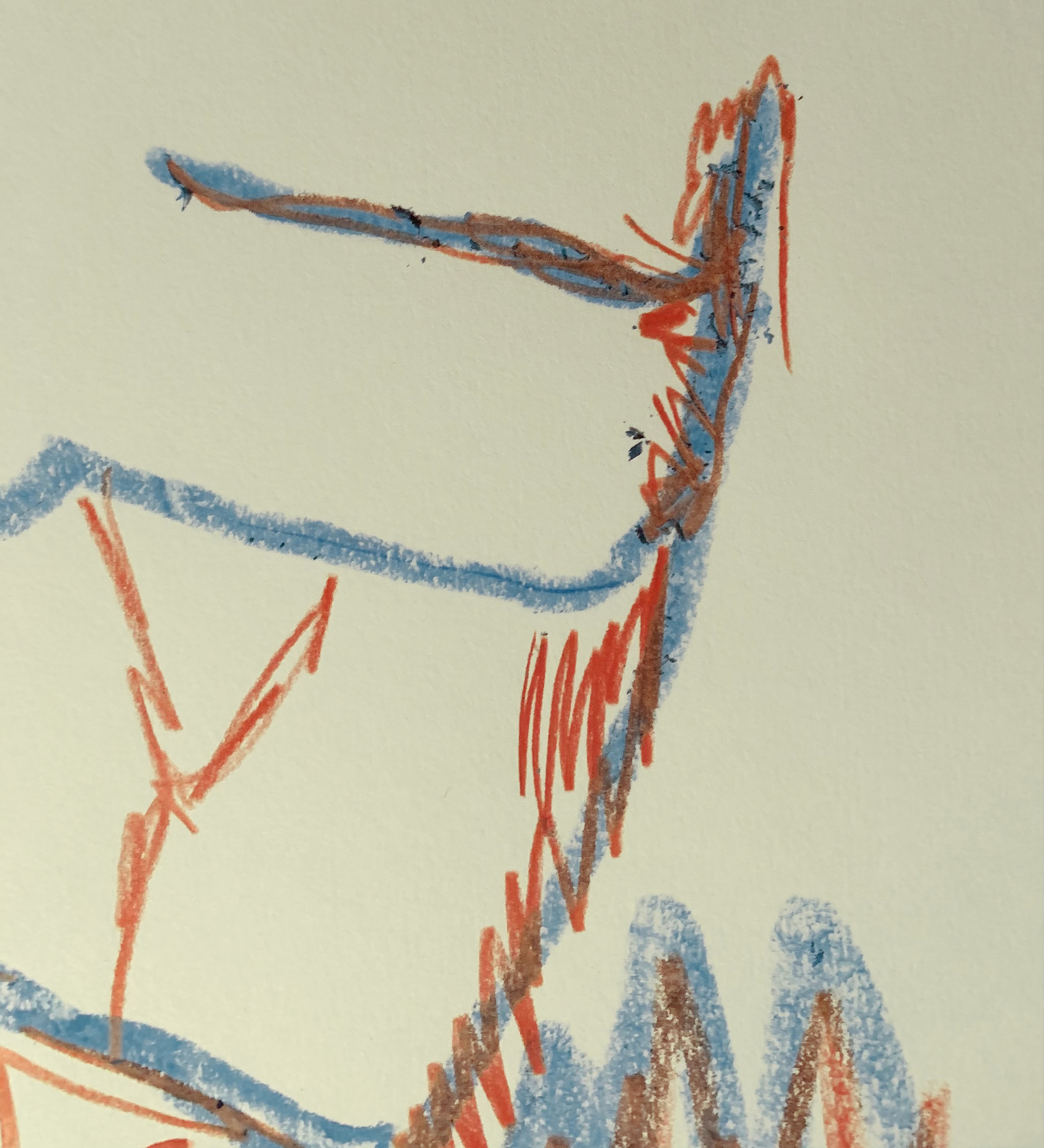
Detail of sketchbook page
Exploring the texture of using a thick pencil on top of oil pastel.
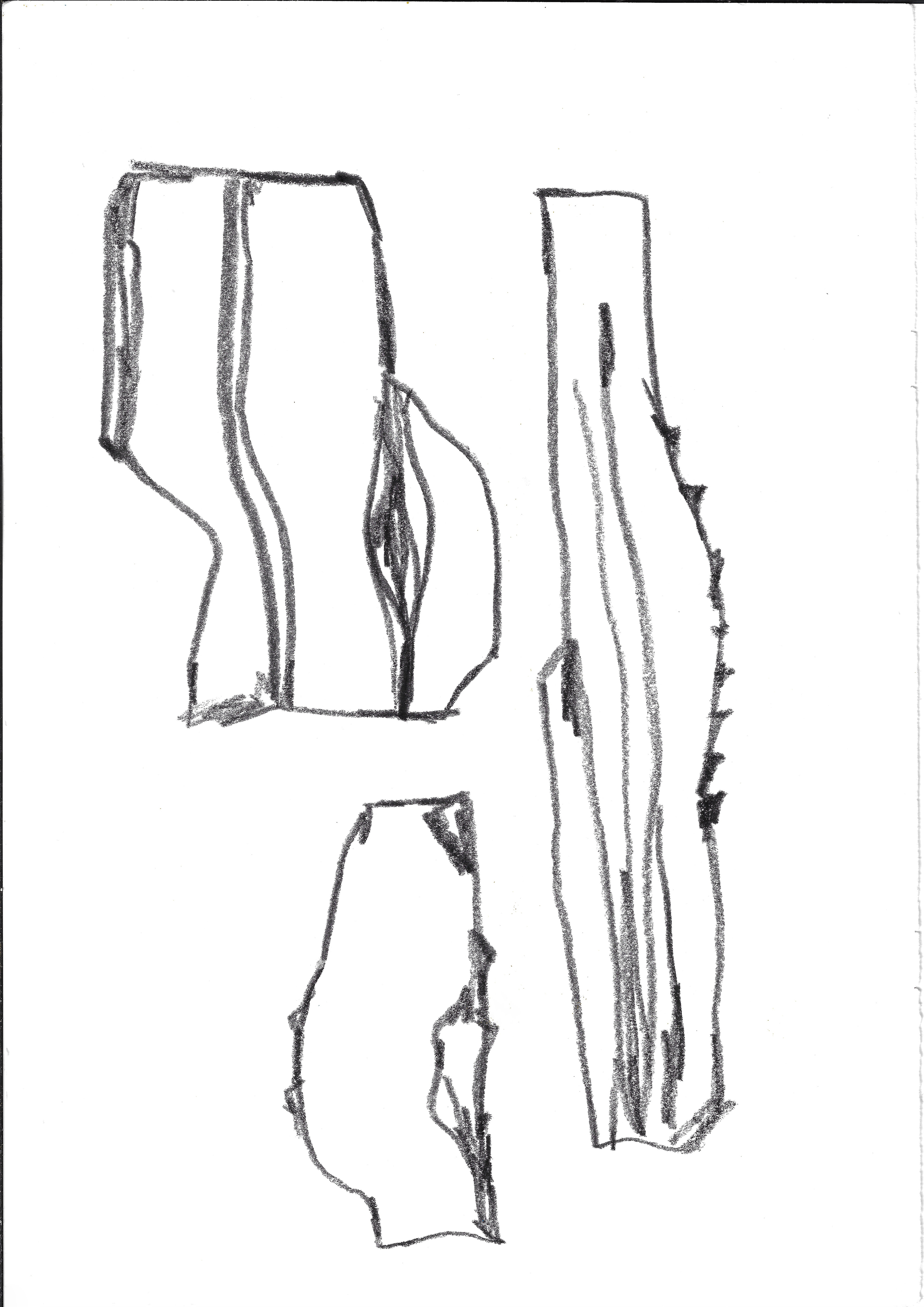
21 x 29.7 cm
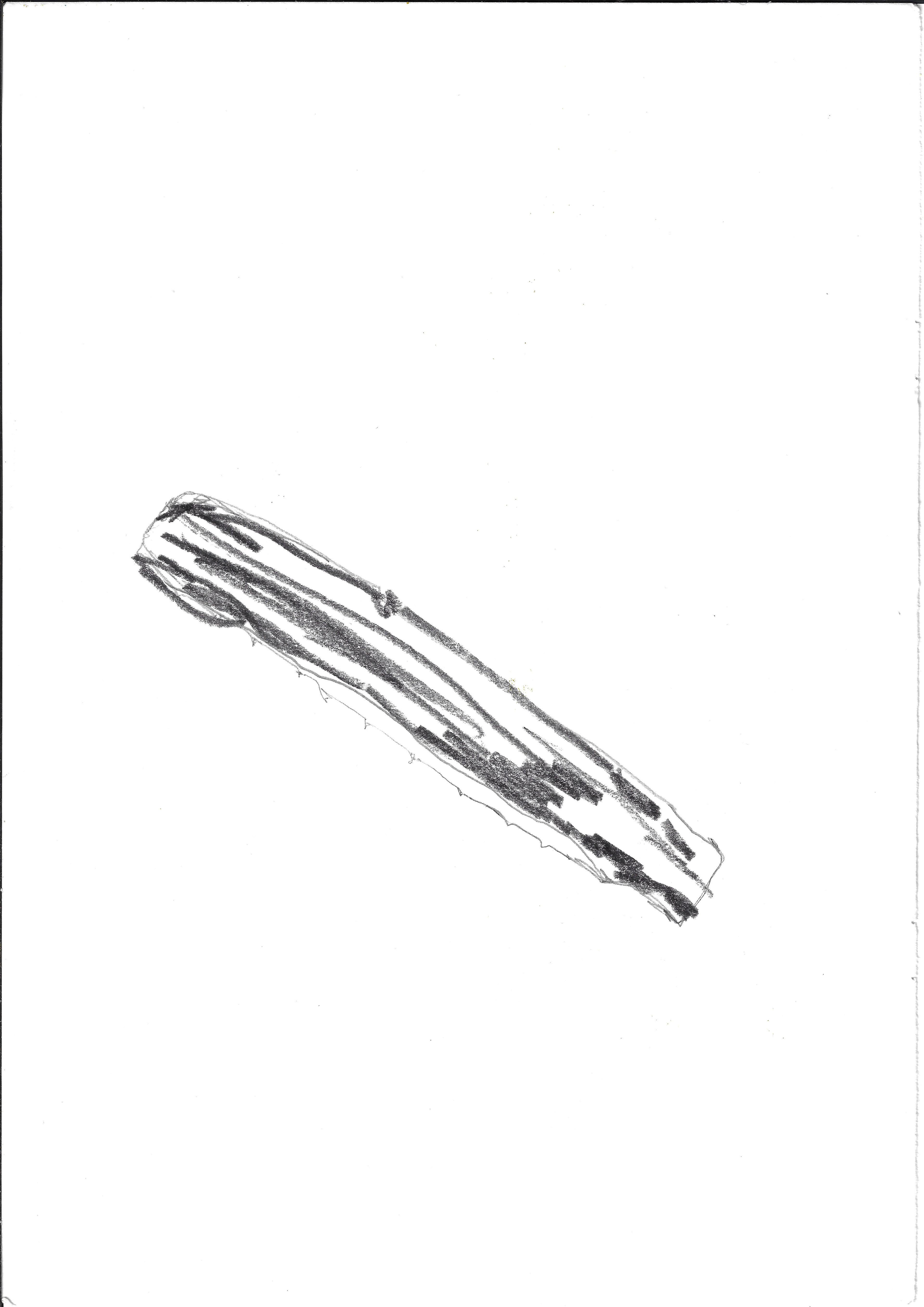
21 x 29.7 cm
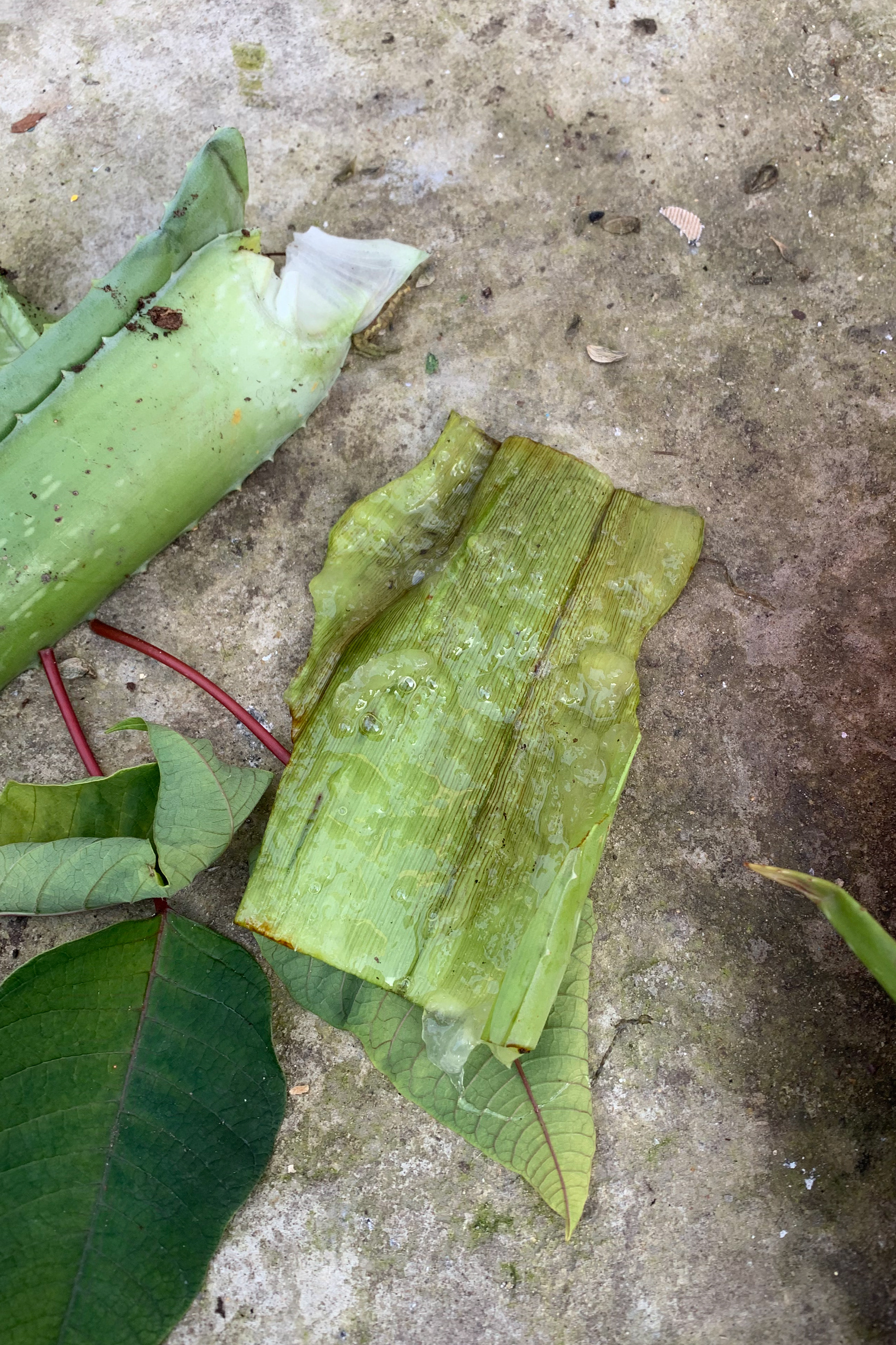


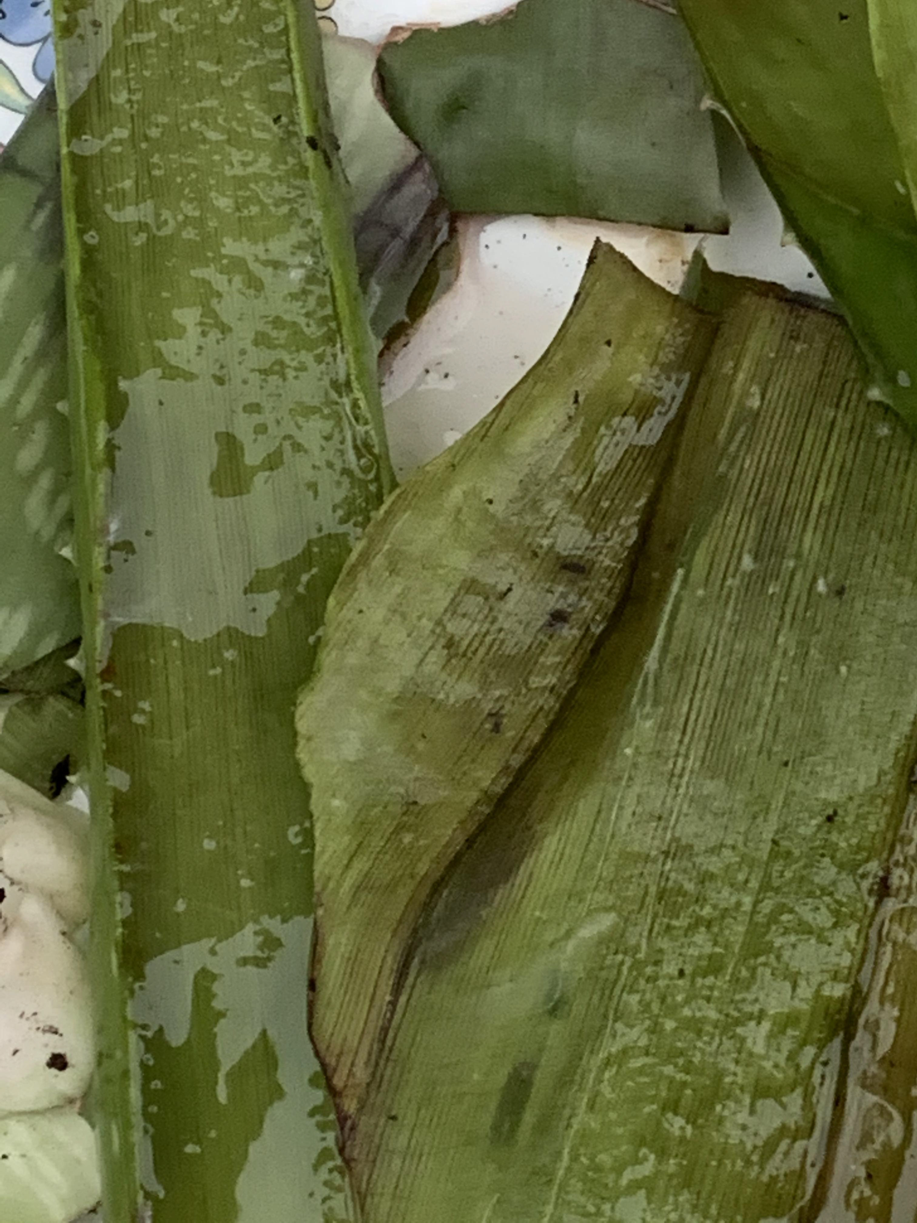
These are slices from a couple of the arms of an aloe vera plant, drawing and photographing the texture of the inside, thinking about how to convey this texture through sight.

Sketchbook page 21 x 29.7 cm

Sketchbook page 21 x 29.7 cm
Josef Albers exercises from his book 'Interaction of Color' using coloured paper, but there is a lack of transparency when coloured paper is overlapped so using the app on my iPad which accompanies the book, this was researched further. Examples of this research can be found in the 'Research and Critical Reflection' section.
21 x 29.7 cm
21 x 29.7 cm
21 x 29.7 cm
21 x 29.7 cm
21 x 29.7 cm
21 x 29.7 cm

21 x 29.7 cm

21 x 29.7 cm
21 x 29.7 cm

21 x 29.7 cm
21 x 29.7 cm
21 x 29.7 cm

21 x 29.7 cm
21 x 29.7 cm
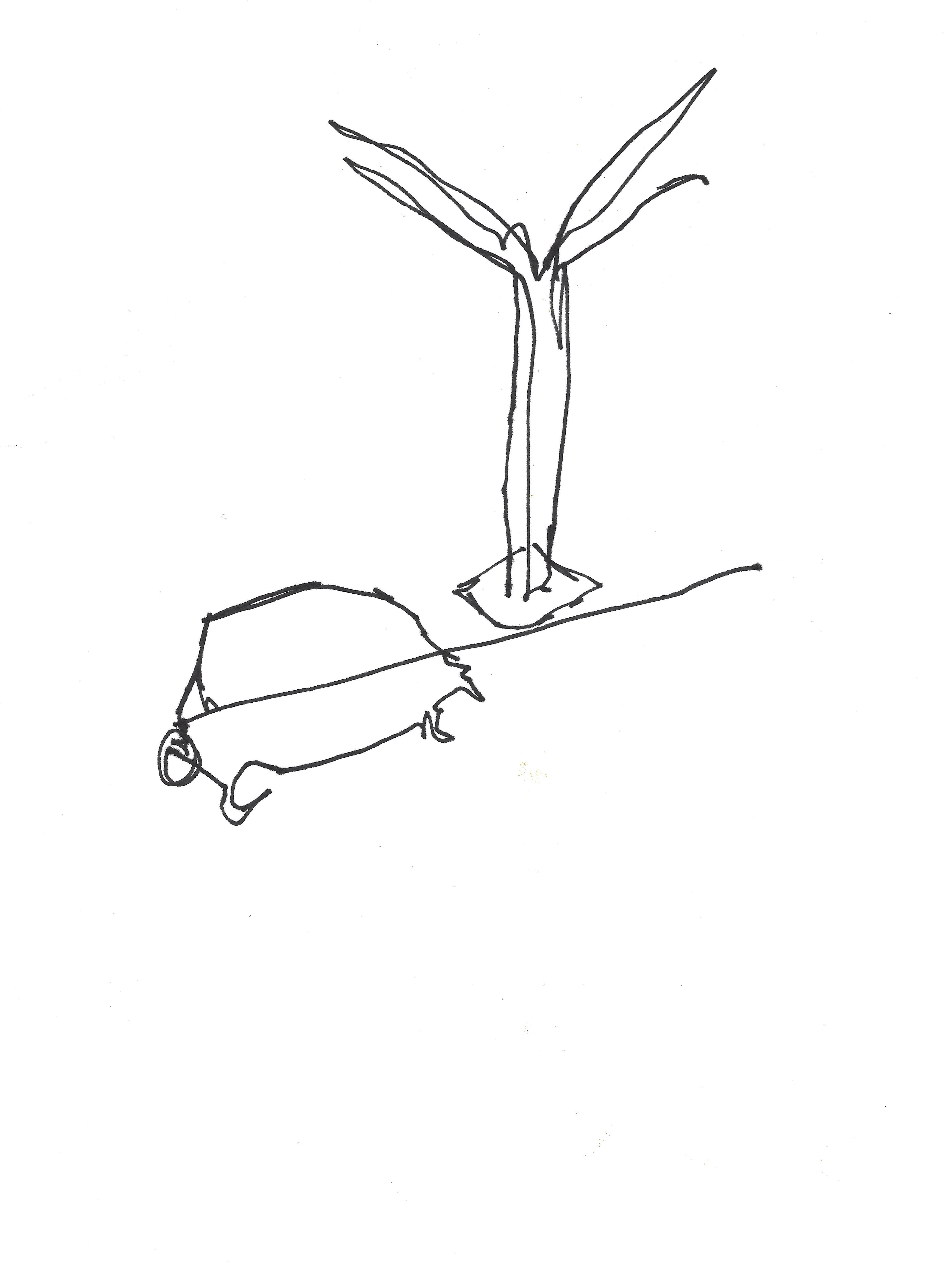
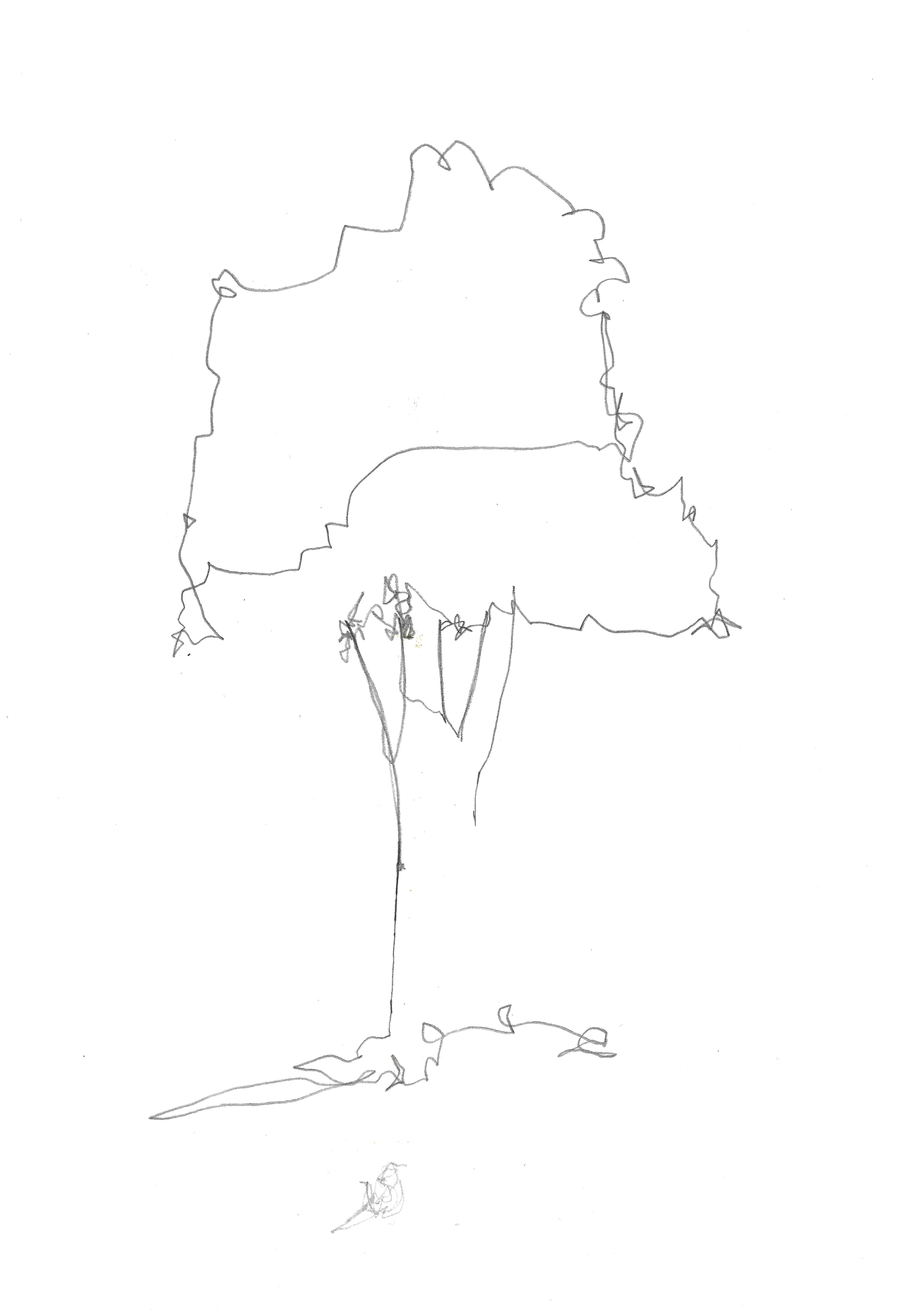
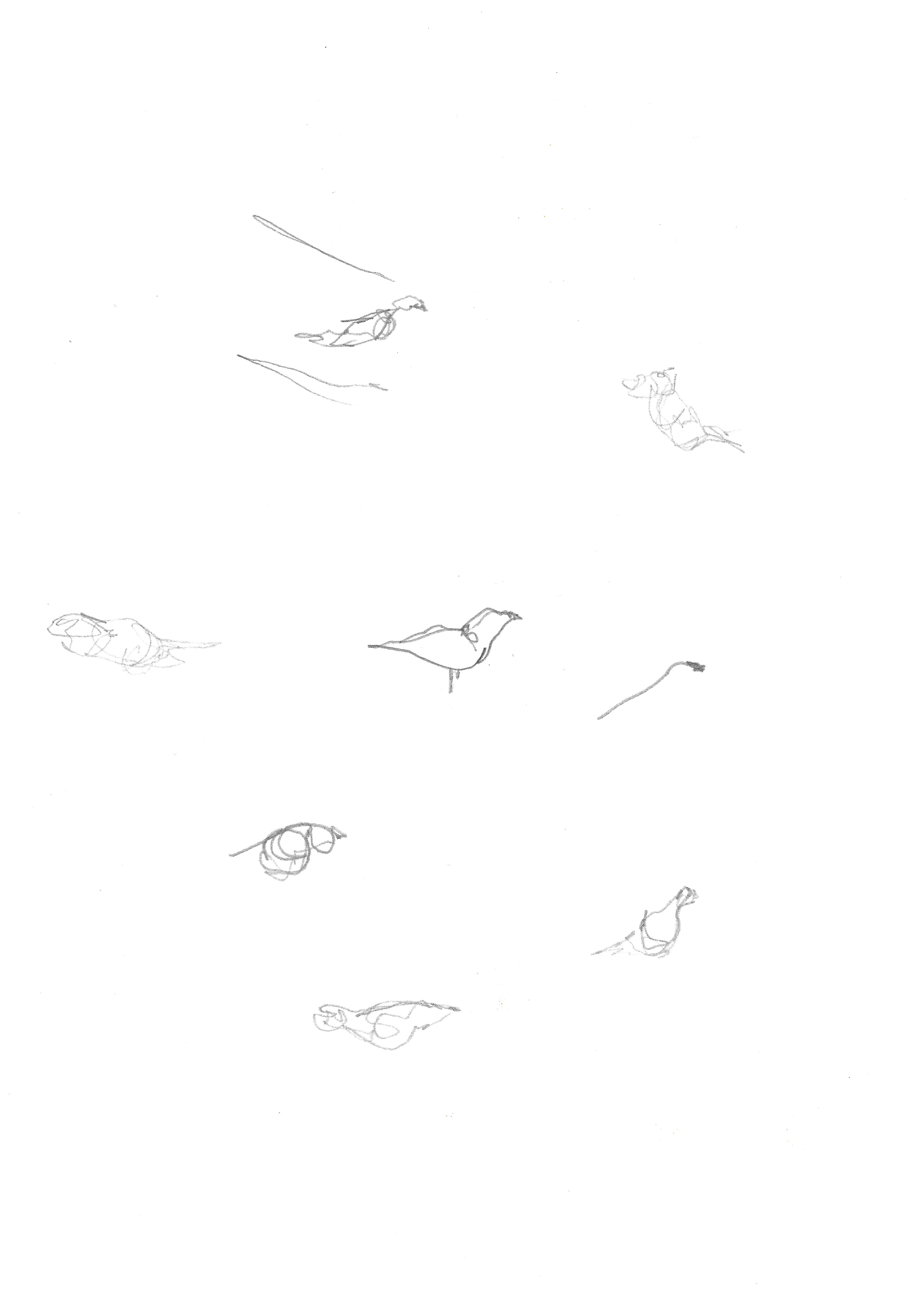
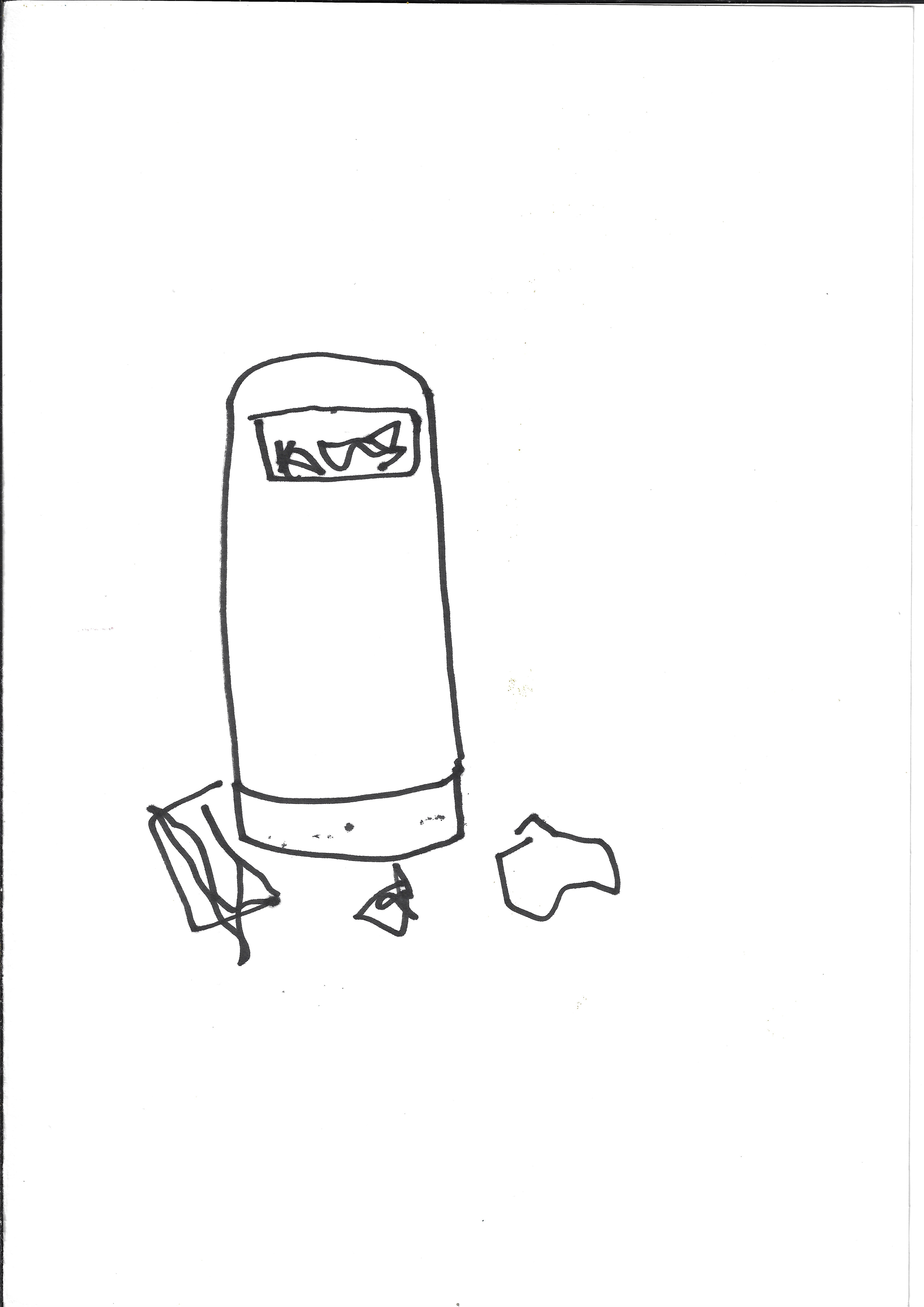
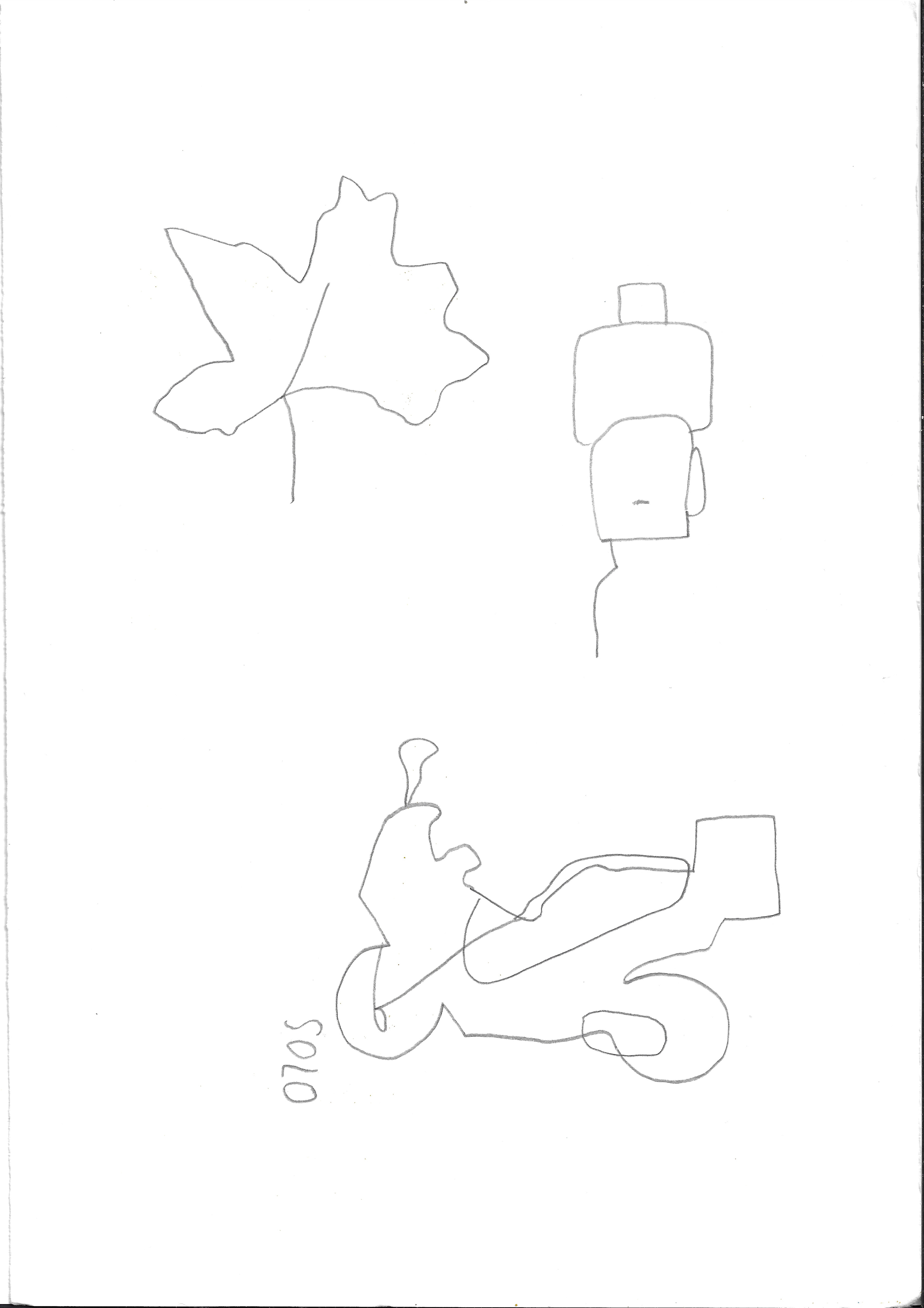
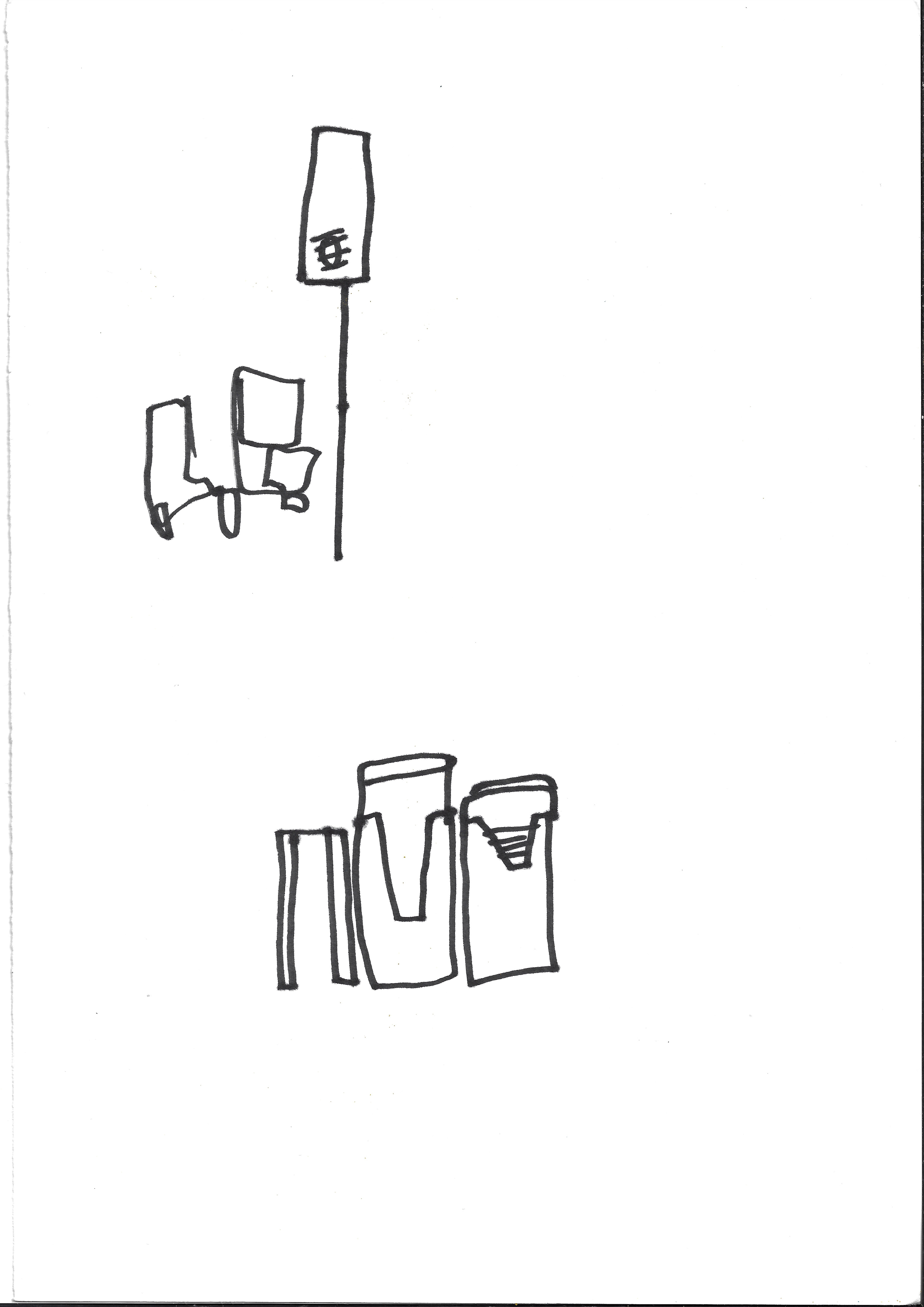
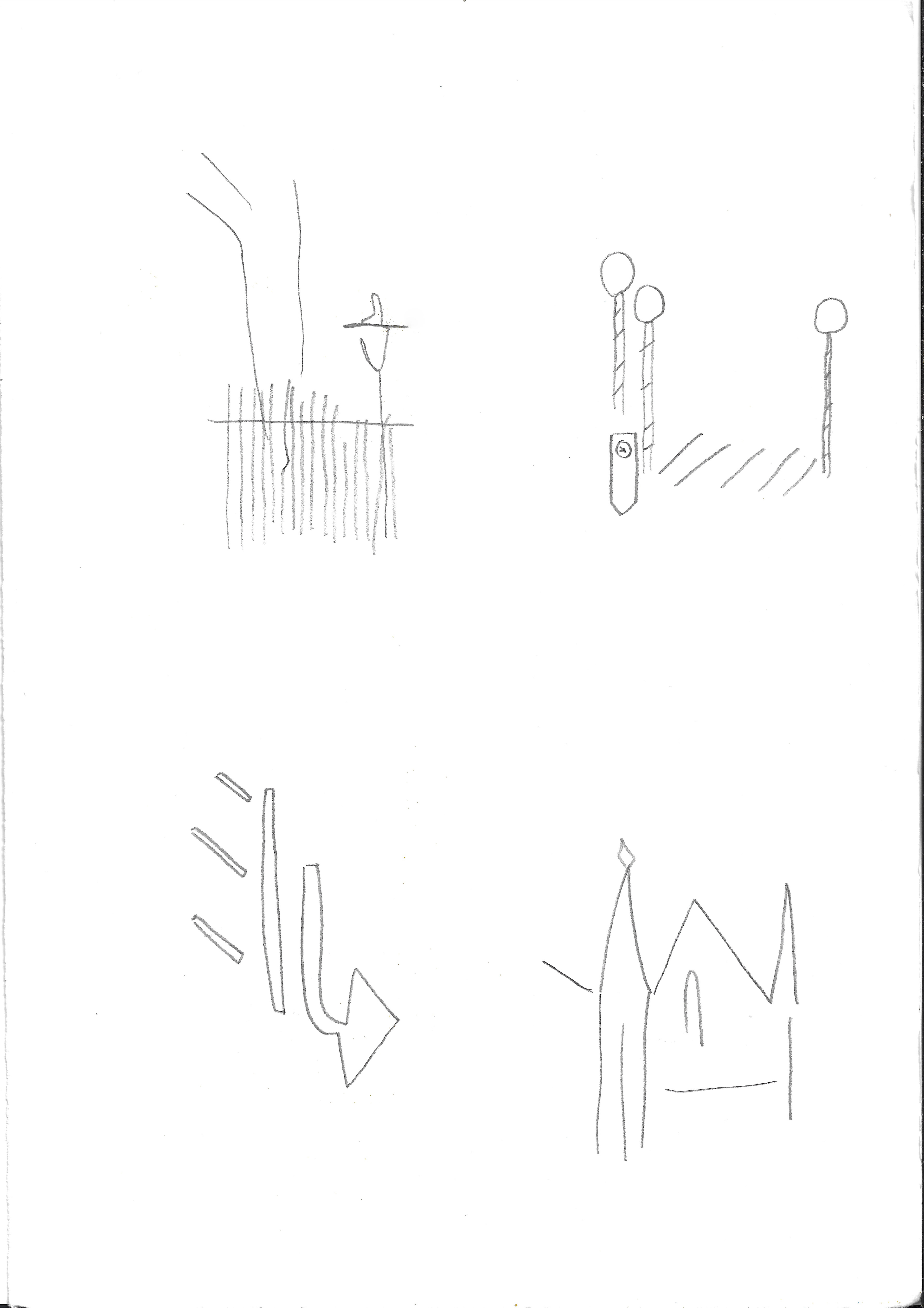
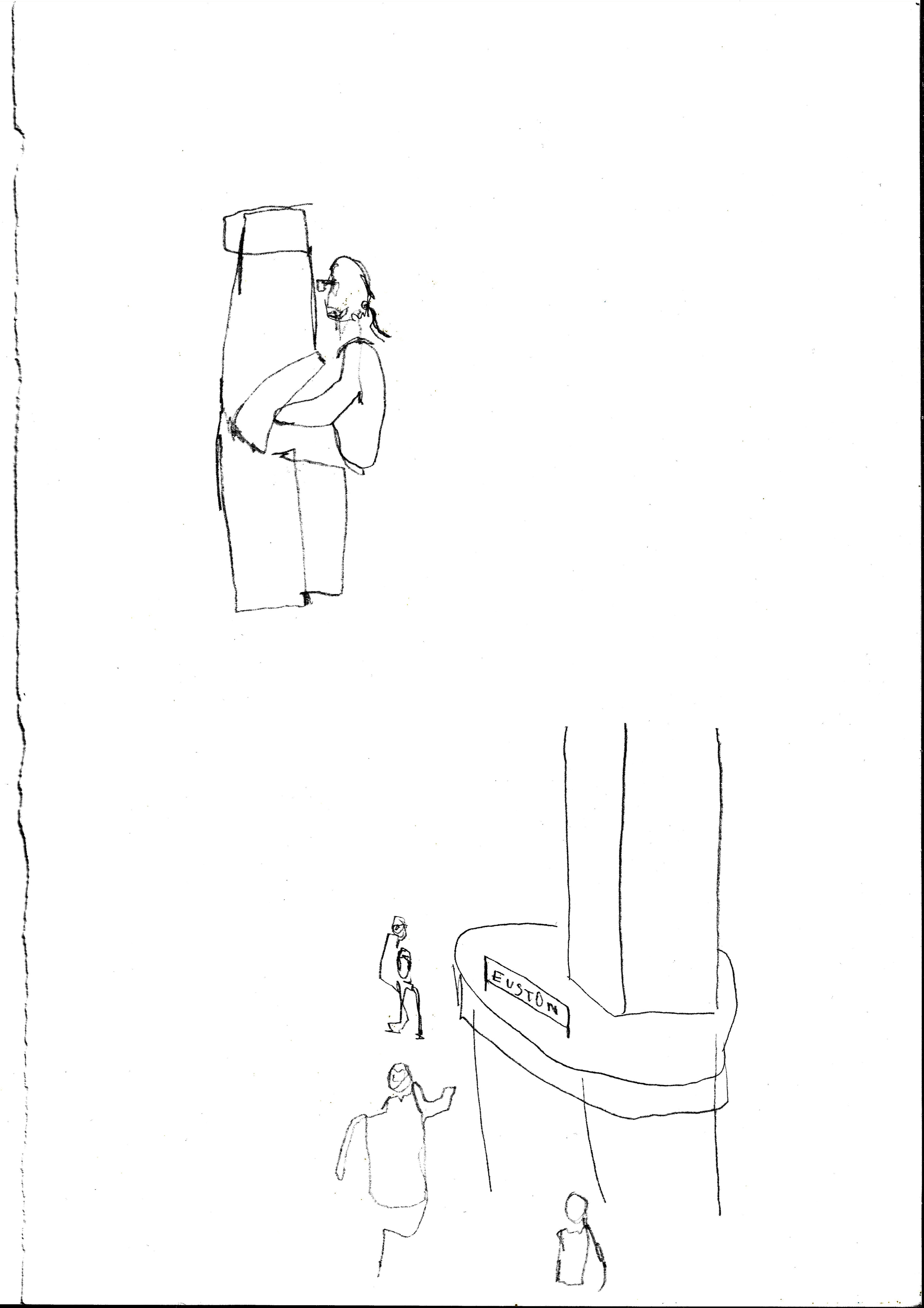
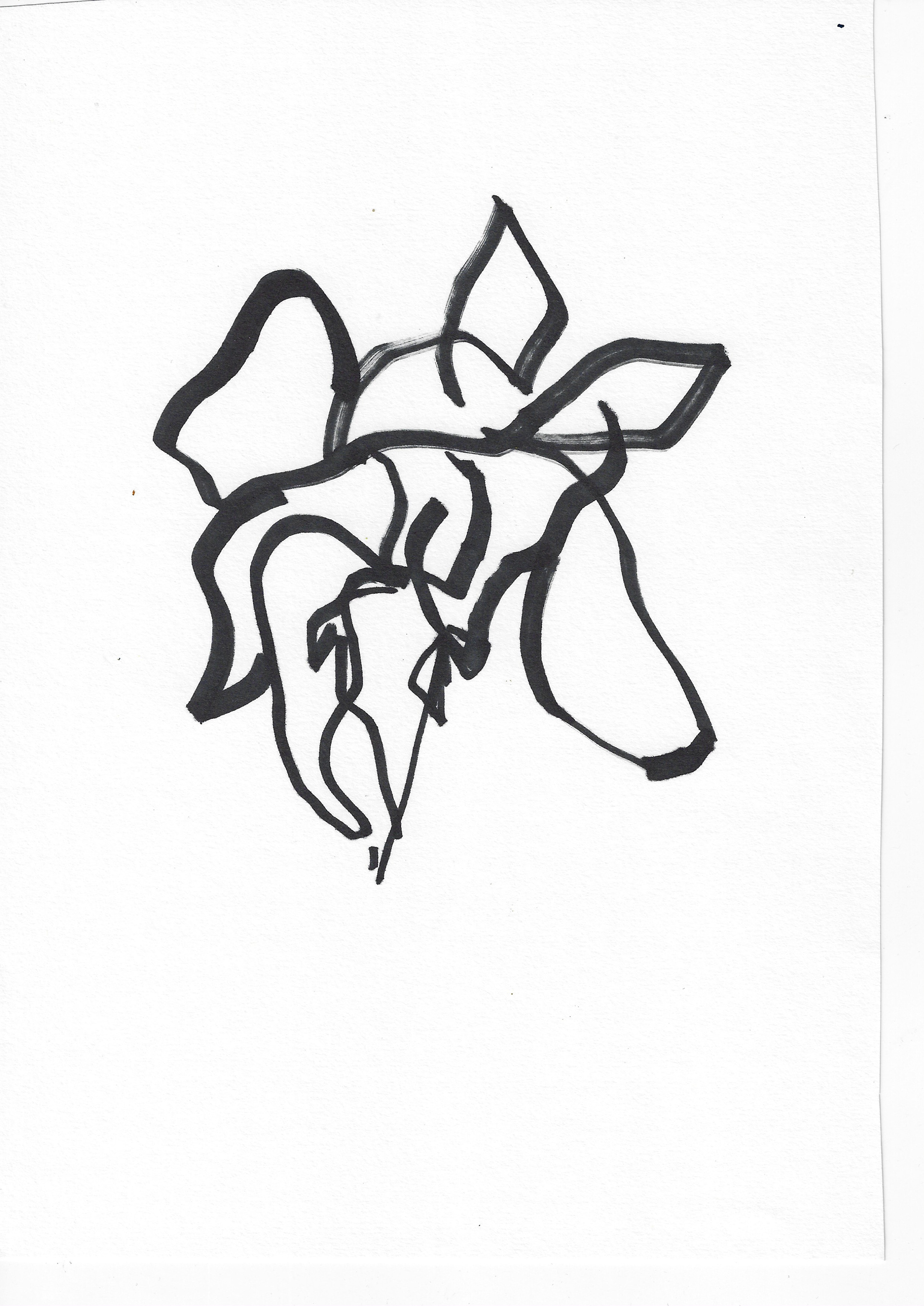
This is the start of a routine of doing simple line drawings of my surrounding environment when I go for my daily walk. Movement through simple line drawings, I enjoy doing simple line drawing as it conveys the individualistic sense of my conscious and subconscious encounters with my environment.
Sketchbook page 29.7 x 42 cm
This is making stencils out of newsprint, then use masking tape to secure these on paper and use a sponge to paint over stencils in flat, block colour, using a sponge rather than a paintbrush to emulate the screenprinted flat, block colour. These have been produced using a limited amount of resources and materials and due to the latest lockdown I am unable to enter the university studios.
In order to create multiple layers, returning to these same images once they have dried and using the stencils again, they are painted with the sponge over the images made with the stencils and then the stencils are repositioned to create a disjuncture.
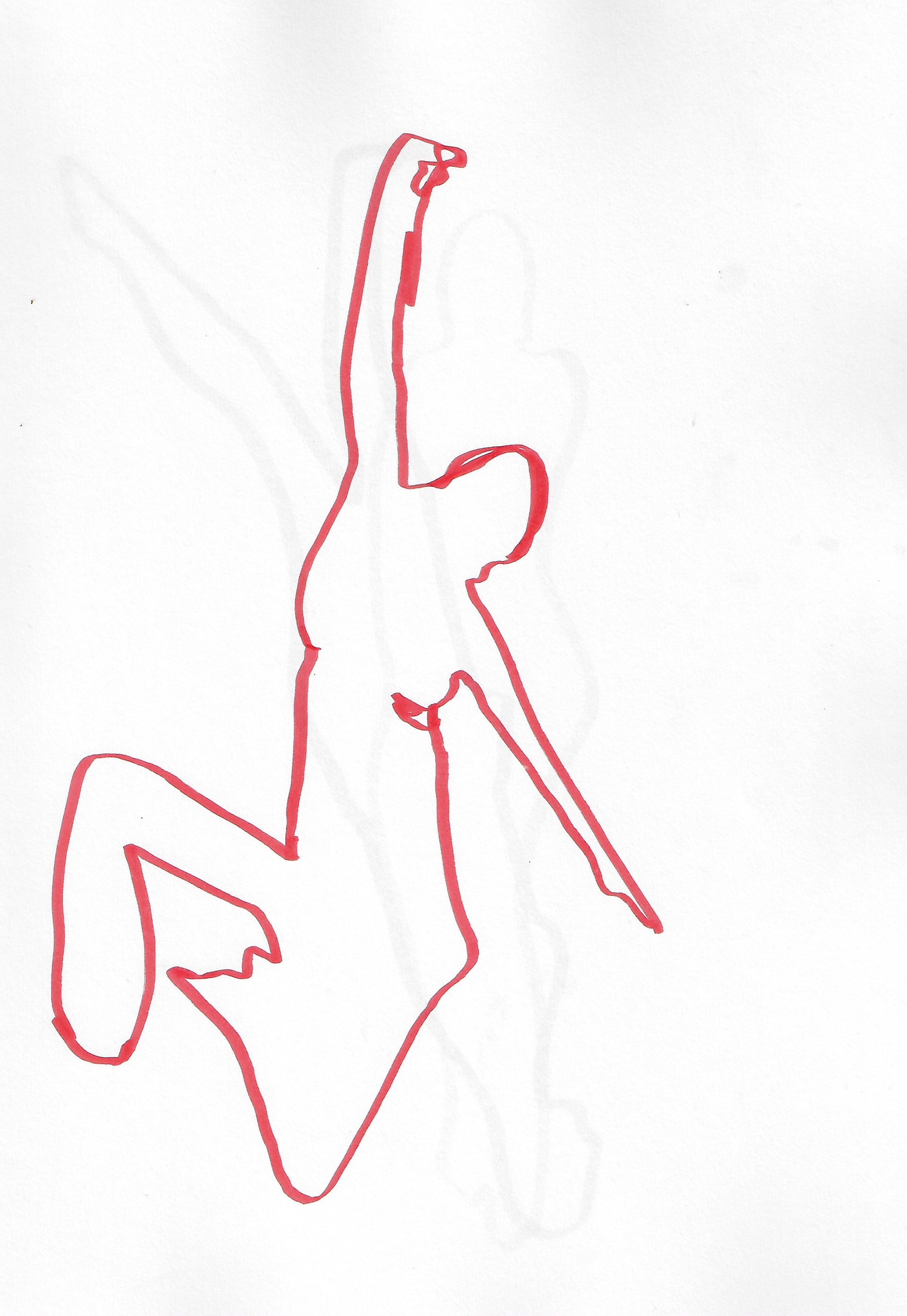
Sketchbook page 29.7 x 42 cm
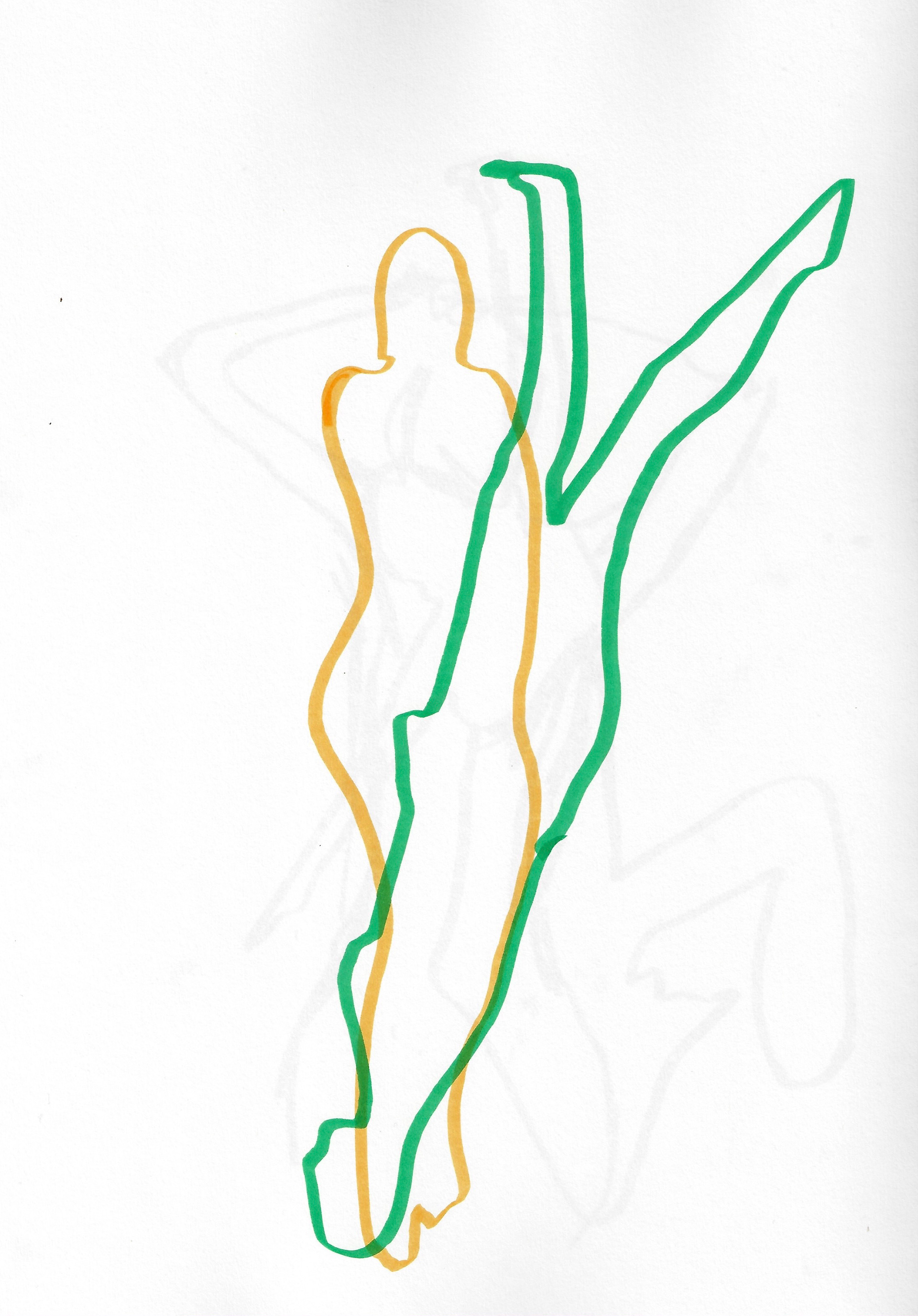
Sketchbook page 29.7 x 42 cm
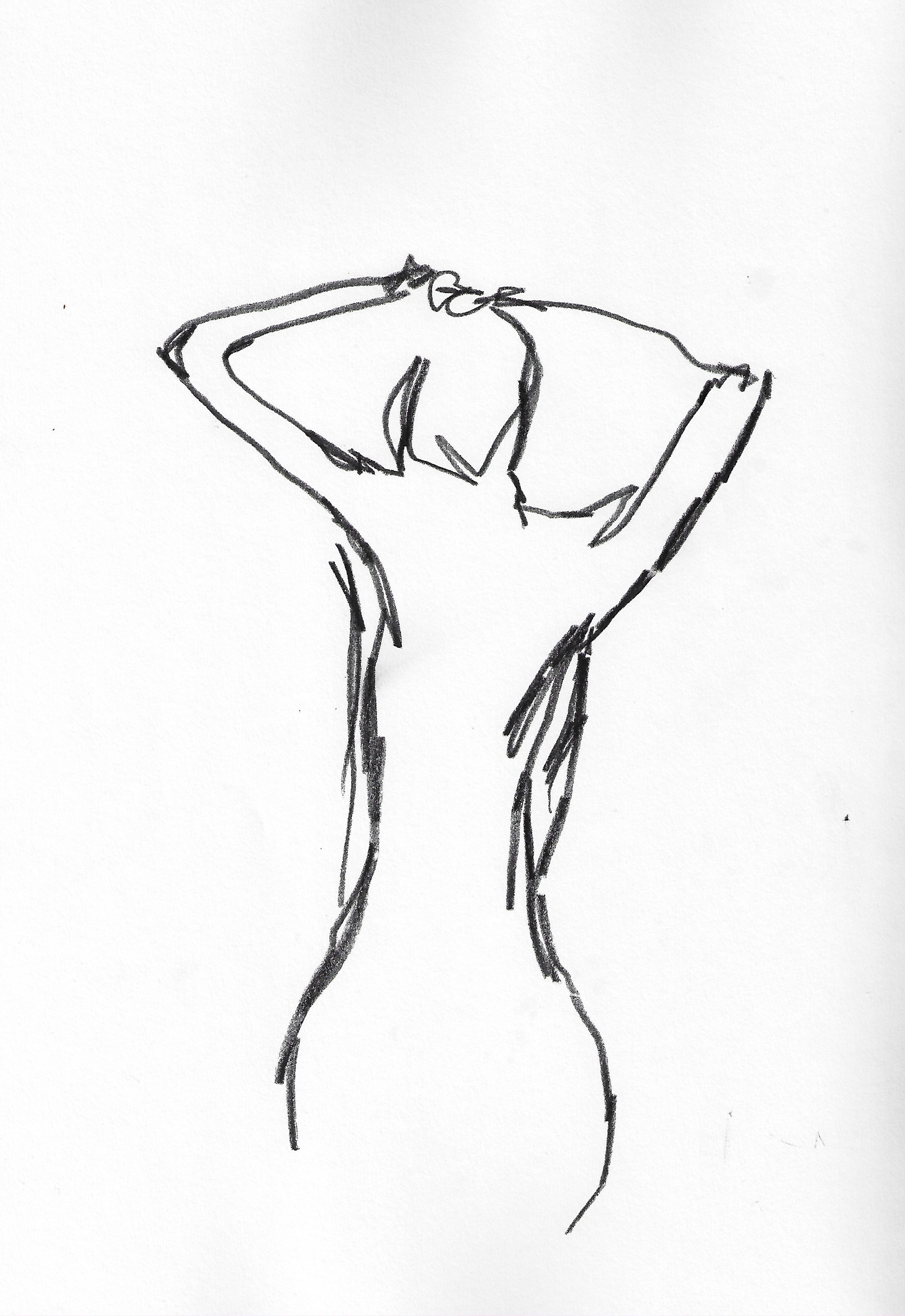
Sketchbook page 29.7 x 42 cm
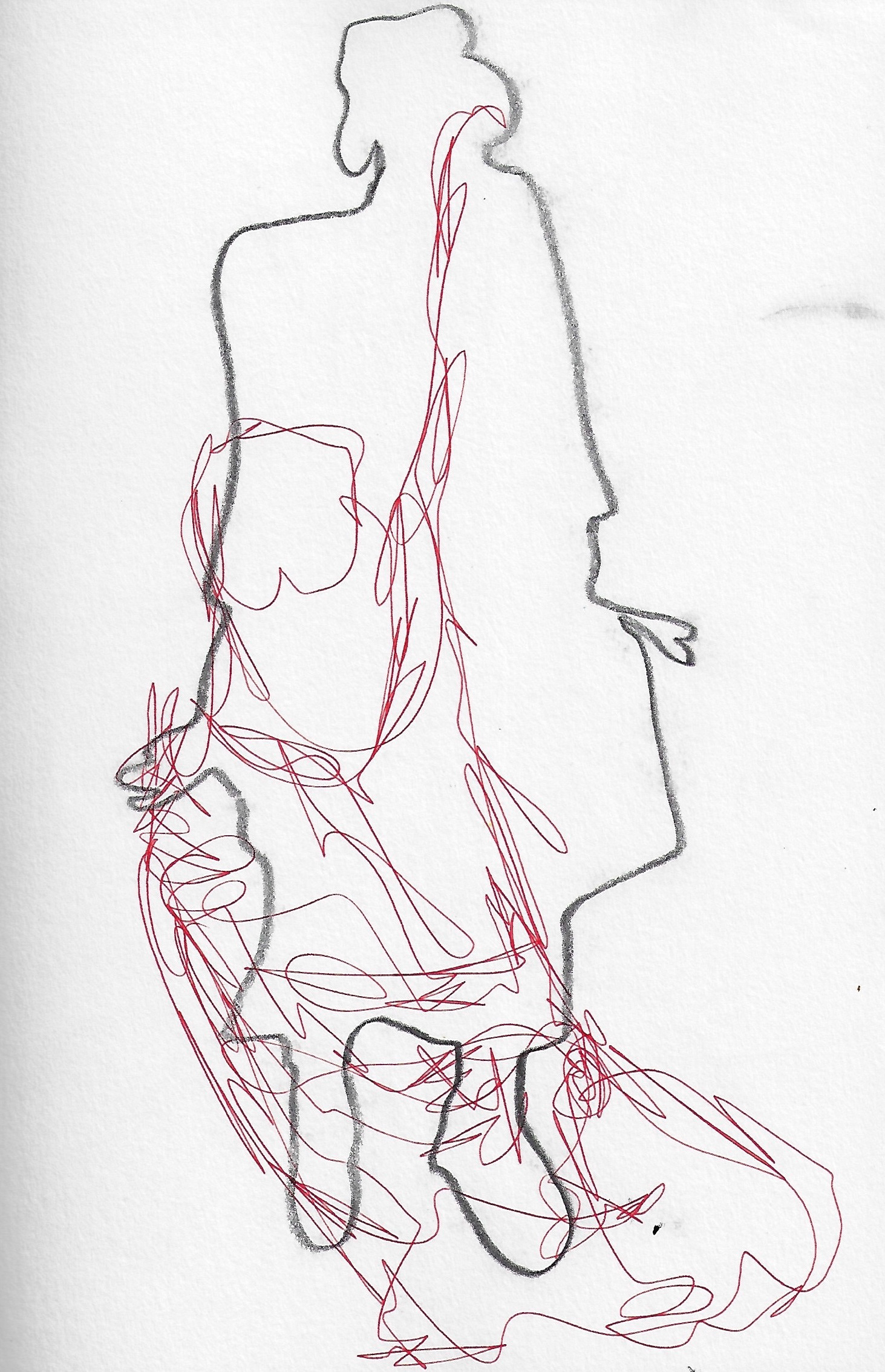
Sketchbook page 21 x 29.7 cm

Sketchbook page 21 x 29.7 cm
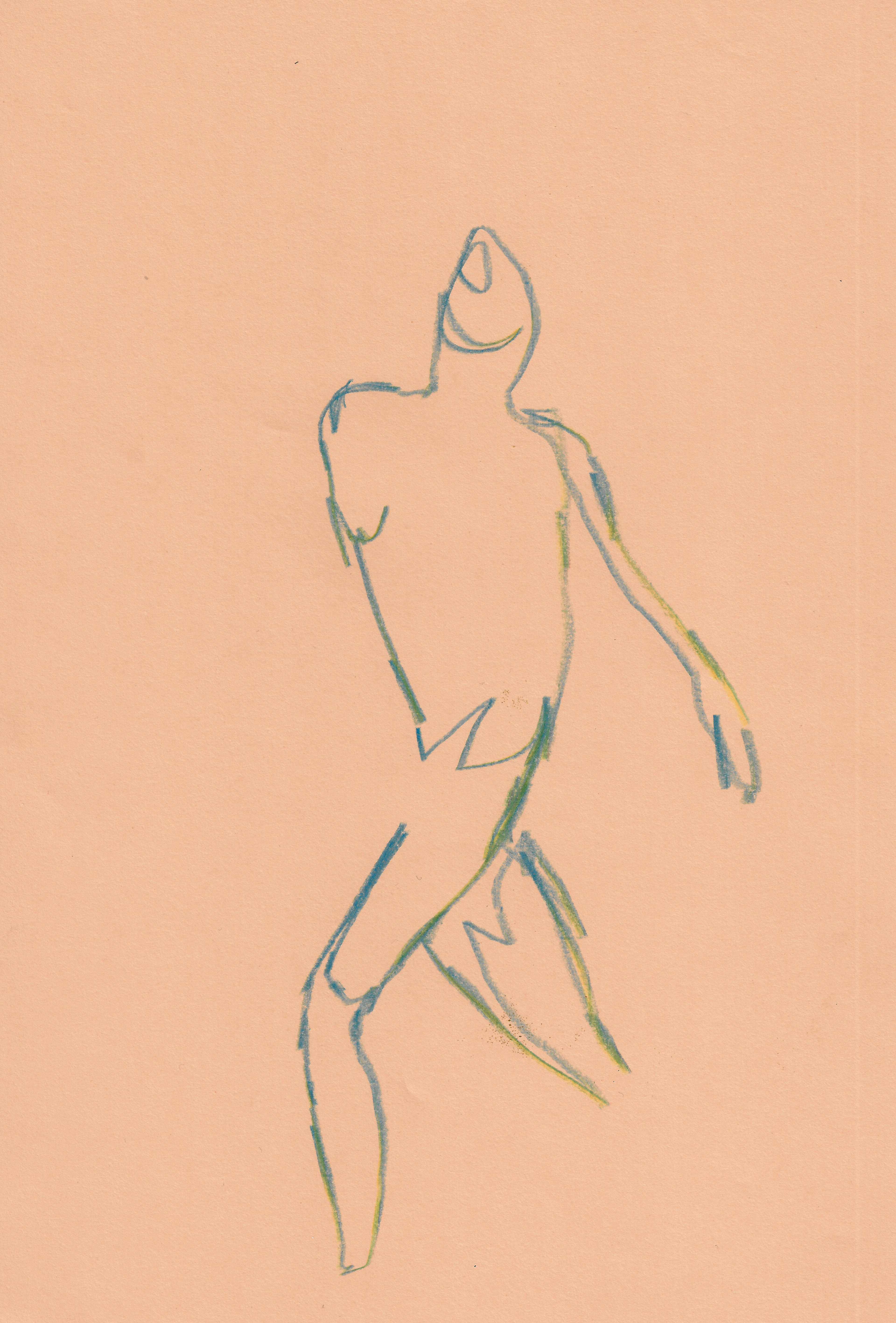
Sketchbook page 21 x 29.7 cm
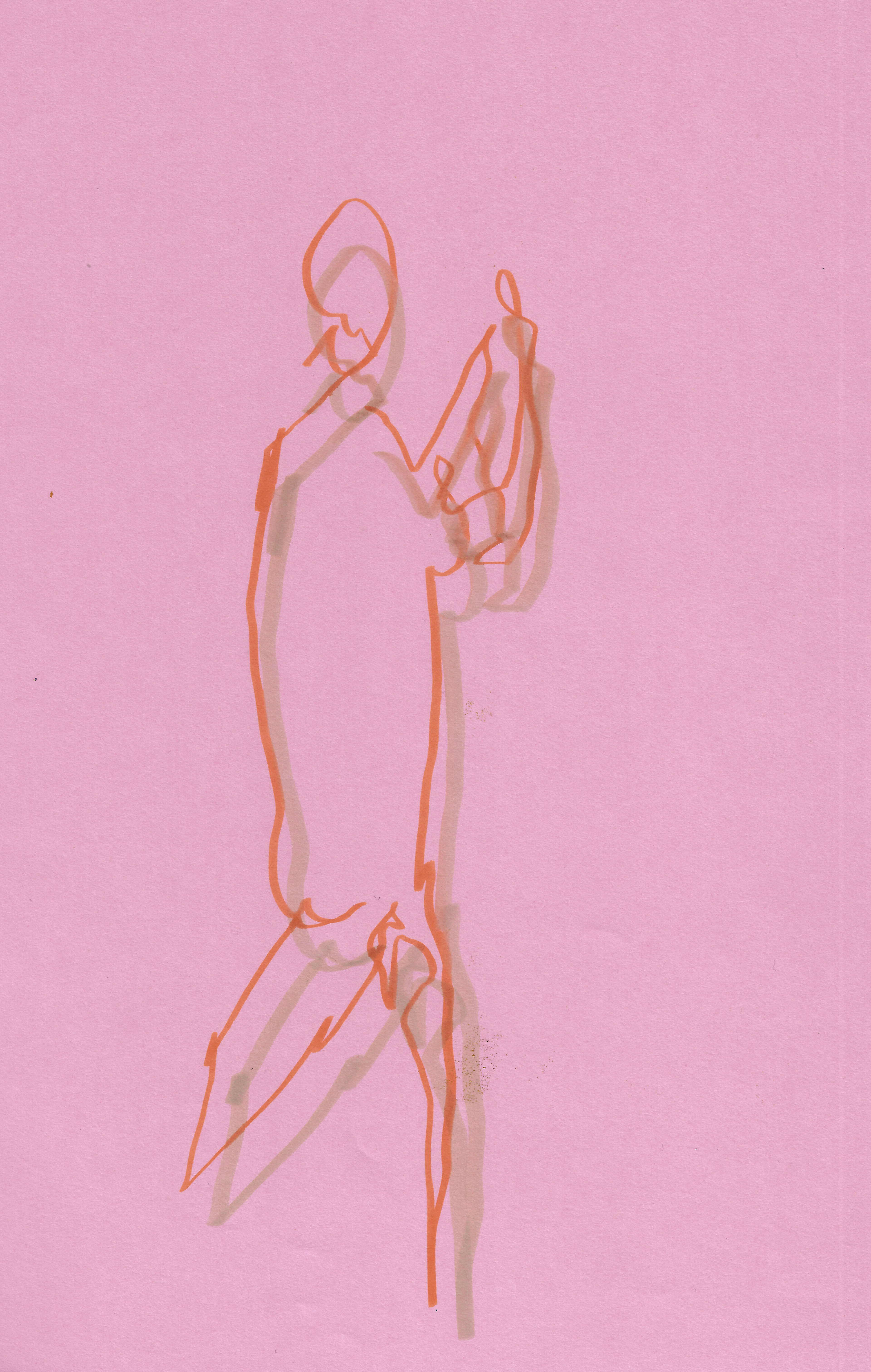
Sketchbook page 21 x 29.7 cm
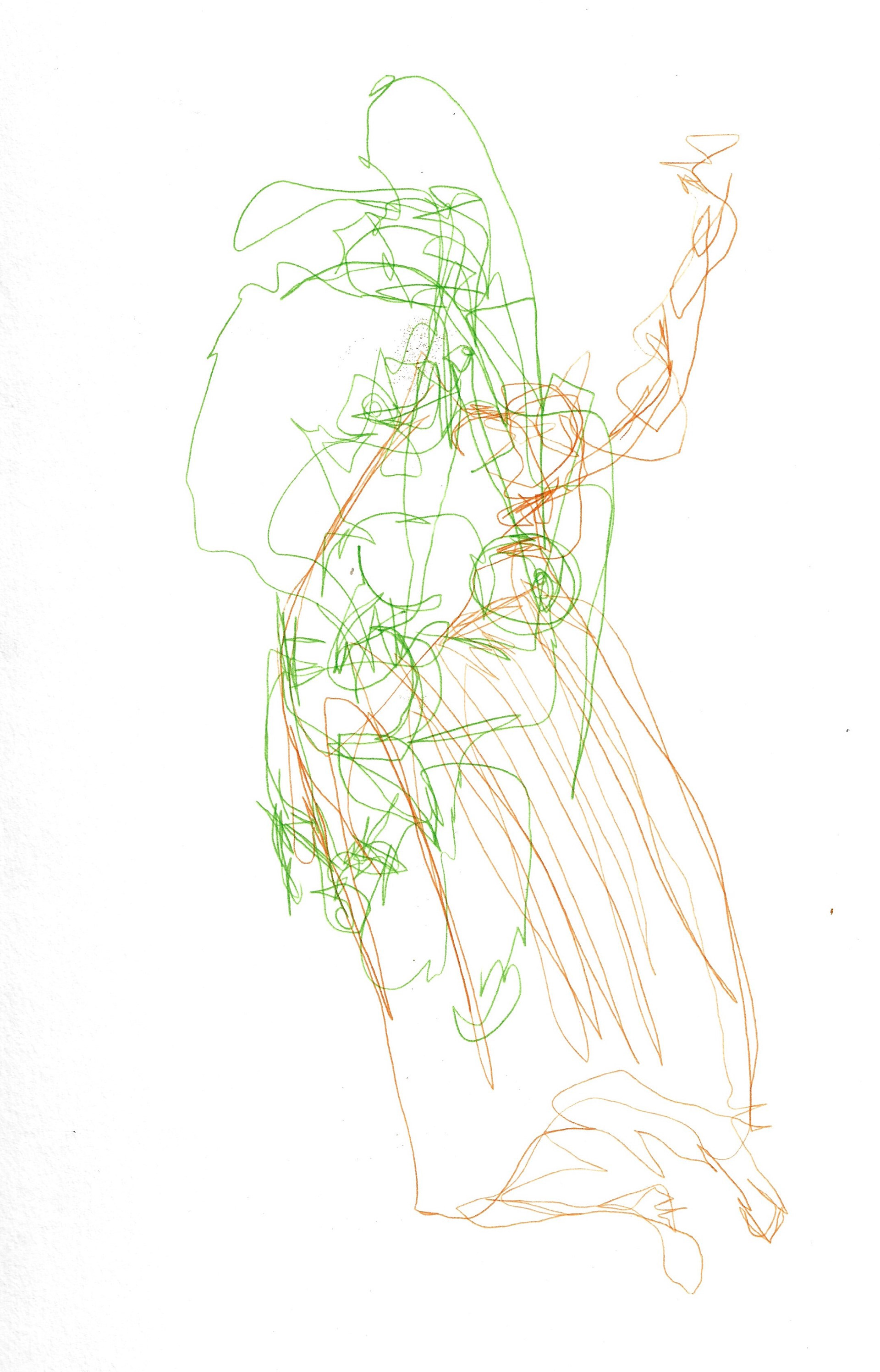
Sketchbook page 21 x 29.7 cm
A life drawing, quick poses, getting the essence of the shape and form of the model down quickly before she moves on.
Photographs of a local playground, highlighting colourful (static and non-static) lines of playground equipment.
A collage of block coloured paper forms and a magazine clipping of textured fabric, which was then scanned into photoshop, to even the colour and to increase the size, as the original image was 7 x 14 cm.
I have been considering scale in relation to my work and how the different components would function differently if the dialogue they created with the viewer was their whole body. This is a new consideration and is difficult to explore since I cannot enter the workshop, as I am limited in the size of my work, working from home.

Sketchbook page 21 x 29.7 cm

Sketchbook page 21 x 29.7 cm

Sketchbook page 21 x 29.7 cm
Simple line drawings of leaves which are only there for a quick moment before they are whisked away; they are natural rubbish. Outline drawing of leaves looks at the collective shape they make and the individual natural shapes they form when they are strewn like rubbish on the floor.
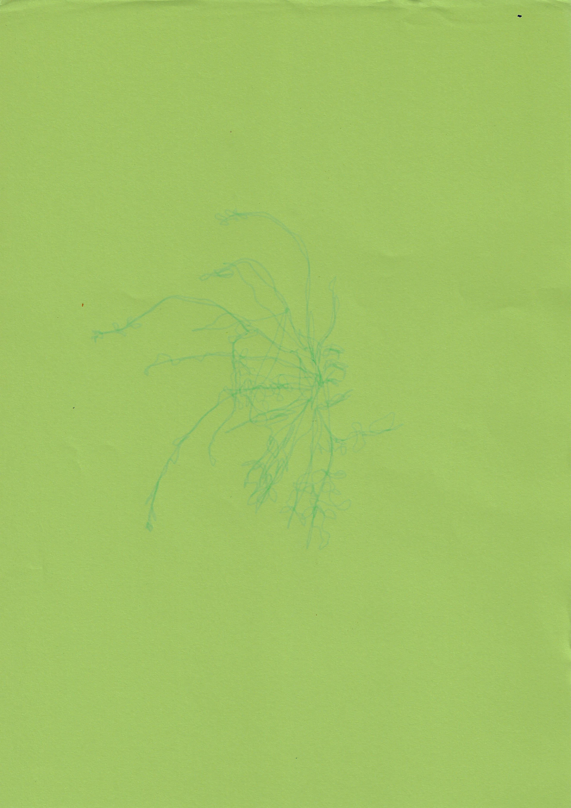
21 x 29.7 cm

21 x 29.7 cm
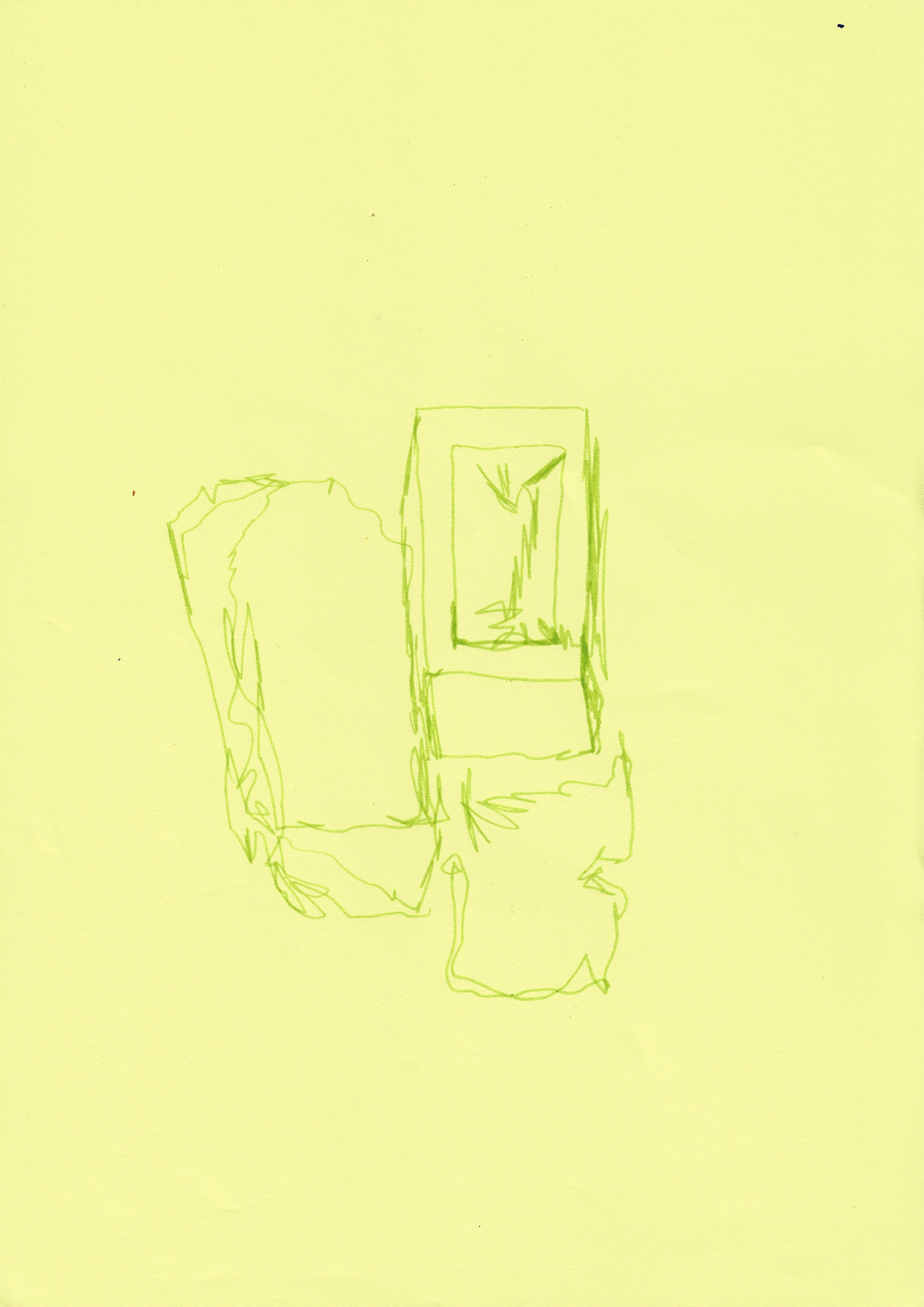
21 x 29.7 cm
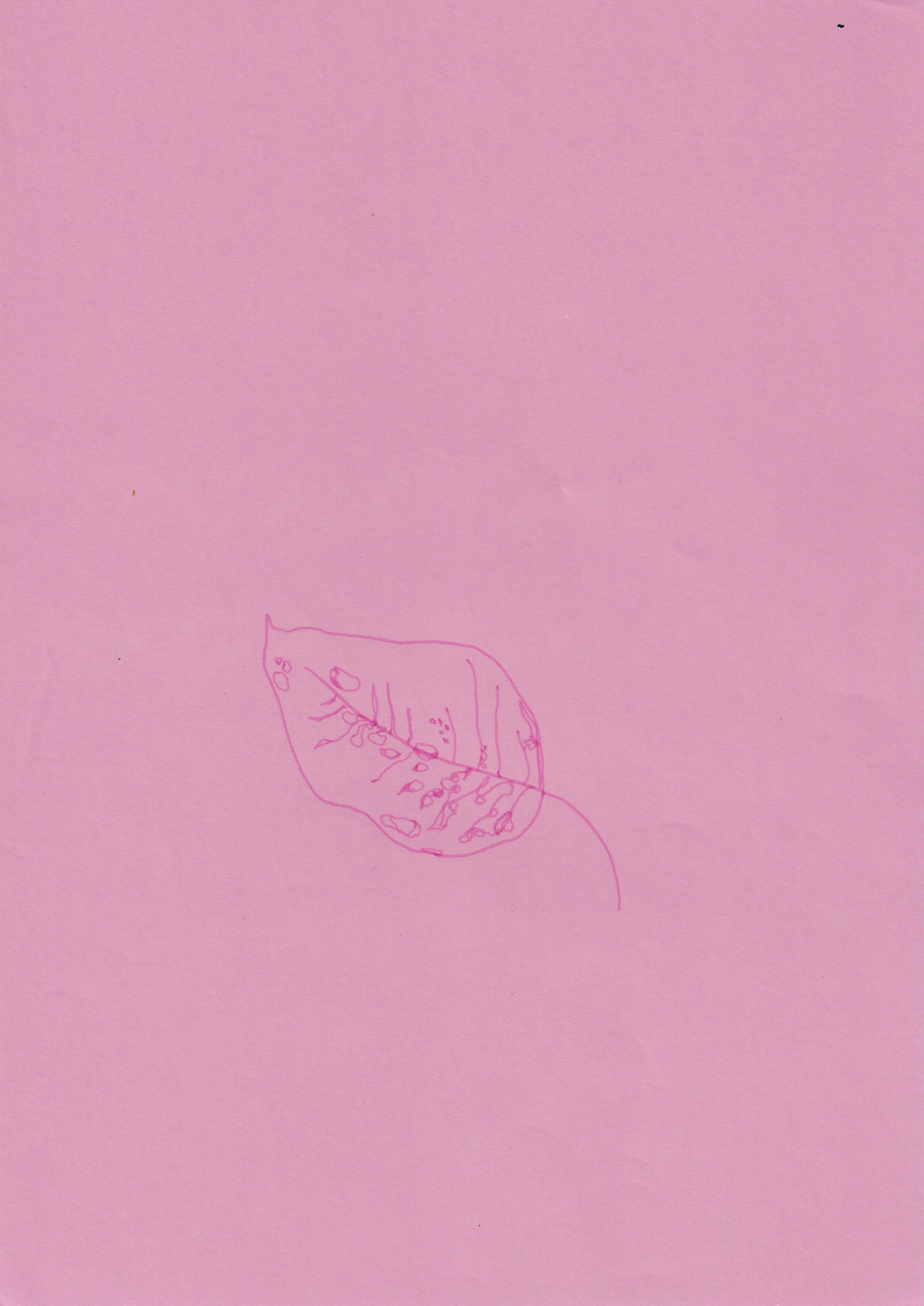
21 x 29.7 cm
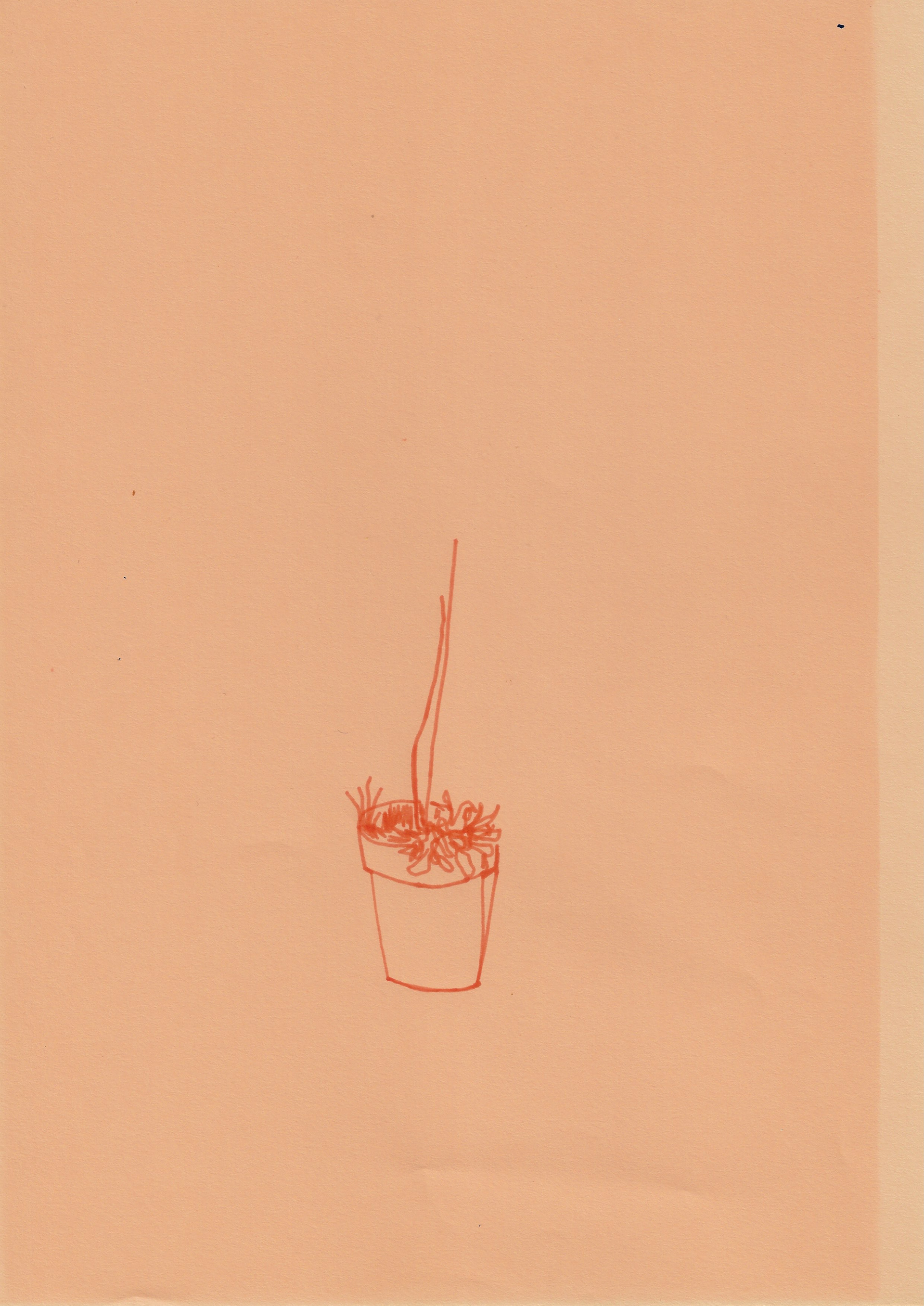
21 x 29.7 cm
By using the same colour paper and the same colour pen (apart from the second image), emphasises how the subtlety in colour can heighten the viewer's awareness of the lines and forms.
Solarfast dye on paper 23 x 34 cm
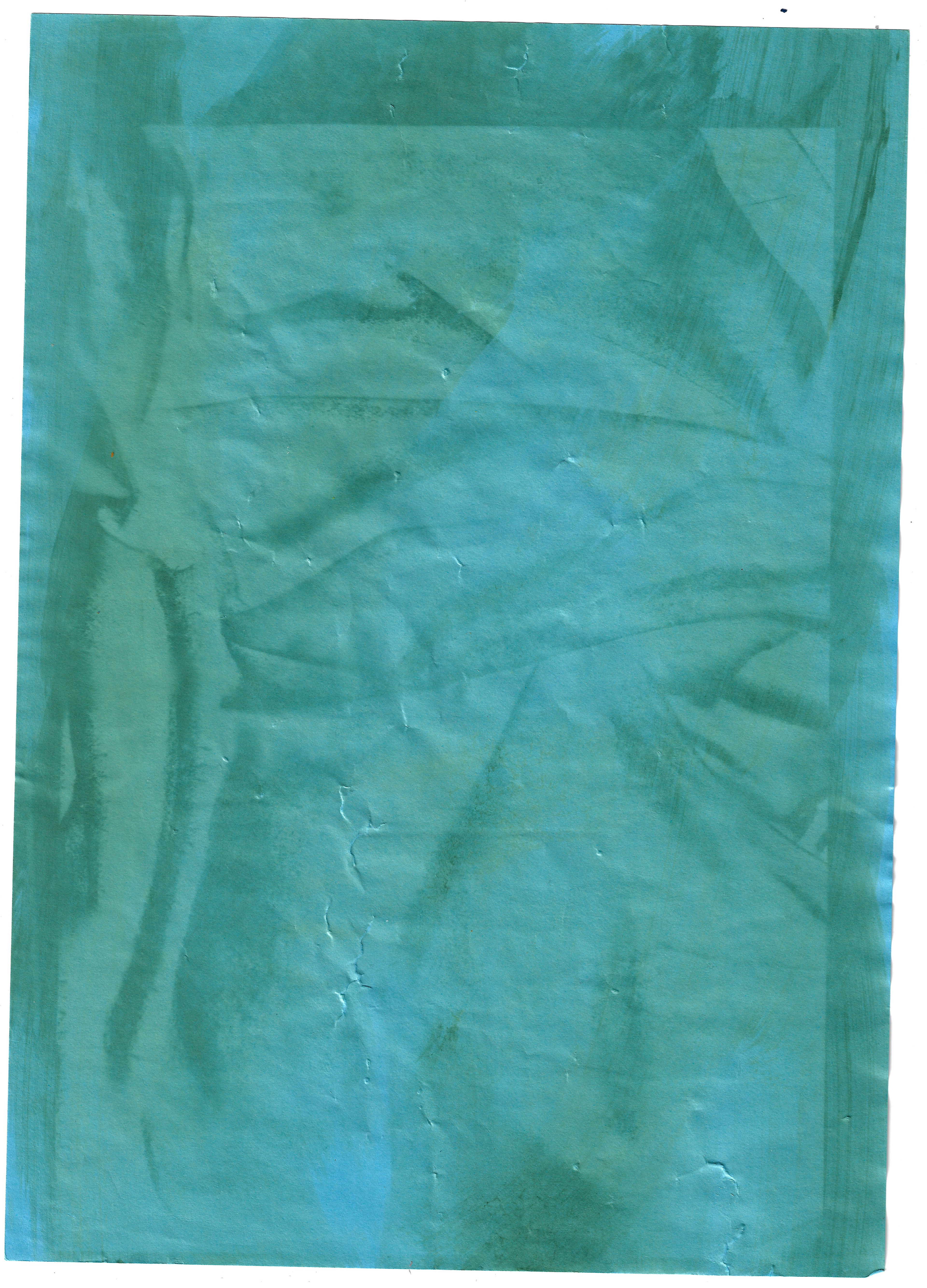
Solarfast dye on paper 21 x 29.7 cm
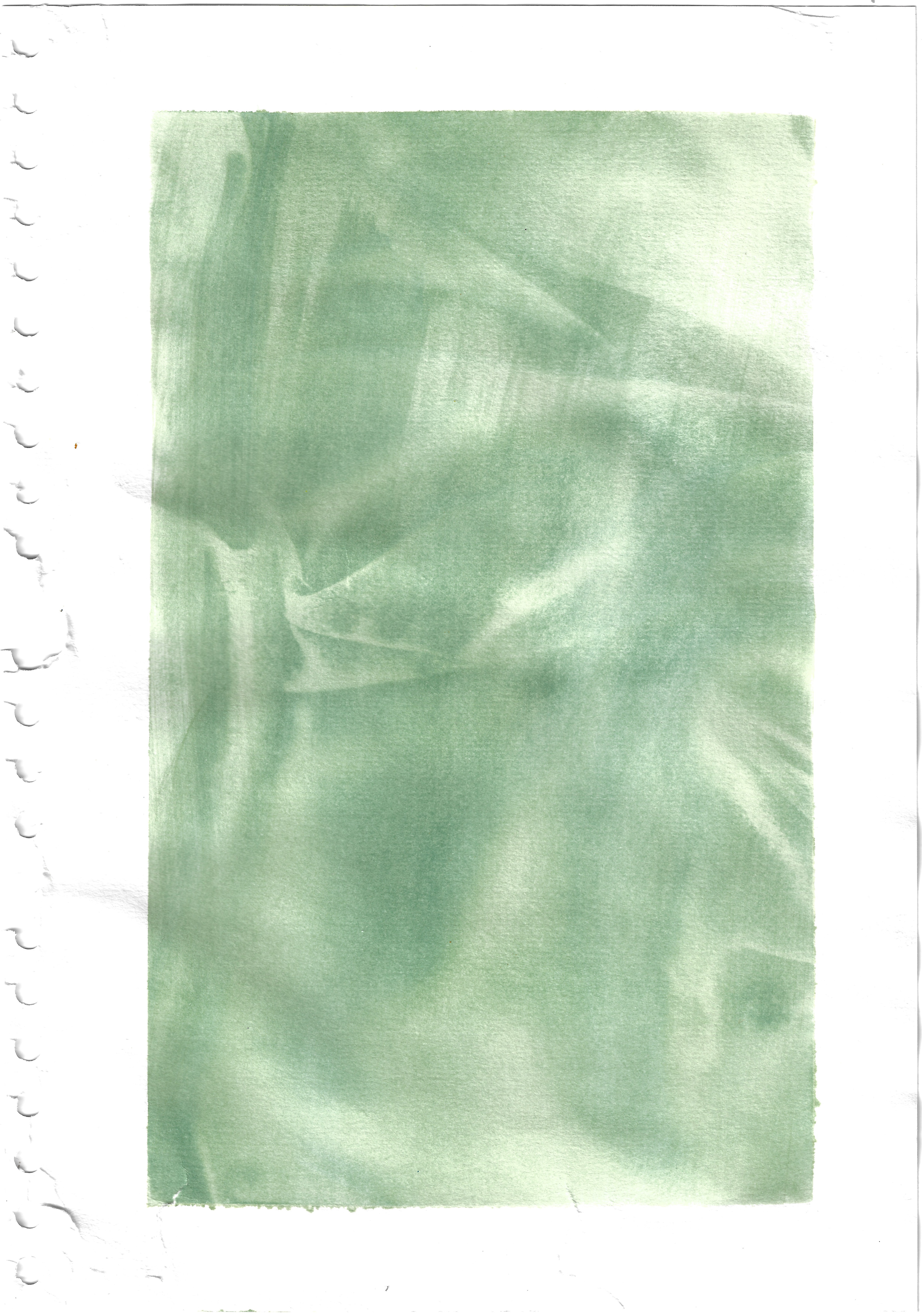
Solarfast dye on paper 21 x 29.7 cm
Solarfast dye on paper 21 x 29.7 cm
Solarfast dye on paper 21 x 29.7 cm
Solar fast dye (which is sensitive to UV light) overlaid with transparent film of an earlier image of fabric I had taken. On the last image I lay petals on the dye when it was exposed to create silhouettes of soft natural forms
These are photographs of film exposed to photographic paper and as I had no fixer, so the image I made did not stay and it was only temporary. On the left red acetate was overlaid on top of the print, and on both images black acetate was laid underneath, experimenting with different textured surfaces and their relative effect on the image.
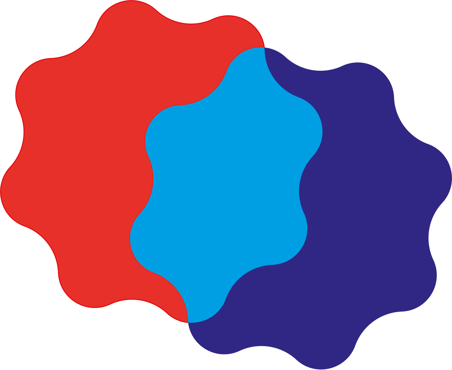
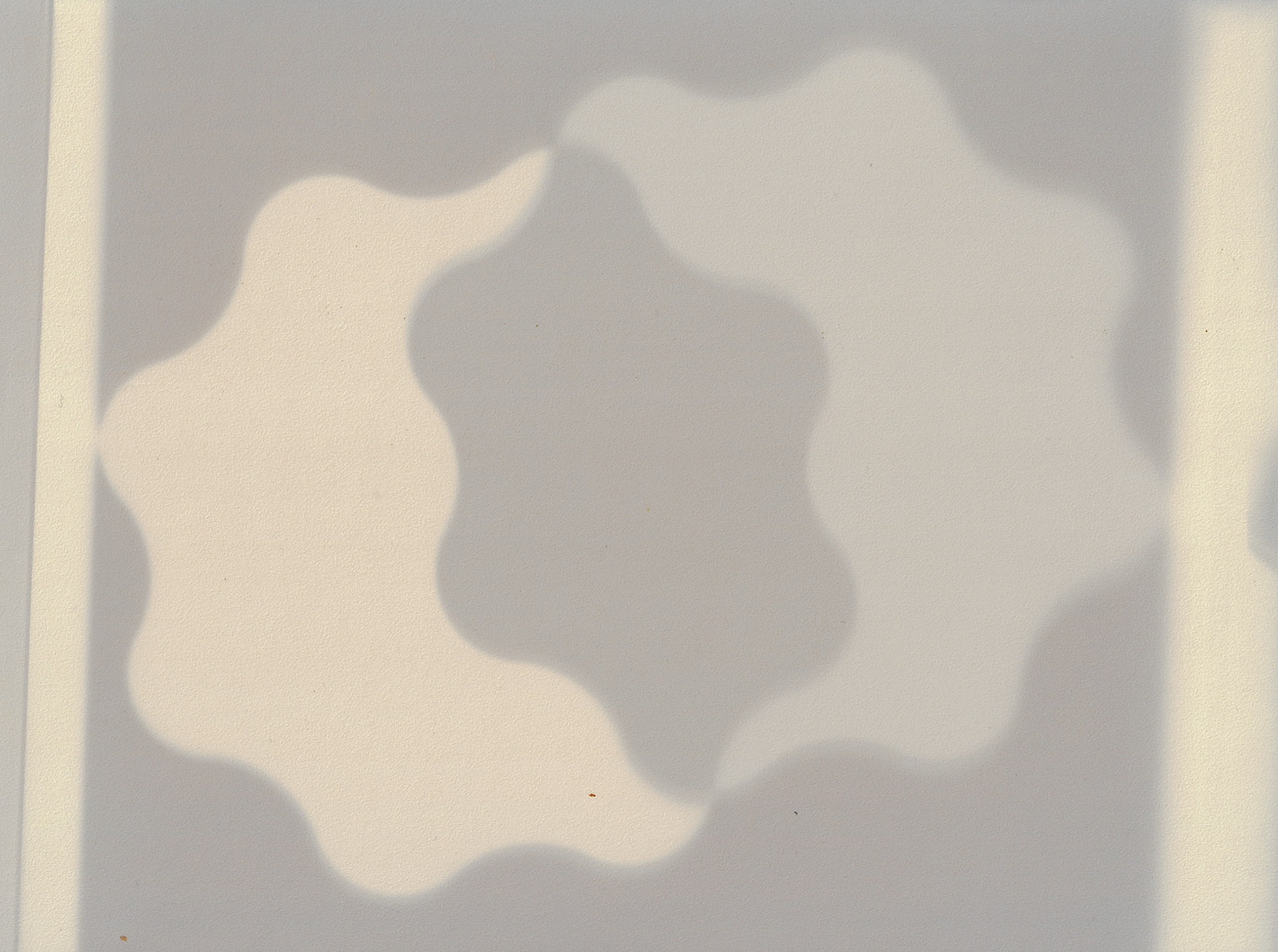
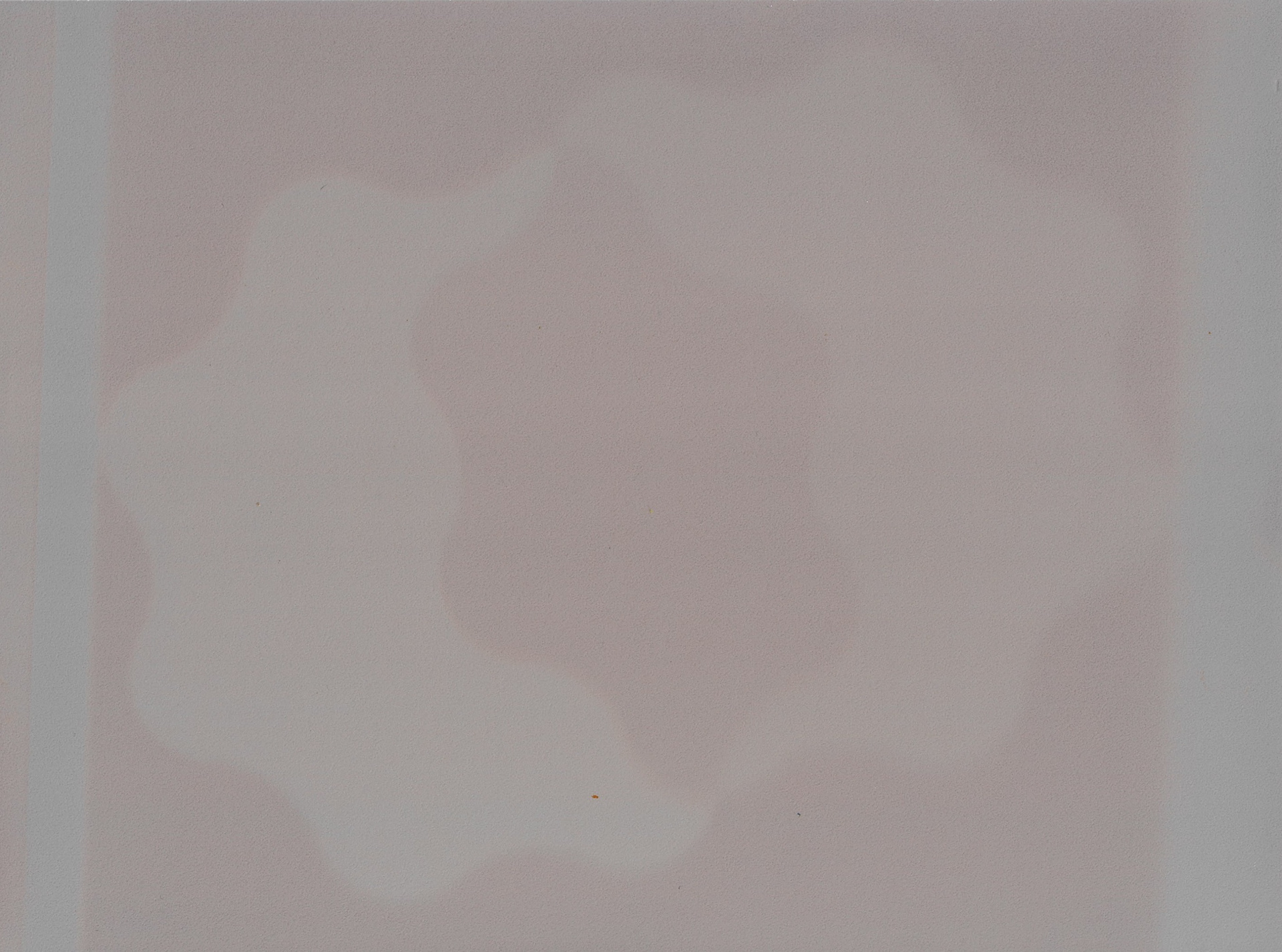
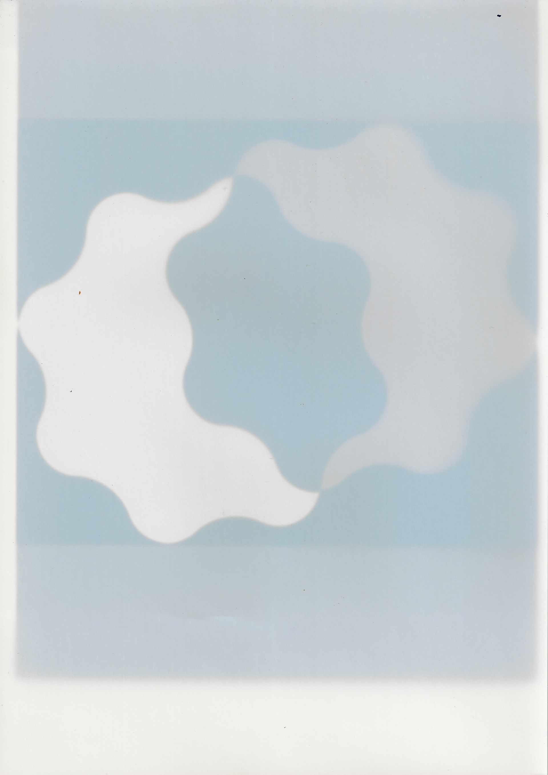
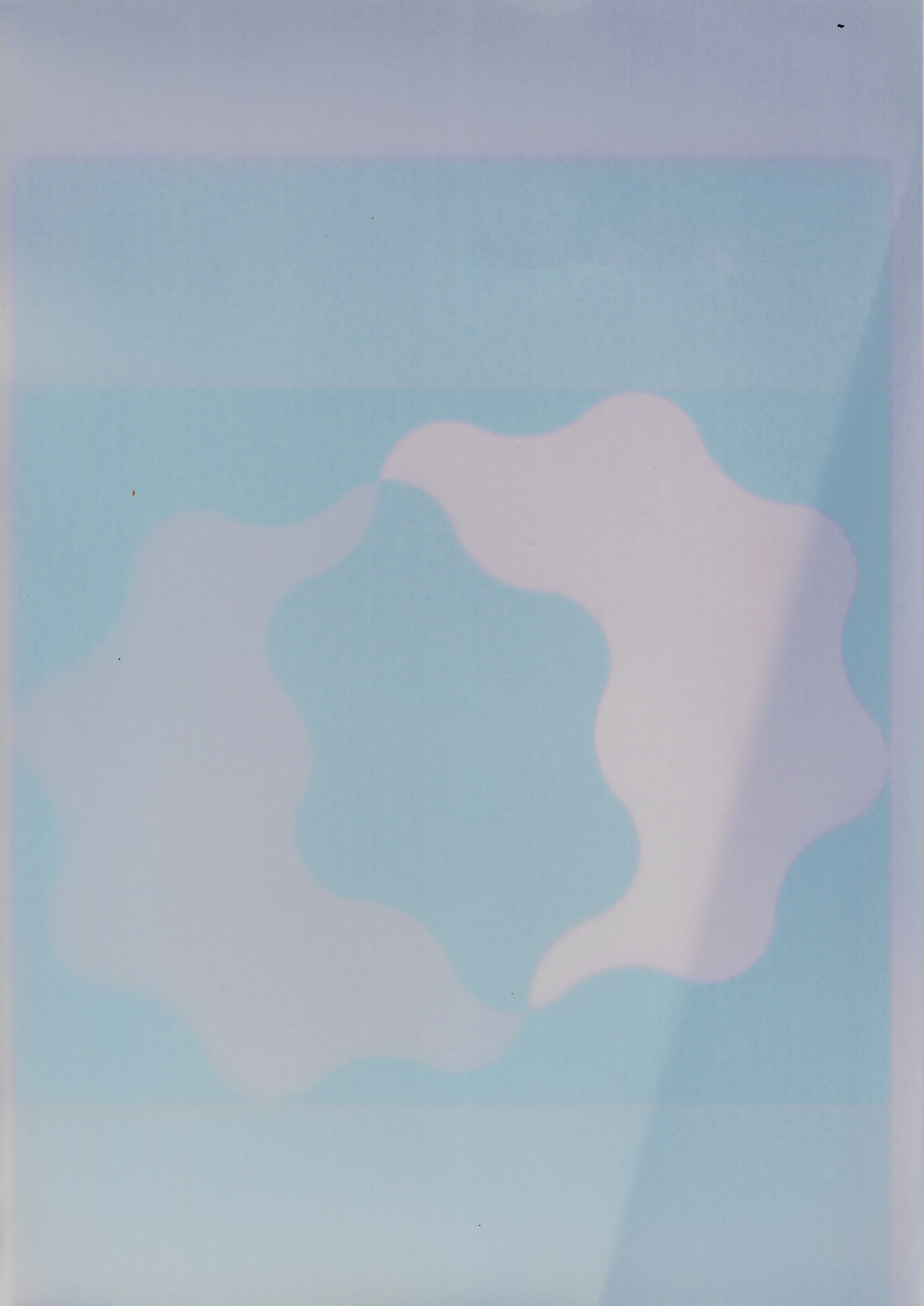
A symmetrical shape was created on adobe illustrator (first image), which was then exposed onto some photographic paper. Again, with no fixer, the images were only temporary once exposed, so the decomposition of the image and the fading colours was documented.
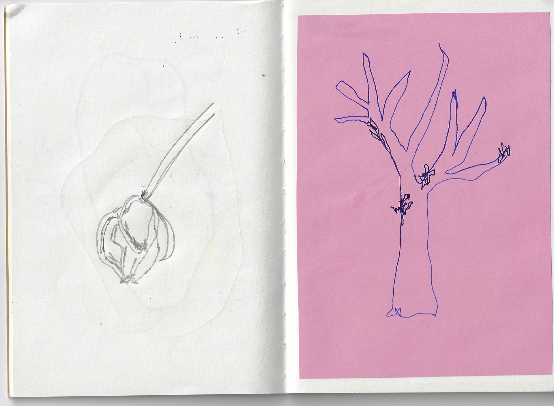
2 x sketchbook pages 21 x 14.5 cm
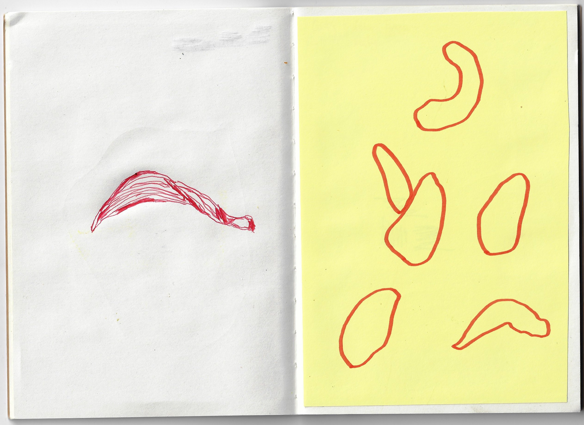
2 x sketchbook pages 21 x 14.5 cm
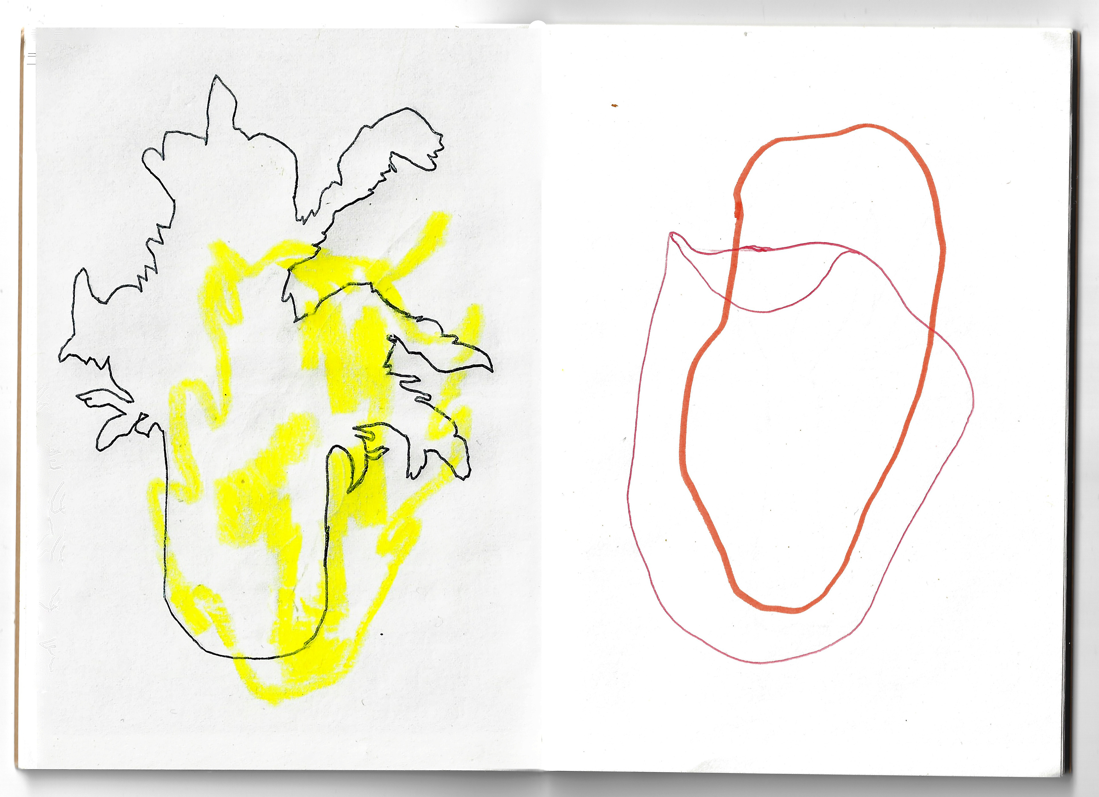
2 x sketchbook pages 21 x 14.5 cm
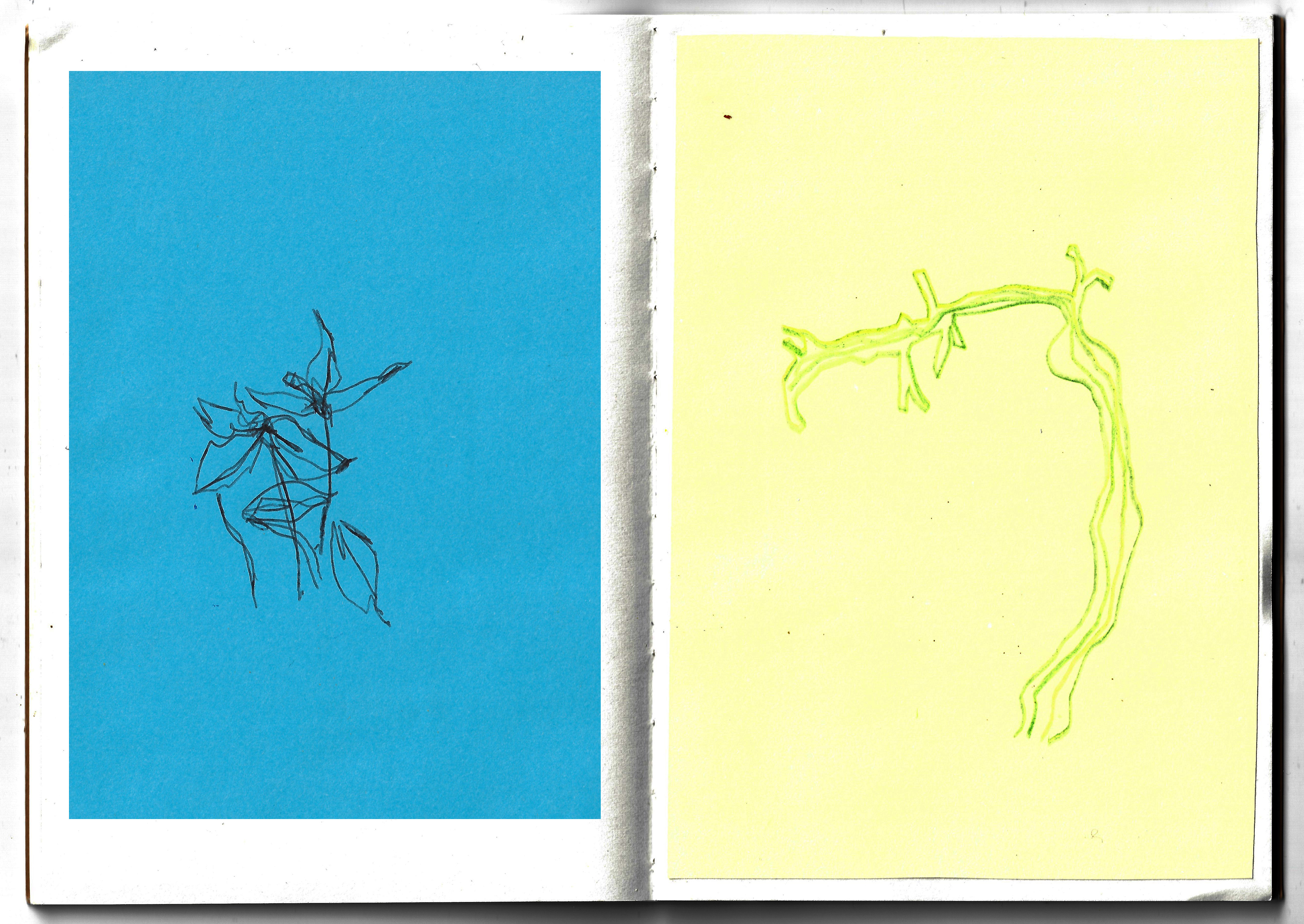
2 x sketchbook pages 21 x 14.5 cm

2 x sketchbook pages 21 x 14.5 cm
These are observational drawings of isolated elements from my environment, focusing on the subtle dialogues between the line of the drawn form and the colour.
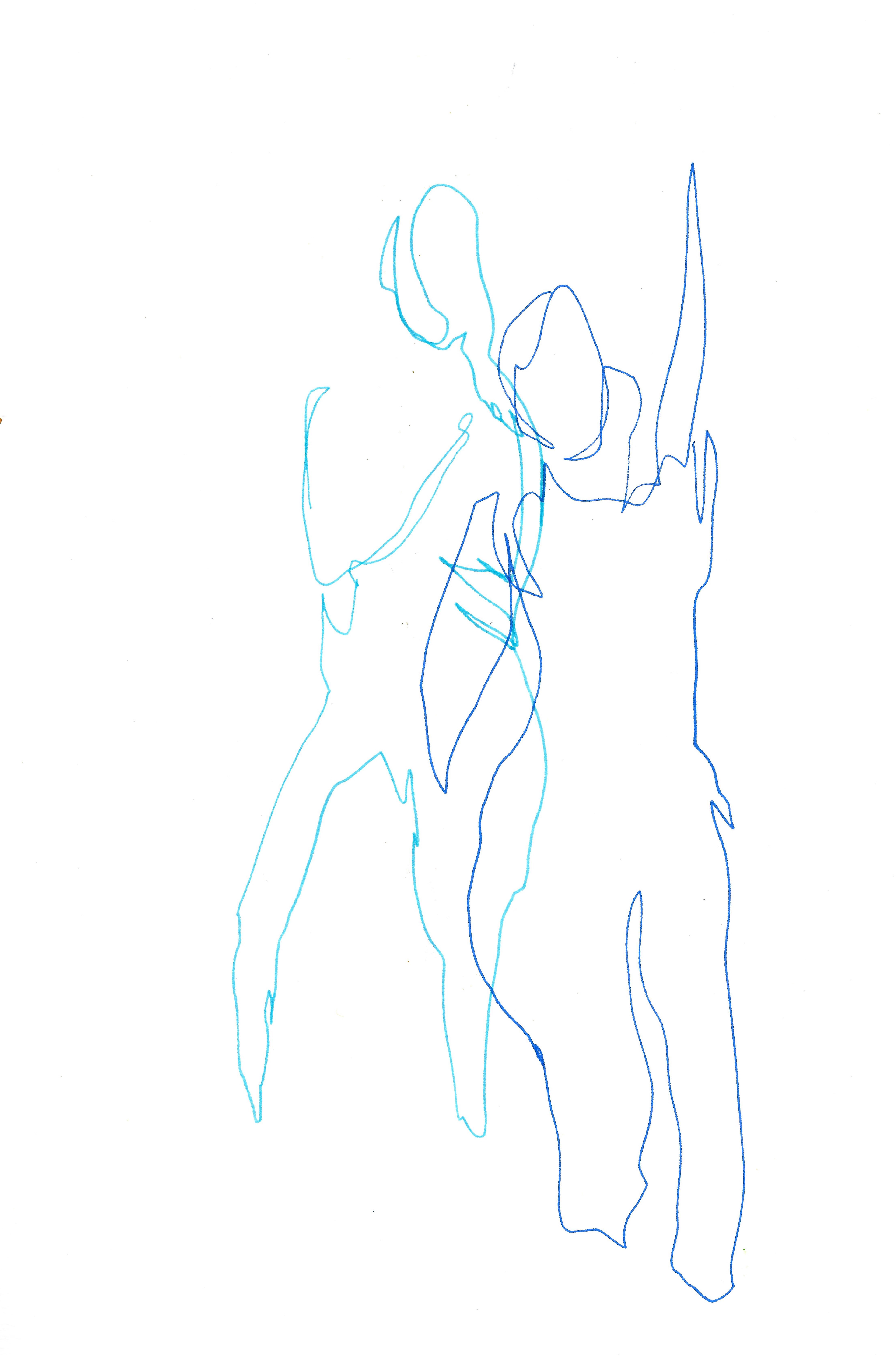
Sketchbook page 21 x 29.7 cm
Sketchbook page 21 x 29.7 cm

Sketchbook page 21 x 29.7 cm
Sketchbook page 21 x 29.7 cm
I attend a life drawing class- paying attention to line and the silhouette of the figure.

21 x 17 cm

21 x 29.7 cm
15 x 21 cm
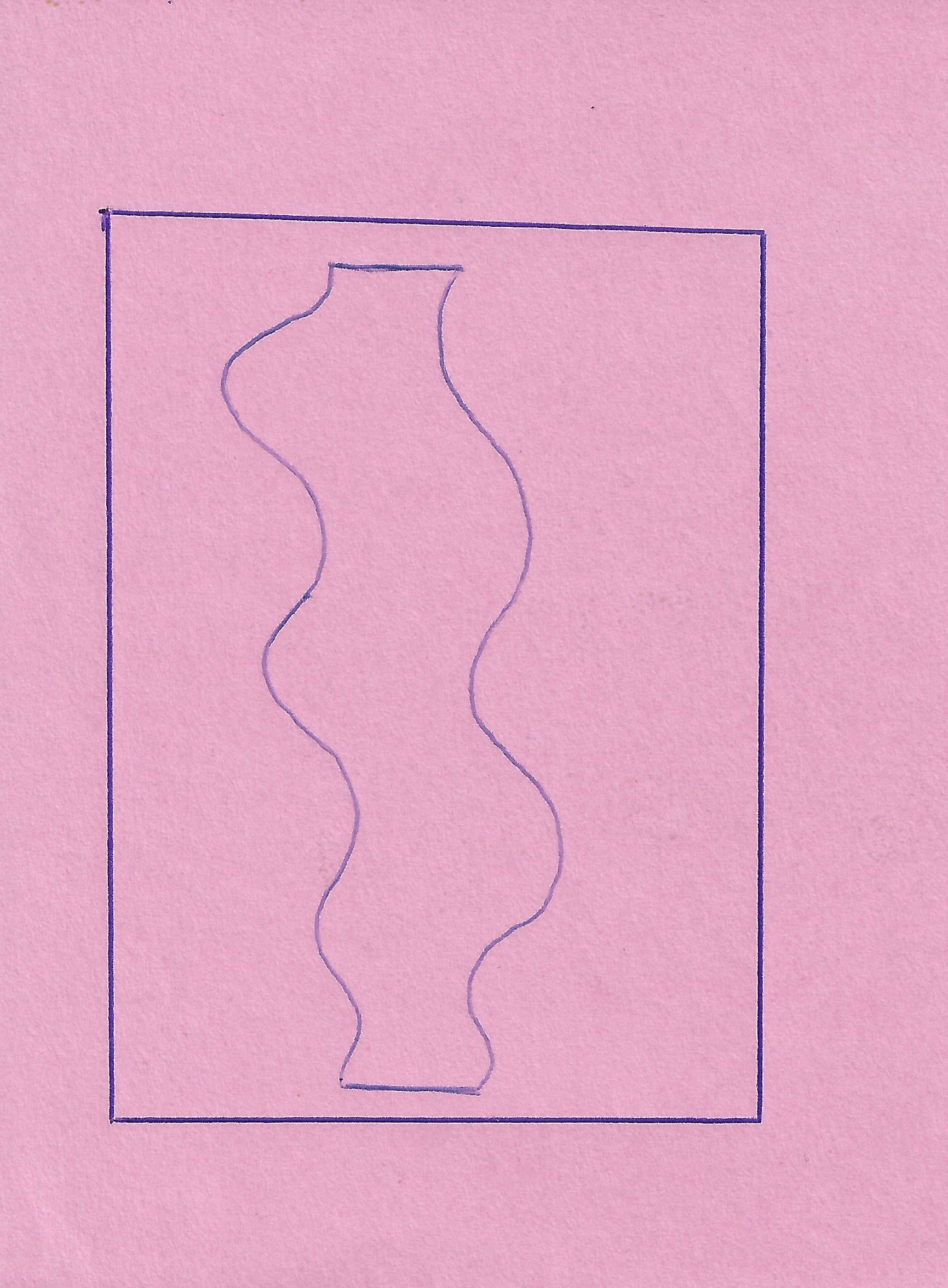
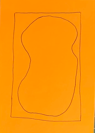
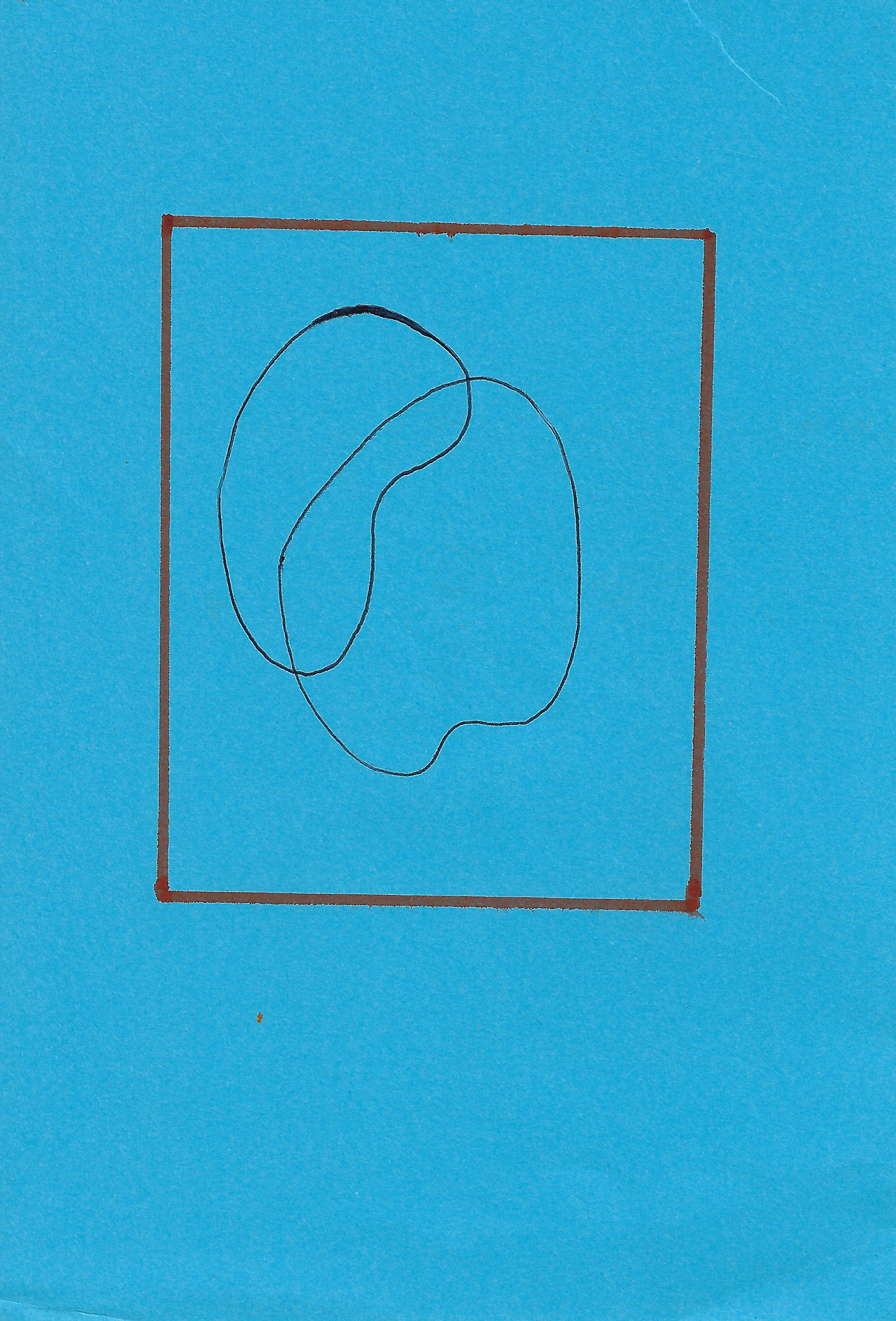
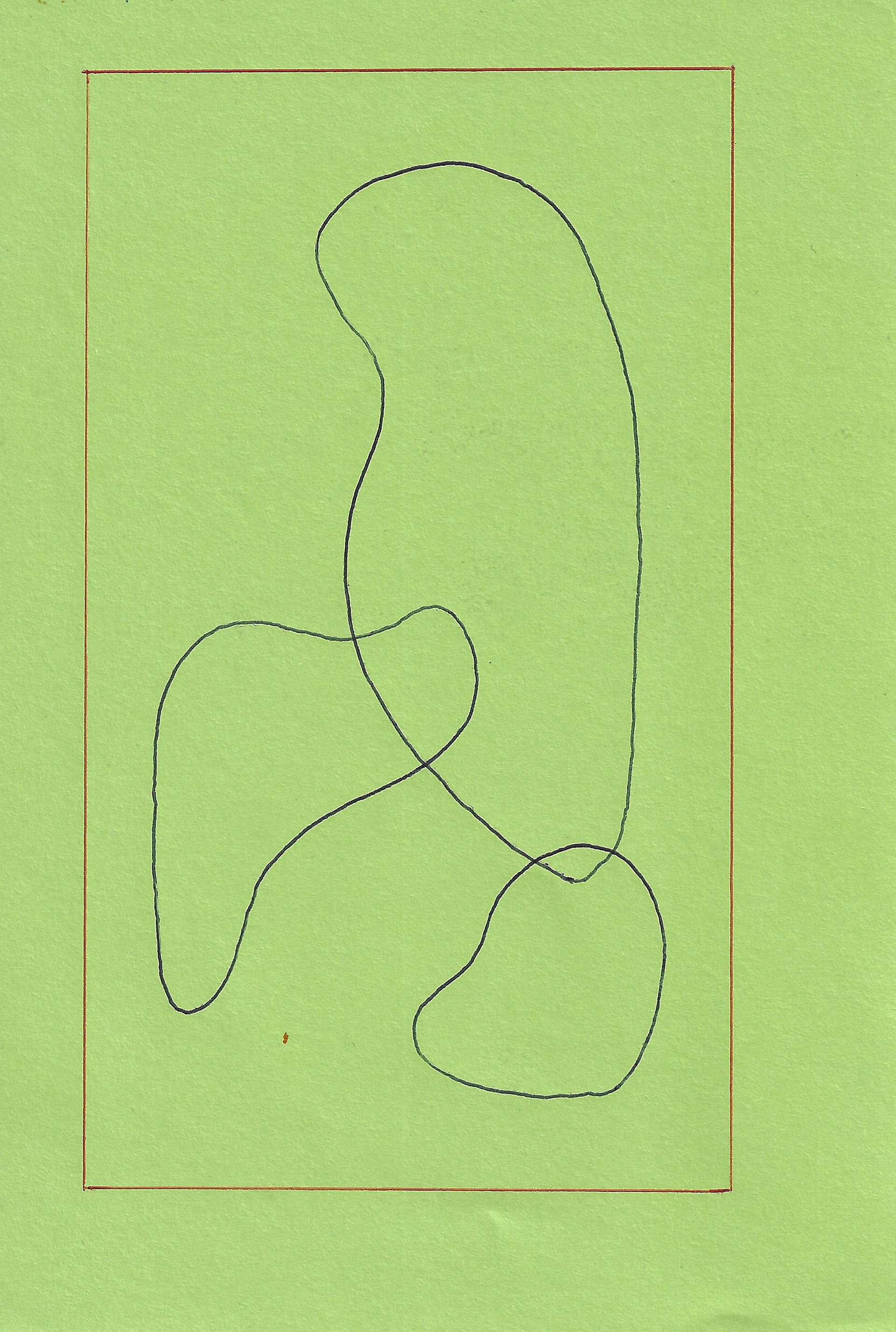
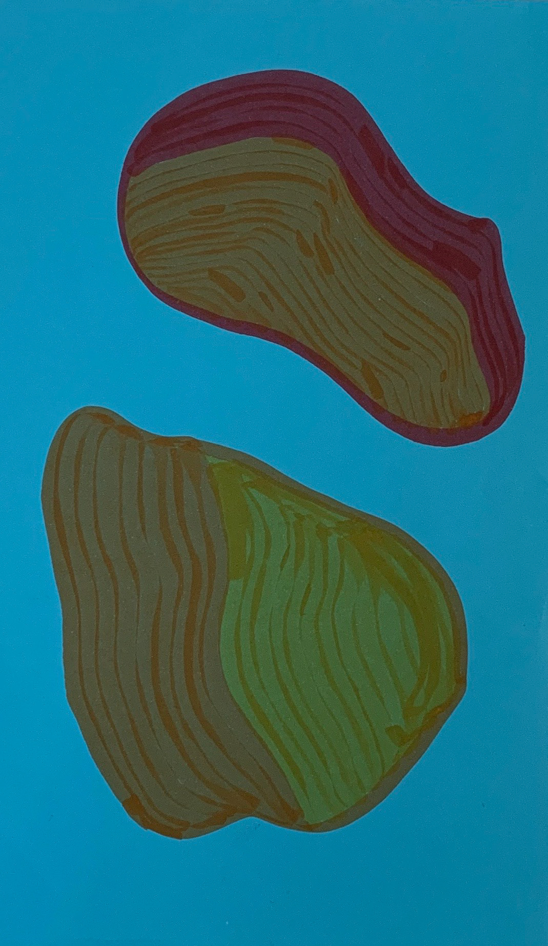
Felt tip drawings, paying particular attention to the organic line that undulates through the form. The line generates a rhythm as it moves through each form, changing colour as it moves. This creates new dialogues and tensions between the lines of different colours.

Monoprint 20.8 x 14.8 cm
Monoprint 25 x 35 cm
Monoprint 14.85 x 20.8 cm

Monoprint 24 x 34.5 cm
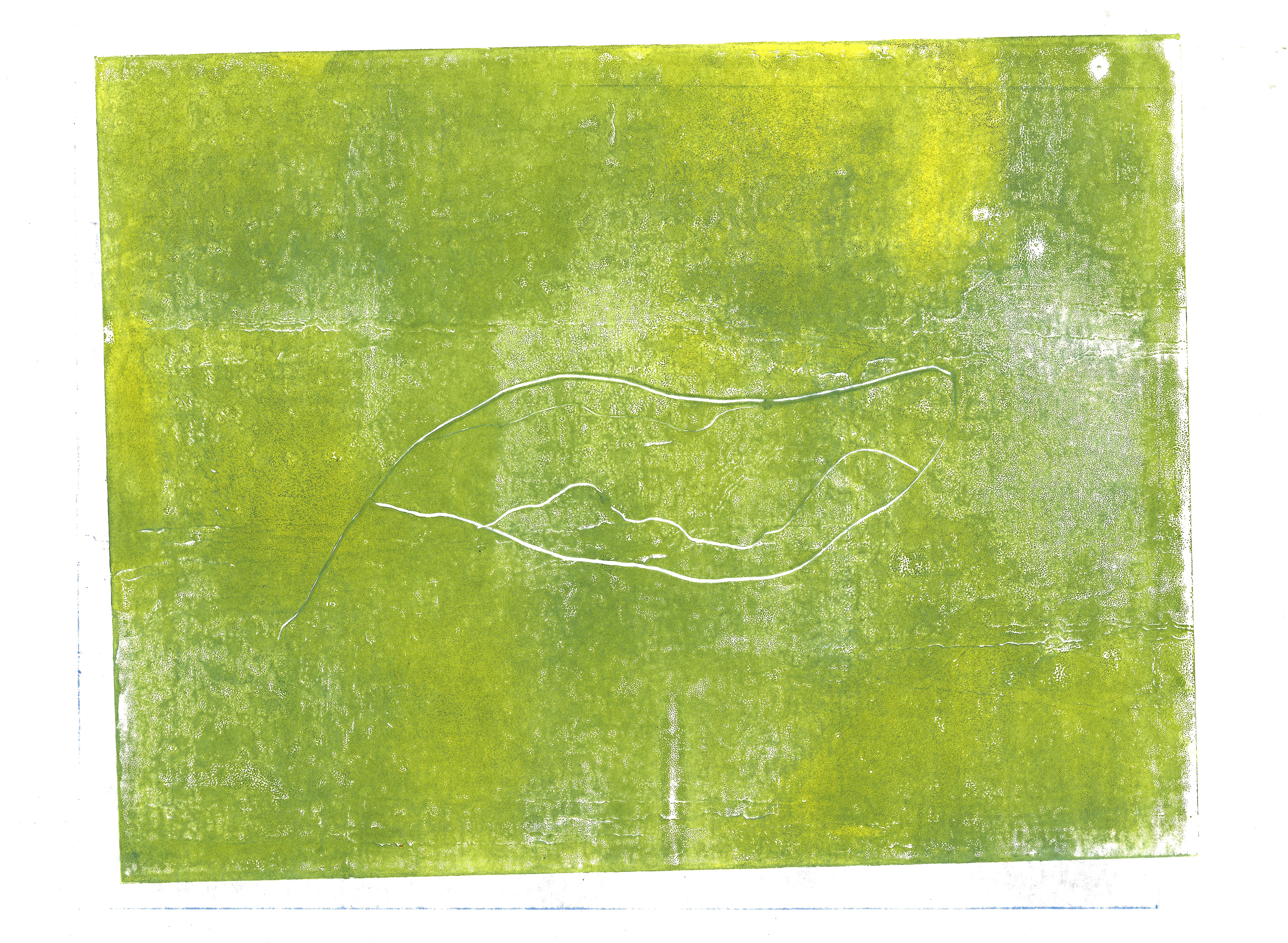
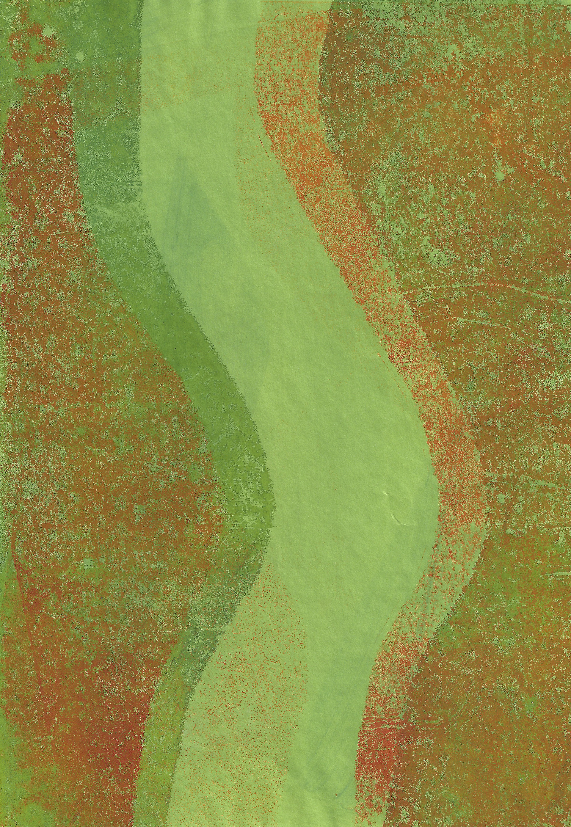
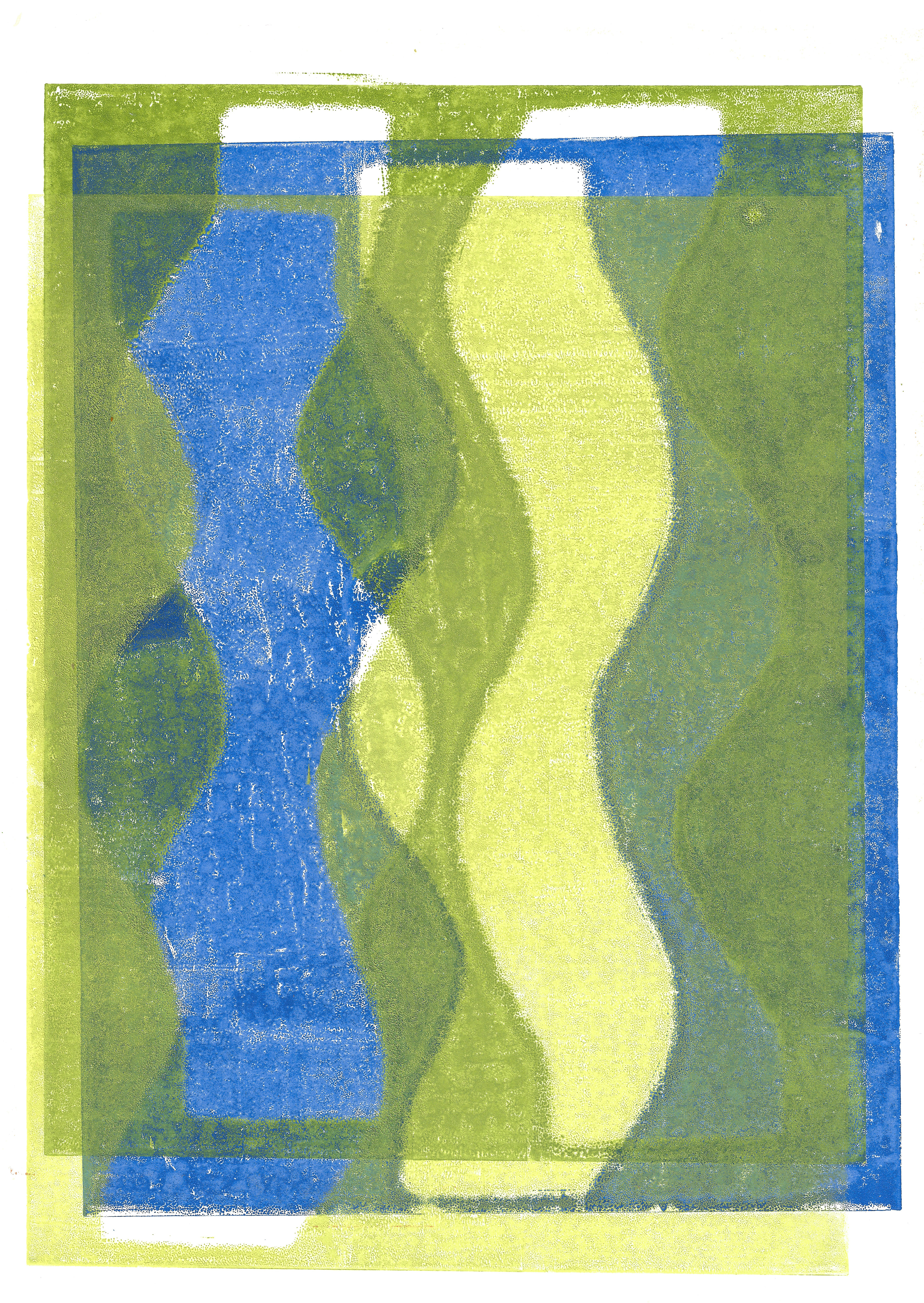
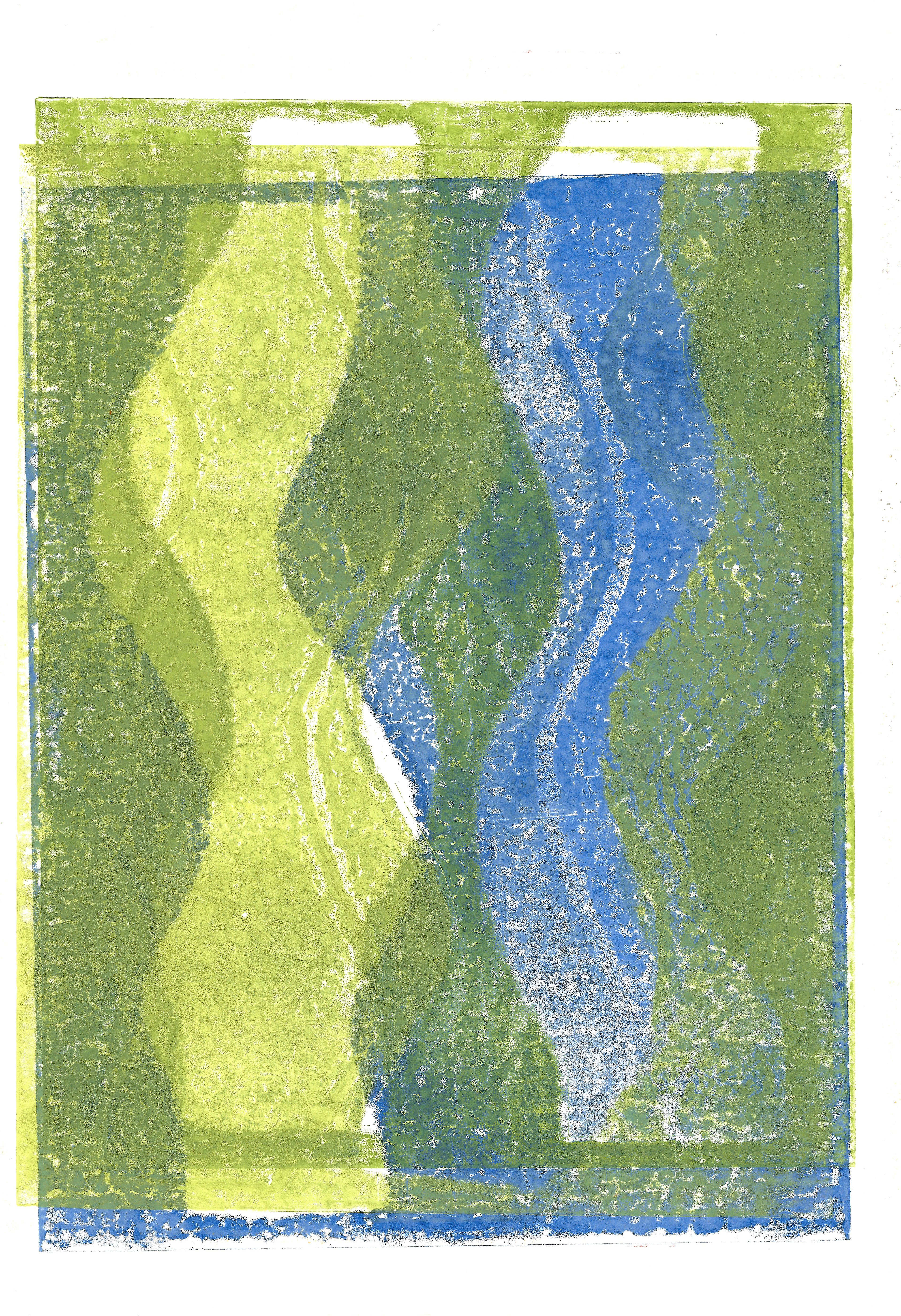
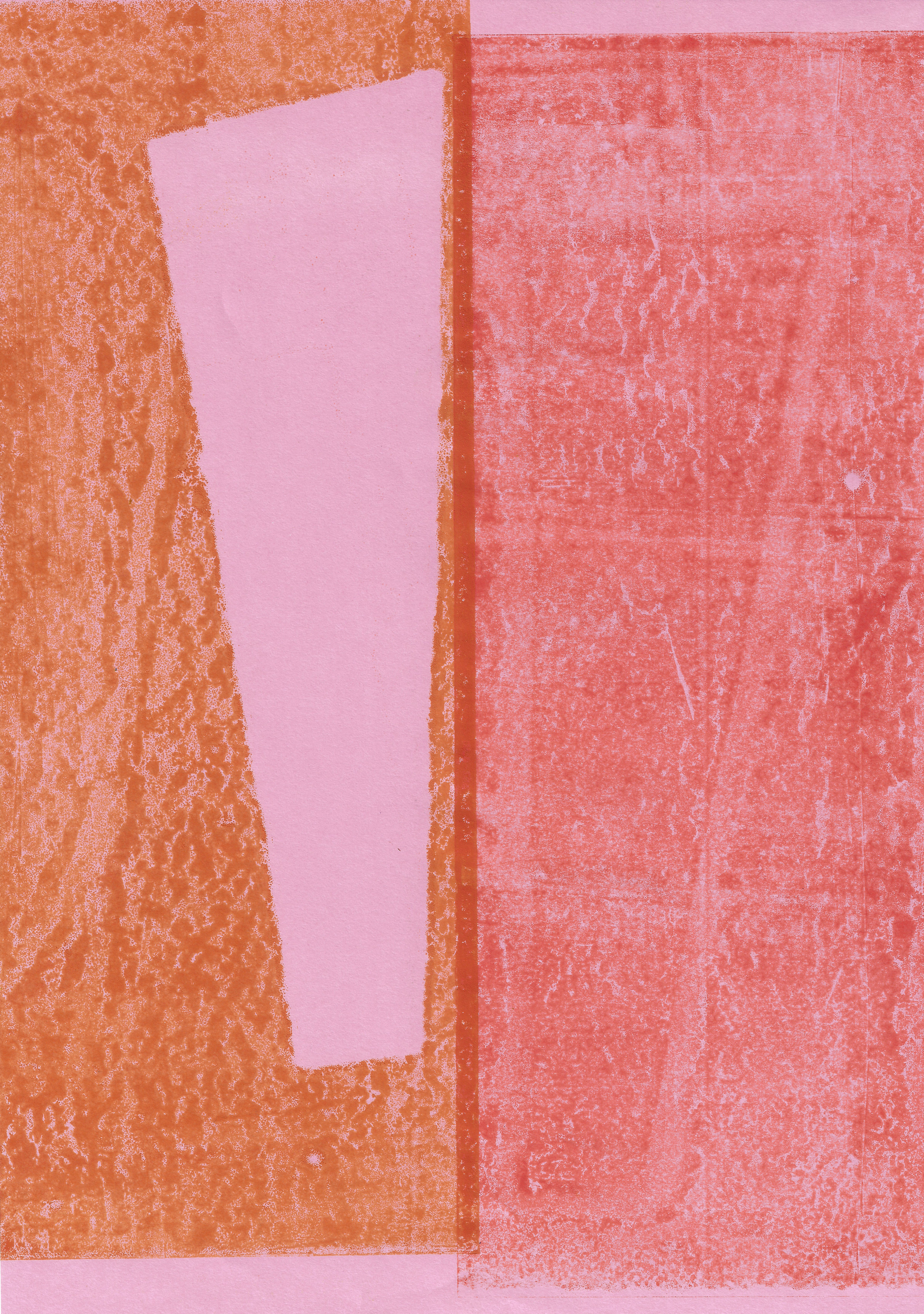
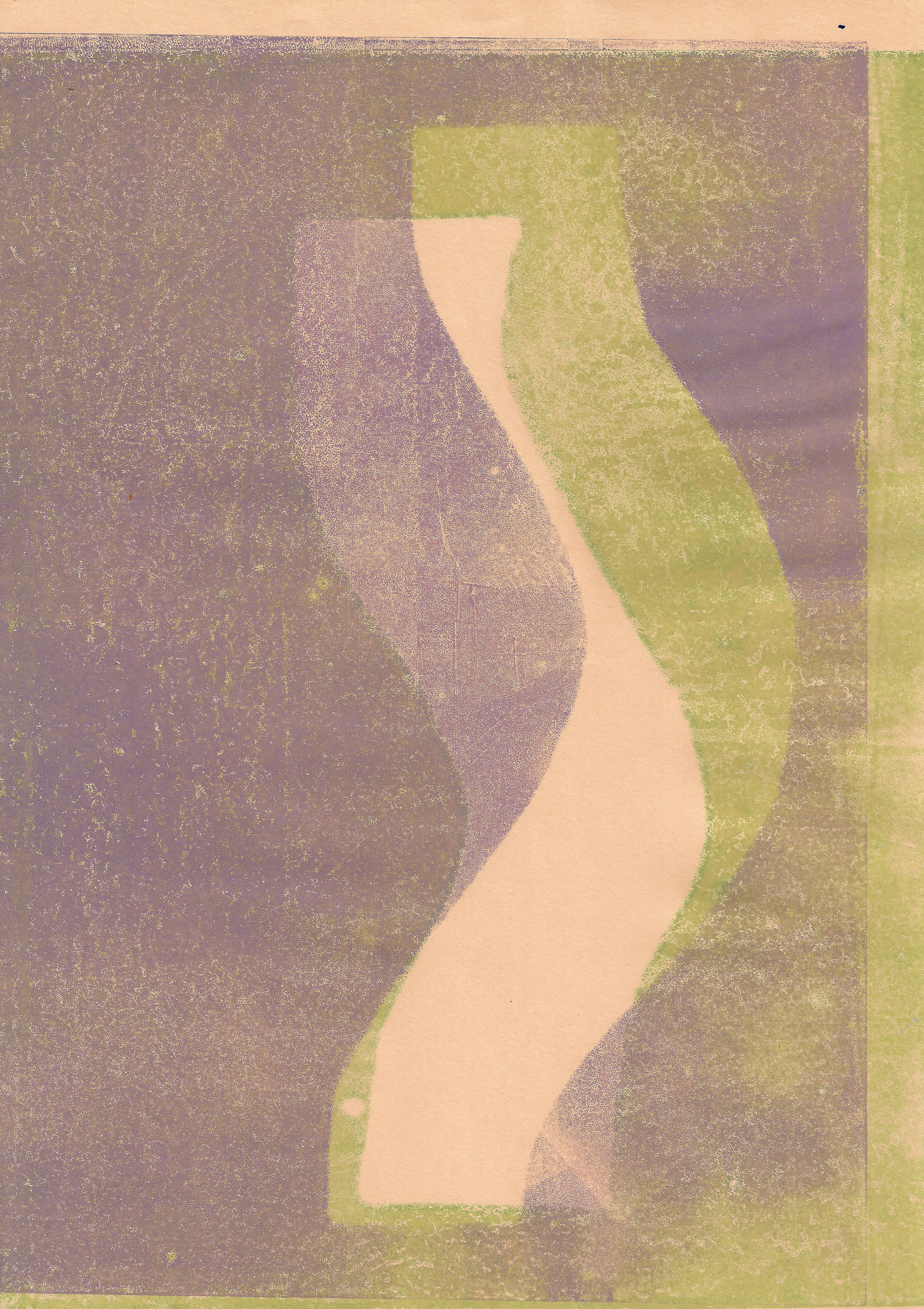
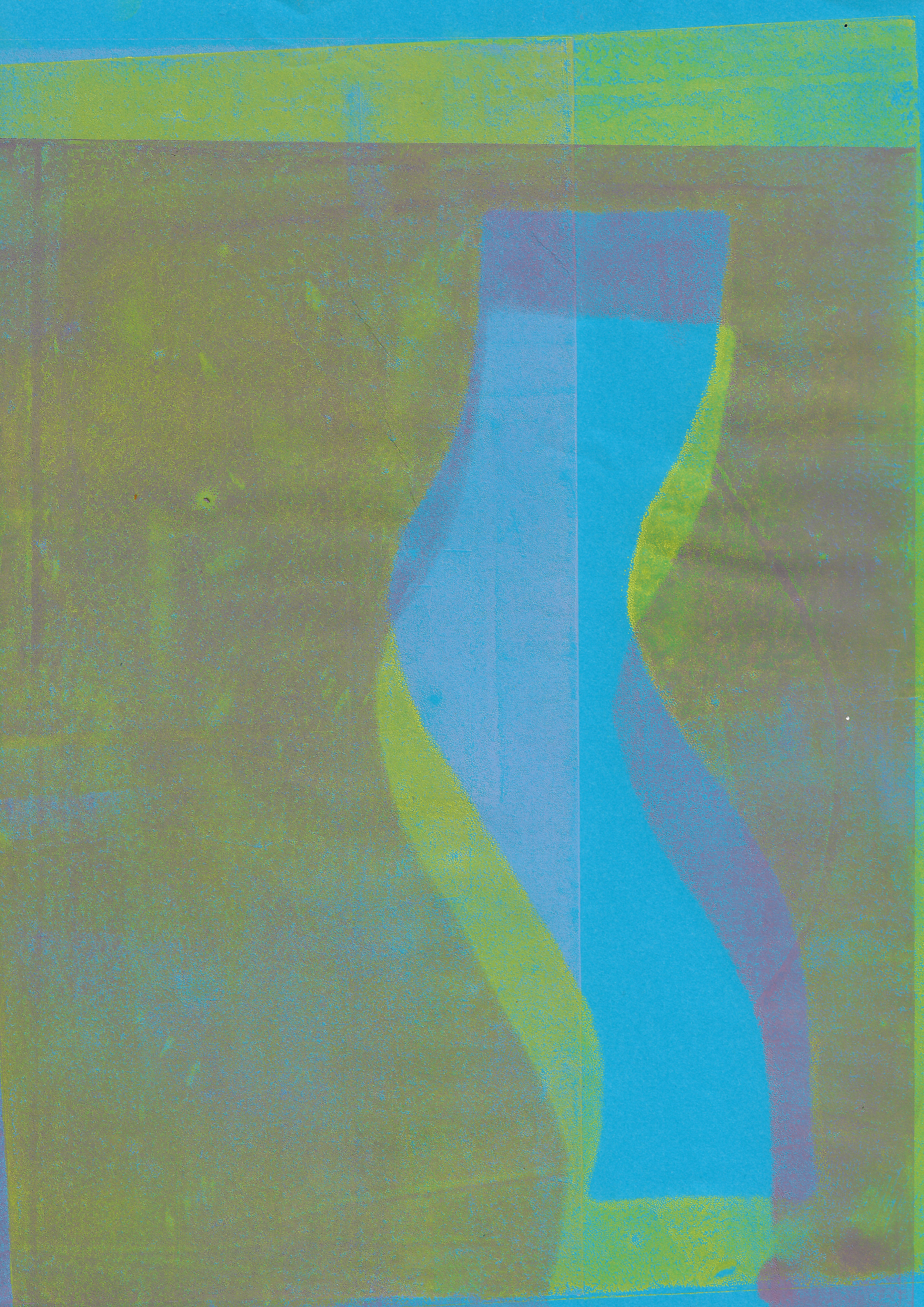
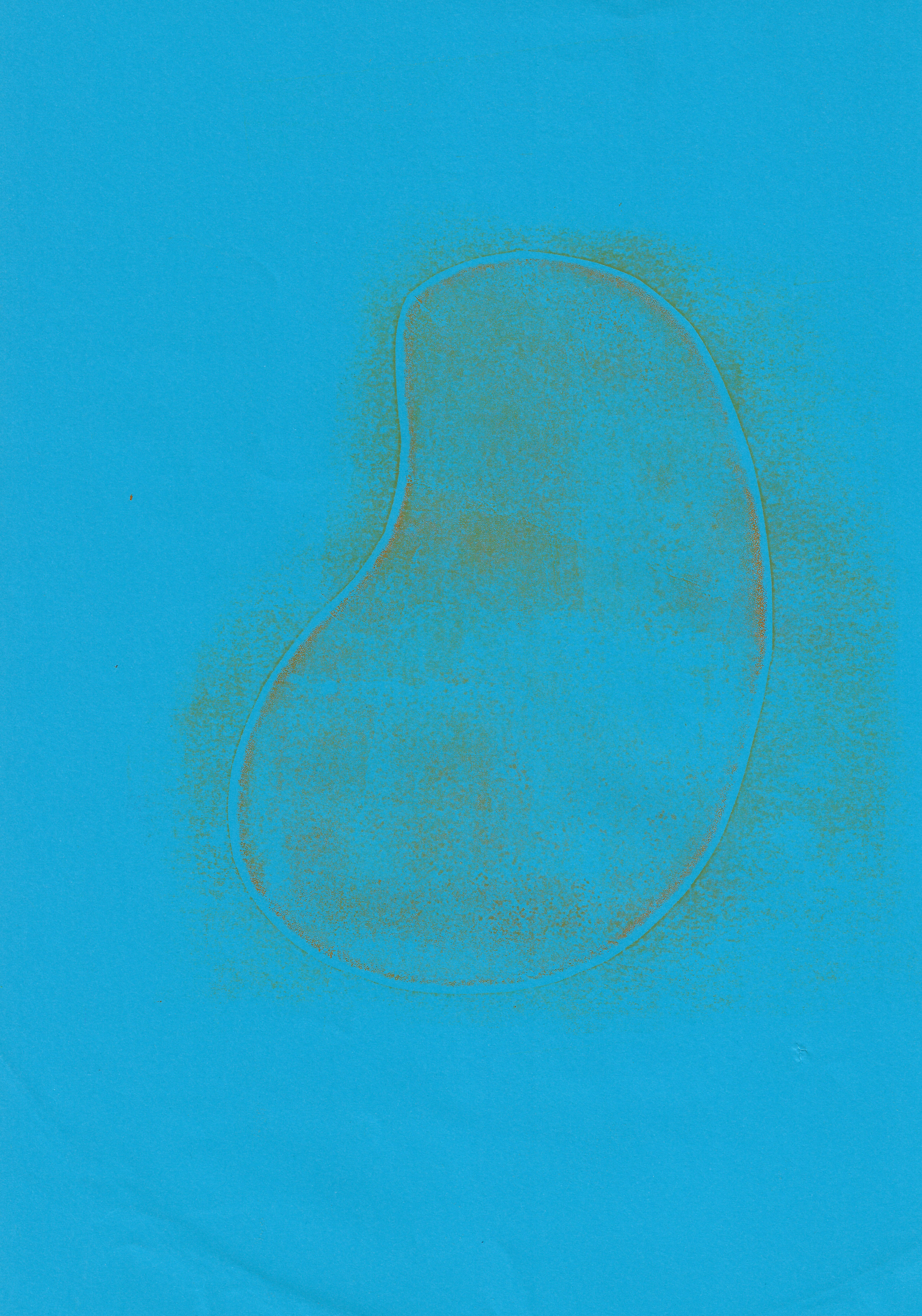
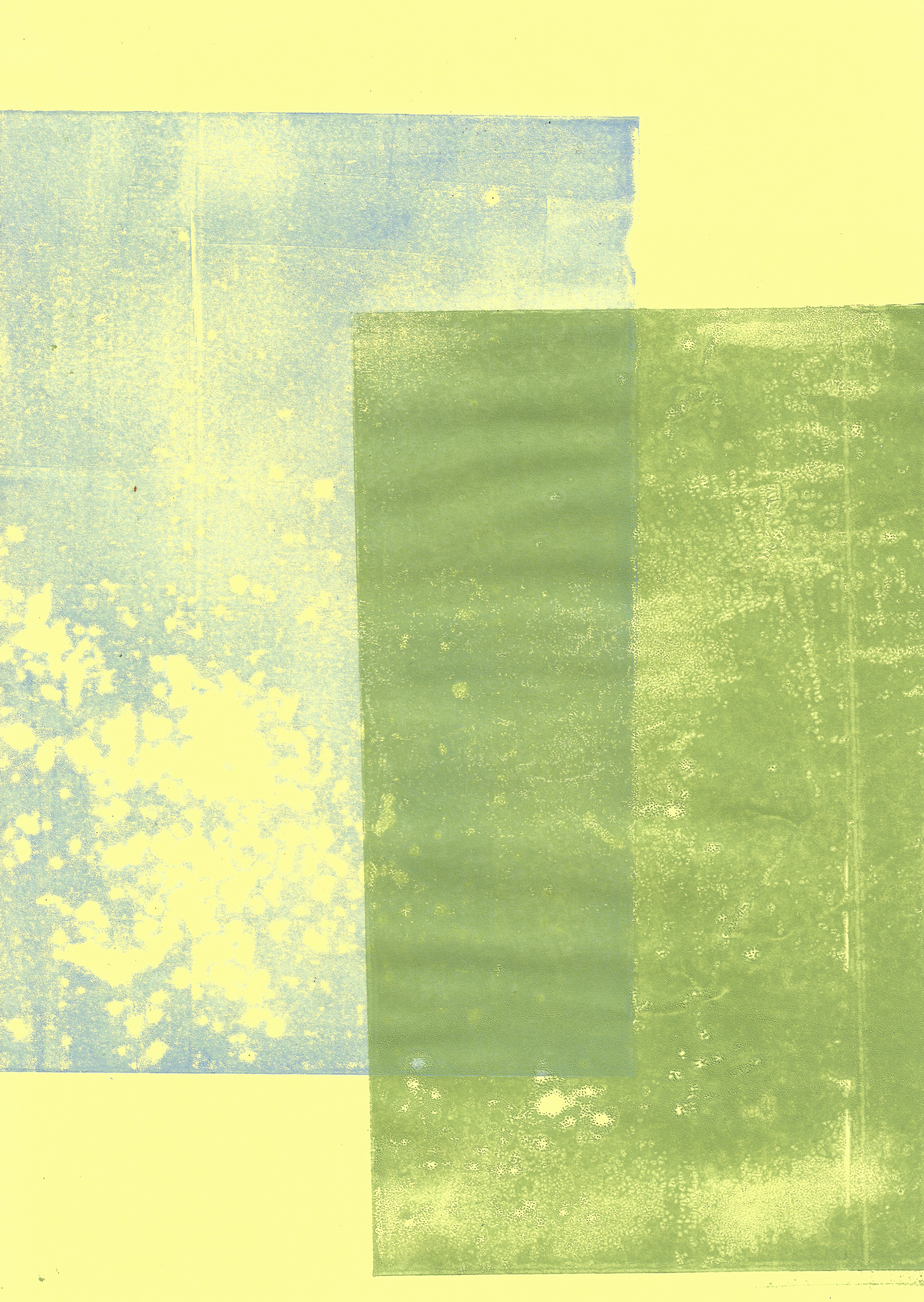
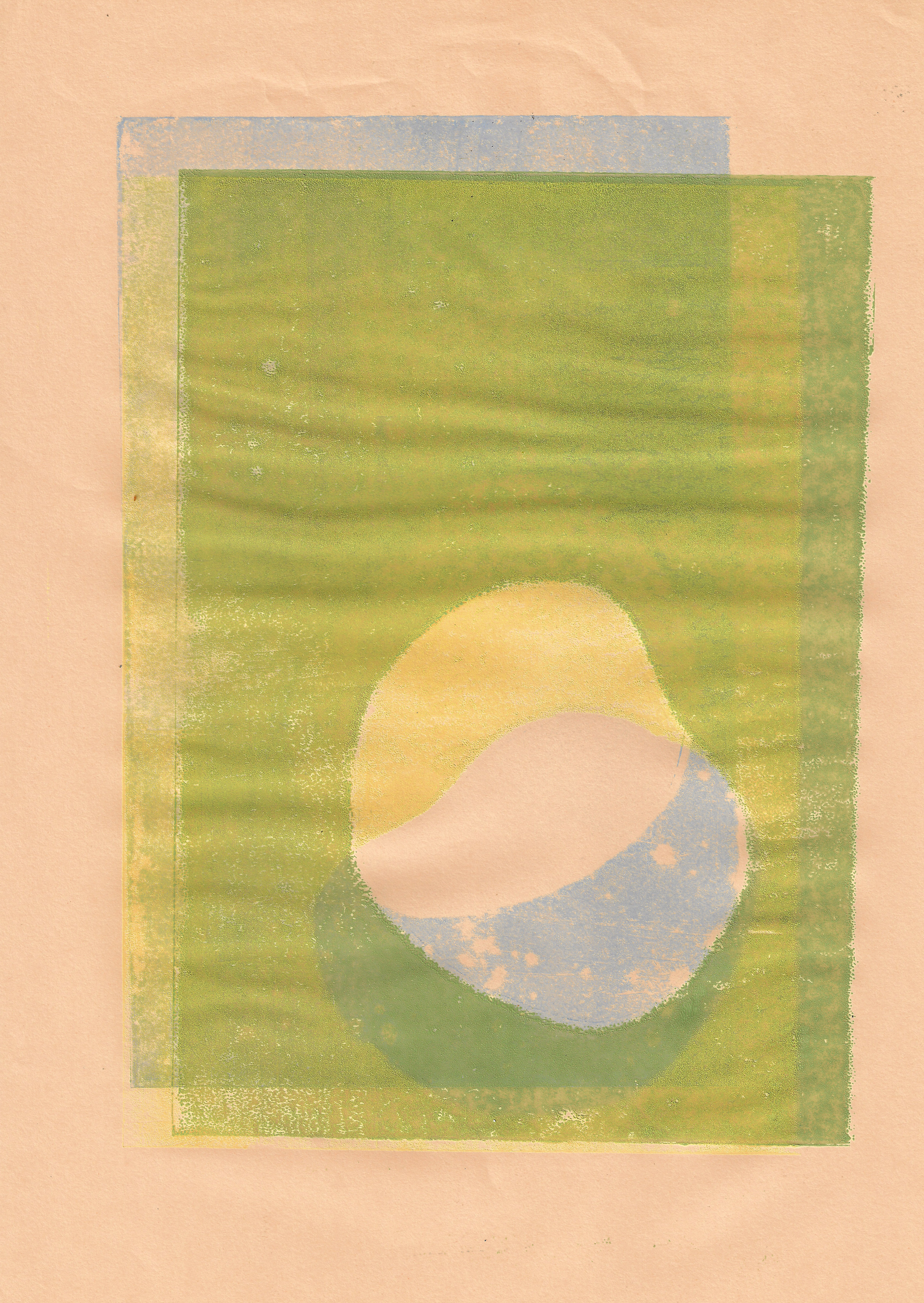
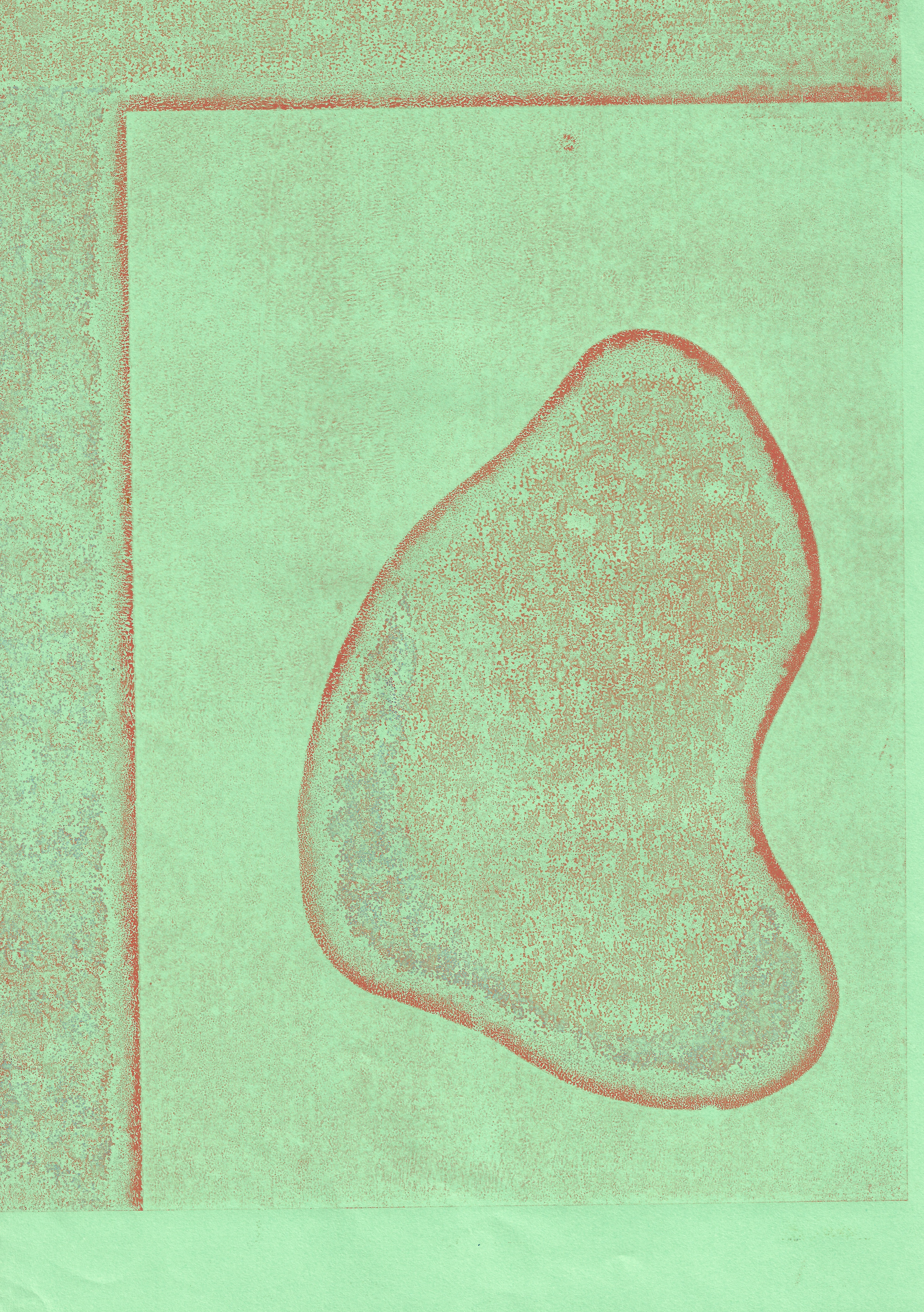
Since I have been unable to enter the workshop due to the lockdown, my work has been limited to monoprinting. I have been experimenting with the different consistencies of ink. From these initial prints, a thicker layer of ink is needed to emphasise the dialogue between form, line and colour.

29.5 x 41.5 cm
24.5 x 35 cm
24 x 35 cm

21 x 29.7 cm
21 x 29.7 cm
21 x 29.7 cm
21 x 29.7 cm

21 x 29.7 cm

21 x 29.7 cm
I have been focussing on the rhythmic line and experimenting how to emphasise this through the use of colour and arrangement of forms. I have not been able to access a wide range of colours or replicate the depth and variety in oil based ink, but I have attempted to with the limited resources I have access to.
16.5 x 26.7 cm

17.8 x 24.5 cm

24.5 x 16.8 cm
21 x 29.7 cm
21 x 29.7 cm

21 x 29.7 cm
21 x 29.7 cm
21 x 29.7 cm
21 x 29.7 cm
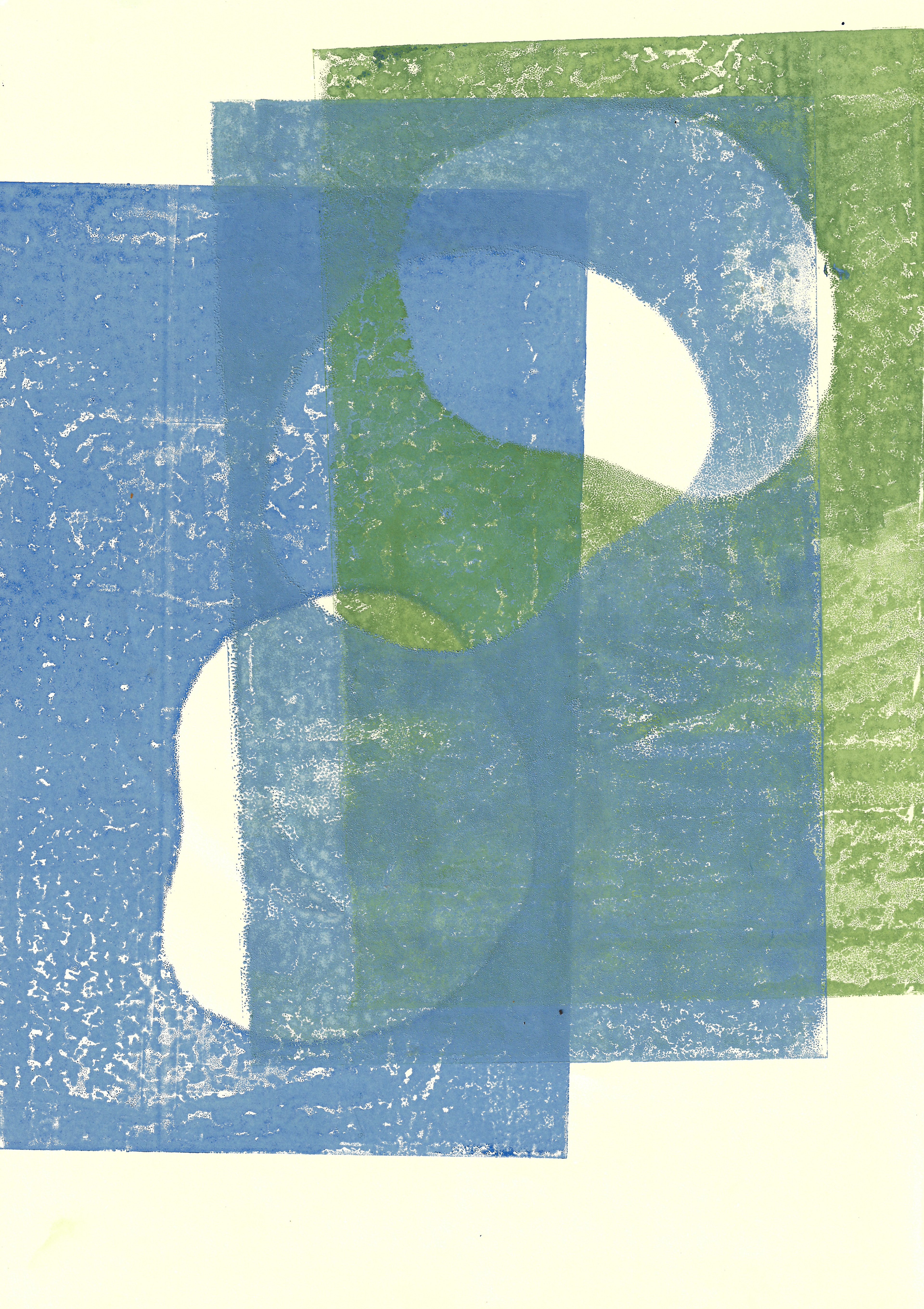
21 x 29.7 cm
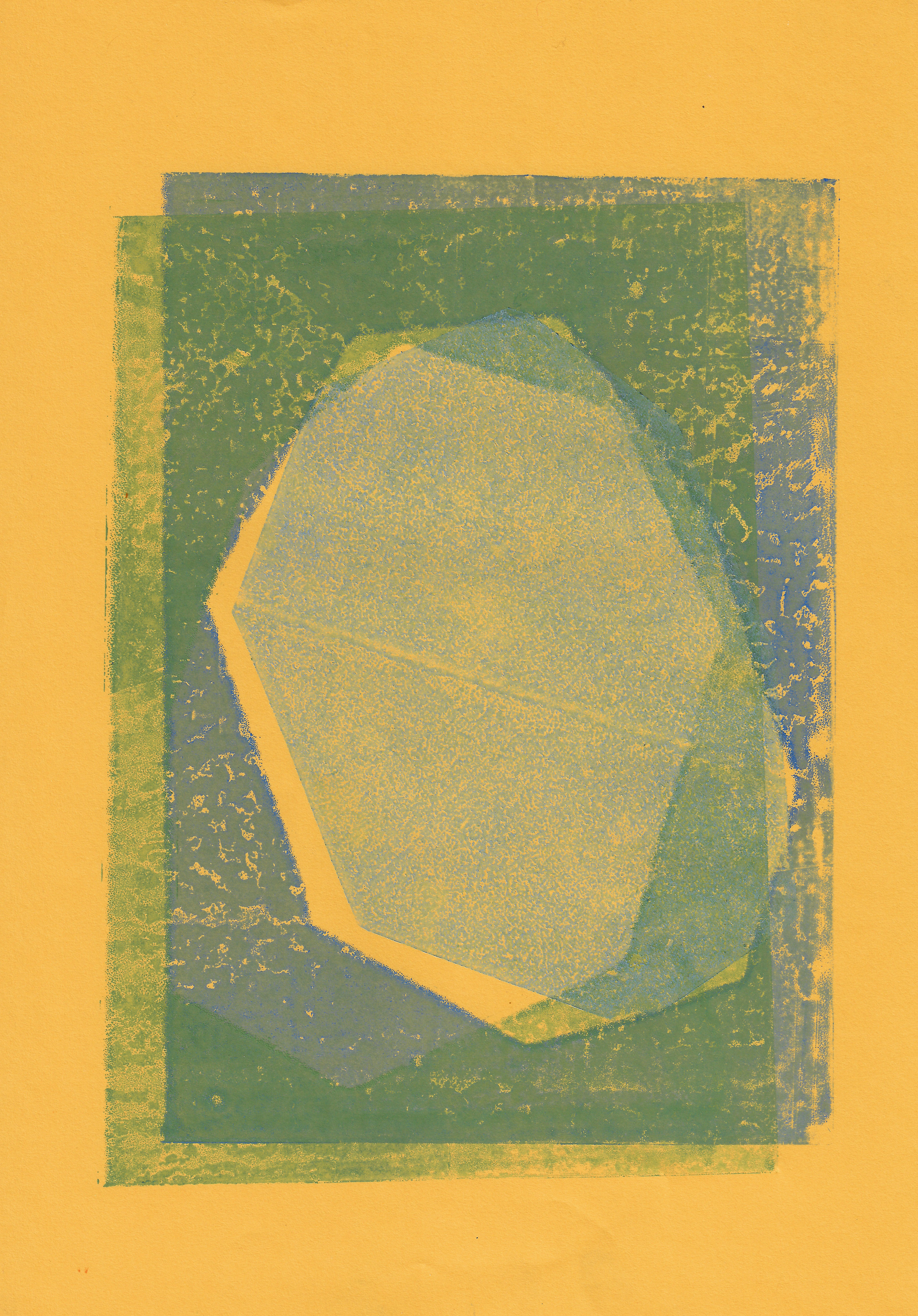
21 x 29.7 cm

21 x 29.7 cm
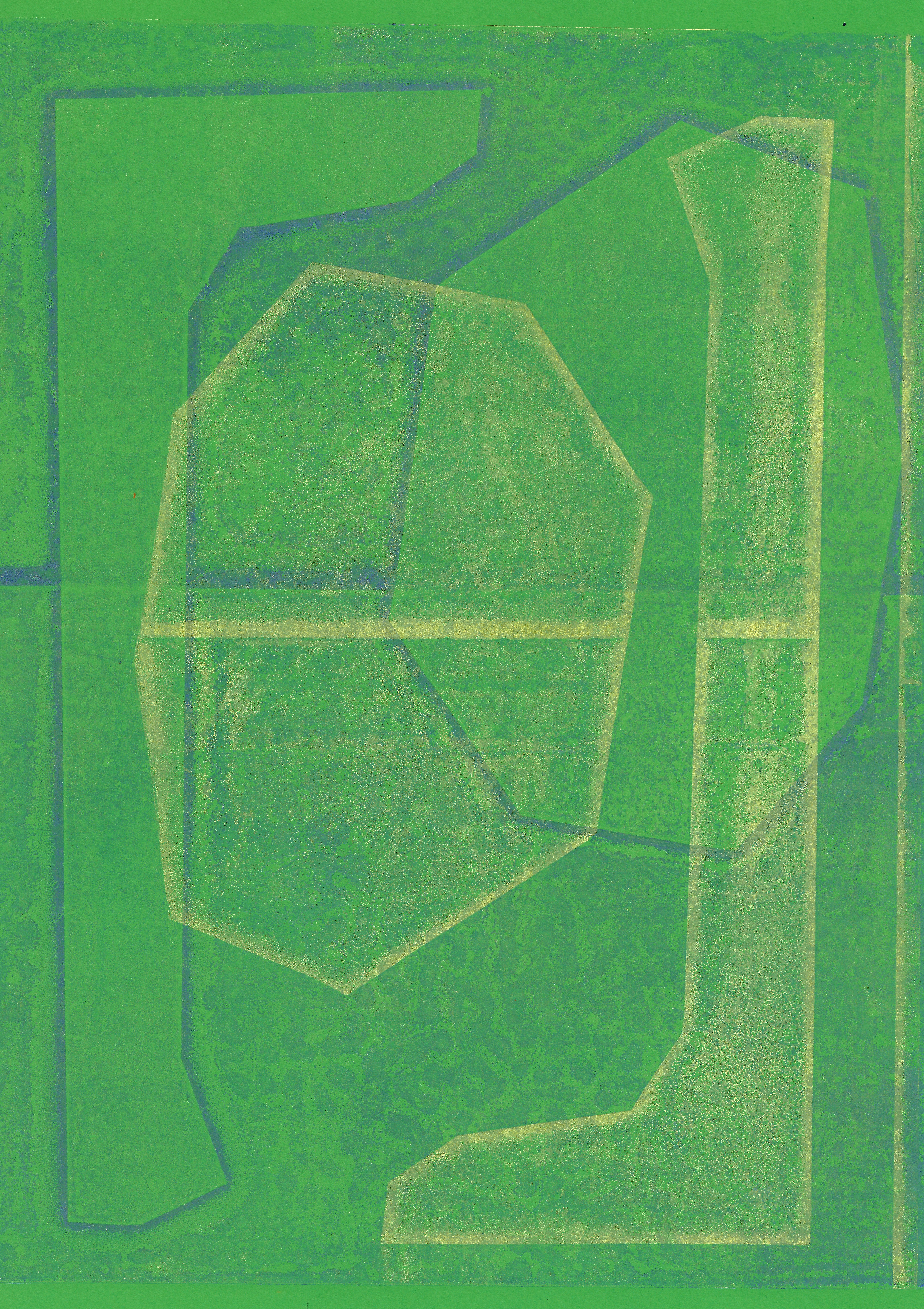
21 x 29.7 cm
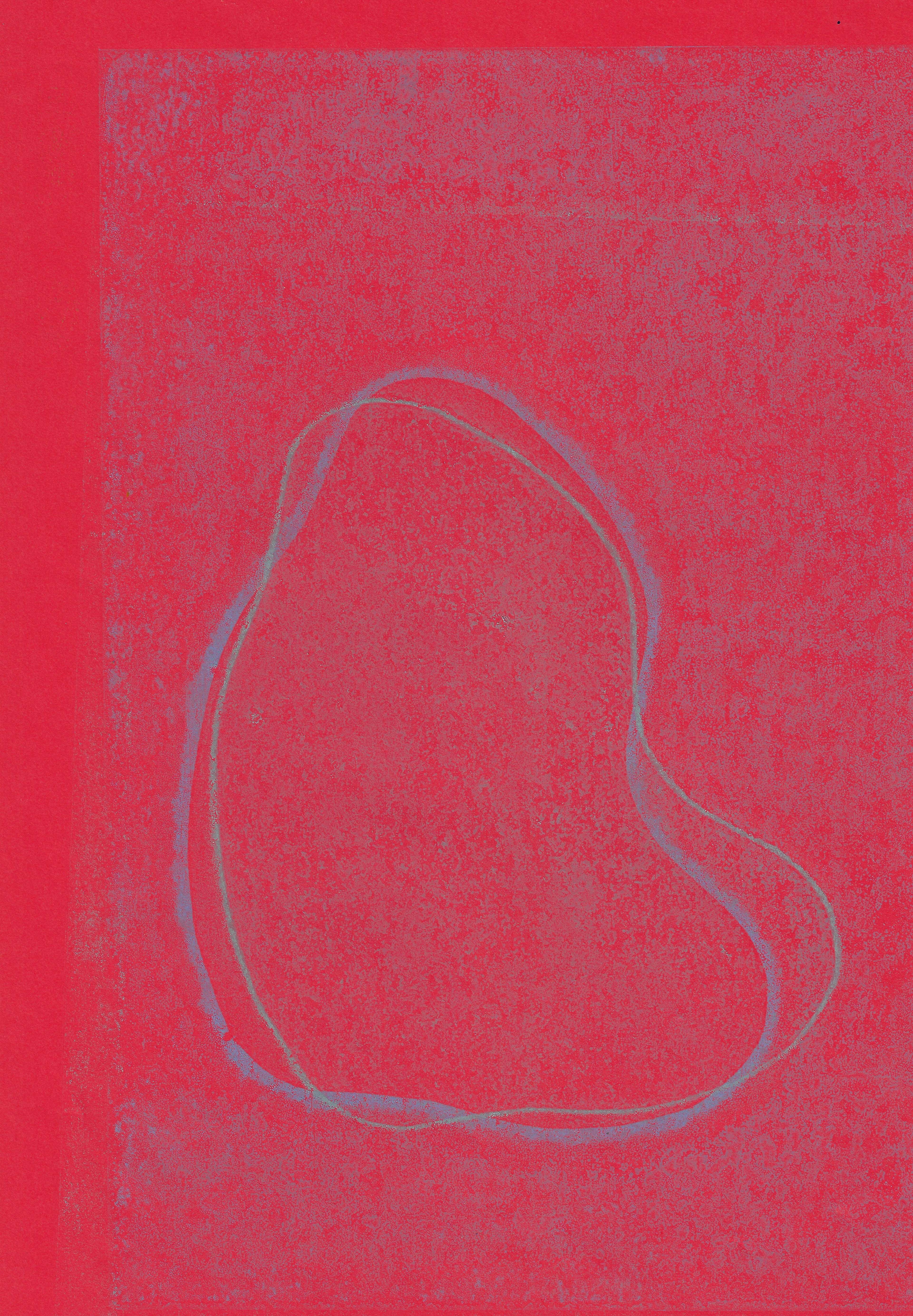
21 x 29.7 cm

29.7 x 42 cm
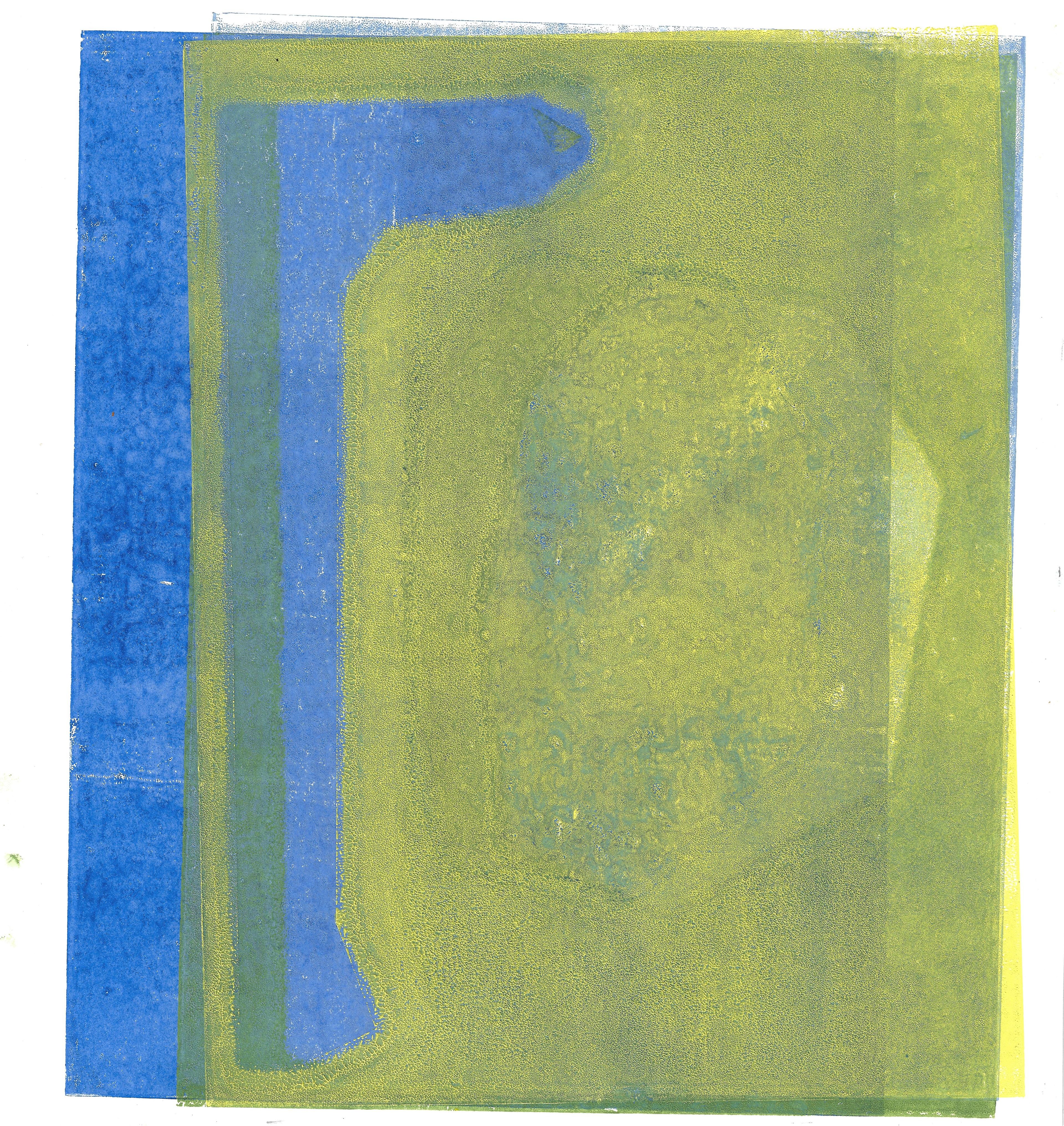
28 x 29.5 cm
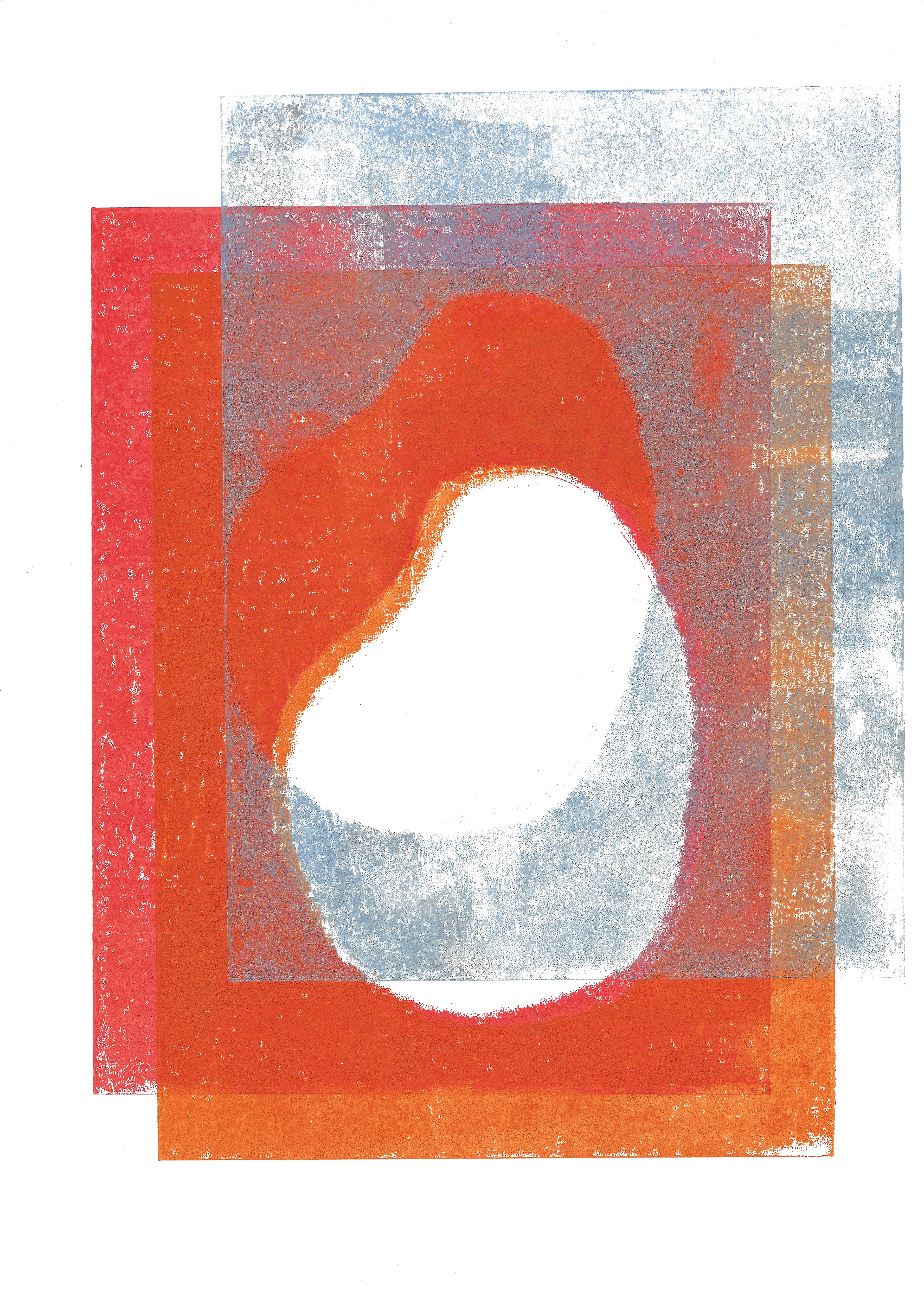
30 x 42 cm
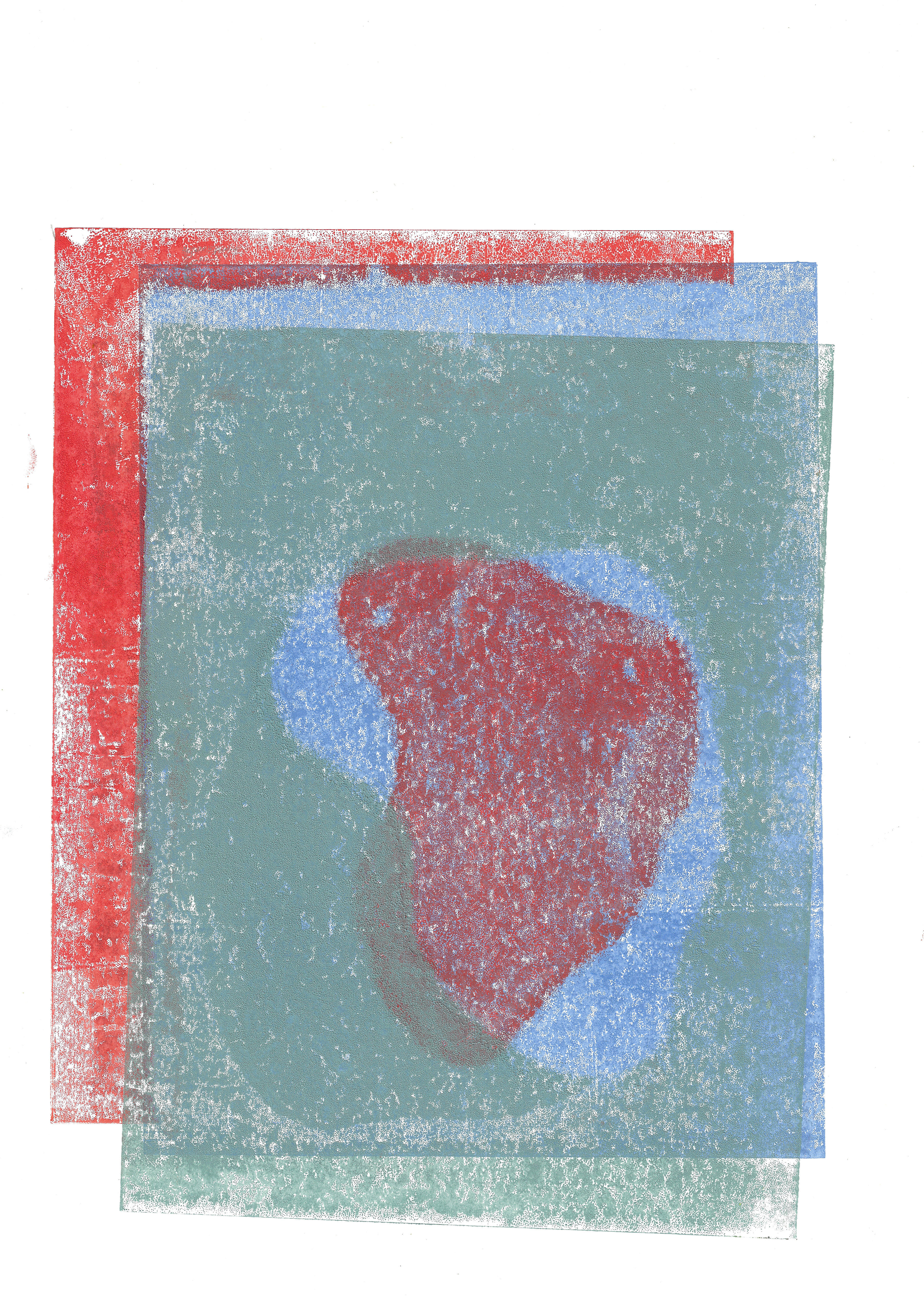
30 x 42.5 cm
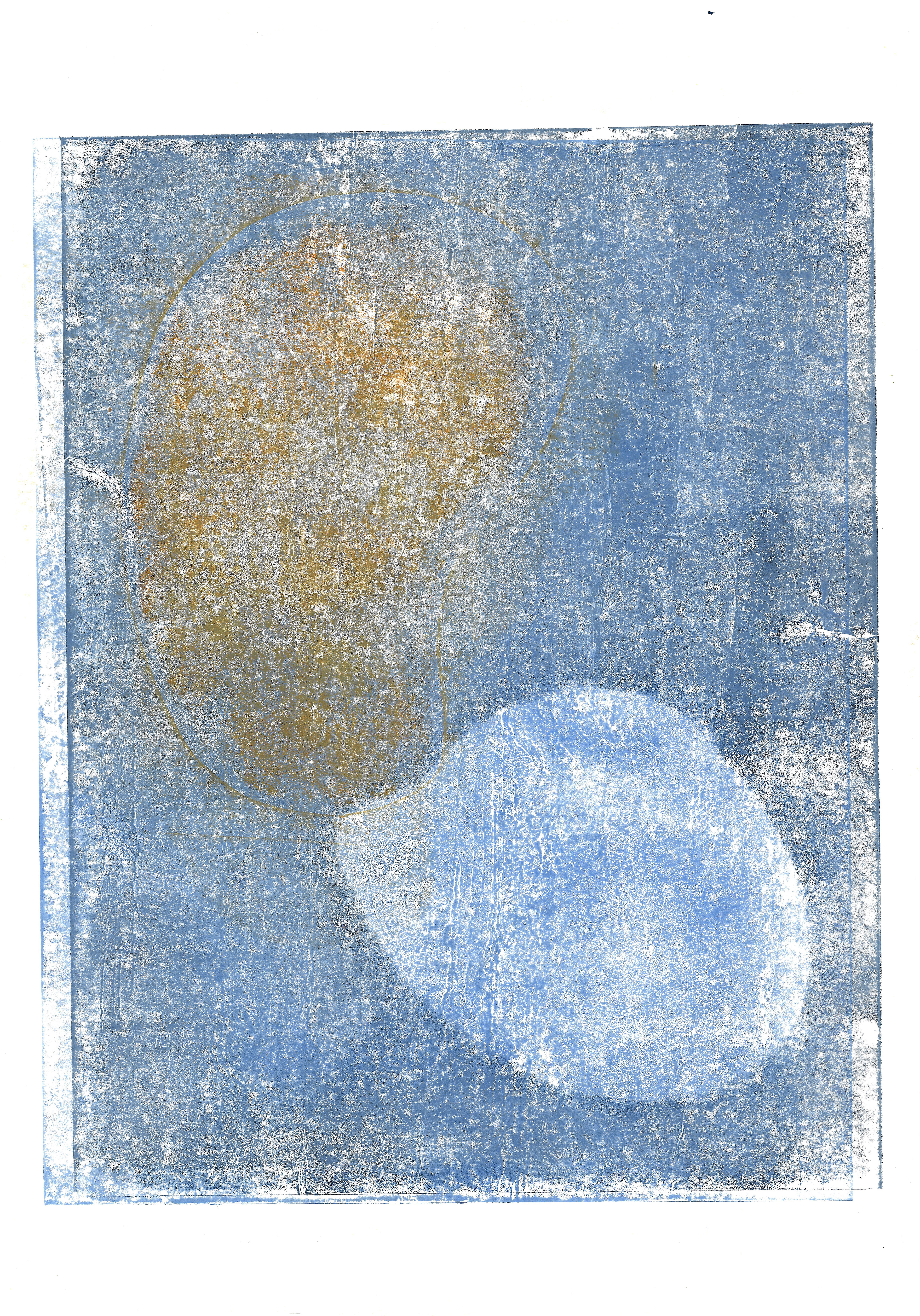
25 x 35 cm

25 x 35 cm
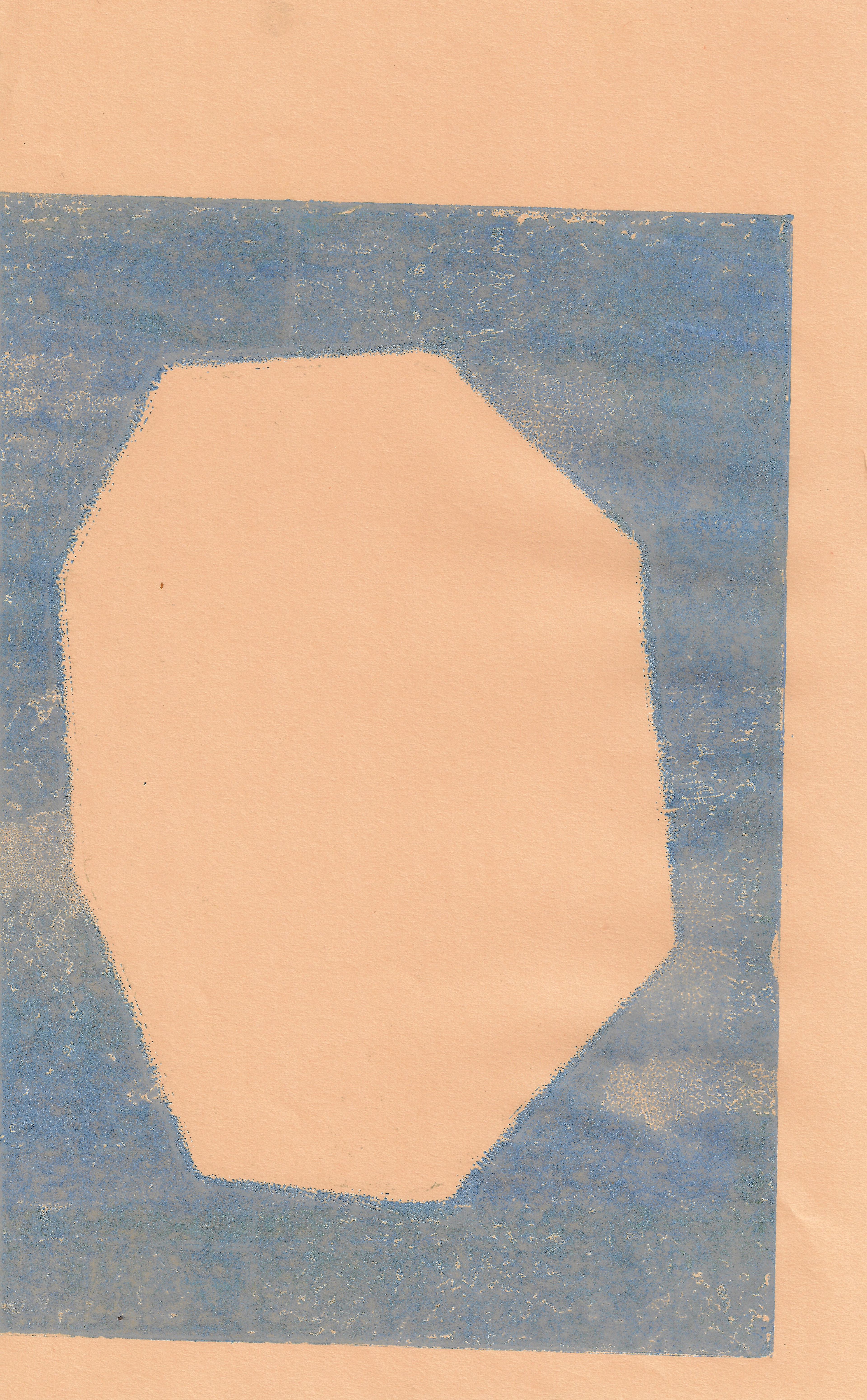
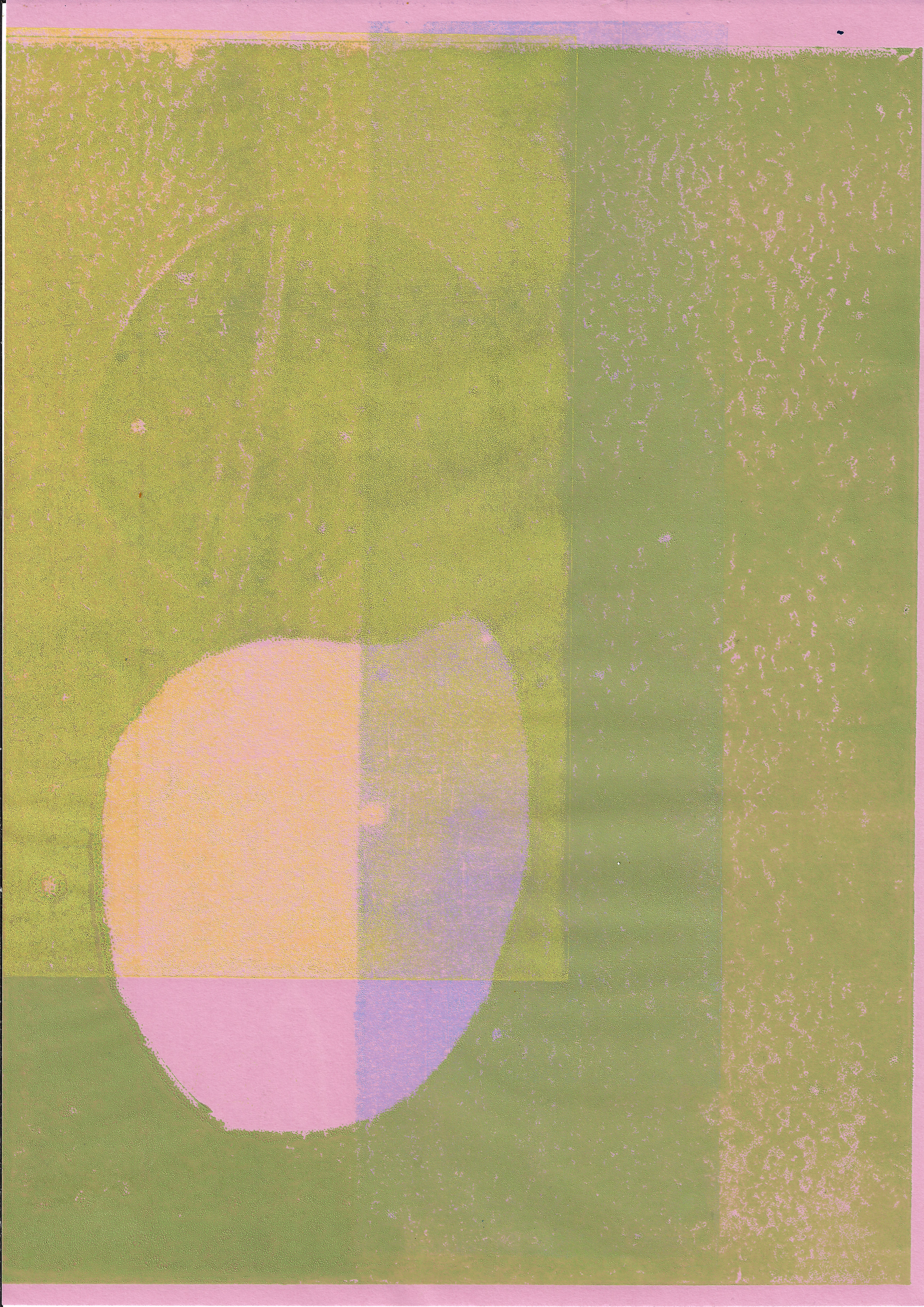
A variety of monoprints focusing on the use of form and line in combination, juxtaposing and emphasising each other, accentuated through the use of colour. Using similar tones and then sparks of a complete contrast in colour to create a harmonious image.
My focus has moved onto the importance of the line and form within my work.
