Initial research question: Explore the dialogue between form, line and colour to create an emotional response in the viewer
Exploring the variety of line, form and colour in my work; looking at the relationship in each of the formal elements and how they harmonise and juxtapose each other. Emphasising the expression of the constant push and pull between conscious and subconscious.
Dialogue of forms in space, emphasising the tension through the use of colour.
Explore creating a variety of translations (in mark making and subject matter) in line and form, relating to my conscious and subconscious environments.
The importance, complexity, emotive strength, and pleasing qualities of colour. Exploring the different combinations, overlaying different colours and varying the transparencies.
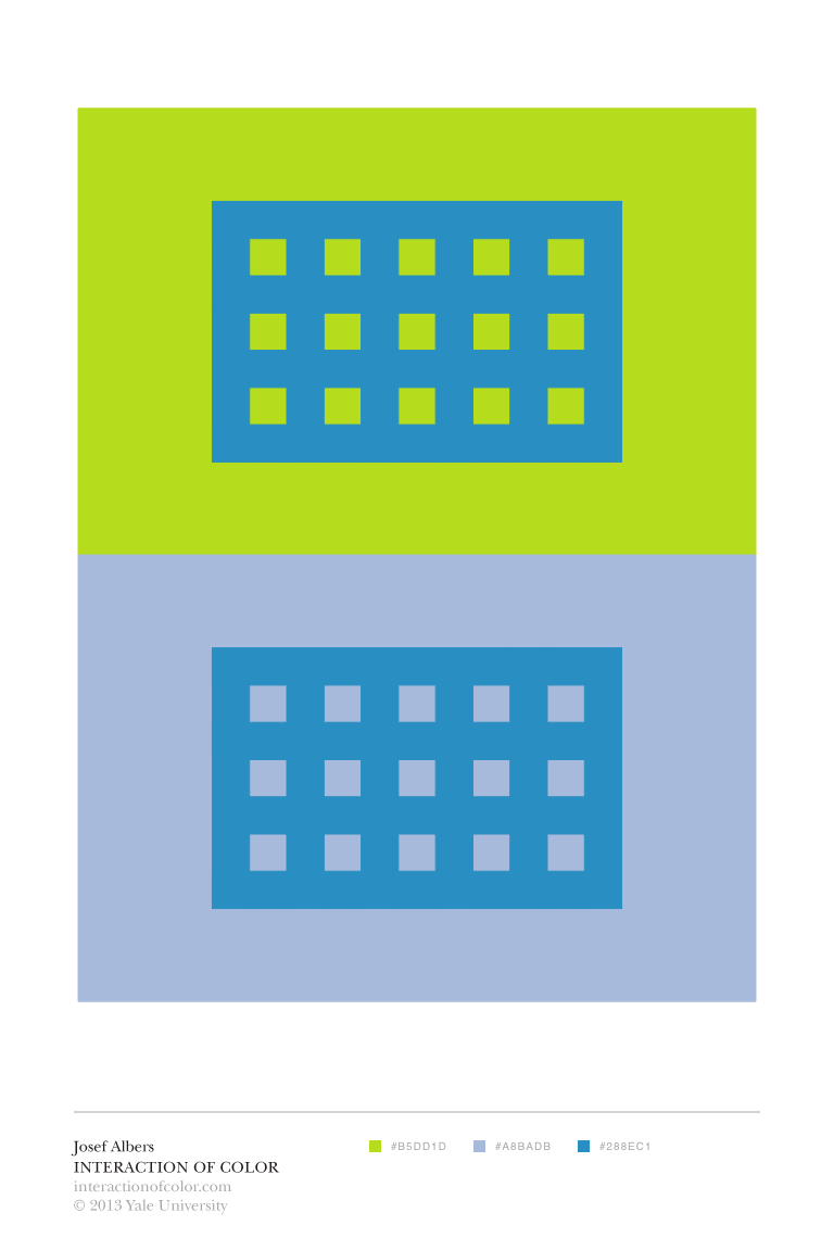
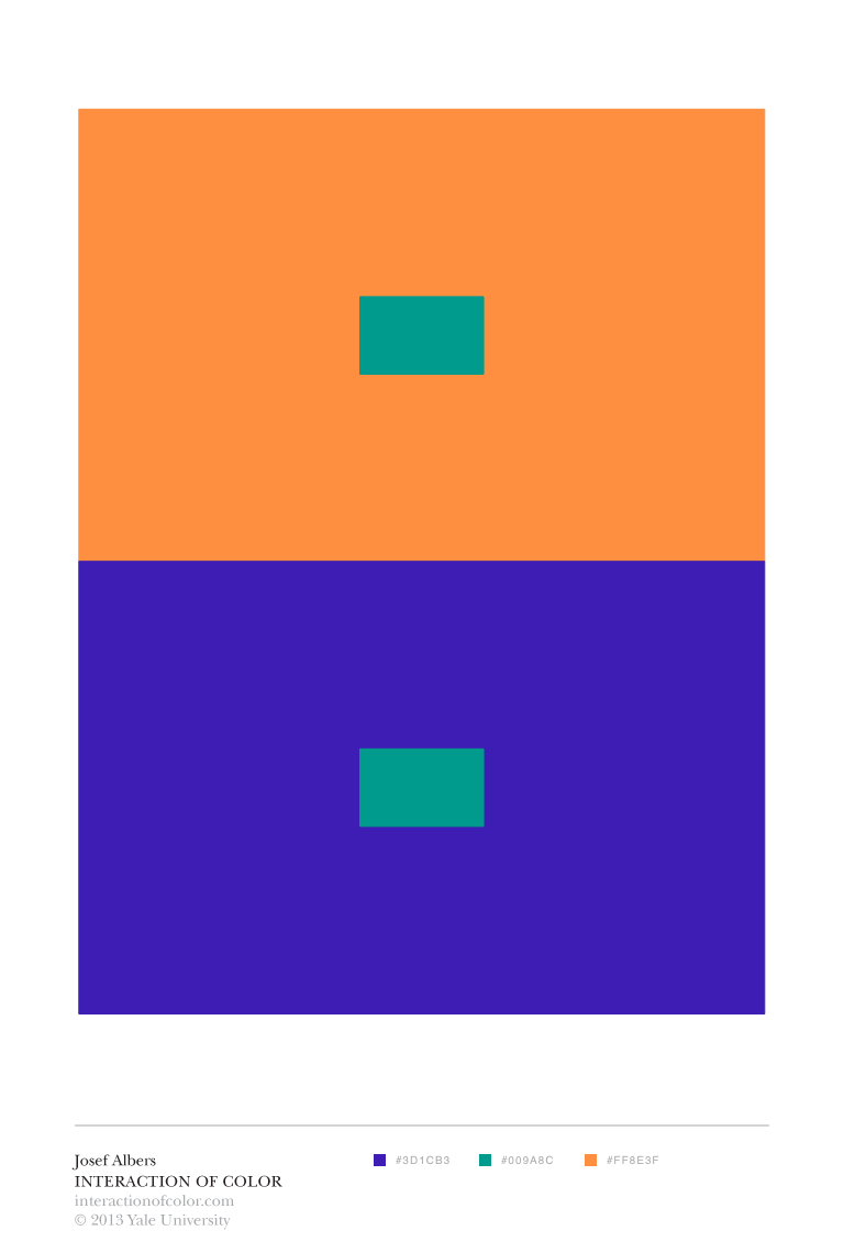
The use of colour within my work forms a fundamental part of my practice and research. In regard to common associations, symbolism and physical effects, there are similarities to be drawn across centuries. Kandinsky states that the first impression from looking at colour is purely physical (1977, p.23) and the initial impressions in regard to colour remain the same. To draw two comparisons, the writings of Goethe and Itten demonstrate the similarity in association. Even though they are written centuries apart, they emphasise that, to some degree, we are similar in our immediate associations. Goethe states that red gives the impression of gravity, dignity and grace (1970, p.314) and Itten corroborates this view stating that whilst red symbolises matter and gravity it also corresponds to the form of the square (1970, p.75). There are fundamental comparisons which can be drawn. Wittgenstein further states that everyone has similar colour concepts (1979, p.4) and that there are large similarities to be concluded.
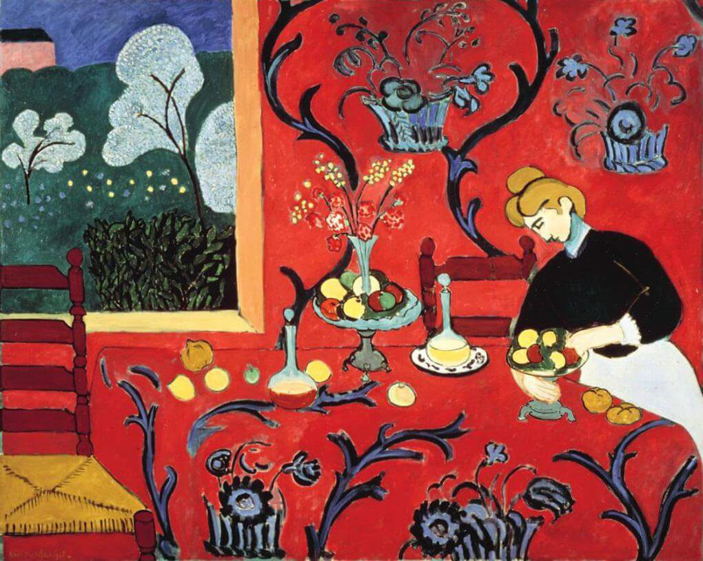
Henri Matisse, The Dessert: Harmony in Red (The Red Room), 1908, oil on canvas, 180 cm x 220 cm

Henri Matisse, Memory of Oceania, summer 1952- early 1953, gouache on paper, cut and pasted, 284.4 x 286.4 cm
Henri Matisse, Forms (Formes) from Jazz, 1947, pochoir on paper, 42.1 x 65.3 cm
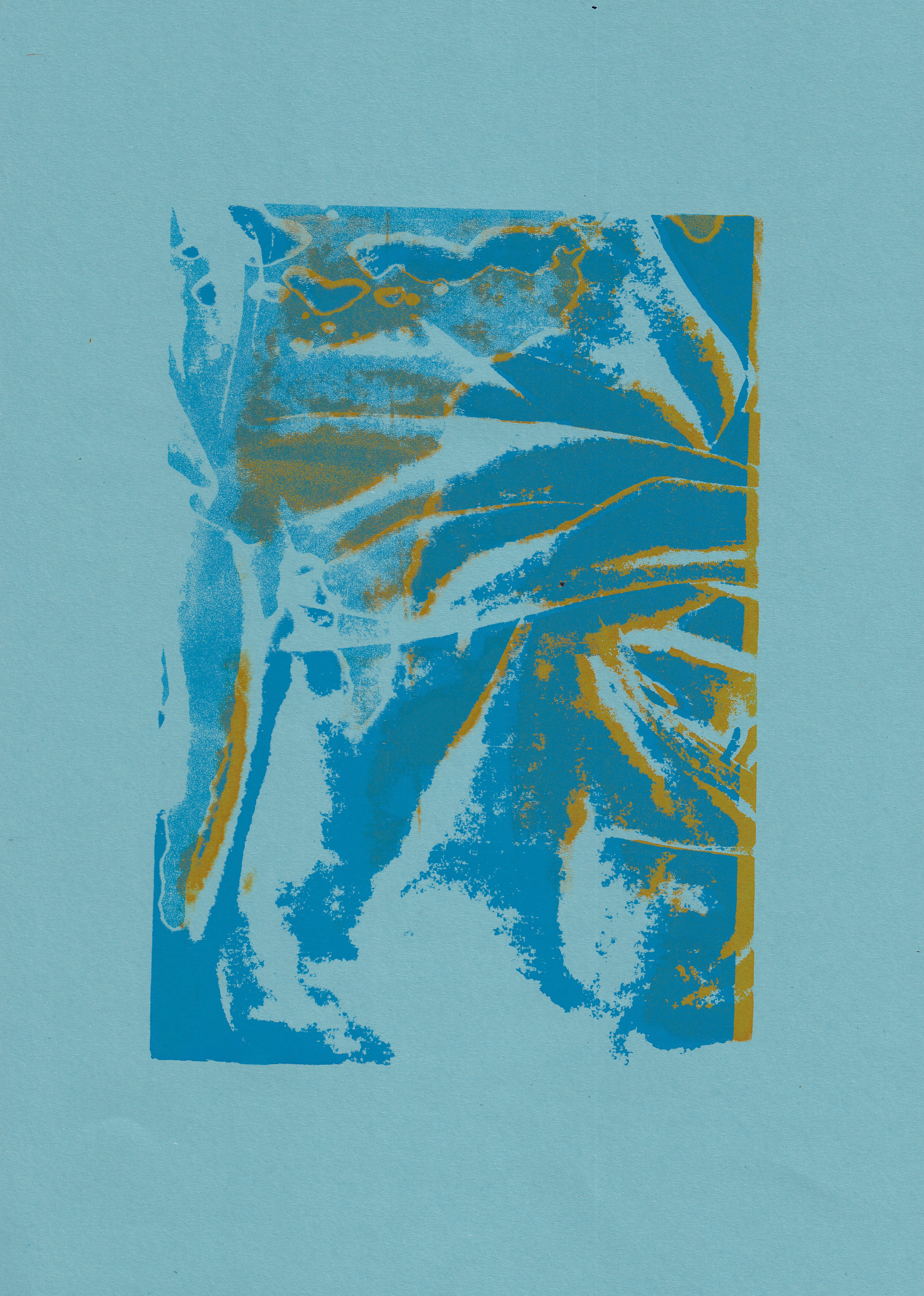
Trinder quotes Matisse, who is well known for his use of colour in his work, especially in his later cut-outs, in his emphasis on the immaterial qualities of the colour blue as ‘a certain blue penetrates your soul’ (2019, p. 32). This suggests that the colour blue can prompt a higher sensation. Trinder goes further to illustrate how this is contrasted against other colours as in Matisse’s, The Dessert: Harmony in Red (The Red Room), the use of red is seen to affect your blood pressure (2019, p. 32). Trinder further illustrates that red is the most bodily (2019, p.30). Whilst blue, as a colour, represents the most abstract in nature, the sea and the sky, being beyond all dimensions, quoting Klein emphasising that ‘all colours arouse specific associative ideas’ and blue suggests what is in ‘visible nature what is most abstract’ (2019, p. 113). The combination of red and blue has been a common thread throughout my practical work as the concept of red suggests an earthly, bodily association and blue suggests a higher, more ethereal association. When using these colours in my work, I offset the different layers when screenprinting to highlight the use of different colours, which are mainly red and blue. To develop this further I would be interested to use oil-based inks, to make a third colour and emphasise the two different elements mixing to become one, both physically and symbolically.
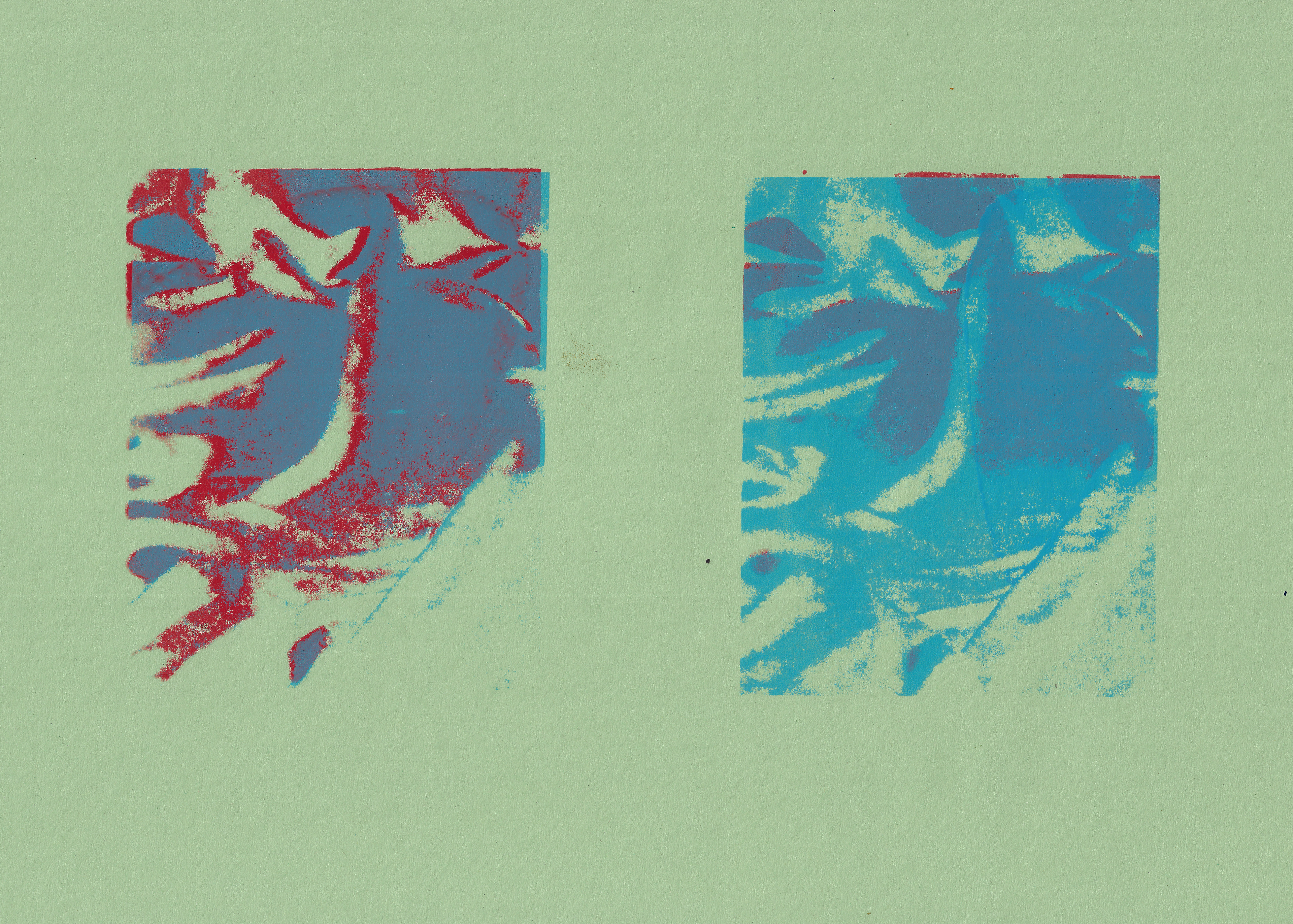
Screenprint on paper, 29.7 x 42 cm
Although one must not get carried away, as Kandinsky reinforces the notion that the extent to which colour affects the individual depends on their sensitivity and their own personal experiences (1977, p. 24). Thus, whilst there are similarities in the perception of colour, the degree to which colour communicates is entirely dependent on the individual. Kandinsky asserts that ‘colour is a power which directly influences the soul’ (1977, p. 25). It is clear that colour can communicate on this level, but the degree is dependent on the individual.
The more personal the use of colour within a piece of work, the more likely it is to strike a similar chord in an individual viewer. Milner outlines fundamentally that everyone’s experience with colour is intimate (1983, p. 22). Throughout my practice and research, I have been developing my sensitivity and awareness of colour. However, I am unsure if through varying the tonal range of the colours I use, my work will necessarily have a correspondingly emotional impact on the viewer. I am unsure on how to communicate my developing sensitivity in my experience of colour in my work. Castleman highlights that throughout Albers’ work he preferred to use standard print colours to remove the personal and unpredictable element (1988, p.200). I am not sure if necessarily I need to vary my tonal use of colours, and not just use standard colours, to have an emotional impact upon the viewer. The focus of my work has been mainly on my use of colour, as it has dominated my research and reading. Moving forward in the next unit, I intend to develop an equal dialogue between line, form and colour.

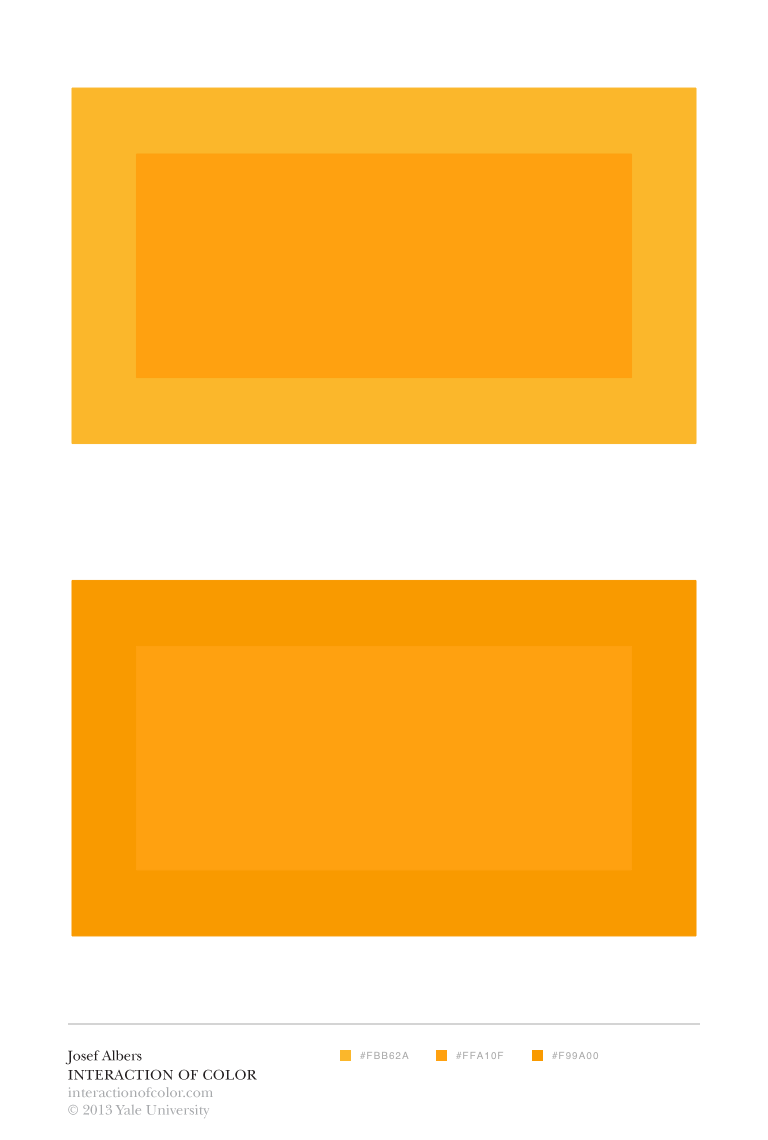
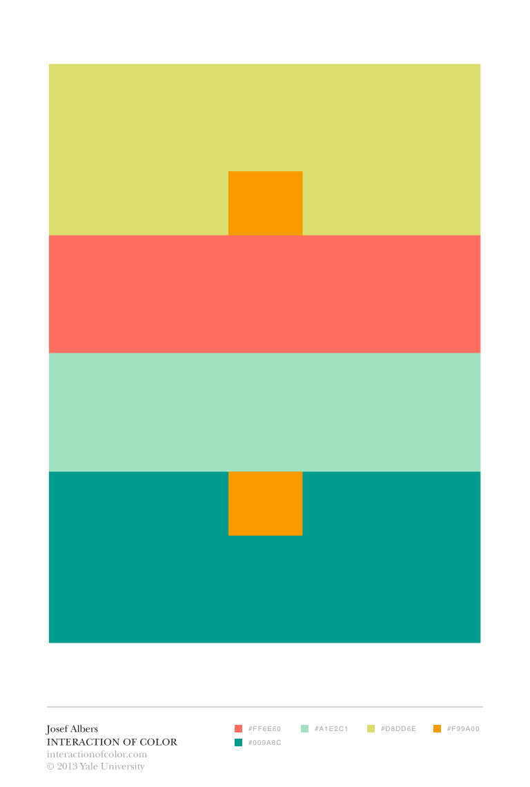
Josef Albers, Homage to the square: Apparition, 1959, Oil on Masonite, 120.6 x 120.6 cm
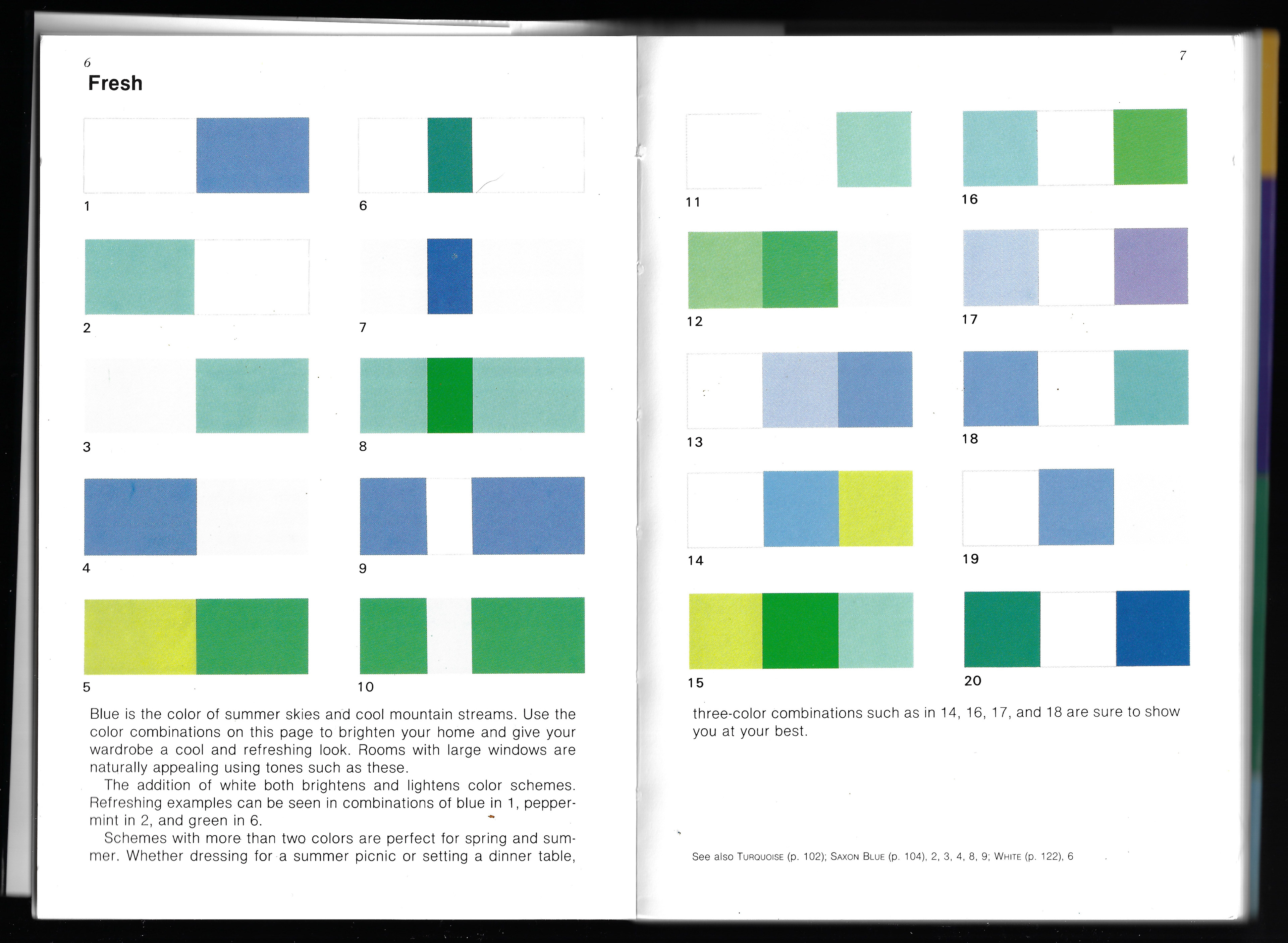
Benjamin Plantier, Maximage Color Combinations
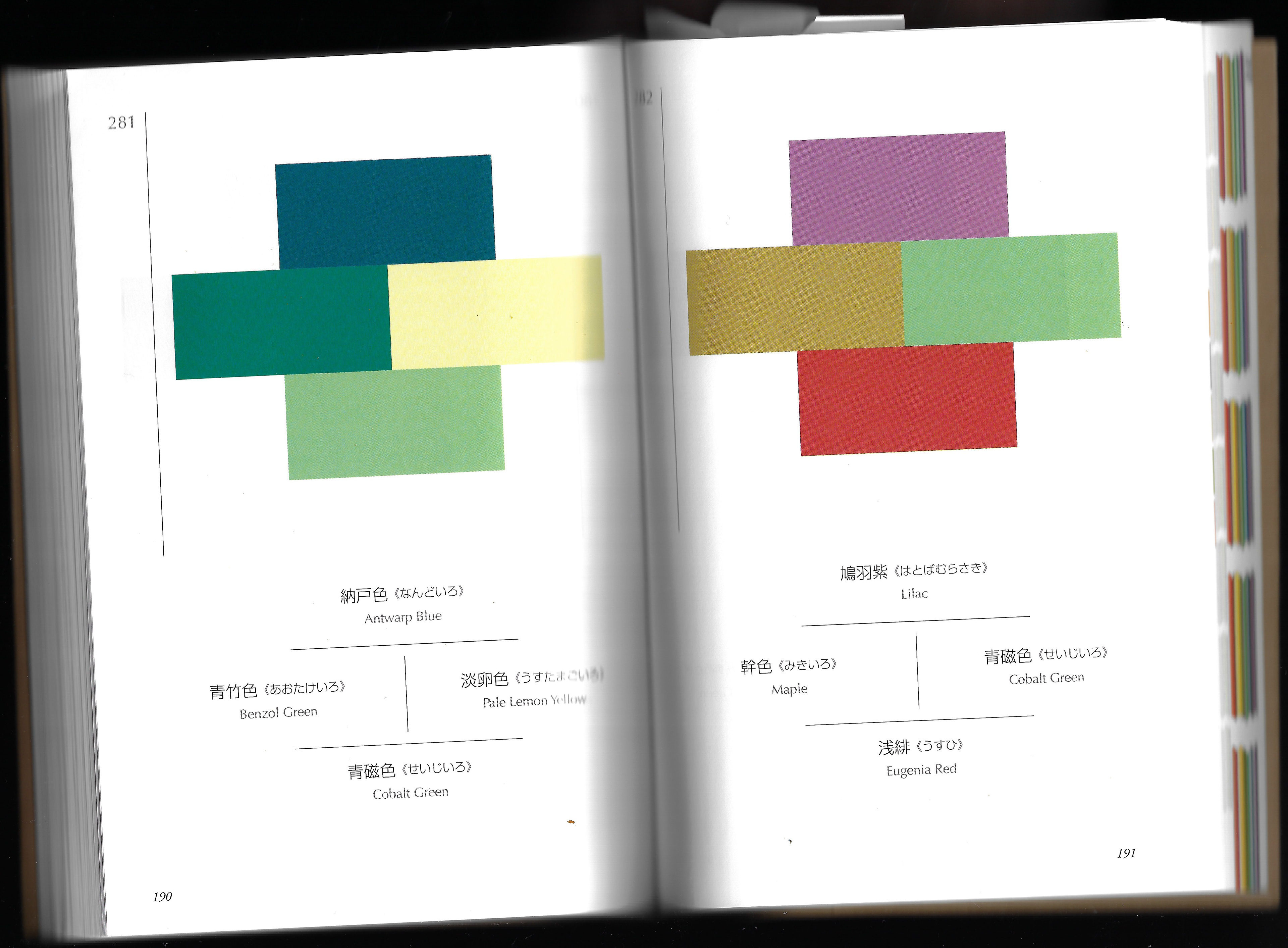
Sanzo Wada, A Dictionary of Color Combinations

Benjamin Plantier, Maximage Color Combinations

Benjamin Plantier, Maximage Color Combinations
Shigenobu Kobayashi, A Book of Colours: Matching Colours, Combining Colours, Color Designing, Colour Decorating
Goethe claims that the effects of colour are associated with emotions of the mind (1970, p. 304). There is no rule which states the exact translation of every colour. Wittgenstein claims that you cannot translate colour (1979, p.4). Increasingly, I have found that throughout my research and practice, I have found that with my increase in experience with colour, I find it increasingly difficult to express in words the true translation of colours and the experience. Kandinsky expresses the problem I am facing, in that the soul’s emotions which colour awakes are too finer texture to be expressed in words; words are limits and they will only ever remain as hints (1977, p.41). I have found Plantier’s Maximage Color Combinations, Wada’s A Dictionary of Color Combinations and Kobayashi’s A Book of Colours: Matching Colours, Combining Colours, Color Designing, Colour Decorating, useful in the production of ideas. They all have a distinct absence of words and it allows the colour and colour combinations to be heard more clearly. This draws attention to the intuitive aspect of the use of colour. Matisse claims that the knowledge of colour is instinctive, relying upon feeling and a constant dialogue with the senses, and most importantly it is not based upon scientific theory (2008, p.53). Itten affirms this, as he claims that the theory of colour design is based on an intuitive feeling and in order to develop experience with colour, one must practice exercises (1970, p.28). In the days or in the morning just before I entered the print workshop I would look at these books, to subconsciously engage my mind. Not only in the variety of different colour combinations but also to increase my sensitivity and awareness. My research in this area is not going to be developed further by reading more books about theory. The feedback I have received from my tutors has been to focus my research on my practice and in the practical aspects of colour, building up an experience and my own personal relationship.
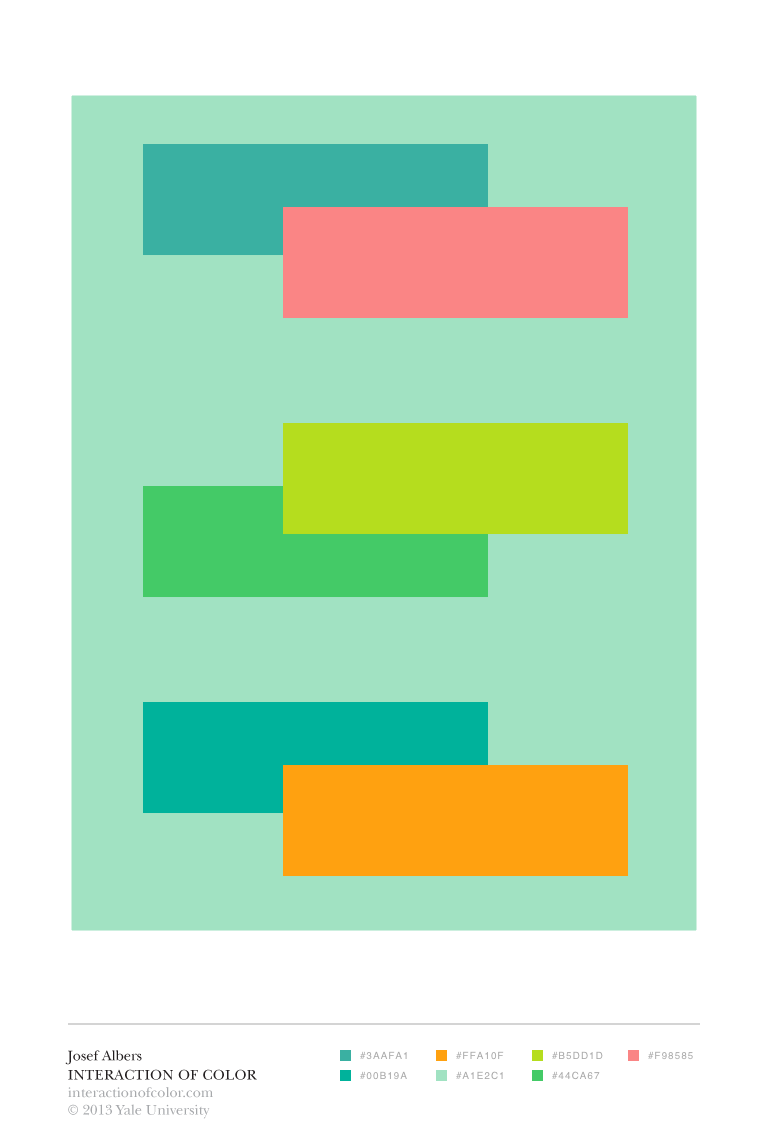
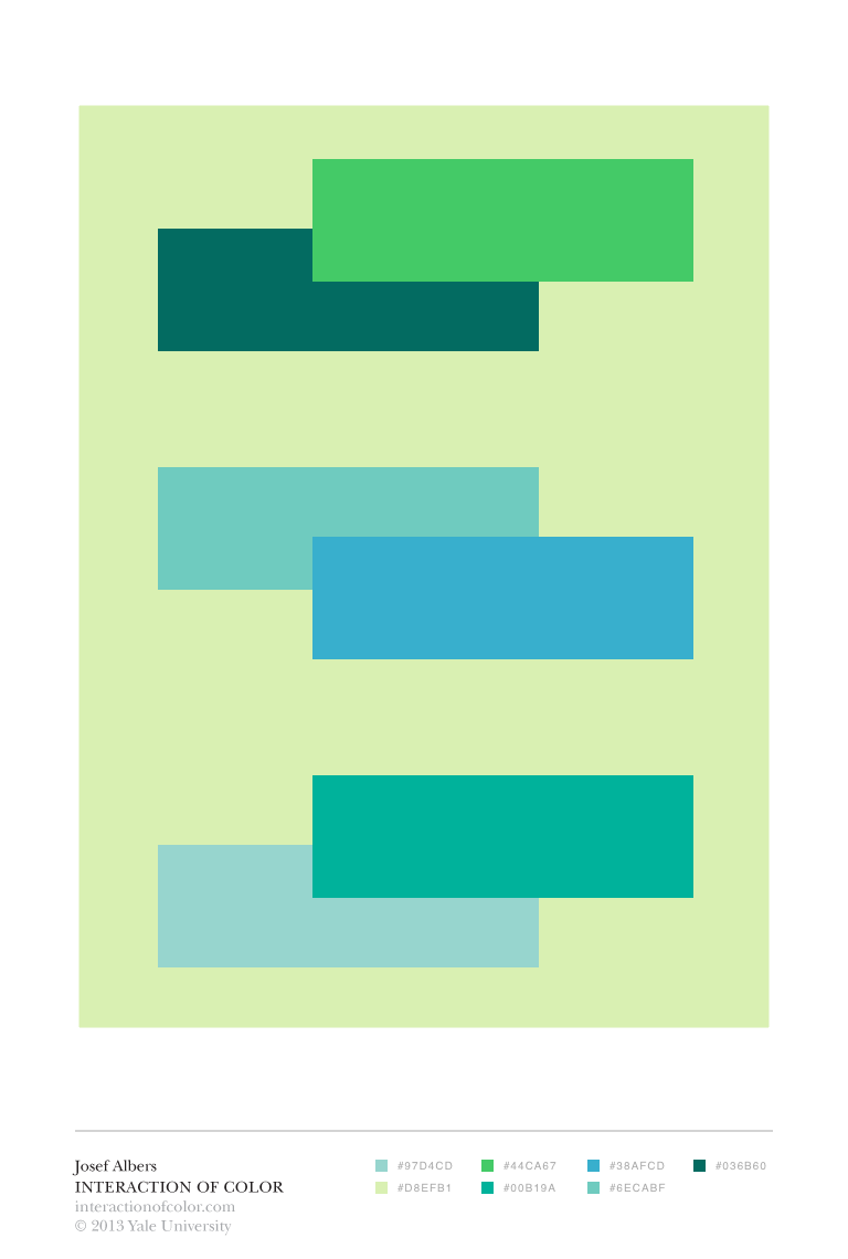
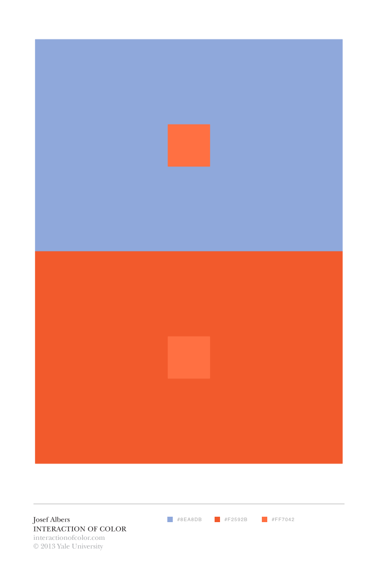
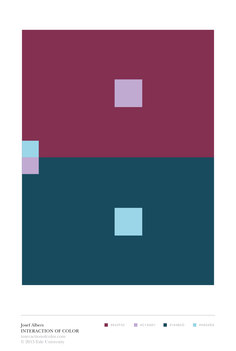
An important part of my research is practically developing my awareness of colour. As through the act of doing, inevitably I will build up sensitivity and a personal experience of colour. As outlined earlier in my practical work, I had tried using coloured paper to conduct the various exercises outlined in Albers’, Interaction of Color but I was having difficulty in exploring a large range of colours quickly. Consequently, I have downloaded the accompanying app to Albers’ book, Interaction of Color , on my iPad. This allows me to conduct various experiments with a wide range of colours quickly and effectively. Building up my experience with colour, playing around with colour and form.
This research has allowed me to explore the relative relationship of combining colours and how important this is in the overall effect, but it has most importantly highlighted how form is equally as important as the use of colour.


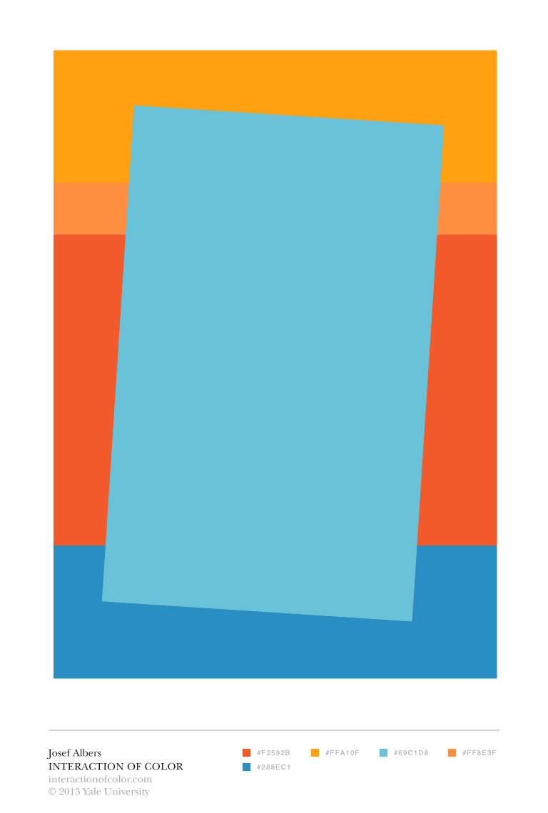
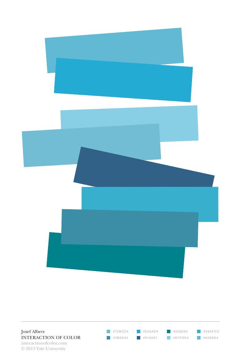


In the physical format you cannot have colour without form, or form without colour. Kelly states that the content of an image is made up of form and colour (2008, p.223). They are mutually dependent. Itten supports this by claiming that colour and form support each other (1970, p.75). The colour and colour combinations within my work are governed by the form. Equally the form governs the colour and colour combinations used within my work. There is an active working dialogue between the two. One cannot exist without the other. The dialogue between form and colour inaugurates rhythms and tension, according to Castleman (1988, p.197). This tension is most perceptible through the use of colour combinations. Castleman expresses that expansive planes of colour create tension through the spatial contrast and the confrontation of sharp edges (1988, p.193). Throughout my work I have used a combination of sharp and rounded forms, and more recently I have been using a sharp line to define the form, with the use of lucid lines within this sharp form. This is because I am using a sharp form initially to communicate with the original sharp form that the page is made up of. Thus, there are different layers of dialogue set up between the outer sharp forms contrasted against the inner lucid lines. Further demonstrating the concept of conscious and subconscious thoughts communicating on different levels. This is also demonstrated in my practical work throughout with the use of layers in general. The work I most recently completed in the print workshop was a set of stone lithographs (which I haven't recorded or been able to access) in which I had transferred a cut out shape of the photograph of fabric I had earlier taken, which I was planning on printing on top of with the same stone, in a different colour. This would create different layers of juxtaposing forms in different colours. I had also prepared the same image to use in photo lithography and I was going to print this using a stencil to create a different outlining shape, rather than just the rectangular format of a photograph. I had then planned to layer these, using different shaped stencils and different colours, creating alternative dialogues between form and colour.

Screenprint on paper, 29.5 x 42 cm
Mohamad Melehi, Flamme, 1975, Cellulose paint on wood, 99 x 113 cm
I have been looking into the work of Mohamed Melehi (1936-2020), in relation to my practical work. His work (1975) uses bright thick colour in alternating curved and straight lines. Formally, the use of line, form and colour play an important role in the construction of his work. His bold use of kaleidoscopic flat colour and mixture of geometrised and undulating forms take inspiration from the abstract and hard-edge nature inherent in Islamic art. Melehi did not just confine his work to the canvas but created many street murals in Morocco. In my work, I am also investigating a similar combination of form, line and colour in the contrast between curved and straight lines and a similar dynamic combination of colour. In order to take my work further, I intend to increase the scale to open up a further dialogue with the viewer, not only through their sight but with their whole body as a form in conversation.
Colour impressions are made in relation to the surroundings they are in, the elements of a piece are not seen in isolation of one another. Goethe affirms that impressions can be made singly but also in combination (1970, p. 312). Unless the focus of a piece of work is in entirely one colour, then this draws attention to the singular colour and the depth within the image. Itten states that the background colour is essential to depth effect, demonstrating the relativity of colour (1970, p.77). Fundamentally, both Albers (2013, p.8) and Riley (2008, p. 208) state that colour is the most relative medium in art and the perception of colour is entirely dependent on its surroundings. Thus, the more discordant the colour combination, the more tension is felt throughout the piece. However, it is widely understood, as Itten outlines, that whilst two colours, opposite on the colour wheel, have the greatest contrast, they are regarded as complementary of each other, allowing each other to stand out more, but at the same time there is a principle of harmony bringing them together (1970, p. 72). The choice in one colour, will have an effect on the adjacent colour. As Riley states fundamentally when you put two colours side by side the contrast may enhance them (2008, p.208). The perception of a colour is entirely dependent on its surroundings. Albers iterates that you never see a single colour unrelated to surrounding colours (2013, p.5). Throughout my work it has been important to consider the blank page as the first colour. Rajchman references the philosophy of Deleuze, in affirming that the canvas is never blank (1998, p.61). The page already has a colour and form before any mark is made, being the four lines that make the page, and the surface of the page is the first colour given to the form of the page.
Throughout my work the subject matter of the image has governed the line, form and colour, whether consciously or subconsciously. Itten states that all procedures are governed by subject matter (1970, p.74). Throughout my practice it has not been a conscious decision as to whether the subject matter governs the image or not. I, personally, do not see them as separate from one another. Neither governs the other. The majority of subject matter in my work comes from my natural environment. Thus, the inspiration for the colours used subconsciously comes from that environment too, neither is divorced from the other too heavily. Itten iterates that the study of colour impressions properly begins with the colour effects in nature (1970, p. 79). The choice of colour within my work is never divorced greatly from the original image. Through the transformation of natural forms to abstraction, they are, according to Barr, classed as ‘near-abstractions’ (2013, p.29). Barr goes further to state that by giving titles to near abstractions, this can confuse the viewer, as they should just focus on the colour and form (2013, p.30). Through the combination of colour, line and form I am able to translate my conscious and subconscious environments to the viewer through the use of near abstractions. Most recently in my work, I am able to evoke both the conscious and the subconscious sensation of touch in the viewer, through the expression of tactile qualities and slightly offsetting elements in the image to convey the slight disconnect between conscious and subconscious thoughts.
Screenprint on paper, 29.7 x 42 cm
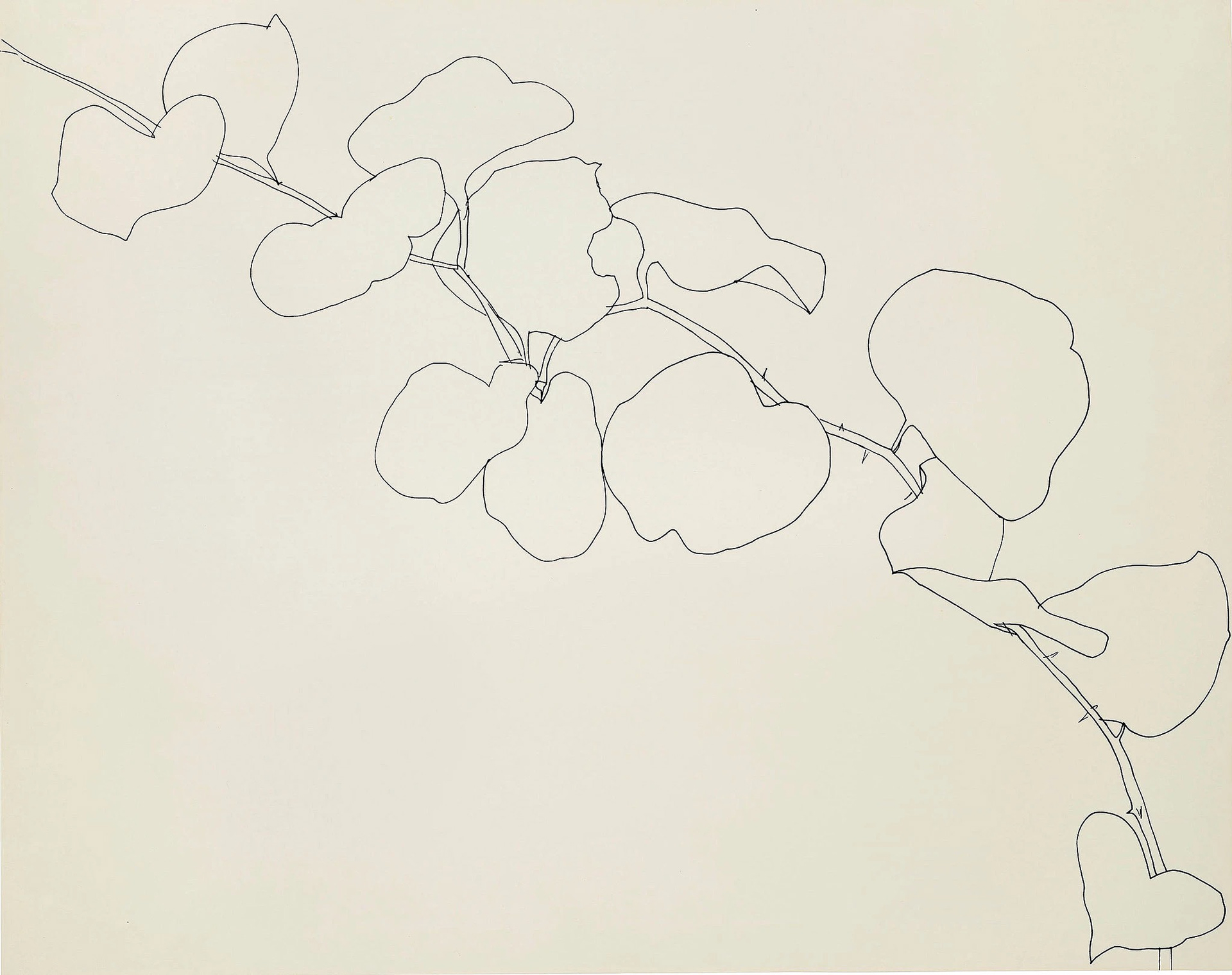
Ellsworth Kelly, Briar, 1961, ink on paper, 57 x 72 cm
I have been looking at the development of Ellsworth Kelly’s work, from his earlier line drawings to his later paintings, lithographs and sculptures. It is interesting to notice how his focus on line, form and colour in his drawings of natural forms influence his later abstract work in line, form and colour. I look to draw similar parallels in my own work, with my natural environment influencing my abstract compositions, consciously and subconsciously. The majority of my work consists of near abstractions, and I am experimenting creating my images from both abstract and non-abstract environments. I am undecided on my path, whether I fully commit to using abstract forms or not. I do not regard this as an important point in the development of my research, as the focus is more upon dialogue between the line, form and colour within the image. However, through my translations whether abstract or not, the form is an important focus. Rajchman claims whilst there are different kinds of abstractions, there is no single point of view, there is no specific entrance or exit (1998, p.68). Subsequently this gives me a lot more freedom in the production of my work, it reminds me that it is about my relationship to the work and the translation of my environment and not necessarily whether the viewer can perceive an entrance or an exit. Just as forms are created without a prescribed viewpoint, they are also not created independently of each other. Just as colour is relative to its surroundings, so is form. Lefebvre asserts that the Bauhaus people understood that things are not created independently of each other, without taking into account their interrelationships and relationship to the whole (1974, p.124). This is essential to my work, as nothing is created in isolation, it is all relative. Lefebvre outlines that forms are perceived depending on their surroundings (1974, p. 304). Thus, it can be concluded that, just as colour is relative to its surroundings, so is form. Throughout the production of my work, especially with respect to the construction of layers, the previous layer is taken into account when adding a new layer or not. Both in terms of colours and forms. They do not speak alone; it is a dialogue.
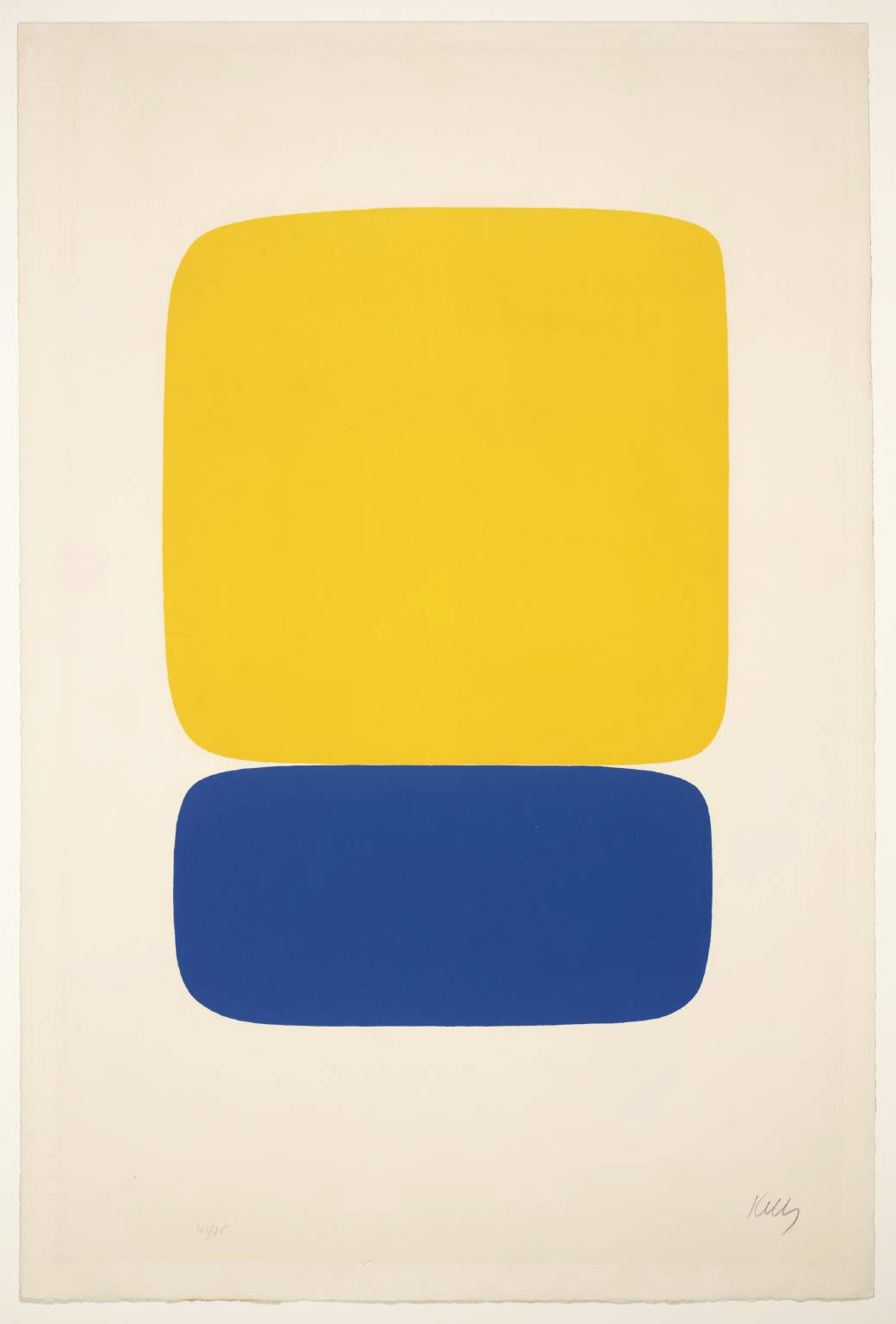
Ellsworth Kelly, Yellow over Dark Blue, 1964-5, lithograph on paper, 89.2 x 59.8 cm
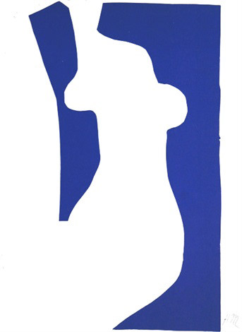
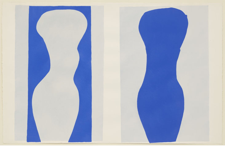
Henri Matisse, Venus, 1952, lithograph, 35.6 x 26.7 cm
I have not only looked at Matisse’s images in relation to his use of colour, but his use of form as well. Especially in his later cut outs his use of form in space is more striking to the viewer. There is a dialogue present between the forms in the piece and also with the viewer. The combination of the flat, bold colour with the fluid, continuous line of the forms makes a striking impression on the viewer. Moving forward, the dialogues of colour are important in their impact on the viewer, but the impact is far greater when the dialogue of line and form are considered in conjunction with colour. The dialogue is a conversation between all three elements, and they should not be considered as isolated elements.
Most recently in my observational drawings, I outline the form I am drawing. This not only is a translation of my experience of the form, but it creates a dialogue on the page, and whether I add to the outline creates a further dialogue between the forms I were to add. In my practice I experimented with outlining forms and layering these on top of one another. Lefebvre claims that a new consciousness of space is explored when it is reduced to an outline (1974, p. 125). Moving forward and following the feedback I have received, would be to reduce more complicated drawings back, so that they become simple outlines. This would increase the sensitivity within the image, emphasising the essential dialogue between line, form and colour.
I feel that the majority of my focus in this unit was on the role of colour within the image and the relationship of this with the viewer. Since I have been unable to enter the printing workshops, my work has become more focussed upon the role of form and line within my work. My colour range has become more limited, as I cannot explore the depth and breadth so easily without access to the workshop, consequently it has become more intuitive in my work.
Following feedback I have received on my work I am going to strip down more complex line drawings of my environment. Playing with the use of colour and combination of forms, deciding which elements to remove and which to keep.
Moving forward, I am going to develop an equal dialogue between form, line and colour within my practice, as much of this unit has been dominated by colour. I am next going to explore the translation of this essential dialogue through the medium of print.