Part 1
A chronological development of my work. Click on the image to enlarge the work.
These basic principles guide my colour combinations and choices.
- Complementary colours (two colours directly opposite on the wheel)
- A dyad harmony (a combination of two colours only separated by one colour on the wheel)
- Split complementary (one colour paired with the two colours on either side of that colour’s direct complement)
- Triad (a combination of three hues equally spaced from one another on the colour wheel)
- Analogous harmony (two or more colours that are side by side each other on the colour wheel)
- Double complement (two sets of complementary colours)
- Rectangular tetrad (four colour harmony)
- Square tetrad (four colours equally spaced apart from each other on the colour wheel)

Sketchbook page, 29.7 x 42 cm

Sketchbook page, 29.7 x 42 cm

Sketchbook page, 21 x 29.7 cm
Sketchbook page, 21 x 29.7 cm
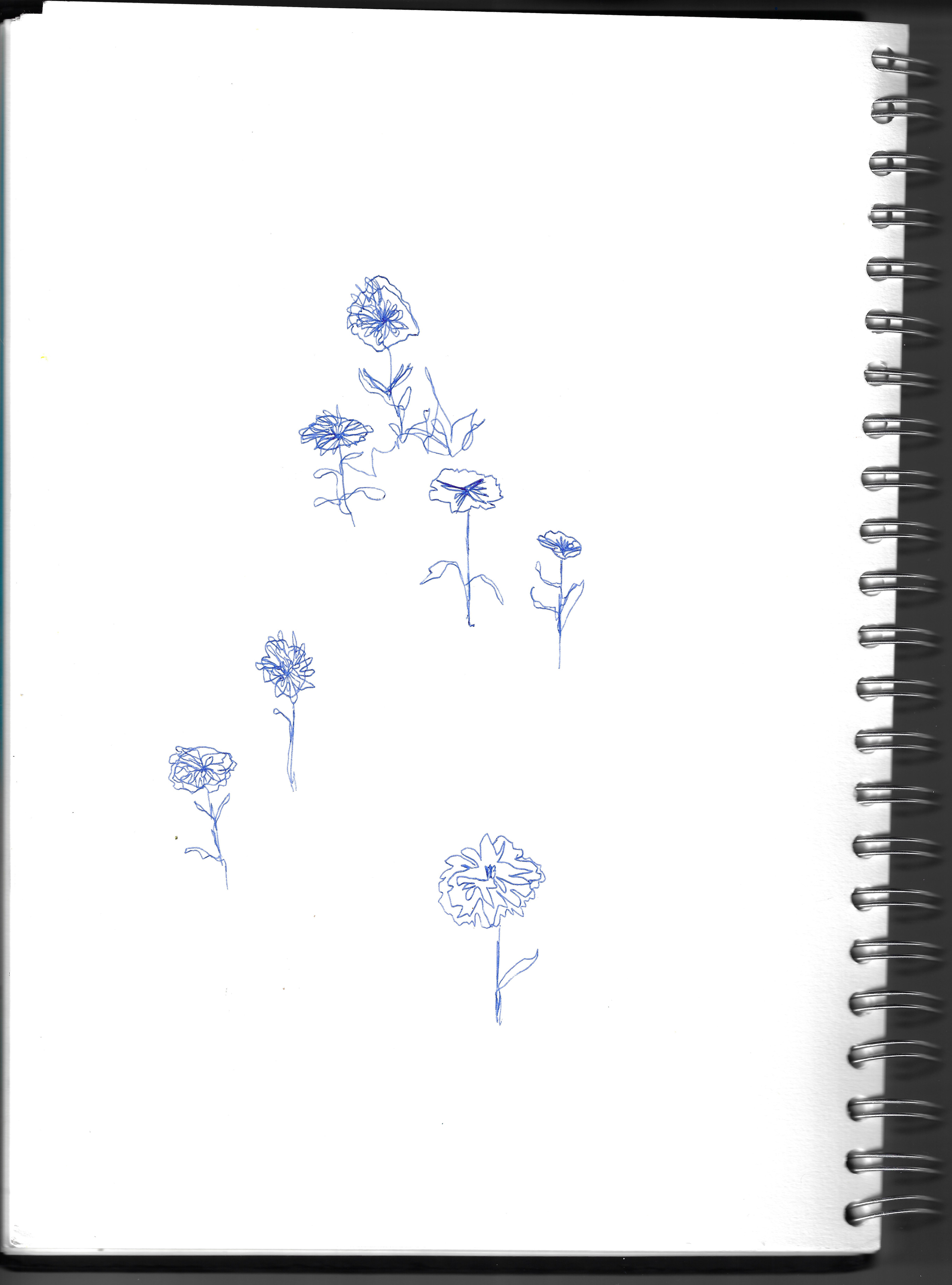
Sketchbook page, 21 x 29.7 cm
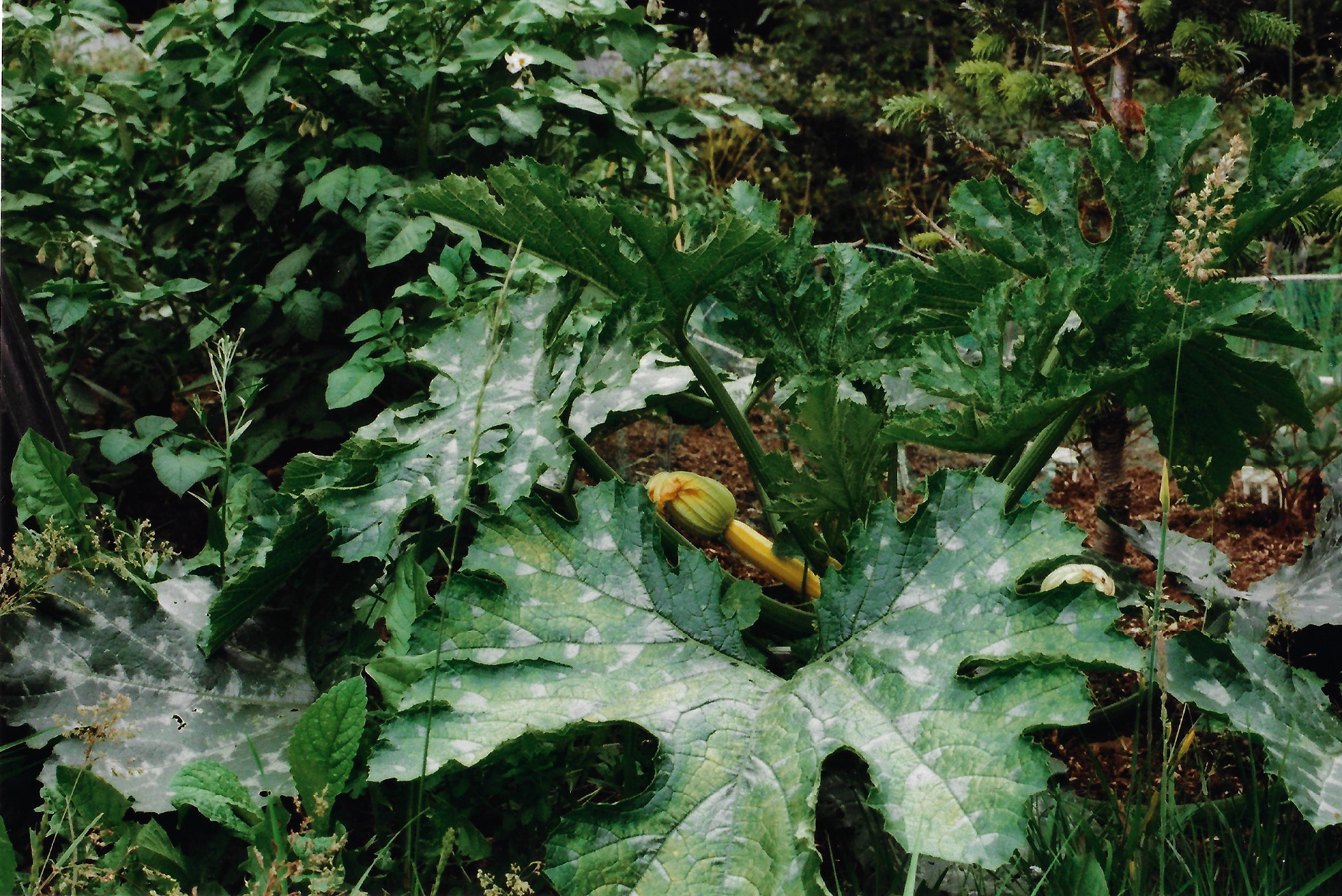


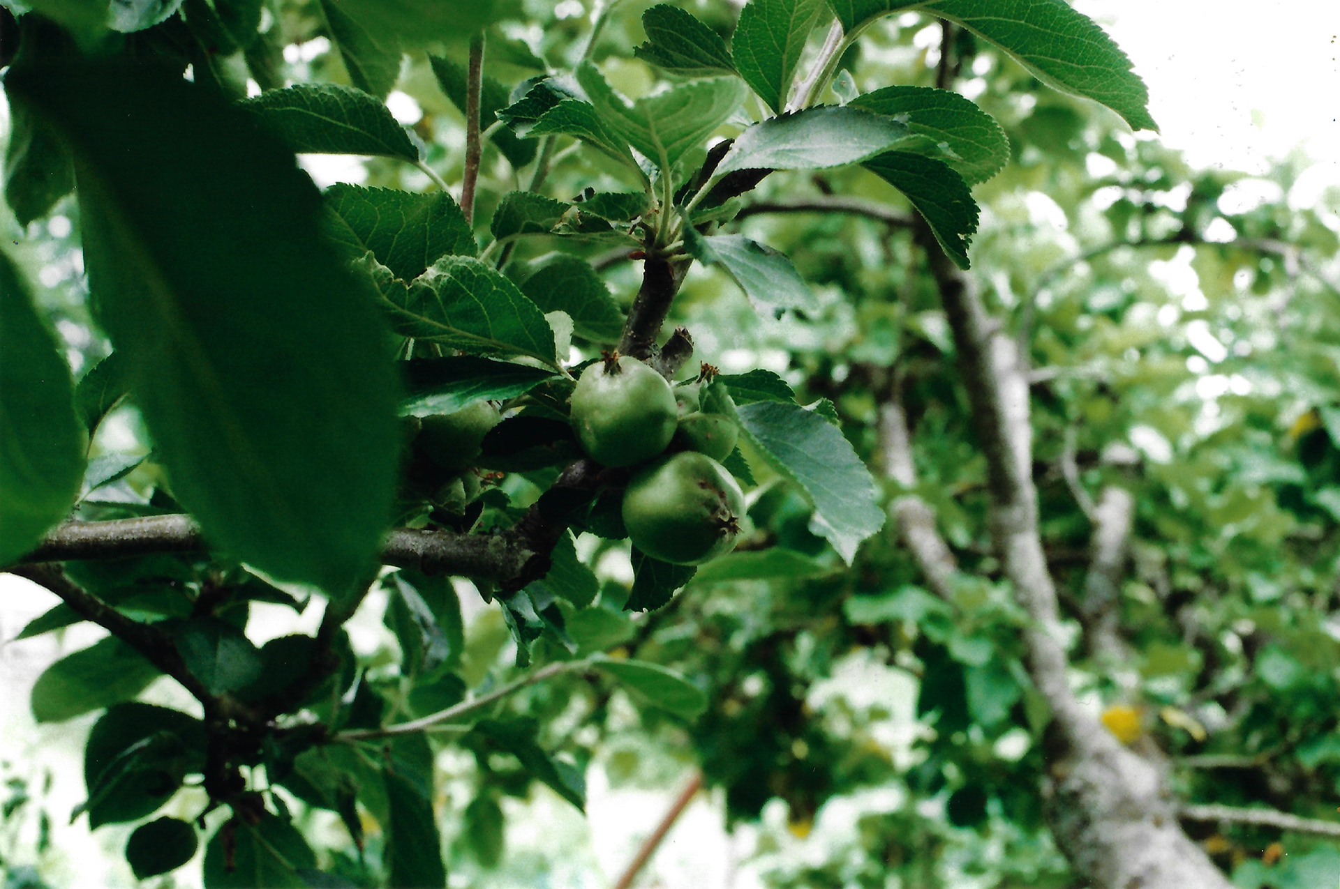
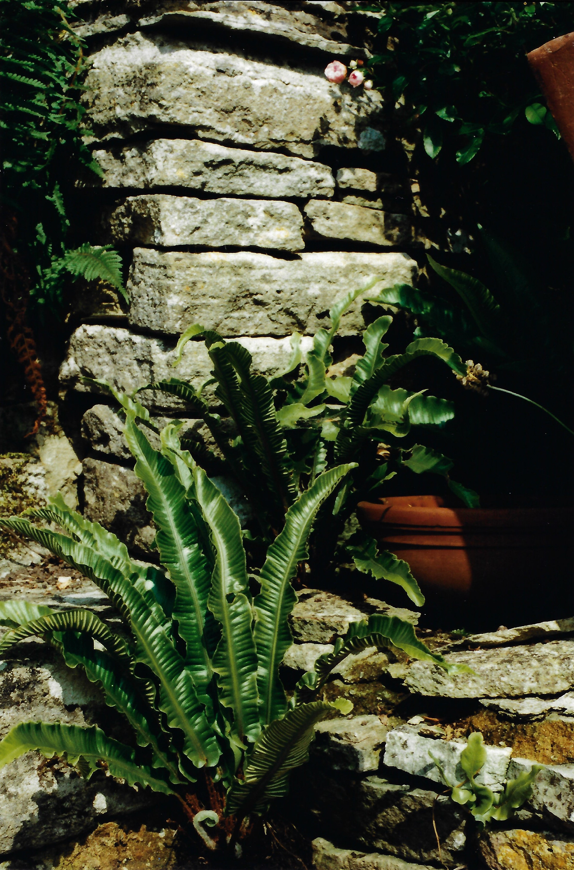
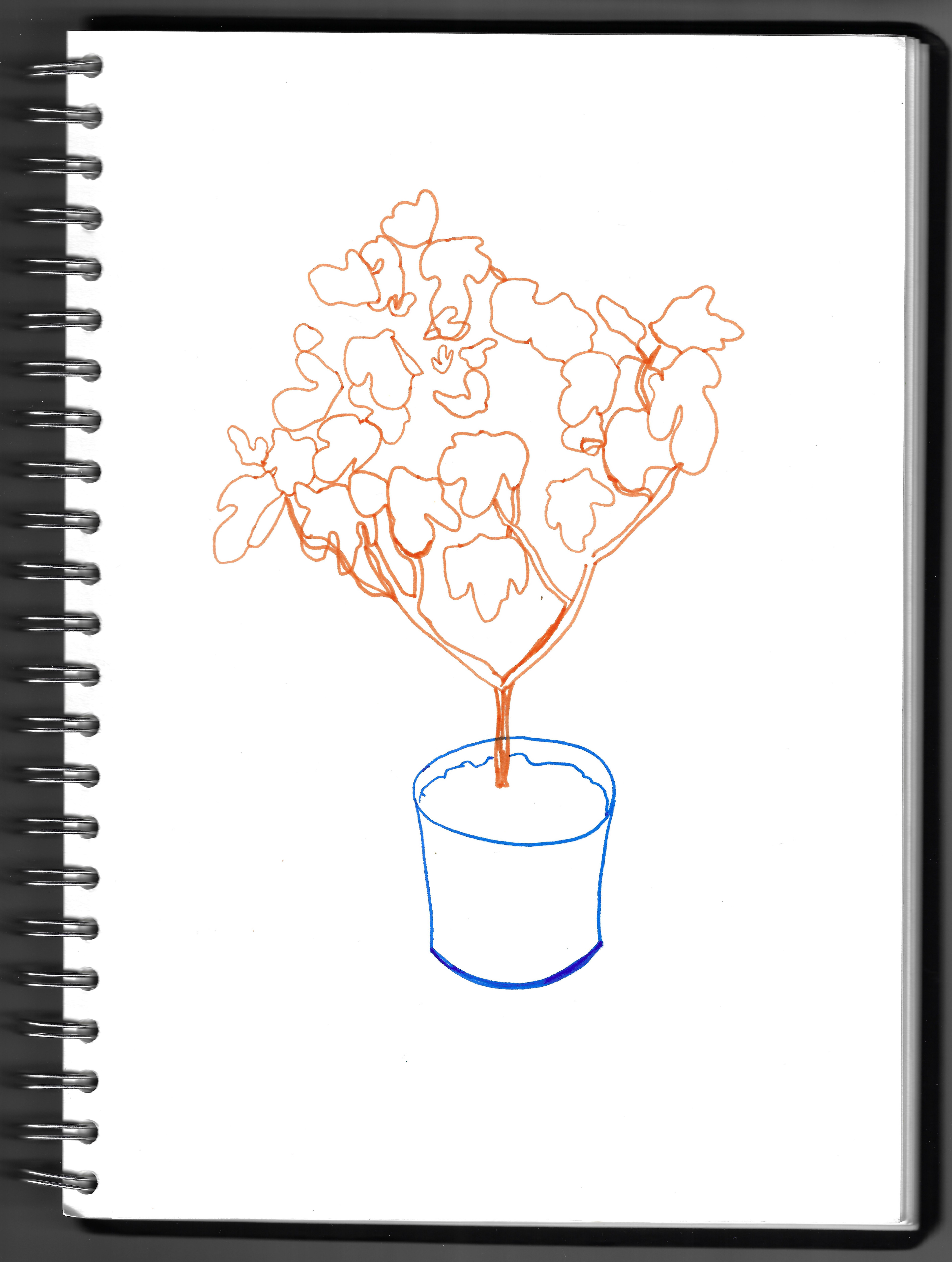
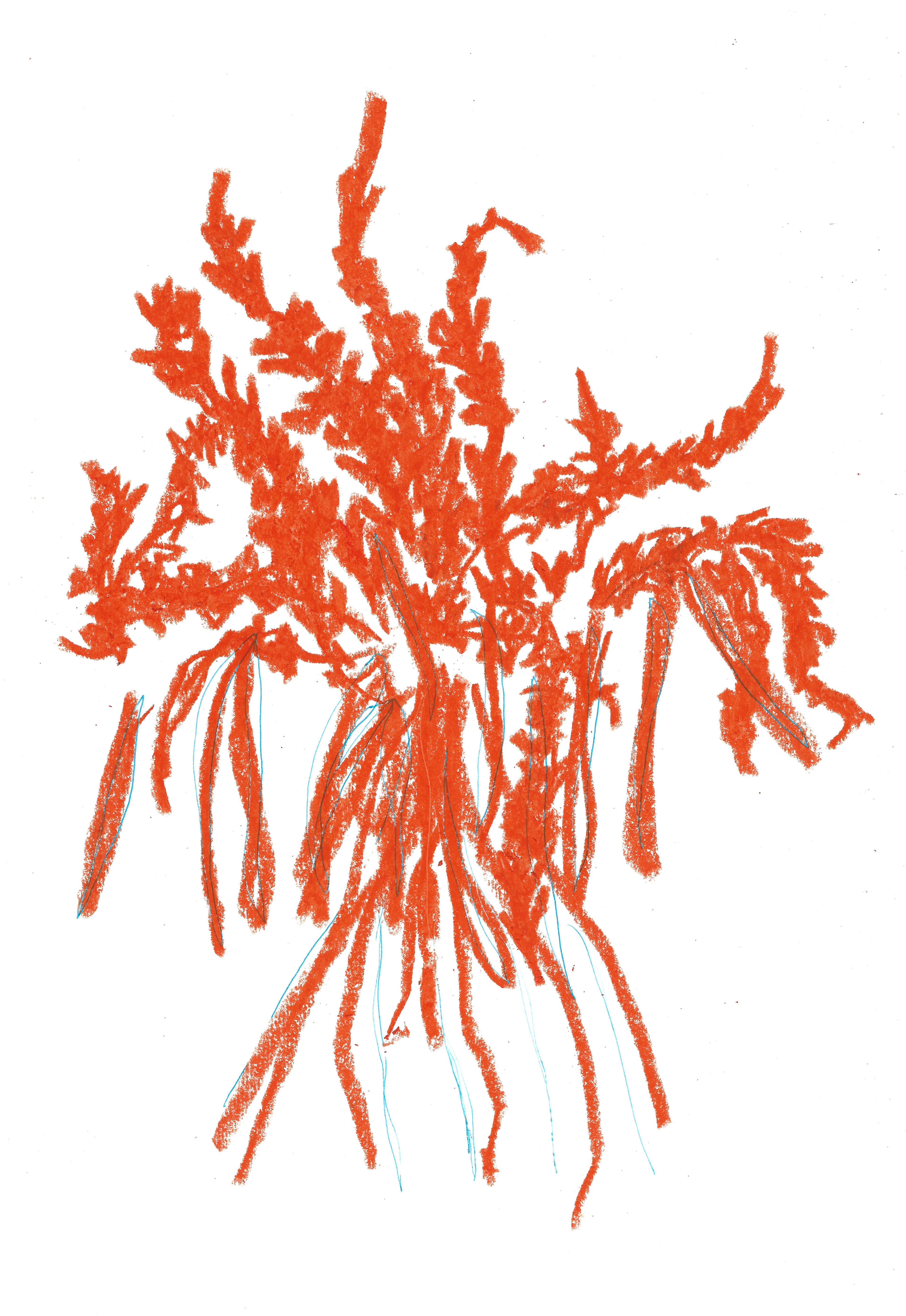
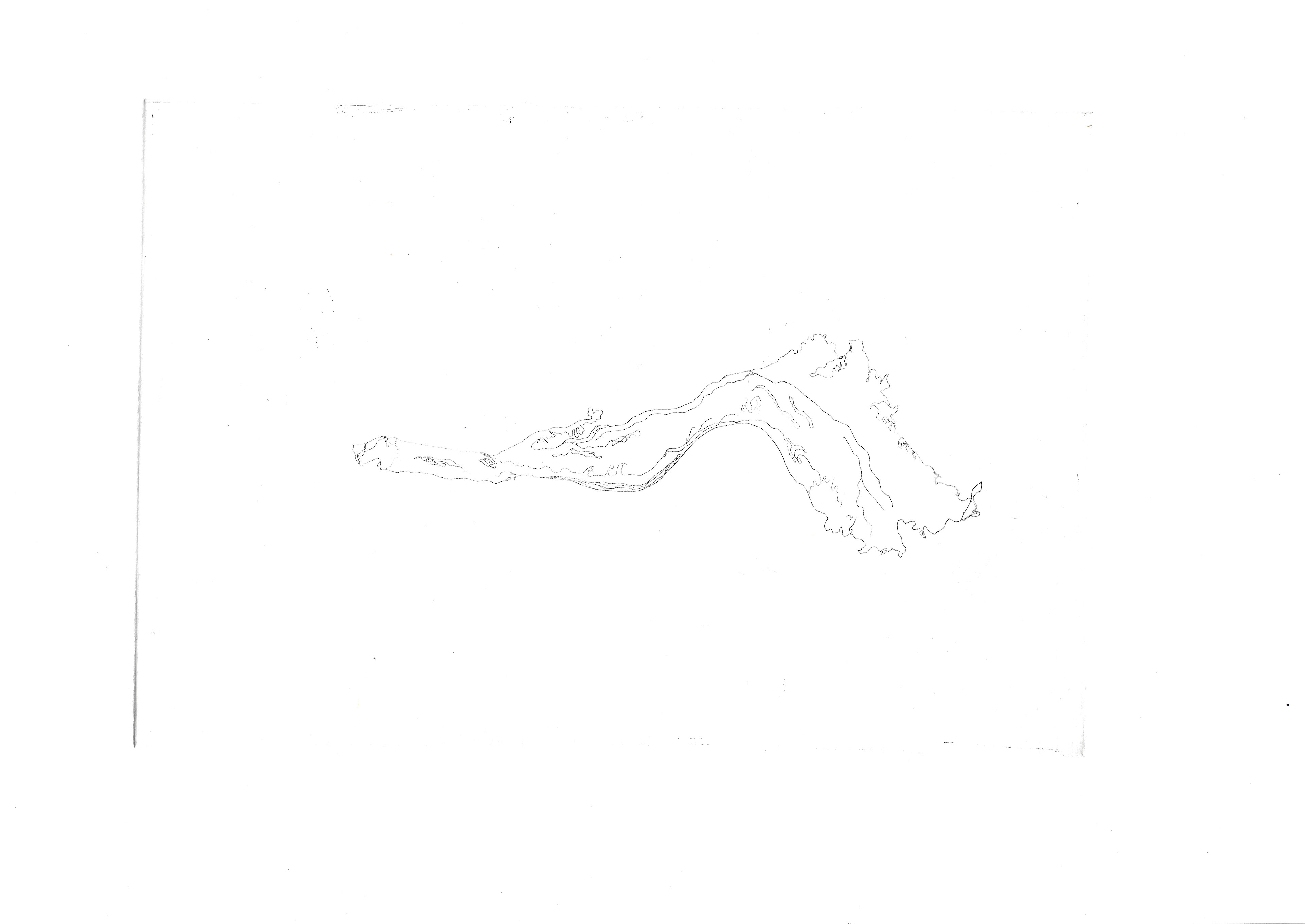
There is a range of different lines and curves on my parent’s allotment, which I document through photography and drawing. The organic lines interweave with one another yet remain clear to the viewer. I do not visit the allotment frequently, so the next time I will be here the plant matter will all have changed dramatically.


Sketchbook page, 21 x 29.7 cm

Sketchbook page, 21 x 29.7 cm
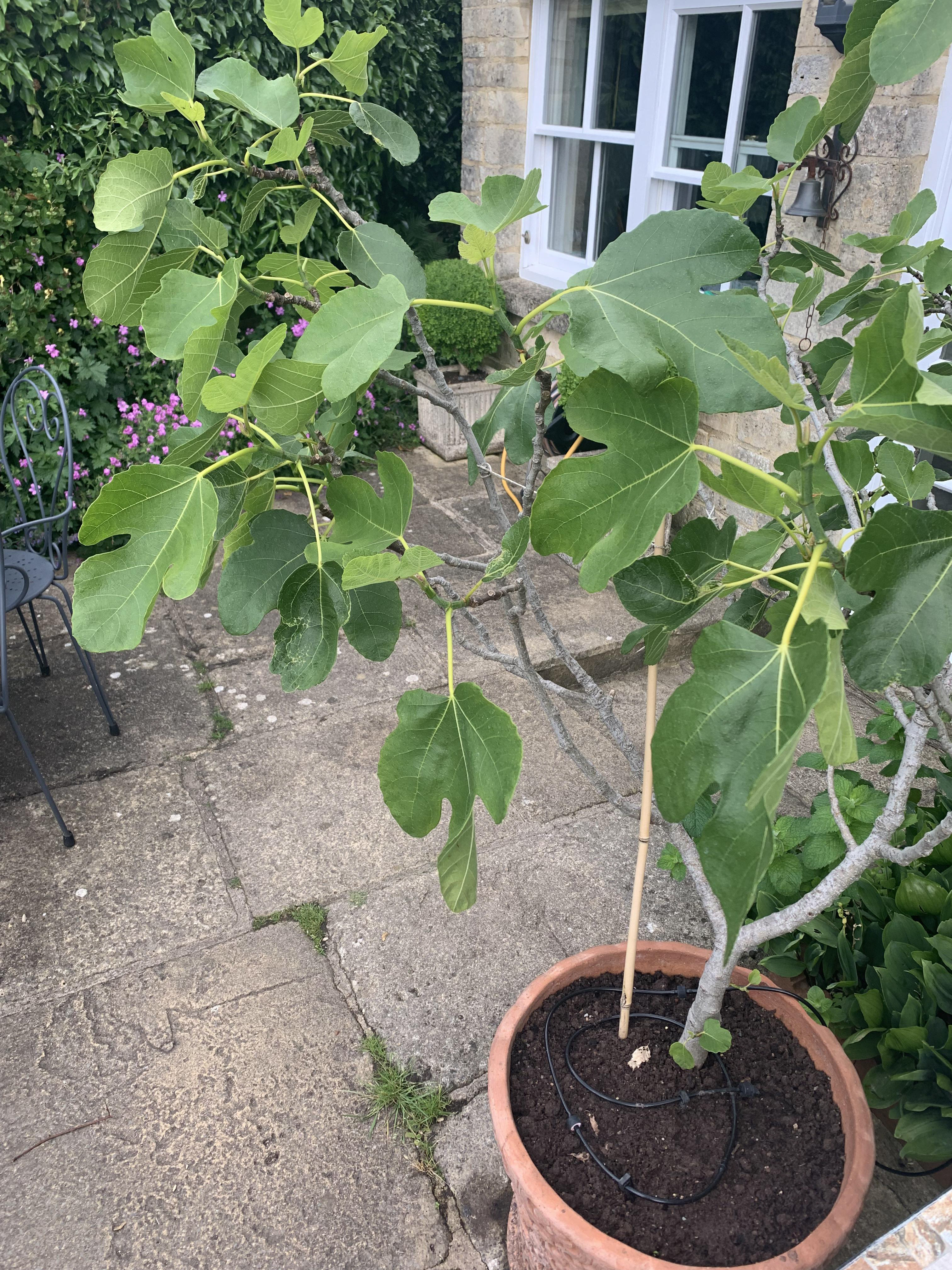
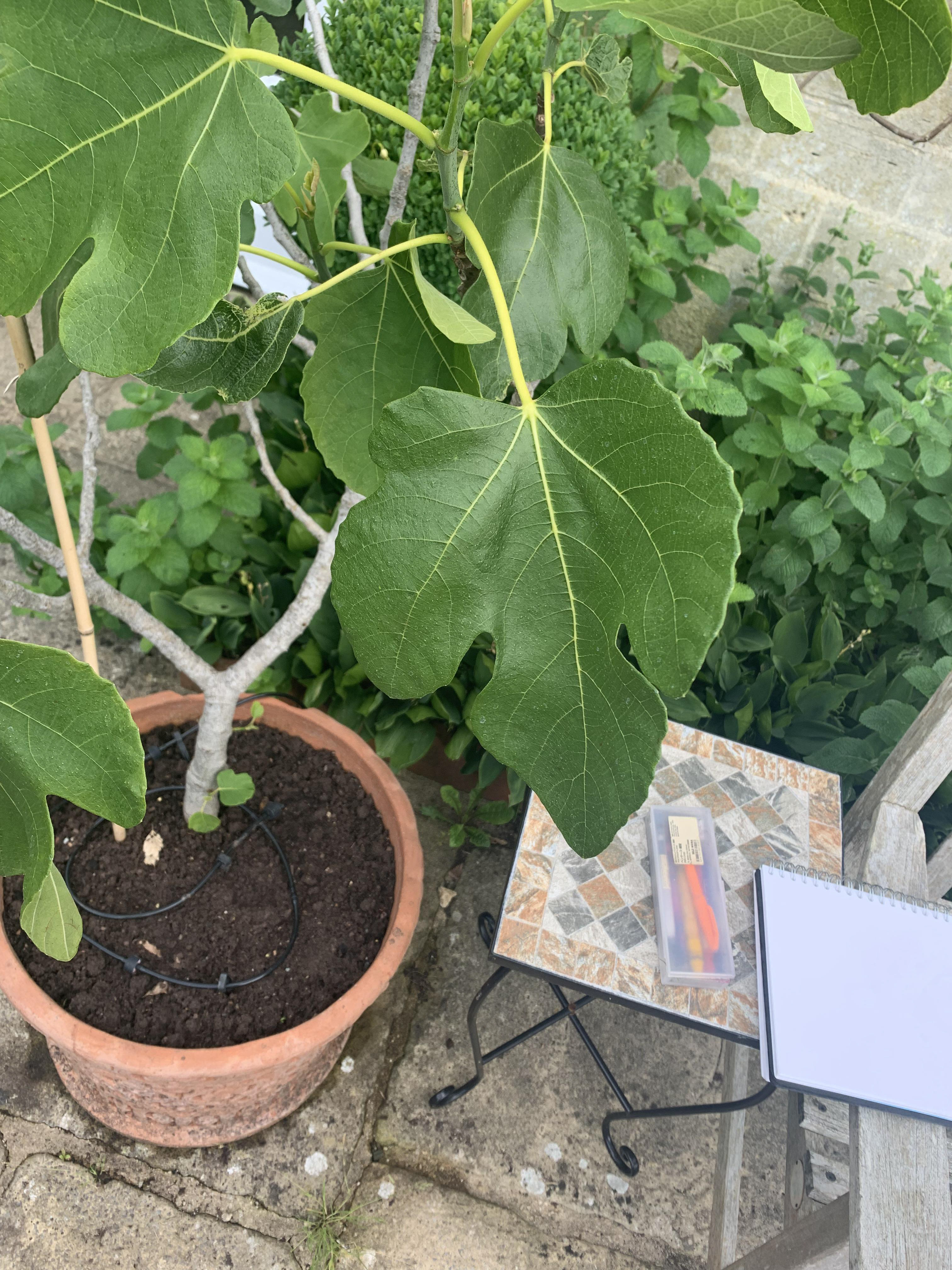
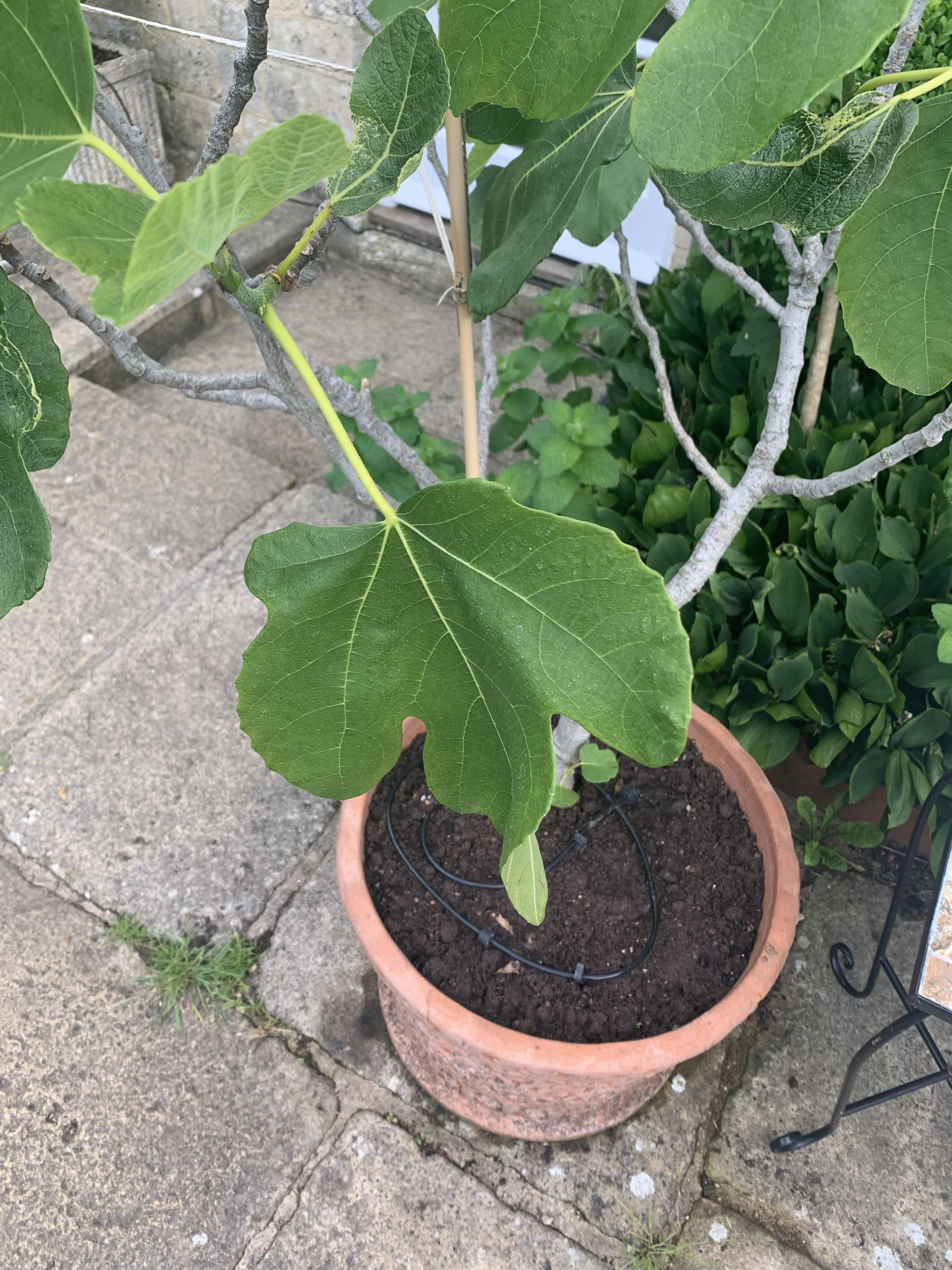
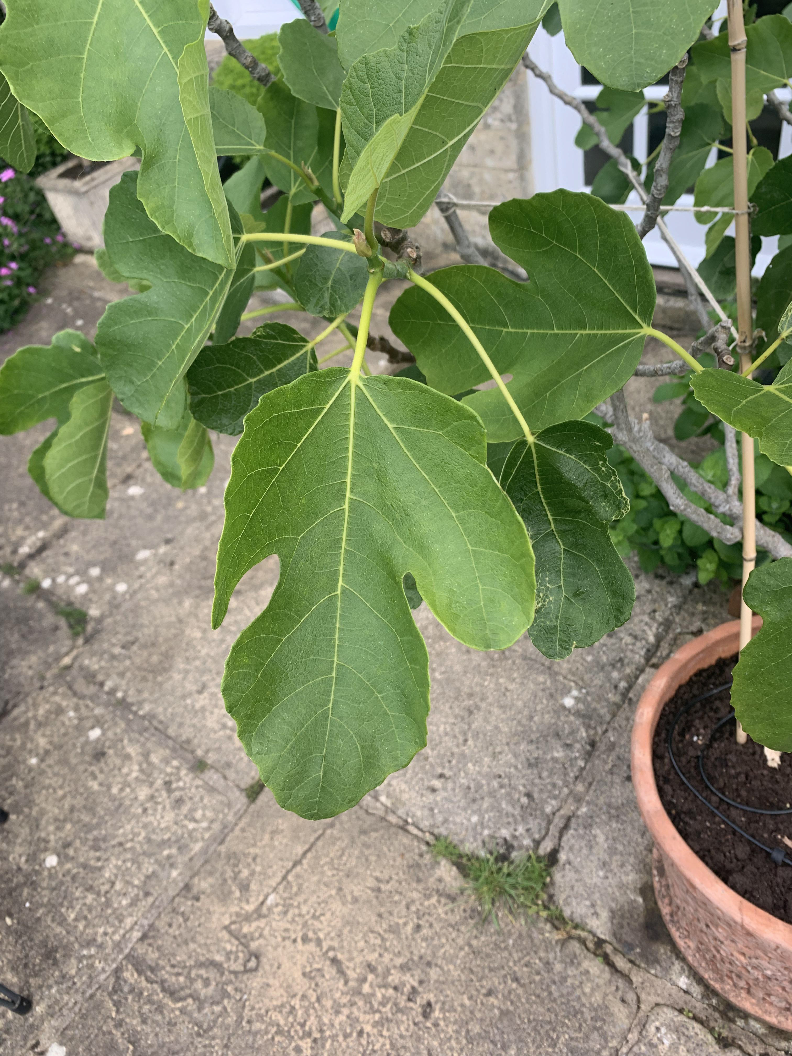
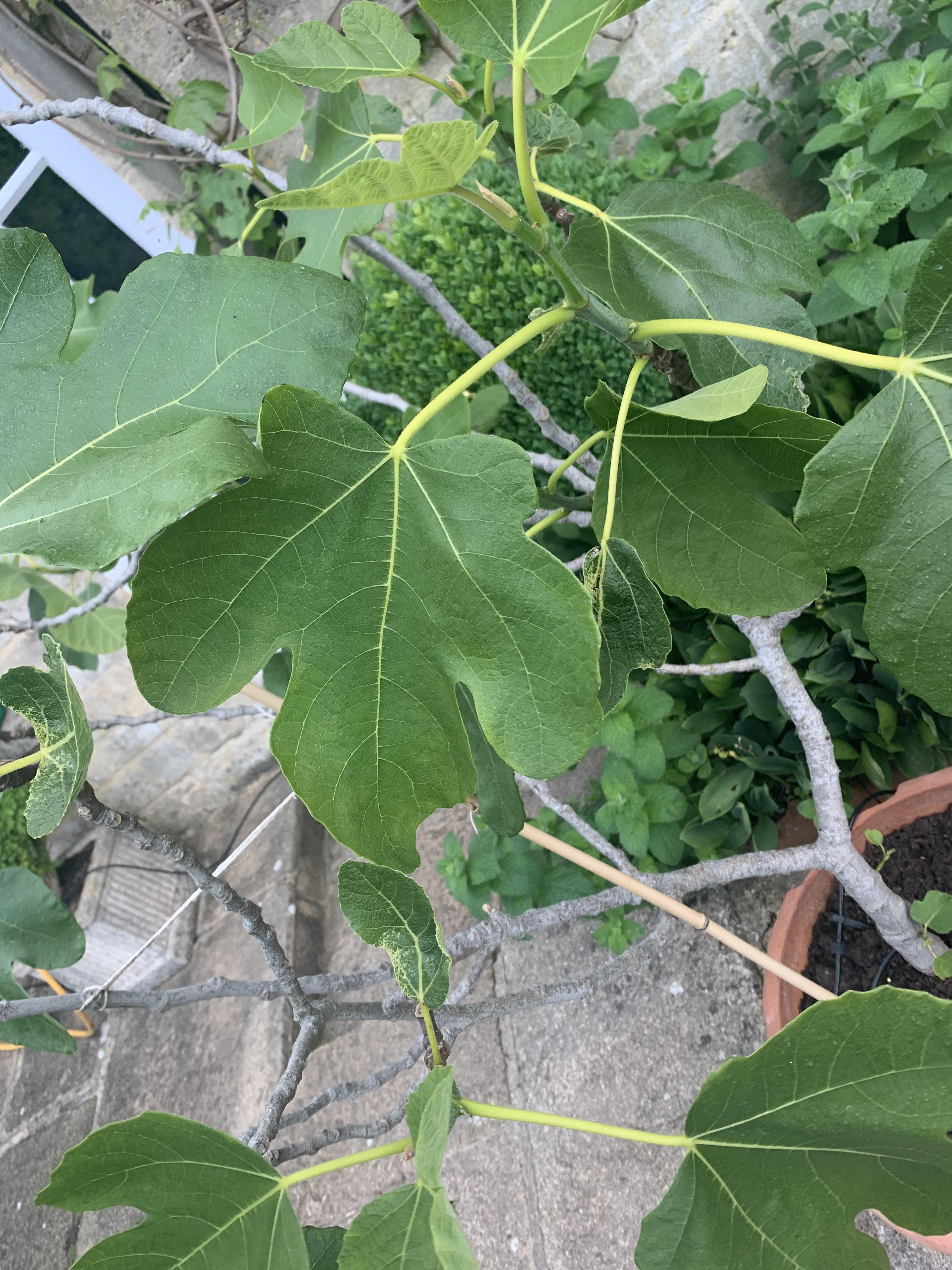
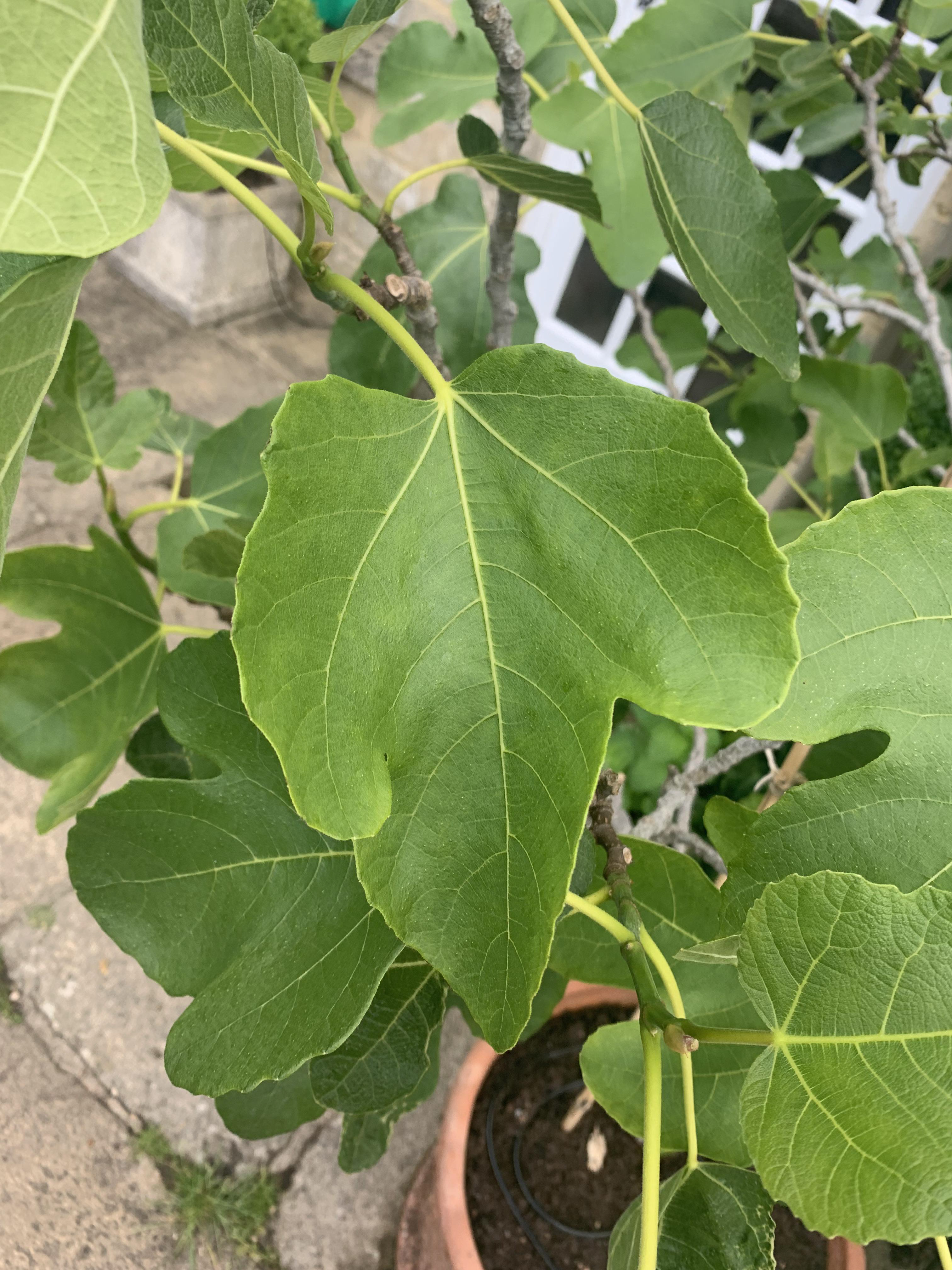
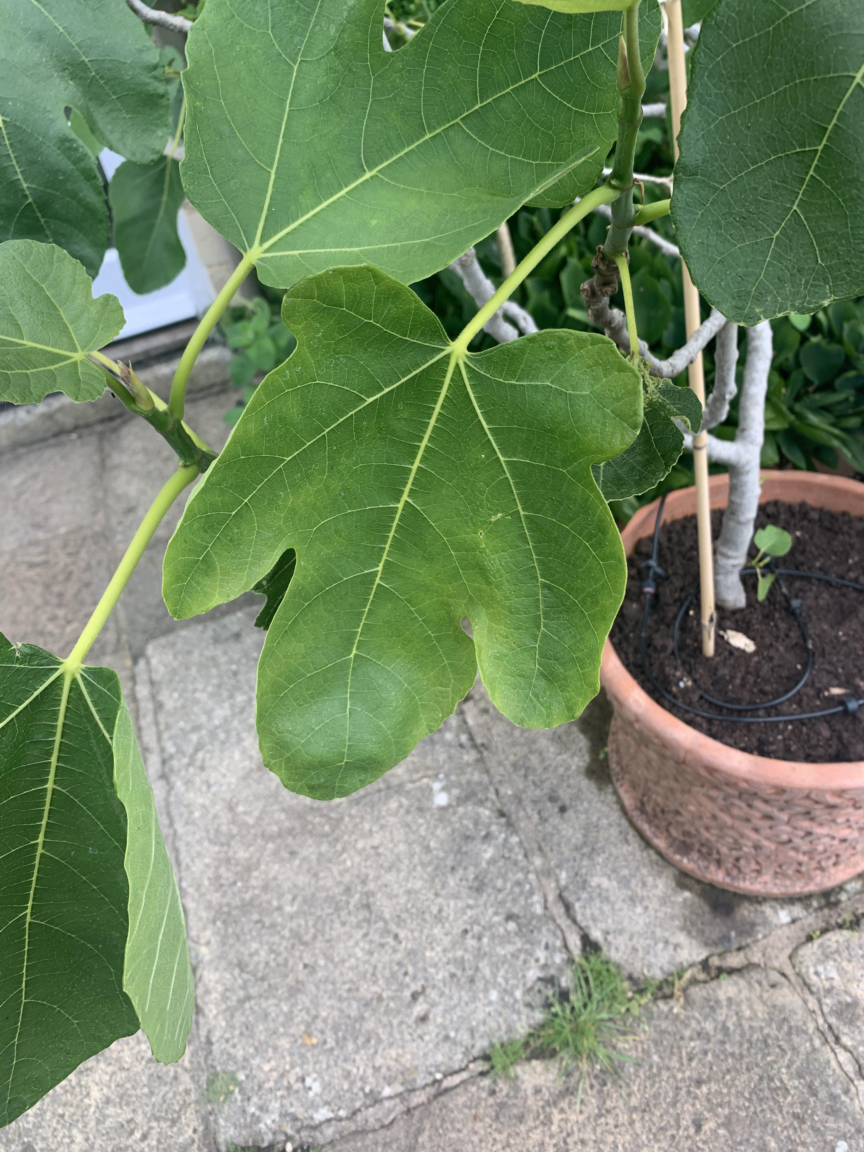
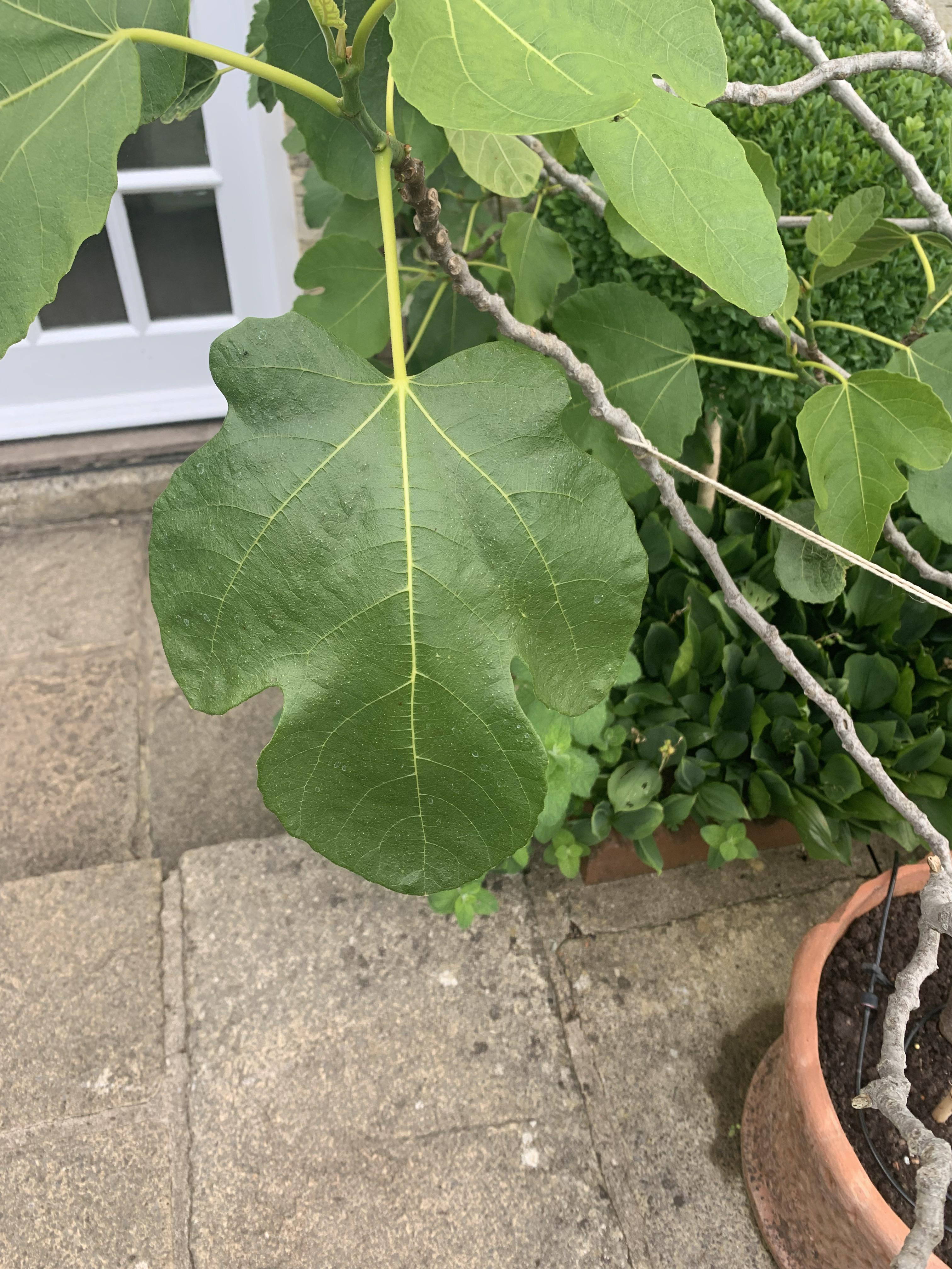
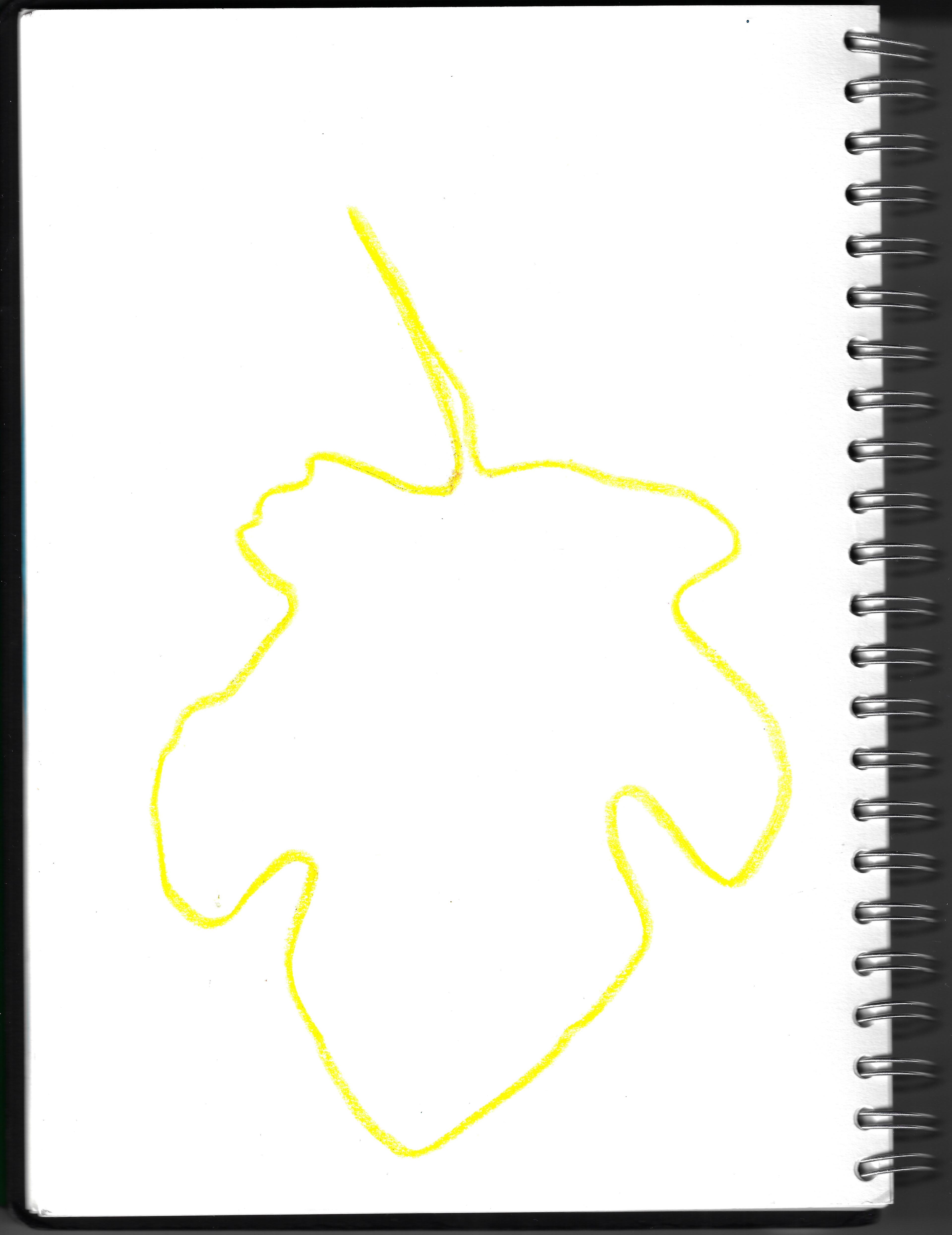
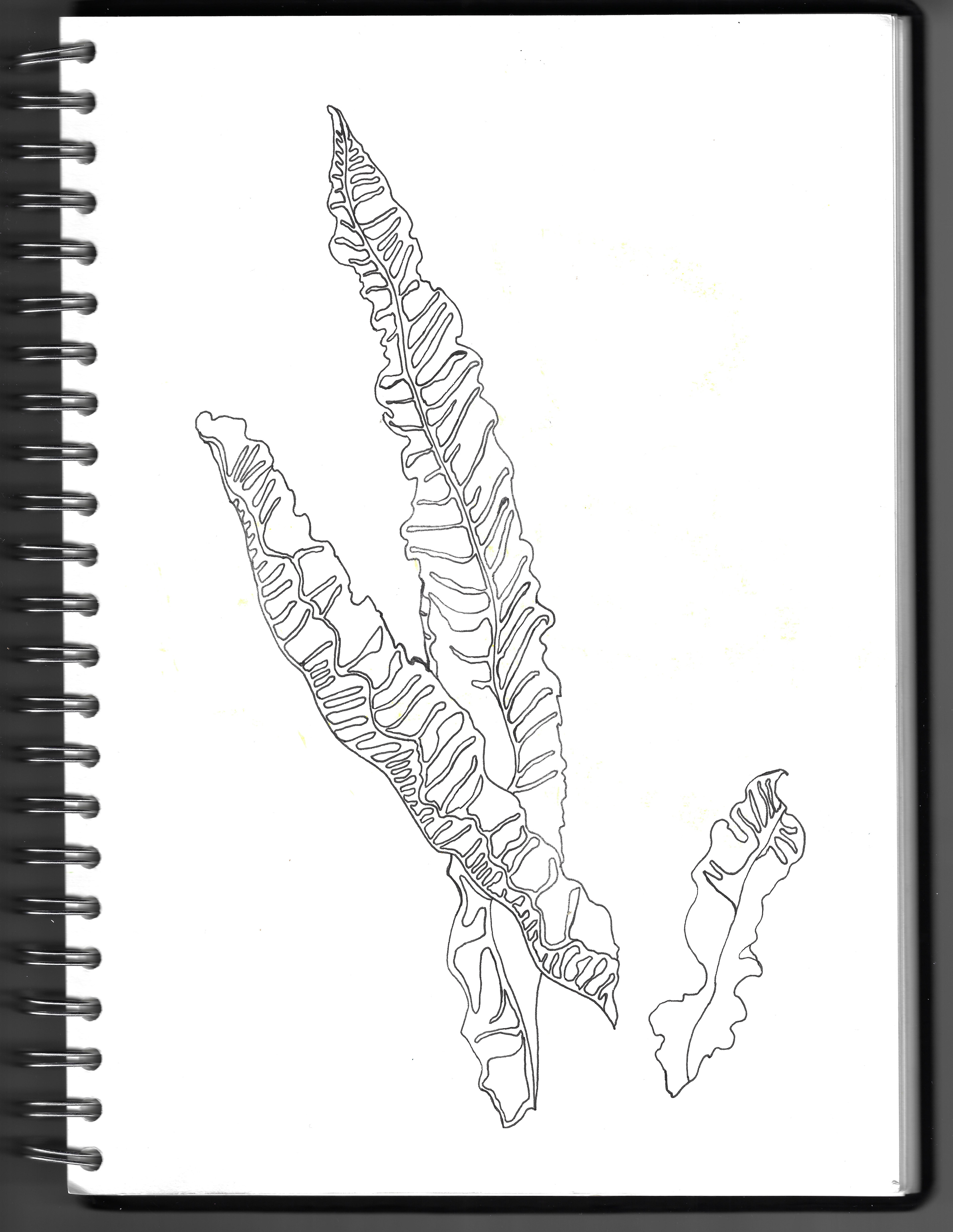
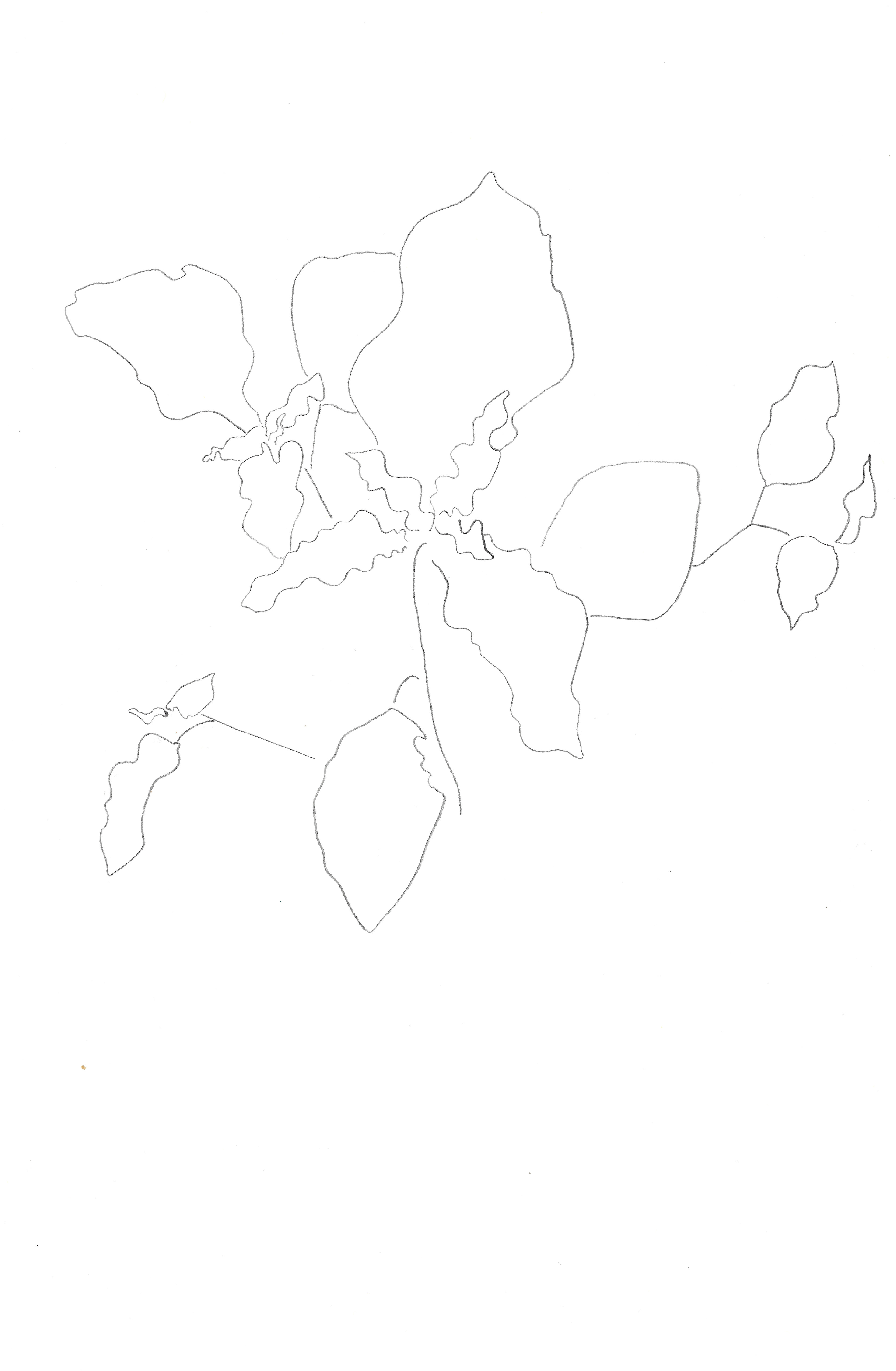
I take some photographs of fig leaves, taking photographs of the same leaf from different angles. Also, I draw the fig leaves from multiple positions and in a range of media, using essential lines to convey the characteristics of each leaf.

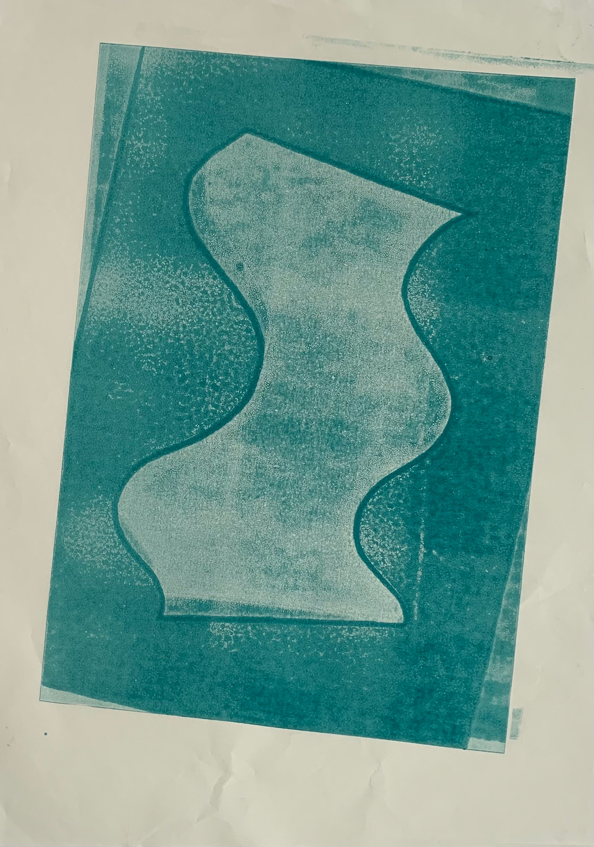
Relief print on paper, 21 x 29.7 cm
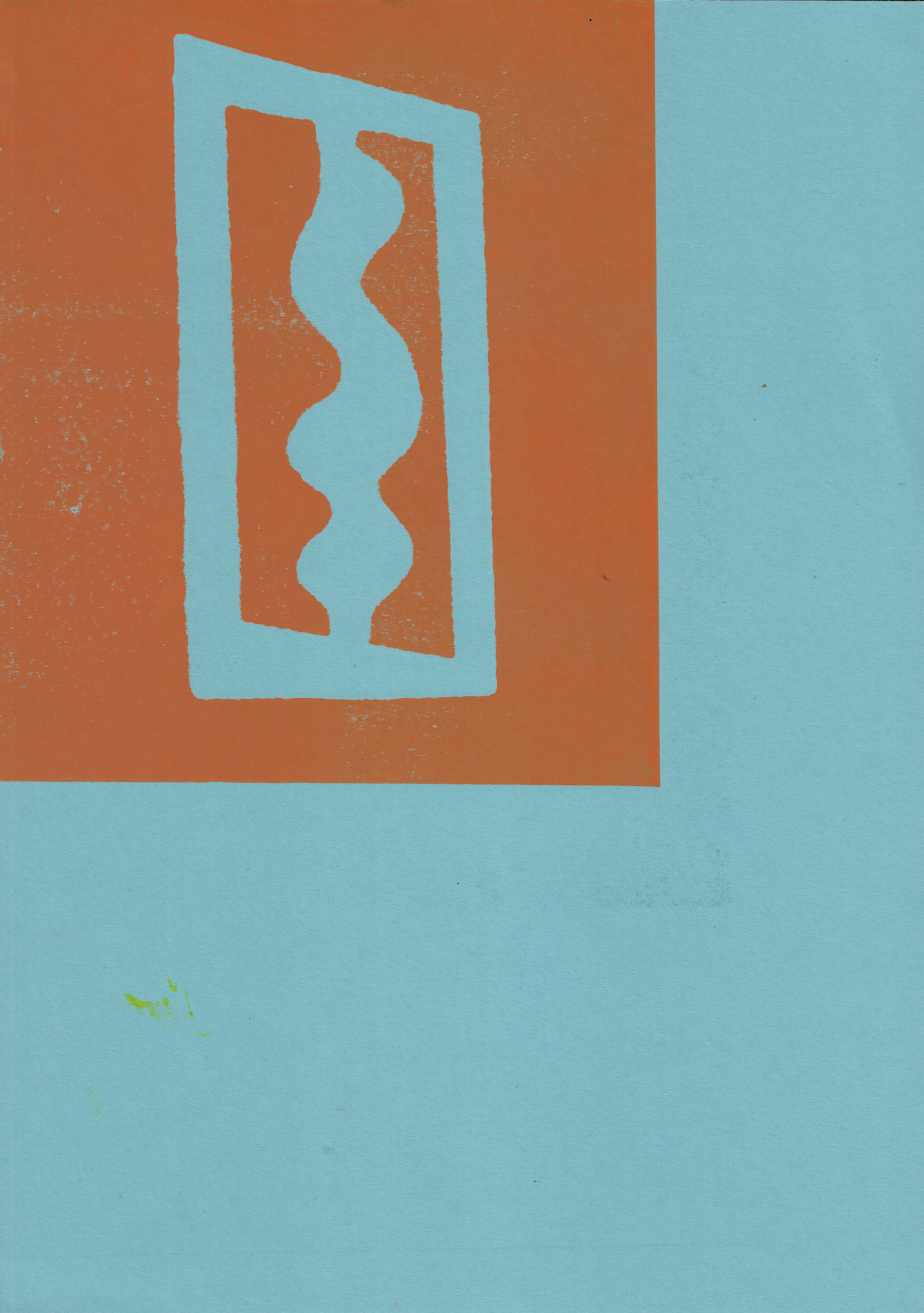
Relief print on paper, 29.7 x 42 cm

Relief print on paper, 35 x 50 cm
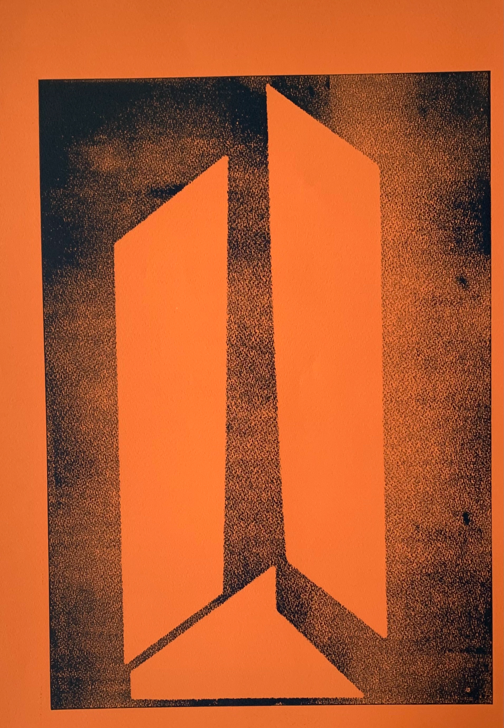
Relief print on paper, 35 x 50 cm
Relief print on paper, 35 x 50 cm
Relief print on paper, 35 x 50 cm
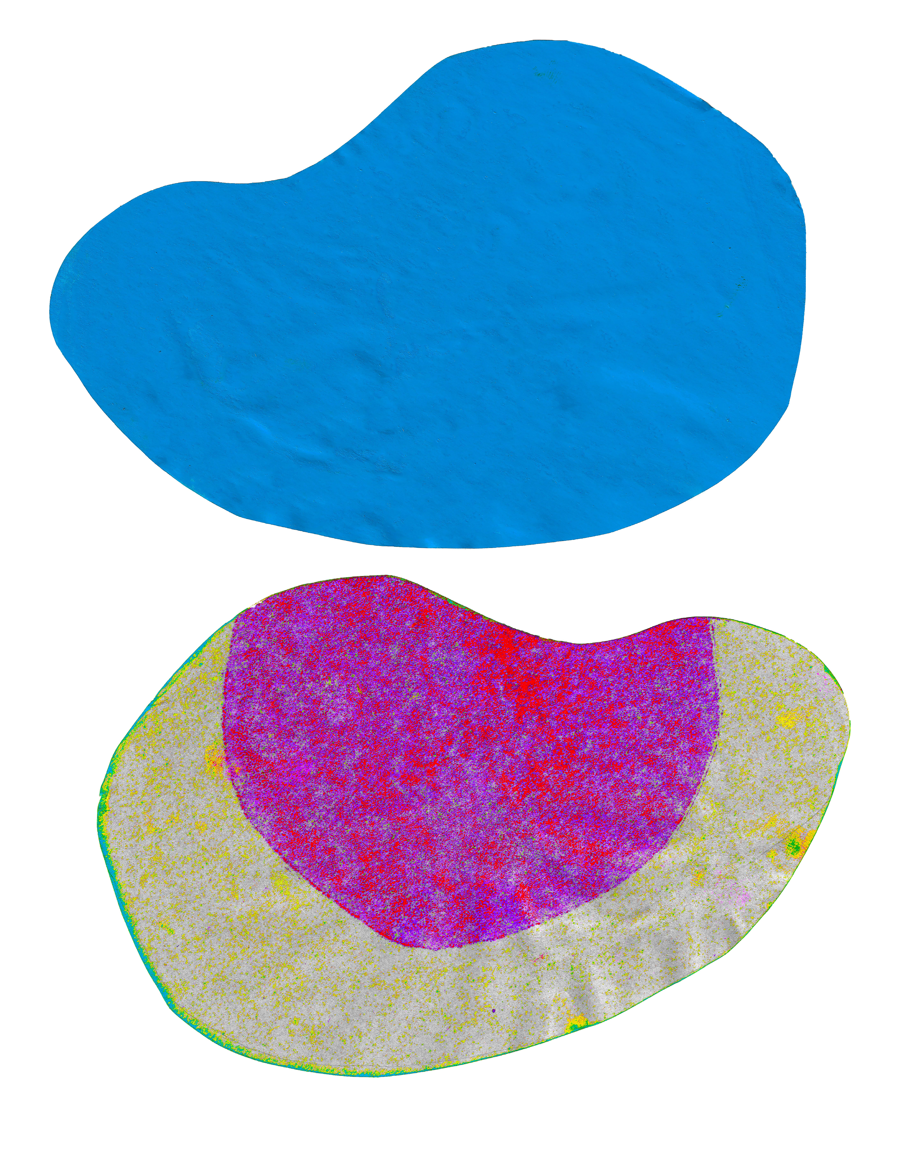
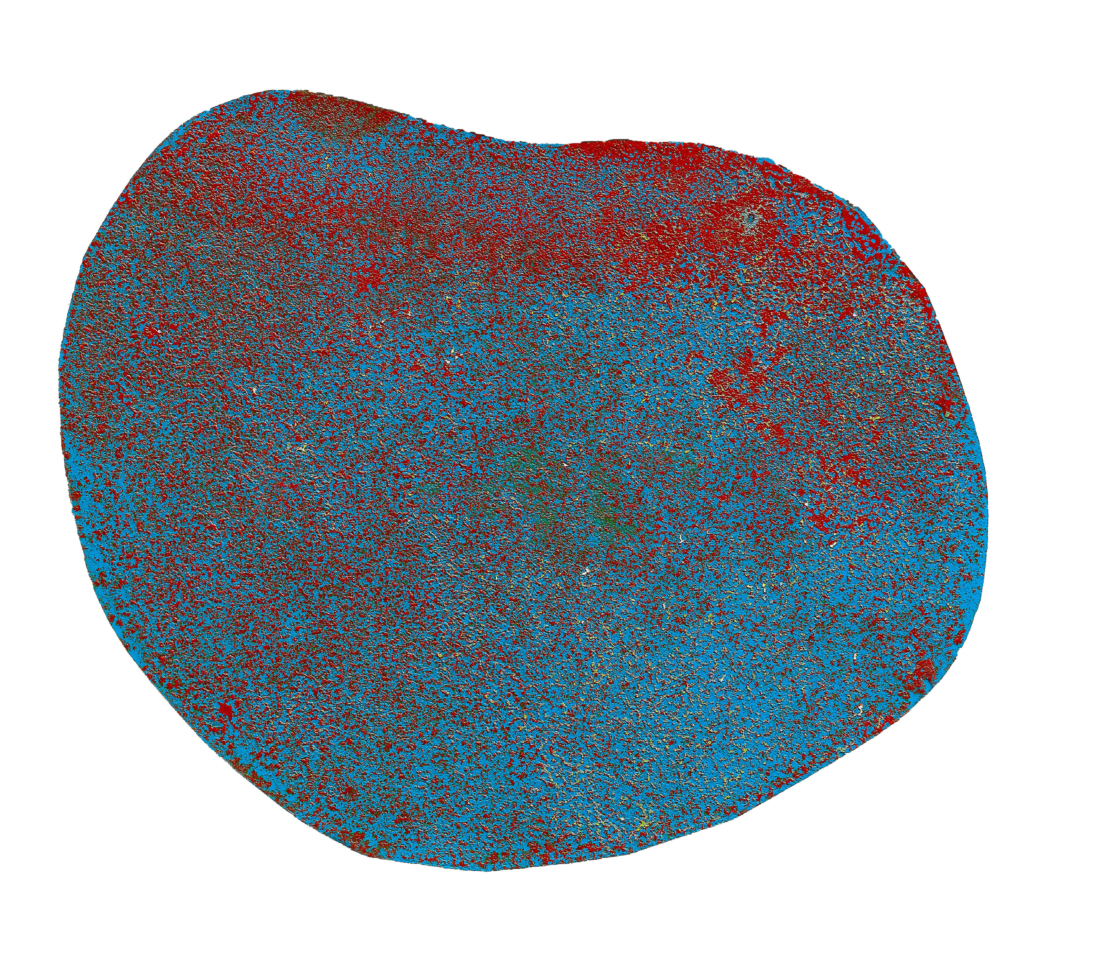
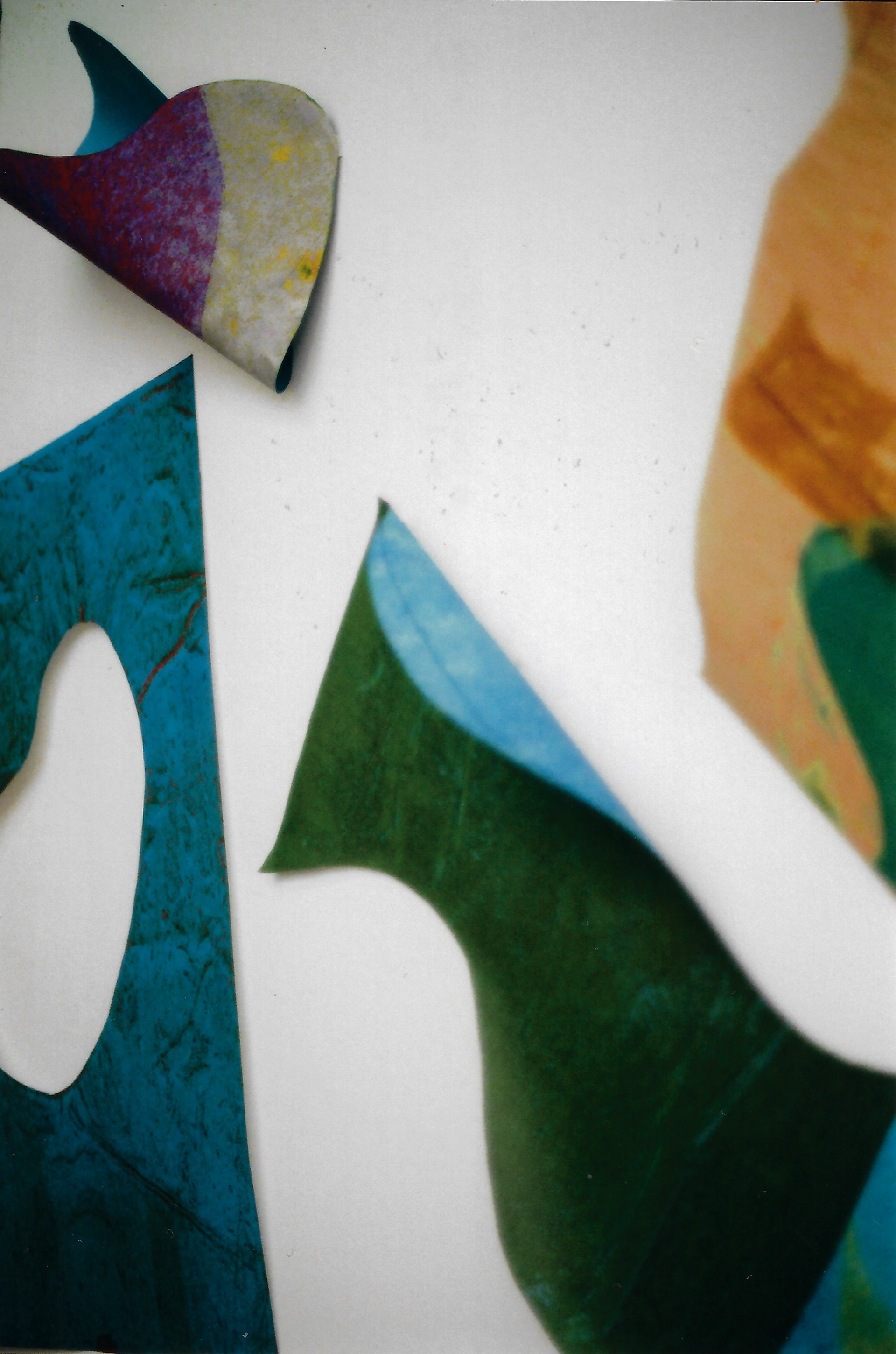
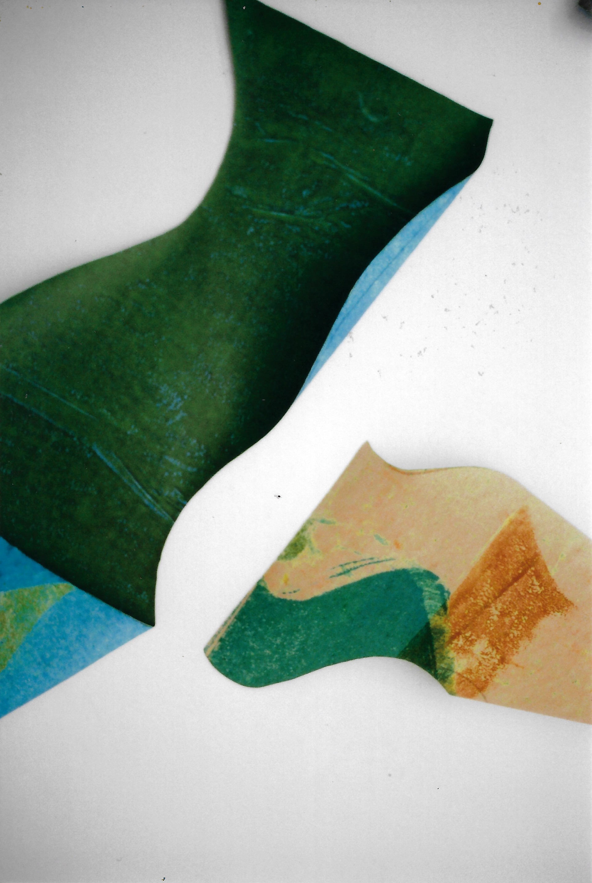
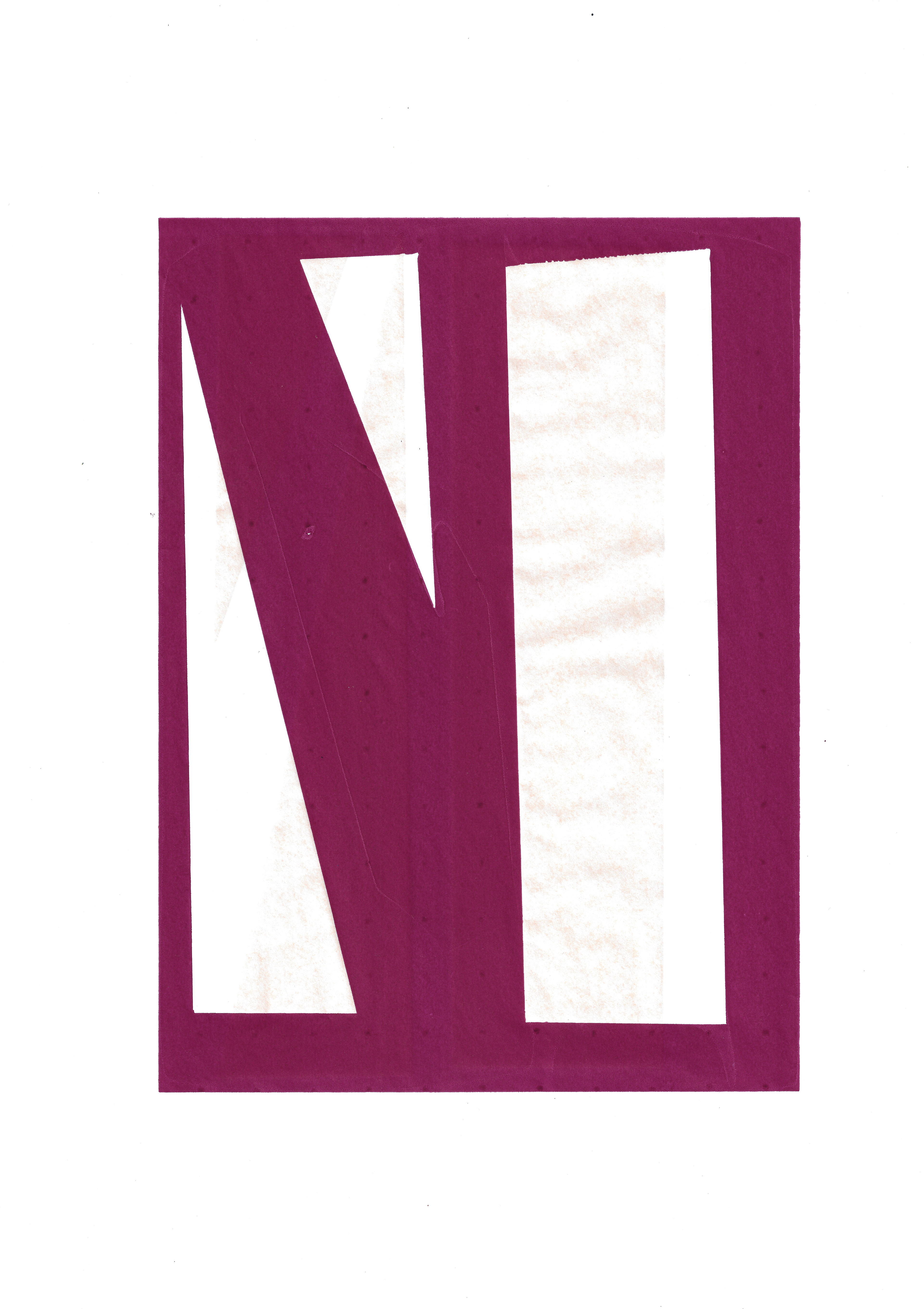
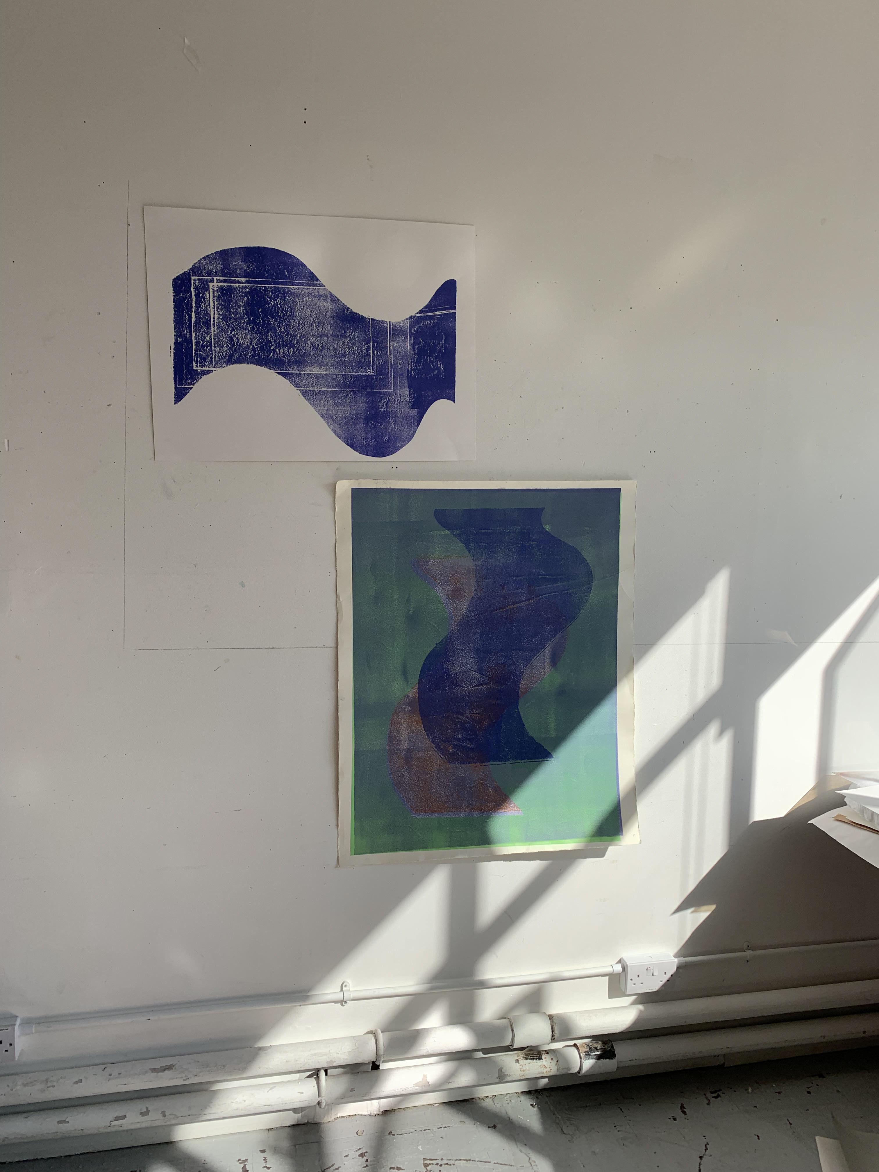
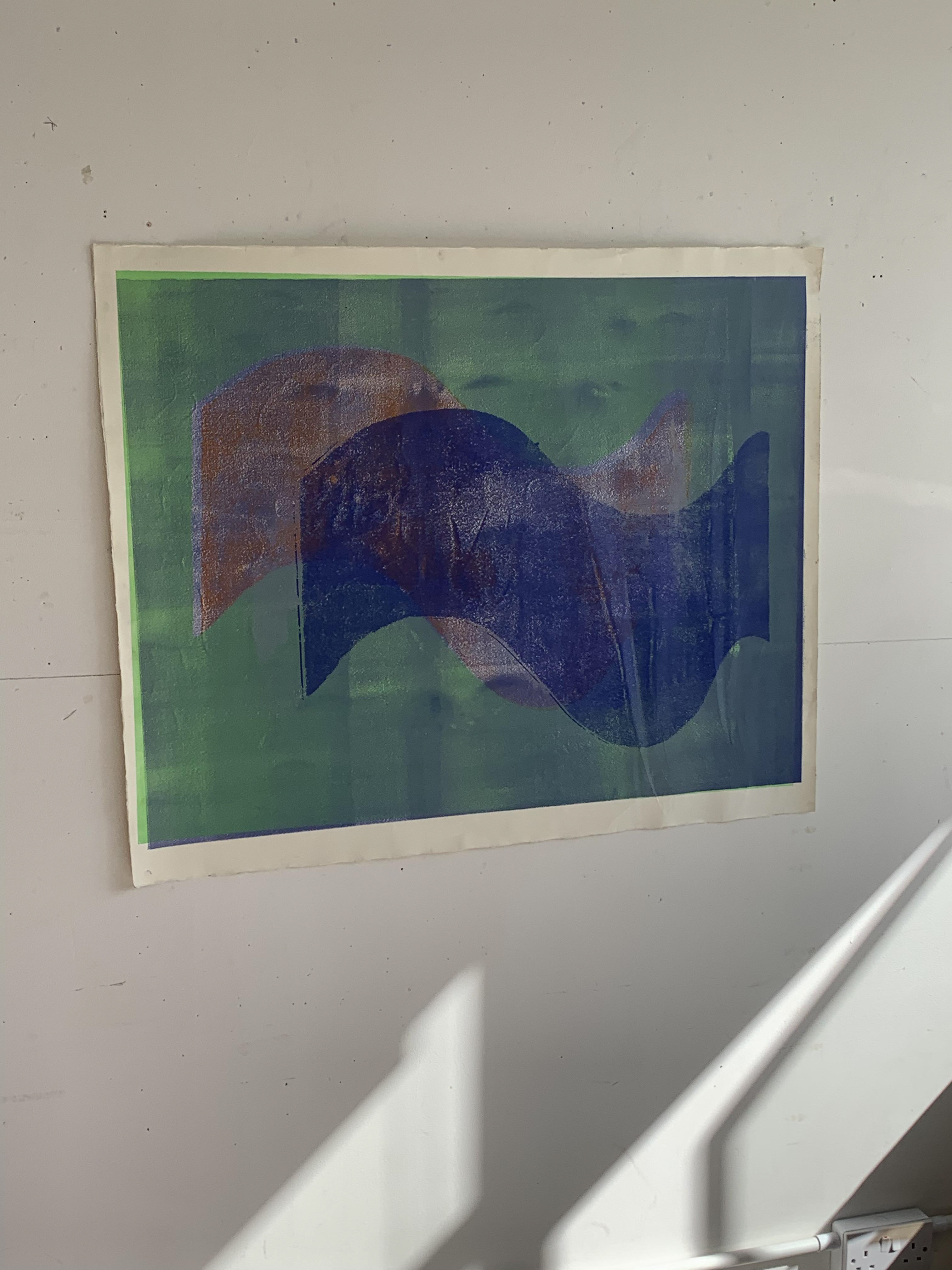
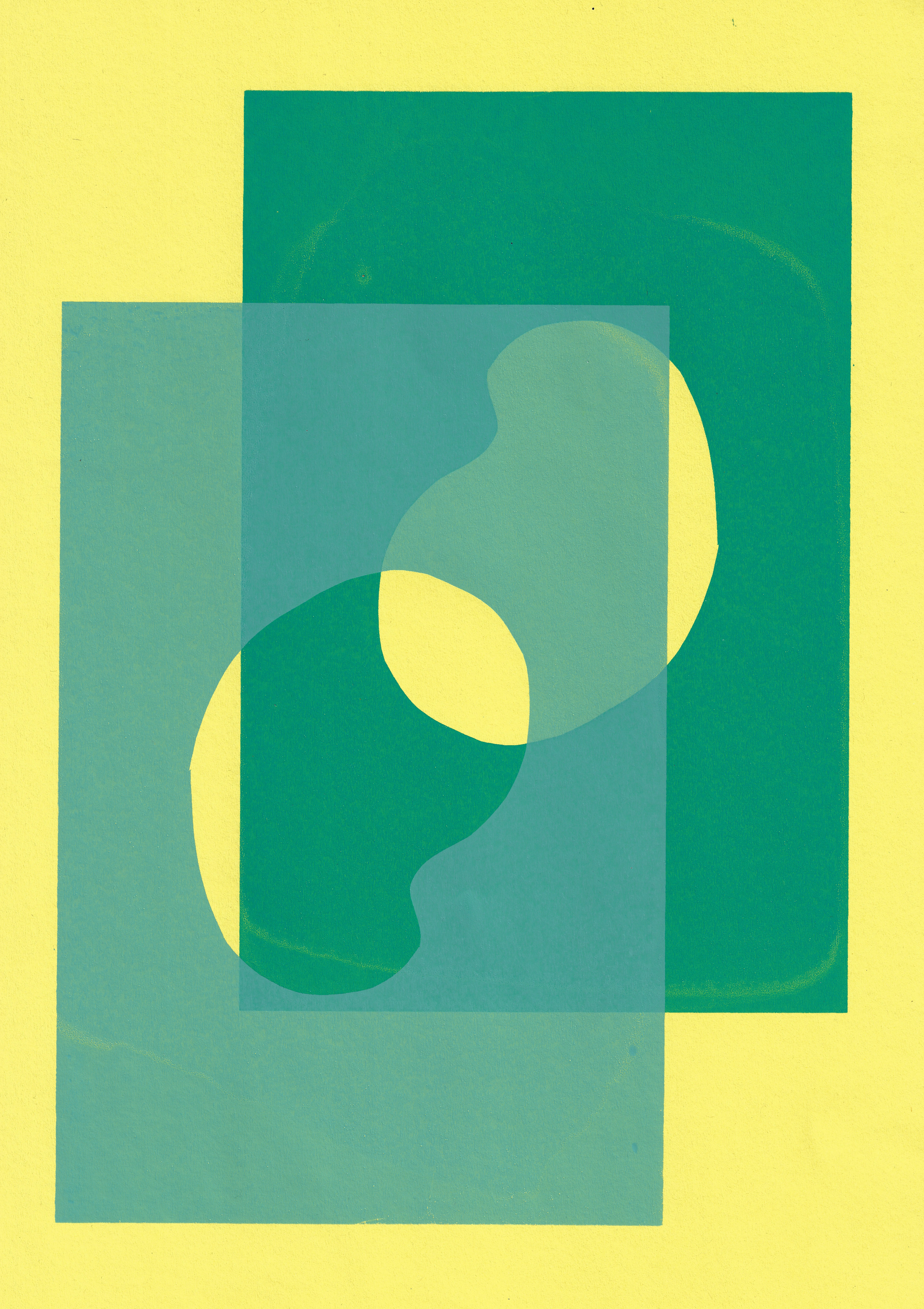
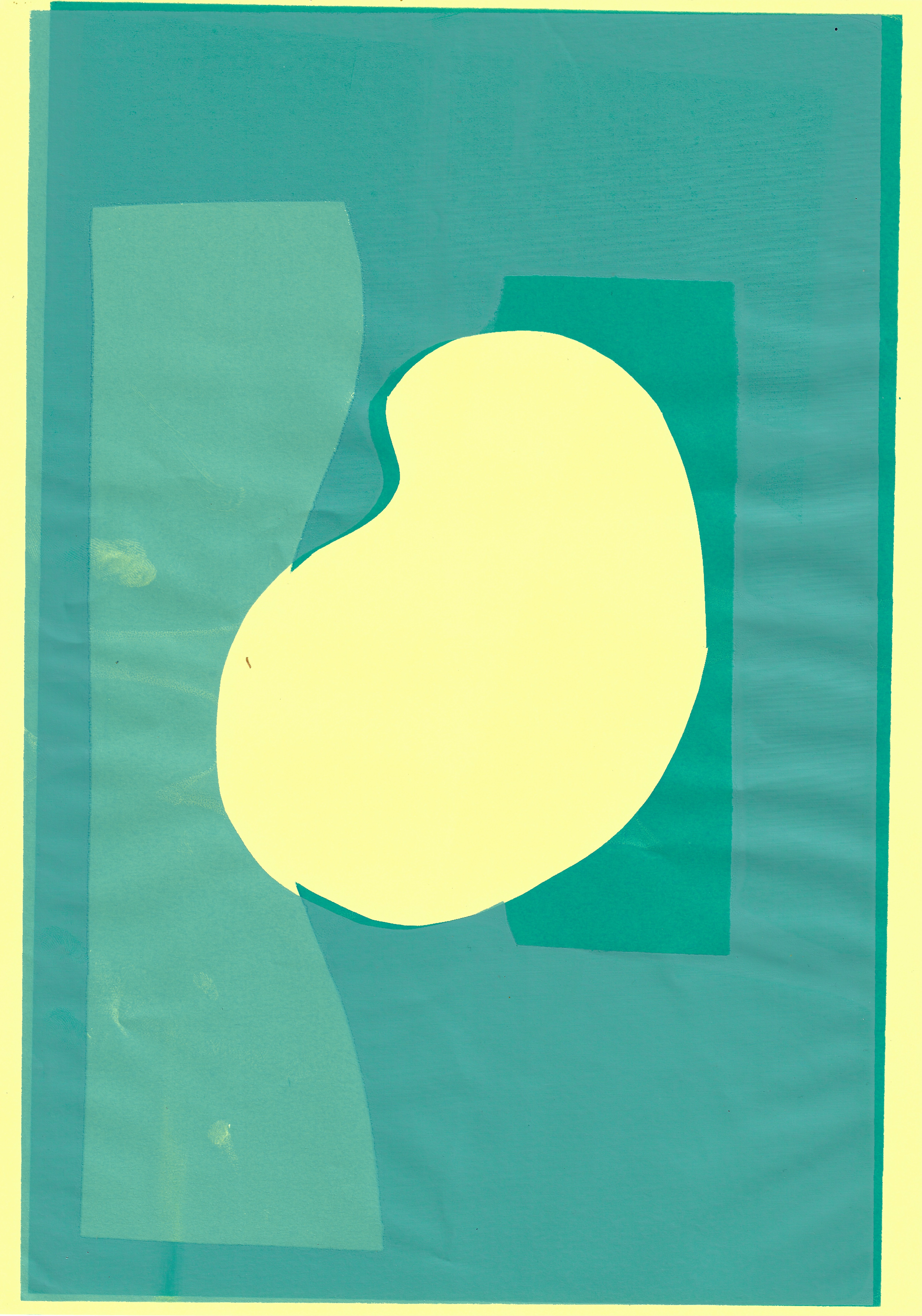
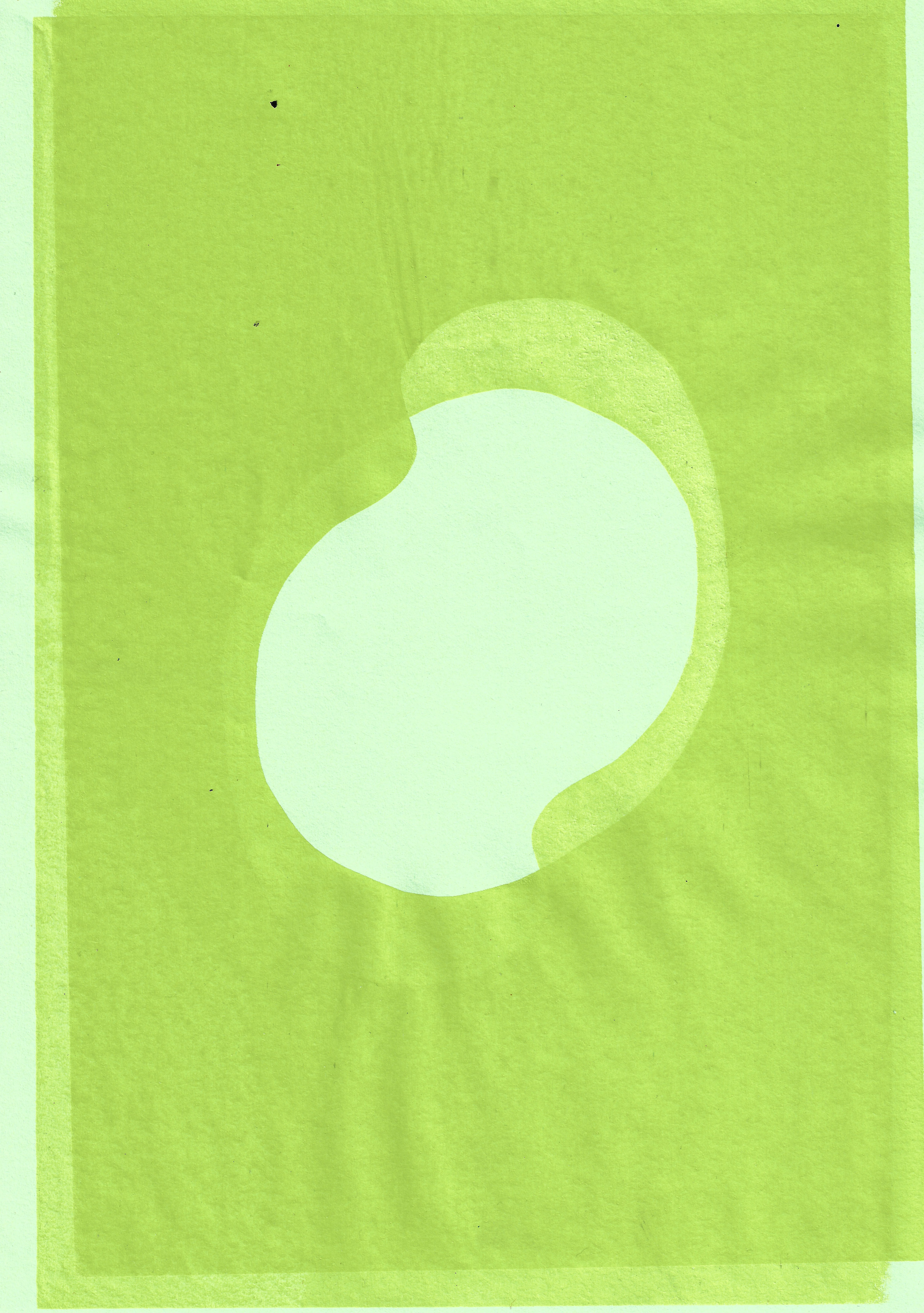
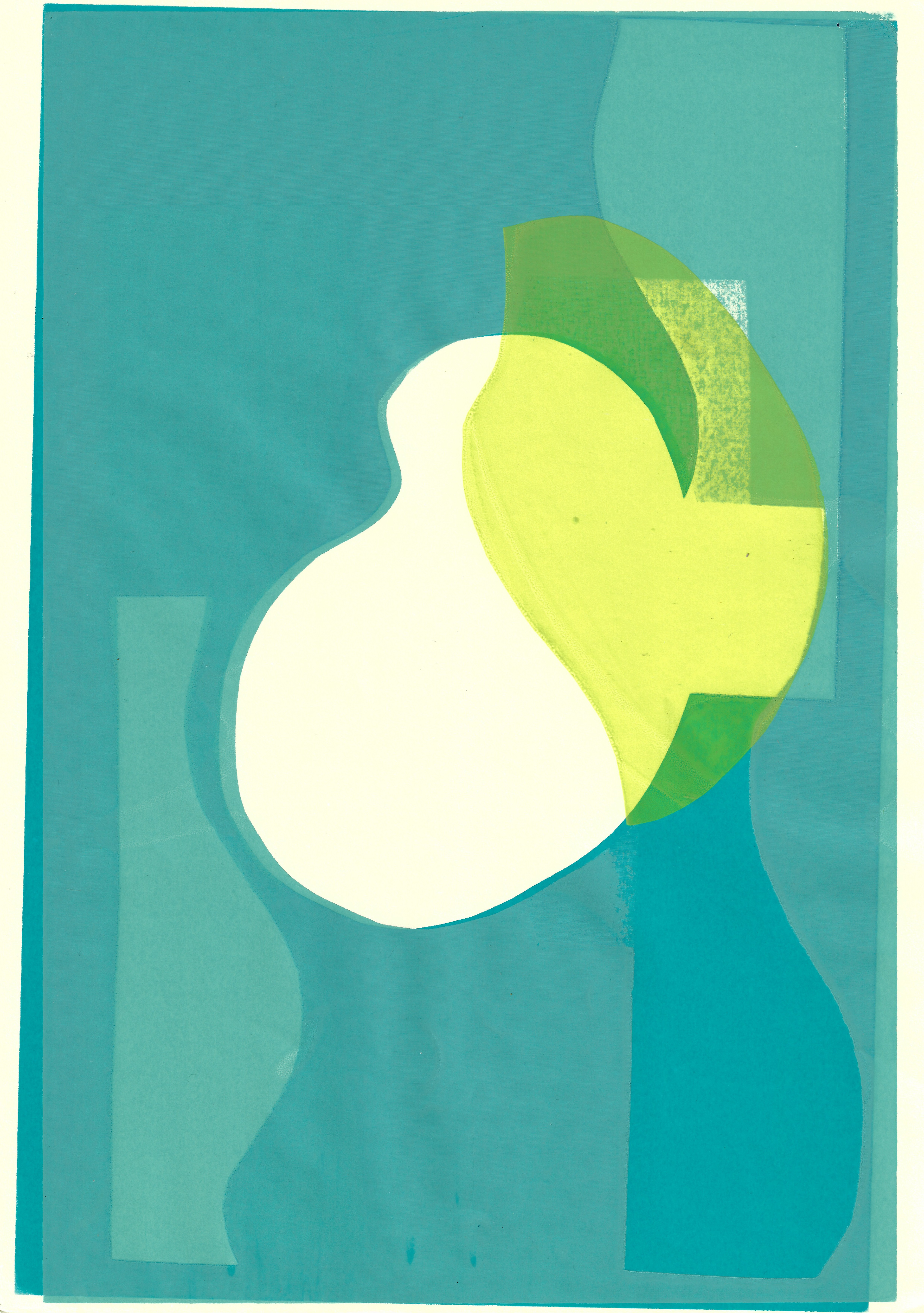
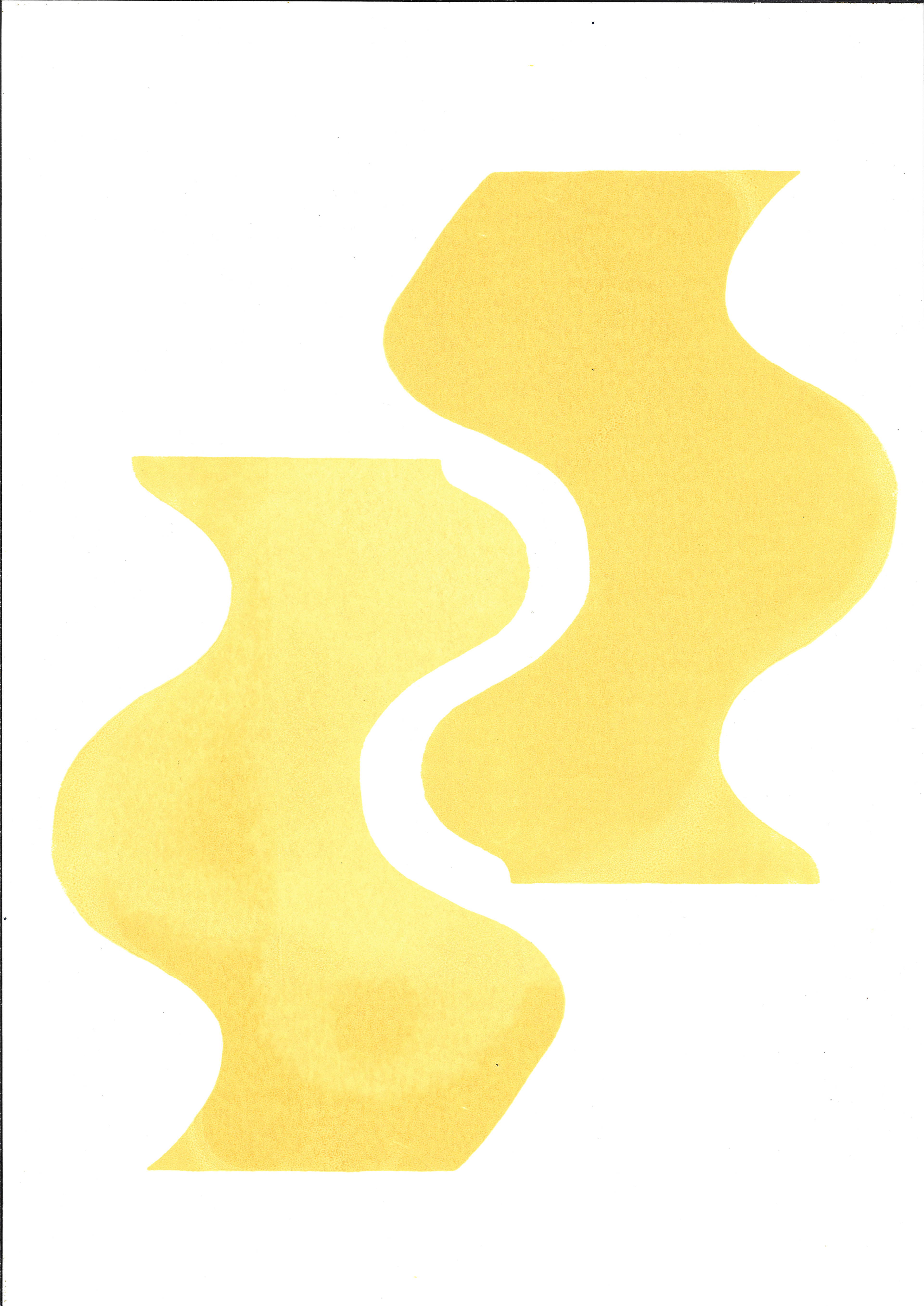
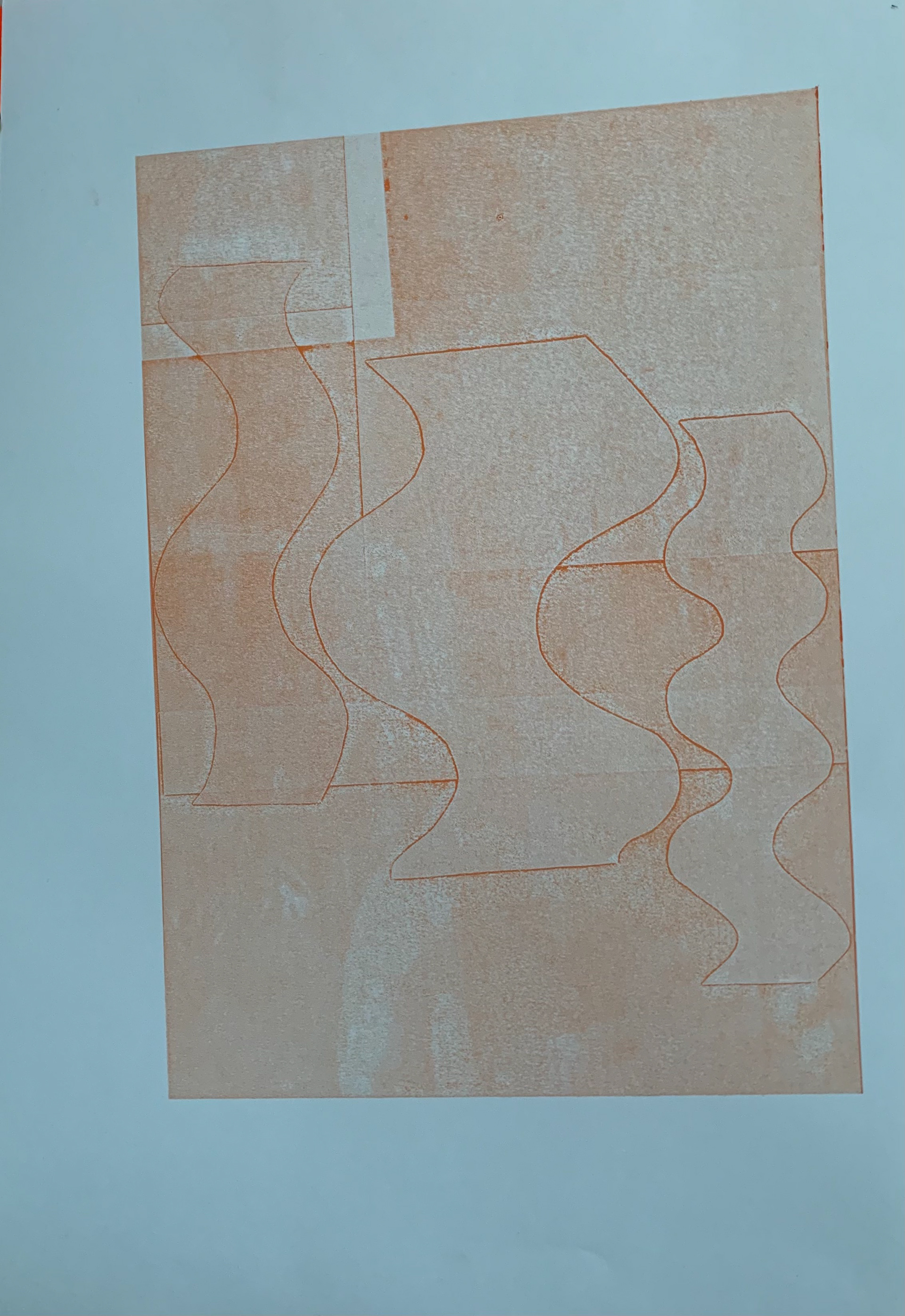
I use stencils to monoprint shapes onto paper. There is equality in status of the stencils used to create the images and the images produced from the stencils. Neither is more important than the other, just like the positive and negative are two sides of the same coin.


I scan in a variety of shapes that have been previously used in monoprinting to create images. The stencils range in texture, as some have more ink and have been used for multiple layers; also they are made from different substrates. Additionally, the shapes all have individual marks from the different positions and multiple times they have been used on the monoprinting plate.
I increase the scale of the shapes, creating a variety of different sizes. I also map out roughly their arrangement for the Copeland Gallery, and decide which ones will be double-sided.
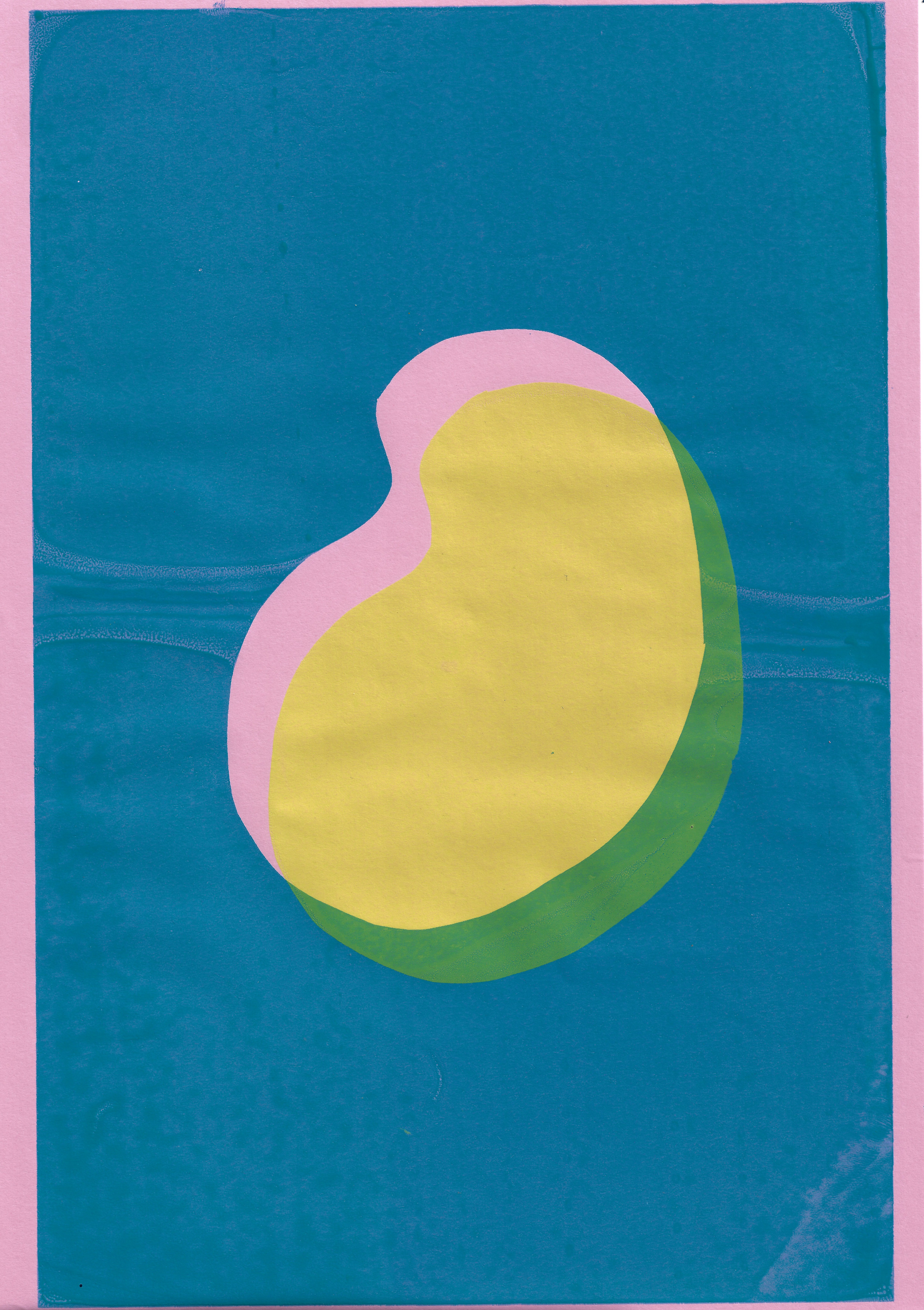
I edit and adjust the scanned in images. Adjusting hue, colour balance, saturation, vibrance, contrast and the levels on photoshop. For the double-sided shapes, I adjust the image on one side in correlation and to be in balance with the reverse.


I digitally print 9 shapes to hang at the Copeland Gallery exhibition, some of the shapes are double sided, which proves harder to digitally print than I first thought. The paper is only coated on one side, meaning that the reverse will not have the same qualities. Additionally, the paper is from a roll, so it has a natural curl. To feed the paper into the printer to print on the other side, it must be completely flat. I overcame this by ironing the paper.
I start to cut out the shapes using a scalpel, rather than scissors or a guillotine, to accurately cut the different shapes, as they are just printed on rectangular paper. I want the materiality of the different forms to be noticeable to the viewer up close, as from far away this is not obvious. I want different levels of engagement from different viewers depending on their position. This reflects the direction of my thoughts; I am mirroring nature. From far away natural forms can appear perfectly in proportion, symmetrical or geometric and the human eye naturally adjusts to compensate any irregularity. However, up close the imperfections in the form are noticeable and inescapable.
With some off cuts I rehearse attaching the paper to the wall with the adhesive tape. I also twist the shape, to practise hanging and displaying a double-sided piece.

I start to install the shapes at the Copeland Gallery, using a combination of adhesive tape activated with acetone and thin nails. When installing some of the shapes at height, the adhesive tape works but there is doubt over its reliability. I use very thin, small nails to secure some of the shapes. I did not want to use these initially because they would leave a mark on the work, as each time this work will be installed it will not be the same and the small marks from the nails will be a reminder as to where it was previously hung. The installation of my work is dependent on the space I am allocated. Interestingly, I am allocated a space near the end of a wall, so I additionally use the end of the wall which bends round the corner, which I had not anticipated.

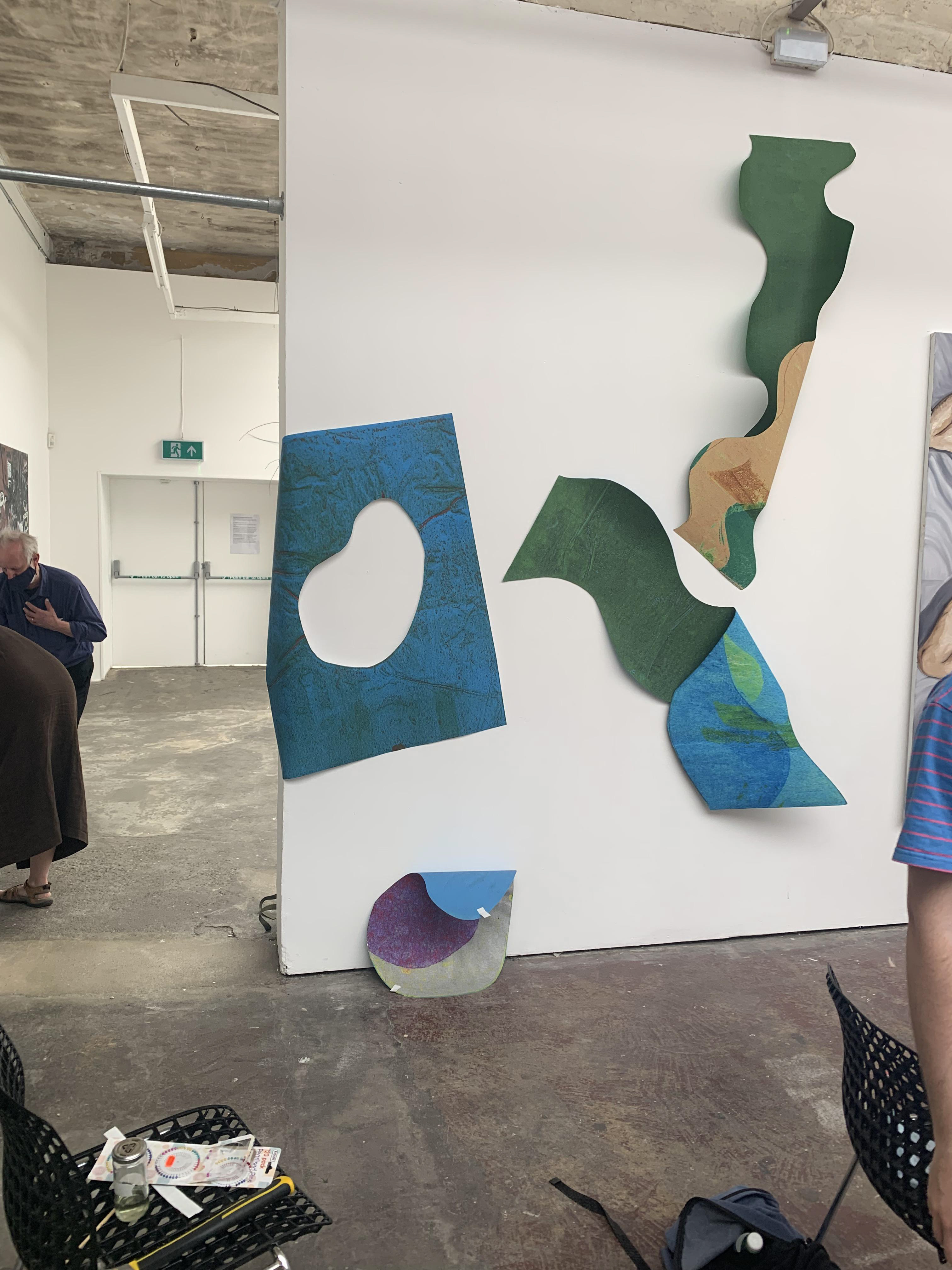

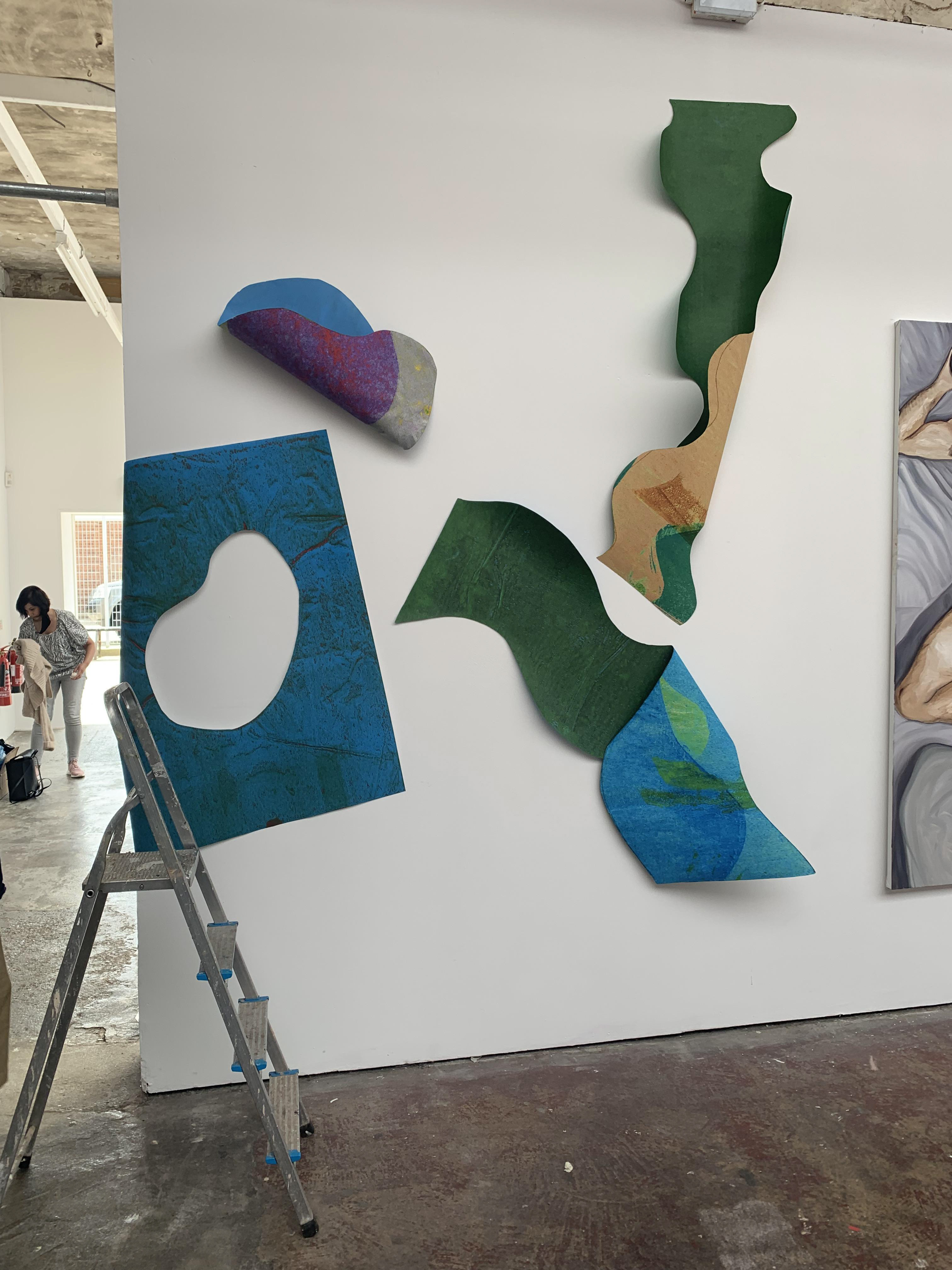
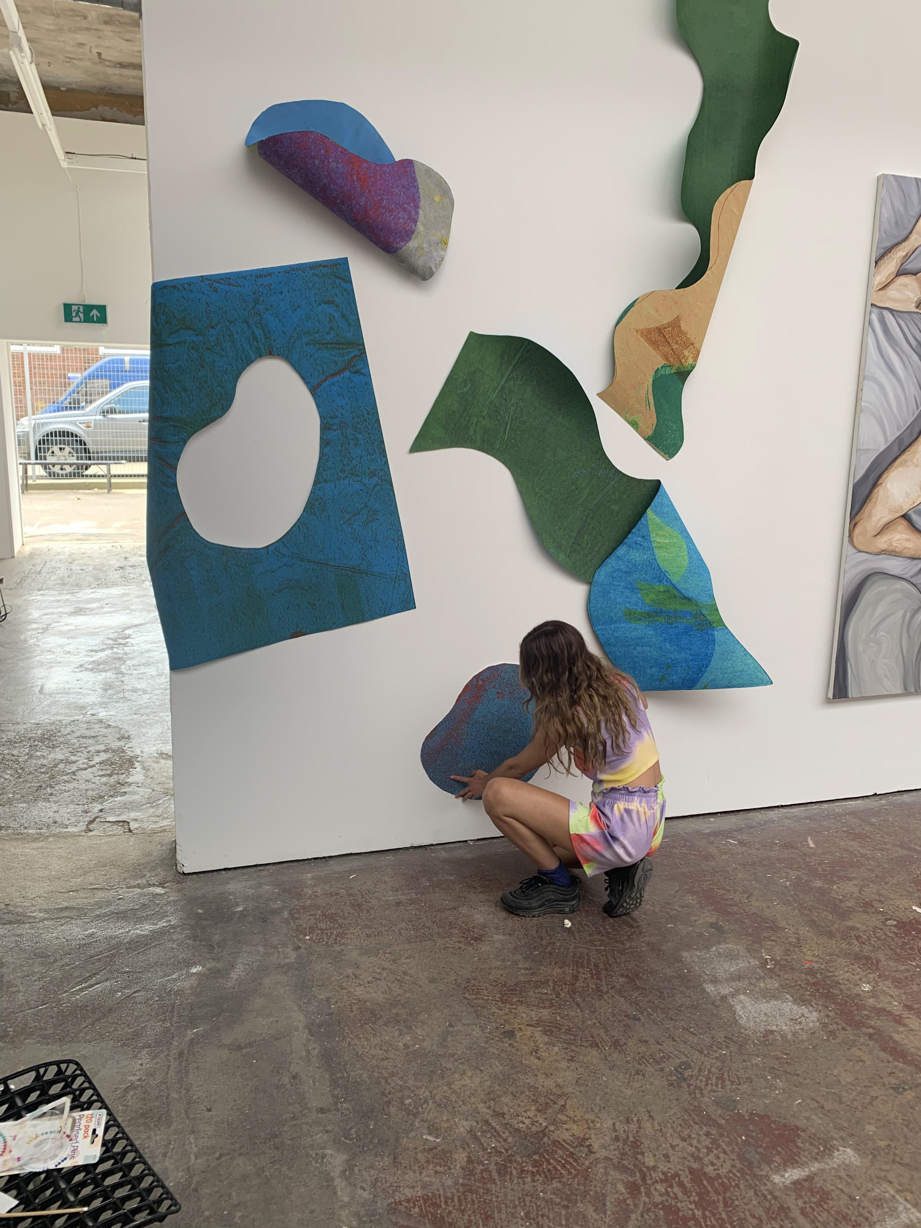


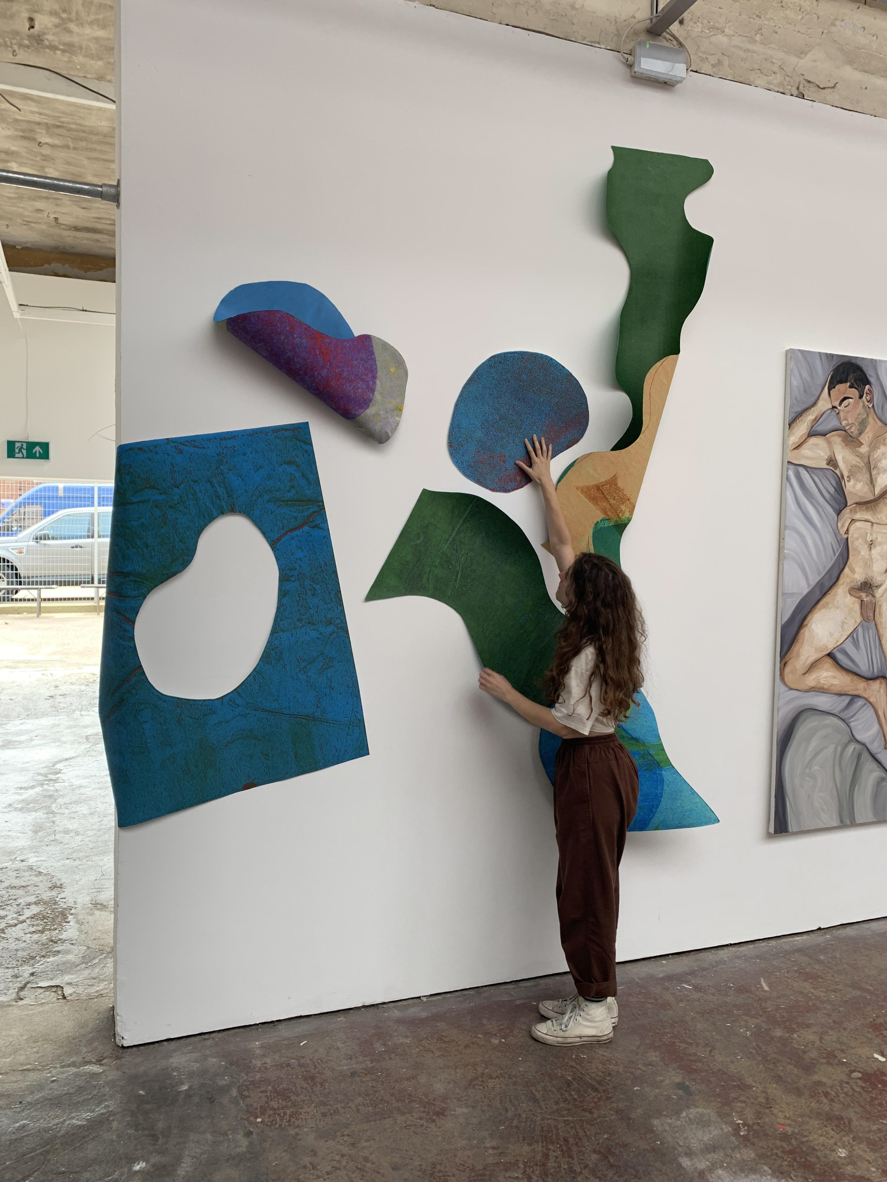

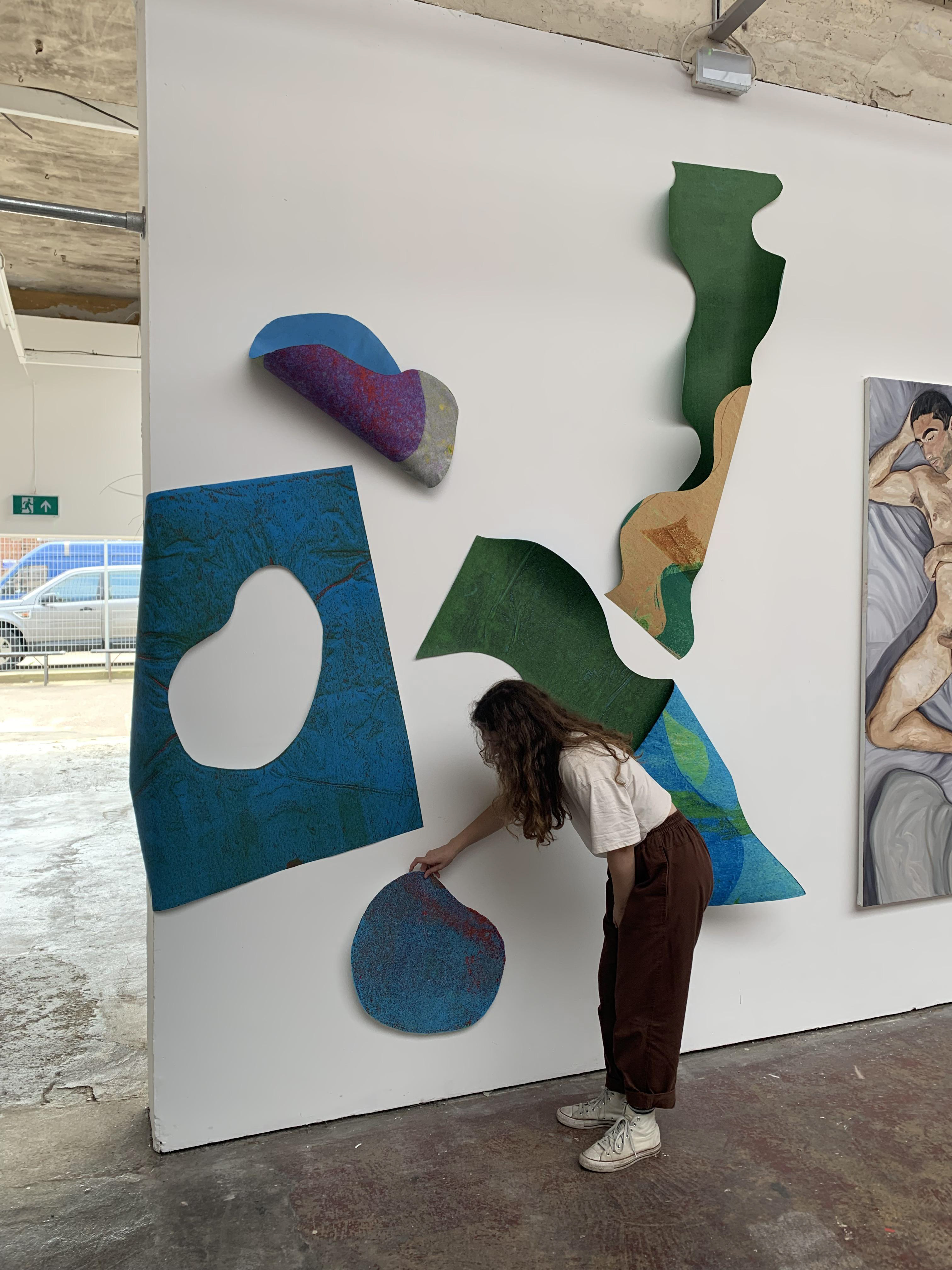
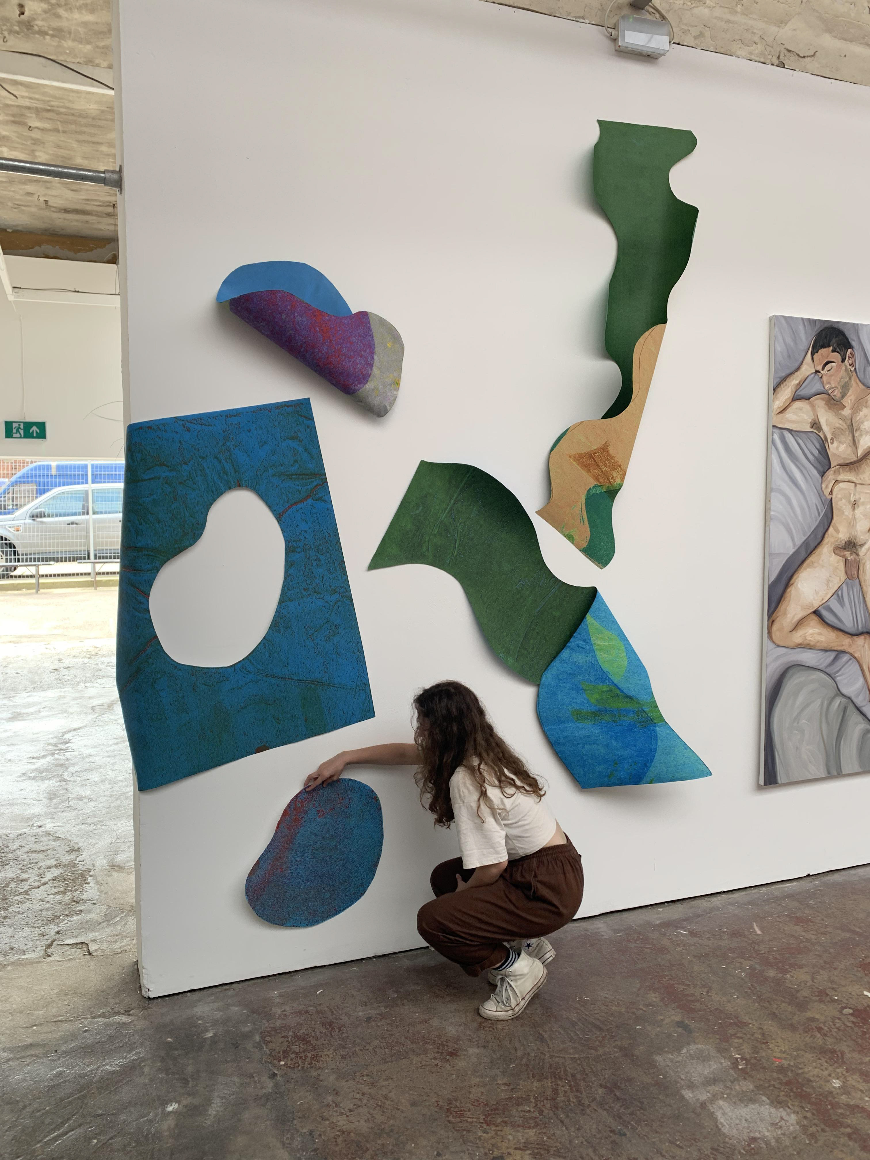

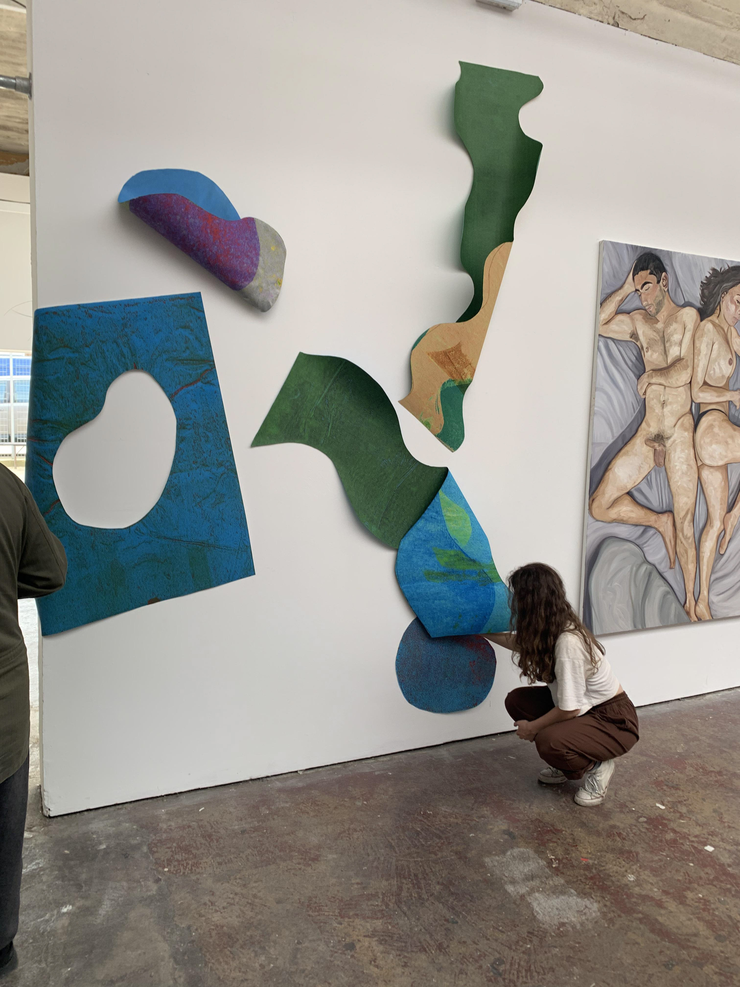
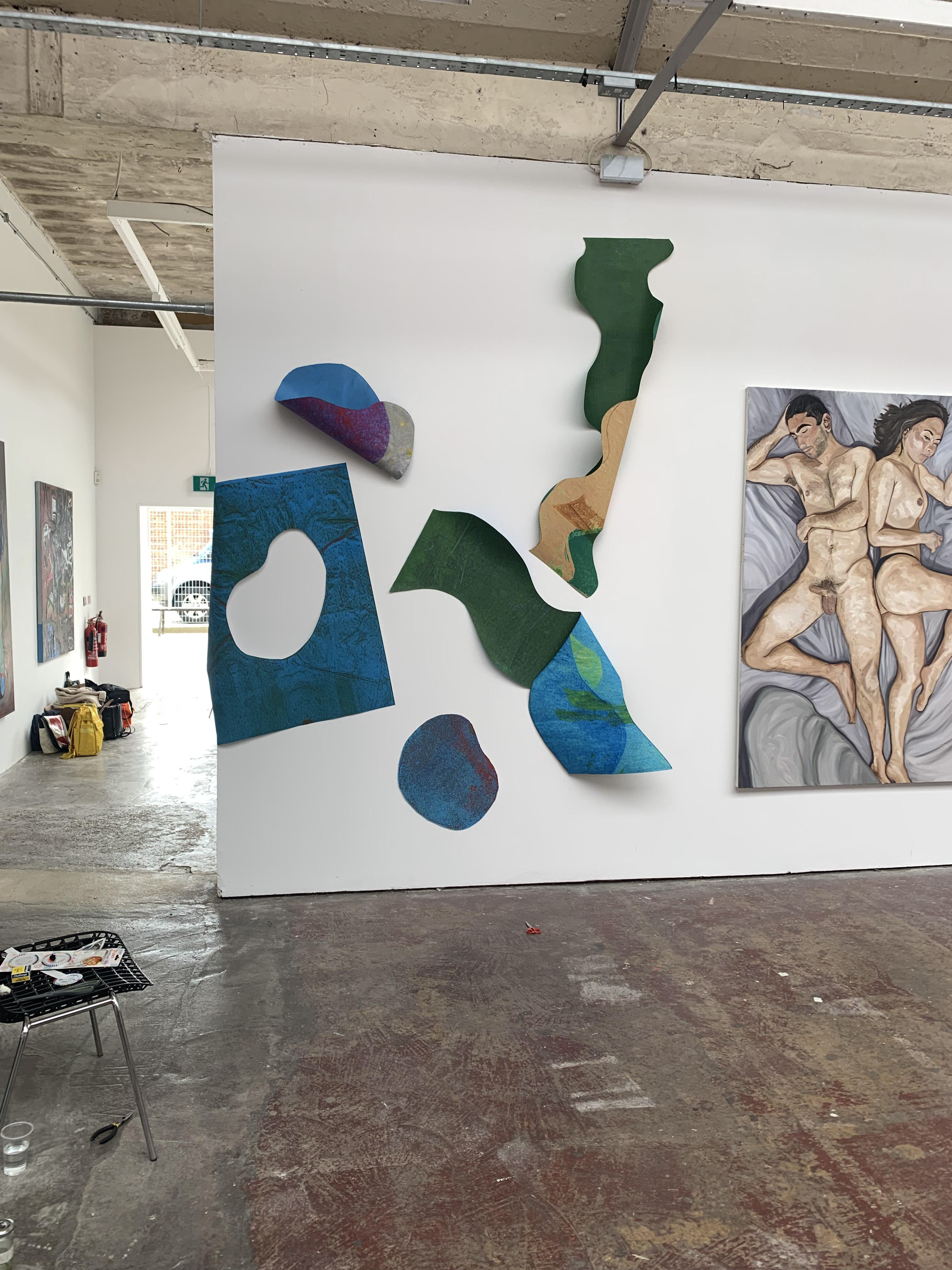
The arrangement of the different shapes becomes harder, I use other people to hold shapes whilst I stand back and look at the work. I paused after I had installed 4 of the shapes to consider where the fifth would go. I did not want to install an even number and I wanted to utilise the height of the wall as well as the width I was allocated. Once I had hung the fifth, I felt that the work was complete, that if I were to add any more it would be too chaotic, and less was more in this case. In the end, I only hang 5 out of the 9 shapes I had prepared. The two big squiggles I installed had a personal resonance, as one was my height before I had back surgery and the second was my height after my surgery. The taller rhythmic squiggle had more curves compared to the slightly shorter one, representing, to me, how the pace of life has slowed since, but it has not lost its power.
I take a video of my work installed in the gallery, as it is difficult to convey the sculptural, three-dimensional nature of the work from a photograph.

I go to the gallery to take some photographs using the 35mm analogue camera I have been learning to use. The photographs I take focus on the materiality and texture of the work, whilst also demonstrating the ability of paper to extend off the wall.


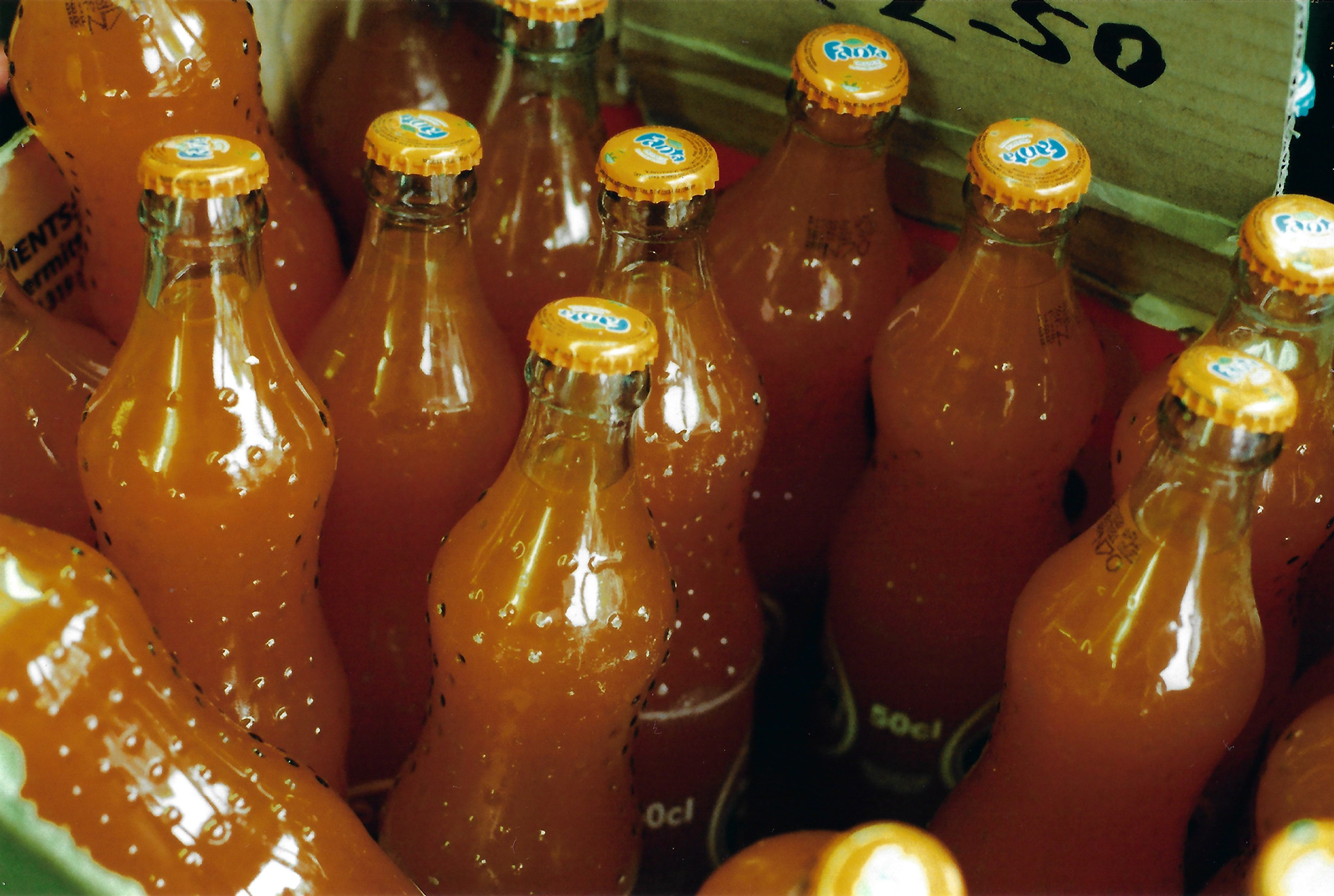

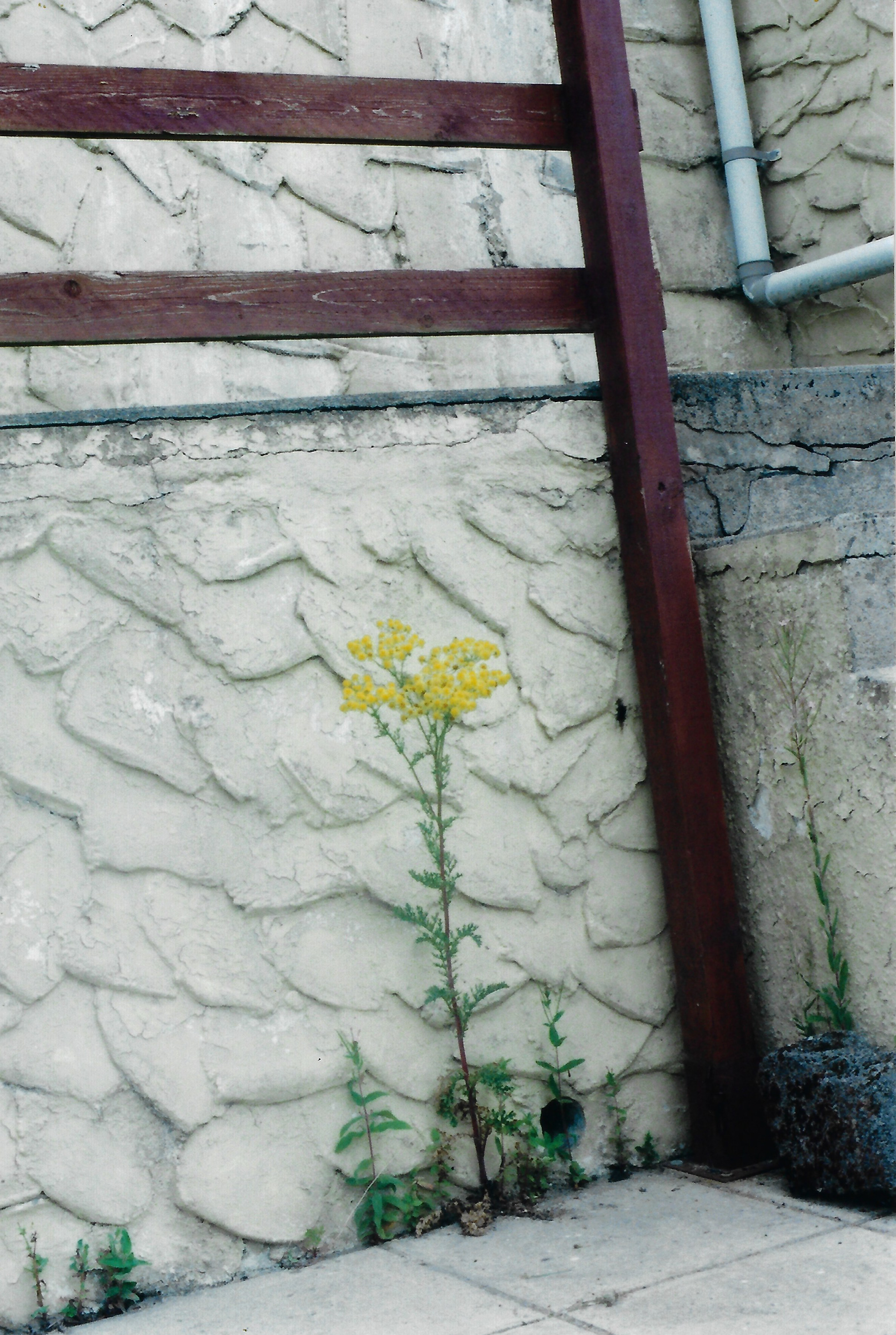
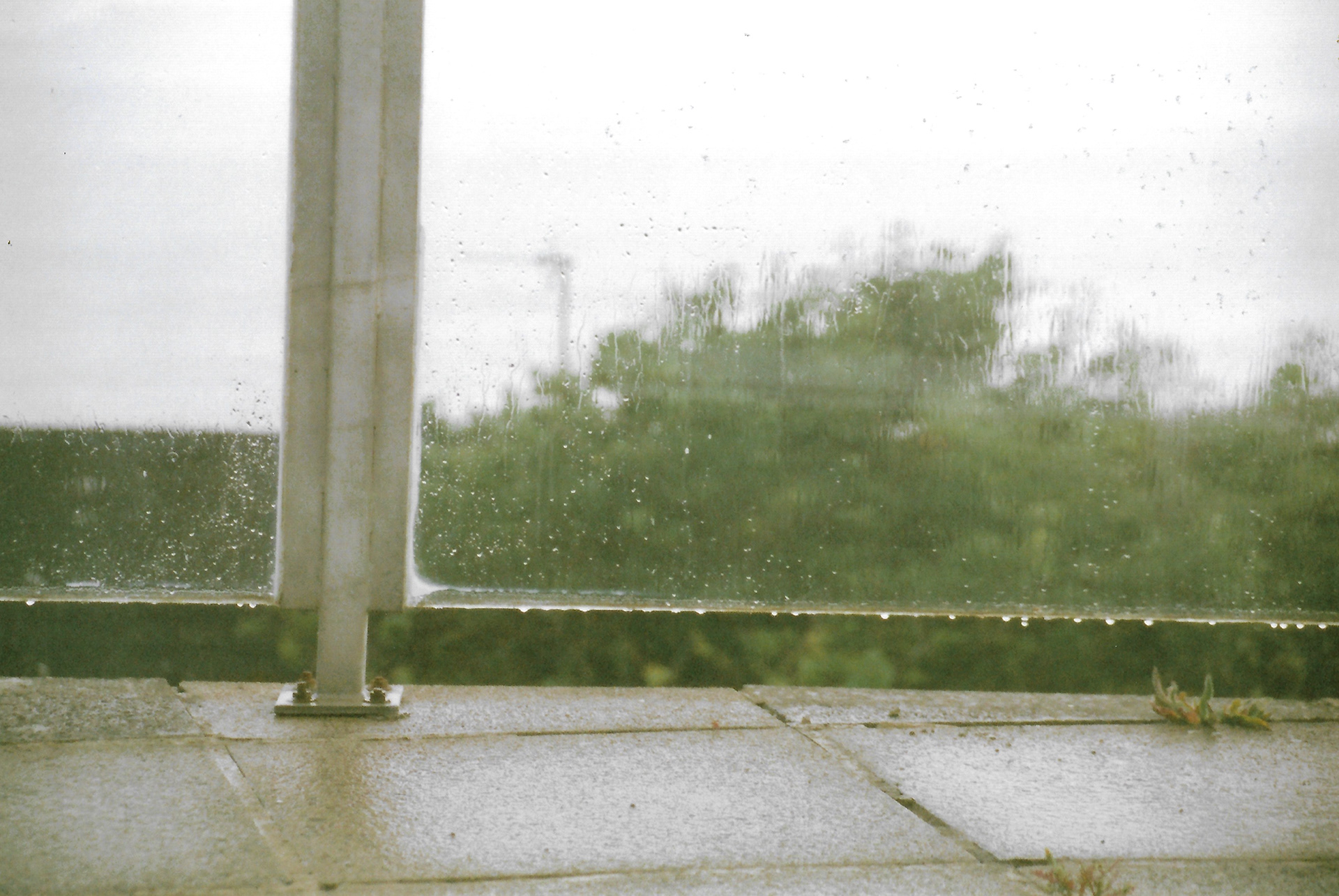
I use the analogue camera and I also digitally photograph my surrounding environment, which is very different to the environment I encounter when I return to my family home in Gloucestershire. I still encounter natural matter, but it is completely different in this context. The natural vibrancy of plant matter stands in greater contrast to the surroundings, making it more noticeable, yet the colours are different – I believe this is due to the different air quality compared to the countryside.


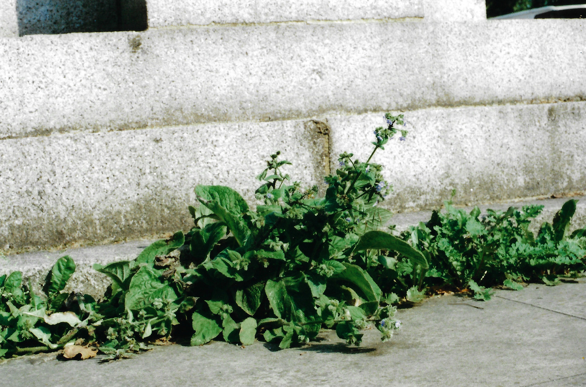
I return to Gloucestershire and use the analogue camera to photograph my environment. Different natural matter stands out in the rural surroundings in comparison to when it is encountered in an urban environment. Additionally, I draw a curving plant, using one interlocking line, making no distinction between the positive and negative space.

Sketchbook page, 21 x 29.7 cm
Sketchbook page, 21 x 29.7 cm

Sketchbook page, 21 x 29.7 cm

Sketchbook page, 21 x 29.7 cm
Sketchbook page, 21 x 29.7 cm

21 x 29.7 cm

14.8 x 21 cm

21 x 29.7 cm
Sketchbook page, 29.7 x 42 cm
Sketchbook page, 29.7 x 42 cm
Sketchbook page, 29.7 x 42 cm
I draw more natural matter in this environment, following the different undulating lines. I also photograph, using the analogue camera, the allotment. Different plants are more noticeable compared to the last time I was here, it is different. However, this is the same environment, just viewed at different times, allowing for different perspectives on the same matter, which has evolved. My work exhibited at the Copeland Gallery exhibition is a metaphor for this progression, because the shapes were made from paper, over the duration of the exhibition they inevitably began to sag. The viewer was still encountering the same work, it is just subtly different, each time it was viewed.
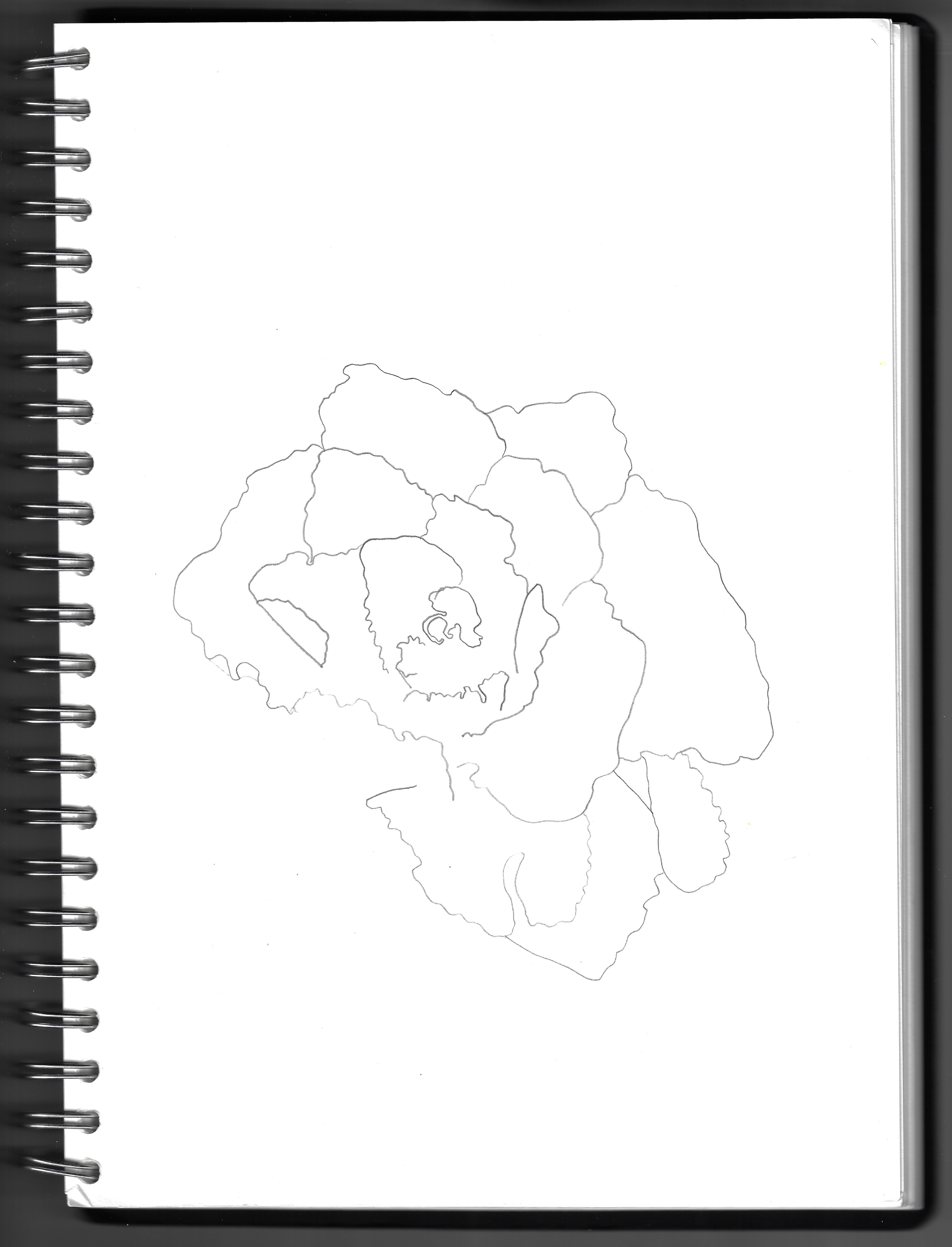
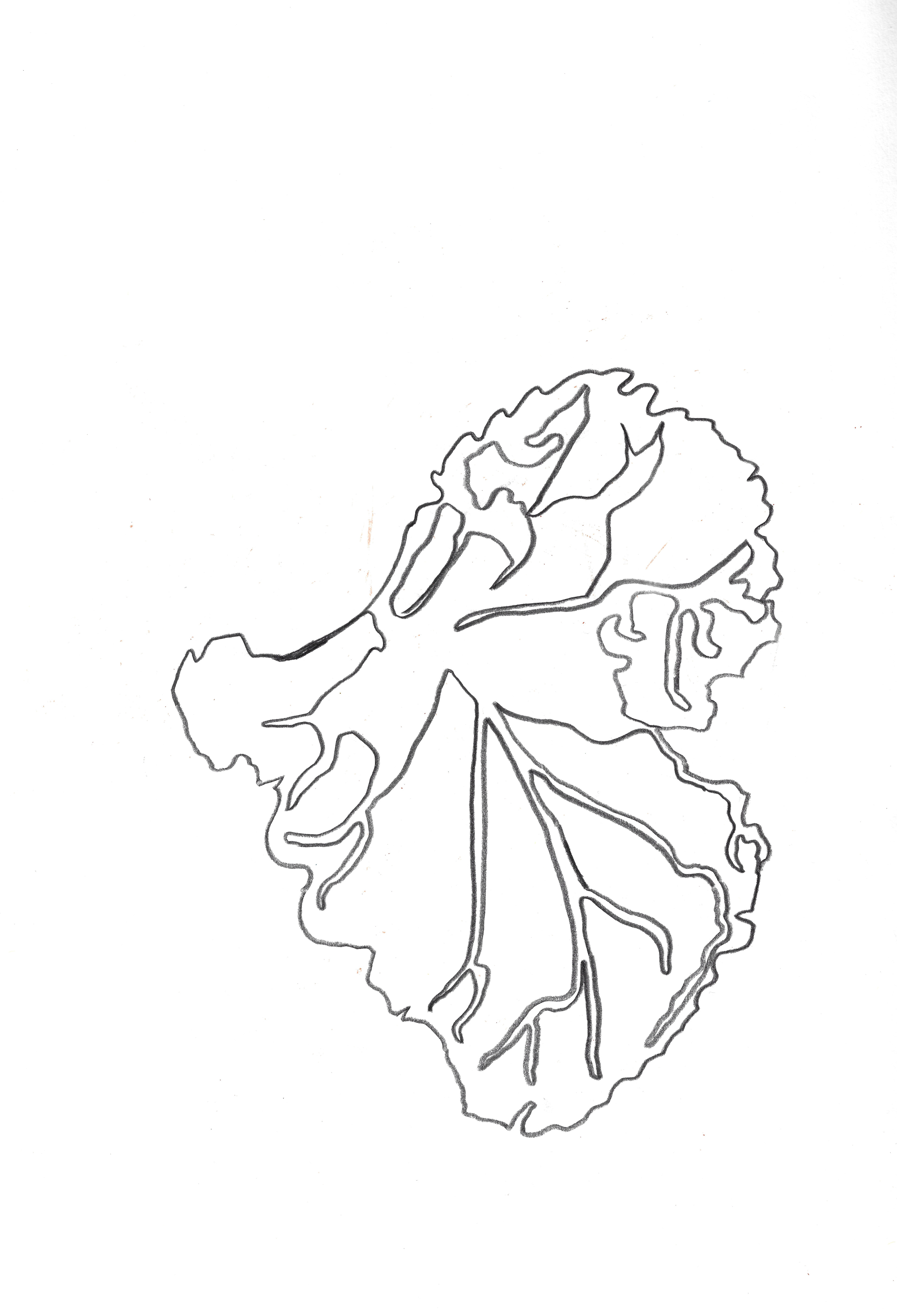
I use a simple pencil to do a couple of line drawings of a plant with noticeable undulating leaves and interlocking curves. I spend a considerable amount of time drawing and re-drawing the line untill it is just right. I pay particular attention to the line, as I want it to convey the plant’s essence exactly as I see it, and this may not be completely accurate and representational, but to me it is.

Sketchbook page, 29.7 x 42 cm
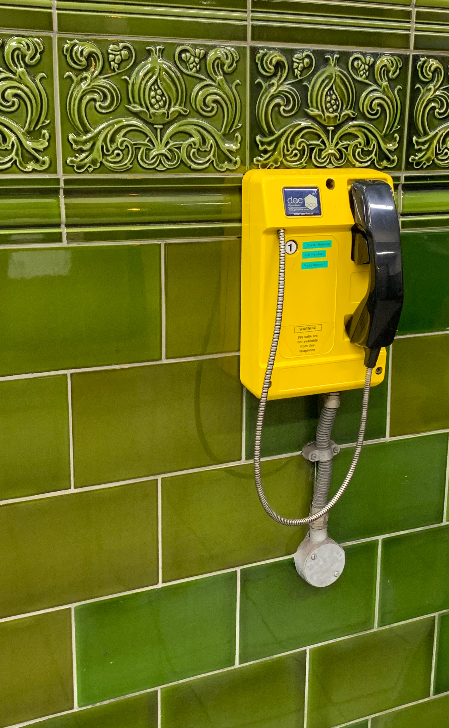
I am in a tube station with traditional green tiles, which are contrasted against a service telephone. Just like I contrast rural and urban environments, this is a similar contrast between different periods of style. On the tiles there is a combination of the curved decorative tiles with the plain square ones.
Screenprint on paper, 29.7 x 42 cm
Screenprint on paper, 29.7 x 42 cm
Screenprint on paper, 29.7 x 42 cm
Screenprint on paper, 21 x 29.7 cm

Screenprint on paper, 21 x 29.7 cm
Screenprint on paper, 29.7 x 42 cm
Screenprint on paper, 21 x 29.7 cm

Screenprint on paper, 21 x 29.7 cm
Screenprint on paper, 21 x 29.7 cm

Screenprint on paper, 21 x 29.7 cm
Screenprint on paper, 21 x 29.7 cm
Screenprint on paper, 21 x 29.7 cm
Screenprint on paper, 29.7 x 42 cm

Screenprint on paper, 29.7 x 42 cm
Screenprint on paper, 29.7 x 42 cm
Screenprint on paper, 29.7 x 42 cm
Screenprint on paper, 29.7 x 42 cm

Screenprint on paper, 21 x 29.7 cm
Screenprint on paper, 25 x 35 cm
Screenprint on paper, 25 x 35 cm

Screenprint on paper, 35 x 50 cm
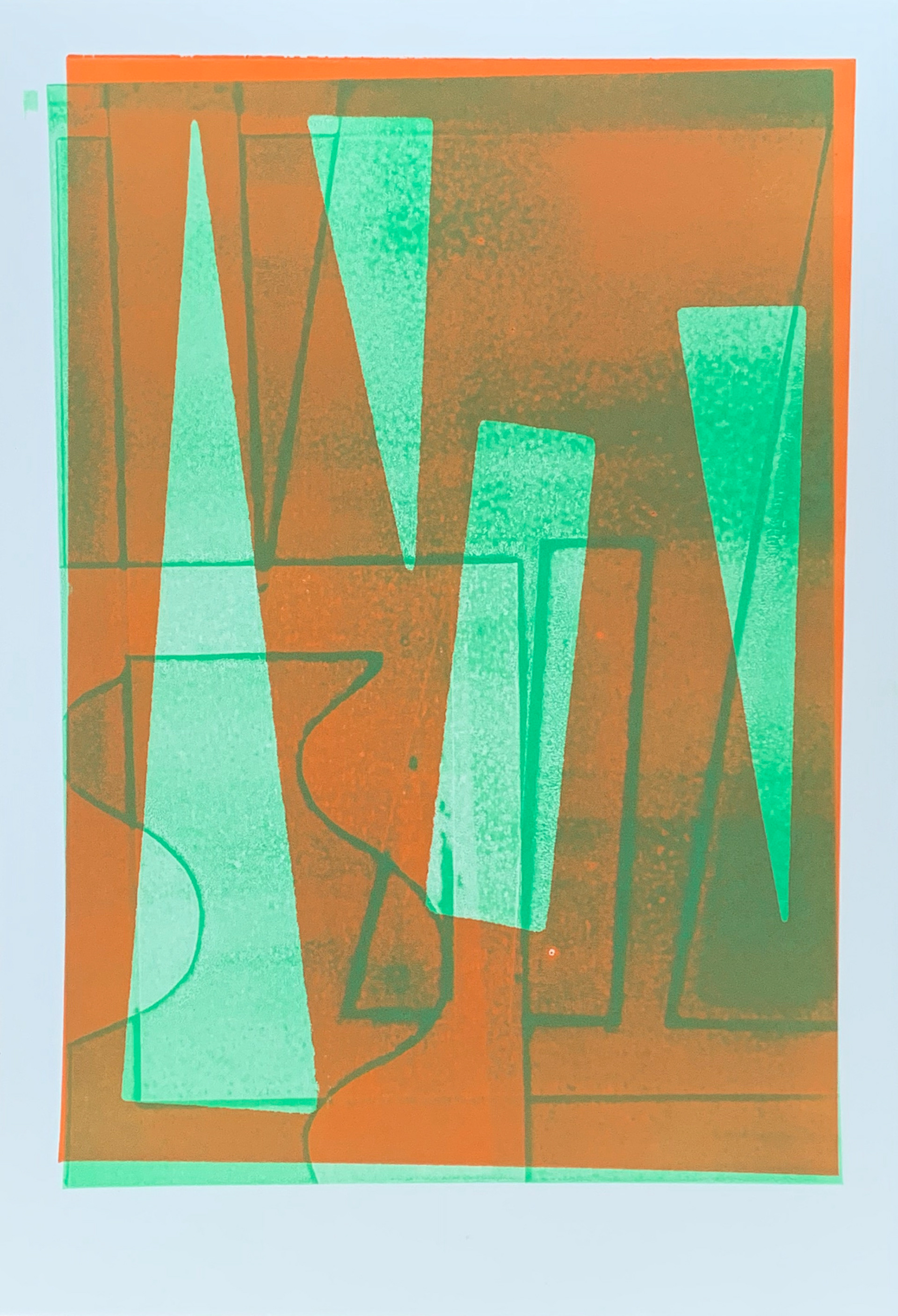
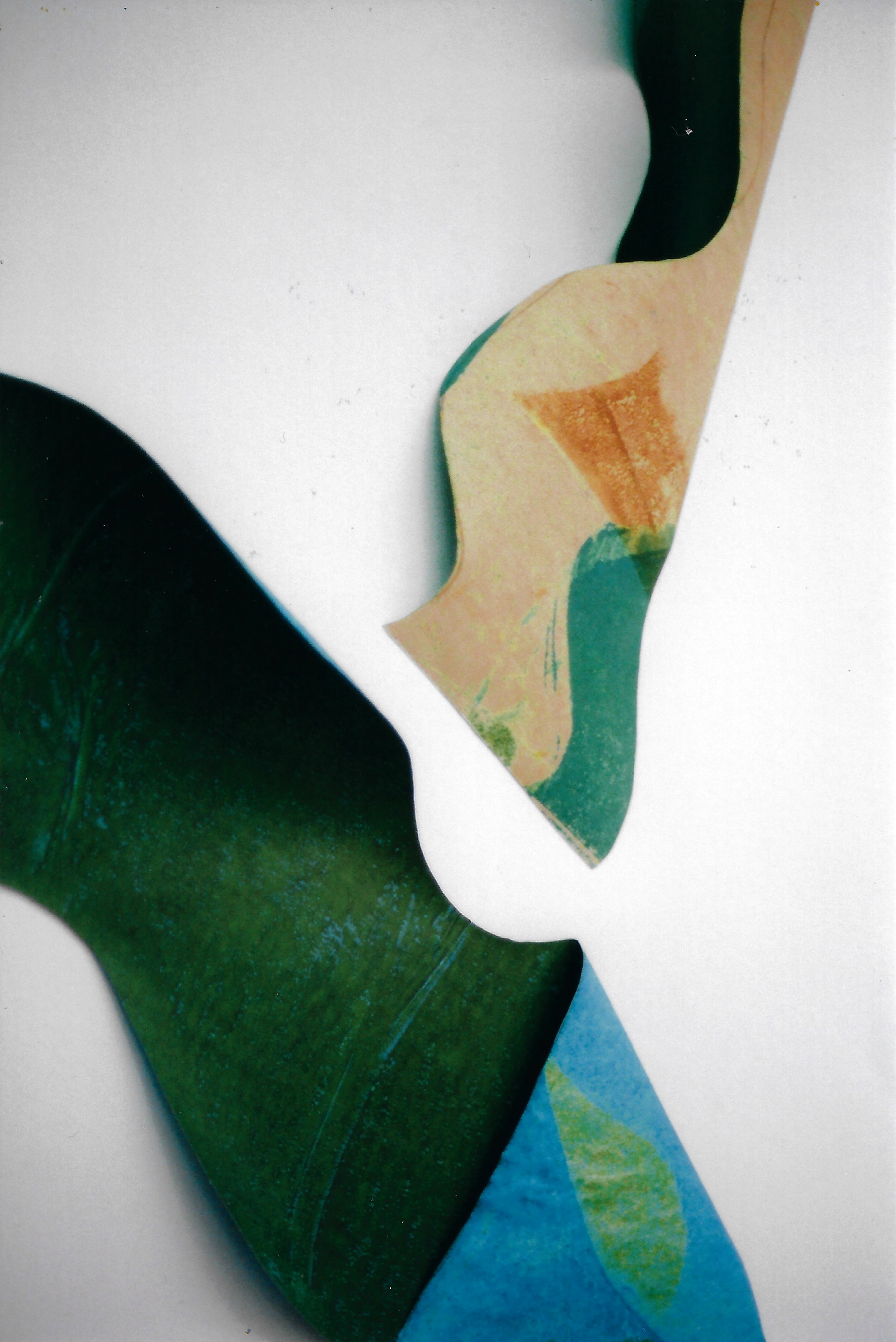
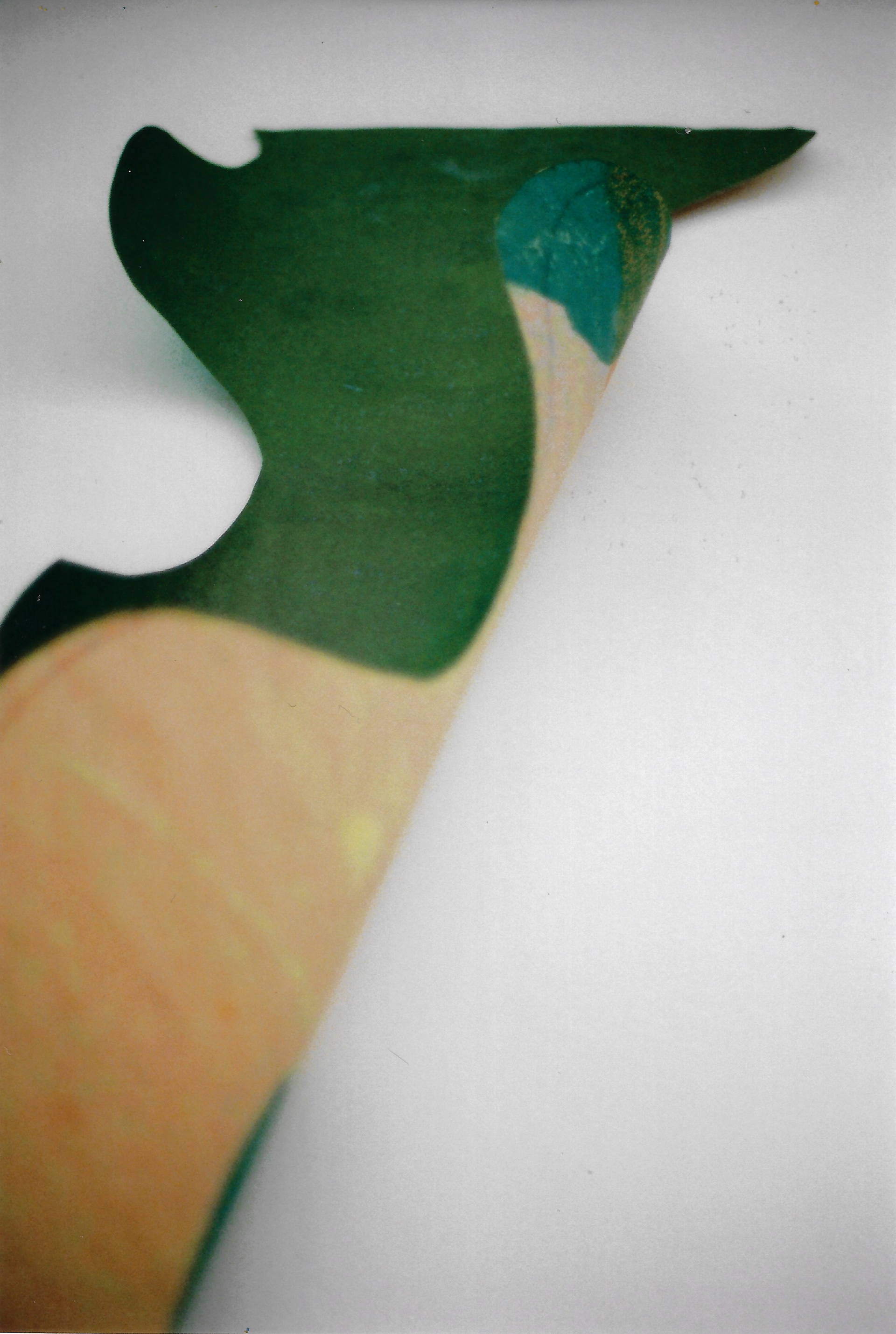
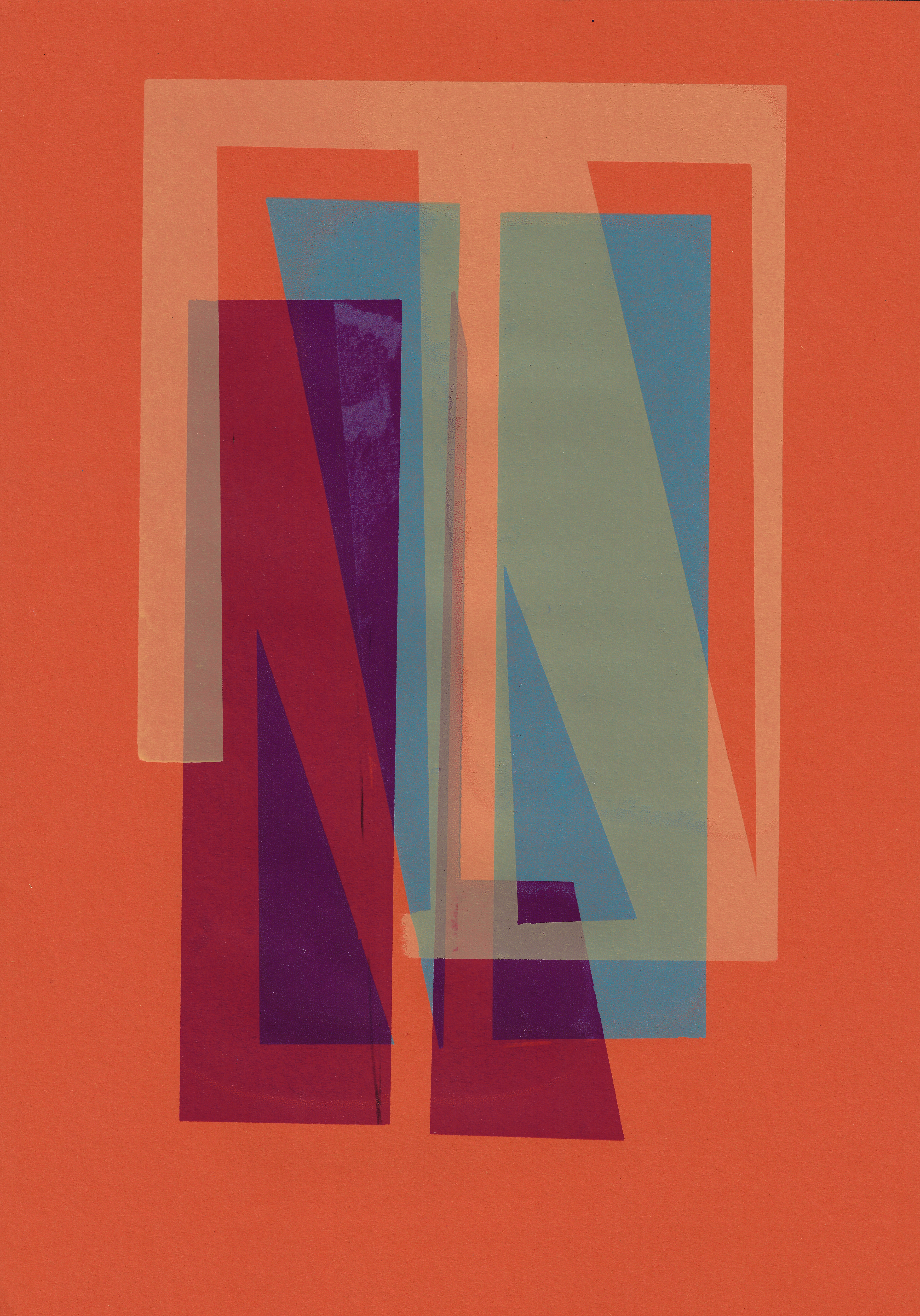
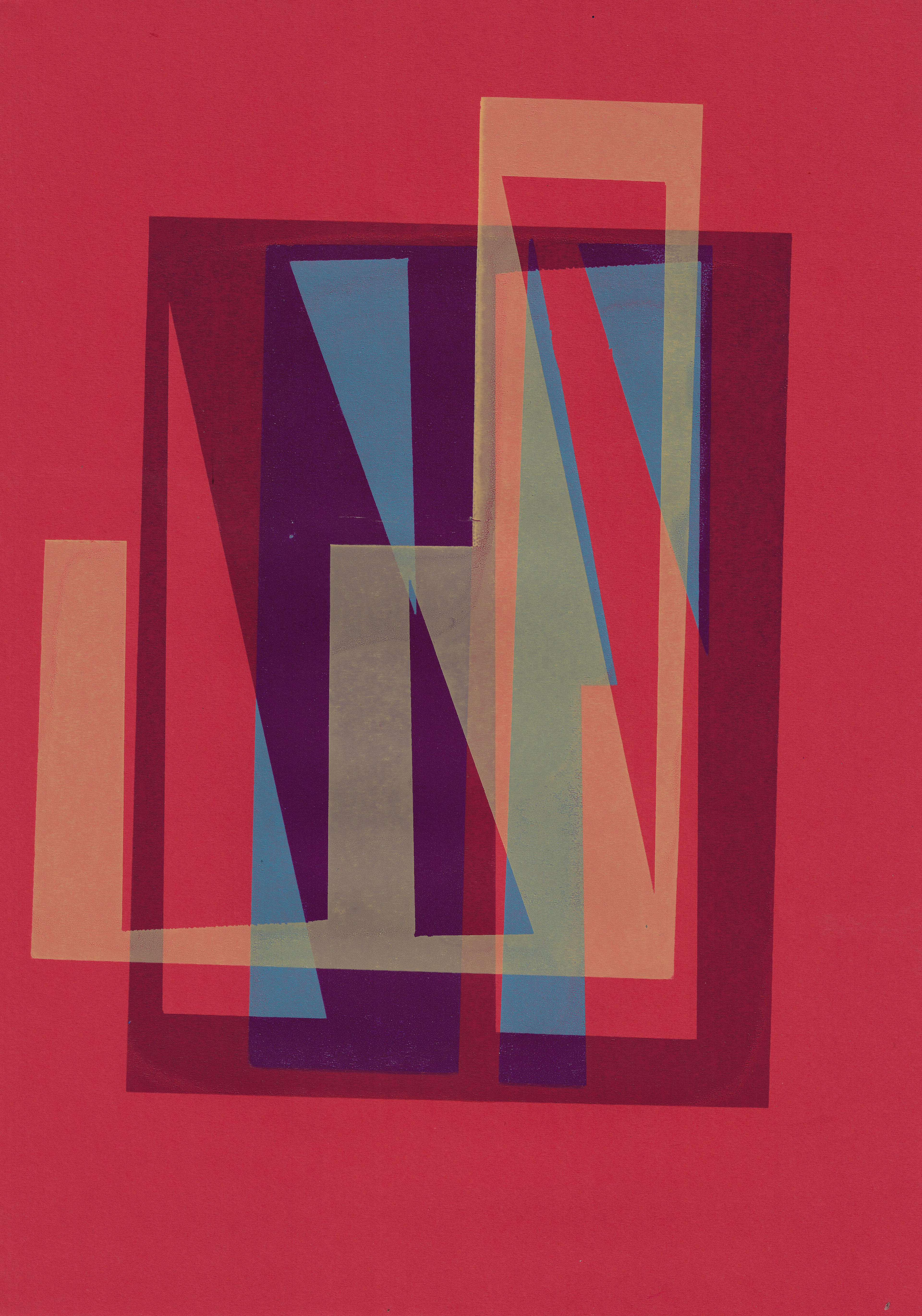
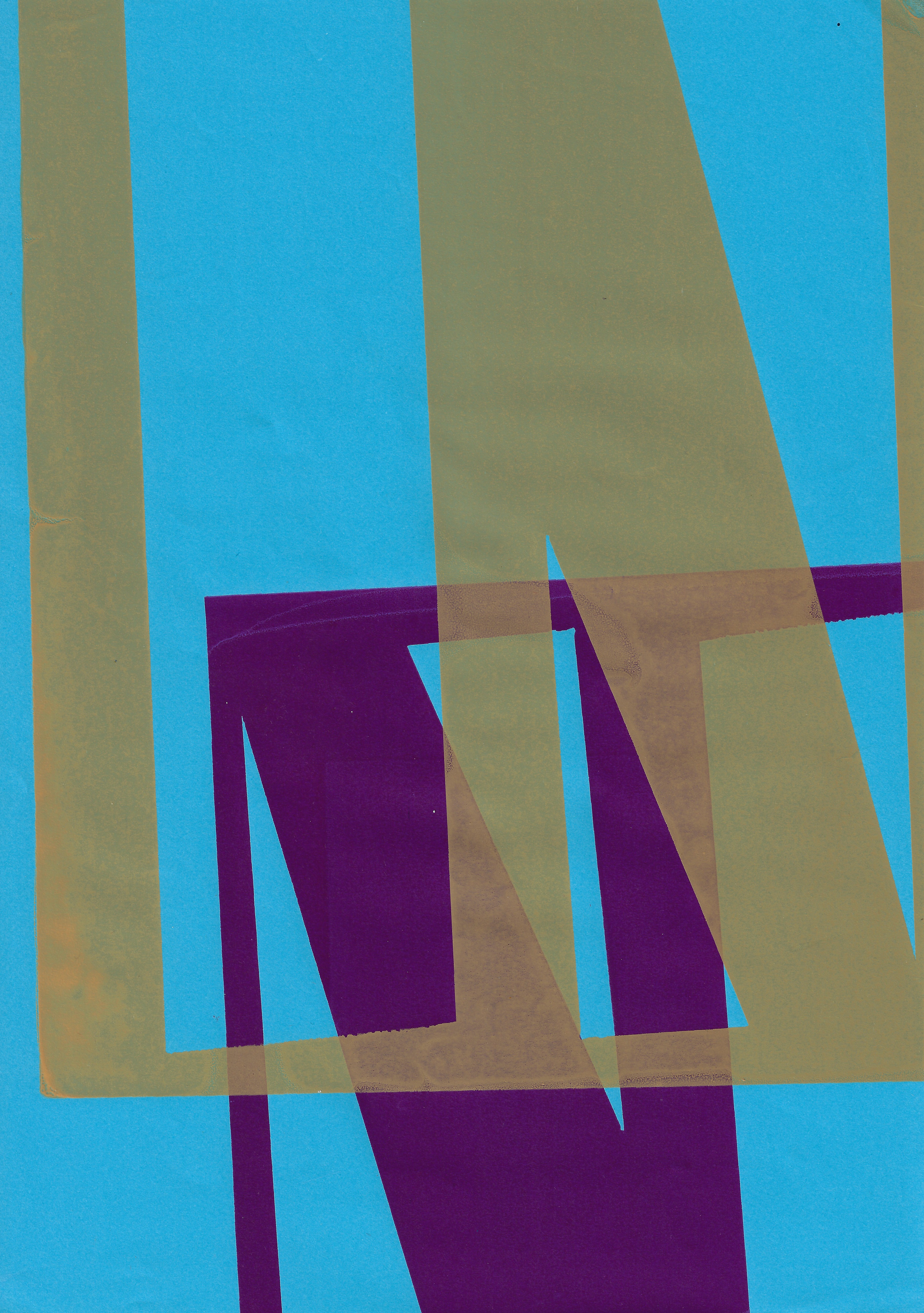
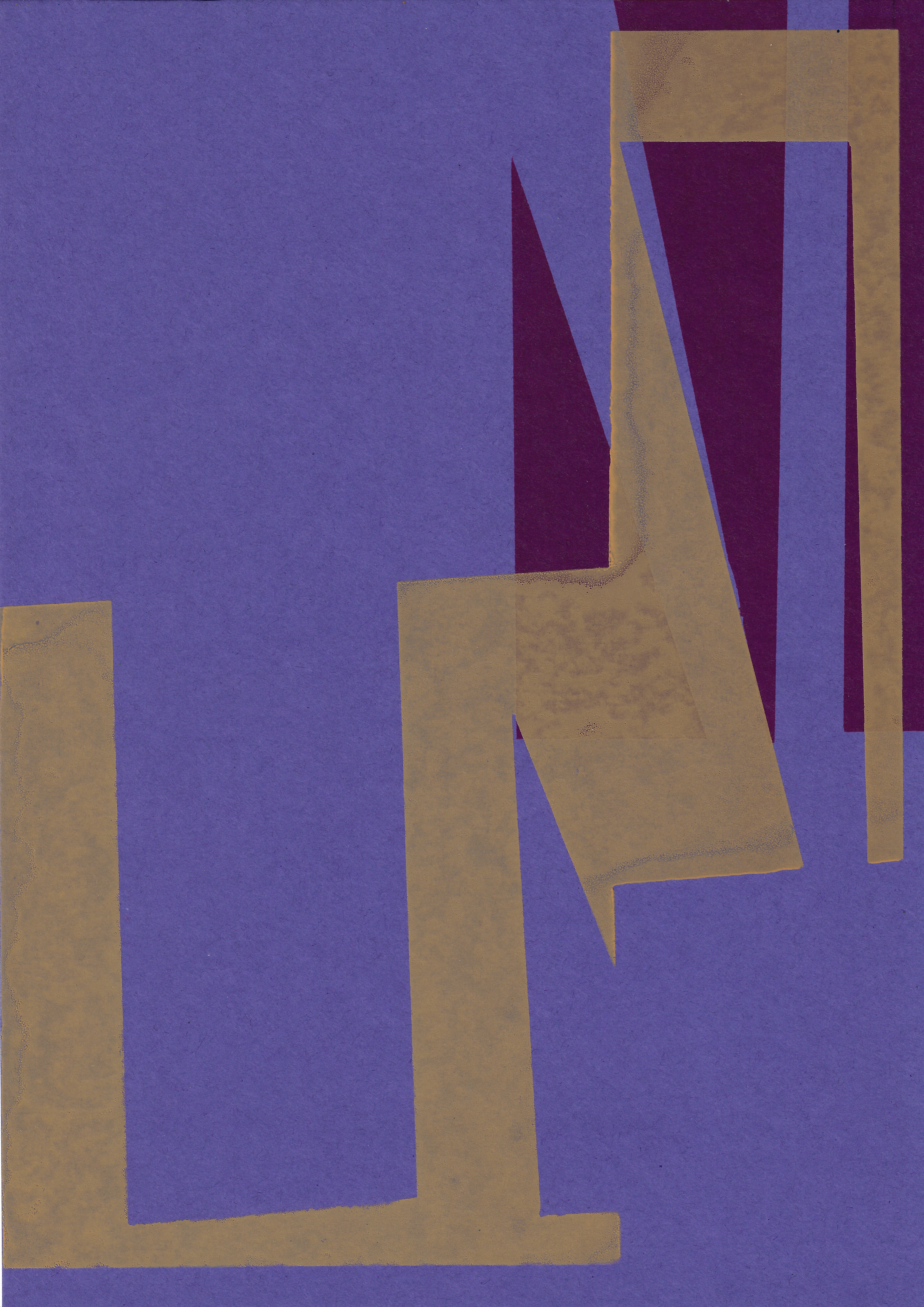
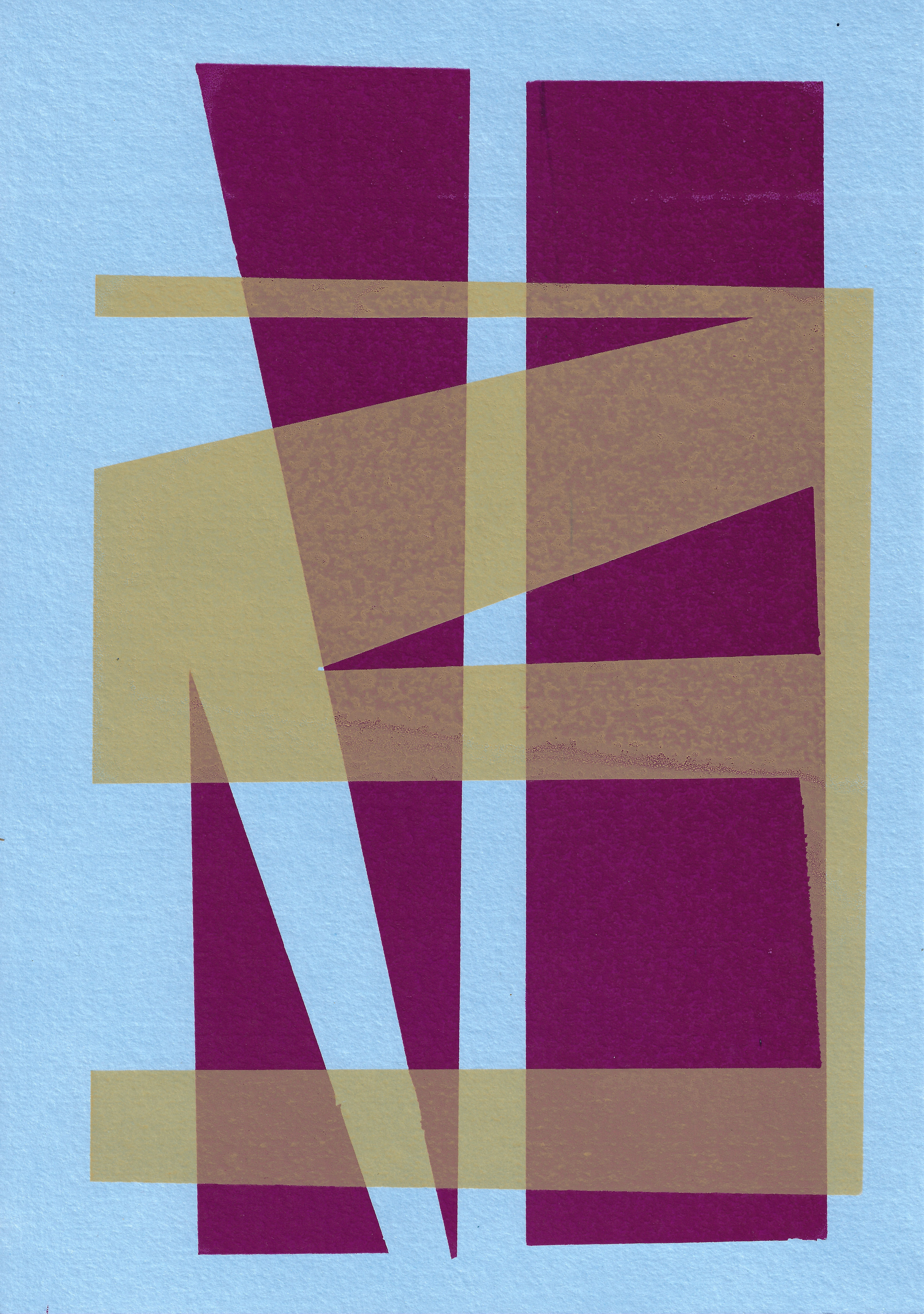
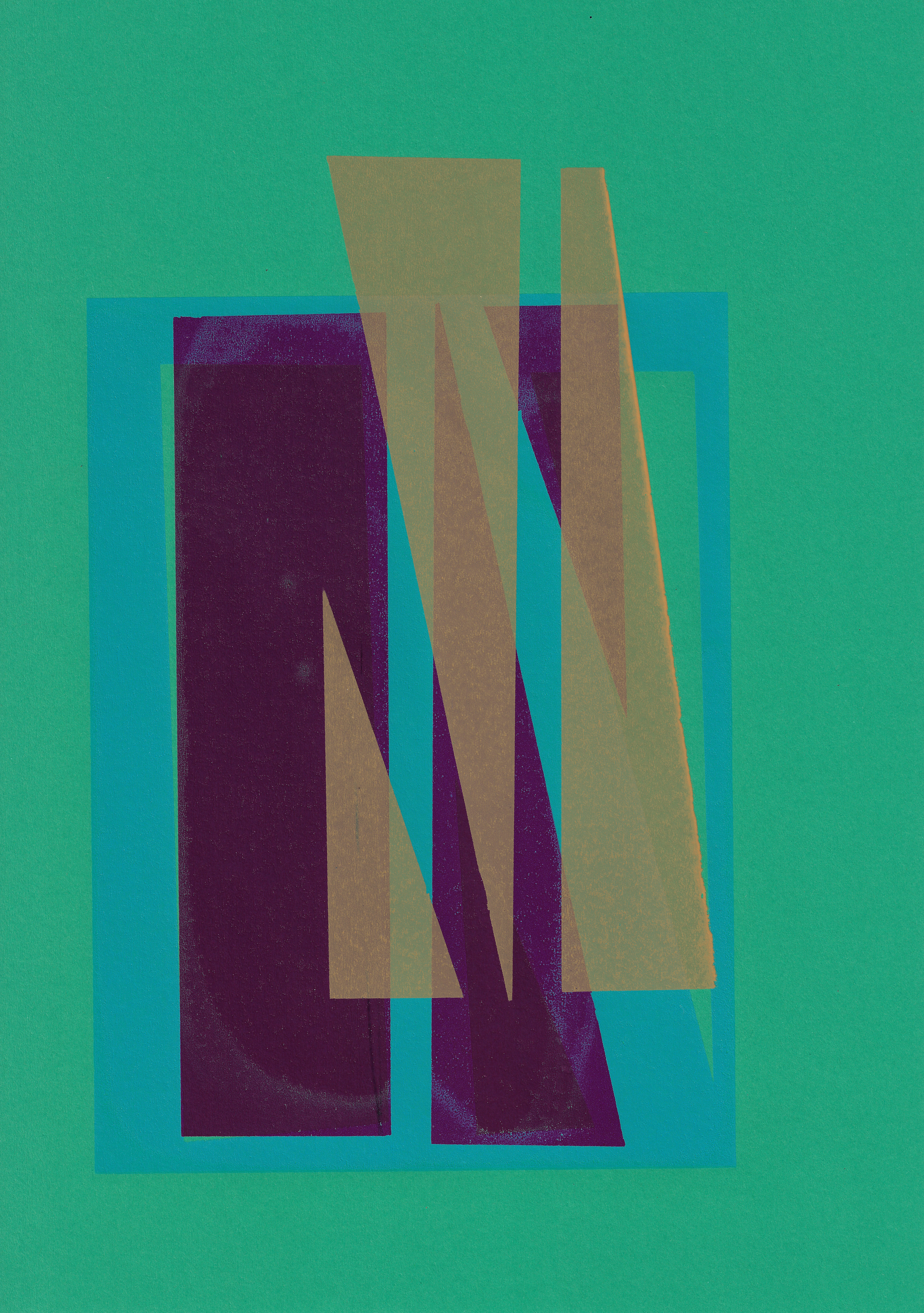
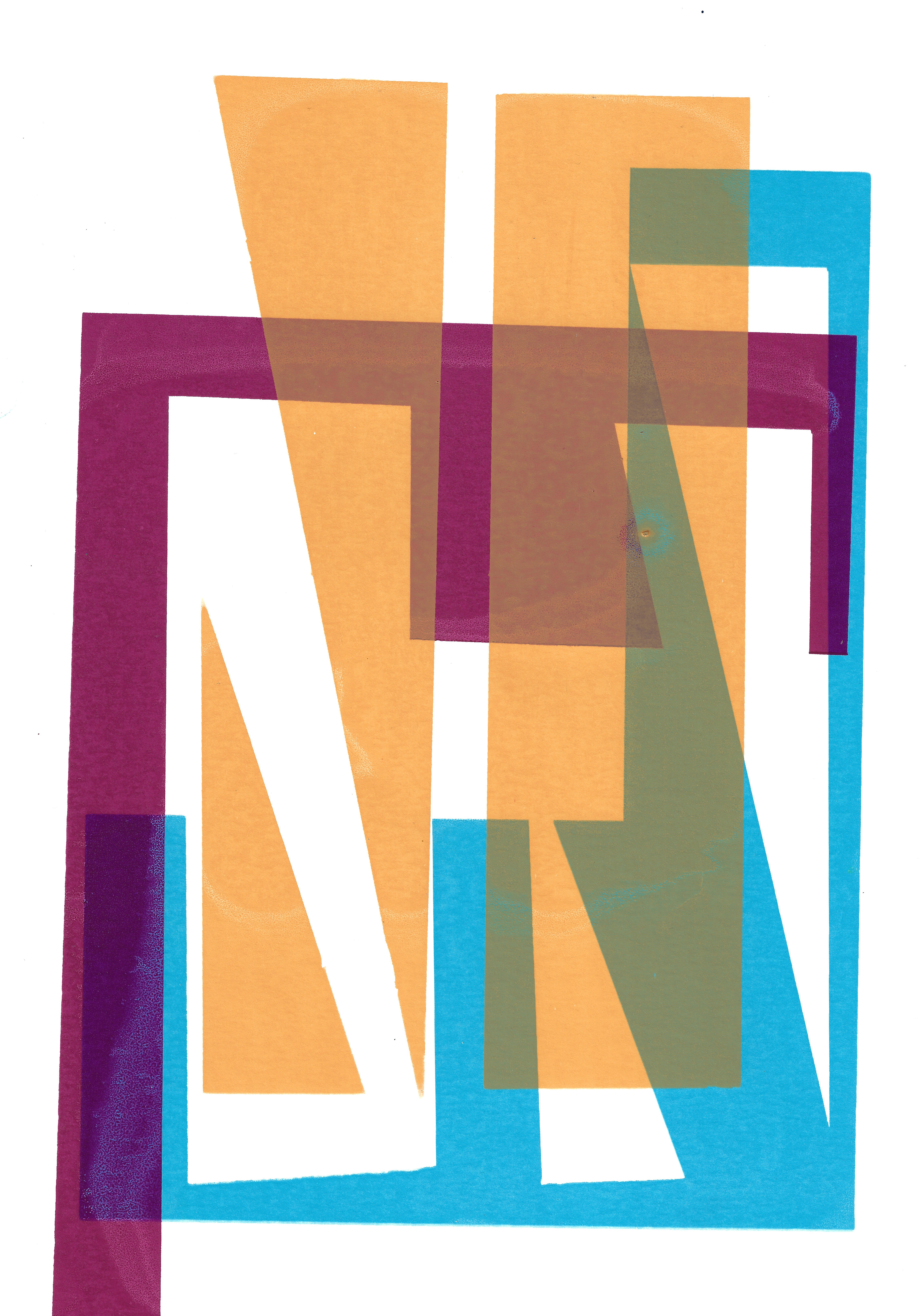
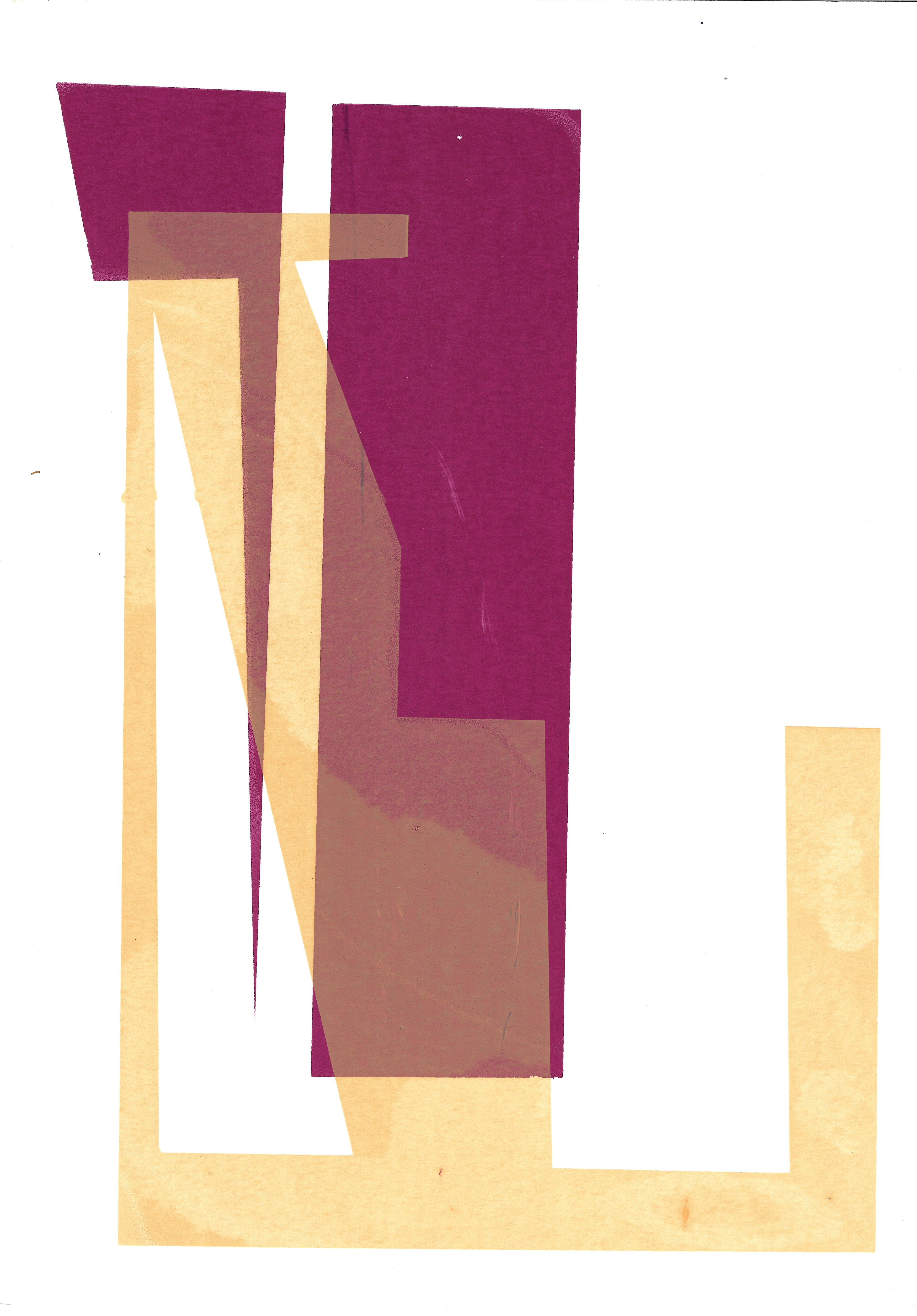
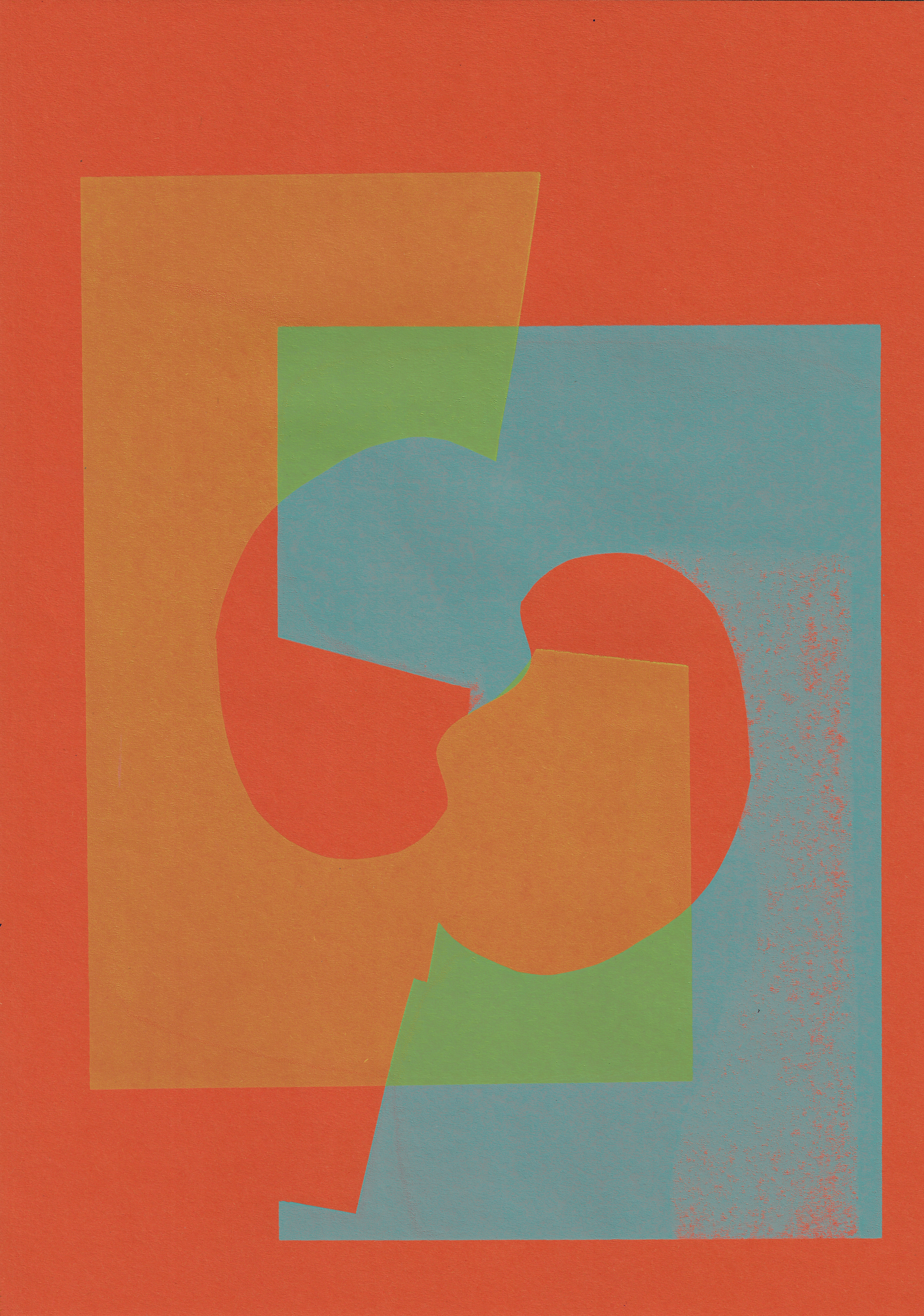
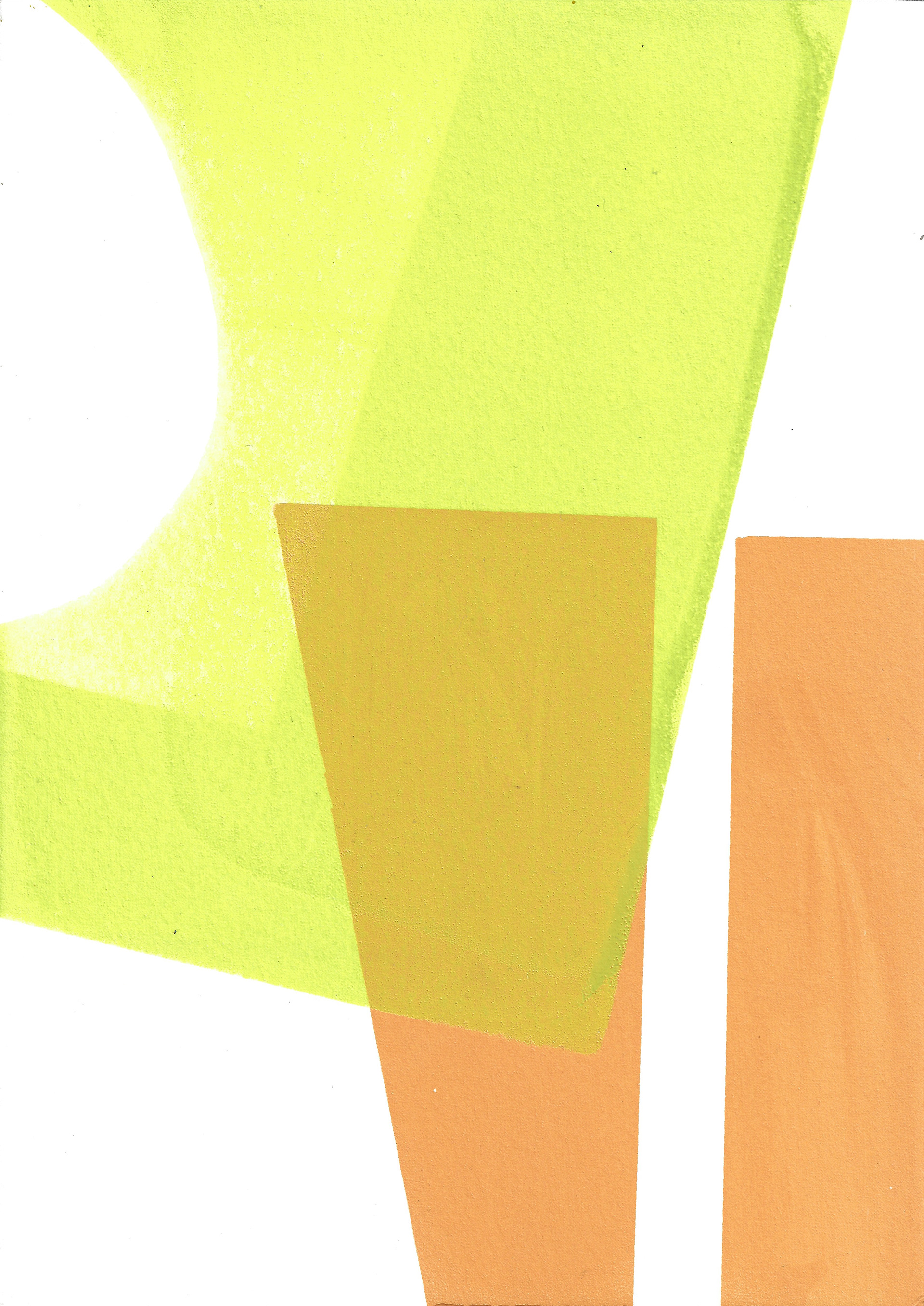
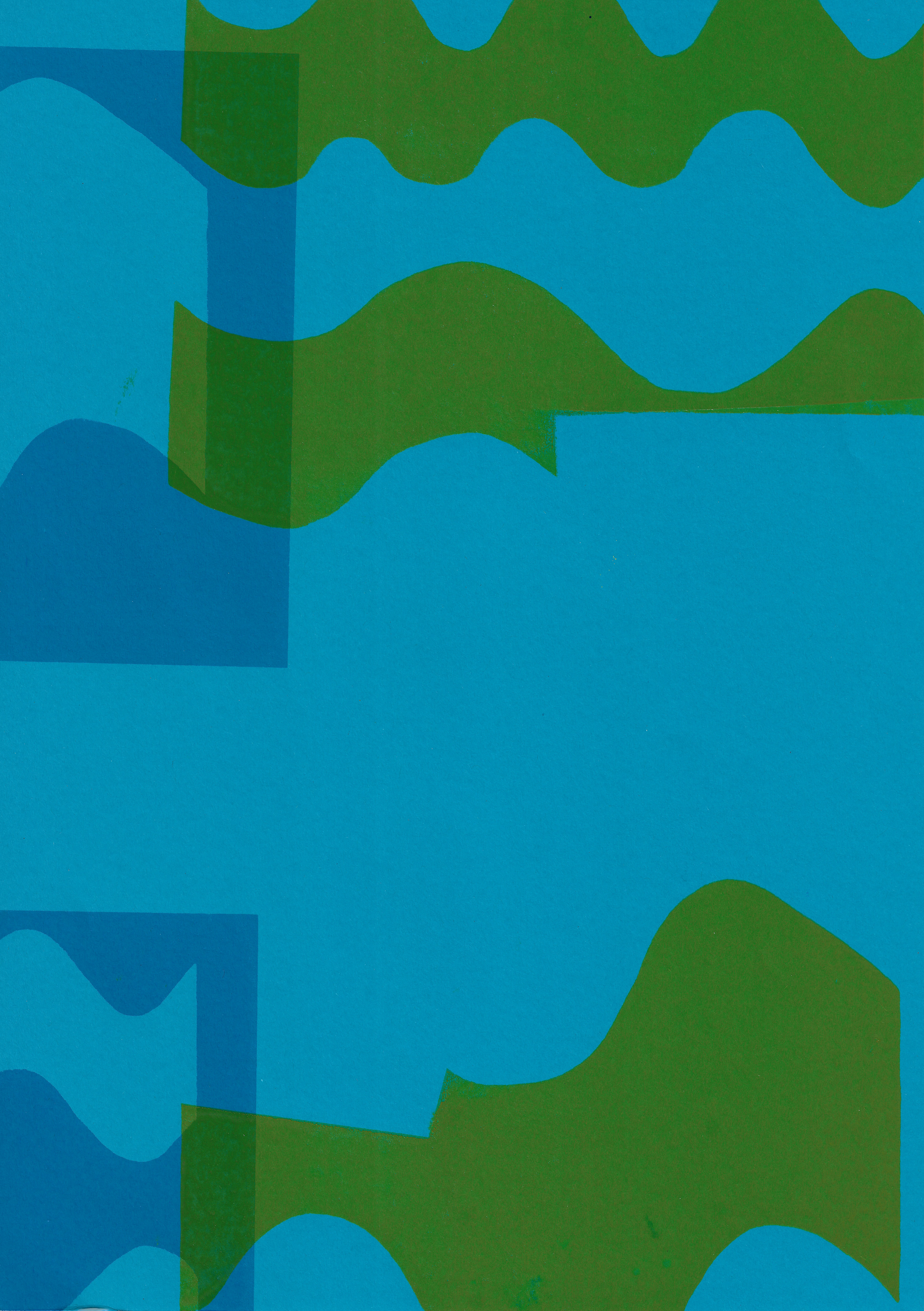
I begin to build up layers slowly in different colours, screenprinting the positive and negative of different arranged shapes (all with straight lines). The positive from the image is arranged differently to the negative, which is fixed, as the shapes are cut from it. I take my time to consider which colours and their order of layering are on top of each other. No print is the same, each relationship is different.
I use shapes cut from newsprint to block out certain parts of the pre-exposed image on the screen. Alternatively, I also arrange the paper in a mosaic format on the vacuum table, so that different parts of the shapes are on different pieces. I repeat this in different colours with different shapes- there are endless possibilities. The shapes cut from newsprint are also pieces in themselves, they have an unusual combination of shapes and colours on them from their use of blocking certain parts of the screen. As I work quickly screenprinting, and I do not make multiples of the same image, each arrangement is different. So, whilst the colours and which stencil is used is considered, their arrangement is intuitive. My intuition and subconscious inform my decisions.
Monoprint on paper, 76 x 56 cm

Monoprint on paper, 84 x 59 cm

Monoprint on paper, 94 x 59 cm


Monoprint on paper, 97 x 79 cm

Monoprint on paper, 97 x 79 cm
Monoprint on paper, 97 x 79 cm
I print a very large monoprint plate and I utilise the help of the technicians available. I print one layer using a paper stencil; the texture of the paper with the ink heightens the materiality. The stencil for the next layer is also made from paper, but this buckles when it is put through the press, leaving a creased shape. I make the same stencil out of acetate and print on top, but not aligned to the last layer which was the same shape. This leaves the image on the middle layer, that the stencil crumpled in the press during the process, creating a ghost image. The shape is there, but not fully present. It does not engage in the dialogue with the other colours as strongly.
I print my hard ground etching plate. Firstly, I print the plate in black ink and clean the rest of the ink off the plate, so just the line prints. Then secondly, I use a dark green ink and when preparing the plate, I do not clean off all the ink entirely. I roughly clean the surface, leaving small marks, allowing marks to appear on the print. unfortunately this print seems to have been misplace in the etching workshop and i am unable to find it.
Hard ground etching on paper, 25 x 35 cm

Screenprint on paper, 29.7 x 42 cm

Screenprint on paper, 29.7 x 42 cm

Screenprint on paper, 29.7 x 42 cm

Screenprint on paper, 29.7 x 42 cm
Screenprint on paper, 29.7 x 42 cm

Screenprint on paper, 29.7 x 42 cm
Screenprint on paper, 29.7 x 42 cm
Screenprint on paper, 21 x 29.7 cm

Screenprint on paper, 21 x 29.7 cm
Screenprint on paper, 21 x 29.7 cm

Screenprint on paper, 21 x 29.7 cm

Screenprint on paper, 21 x 29.7 cm
Screenprint on paper, 21 x 29.7 cm
Screenprint on paper, 21 x 29.7 cm
Screenprint on paper, 21 x 29.7 cm
Screenprint on paper, 21 x 29.7 cm

Screenprint on paper, 21 x 29.7 cm
Screenprint on paper, 21 x 29.7 cm

Screenprint on paper, 21 x 29.7 cm
Screenprint on paper, 14.8 x 21 cm
Screenprint on paper, 14.8 x 21 cm
Screenprint on paper, 29.7 x 42 cm
Screenprint on paper, 29.7 x 42 cm
Screenprint on paper, 29.7 x 42 cm

Screenprint on paper, 29.7 x 42 cm

Screenprint on paper, 29.7 x 42 cm

Screenprint on paper, 29.7 x 42 cm
Screenprint on paper, 29.7 x 42 cm

Screenprint on paper, 33 x 47.5 cm

Screenprint on paper, 33 x 48 cm

Screenprint on paper, 20 x 48 cm
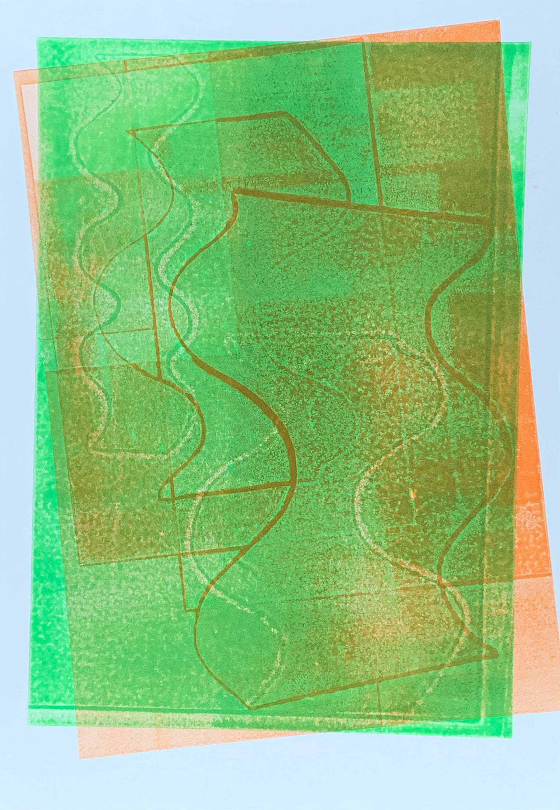
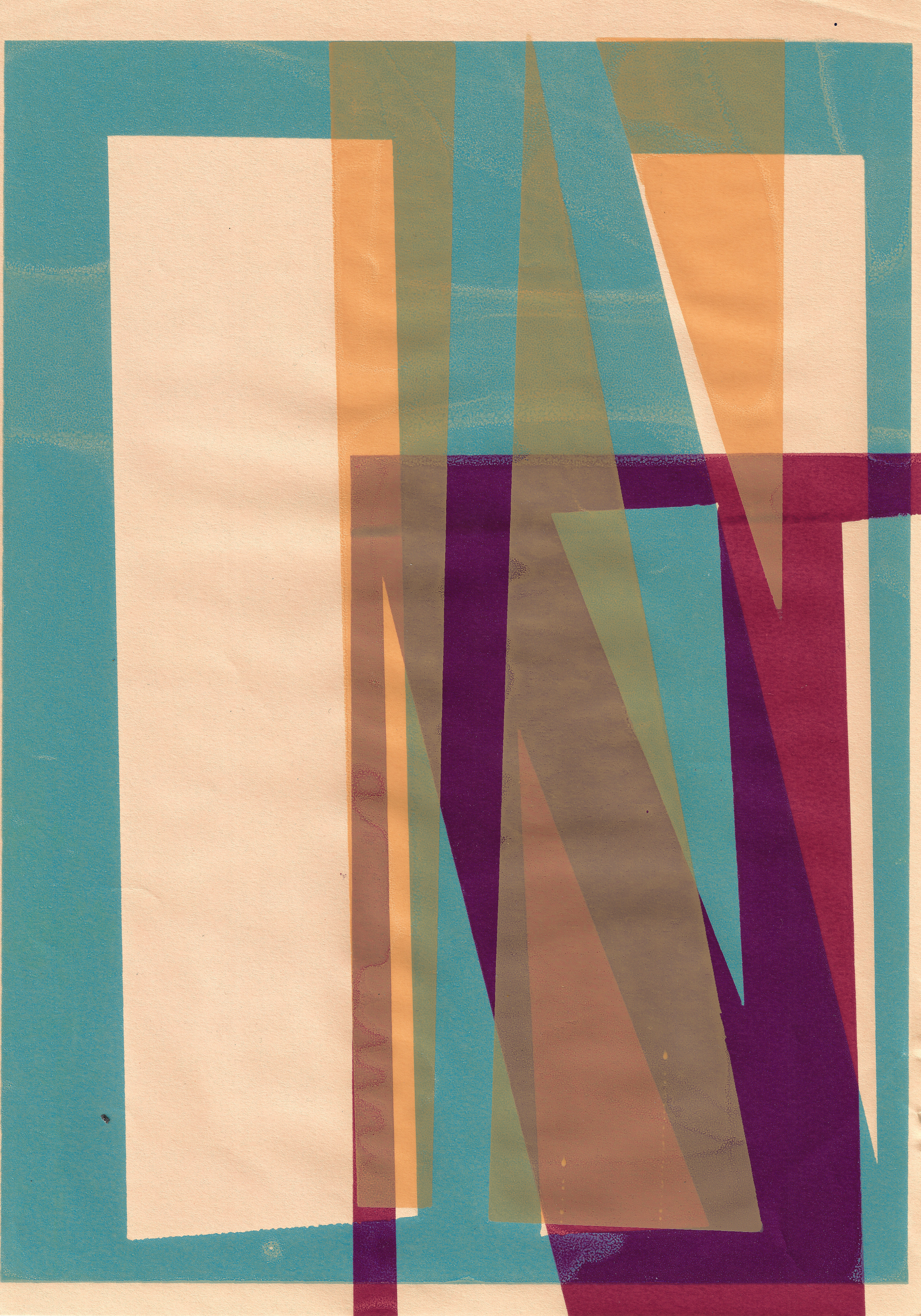
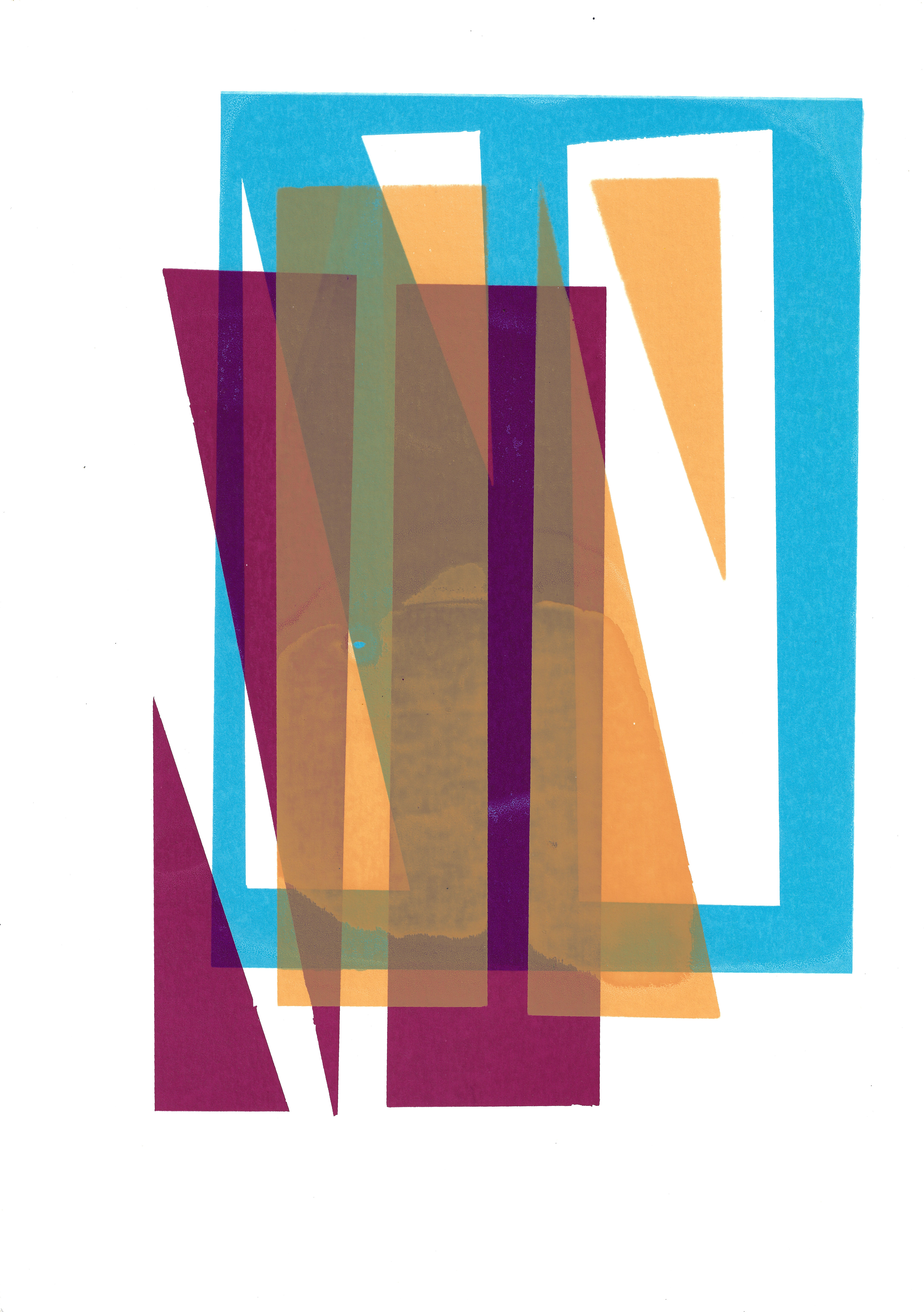
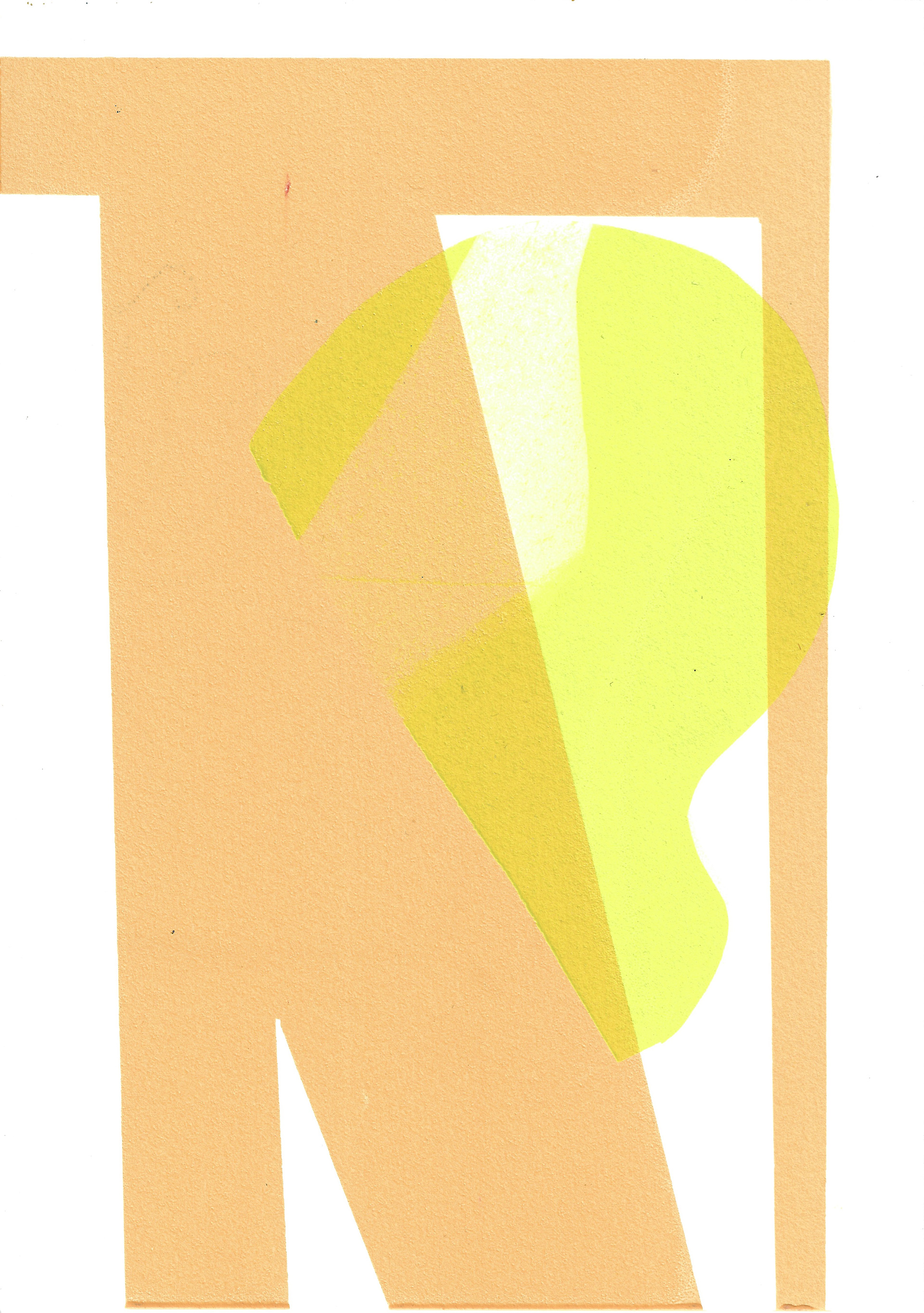
I apply the same principle, of my previous techniques used in screenprinting, to a different image. This image includes a curved form. There is an integration of the curved and straight line, they exist in each other’s company. Interacting, and juxtaposing one another, creating new dialogues through the new forms that are created from their combination.
I screenprint the second layer (using the same technique as I have done previously) onto images of interrupted curved forms, using newsprint stencils. Most of the forms do not touch. The space between them is pregnant; it makes a shape of its own through the absence of form.
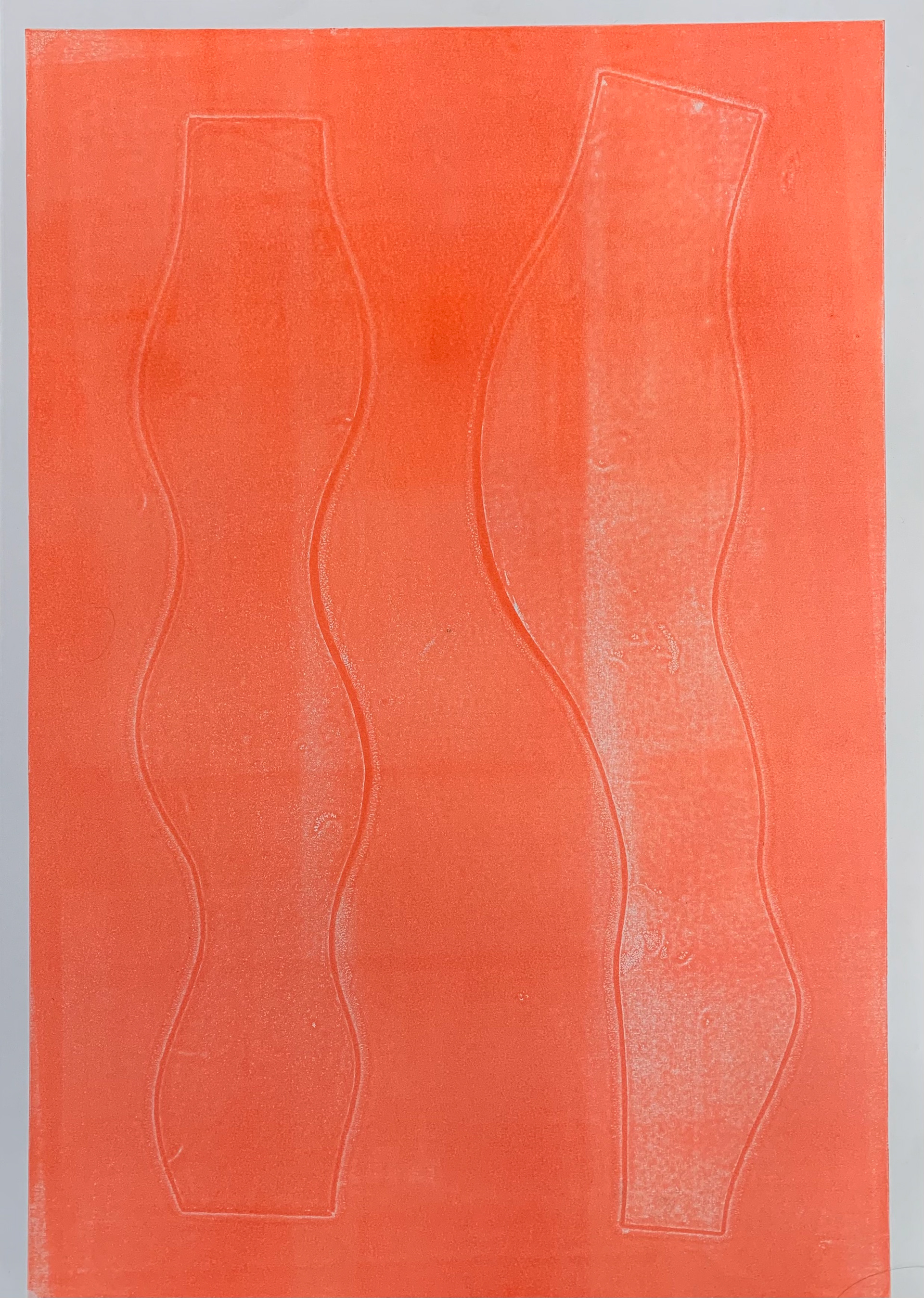
Relief print on paper, 50 x 70 cm

Relief print on paper, 33 x 51 cm
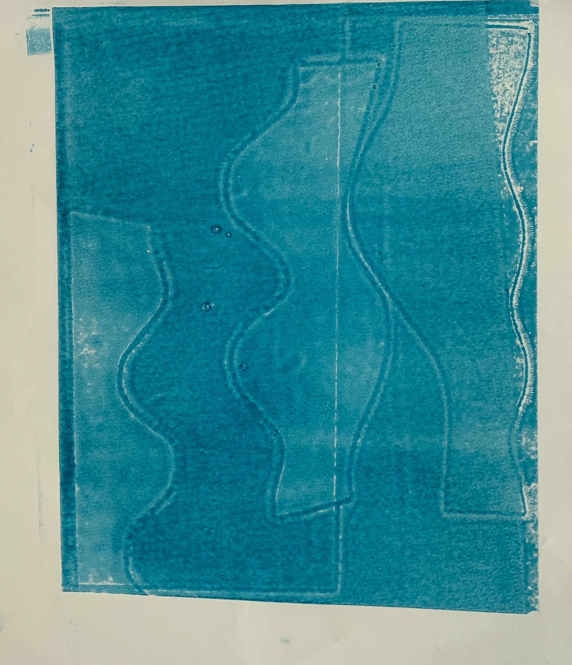
Relief print on paper, 37.5 x 42 cm
Relief print on paper, 39.5 x 54.5 cm
Relief print on paper, 42 x 60 cm
I use my monoprinting plate on the relief press, giving even pressure, producing the desired image quickly. The print is made from pressure pushing evenly down on the plate and paper, whereas the monoprint press rolls over the paper and plate, starting at one end and finishing at the other. Additionally, comparing the same technique in screenprint, of intuitive combinations of the positive and negative image, which I also do in monoprint, a third image is created from the ghost plate in monoprinting. After I have created the images of different shapes and stencils, I then print the plate by itself. This produces a print where not only the stencil is visible but the mosaic of pieces of paper which were laid on top of the plate.


Sketchbook page, 21 x 29.7 cm
Sketchbook page, 21 x 29.7 cm
Sketchbook page, 21 x 29.7 cm

Sketchbook page, 21 x 29.7 cm

Sketchbook page, 21 x 29.7 cm
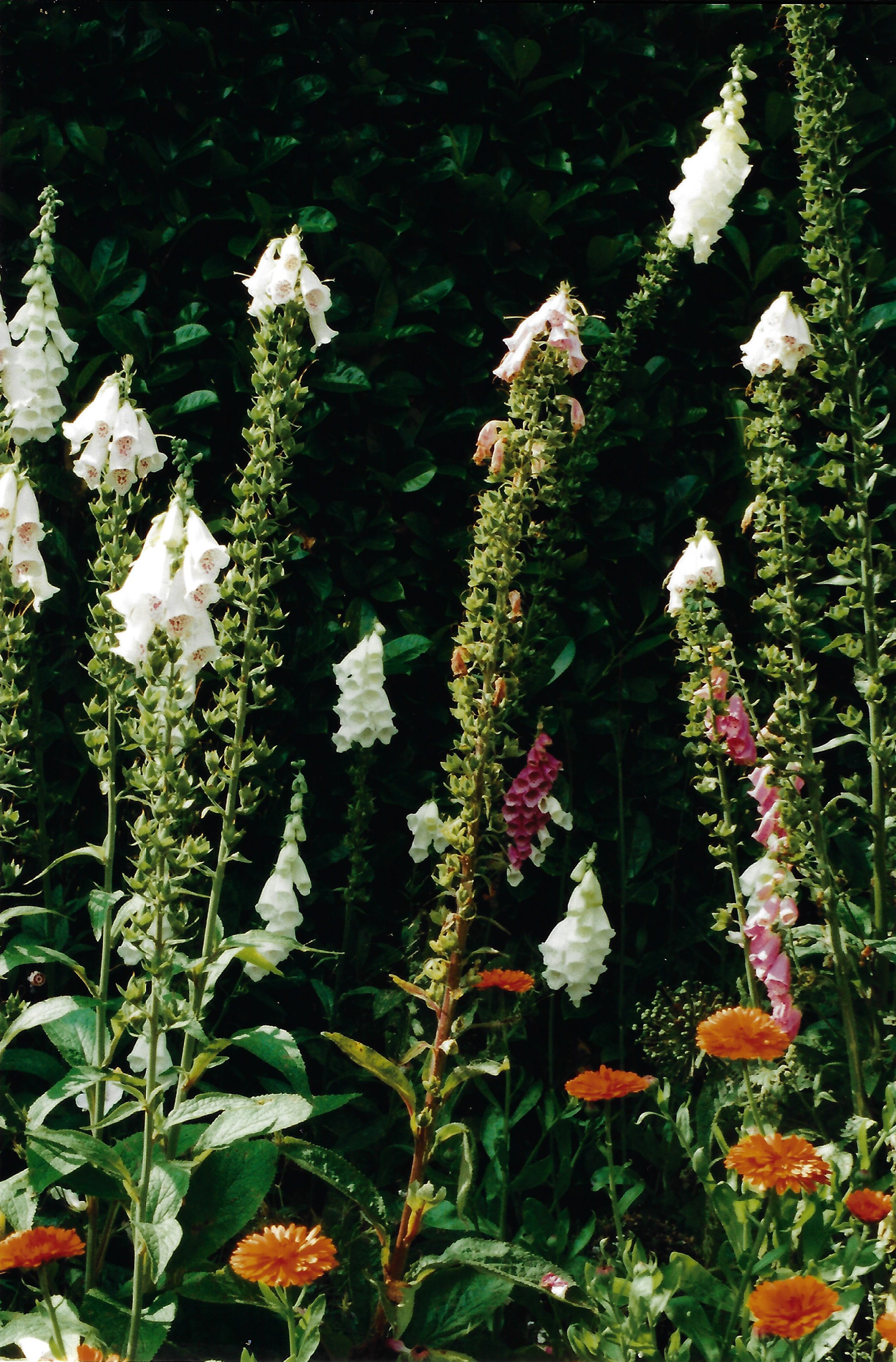
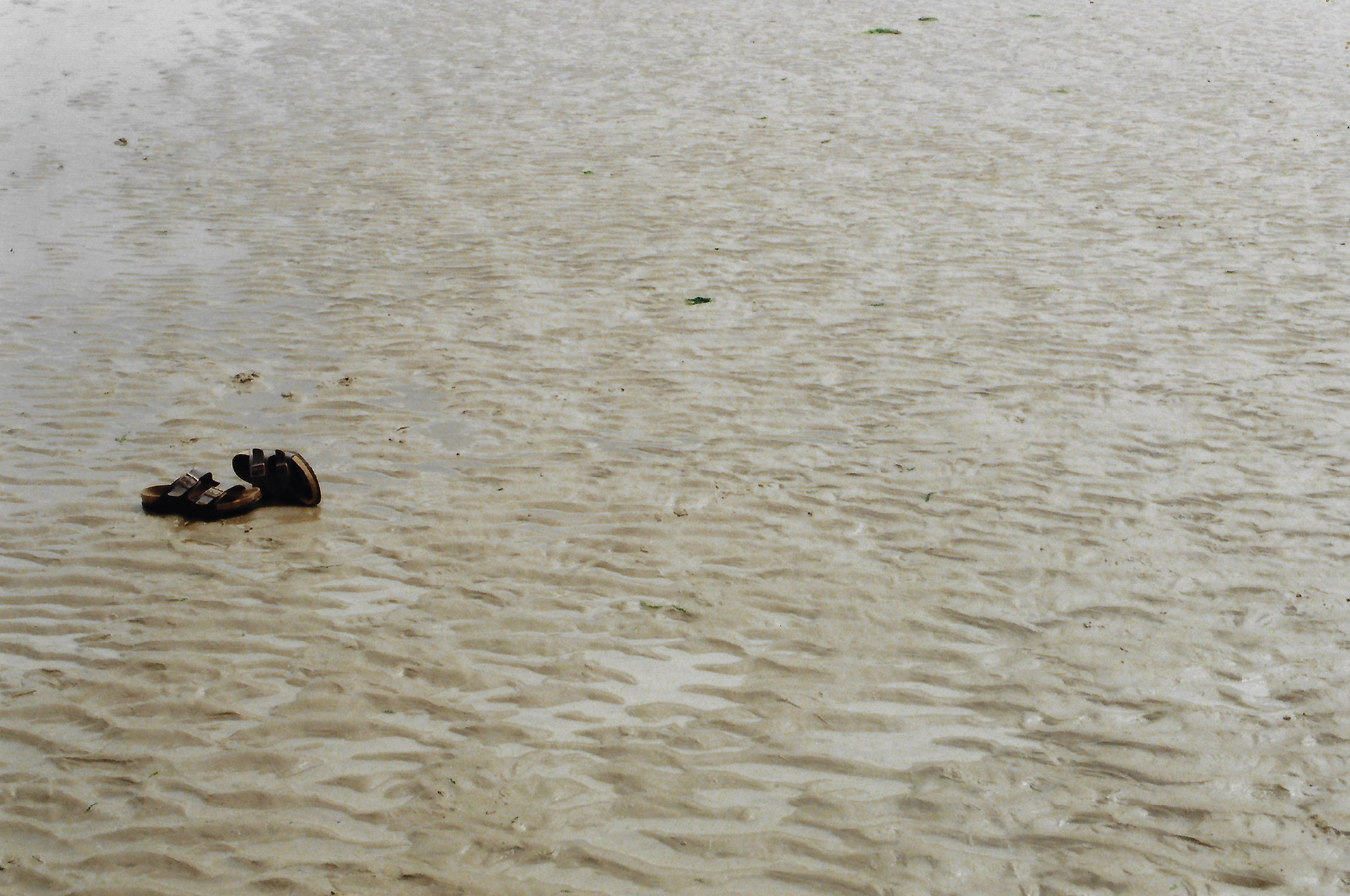
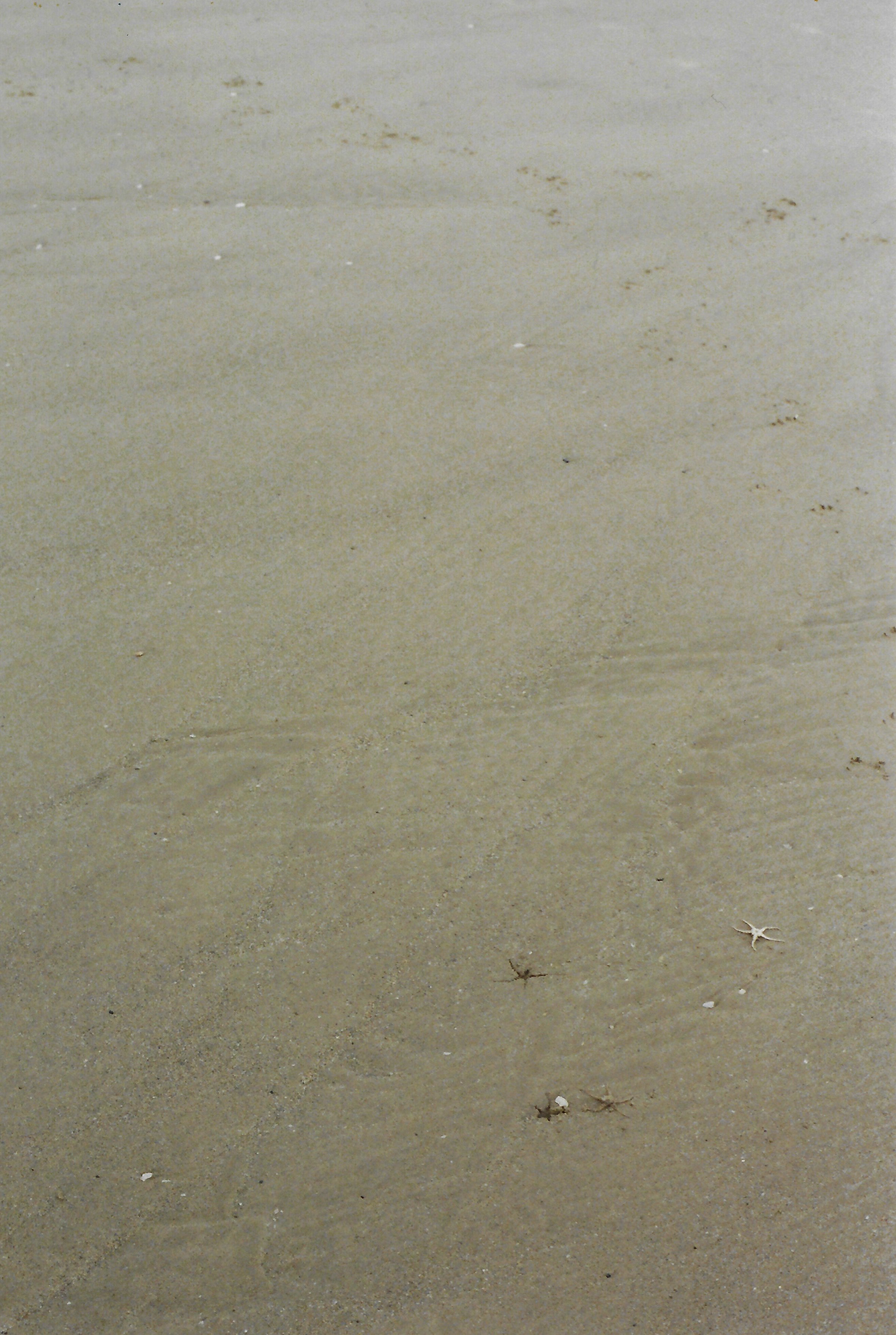
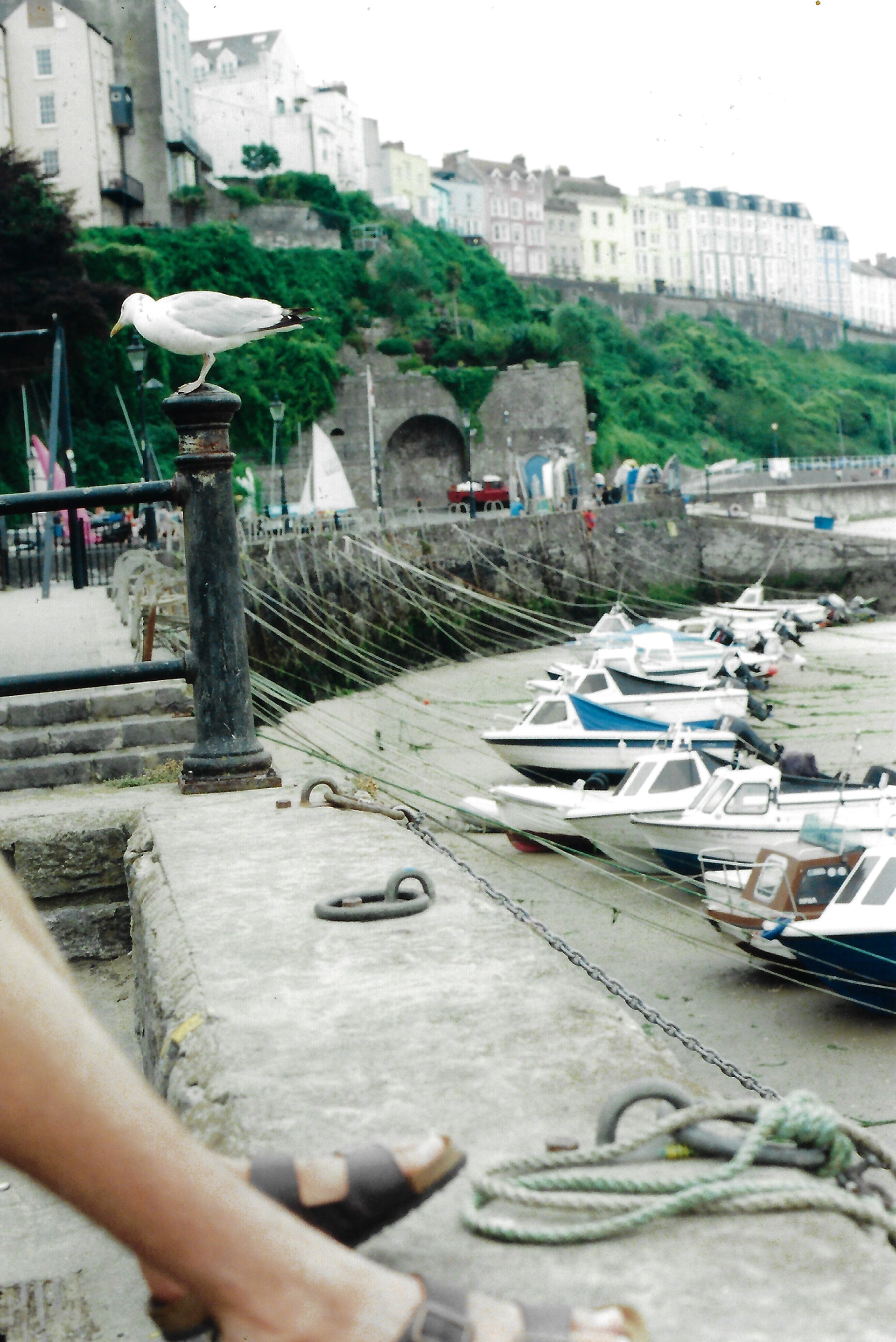
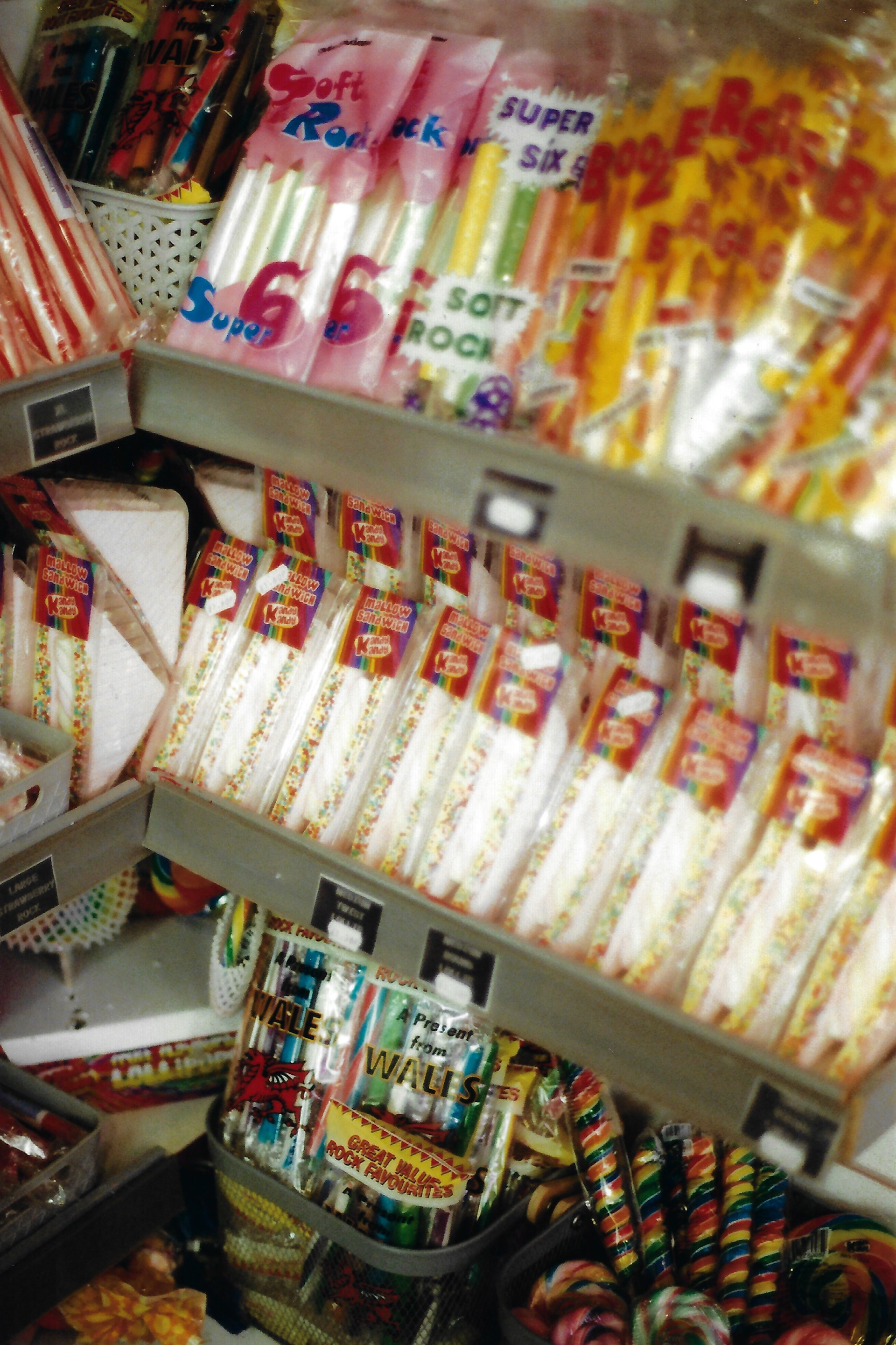
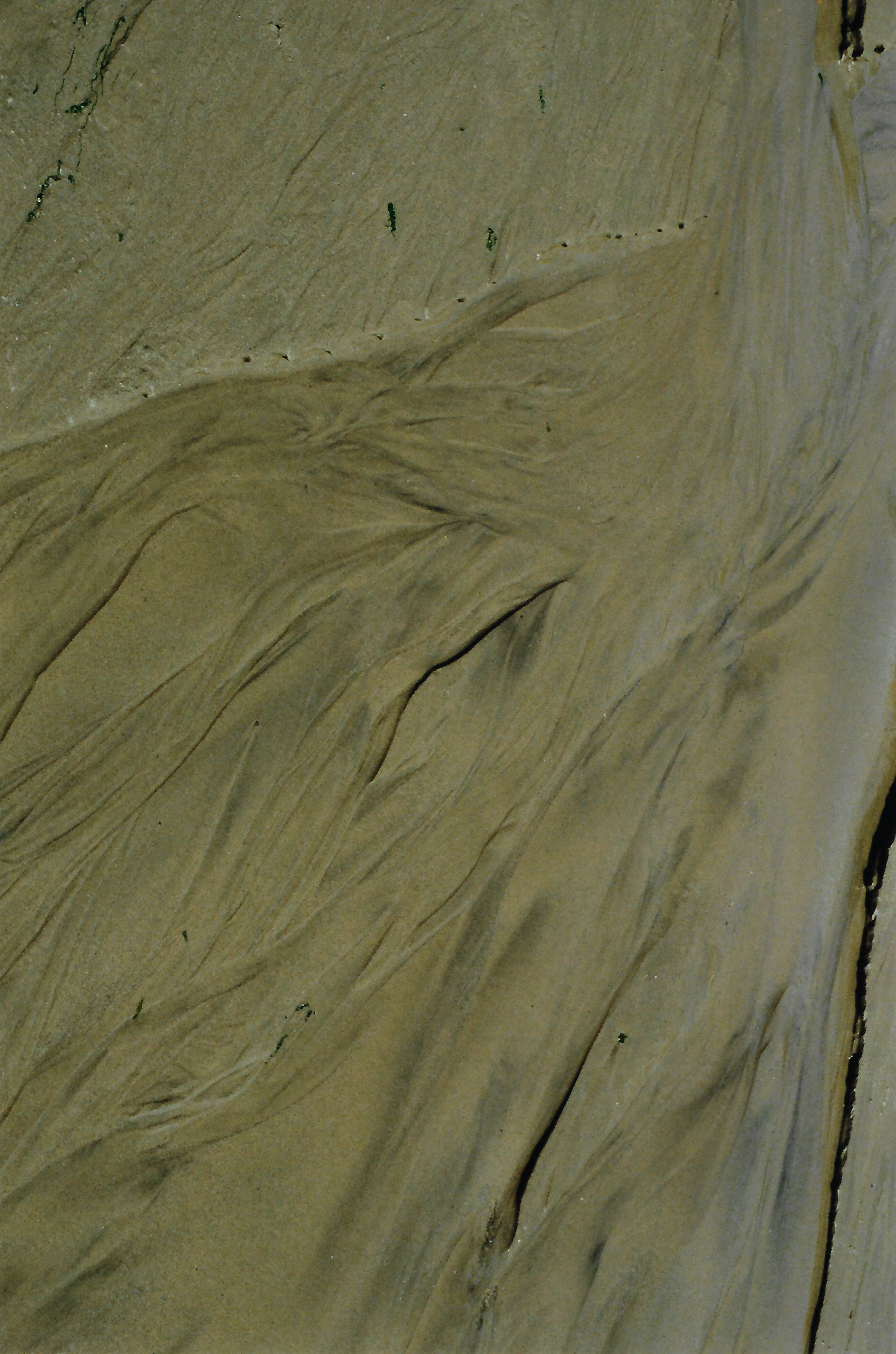
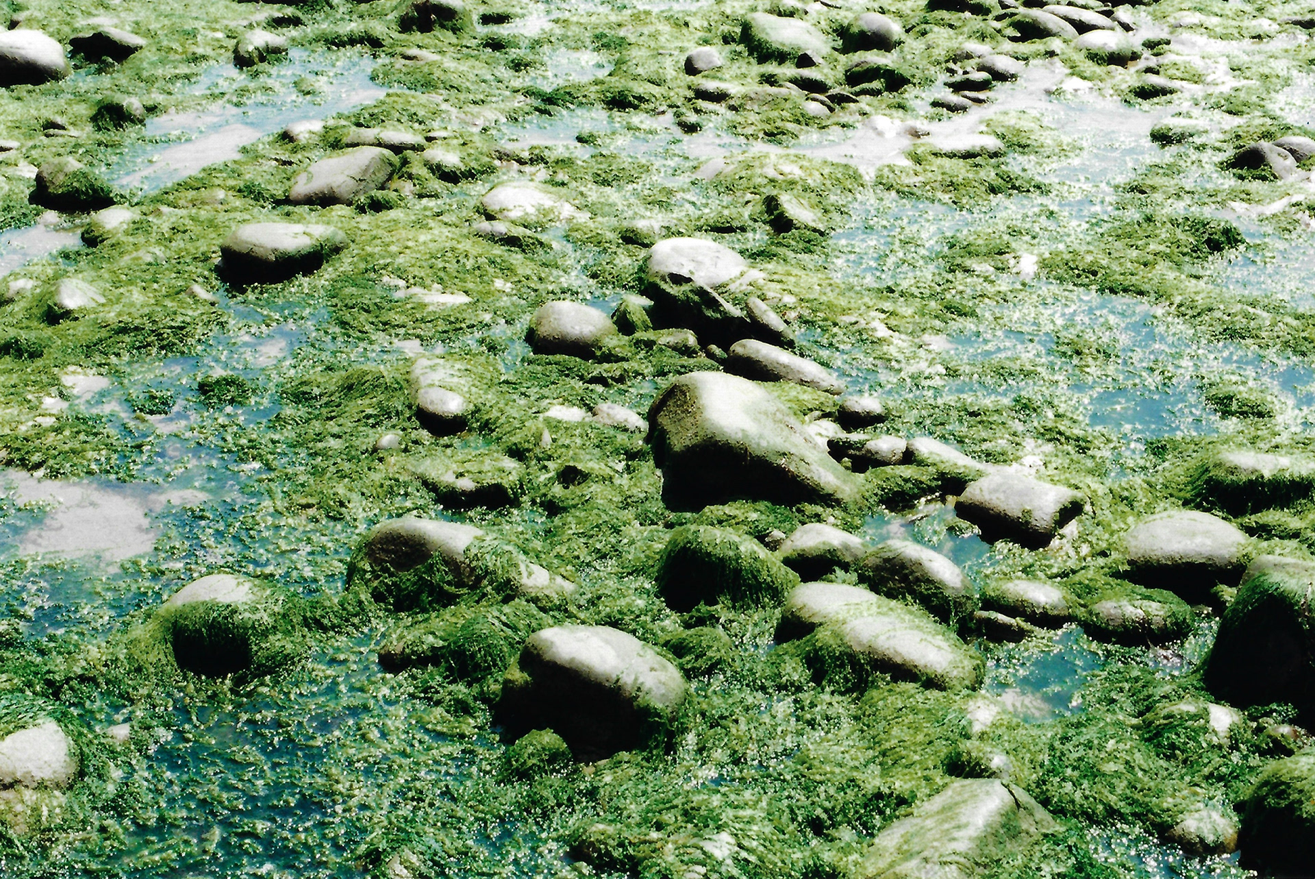
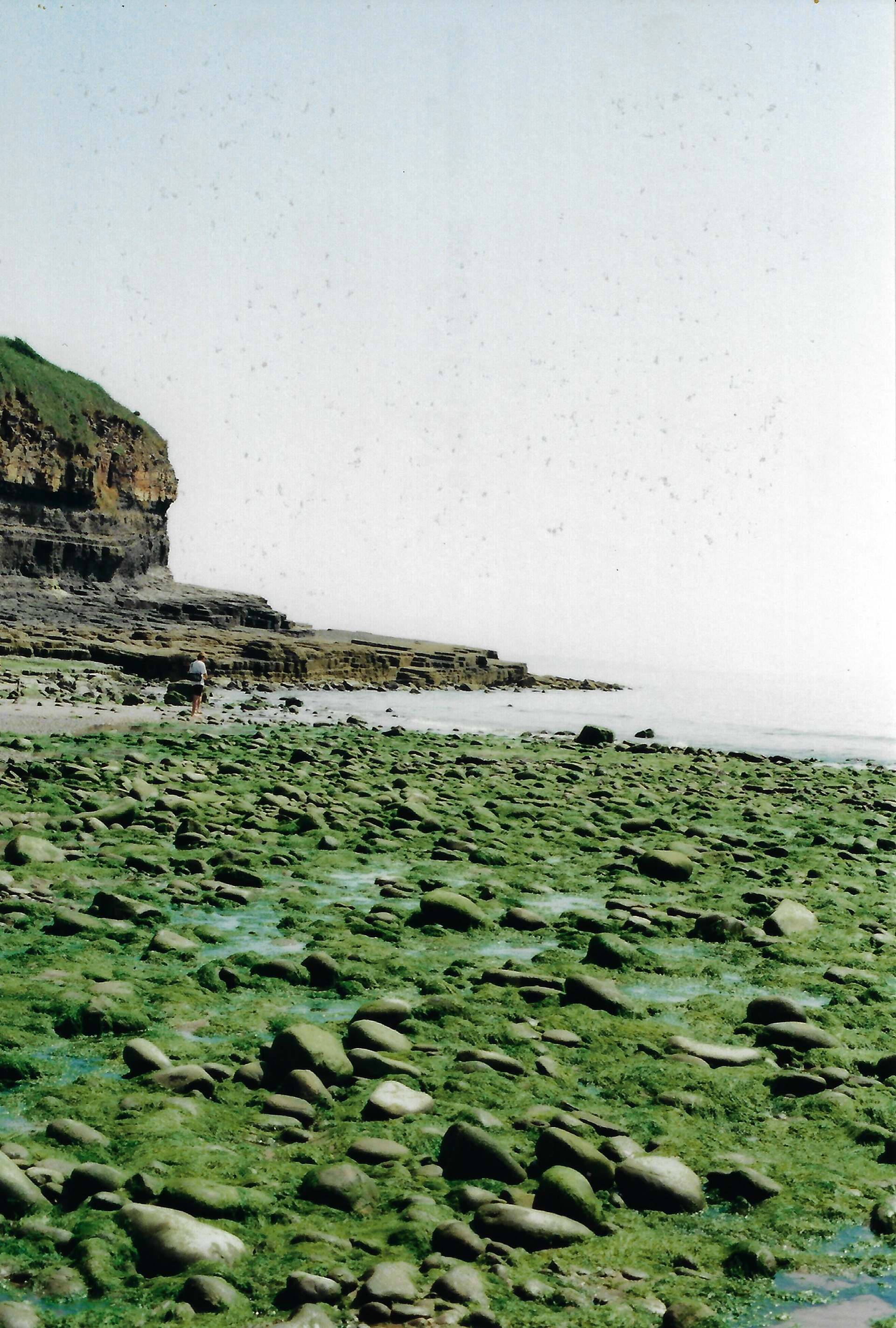
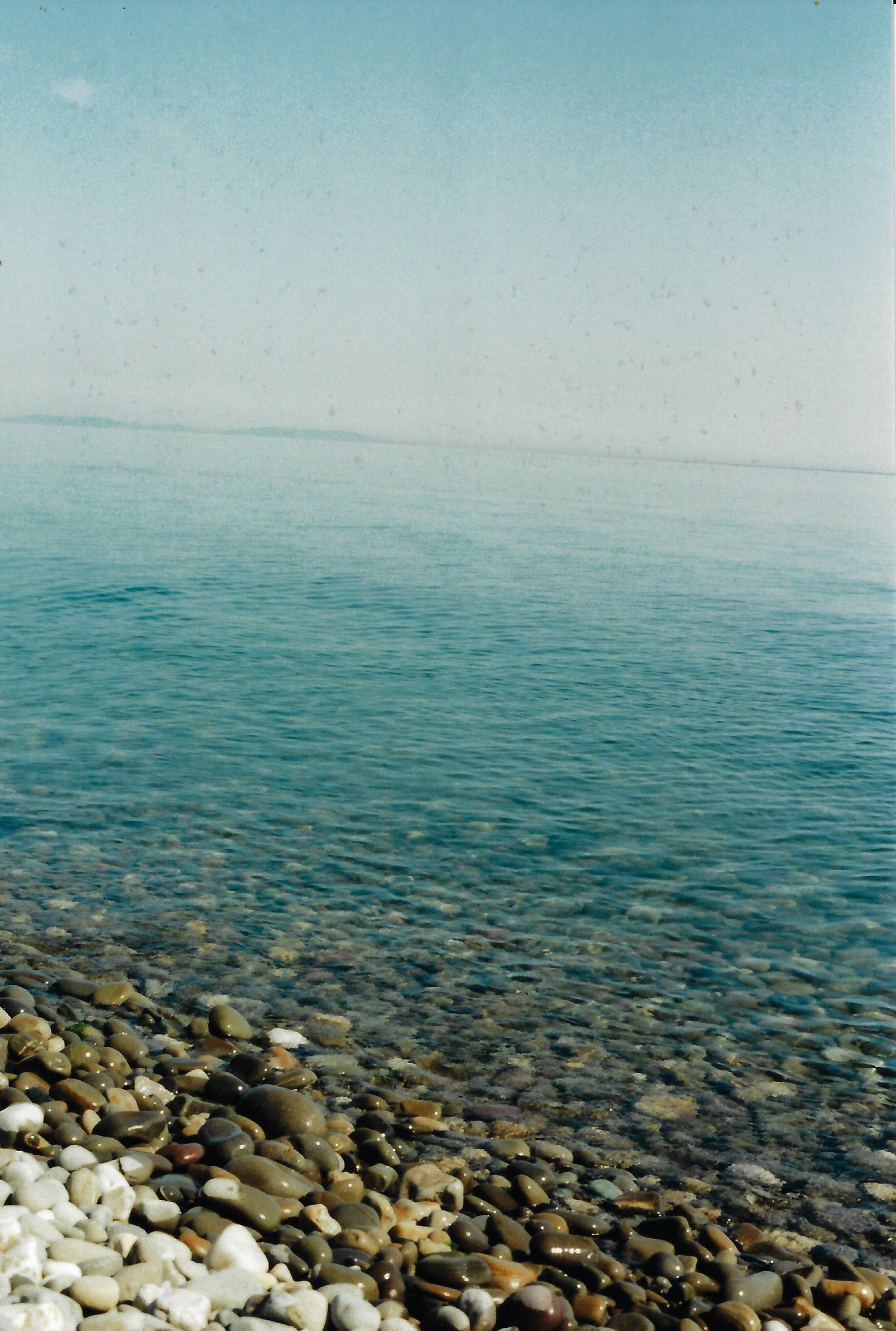
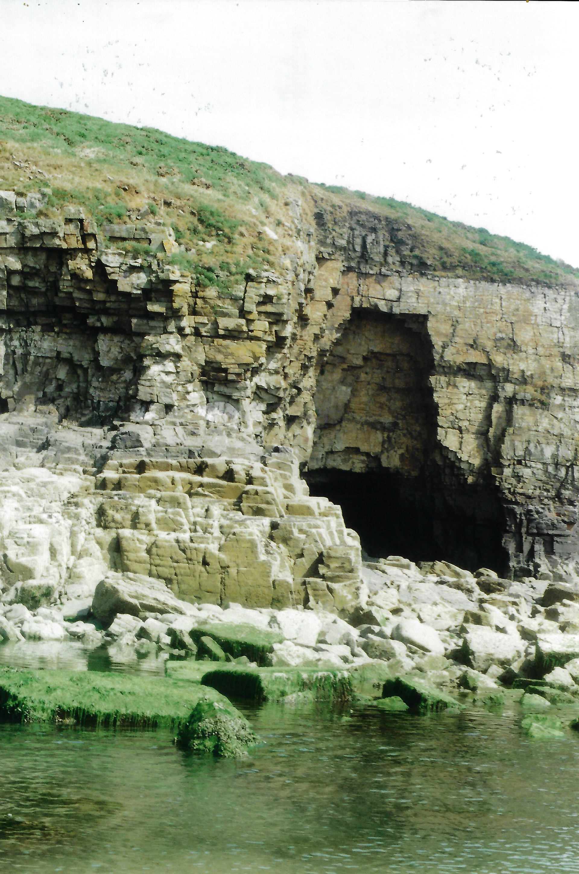
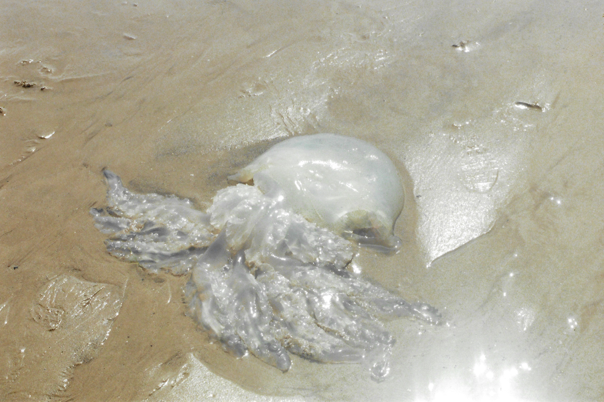
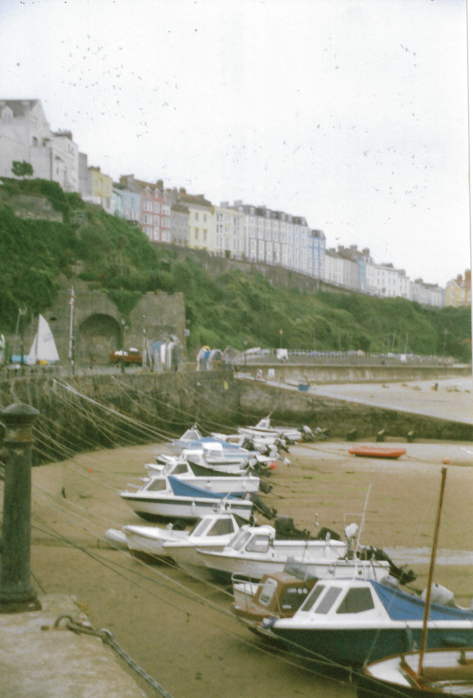
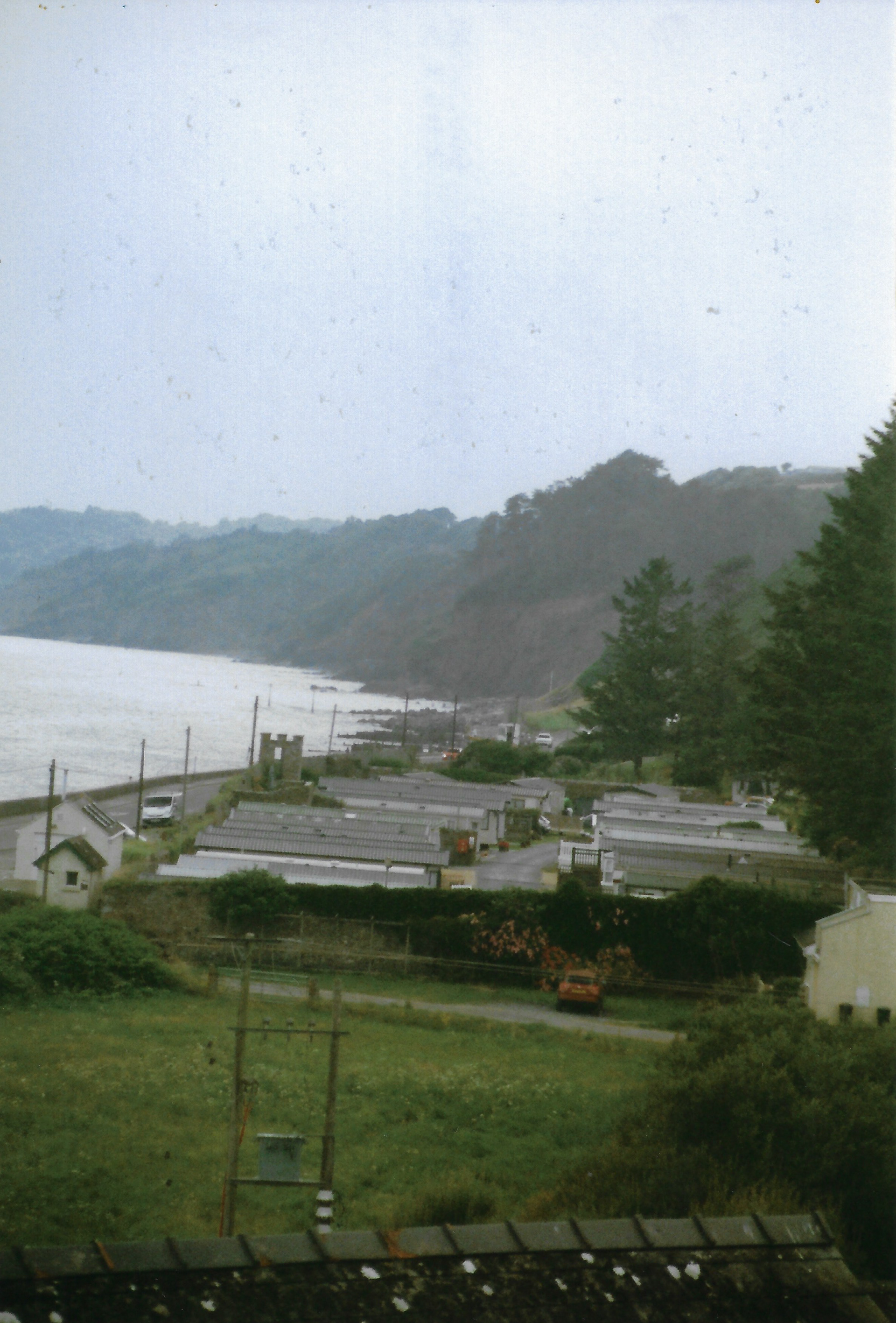
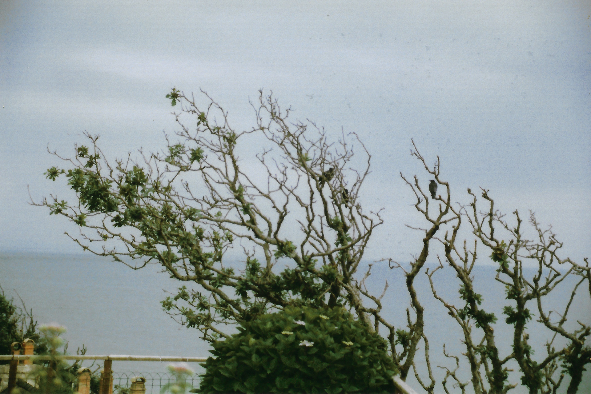
I visit Amroth, Pembrokeshire for the week. I use this time away from the workshop to focus on the natural forms and landscapes. I use a combination of analogue photography and observational drawing to document my time away, focussing on the different forms, lines, and colours in this environment, which are completely different to both the countryside and city scape I am normally surrounded by. This period away from my normal environments allows me not only to focus on different aspects of the landscape but allows me to return to my normal environment with fresh eyes.
I pay particular attention to the sea, as I spend a long time over a period of days listening and watching how the rhythm of the water changes with the varying weather.
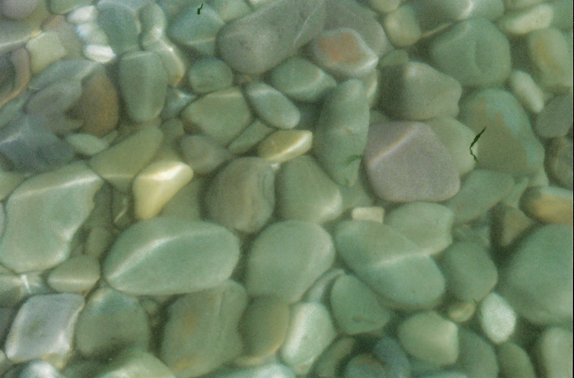
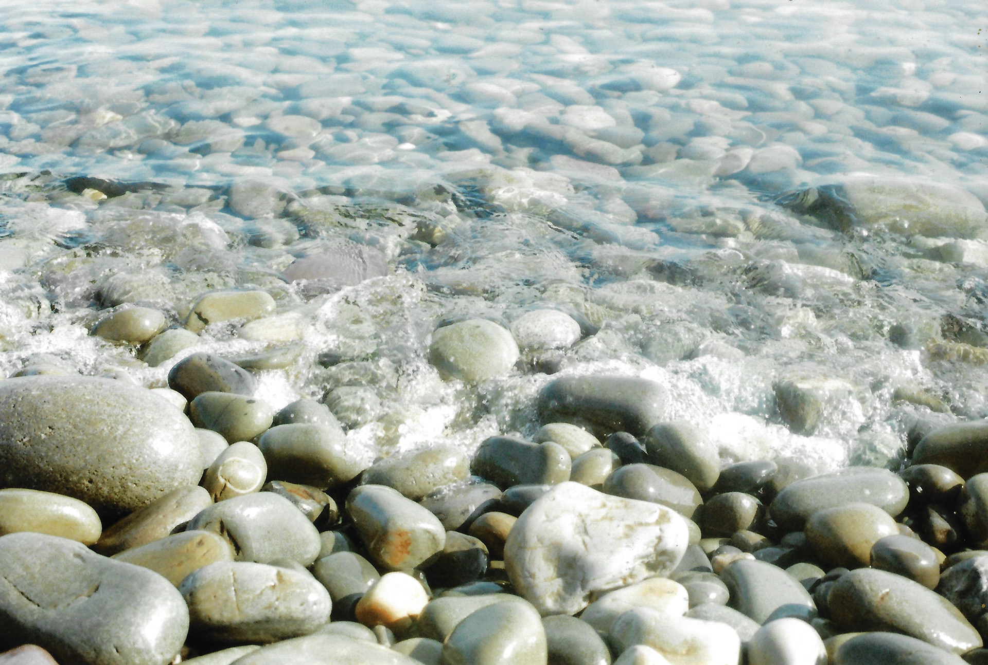
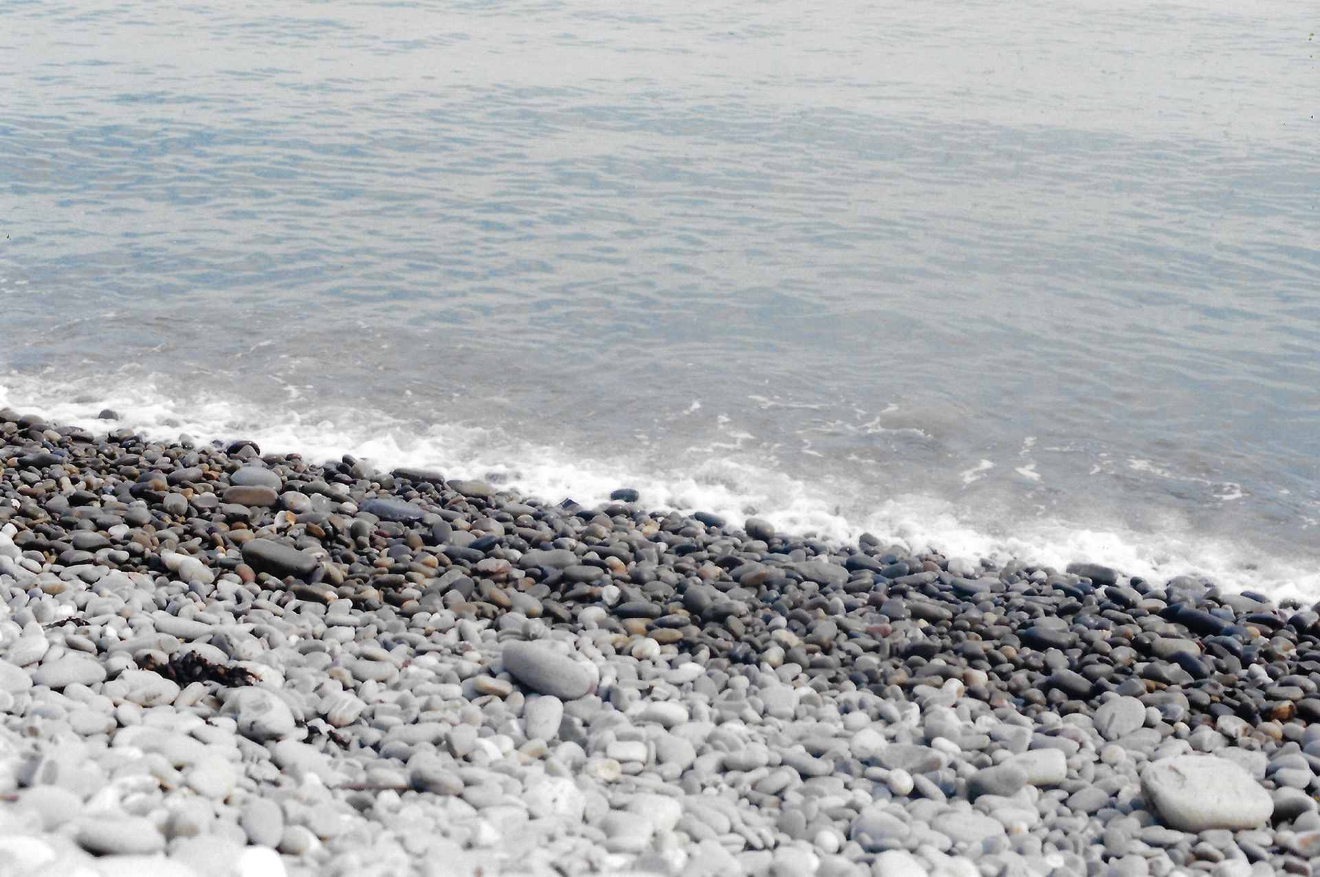
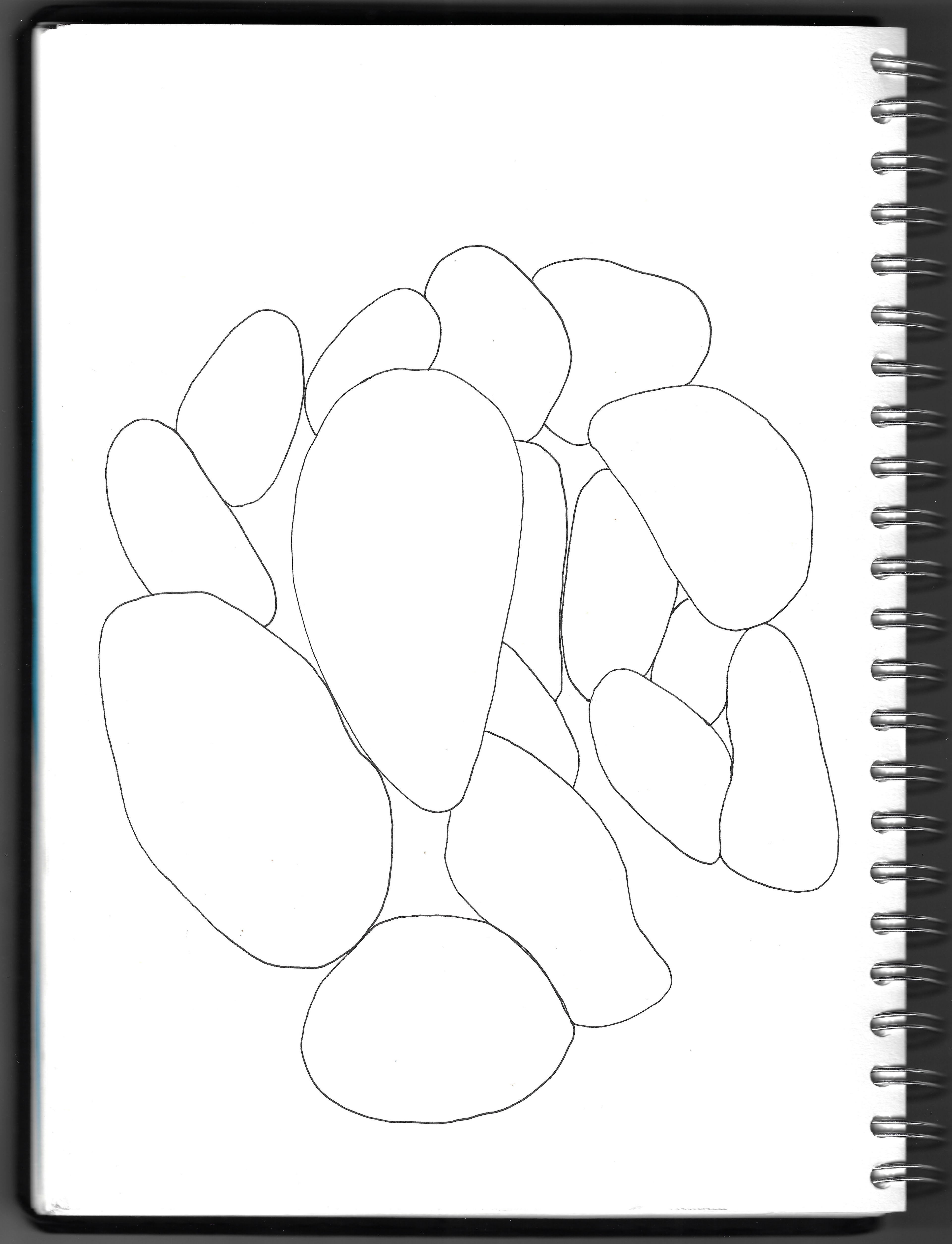
To reach the beach you have to climb down a huge pile of stones, and I sit for a while drawing them, in their varying arrangement. I use a range of marks to convey the diversity in their subtle different textures and tones. Not only this but observing the random arrangement of forms and their different shapes.


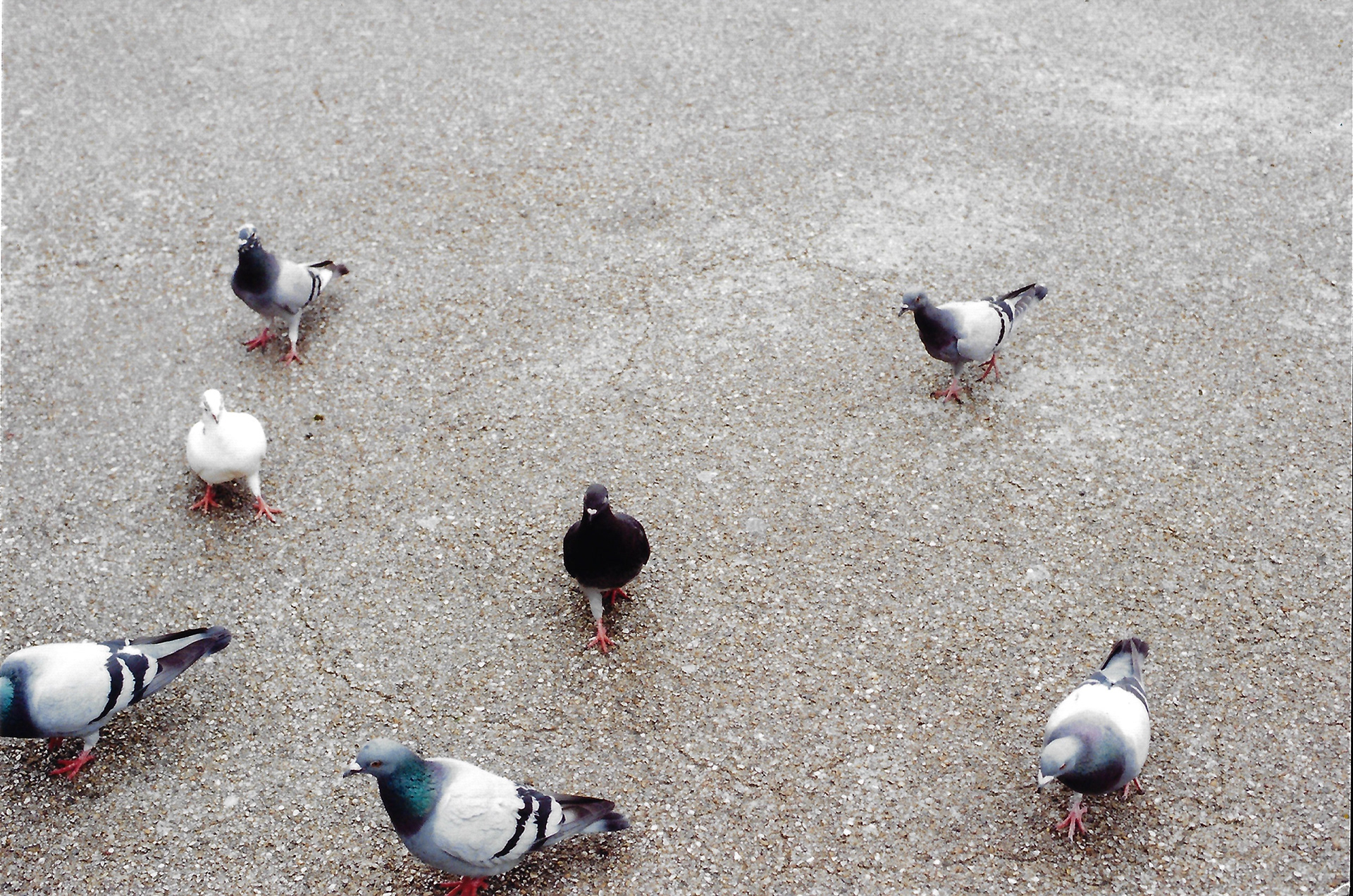


I spend a week in the rural English countryside. I use this opportunity to take some photographs in the local town, even though it is more urban than the rural countryside, it is still notably rural in comparison to my surroundings in London. Just like the green spaces and parks in London are not notably part of the cityscape and are particularly urban, there is still a difference between a park in a city compared to the countryside. The colours, forms, and lines are different, but it is not exactly explicable in words.