Research Title: Explore the generation of harmony in the relationship of colour, line and form.
Keywords: harmony, balance, tension, juxtaposition, curved, straight, saturation, three-dimensional
Objectives and core ideas:
- To translate my different environments (city, seascape, and countryside) and surroundings through colour, line and form.
- To create a sense of harmony in my work through balancing different tensions and juxtapositions in colour, line, and form.
- To create my own visual language through line, form and colour based off these interpretations of my surroundings.
- To allow my intuition and subconscious, which reflect my exposure to visual information, to inform my work and aesthetic decisions in my work.
Line
A big characteristic of my practice that has become more evident as the course has progressed is the equal influence of rural and urban environments within my practice. As Hargittai outlines (2002, p. 293), townsfolk with geometric surroundings prefer natural art whereas nature is full of curved, organic lines and forms so country people surround themselves with geometric patterns. Having grown up in the rural countryside then moved to urban surroundings when I was a young adult, there is an equal presence of both curved and straight lines within my work.
The presence of curved and straight lines is a deciding factor in the arrangement of my work on the wall, such as for the graduate showcase at the South London Gallery. This involved meticulous arranging and rearranging of my work on the floor in front of the wall where it was to be hung. Even when my work was hung on the wall there were still rearrangements made regarding the flow of lines throughout the piece. Line functions in singular pieces of work but when displayed it works relatively with the surroundings
Line is used considerately and carefully, it is deployed with great thought as its placement is very important to the understanding of the piece as a whole. Stomberg asserts (2015, 21) that both Kelly and Matisse capture complex ideas of shape and space with limited means. However, they both used line differently, ‘Kelly’s drawings delineate shapes where Matisse’s suggest forms’. There is no set formula for how line is deployed in my work, this is particularly evident when working with different materials and mediums, as a laser cut line is far more vibrant compared to an etched line. The function of line is relative to the mediums and materials used.
A large majority of my observational drawings are executed with a simple line cutting into the space of the blank page. Axsom claims (2005, p. 17) that Kelly’s drawings have the feeling of being defined by one continuous line. The curvature and repetition of lines similarly also add to the sensation of rhythm. Stomberg claims (2015, p. 14-15) that Matisse evoked space in his drawings through his simple use of line, he would tilt his pen up to the hard edge then tilt the pen flatly to make a wide mark. The deployment of simple lines and their variation within my work have explored alternative ways of generating rhythm and space.
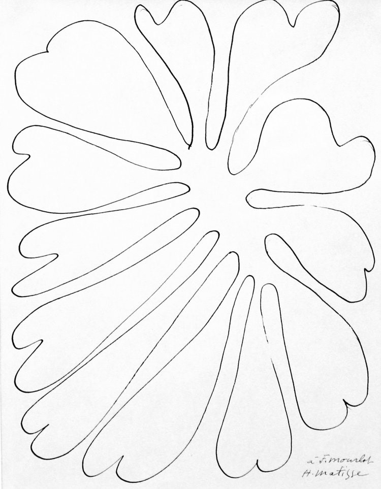
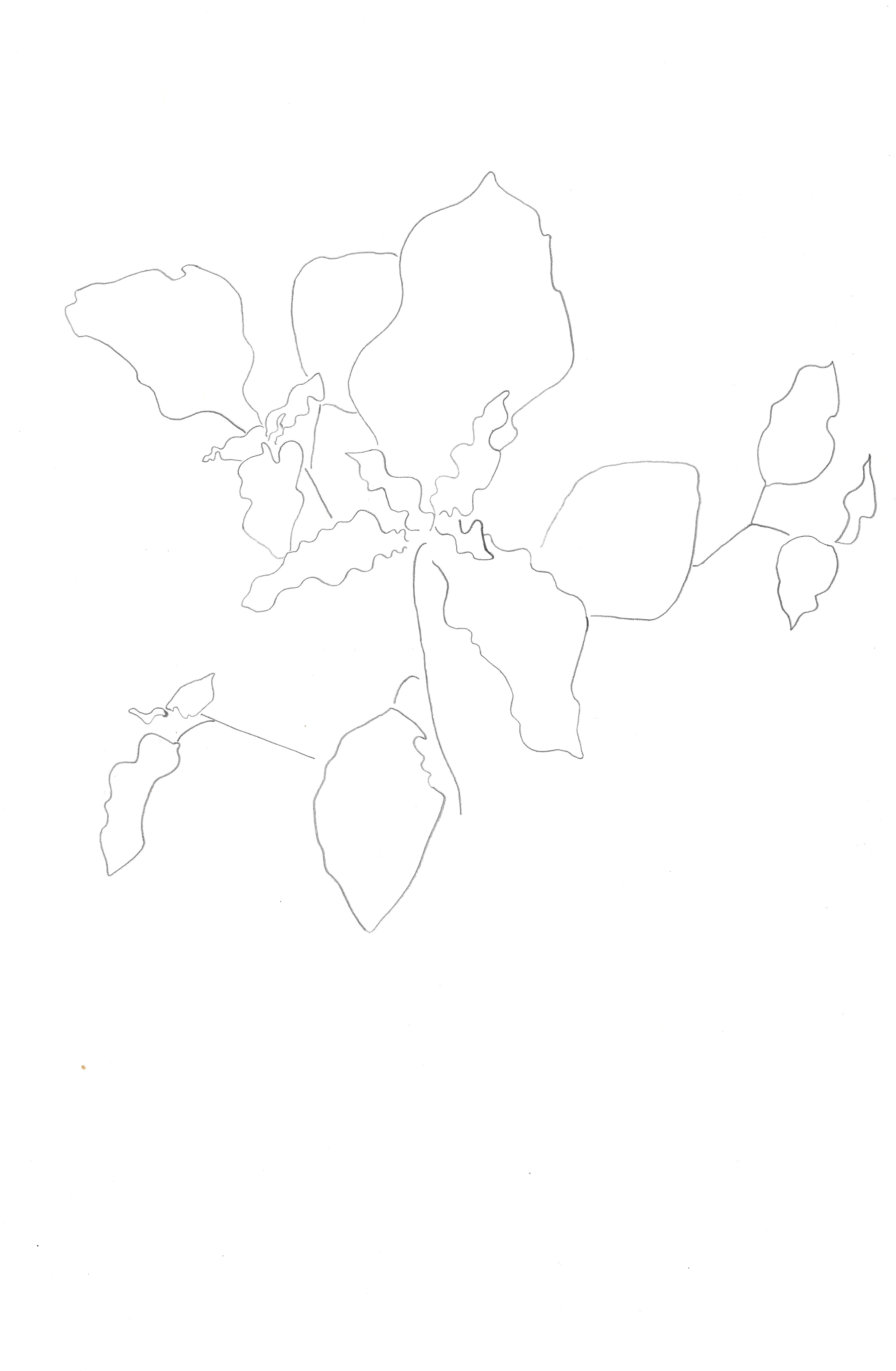
Henri Matisse, Flower, ink on paper in style of cut out

Yves Klein, Blue Monochrome, 1961
Colour
Colour is very personal, and can have different effects on everyone, dependent on experiences and cultures. Albers outlines (2013, p. 8) that colour is the most relative medium in art. Colour has great power to influence and affect the viewer. Kandinsky claims (1977, p. 25) that ‘colour is a power which directly influences the soul’. The associations of certain colours are completely individual but are not subject to change frequently. Debais affirms (2021, p. 33) that colour is the most stable system of signs. Judd asserts (2007, p. 26) Bauhaus thought, as expressed by Itten and Kandinsky, that colours always produce the same emotions and correspond to certain shapes. However, the perception of colour is dependent upon the environment. As Birren affirms (1981, p. 46) that colour perception is not static, sensations shift depending on the circumstances.
The distinctive use of colour within my work reflects my subconscious aesthetic and personality. It is highly personal because it is such a dominant and distinctive feature of my practice. As I start off with observational drawing in nature the use of colour within my work also originates from my first-hand observations in nature. Itten states (1970, p. 79) that ‘the study of color impression properly begins with color effects in nature’. Through first-hand recording, whether photography or drawing, the colours and combinations present make an imprint and influence the work that I produce later.
The colour combinations can be traced back to my initial observations, but they are also a result of the visual information I have been exposed to. Albers outlines (2013, p. 5) that a colour is never seen unrelated to others. My work reflects the colour combinations present in the illuminated medieval manuscripts I have been looking at in this unit of work. Stokes claims (1937, p.49) that the relationship between colours is the basis for all further relationships that occur as a result. Colour is entirely dependent upon its surroundings.
I naturally gravitate towards the mixture of red and blue, and variations of this basic combination. Trinder asserts (2019, p. 113) that Klein’s use of blue was due to the symbolic associations of the colour representing what is most abstract in nature, there are no dimensions of the sea and sky. There are simple symbolic associations with the use of red and blue in my work, as red representing the earth and blue the sky. I do not strictly stick to just using these colours, but this is the essential framework.
Throughout I have saved my ink when using the relief press between two sheets of acetate, so that when I go to print the next time, I use or modify the colours that I have used before. This builds up my own personal palette, that I use throughout my work, adding to the sense of rhythm sensation when looking at my work collectively.
Form
The basis for all my work stems from my initial recordings, as mentioned previously, and this also applies to the use of form within my practice. Crowther and Wünsche (2012, p.11) emphasise how the principles of form and structure are present within nature, which are emphasised by the curvilinearity in plant growth. Lines produce forms and shapes, whether curved or straight, and these have their basis within my initial recordings.
Additionally, as mentioned in the previous unit of work, there is an emphasis within my work of equally using the positive and negative space. Neither has priority. Labrusse (2002, p. 33) asserts that Kelly believed that there was an equal importance of all elements in space, and Kelly’s plant drawings were based on the idea of positive and negative space. Waldman states (1996, p. 15) that Kelly utilised the ‘positive and negative space as equal components of the composition’. This is also evident in Matisse’s cut-outs as he equally used the positive and the negative space. This concept has played a large part in the construction of my work and the techniques I have used. In screenprinting, I have always had the positive and negative of the image exposed onto my screen and more recently in relief, when I have made stencils, I have not prioritised the use of one over the other.

Ellsworth Kelly, Plant II, 1949
Sketchbook page, 29.7 x 42 cm

Photograph on 35mm film
Observational recording of natural environments
Throughout the MA I have always used observational drawing as my first step in the process of making work and I continued this throughout this unit of work. Additionally, I have become increasingly more comfortable with using an analogue camera. This has now become another method of recording my environment, that I will continue in my practice. However, I do use analogue photography at other stages in the creation of my work and throughout my practice. It does not always function at the beginning, like observational drawing does. Hinkinson claims (2017, p. 20) that photographs can distort visual appearances, and they cannot replicate looking in real life. For this reason, I do not heavily rely upon photography to record my initial observations.
I have always found observational drawing an important first step in the process of producing work. Stomberg outlines (2015, p. 16) Kelly’s view, that everything first starts with a drawing, even sculpture. Observational drawing provides a direct, first-hand experience which I then echo throughout my work at later stages. Lefebvre claims (1974, p. 304) that objects have perceptible relationships to their surroundings. Through creating new work I produce new relationships, so even though it has originated from a natural environment, it does not necessarily exist there anymore. Through the printmaking process my work still has its original source in nature but through the techniques and materials used it is now a separate object. There is present a dualism of its natural origin combined with its technical construction. Through close observation of the natural world, Crowther and Wünsche (2012, p.25) emphasise the dualism present within natural forms, reflecting natural processes whilst also adhering to geometric forms; these are not opposite but ‘different sides of one and the same reality’.
Through my observations of the surrounding environment, I do not always represent it directly, except when using the analogue camera. My drawings convey the essence or character of what I am depicting, rather than an accurate portrayal. Crowther and Wünsche (2012, p.9) emphasise how the natural world can be explored that does not require it to be represented directly. It is important in my practice to convey the subject’s essence and energy rather than an accurate depiction because this is what I aim to portray in the product, to be able to resonate with the viewer. Labrusse claims (2002, p.17) that both Matisse and Kelly used ‘active contemplation of the plant kingdom as a source of energy’.
Additionally, through my observations of natural forms, geometrical precision is clearly referenced but then disregarded in a sense as the natural world adheres to its own rules. Just like there is symmetry present within nature, the application of geometrical forms, according to Taylor (2005, p. 71), does not necessarily require a conscious, mathematical approach. Further, dynamic symmetries present within my work only reflect the environment they originate from. Darvas asserts (2001, p. 143) that ‘symmetry is never perfect’ and that dynamic symmetries follow the deeper invariances of nature. This is similar to both Kelly and Matisse, but more so Kelly in his larger abstract work, as the original sources in the natural world are evident. De Chassey (2002, p. 62) outlines that Kelly’s plant drawings were always abstract. When you look at the range in Kelly’s practice, the natural origin is obvious, and parallels can be drawn between his sculptures and plant lithographs. The abstract character of the lithographs becomes more apparent in context with the rest of his work. Waldman asserts (1996, p. 20) that in Kelly’s La Combe series there is an indication of the original source in nature. Also in Matisse’s botanical prints, according to Stomberg (2015, 21), these demonstrate how the subtle universality of basic shapes were based in nature.
Harmony
My work aims to generate harmony from the balance of different tensions and juxtapositions. The sensation of harmony from an image is achieved, as Poulin outlines (2011, p. 113), from the balance of different visual elements, communicating stability. Hauptman outlines (2014, p. 23) that Matisse ultimately strove for balance in his cut-outs. There are different kinds of balance which are reached to produce a harmonious image. Poulin summarises (2011, p. 114) these as, formal, dynamic, and radial. The balance of colours is the primary approach for producing harmony. Birren states (1981, p. 89) that complementary colours, which are on opposite sides of the colour wheel, generate harmony. The combination and balance of contrasting elements, whether that is colour, line or form, generate a sensation of harmony.
Poulin further states (2011, p. 142) that one cannot experience harmony without tension and vice versa. For the viewer to experience a harmonious image there will be juxtaposing elements within a composition, of either colour, line, or form. Goethe states (1970, p. 280) that ‘two pure original principles in contrast, are the foundation of the whole’. To create a harmonious image there must be two equal parts in contrast, which balance each other out. According to Kandinsky (1977, p. 43) harmony rests on the principle of contrast. Ratcliff asserts (1996, p. 57) that Kelly engaged with opposites when creating his work. Dynamism present within Matisse’s cut-outs, as Frigeri asserts (2014, p. 153- 158), helped unify, as there was no separation between the different elements, it was treated as a whole.
Throughout my work there features combinations of contrasts in all forms, ranging from colour to material combinations. The principle of dynamic contrast and tension unifies my work which establishes a sense of harmony.
The concept of bringing together contrasting elements to produce harmony also resides in nature. Labrusse (2002, p. 34) outlines that just like in organic beauty there are combinations of opposites, order and disorder, structure and accident which are evident in Matisse’s plant drawings.

New abstract language
Throughout the MA I have struggled linguistically articulating my work, especially in relation to colour. However, Polin affirms (2005, p. 35) that this is not uncommon as many artists struggle to explain what triggers the aesthetic success of a piece of work.
According to Day (2013, p. x), it is hard to translate an image into words. I do not intend for the work I produce to have a direct translation but rather within the context of my other work, to be visually explainable. There is no need for my work to be explained or to be explainable, words are not adequate. Labrusse (2002, p. 29) argues that language is not sufficient. This links to my visual interest in medieval manuscripts, as I cannot read the text of Egerton MS 2902, Harley MS 5790 or Additional MS 15268, but this did not detract from or devalue my experience.
I intentionally repeat the same forms and colours throughout a piece and arrange my work so that there is a sense of subtle repetition. This creates a sense of rhythm in my work but also it establishes a vocabulary which is then reused and applied in different contexts.
When I encountered the manuscripts in the British Library I was able to understand the manuscripts on a purely visual level, it required a non-traditional reading, which focussed on the visual content and required an understanding of the text visually. This was made easier by the fact that I could not read the language of the text so it allowed me to focus purely on the line, form and colours present. In some medieval manuscripts, mainly anatomical or educational, functional abstraction, as McCall affirms (2021, p. 287) conveys knowledge to the reader which could not be understood through the text alone. Abstract images are utilised to convey information, and this is parallel to my practice. In order to communicate multiple levels of meaning in illuminated manuscripts, according to McCall (2021, p. 300) a language of abstract forms was developed, and this relied upon the ‘suspension of reality’. For the viewer to fully understand the new language they are presented with, the viewer has to forget the conventions of functionally reading text. The repeated use of similar forms, lines and colours not only communicate to the viewer, but they are not translatable or explainable in words. According to Waldman (1996, p. 34) Kelly also developed a vocabulary of forms which originated in nature. This is parallel to my practice, as my work all begins with observations of nature.
Through increasing scale, the abstract language present throughout my work is only intensified. Rosenthal claims (1996, p. 64) that in Kelly’s work it is a ‘transcendent experience through an abstract language seen on a large scale.’ The viewer is not set a prescribed way to encounter my work when displayed. Rajchman claims (1998, p. 68) that there is no single point of view, but multiple entrances and exits. However, it is my intention to create a sense of the rhythm and harmony generated from the contrasting tensions.

Egerton 2902 f. 64 v Decorated Initial

Harley 5790 (detail of) ff 233-398
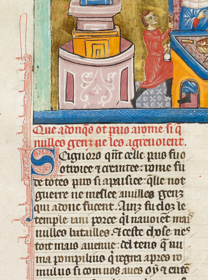
Additional 15268 (detail of) f.242v Pax Romana
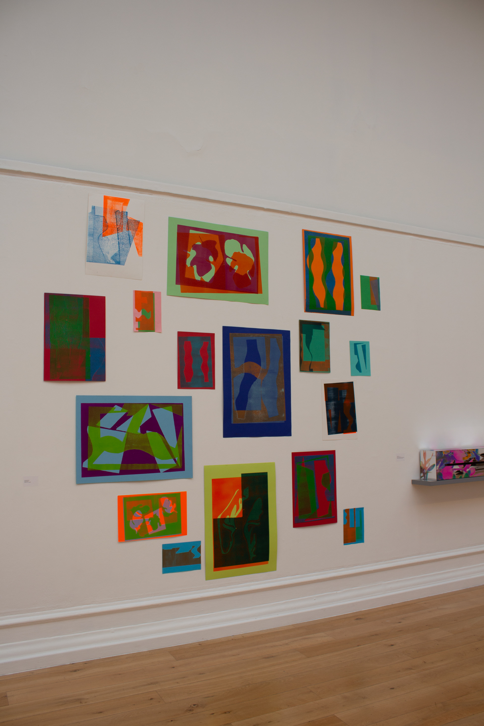
Installation view of Dolly Mixture at the South London Gallery
Intuition
Intuition plays a large, understated, subconscious and conscious role in the production of my work. Waldman claims (1996, p. 12) that abstract artists, such as Rothko, Newman and Kelly all relied on intuition when making decisions about what to do with their work. Bell also agrees (2996, p. 74) that Kelly relied heavily upon his intuition in relation to his work. Intuition forms the link between my work and explains how I make a lot of my decisions. My intuition is informed by my reading and the visual information I surround myself with. De Wolf asserts (2005, p.14) that intuition is an independent source of cognition that is a ‘subjective experience of a process that is fast and non-rational’. Intuition provides the link and communicates between the subconscious and conscious mind. De Wolf further claims (2005, p. 15) that with Plato and Aristotle, intuition was the highest form of knowledge, an ‘unconscious knowledge’.
The connections between my first encounters with natural forms, the observational drawings I produce as a result and then the abstract forms I then later produce are all influenced by my intuition. Axsom argues (2005, p. 14) that there is an intuitive visual understanding that connects the natural form with the abstract shape. In some aspects of my work, for example colour choice, I have to fully let go and allow myself to be guided and trust my intuition. Vervoordt claims (2005, p. 8) that intuition emerges out of total freedom, prompting new ideas but not knowing their source.
When arranging my works for both exhibitions I did make a loose plan for the display to work from, but I knew that I would not stick strictly to the plans made. I let my intuition decide on the placement of works and allowed my intuition to guide their placement regarding the sense of rhythm I aimed to generate. Itten asserts (1970, p. 28) that in relation to colour design, intuitive feeling is far superior to a calculated plan. Relying on my intuition felt far more trustworthy than sticking to the plan I had originally made on the computer. Additionally, it is well known, that things look different in real life than compared to how they look on a computer screen.
Rhythm
Rhythm is primarily generated through the dynamic arrangement of my work on the wall and subtle repetition of certain motifs. Alber’s work, according to Hinkinson (2017, p. 27) was not static and possessed visual rhythm. Rhythm is produced from the continuous repetition of colours, forms and lines in my work producing a sense of movement. Additionally, rhythm is not exclusively visual and it can imply the sensation of movement which can be felt by the viewer. Hauptman outlines (2014, p. 17) that the rhythm of the cut is not only visible but can be experienced in Matisse’s cut outs. Weschler affirms (1982, p. 63) that through compositional techniques the viewer can be brought around by the flow of lines, colours, and hierarchy of subject ideas.
Colour is one of the principle ways of producing a sense of rhythm in a piece of work. The use of colour within medieval manuscripts highlighted certain parts of the text and generates, according to Debais (2021, p. 44), a rhythm of narrative. This was evident from the three manuscripts I encountered in the British Library, Egerton MS 2902, Harley MS 5790 and Additional MS 15268. They all included repetition of colours to lead the reader through the text, highlighting the parts where to pause at, generating a sense of pace.
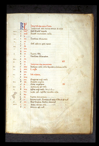
Egerton 2902 f.4 July
Medieval manuscripts
Most of the artists I have researched in relation to this unit of work have previously studied or taken an interest in previous art history. Waldman states (1996, p. 11) that in Kelly’s work, as he had previously studied Romanesque and Byzantine art, provided a ‘seamless blend of past and present, almost transcending time’. However, it must be remembered that this is an entirely different context to the original in which the work was produced. Berger argues (1972, p. 16) that art of the past is perceived differently today. The manuscripts function completely differently compared to their original function as devotional objects, compared to now functioning as objects within a national library. However, the audience, albeit restricted, is similar. Mills affirms (2021, p. 123) that ‘objects from the past seemingly transcend the time of their creation’. The main difference is to do with the audience, as the different circumstances provide alternative readings. This is true of my work as well because everyone will view my work differently depending on their own circumstances.