Sunflower I, 2004, lithograph, 39 x 29.125 inches
Pine Branch VI, 1950, pencil, 16.5 x 20.25 inches

Grape Leaves III, 1973-4, lithograph, 47.25 x 31.5 inches
Work of Ellsworth Kelly
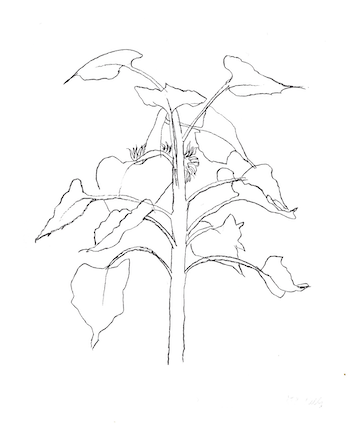
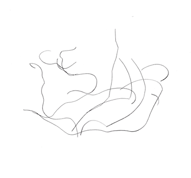
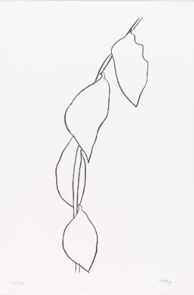
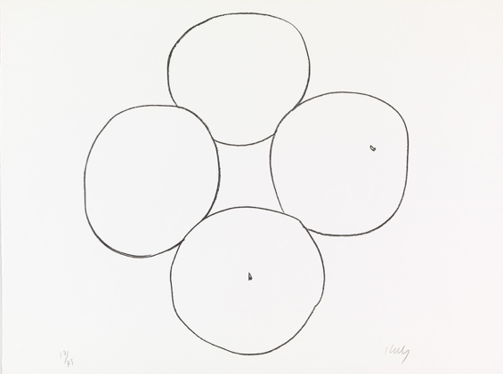
The observational drawings of plant forms by Ellsworth Kelly, which are either lithographs or drawings using pen and paper, provide an essential base and a parallel returning point, to that of Kelly, within my own practice. The simplification and clear defining line allow me to focus purely on the form in front of me, rarely taking my eye off the subject and making the line I use to be carefully considered. In the context of Kelly’s observational plant drawings, this is a very similar approach, as Bell clarifies, that Kelly’s eye was fixed to his subject and rarely looked away (1997, p. 35). However, this is not true of all my observational drawings, as invariably when looking purely at the subject I find myself using a various mix of different lines or looking at the paper to consider the placement of the line in relation to the rest of the image.
Another distinct parallel I find between my practice and Kelly’s work is the relation of his observational drawings to his abstract work. Axsom claims that his drawings are related to his abstract work and although not consciously recognised by Kelly, they are a parallel pursuit of fundamental form (2005, p.12). When Kelly’s observational drawings are stripped back even further, it is reasonable to perceive the parallels between his abstract work and his observational drawings. The observation and drawing of natural forms undeniably influence his practice and is a fundamental part of it. My practice, although starting from a similar point, is visually very different to Kelly’s, in relation to his minimalist abstract work. The same starting principle applies, even though there is a different product, it is just a different context.

Blue Green Curve, 1972, oil on canvas, 87.5 c 144 inches, The Museum of Contemporary Art, Los Angeles, The Barry Lowden Collection

Curve, 1951, ink on paper, 7.5 x 8 inches, private collection
Untitled, 1962, pencil on paper, 28.5 x 22.5 inches, private collection
Lemon Brancg, 1965-66, lithograph, 78.4 x 28.2 cm
Oranges, 1966, lithograph, 61.9 x 81.9 cm
In relation to his observational drawings, which are a parallel starting point for both Kelly’s work and mine, there is another parallel to be drawn in the process of working. Bell asserts that Kelly’s line drawings took no longer than 5 minutes to complete (1997, p. 33). This is also comparable to many of my own observational drawings, as due to the changeable conditions or my levels of patience, there is always a sense of urgency to finish a drawing. However, this is not true of all my observational drawings. To produce a considered line, sometimes I can do this with just a single line, depending on my environment, but also, I do this by creating various lines and then selecting the desired line. Further, I meditate upon the subject, taking time to create the image, even when a simple line is drawn. This process allows me to fully engage and rest my eyes upon the subject, taking time to consider the line.
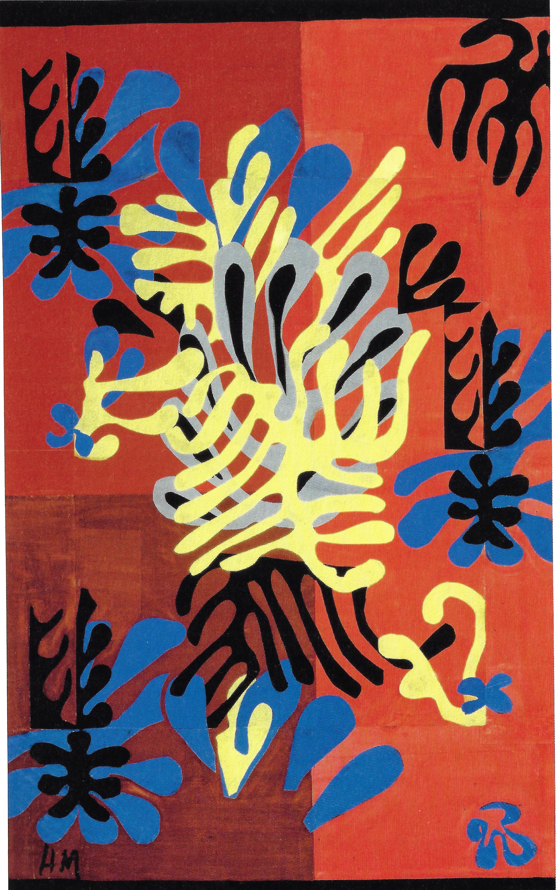
Work of Henri Matisse
There are many visual parallels to be drawn between my practice and Matisse’s easily, in terms of the use of colour and shape. Yet, some of the similarities and alterations of these similarities are not apparent at first glance but provide a useful context for my practice when it is fully explained.
Increasingly in my work I have been utilising the positive and negative of an image, using neither one above the other. This is most noticeable in Matisse’s cut-outs, as Hauptman outlines that to Matisse, he considered them to be equal (2014, p.17). Further to this, when considering the term cut-out, as Hauptman outlines, it is fundamentally flawed, as it implies that one part is held above the other, which is disregarded and inconsequential (2014, p. 19). In my work, neither is more important than the other; there is a democracy in the creation of the image. More recently I have taken this a step further in my screenprints, utilising the front and the back of the piece of paper. Neither side is more important than the other, they both provide an equally intriguing view. This is also exemplified through the construction of the boustrophedon structure as both sides of the paper are equally as important as the other.

Henri Matisse, Forms, 1944, Maquette for plate IX from the illustrated book 'Jazz' (1947), 44.3 x 67.1 cm
Mimosa, 1949-51, Maquette for rug (realised 1951), gouache on paper, cut and pasted, mounted on canvas, 148 x 98 cm

Ensemble of unused gouache cut-out elements, 1945-1954, Musee departmental Matisse, La Cateau-Cambresis, Gift of Matisse Family

The Wave, c.1952, gouache on paper, cut and pasted, 51.1 x 158.4 cm
Additionally, in Matisse’s cut-outs they have the resemblance of a screenprinted image, in that they are bold shapes in flat colour. However, they are cut out from sheets of painted gouache on paper. When looking closely at a cut-out, the subtle variation in tone of colour is present but not obvious to the viewer. In my practice, I tend to steer away from flat colour, although sometimes I do create flat images. I construct images with a variation in tonal colour which is done in different ways and is not always so noticeable or seen to be deliberate at first glance. In screenprinting I vary the range of the colour printed by not using the squeegee in one direction, as you should to create an even flat colour, but both directions over the screen. I have also used the same stencils but in lithography, which uses an oil-based ink. When the images are overlaid there is a depth and richness, which is not achievable in screenprinting. Additionally, I have also combined both techniques, using a lithographic print and screenprinting another layer on top but also using a screenprinted image and printing an additional layer in lithography.
In Matisse’s work there is a combination of line and form, as not all his work is abstracted shapes. Labrusse asserts that in Matisse’s work the shapes and lines interact (2002, p. 31). This provides a contextual reference for my practice, as not all my work is abstracted. There is a combination of line and shape, which provides a combination of both figuration and abstraction. My work does not resemble Matisse’s, in terms of content, but it does reference a similar combination.

Henri Matisse, Leaf cut into an Arabesque, c.1944 - 1947, pen and ink on glossy paper, 10.07 x 8.26 inches
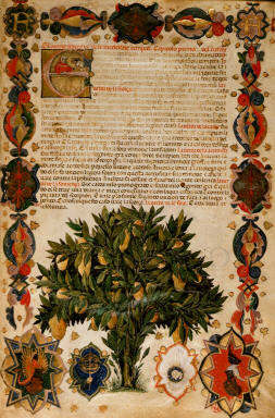
Medieval manuscripts containing botanical or herbal illuminations
Many of the artists that I have looked at in relation to my practice in this unit of work reference previous work from centuries before their own. Whether this has a conscious or subconscious influence on the work they produce, it does have an influence due to the interest the artist has in relation to the different period of work. Every artist produces this influence differently to each other, as it is not always a conscious decision to include it.
I have been researching medieval illuminated manuscripts and focussing on botanical and herbal imagery. The interest in this period of imagery stems from my interest in geometry in nature. This is more prevalent and expressed in a different way during this period, compared to contemporary culture. The flat, geometric, botanical forms are clearly defined using a decisive line and flat colour. However, to me, there is no literal translation of this work within my own. Hinkson argues that similarly Albers did not directly link his work to the pre-Columbian monuments and artifacts that he took interest in, as this would constrain the perceptual freedom of the work (2017, p. 26). Thus, the research and interest in this imagery can be argued to influence my work visually and subconsciously. Although through recognising this influence on my work, my visual uptake, undoubtedly, will influence the work I produce, making this a conscious influence of my subconscious application.
Egerton Ms 2020 f.4, Full border with heraldic decoration and historiated initial 'E', with miniature of a citron tree ('citrus medica'), Italy, N. (Padua), British Library

Egerton Ms 2020 f.7v, Clover, trefoil plants, Italy, N. (Padua)

Observational drawing of natural forms in my surrounding environment
By observing the majority of the material I engage with first-hand, the visual imprint of this matter dominates the forms I then produce. This is an important context when considering the work I have produced in this unit. Undoubtedly, observing natural matter not only has an imprint on the shapes and forms I produce but the combinations of form and colour within my work. As Klee states that the essence of form within his work comes from nature (1953, p. 7), I draw a similar parallel in my own practice. An important part of this contextual reference within my work is that the large majority of the material I engage with is first-hand and not from a photograph. Photographs provide a different viewpoint. As Berger argues that ever since the invention of the camera, this has changed the way people have looked (1972, p. 18). I prefer to engage with material first-hand, not because I dislike photography altogether, but because I can meditate upon the object and through my point of view, I can show multiple points of view. Hinkinson asserts that photographs distort visual appearances, and that they are different to real life (2017, p. 20). This is true, yet I do not want to disregard the point of view of the photograph. It is important in the democratisation of viewpoints but also allowing the viewer to see from my viewpoint, and I wish to explore this further in the next unit of work.
Influence of geometry and symmetry
The orderliness and mathematical precision in the use of line has been an important point of reference for this unit of work. I have focussed on the function of the line and its capabilities, and I am more aware of the role line plays in different contexts and applications. Geometry is subtly referenced in different ways and in many different applications within art. Taylor affirms that William Scott brings in references to geometry through flattening shapes (2005, p.67) and many other abstract artists reference geometry with the use of geometrical shapes, yet without using a mathematical approach.
The main starting point for the reference of geometry and symmetry within my work originated from an observation of nature and how the use of geometry and symmetry is recognised and then distorted. Darvas clearly affirms that objects in our surroundings show symmetry and the lack of symmetry simultaneously (2001 p. 136). Through observational drawing of natural forms, geometrical precision is clearly referenced but then disregarded in a sense, as the natural world adheres to its own rules.
Through my work within this unit, it has become increasingly obvious and apparent that geometry plays a significant role in the construction of my imagery. However, the extent of this influence is not regular throughout my work. It is more prevalent in some pieces than others.
Additionally, my interest in the boustrophedon structure and the use of isometric and gridded paper adds a layer of regularity to the forms within. Regularity is given to looser forms as they are constrained to the lines and dots already prevalent in the paper. This also highlights the looseness of the line when it is not conforming to the structure within. It is more prevalent, and the line becomes more definitive and clear.
A graphical unit to represent a quark
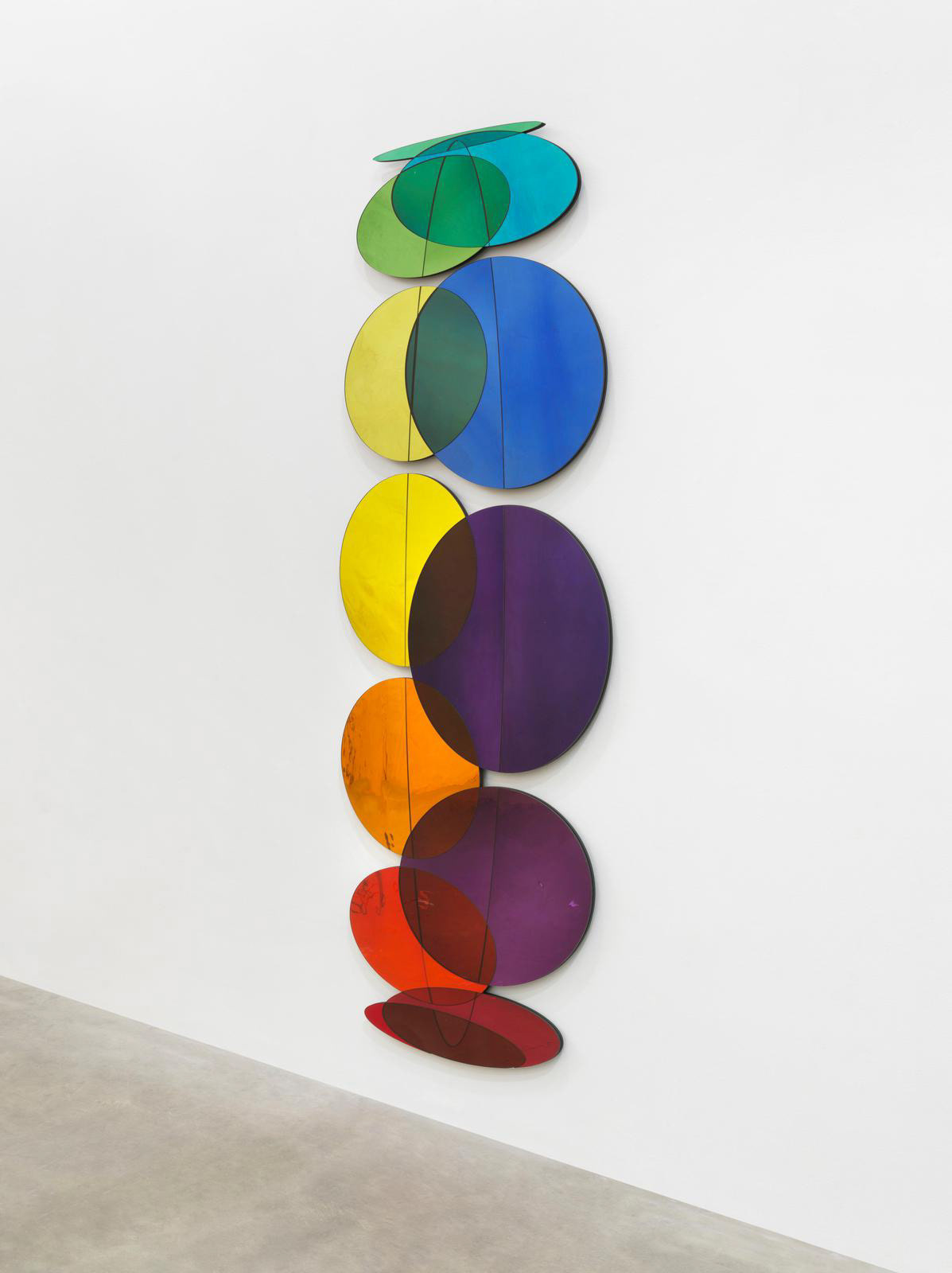
Photo: Jens Ziehe, Studio Olafur Eliasson, Colour mirror wheel, 2019, silver coloured glass (shades of red, orange, yellow, green, blue, indigo, violet), aluminium

Photo: Jens Ziehe, Studio Olafur Eliasson, Colour mirror wheel, 2019, silver coloured glass (shades of red, orange, yellow, green, blue, indigo, violet), aluminium
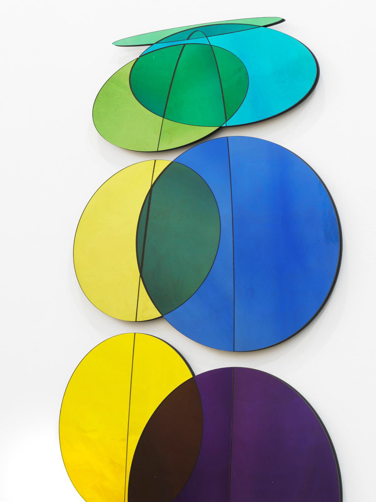
Photo: Jens Ziehe, Studio Olafur Eliasson, Colour mirror wheel, 2019, silver coloured glass (shades of red, orange, yellow, green, blue, indigo, violet), aluminium

Photo: Jens Ziehe, Studio Olafur Eliasson, Colour mirror wheel, 2019, silver coloured glass (shades of red, orange, yellow, green, blue, indigo, violet), aluminium
Work of Olafur Eliasson
In the second half of this unit the work of Olafur Eliasson is an important context in the relation to the development of ideas in my work. As this unit has progressed, I have become more comfortable with exploring scale; the viewer is just as important as the work itself. In Olafur Eliasson’s work the viewer is essential in the reception and understanding of the work. The viewer’s interaction and perception with and of his work promotes, as Saul outlines, the intersection and dialogue between nature, science, and art to be fully realised (2002, p.1). The viewer is similarly important in the interaction with my work; however, I do not care for the reaction. For my work to provoke any reaction, whether positive or negative, is a success.
In addition, the influence of geometry in his work, which is not noticeable at first and abstracted, reflects the same influence within nature. The relationship between the two is there, even if it is disregarded and ignored, it is still there. This is an important contextual point. Within my own work, it is not necessarily obvious, because it is abstracted, deliberately ignored, or deliberately attempted to not be accurate, the reference to geometry is still there.
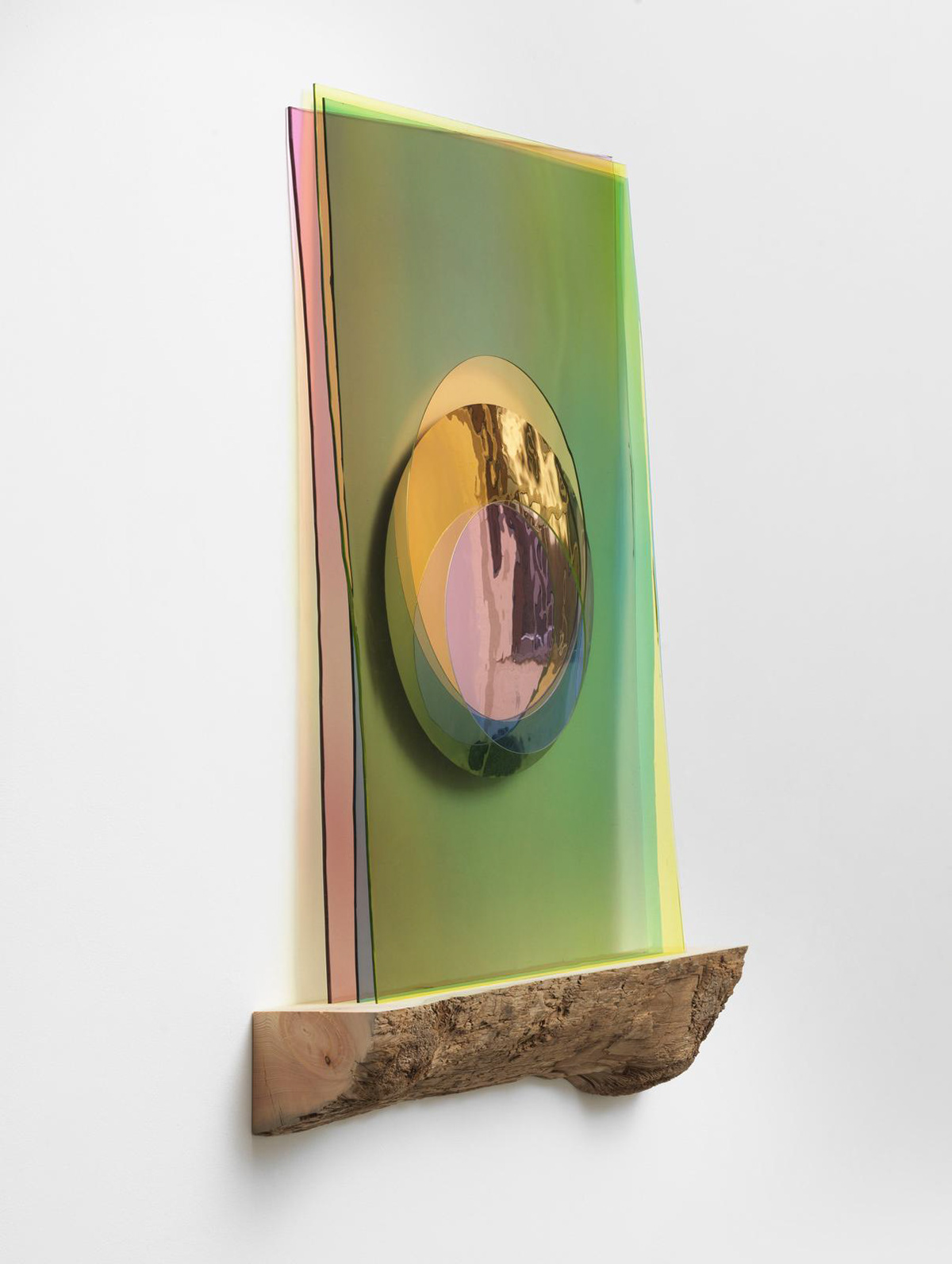
Studio Olafur Eliasson, Imaginary Morning Eclipse, 2020, coloured glass (pink fade, yellow, blue), silver, driftwood

Studio Olafur Eliasson, Imaginary Morning Eclipse, 2020, coloured glass (pink fade, yellow, blue), silver, driftwood
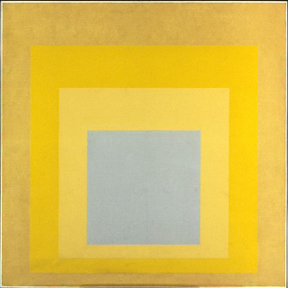
Josef Albers, Homage to the Square: With Rays, 1959, Oil on Masonite, 48 x 48 inches
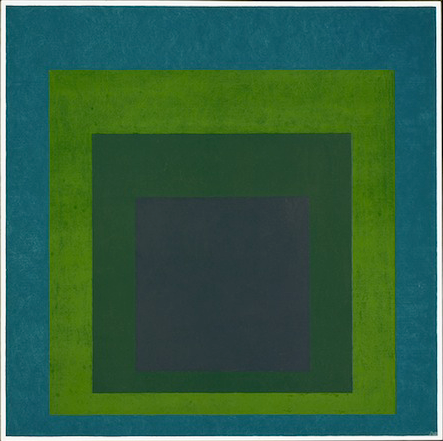
Josef Albers, Homage to the Square: Soft Spoken, 1969, Oil on Masonite, 121.9 x 121.9 cm
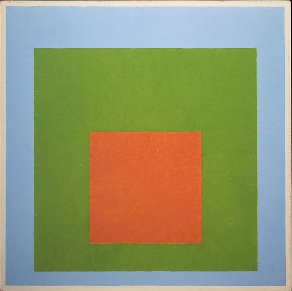
Josef Albers, Homage to the Square: Young, 1951-2, Oil on Masonite, 23.25 x 23.25 inches

Josef Albers, Homage to the Square: With Saffron, 1962, Oil on Masonite, 24 x 24 inches
Work of Josef Albers
Alber's work remains a useful context in relation to my work in this unit, mainly because of his, as Hinkinson claims, his truth of materials (2017, p. 17) present in his work. In my work I emphasise the process, and through enlarging my screenprints, this drew attention to the material process used to make the image in the first place. Furthermore, Hinkinson outlines Alber's process of working, by creating a series, which share a baseline composition, instead of singular works (2017, p. 25). The Homage to the Square is composed of four superimposed squares and this series of work occupied him for 25 years. I can easily draw a similarity with my own work here as the squiggle and it's slight variations (no two images are the same) have dominated this unit of work.
Work of Ann Veronica Janssens
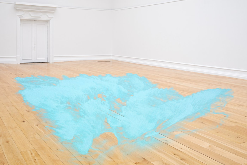
Janssens had an exhibition at the South London Gallery from23/09/20 to 03/01/21. This is where I first encountered her work. The main characteristic of her work that struck me was the interest in and relationship between light and the impact upon our experience and perception as viewer. Janssens described Blue Glitter (2020) at South London Gallery as 'ephemeral', with Lloyd (2020) expressing how each time the viewer encountered the work it was different, and no one had control over that. There is a tension between what is experienced and what is proposed present in Janssens work. Janssens work is relevant and a useful context because of the relativity of experience and individual perception of light that is central to her work. With my work on the A3 fluorescent acrylic, light was a fundamental part of the experience, and the individuality in viewing experience was emphasised.
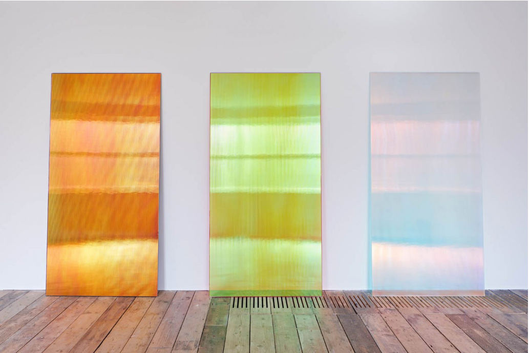
Installation view of CL2BK, 2015; Pinky Sunset R, 2019; and CL2 Blue Shadow 2015, photo: Andy Stagg
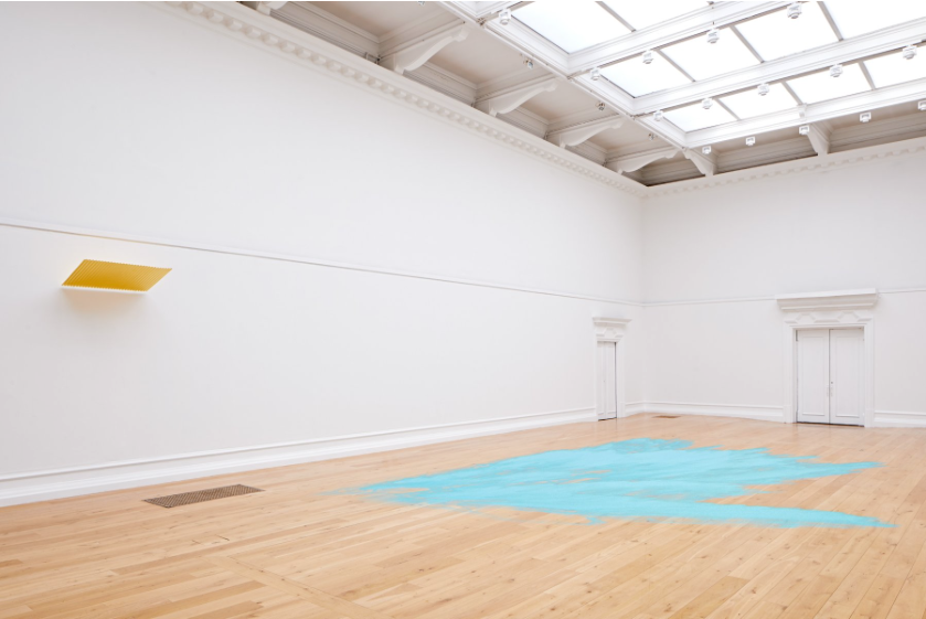
Installation view of Untitled (Blue Glitter), 2015, photo: Andy Stagg