Initial Research Title for Unit 2: floating between possibilities of the different translation of lines found in natural forms and my surrounding environment.
Key words: nature, abstraction, line, form, rhythm
Aims and Objectives for Unit 2:
- Use my immediate environment as raw material to extract forms, lines and colours to then translate into abstract work.
- Explore the relationships between form, line, and colour- examining visual tension and harmony.
- Use my imagination, which is a subconscious engagement and translation of my environment, as the intermediary position between my observational drawing of natural forms and the final image created.
- Explore materials, processes, and scale.
- Experiment with installation to emphasise particular themes.
- Research artists and ideas within the field of visual abstraction.
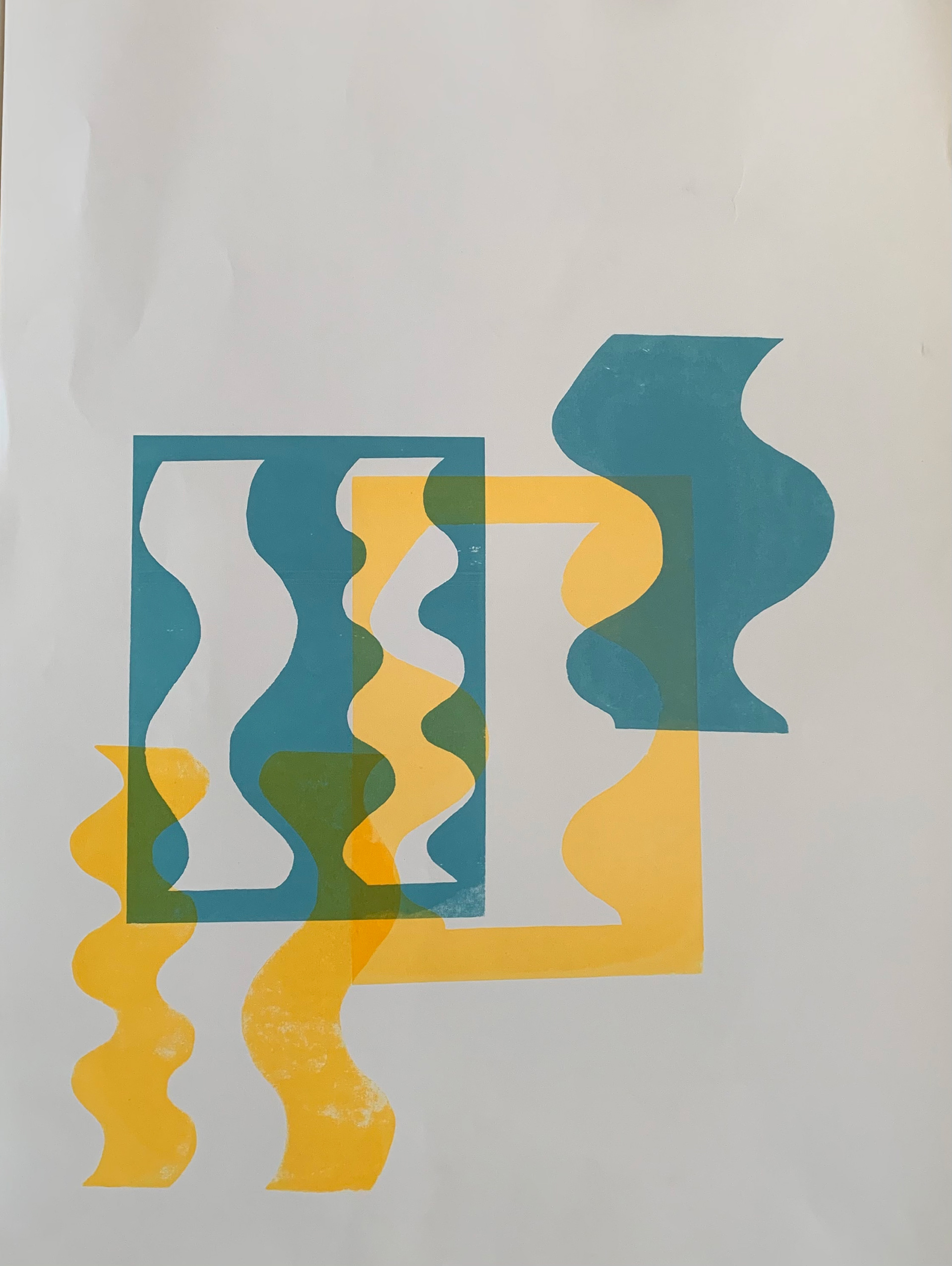
- Explore layering and the use of colour to create new lines and forms, emphasising and creating new tensions between the different elements.
- Explore the domination of the line and the emphasis of this through different means.
Throughout my practice there has been emphasis on the materiality of process. As a result, it guides and defines the work I produce. Hinkinson argues that Albers claimed, every artwork was based on thinking out of the material (2017, p. 50) and that there was a truth of materials in Alber’s work (2017, p. 20). Increasingly, as I have become more familiar and knowledgeable, I have found myself challenging and pushing the bounds of particular materials and processes. Hinkinson claims that Albers worked in a similar way, manipulating a set of variables to emphasise different parts within a piece of work, whether that would be colour, line or the relationships between geometric forms (2017, p. 25). This notion is not a new way of thinking, it has been around for centuries. As Mills argues, in Bosch’s polyptych, Visions of Hereafter, made between 1505 and 1515, the reverse of the panels is similar to work by Pollock. Yet, they remain to be nothing other than a painted surface (2021, p.123). The materiality of a piece of work has always been an important consideration to the artist, with the process chosen before the work is made. Beaupré states that the process of lithography appealed to Kelly because of its physicality (2015, p. 124), especially during the pandemic, with the inability to see work in the flesh and the rise of the digital world. The physicality of an image has become more significant to the viewer in their understanding and appreciation of a piece of work, but it is equally important in the process of making the work.
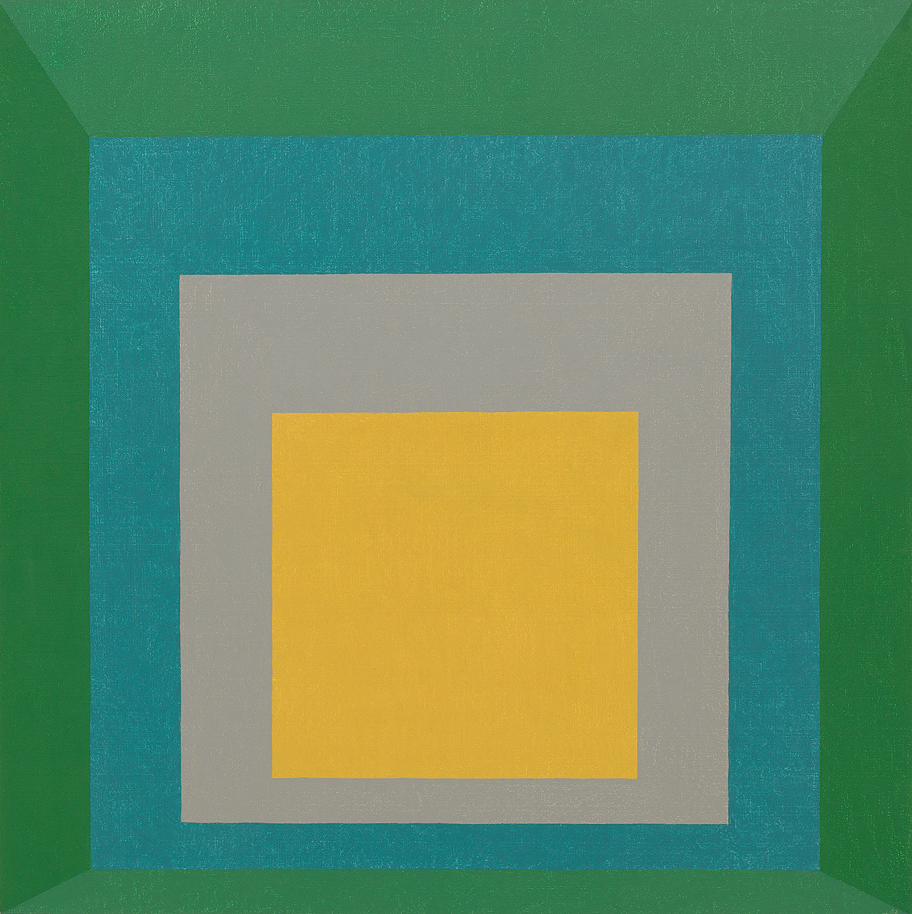
Josef Albers, Homage to the Square: Apparition, 1959, oil on masonite, 120.6 x 120.6 cm, Guggenheim Museum, New York
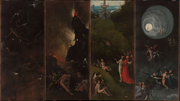
Hieronymus Bosch, Visions of Hereafter, ca. 1505 - 1515, oil on oak, Fall of the Damned 88.8 x 39.6 cm, Hell, 88.8 x 39.6 cm, Earthly Paradise 88.5 x 39.8 cm, Ascent into Heaven 88.8 x 39.9 cm
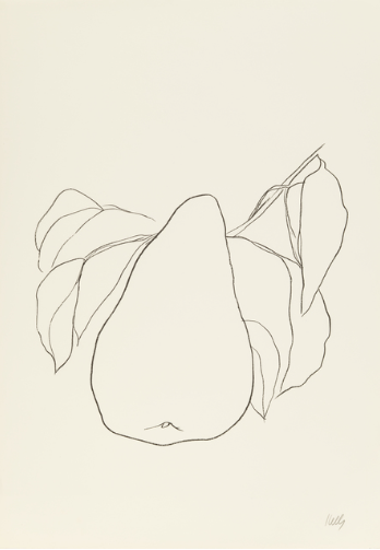
Ellsworth Kelly, Pear III, 1965-66, Lithograph on paper, 87.9 x 39.9 cm
Line
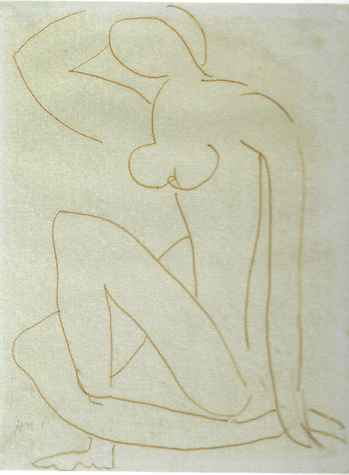
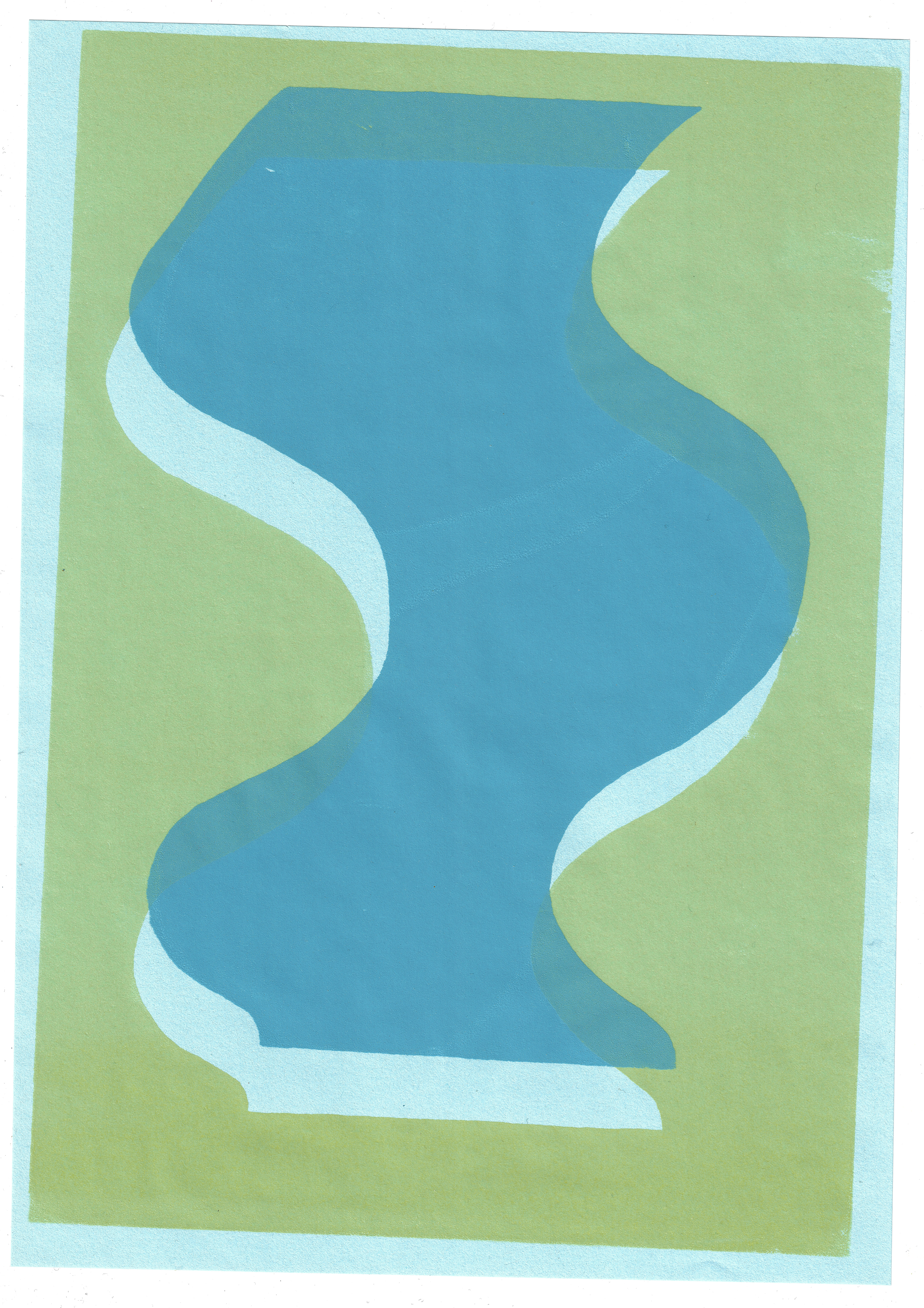
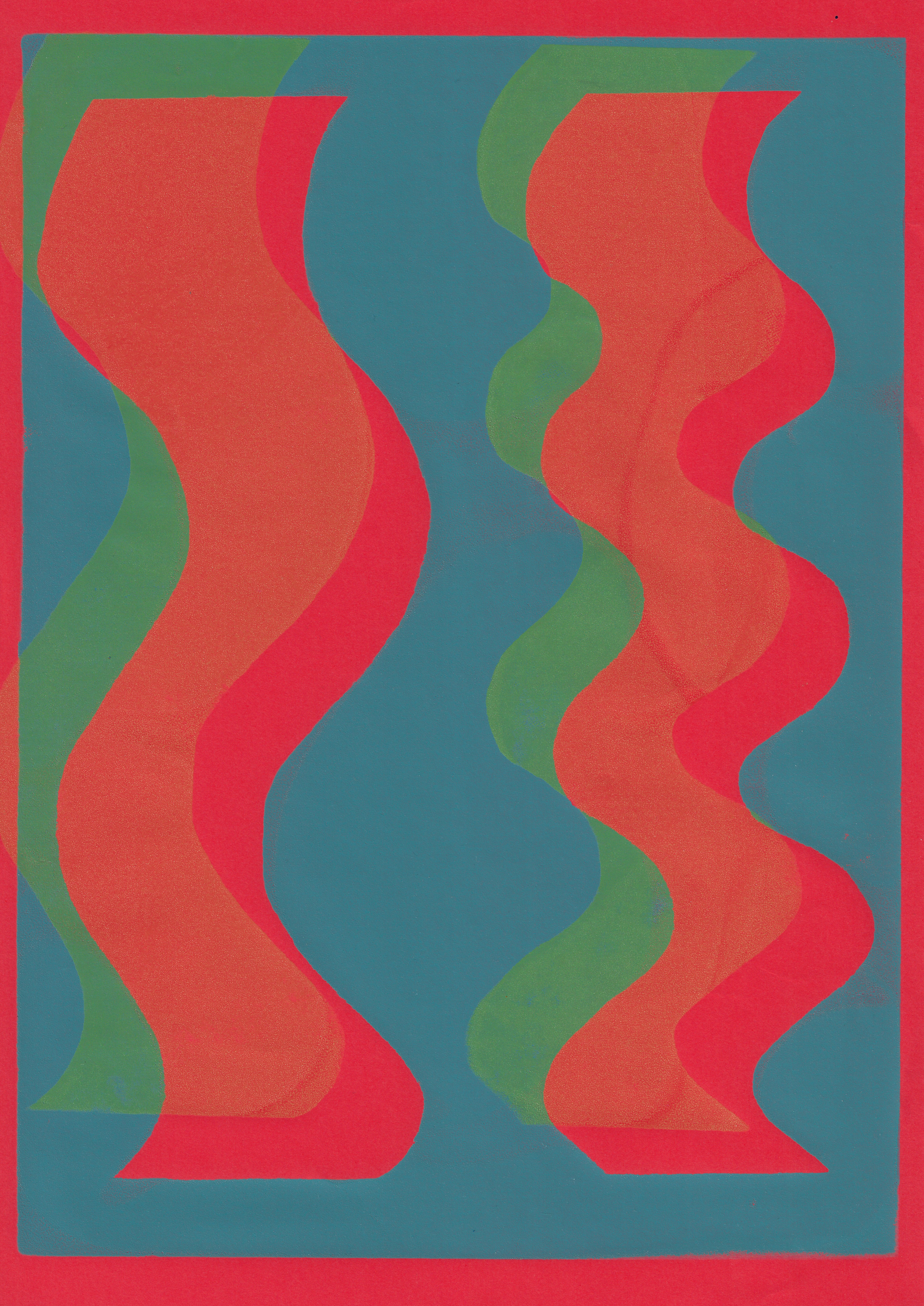
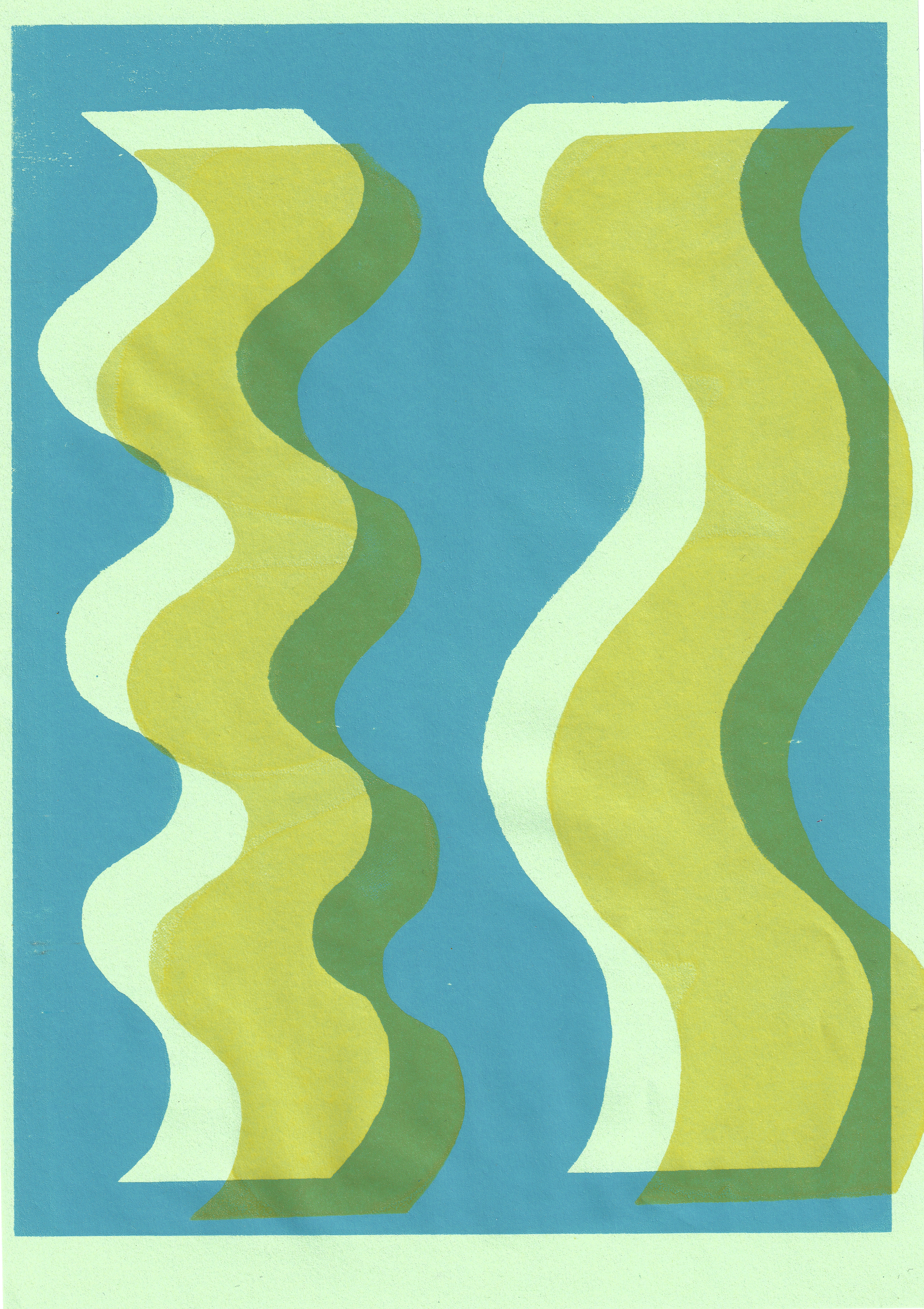
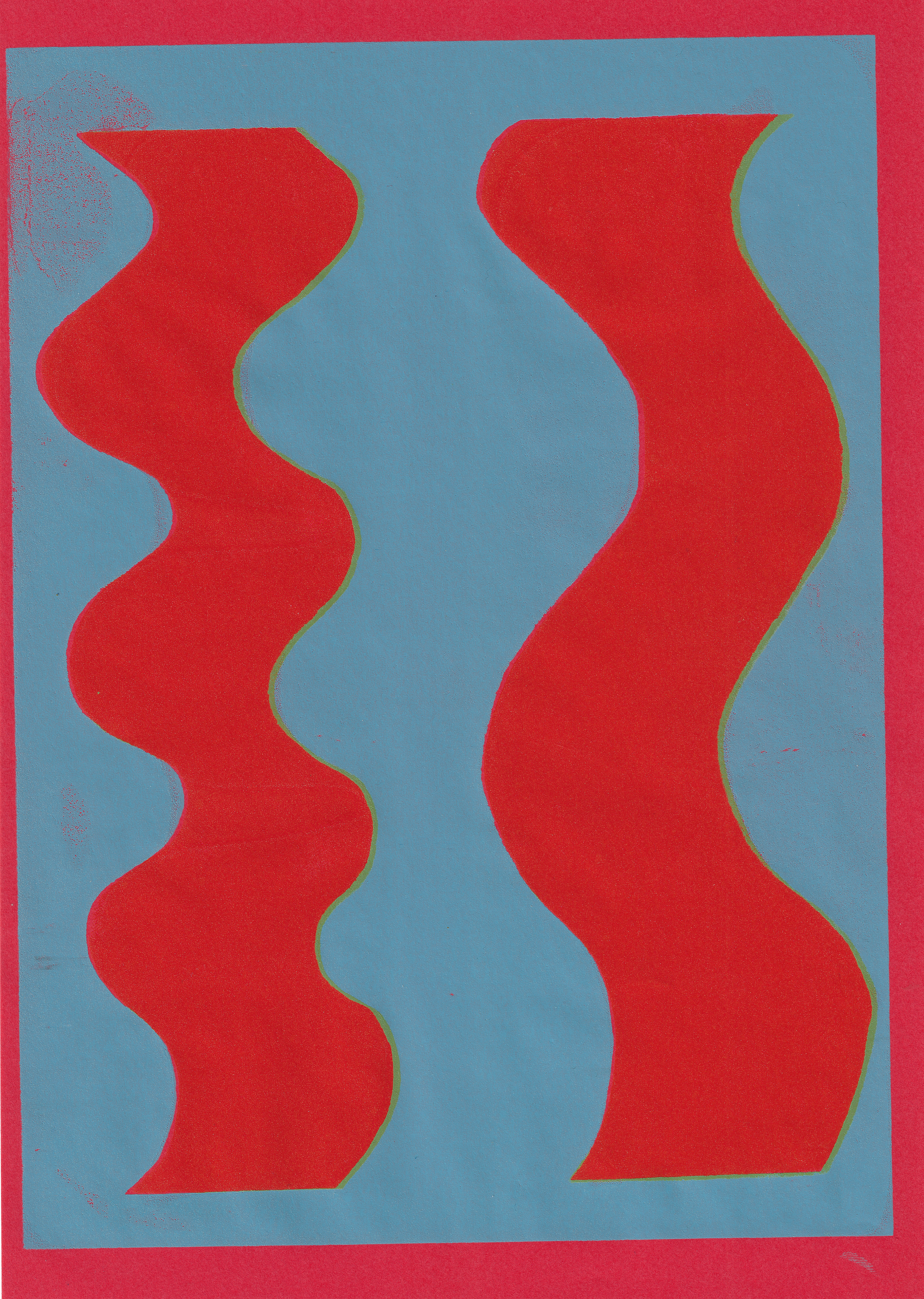
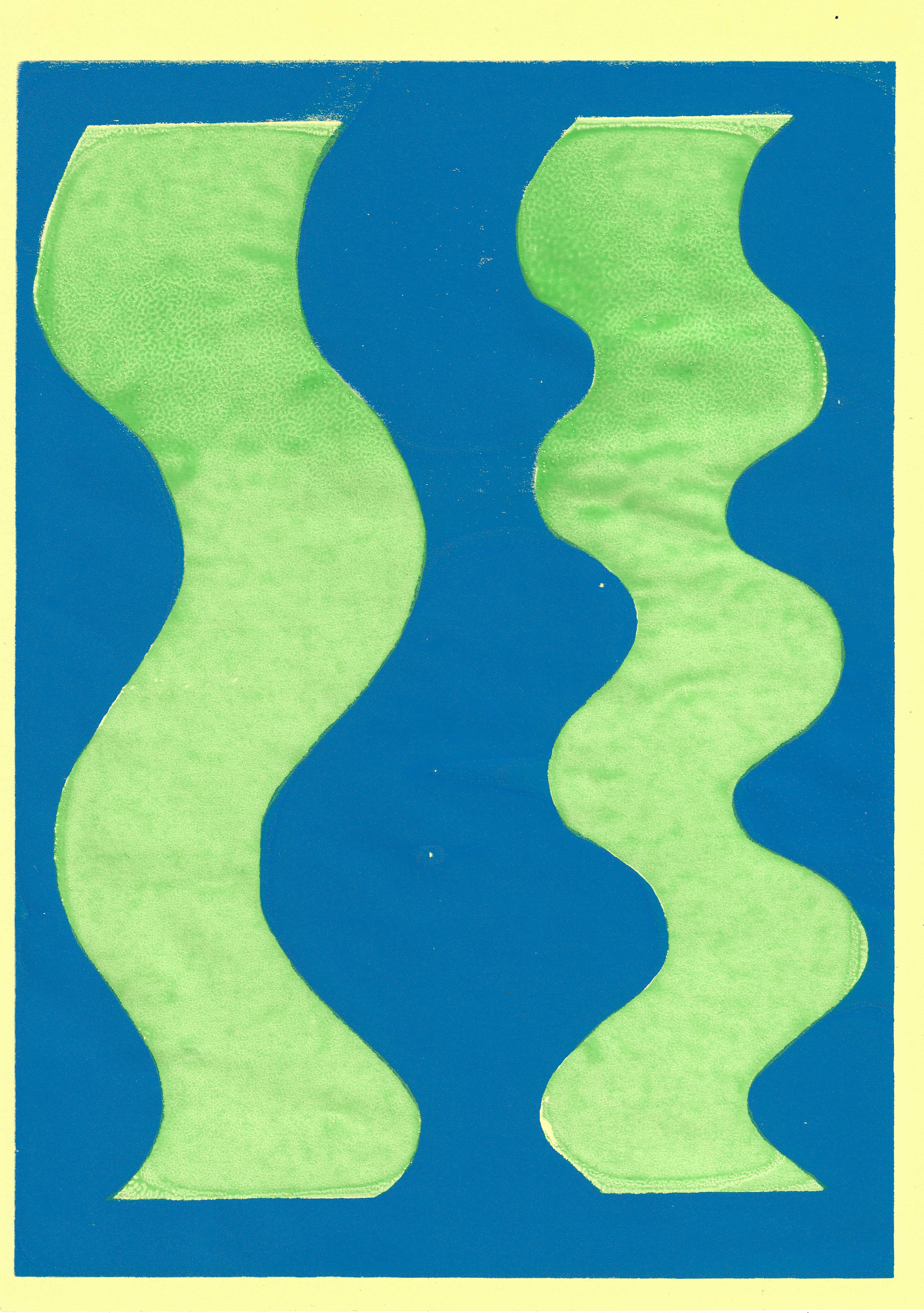
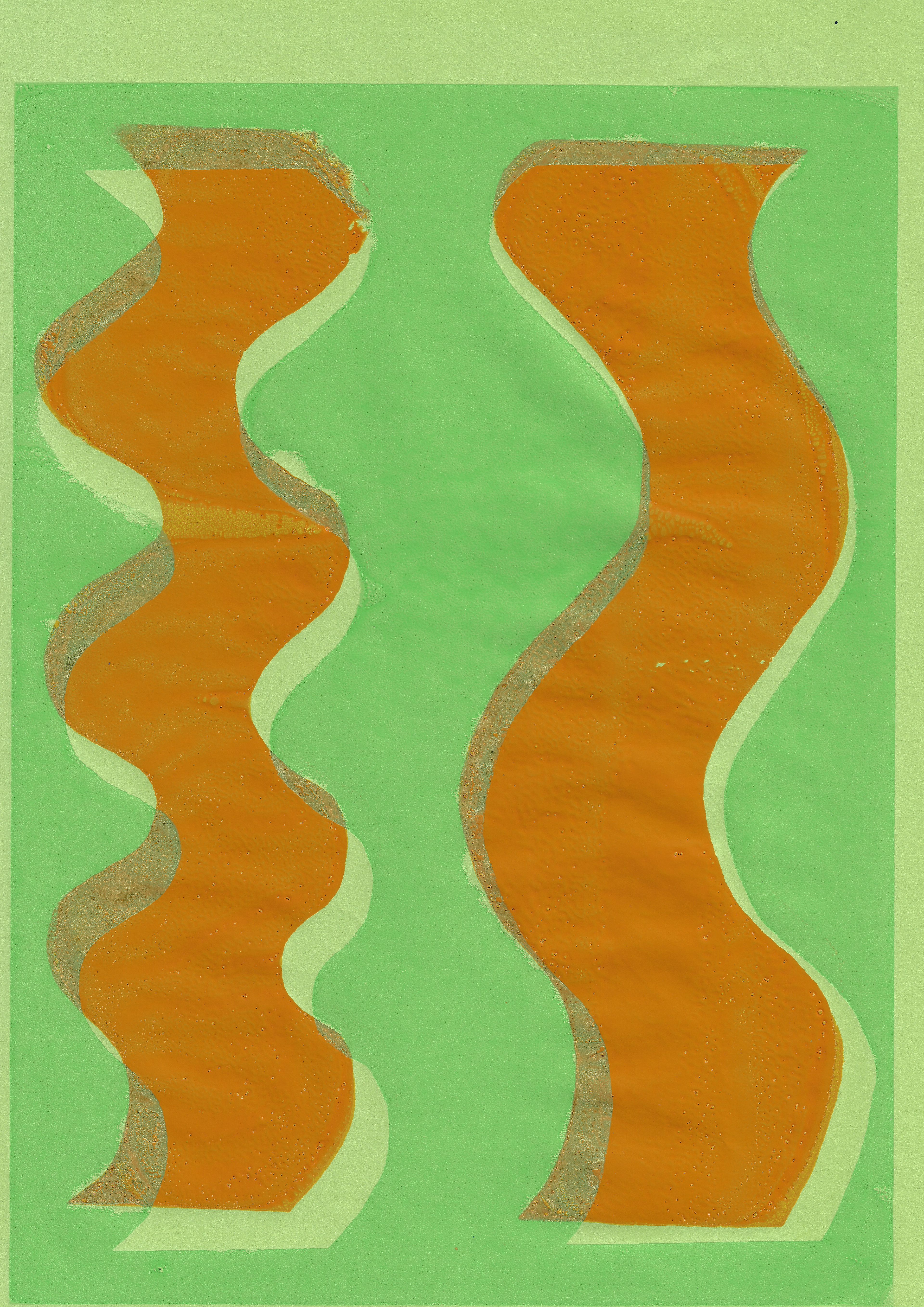
My focus in unit 2 has largely been on the use of line within my work. There are distinct parallels between my own practice and with the work of Kelly and Matisse in their use of line. Labrusse outlines that in both Kelly’s and Matisse’s work, the line fundamentally dominates and there is an ‘unbroken flow’ in Matisse’s drawings (2002, p.24). My own work creates a rhythmic, flowing line in my drawings through not taking my pen off the paper, to create a continuous flow or by using a sparing number of lines. This means that a large majority of my drawings do not take long to complete; also it reflects my attempt to capture the specific moment and environment. This is similar to Kelly’s line drawings, as Bell asserts that they usually took no longer than 5 minutes to complete (1997, p. 33). By completing the drawing quickly, I become totally absorbed in the subject and moment, much like the drawings of Kelly, as Bell outlines that he drew with his eye fixed to the subject, barely looking away (1997, p. 35). However, I have also done the complete opposite to this, yet still remaining totally absorbed by the subject. I spent a whole day drawing a single rhubarb leaf. It was a good test of patience, yet I did not feel it conveyed the essence that is achieved by using singular, energetic, and rhythmic lines. A large part of the use of line within my work is intuitive, therefore constraints are not necessarily productive.
The lines produced in my observational drawing are recycled and transformed into larger abstract forms. The recycling and repurposing of lines within my work is not necessarily obvious without seeing the whole process. However, it does emulate, as Bell claims, Matisse’s use of line, as he recycled them throughout his work (1997, p.35). In addition, the abstracted form created at the end is a combination of images; it is never just one. This, again, is a similar approach that Matisse took, as de Chassey affirms that Matisse used multiple points of view to emulate reality (2002, p. 55). Yet, by combining multiple images in one, it implies a messy image with a combination of lines. However, this is not the approach I take in producing my work. I produce many drawings of natural matter, so when I come to generate an abstracted image from these, my hand has been trained to move in a particular way. The repeated drawing of nature’s lines means that I am able to reproduce this line accurately and remove it from its context, abstracting it. Both Kelly and Matisse, as de Chassey states, drew thousands of images, so that when the final image was produced the line was right (2002, p. 59). When completing a drawing on a lithographic stone I use a red pencil (as it has no grease content) to draw the outline of the image I am producing. This is so that when I draw the image in a greasy medium I am able to use the red lines to guide me to produce the considered image.
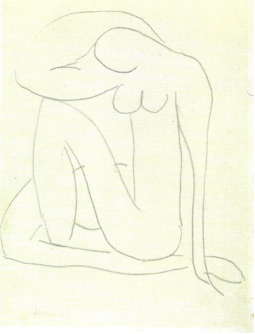
Henri Matisse, Untitled (study for blue nude), ca. 1952, pencil and ink on paper, 27 x 21 cm

Henri Matisse, Untitled (study for blue nude), ca. 1952, pencil and ink on paper, 27 x 21 cm
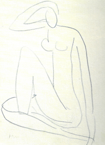
Henri Matisse, Untitled (study for blue nude), ca. 1952, pencil and ink on paper, 27 x 21 cm
Henri Matisse, Untitled (study for blue nude), ca. 1952, pencil and ink on paper, 27 x 21 cm
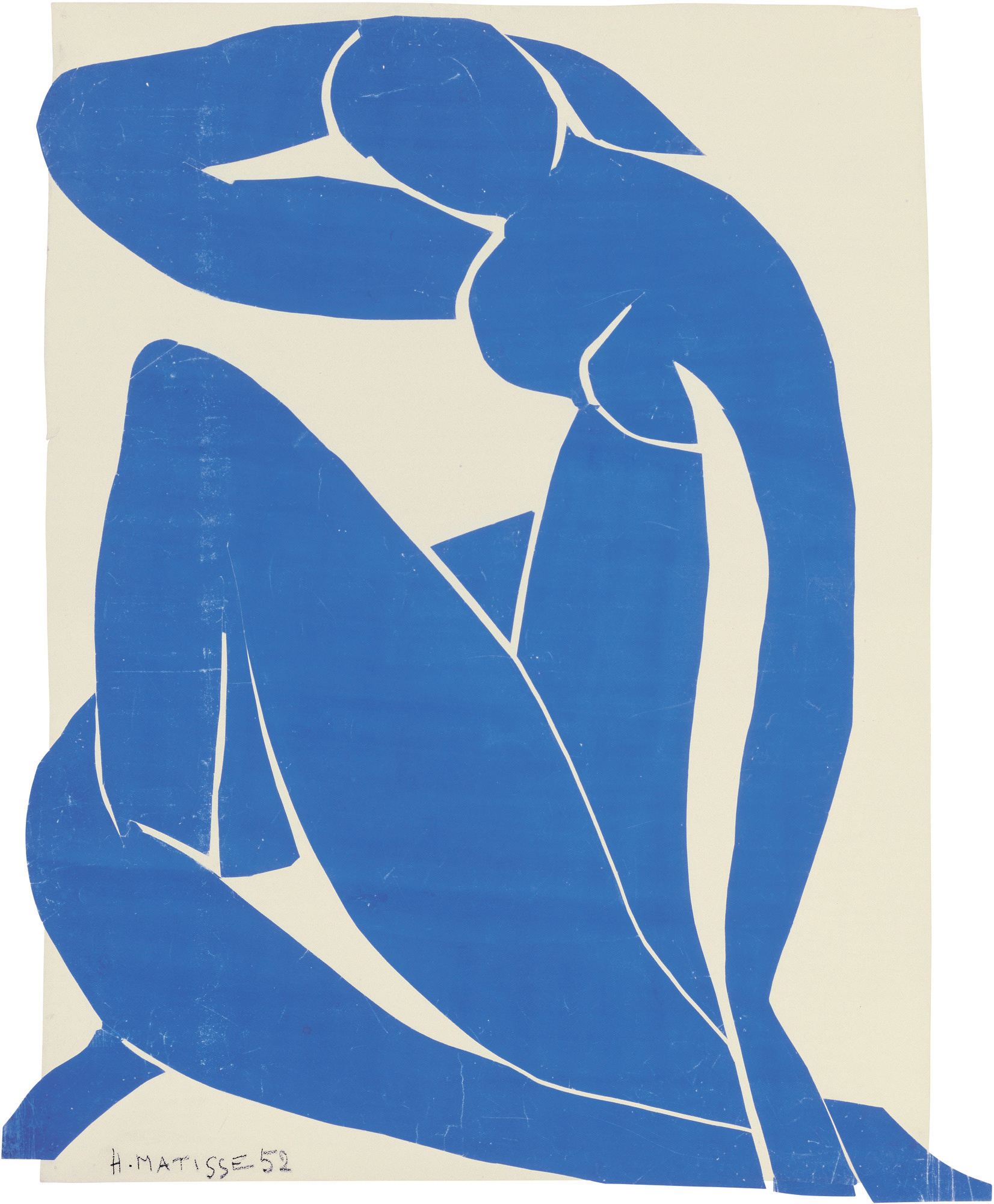
Henri Matisse, Blue Nude II, 1952, gouache on paper cut and pasted on white paper, mounted on canvas, 116.2 x 88.9 cm
Tetsuo Abe, Hotel Regina, Nice, 28 September 1952
More recently in my work I have been considering the sculptural nature of the use of line. The dialogue formed when creating my work is not limited to flat, two dimensional planes. Even hanging my work flatly on the wall prompts a dialogue with the surrounding space as the viewer interacts with the work, by moving closer to look at certain details to then moving back to take the whole image in. The viewer moves around the work as if it was a sculpture. A similar parallel can be drawn with Matisse’s cut-outs as Hauptman states Matisse was ‘creating dimension out of flatness’, whilst still remaining true to the flatness of the paper (2014, p. 195). The ability of flatness to become three dimensional does require the viewer to engage with the work. Waldman argues that shape can be made from just line in Kelly’s plant drawings (1996, p. 31). Yet, this is all dependent on the engagement of the viewer with the work. Presenting an image held flat against the wall prompts a dialogue with its presentation, especially with curved lines, as they stand in contrast to the straight lines of the wall. Ratcliff argues that although curves are separate, they still engage with the wall (1996, p. 59). Hanging my work up in the studio prompts an alternative perspective and most recently I have been pinning shapes I have made and printed, on the wall. The individual relationships between each of the pieces is completely relational and dependent on the surroundings. Hauptman claims that Matisse’s cut-outs become sculptural and relational when pinned on the wall (2014, p. 23). However, this is not true of all my work in this unit, as it is only nearing the end of this unit, that my work has evolved into engaging in a sculptural dialogue. Not all line drawings are sculptural and, according to Bell, Kelly lacked the sculptural presence that Picasso brought to line (1997, p. 36). The three dimensionality of line is enhanced through providing rhythm to the line, whether that is with curved or straight lines.
Through inducing line with rhythm, the line becomes active. It is not static but dynamic. In Klee’s Pedagogical Sketchbook, which was complied from notes on lectures he gave at the Bauhaus, he defines line extensively. According to Klee, the active line moves freely with no goal (1953, p. 16). Yet this can be limited with fixed points (1953, p. 17). With the large majority of the abstract forms there is always a start point and end point defined on the paper or within my mind I have an idea of what the work will loosely look like at the end. Thus, in effect these are my fixed points and the line, which is controlled by my hand, and my subconscious, moves freely inbetween these fixed points. De Bruyn argues that the active line is the most abstract, as it exists beyond representational space, yet the medial line responds to a “segmentary” line with marked boundaries (2014, p. 26). As I execute my work with a fixed idea, or as I have drawn the start and end points of the line, I use the medial line which sometimes converts to the abstract line when I draw completely freely.

Klee, P. (1953) Pedagogical Sketchbook, Translated from German and introduction by S. Moholy-Nagy, New York: Frederick A. Praeger, page 6 and 7

Klee, P. (1953) Pedagogical Sketchbook, Translated from German and introduction by S. Moholy-Nagy, New York: Frederick A. Praeger, page 10 and 11.

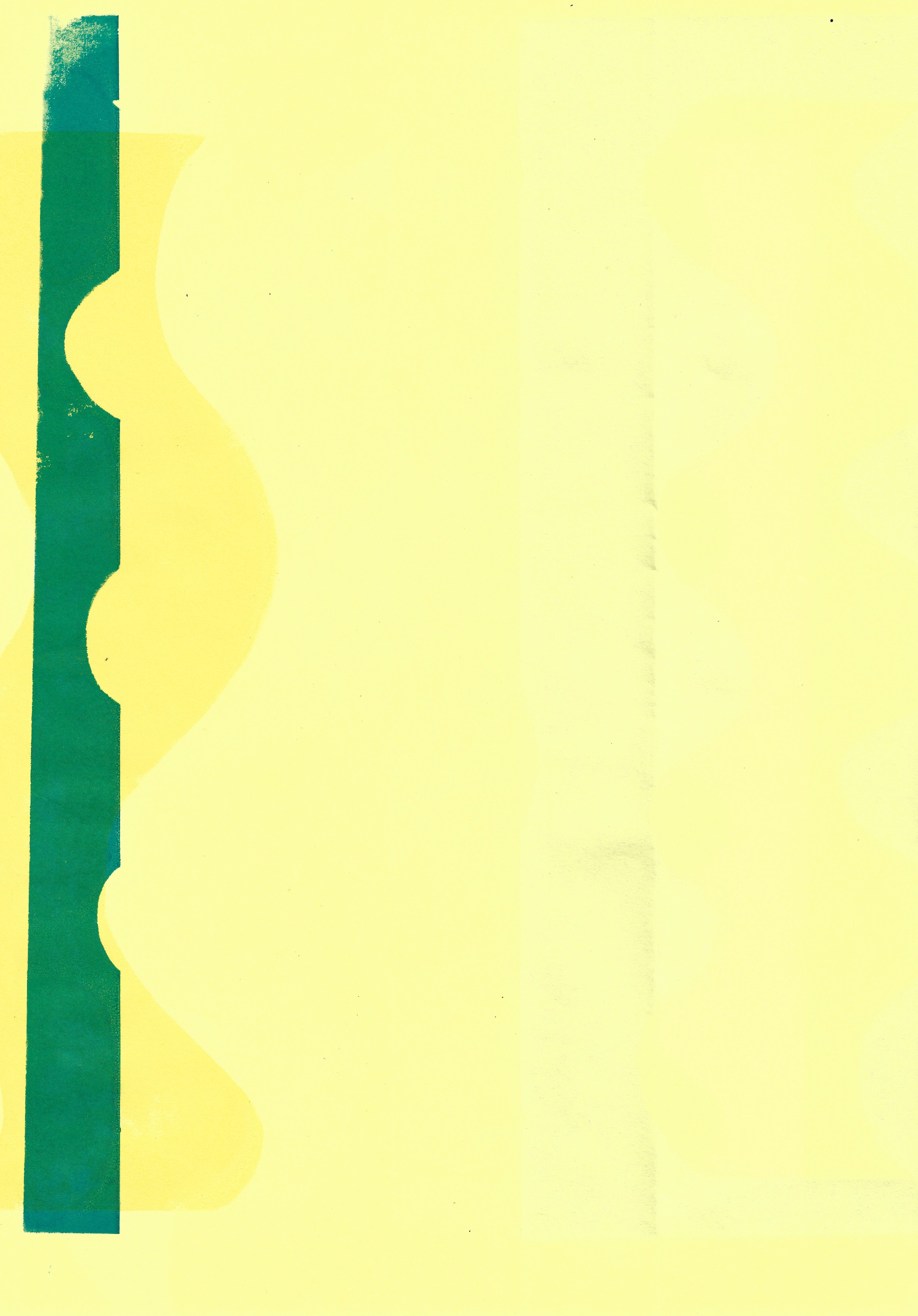
Screenprint on paper, 29.7 x 42 cm
Screenprint on paper, 35 x 50 cm
Screenprint on paper, 76 x 56 cm

Lithograph on paper, 29.7 x 42 cm
Screenprint on paper, 21 x 29.7 cm
Screenprint on paper, 21 x 29.7 cm
Screenprint on paper, 21 x 29.7 cm
Screenprint on paper, 21 x 29.7 cm
Screenprint on paper, 21 x 29.7 cm
Screenprint on paper, 21 x 29.7 cm
Relief print on paper, 21 x 29.7 cm
Screenprint on paper, 21 x 29.7 cm

Relief print on paper, 21 x 29.7 cm
Positive and negative equality
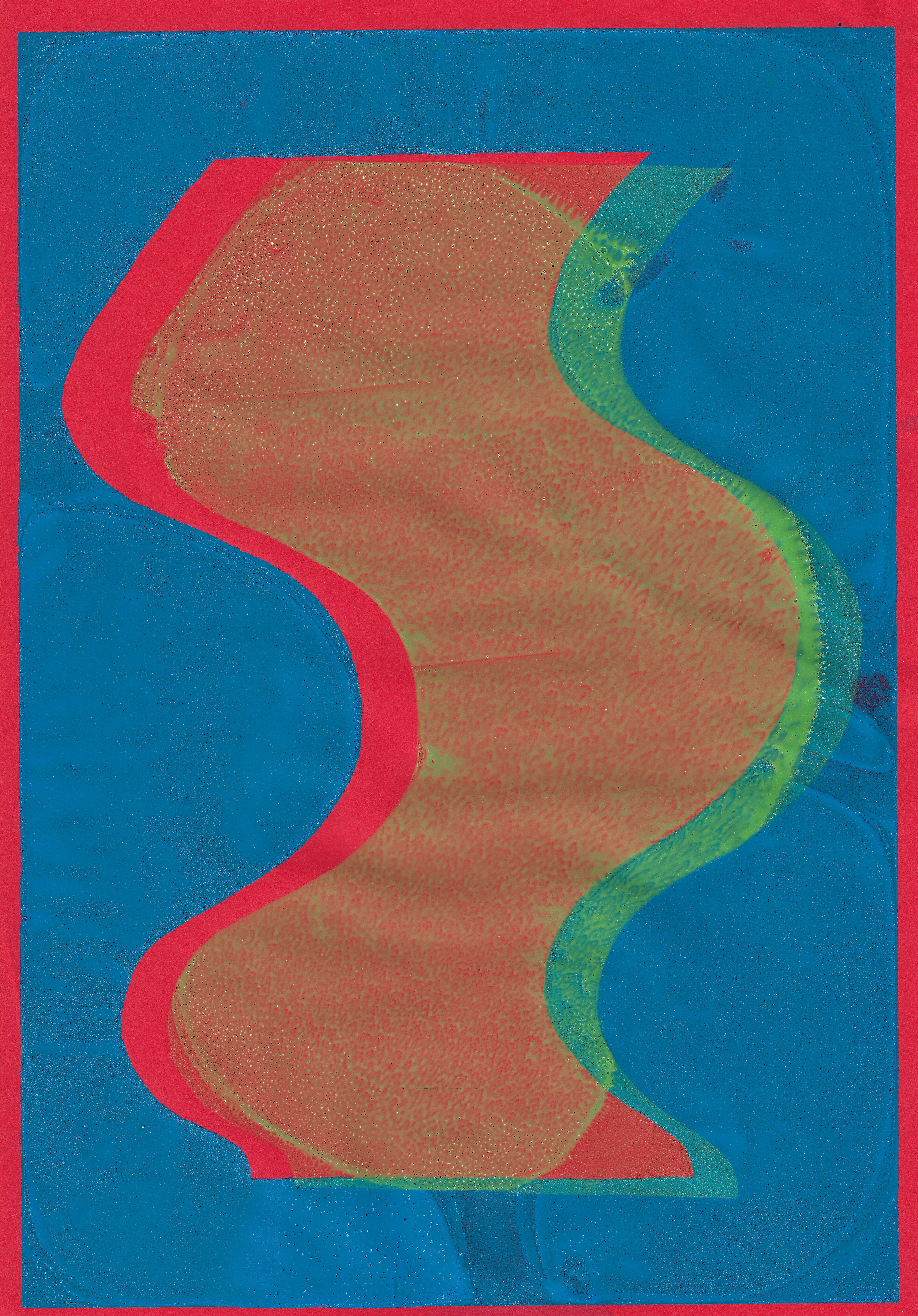
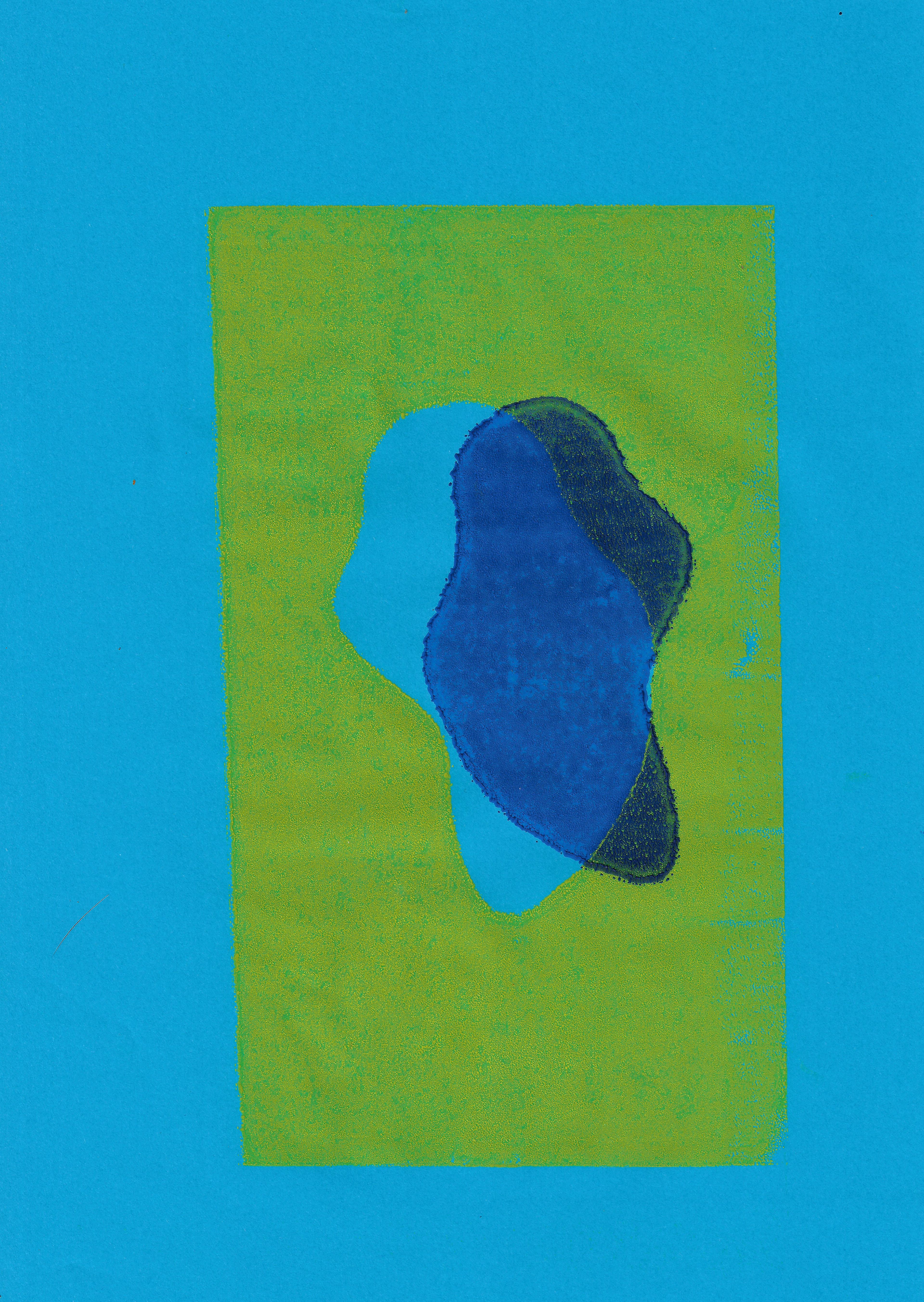
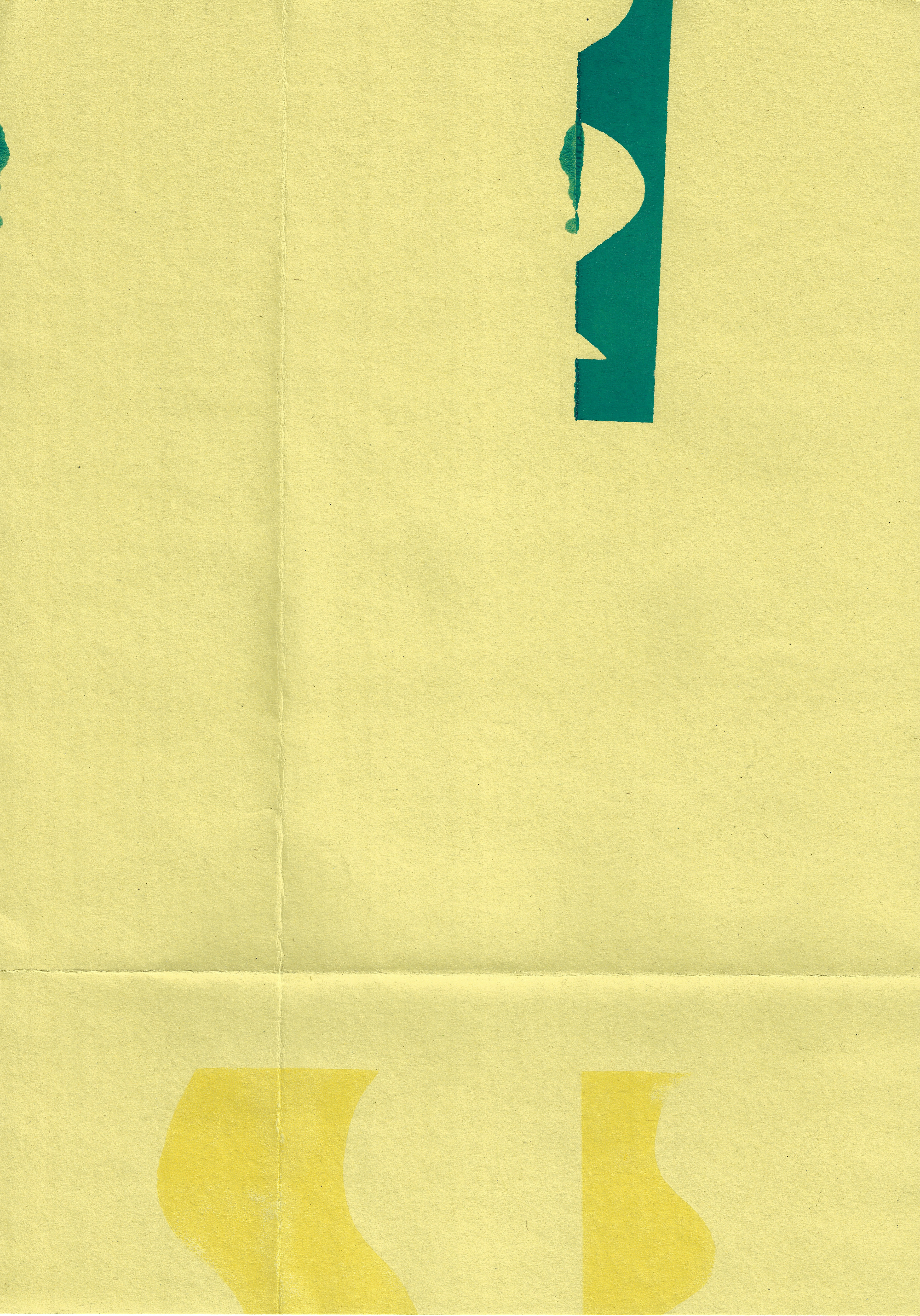
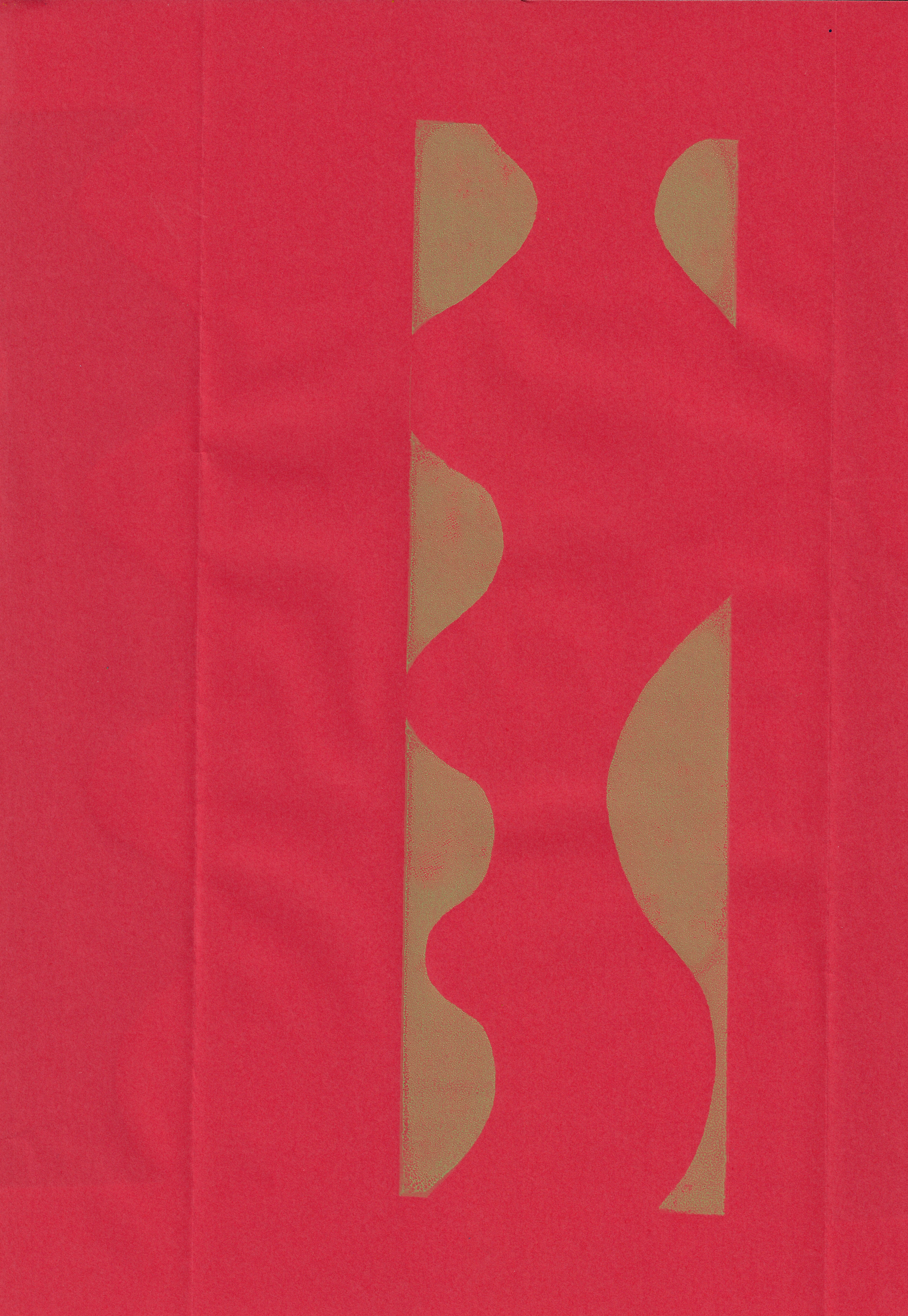
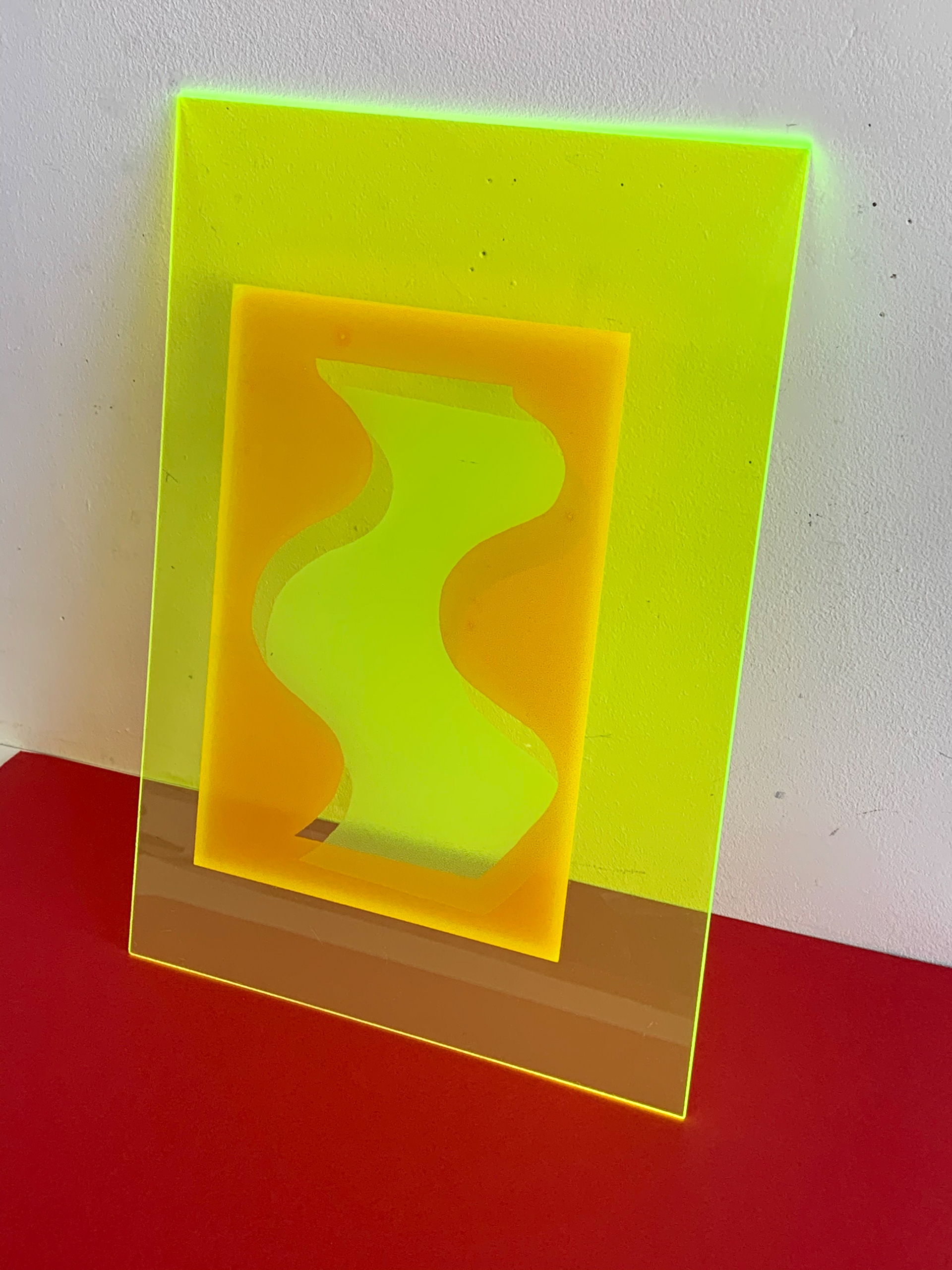
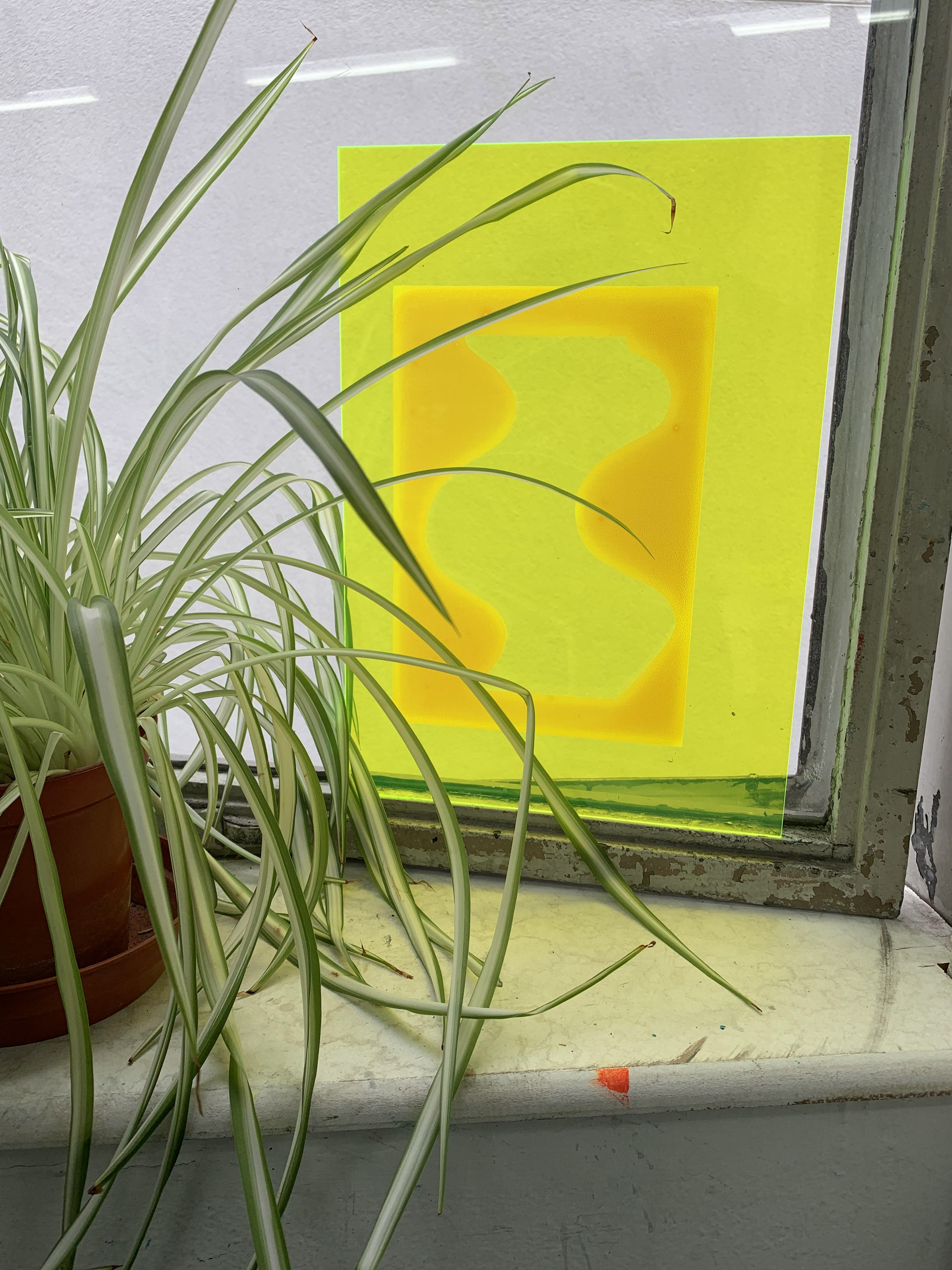
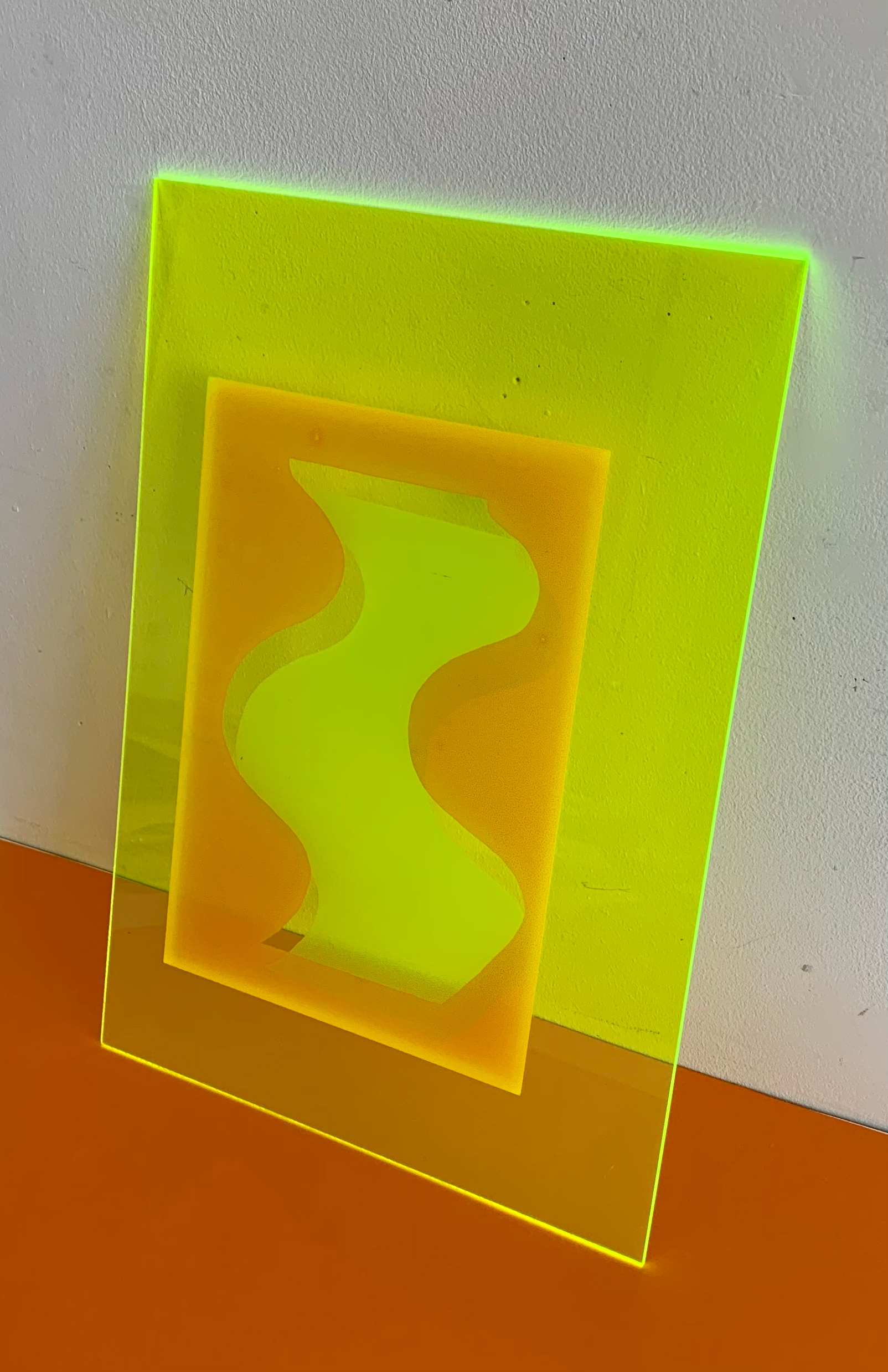
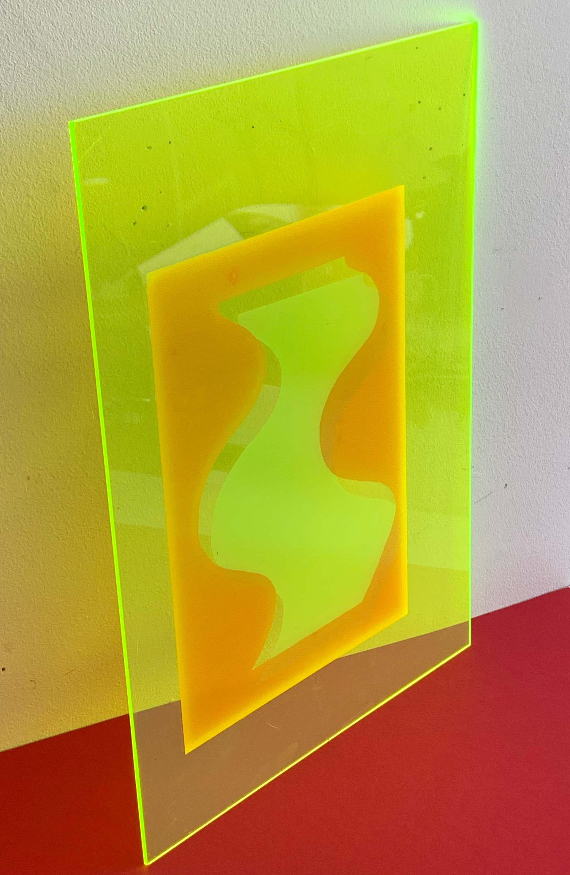
In my practice, I use the positive and the negative of an image equally. The line defines them from one another and provides the cut between the two. The awareness of creating two images in one prompts equality. Labrusse claims that for both Matisse and Kellly line creates an equal importance of all elements in space (2002, p.33). Waldman states that Kelly used the ‘positive and negative space as equal components of the composition’ (1996, p.15). This utilisation of both spaces along with hesitant geometry that is present in Kelly’s drawings, according to Labrusse, embody life (2002, p. 44). Especially when screenprinting, I use the positive and negative of an image, and I slightly offset these from one another and do not entirely align them. This draws attention to the utilisation of the positive and negative in the original image, yet it also creates a third space through the misalignment. By using both spaces equally this creates a different connection between the two, especially when misaligned.
A polar contrast is created through the use of the positive and negative. They are complete opposites of each other. There are two main tensions and contrasts, Barriendos claims, the positive and negative and the active and passive (2017, p. 38). This is applied in different contexts and if this is applied to colour, and opposites are combined, harmony is the result. When any two opposites are combined, harmony is usually the outcome. However, there is a subtle balance between the opposites. Fowler asserts that purity of form is achieved through balance and tension, but also the subtle interrelationships (2005, p. 82).
The most distinctive use of positives and negatives within the same work is by Matisse. Yet, as Hauptman outlines, the term cut-out is flawed, as it’s implying that the part removed is inconsequential (2014, p. 19). However, this is not true when looking at Matisse’s work; he utilised them equally, and they induced rhythm throughout his work. In Matisse’s work Swimming Pool, Hauptman states that he used simplified form and the optical rhythm created by the positives and negatives (2014, p. 197).

Henri Matisse, Violet leaf on orange background, 1947

Screenprint on paper, 29.7 x 42 cm

Reverse of previous screenprint on paper, 29.7 x 42 cm
Screenprint on paper, 29.7 x 42 cm

Reverse of previous screenprint on paper, 29.7 x 42 cm

Screenprint on paper, 21 x 29.7 cm
Reverse of previous Screenprint on paper, 21 x 29.7 cm
Screenprint on paper, 21 x 29.7 cm

Reverse of previous screenprint on paper, 21 x 29.7 cm

Screenprint on paper, 21 x 29.7 cm
Reverse of previous screenprint on paper, 21 x 29.7 cm
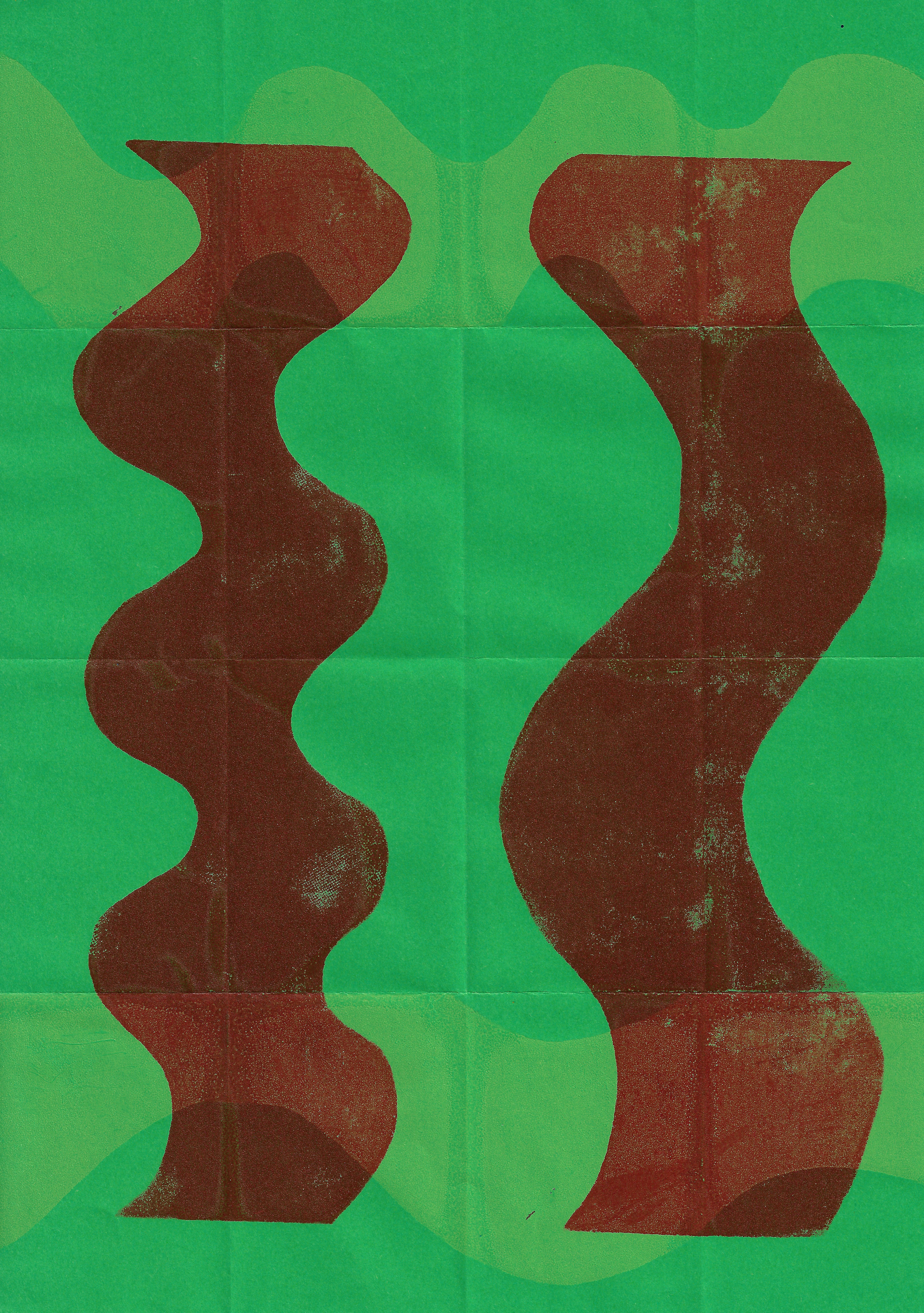
Screenprint on paper, 21 x 29.7 cm

Reverse of previous screenprint on paper, 21 x 29.7 cm
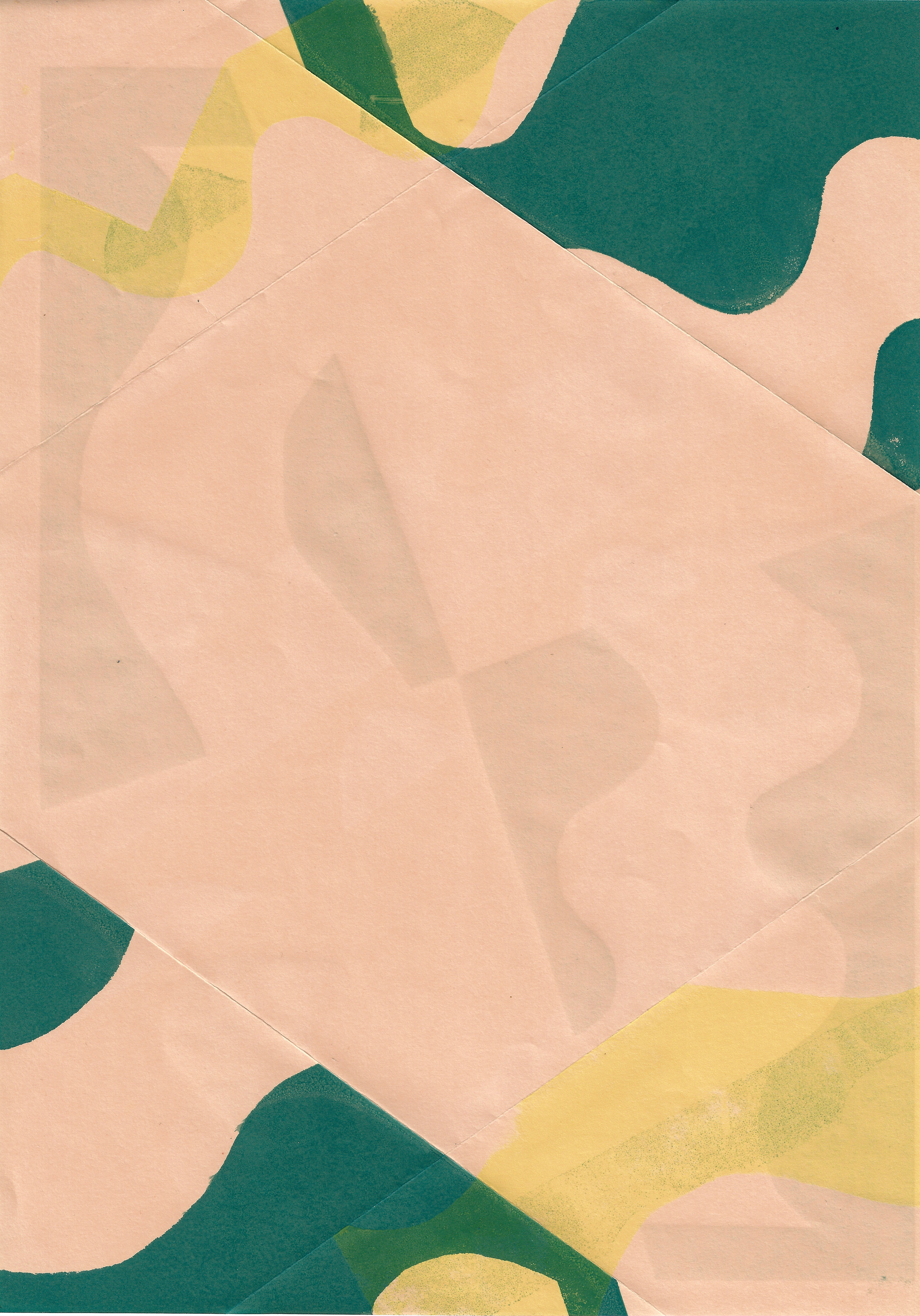
Just like there is emphasis placed on the use of positives and negatives within a work, there should also be equality in the front and reverse side of a two-dimensional work. Even from the Middle Ages, as Thebaut affirms, artists have frequently left traces on both the front and back of a work, suggesting they are deeply intertwined (2021, p. 223). Also, Mills claims that in Bosch’s polyptych, Visions of Hereafter, the back of the panels should be treated as fronts (2021, p. 131). In my practical work I have not only been using both the positive and negative in the same image but using the front and reverse of a piece of paper equally. There is no prescribed way for the viewer to engage with the work. This only becomes an issue when displaying two-dimensional work of this manner and then the artist is forced to choose one side over another, or the work is set away from the wall, free standing.
Scale
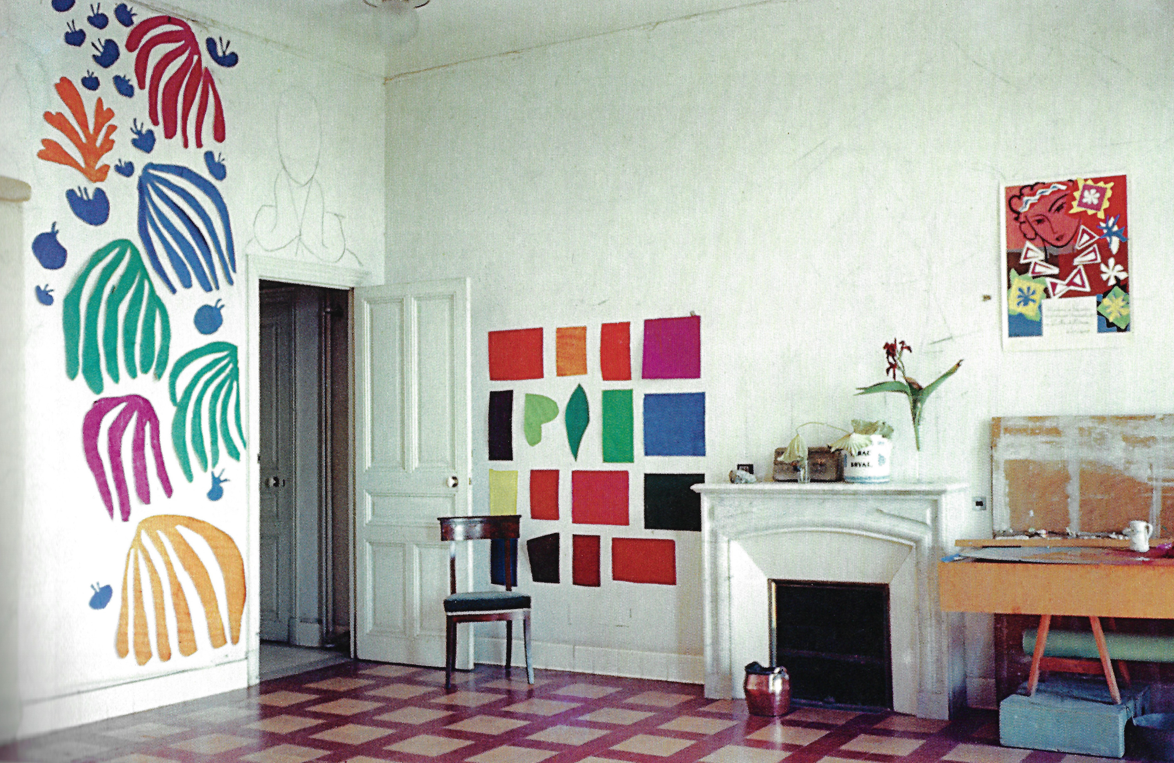
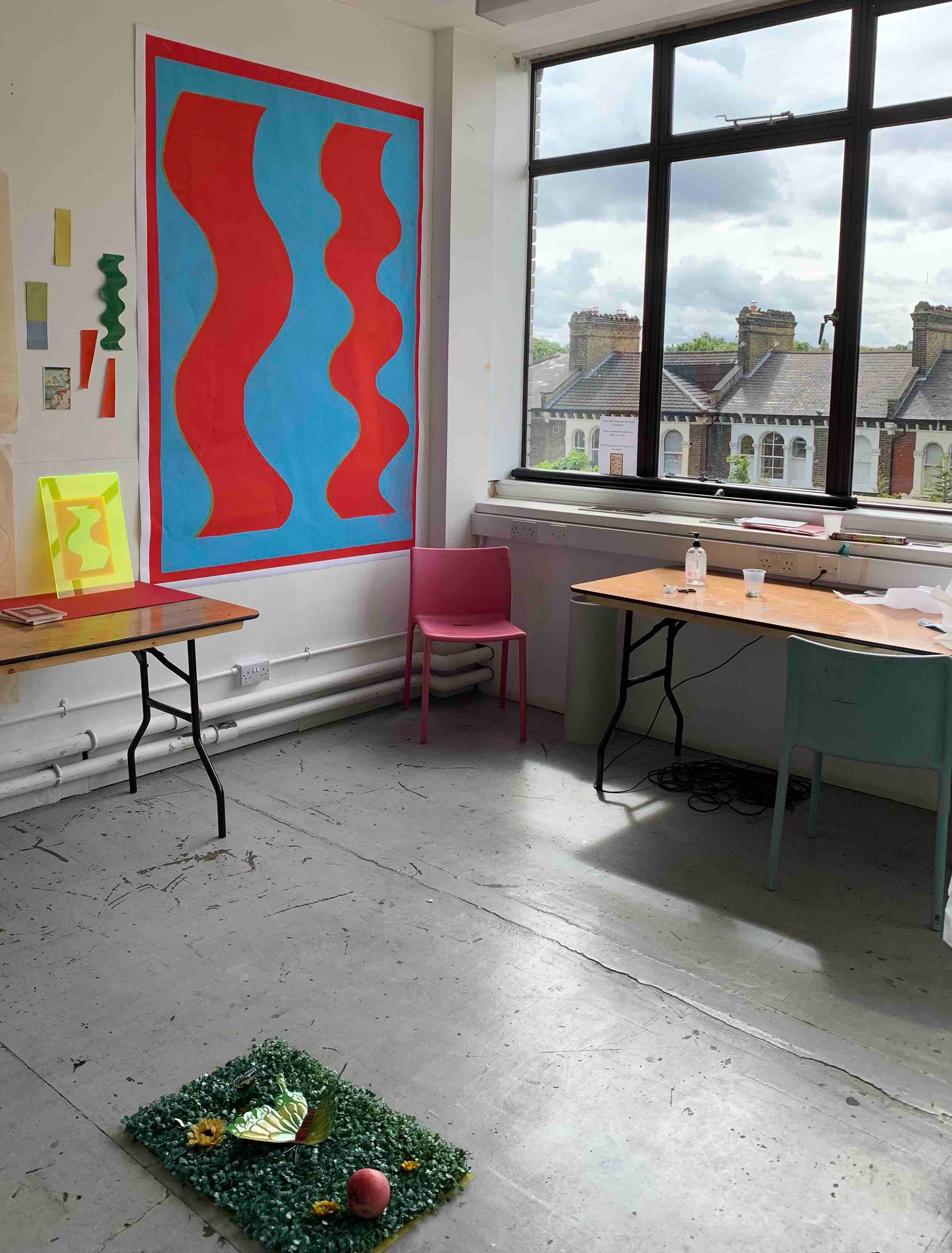
Scale is an important consideration and should never be overlooked in relation to my work. I have been upscaling screenprints massively to prompt dialogues with the viewer’s body. I am not just concerned with the eyes of the viewer, but the whole of their body in engagement with my work. By upscaling my work, the viewer is not just confined to one viewing position. Matisse’s cut-outs, Hauptman claims, created an uncertain viewing position (2014, p. 197). Moving closer and further away; moving closer to focus on details of the print, emphasising the materiality and process. Then moving further away to consider the lines and form as a whole image. The viewer moves around the work and does not just stand in one position. More recently I have been in the process of upscaling individual pieces, to then be displayed together. In The Chapelle du Rosaire de Vence, which was decorated by Matisse, Frigeri states that the different components of the chapel were not treated separately but as a whole (2014, p. 153). The pieces are not conventionally all in one material with a background but they are separate, thus still prompting a dialogue. When there are multiple detached pieces, this emphasises how the viewer moves to different positions to consider each piece, but then the work is still considered as a whole.

The interior of the chapel with the altar and the Tree of Life stained-glass window. From 'Matisse Venue La Chapelle due Rosaire. Photo: Maries-Therese Pulvenis de Seligny
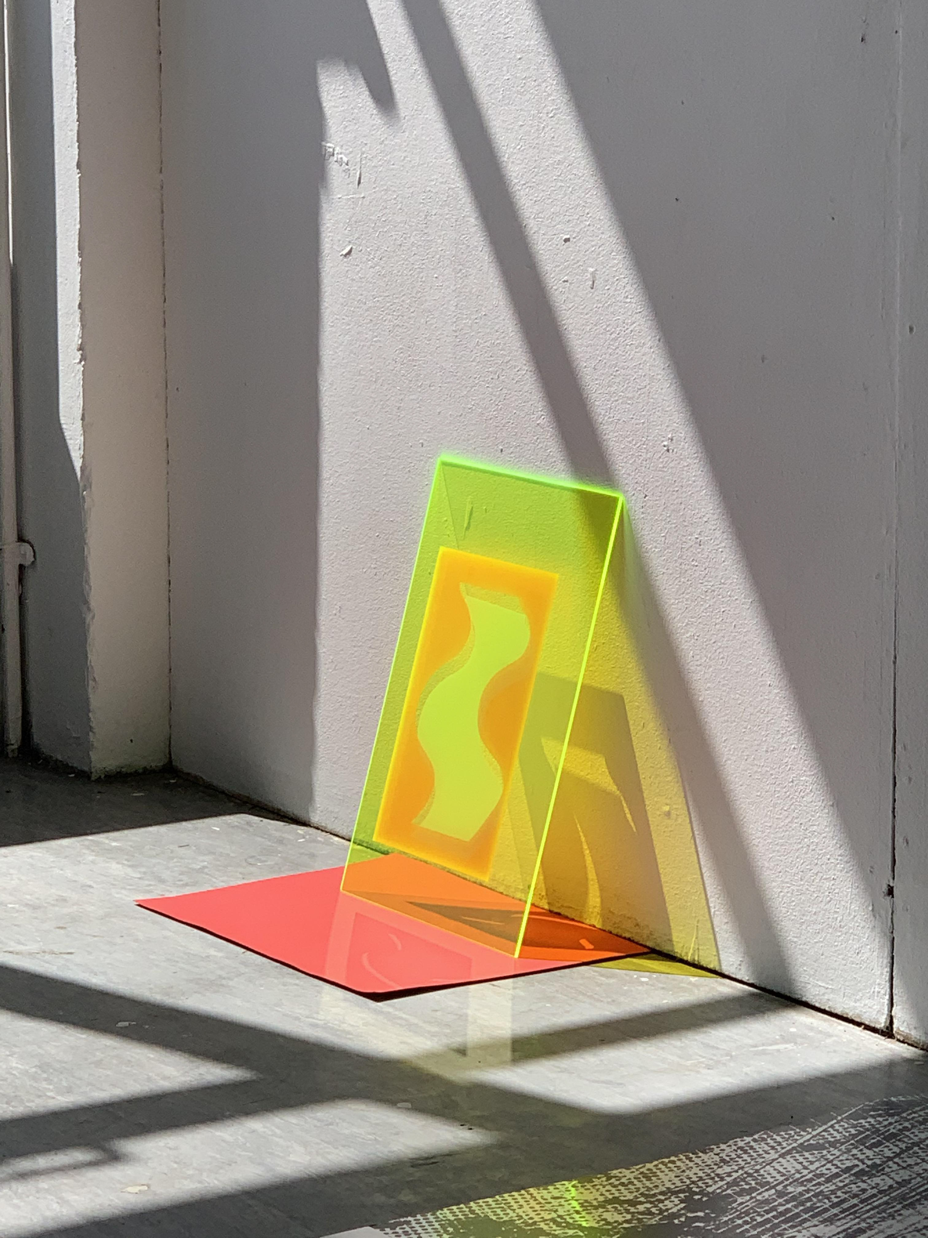
The viewer moves, subconsciously and rhythmically around the work. However, this does not just apply to larger work. The screen-printed image on the fluorescent acrylic was only a3 in size. Although I would have printed this much larger, if I had the opportunity (and money was not an obstacle), it is still effective in creating a response from the viewer. The responses received are different to those expected if it was a different size. Waldman outlines that colour relationships are altered dramatically when increasing, or decreasing the scale (1996, p. 24). Everything about the image changes when displayed on a different scale as it is all relative. This is not just true of scale, but the light and environment can change the reception of a piece of work just as much. As part of my process when creating a large work, or enlarging a work, a decision is made on the desired effect beforehand so that it is not an unknown or a surprise. Creating the image on a3 fluorescent acrylic was not initially my intention, but once I had found out that a3 was the only accessible size, I intentionally pursued and made the image to scale. I wanted to make the viewer adopt awkward viewing positions once it was displayed on the floor, that was intentional, but also see the relation to the size of the piece. I received feedback for this work in a slient crit and although the responses were not all positive, because of the material and awkward viewing positions, I had still achieved my desired outcome.
I want the viewer to move unconventionally around the work before they express their opinion. The work could not just be ignored or passed by. It required engagement, dependent on the scale, from the viewer for any opinion to be expressed.
Changing the scale of a piece of work is always intentional. The effects this has on the viewer is dependent upon the individual and it is relative. Rosenthal states how the abstract language of Kelly’s work on a large scale creates a ‘transcendent experience’ (1996, p.64), yet this is not prescriptive. The scale of a piece of work only emphasises the individuality in the viewing experience.
Individual viewing relationship
The viewer’s relationship with a piece of work is not prescriptive. Hinkinson claims that there are a multiplicity of interpretations, which are dependent on the environment and experience of the work (2017, p. 28). The piece of work amplifies, as le Fort (2018) argues, the relativity of perception. This allows the viewer to have much more freedom in their perception of the work.


The interpretation and engagement with a piece of work is based upon the viewer’s circumstances in which they view the piece of work. Berger states that the way people look at ‘art’ is affected by a list of assumptions (1972, p. 11). Labrusse claims that seeing and thinking are not separate, even though Kelly and Matisse desired for the mind of the viewer to be empty when encountering the work and to be able to fully appreciate it (2002, p. 30). The work cannot be seen without a context, whether that is provided by the environment or the viewer. What the viewer sees is, as Berger continues, is affected by what we know and believe (1972, p.8). This is invariably forgotten, when creating a piece of work, as the opinion surrounding the creation are usually similar. In that, there are large similarities between the viewers, they grew up in a similar culture, of a similar age and have similar experiences. Thus, the environment in which the work is displayed and how it is displayed will cause a difference in opinion and this is chosen, individually, by the artist. As the feedback I received from the silent crit highlighted, there are very different opinions on how something should be displayed, and there is no right or wrong answer. However, the decision that is made on how the work is displayed, emphasises the individuality of the artist.
The viewer can, arguably, be nudged gently to have loosely, similar responses compared to each other. There are biological similarities that mean, as a human race, we respond to stimuli in a similar way. Darvas argues that when imperfection of symmetry is visible, then the sense organs of the viewer will make the correction unconsciously (2001, p. 148). Also as Hargittai outlines there is a general sense that inhabitants of urban areas, who have geometric surroundings, desire natural art. Whereas inhabitants of rural areas, who have natural surroundings, have a preference for geometric forms (2001, p. 293). Thus in my work I use a combination of curved, organic lines with straight, geometric lines. I grew up in the countryside and moved to the city when I left school. Therefore, I have an equal pull between urban and rural, meaning there is a mixture in the use of line in my work.
Although circumstances have dramatically changed since the Middle Ages, there are similarities in the construction of an opinion by the viewer. When looking at a piece of work, the viewer starts to think unconsciously, even if they do not like what they see, they still think about it. Imagination, or simply just even thought, is required and always present when confronted with a piece of work. Mills argues that in the Medieval period, imagination was required to configure abstract shapes, as aids to contemplation (2021, p. 129). The text in an illuminated manuscript provides the context for the viewer to understand the surrounding illuminations. Thus, if abstract illuminations were surrounded by devotional text, then the viewer would assume them to be applied in a religious context. There is a subtle relationship between context and imagination. When encountering medieval illuminations, the response today is undoubtedly different to someone from the context in which it was made. Images are read in a different way. As Touissant argues this requires a new way of reading, which enhances the ornament itself (2021, p. 203).
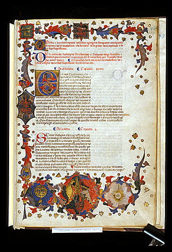
Egerton 2020 f.267 Arms of Jacopo of Padua with illuminate border and initial 'E'
The individual viewing relationship remains individual, there is no set prescribed way to predict how the viewer will respond to a piece of work. The act of looking is a choice, and this cannot be forced. Berger claims that ‘we only see what we look at’ (1972, p.8). Yet, this can be altered, as Ratcliff argues old questions can be posed in new ways (1996, p. 58). Furthermore, Ratcliff claims that there is always a literal immediacy of a piece of work, in which similarities can be drawn, but then this opens onto depths (1996, p. 60). The degree to how far these depths reach is dependent upon the individual.
Pen on paper, 21 x 29.7 cm

Collagraph on paper, 29.7 x 42 cm
Screenprint on paper, 29.7 x 42 cm
Lines of nature
One of the core ideas, which has been a fundamental basis for my work in this unit, is the translation of the lines of nature. Initially, this is in the form of an observational drawing but then developing this into larger abstract work. Throughout this unit of work, and in my practice, I always return to observational plant drawing. Kelly and Matisse, as Labrusse outlines, also returned to plant drawings throughout their careers (2002, p.17).
Geometry is one of the oldest branches of mathematics and it is concerned with the properties of space that are related with distance, shape, size, and the relative position of figures. However, symmetry has different definitions, depending on the context. In relation to geometry, an object possesses symmetry if there is a transformation which maps the object onto itself (it has an invariance under a transformation). Alternatively, in everyday language it can refer to a sense of harmonious proportion and balance. There is a reference present within nature, but this is often not accurate or distorted, much like in my work. I refer to both geometry and symmetry in the sense that I am not adhering to them, or I am distorting their presence by not being completely accurate. Look (1914) asserts that there is a degree of mathematical orderliness in every part of nature. Even without intentionally referencing the mathematical systems present in nature, they are recognisable. Darvas claims that objects in our surroundings equally show symmetry and lack of symmetry at the same time (2001, p. 136). There are two sides to the same coin. There is a refusal to be defined, as either one or the other, as this is limiting. Kelly, as Waldman argues, refused to be confined to either symmetrical or asymmetrical organisation (1996, p. 18). Similarly with my practice, I want to be defined by neither, my work does not fit in either camp, there is a blurred line. Taylor outlines that geometrical forms used by abstract artists do not necessarily indicate “a conscious and intellectual mathematical approach” (2005, p. 71). The artist does not have to be deeply aware of the mathematical rules and definitions when referencing geometry or symmetry. Much like their presence in nature. De Chassey states that Kelly used plants as a source of relative geometry (2002, p. 68), as they were the most symmetrical of any visible organism (2002, p.74). In my practice, the reference to geometry and symmetry is distorted and not completely accurate. As Darvas claims, this is defined as dissymmetry (2001, p. 143).
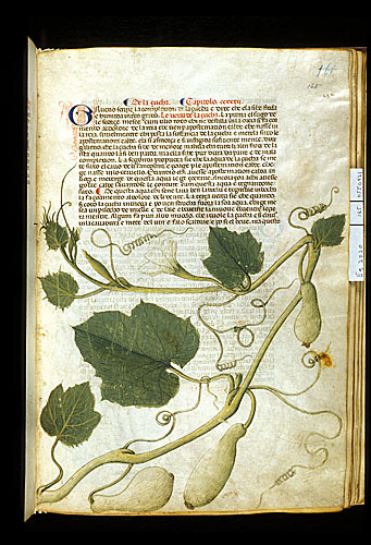
Ms Egerton 2020 f.165 Bottle gourd, Italy, N. (Padua)
When observing nature, it is obvious to see that it does not adhere to a mathematical orderliness. The principles of form and structure in nature are emphasised, as Crowther and Wünsche outline, by the curvilinearity in plant growth (2012, p. 11). Automatically, through growth the plant is adhering to the rules of nature, not mathematical orderliness.
In my practice I focus, mainly, on the line of the plant and its texture, which I also portray through my use of line. As de Chassey outlines, to Kelly, plants are already abstract (2002, p.61). The use of line to express texture from my observations, implies an equal use of both straight and curved lines. Matisse stated, as de Chassey asserts, that curved lines are conscious of vertical lines (2002, p. 69). The use of both within my work, is representative of the tension between the two, as they are aware of each other, yet possess opposite qualities. However, Crowther and Wünsche argue that in organic growth there are only curved lines and not straight (2012, p. 15). Technically, this is accurate, but also no line is ever straight. The line can only appear to be straight to the untrained, naked eye. In my work, I chose to use hand drawn abstract shapes, rather than using computer generated, mathematically correct, drawn shapes. To the viewer, they look symmetrical and geometric, but on close inspection they are not. They are drawn by hand, and this is only evident when looking closely. In 1936, as Crowther and Wünsche claim, Alfred Barr stated that curved and straight lines are not opposite, but ‘different sides of one and the same reality’ (2012, p. 25). They are closely related, and reference each other through their existence.
Not only do I observe the use of line in nature but I also observe form. Form is defined by line; there is a dependent relationship. Waldman states that Kelly had a ‘vocabulary of forms derived from nature’ (1996, p. 34). Also, Klee asserts that his use of form is derivative from nature (1953, p. 7). The definition of form within my work is completely derived from nature, as this is where my primary research is conducted. However, I am subconsciously influenced by the use of natural form in medieval manuscripts, which is also based on observation. Yet, from a completely different context although centuries apart and the plants are different, there is still a similar approach to observing nature, in providing visual material.

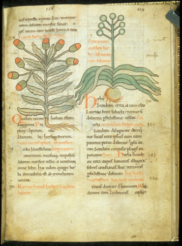
Ms Harley 1585 ff. 22v -23 Plants, Netherlands
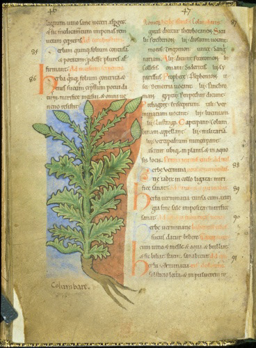
Ms Harley 1585 f.18v Plant, Netherlands
In terms of process, in relation to the physicality of translating my observations of natural forms in my work I tend to use a sparing number of lines when drawing from observation, although this is not true of all my observational drawings. Axsom, claims that this approach was similar to Kelly, as he drew as much as he could with the fewest lines possible (2005, p.17). In the hard ground etching plate I am currently in the process of finishing, I tilt the needle and attempt to create different widths of line. Stomberg outlines that Matisse tilted his pen to make wide marks, evoking space, and volume in his drawings (2015, p.15). The use of different types of line is suggestive of sculptural properties.
Relationship between observational drawing of natural matter and larger abstract work
The relationship between my observations of natural matter and the larger abstract forms I produce is a defining feature of my practice. Fowler outlines a key theme which is also true of my work, that abstract artists usually reflect their environments (2005, p. 74). There is a clear relationship and influence between my observational drawings and my abstract work. This is, however, relative. Axsom claims that Kelly’s drawings are related to his abstract work (2005, p. 12) even though initially this is not noticeable to the viewer without seeing the work in context. I reflect my engagement with my environment through my work. Hinkinson claims that abstract formal relationships must be loosely tethered to some observable realities (2017, p. 27). Even, abstraction, as Cullinan affirms, is rooted in reality (2014, p. 233). Axsom states that Kelly’s abstractions come from his perceptions of the world (2005, p. 12) and it is through this conversion that the individuality of the artist is noticeable. The original environment which my work is built upon is not immediately recognisable when looking at just my work, with no context. Much like my work in the last unit, I struggle to express my work in words, as I do not feel they are comparable. It is a purely visual experience. Much like in Matisse’s and Kelly’s work, Labrusse states that language is inadequate (2002, p. 29). Byatt similarly argues in relation to Heron’s work that it cannot be simply reduced to words (1998, p. 13).
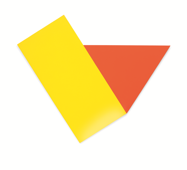
Ellsworth Kelly, Yellow with Red Triangle, 1973, oil on canvas, 2 joined panels, 302.3 x 369.6 cm
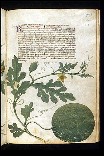
Ms Egerton 2020 f.146 Melon, Italy, N. (Padua)
Ms Harley 1585 f.39 Plants, Netherlands
A big part of my work in this unit has been centred around my use and observation of medieval illuminated herbal or botanical manuscripts. Undoubtedly, the material is viewed differently today than when it was first created, as Berger outlines (1972, p.16). It is a complete change of circumstance, yet as Mills claims ‘objects of the past seemingly transcend the time of their creation’ (2021, p.123). The interest in them still remains, just for different reasons. The abstract qualities of the illuminations emphasise Touissant’s claim, that abstraction is intrinsic to all art (2021, p. 191). A large majority of images from the Medieval period accompany words. McCall emphasises how the abstract forms communicate multiple levels of meaning much more effectively (2021, p. 300). The conversion of the influence of Medieval illuminations in my work is not always obvious. Many of the artists that have been a useful contextual reference for this unit also share a similar influence with referencing older work. Labrusse claims that Kelly used Russian icons, as did Matisse, along with Byzantine art as inspiration in his work (2002, p.30). However, Hinkinson outlines that, although pre-Columbian monuments and artifacts had a profound effect on Alber’s work (2017, p. 15) he did not want to directly link it, as it would constrain the perceptual freedom, (2017, p. 26) so there were no literal references (2017, p. 17). This is similar to my way of thinking and process. There is no requirement for a direct reference; Crowther and Wünsche emphasise how exploration of the natural world is an important influence, yet there is no need to represent it directly (2012, p. 9). I am not bound to explicitly reference my exploration of medieval illuminated manuscripts in my work. Yet, undoubtedly it would have subconsciously influenced my decisions.
The material I have visually surrounded and exposed myself with in this unit has not been explicitly referenced. Instead, it has shown its influence through my making; through my use of line and various combinations but also my subconscious decisions. Frigeri affirms that the spontaneity of Matisse’s work in The Chapelle du Rosaire de Vence was crucial to its success (2014, p. 159). Intuition and spontaneity are an important part of my process, to express the individuality of my work. Waldman claims that, Kelly, Newman, and Rothko relied heavily upon intuition when making decisions (1996, p. 12). Similarly, Gayford states that Heron relied heavily upon impulse (1998, p. 42). There is a non-thinking or unspoken component to my work.
Moving forward
Moving into the next unit of work, I will focus on form. Each of the three units during the course have focused on a different element: colour, line and finally form. I will continue to use natural forms as the basis for my work, with observational drawing dominating as my initial starting point. I want colour, line and form to work in unison, complementing and emphasising each other whilst also experimenting with the viewer’s position and relation to my work. Labrusse claims how shapes and line interact in Matisse’s work (2002, p. 31). The interaction between the three elements: colour, line and form, will be my main focus. All of my material will come from reality, but then translated individualistically by myself. Waldman states that ‘it is Kelly’s strength to objectify colour and form and to distil its essence from the world of reality, drawing on human emotion, imagination, and spirit’ (1996, p. 38). This, in essence, provides a contextual point for the direction of my work in the next unit.