A continuation of the chronological development of my work. Click on the image to enlarge the work.


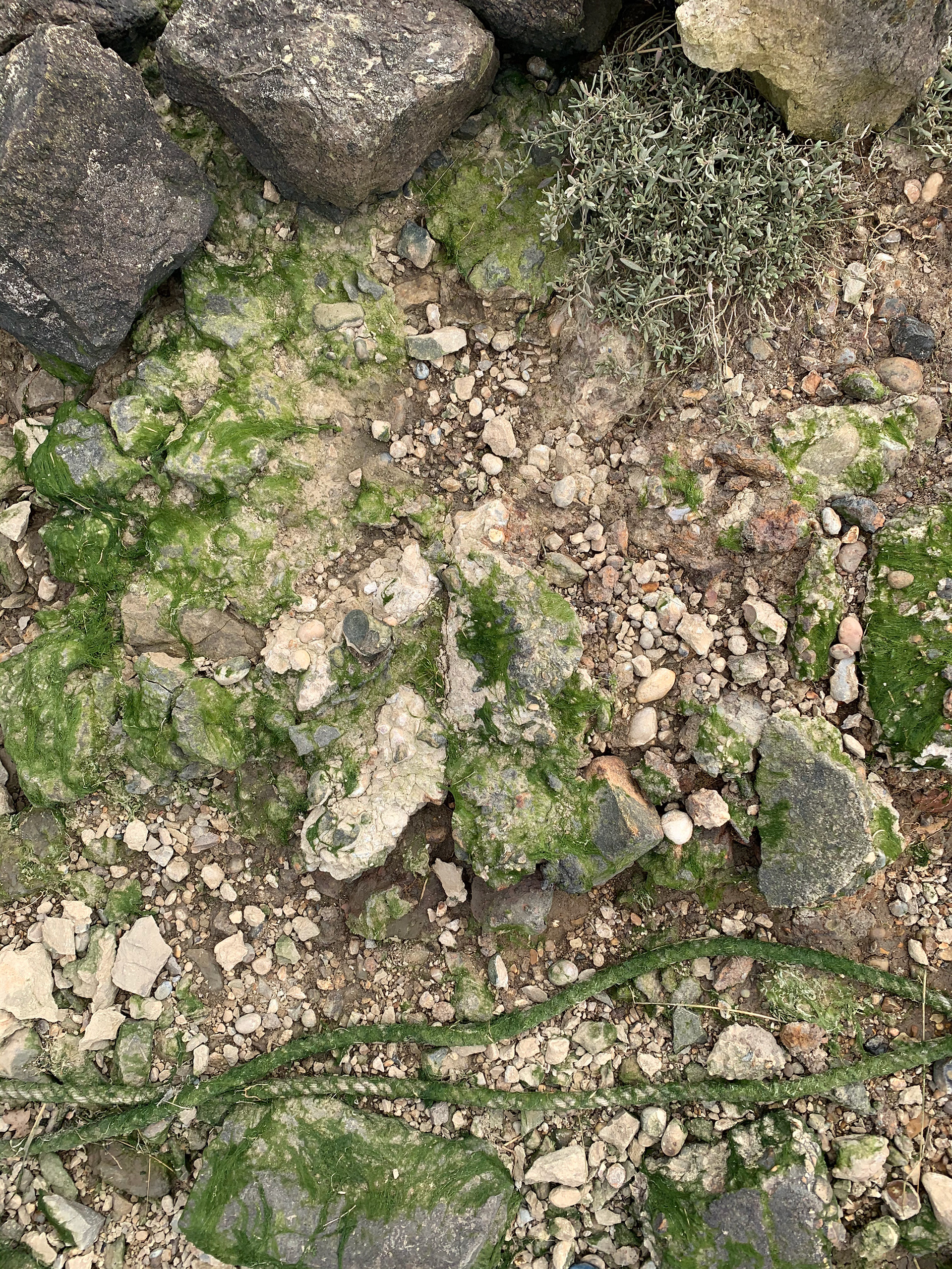
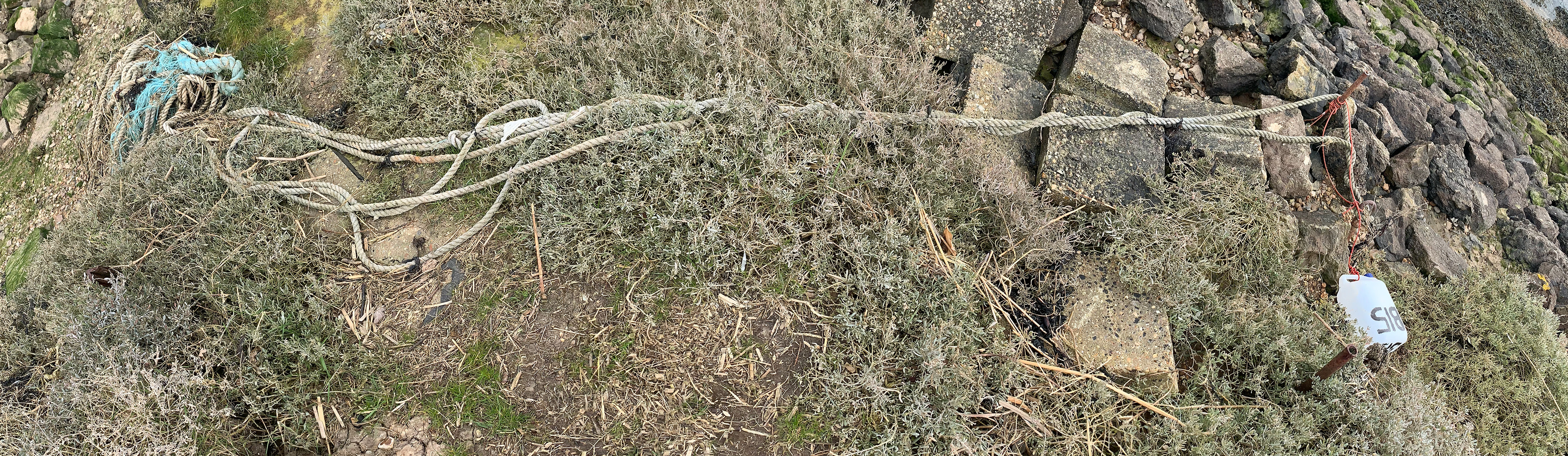
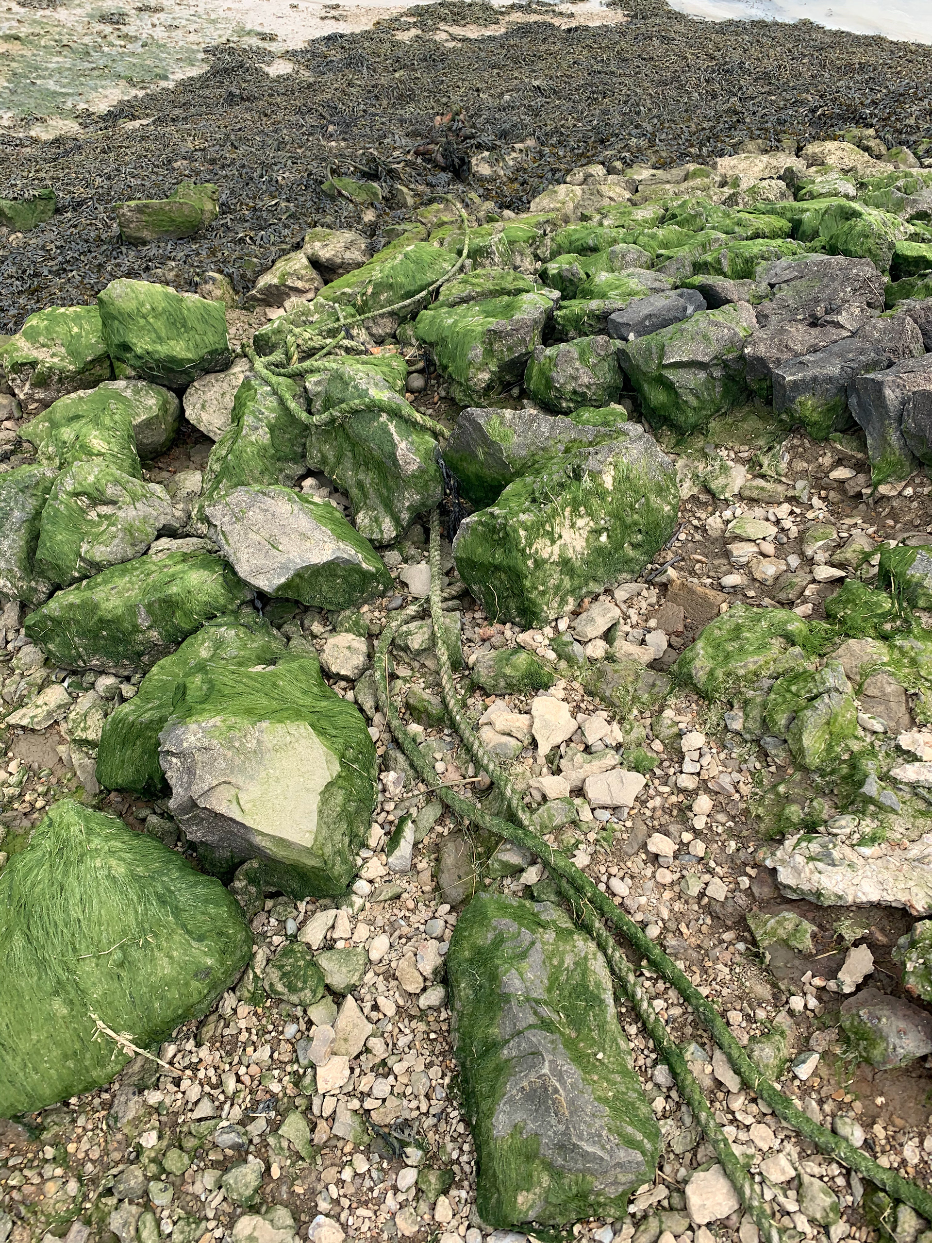
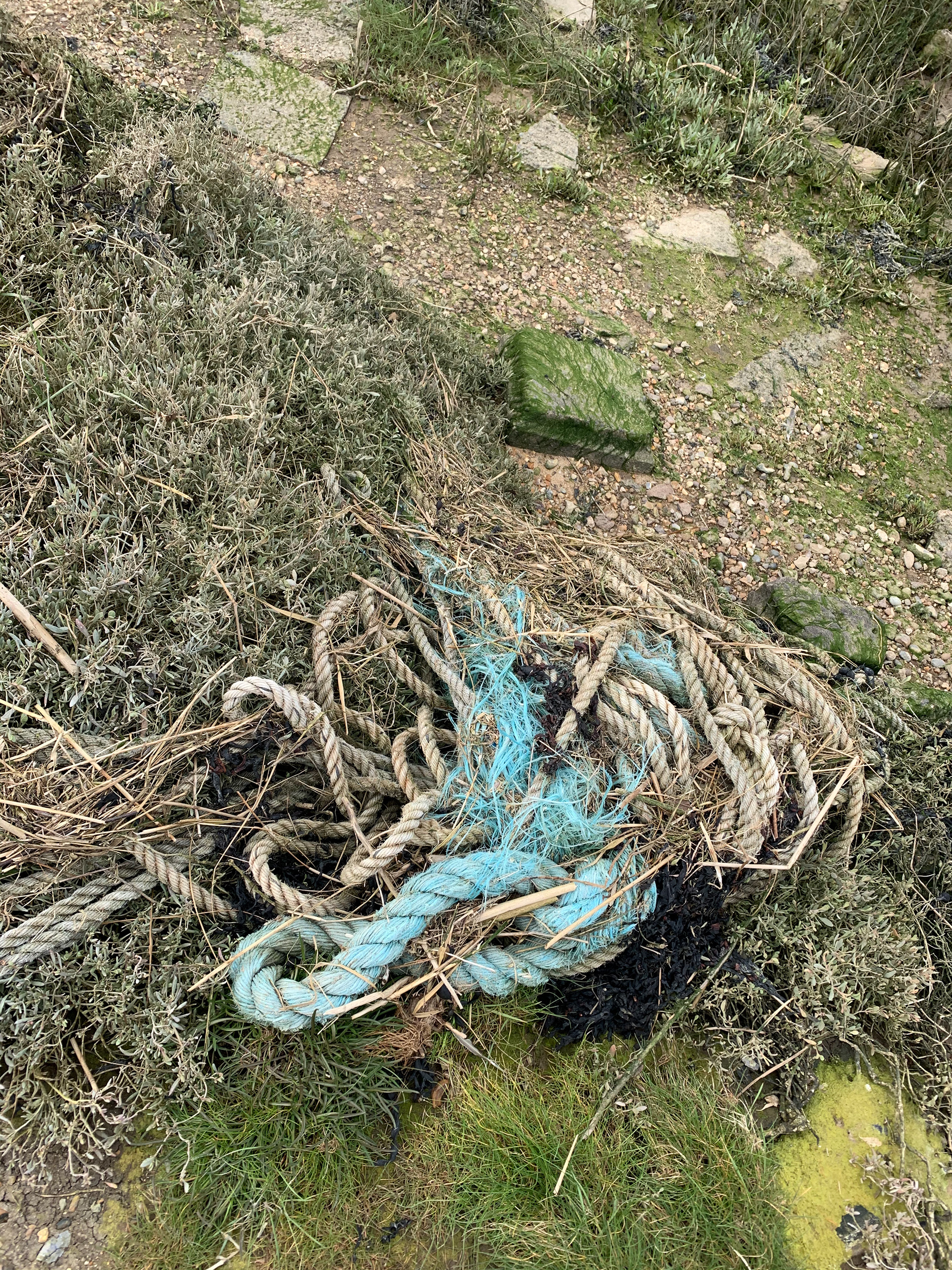
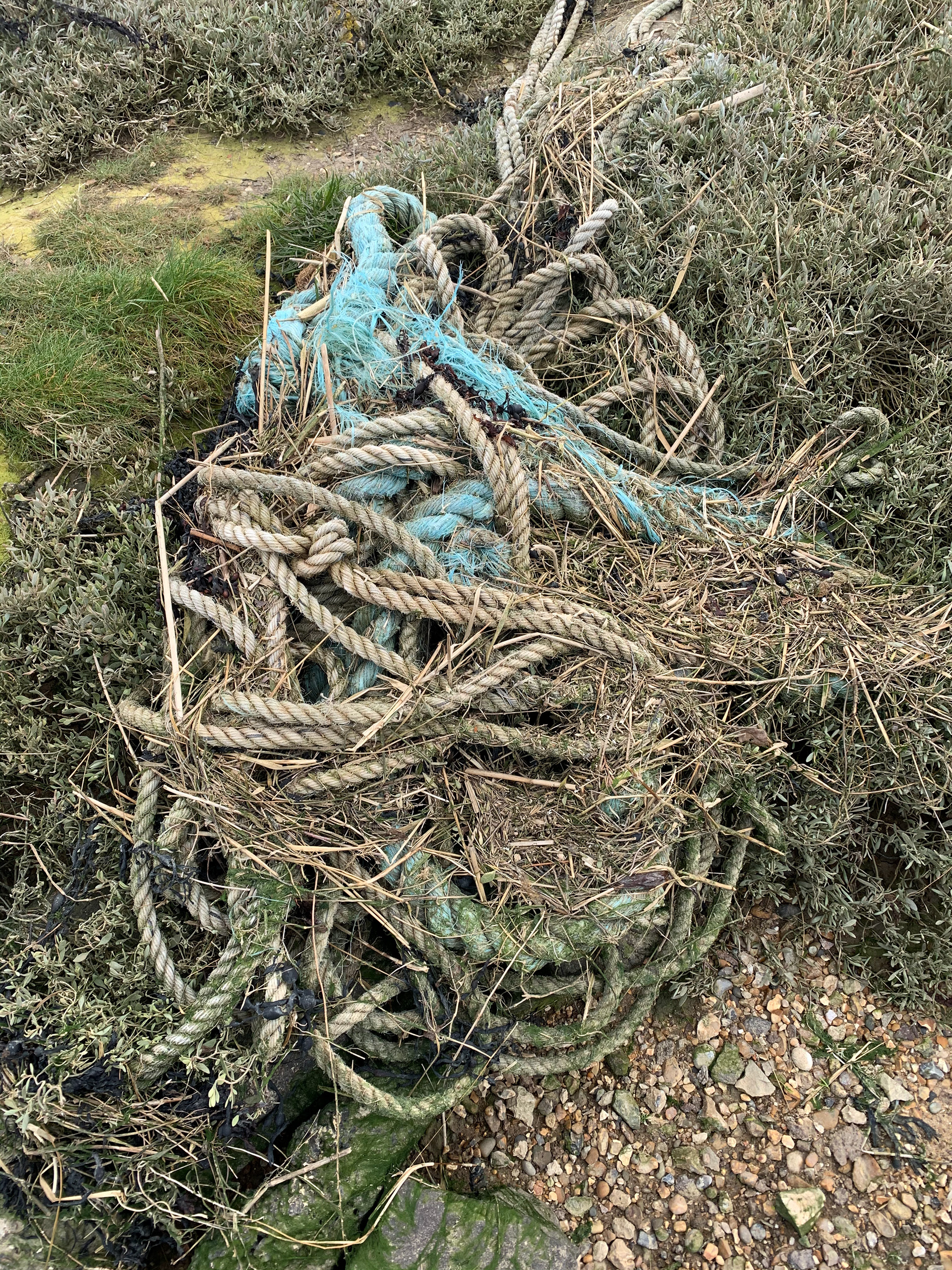
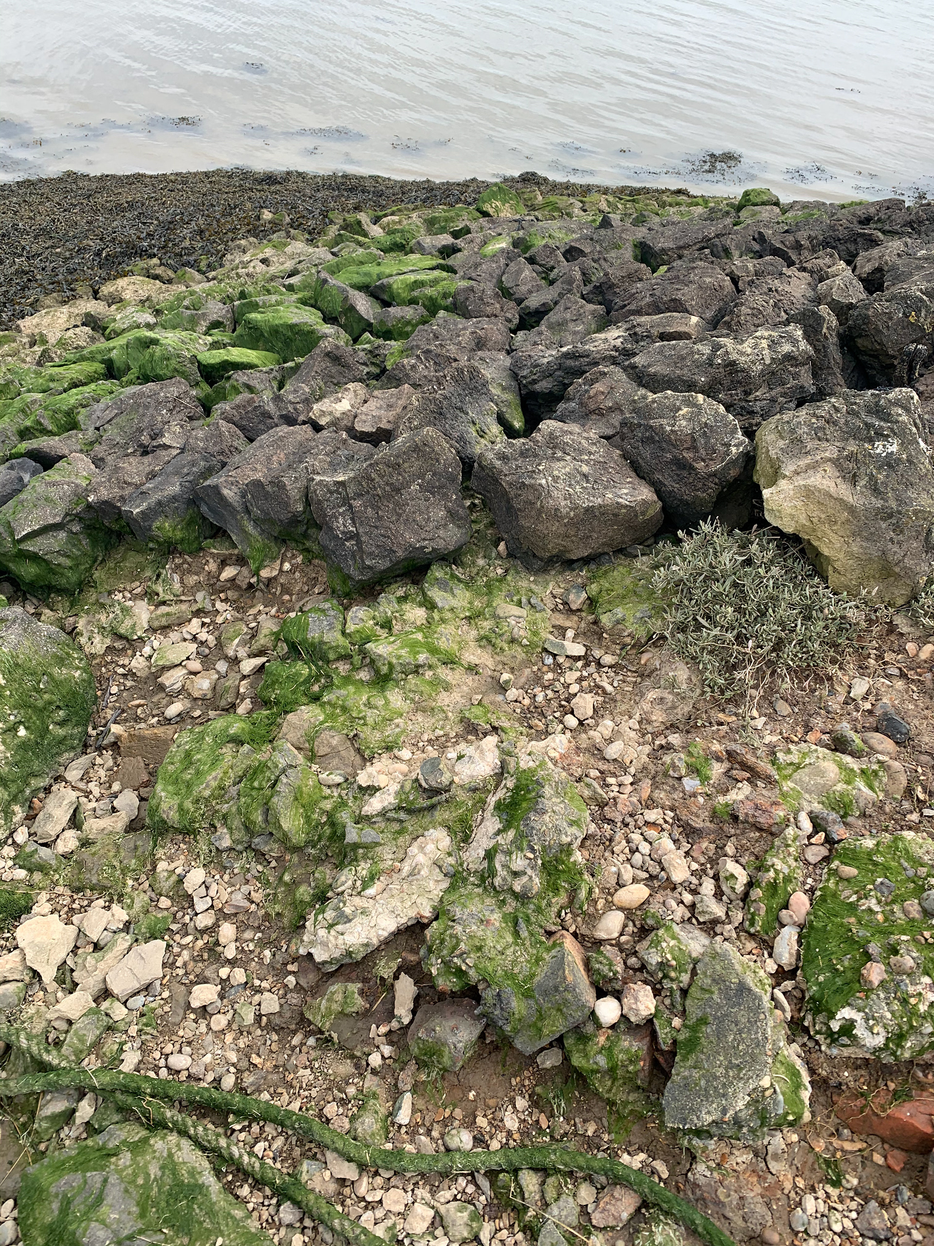

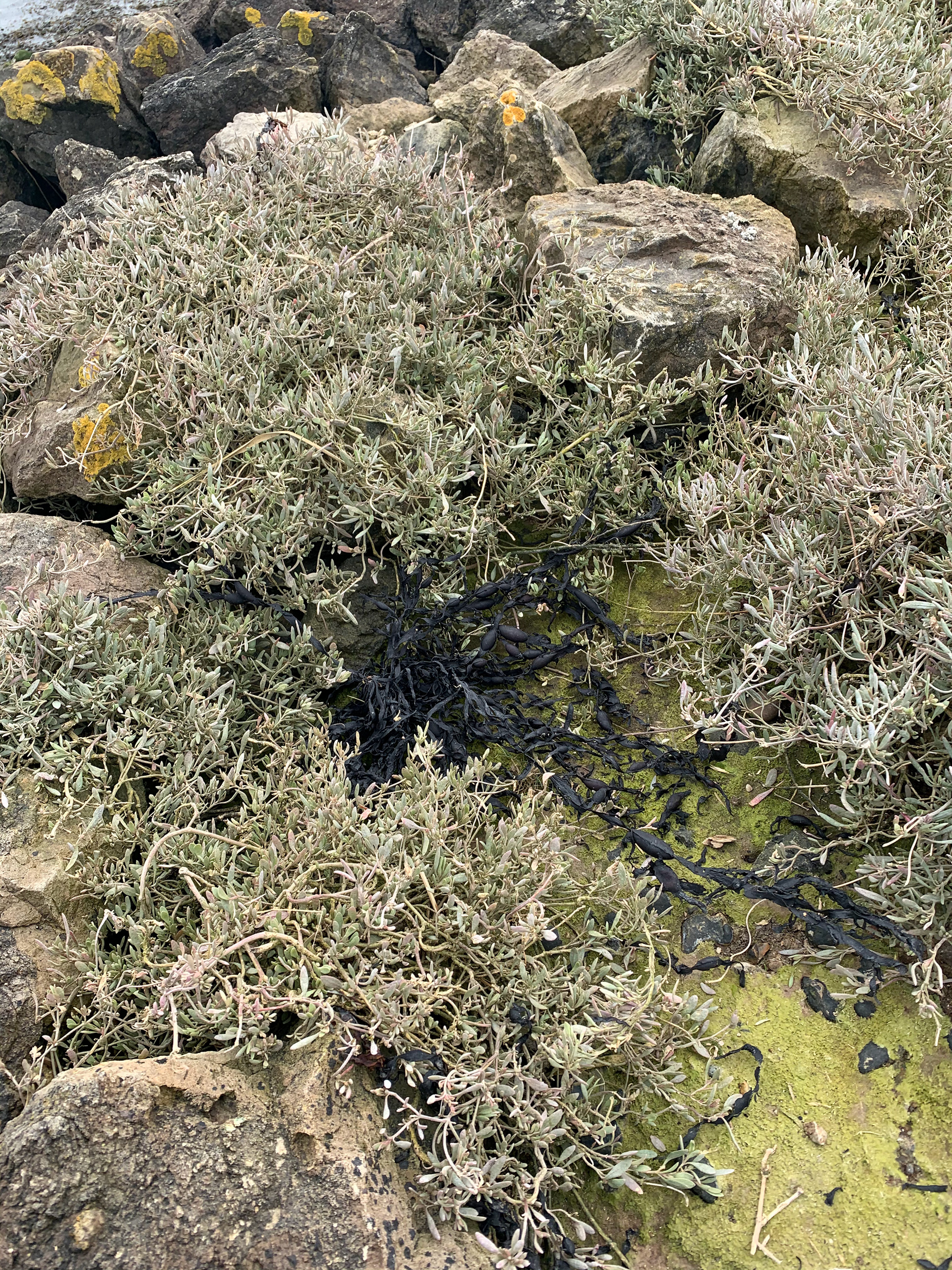
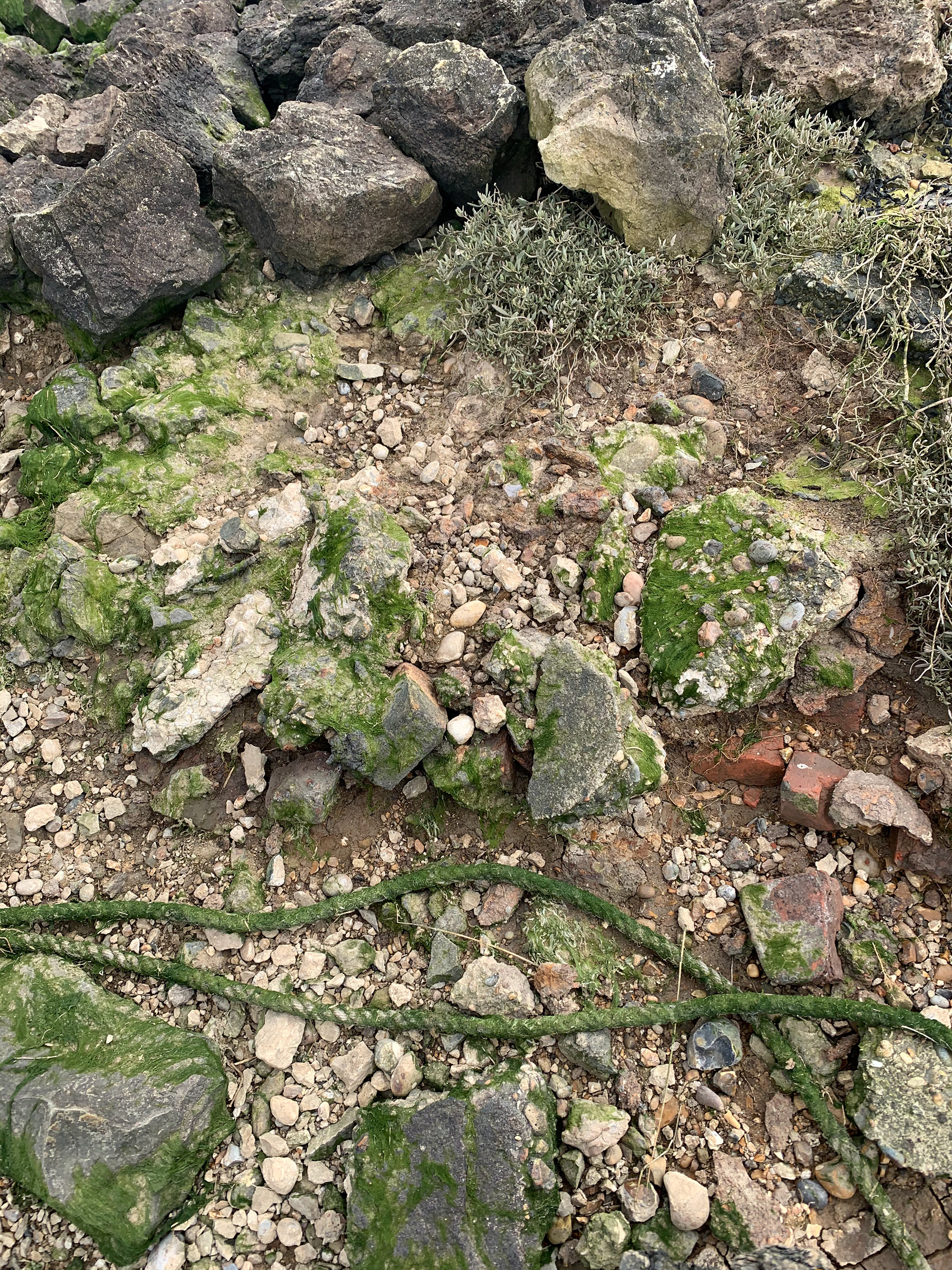


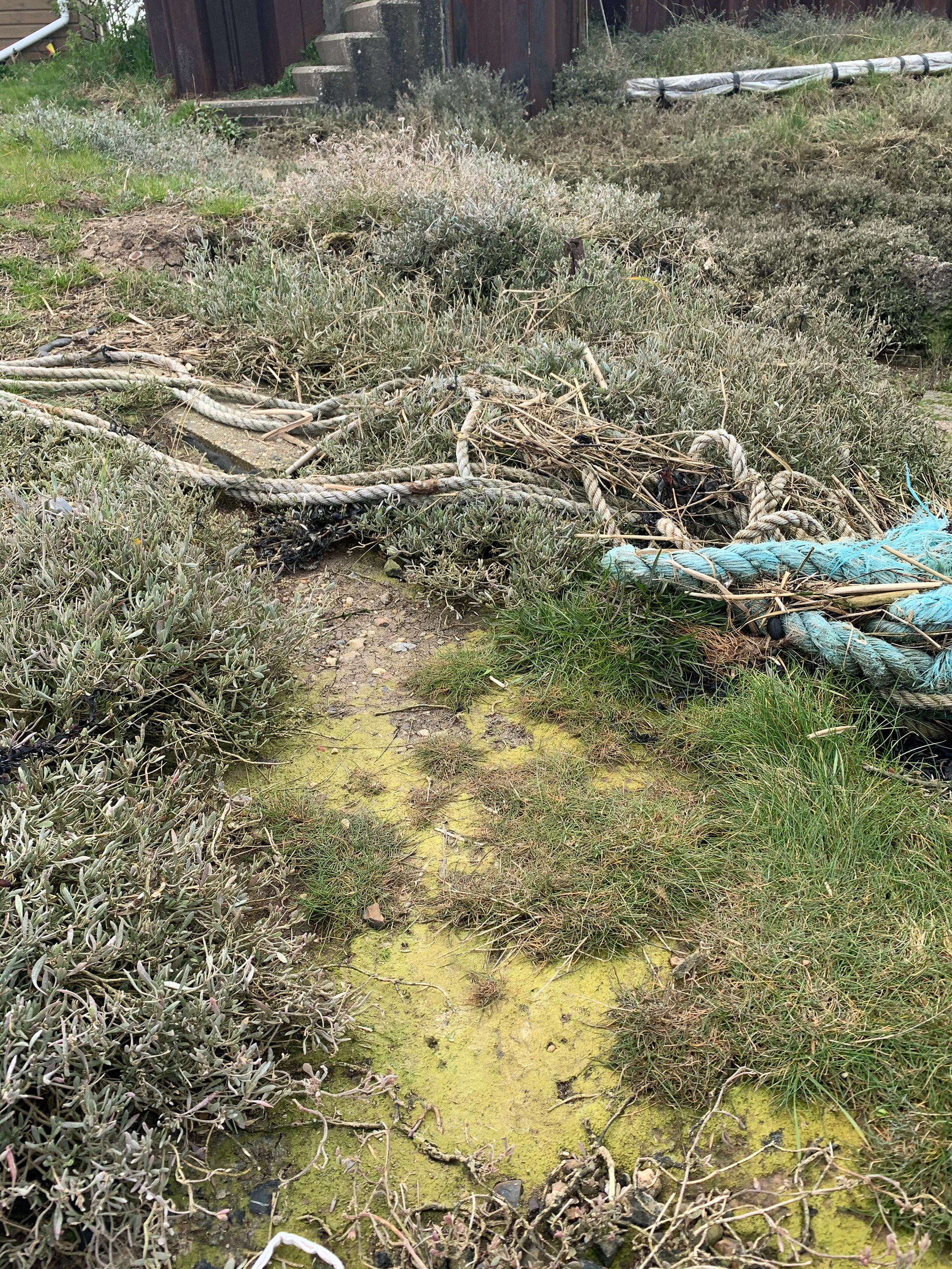
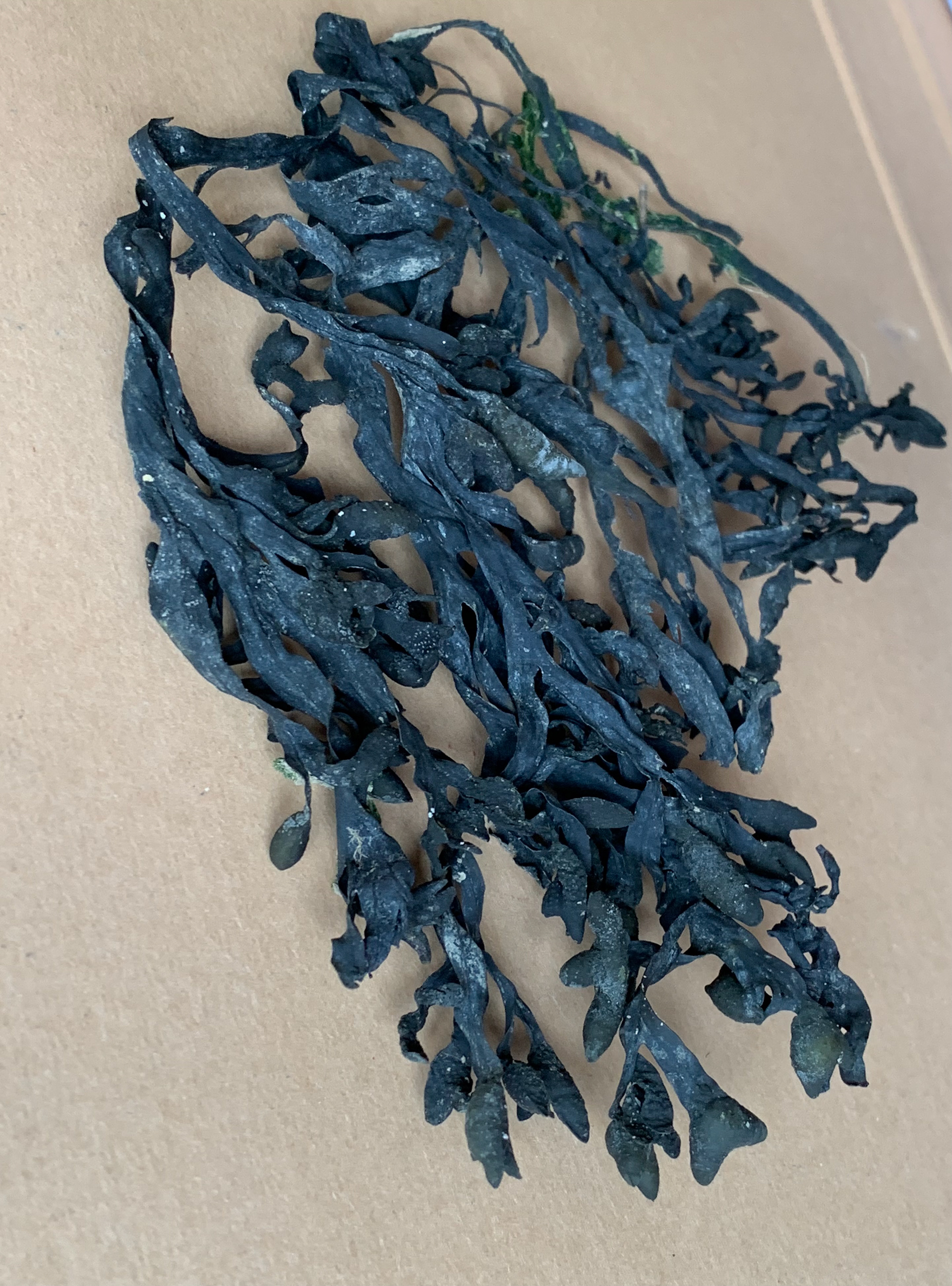


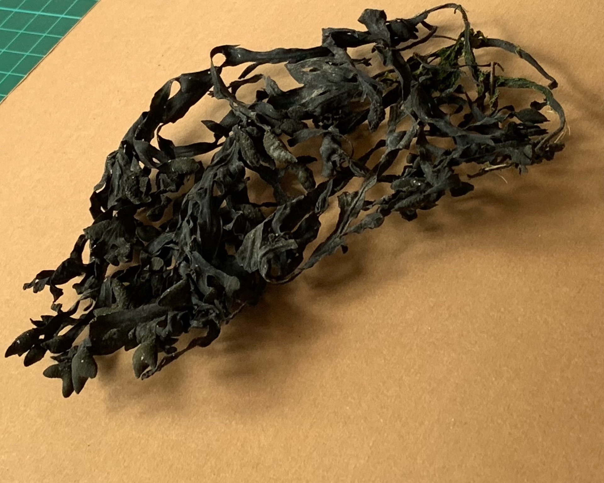

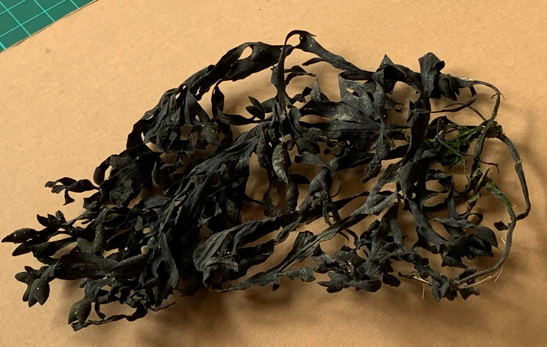

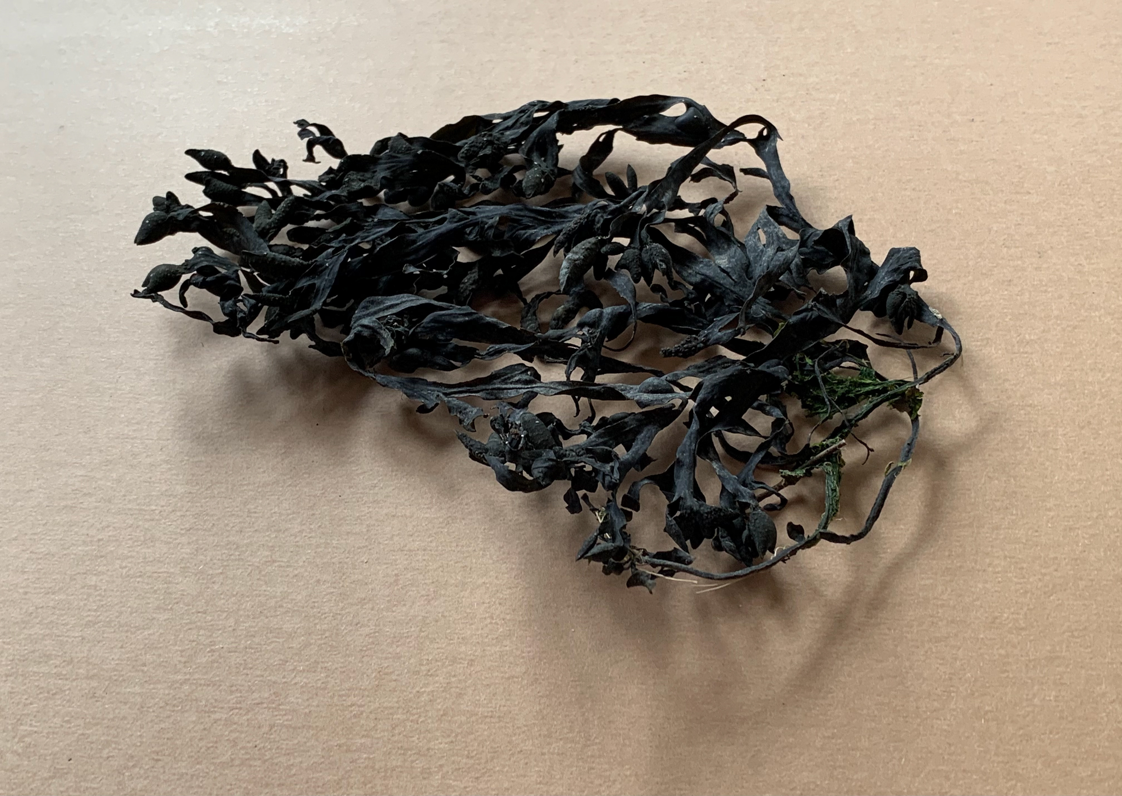
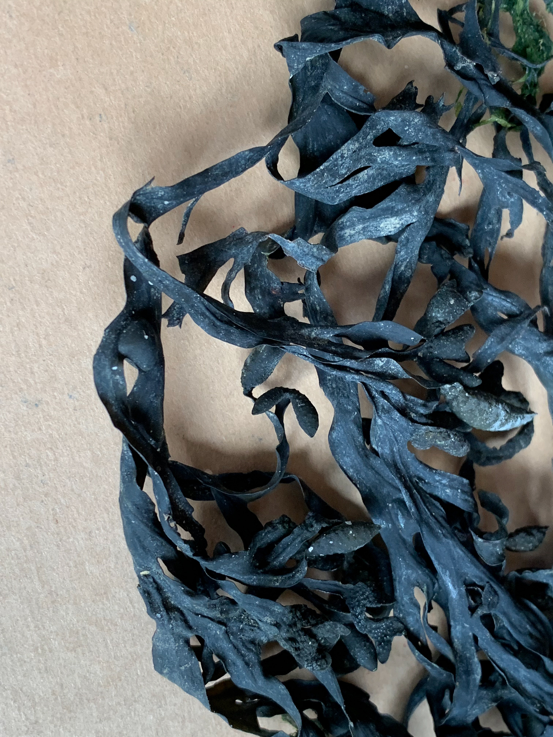
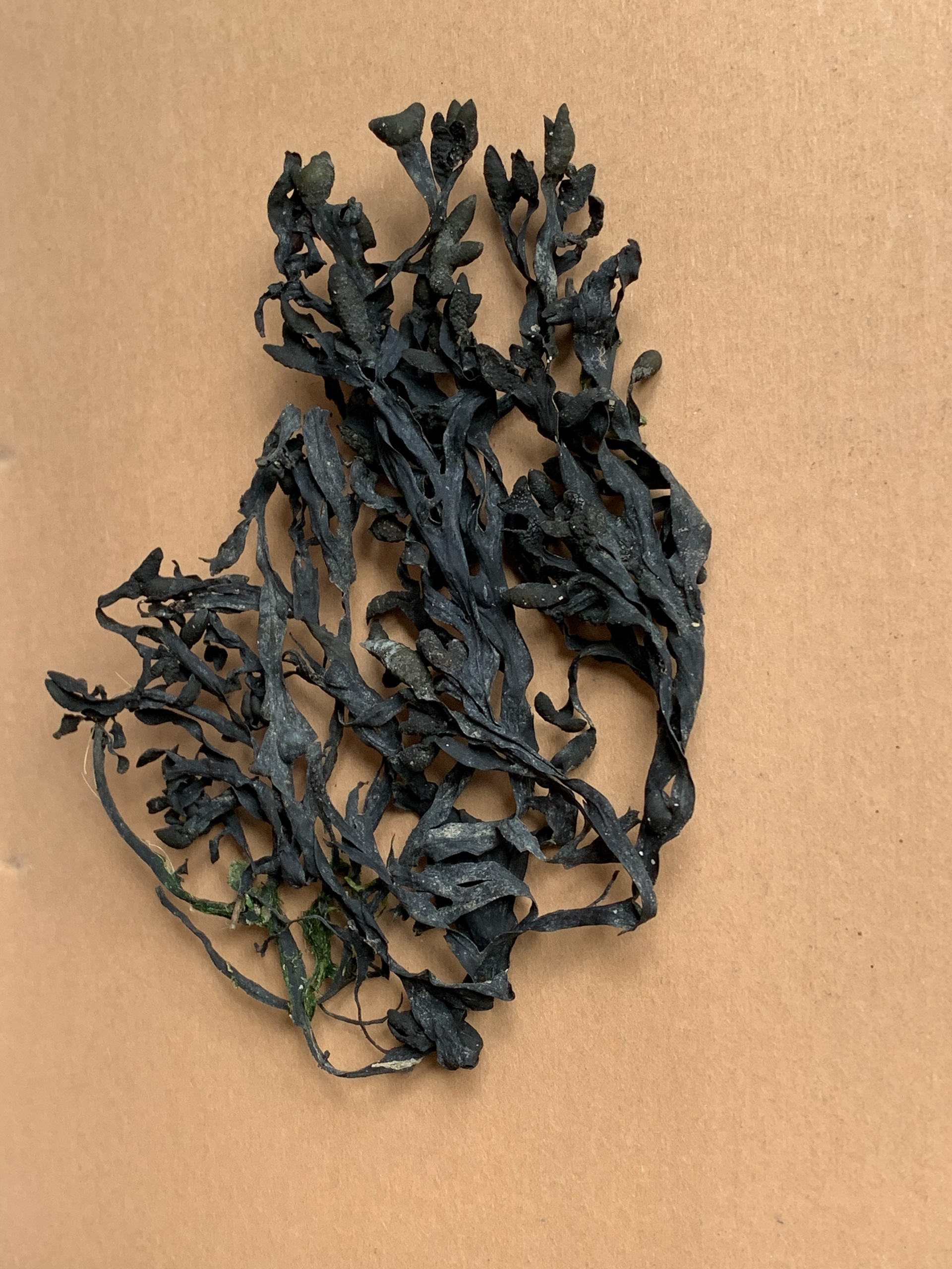

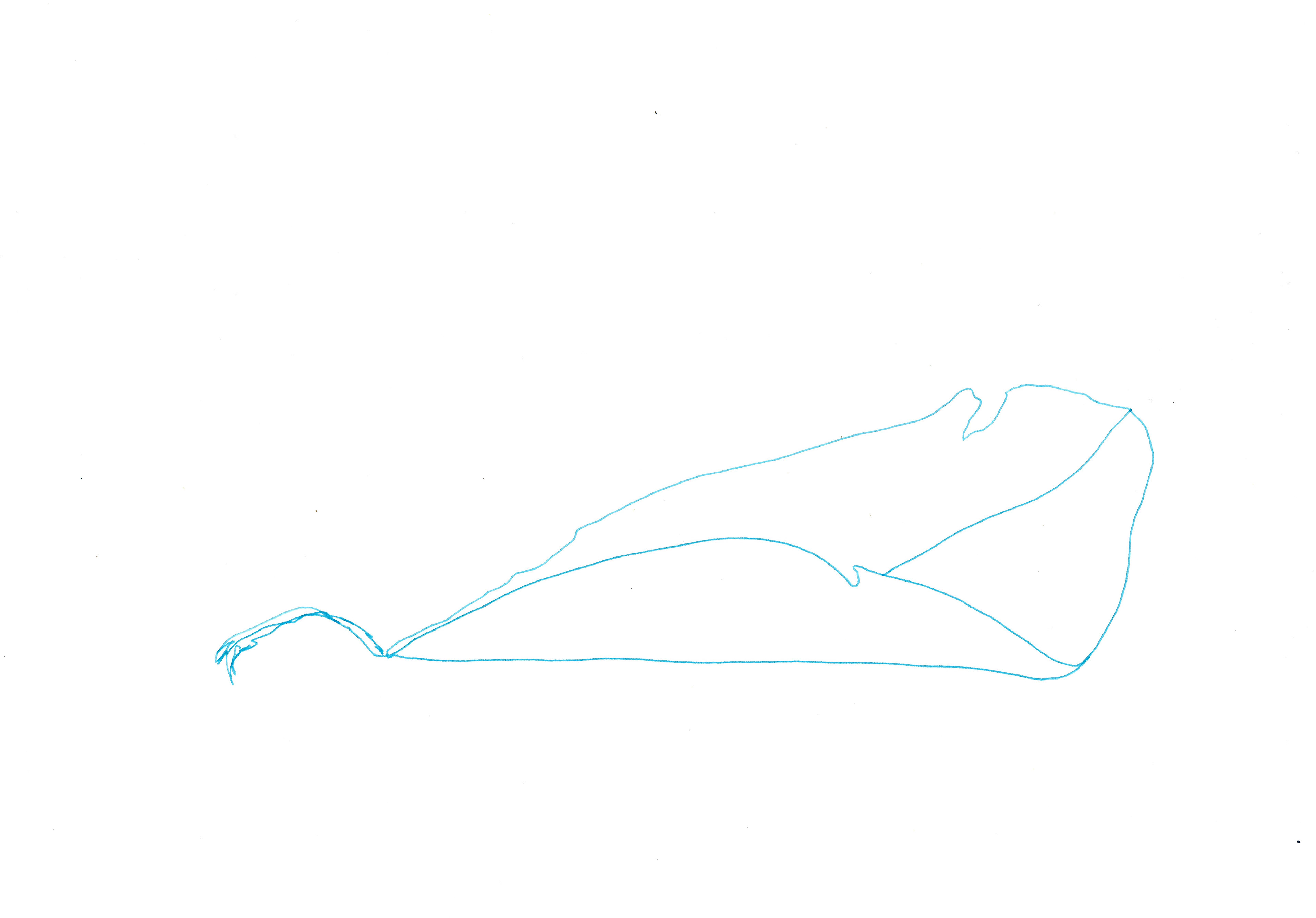
I collect some seaweed and photograph found rope and seaweed on the beach. The sea places the rope and seaweed in certain arrangements, which change each time the tide comes in and goes out. There is a similarity between the unexpected line created, just like how the boustrophedon and slotted zig zag structures connect different lines as unknowingly so does the tide each time it washes over the stones and sand.

Sketchbook page, 21 x 29.7 cm
Sketchbook page, 21 x 29.7 cm
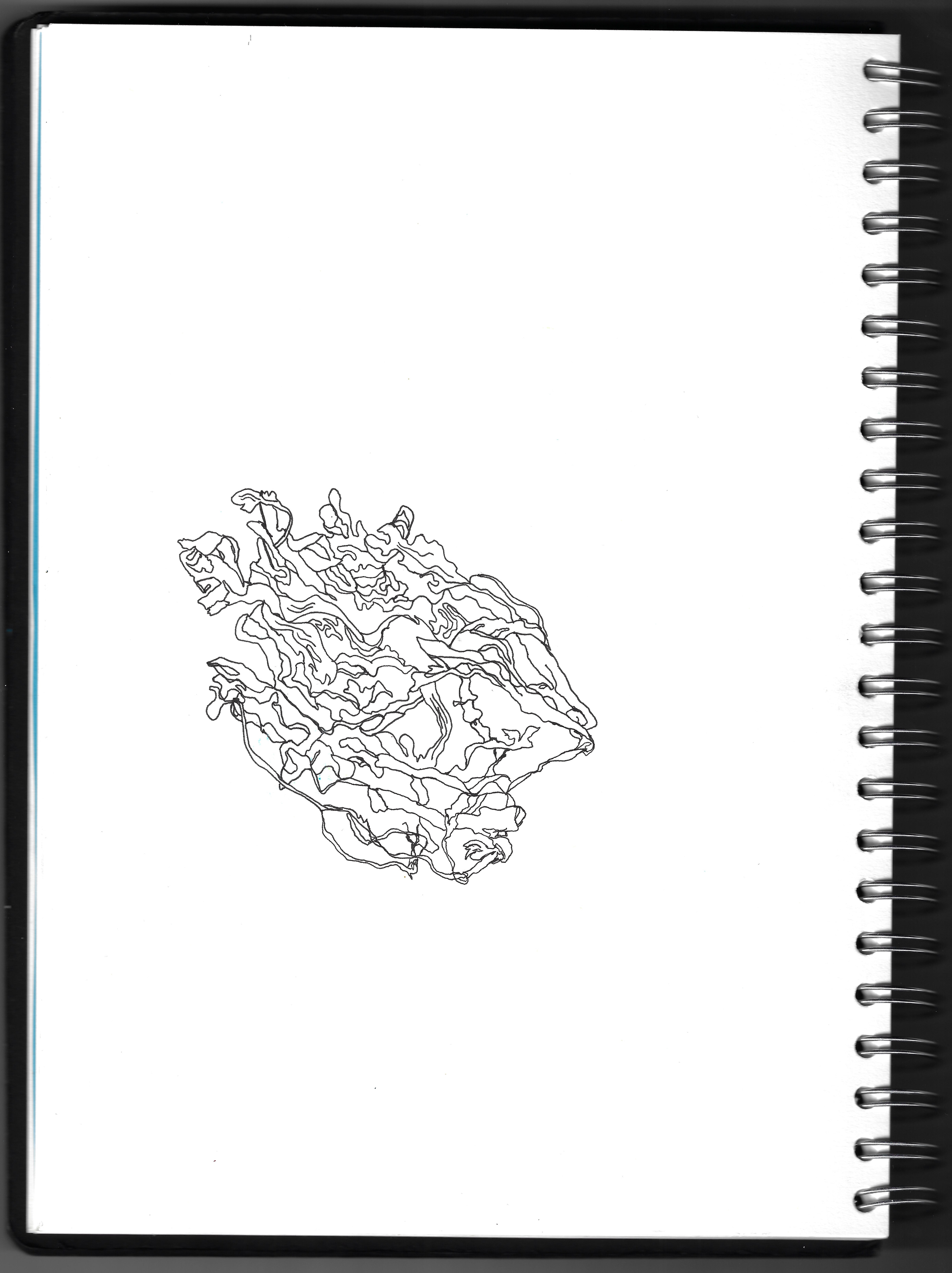
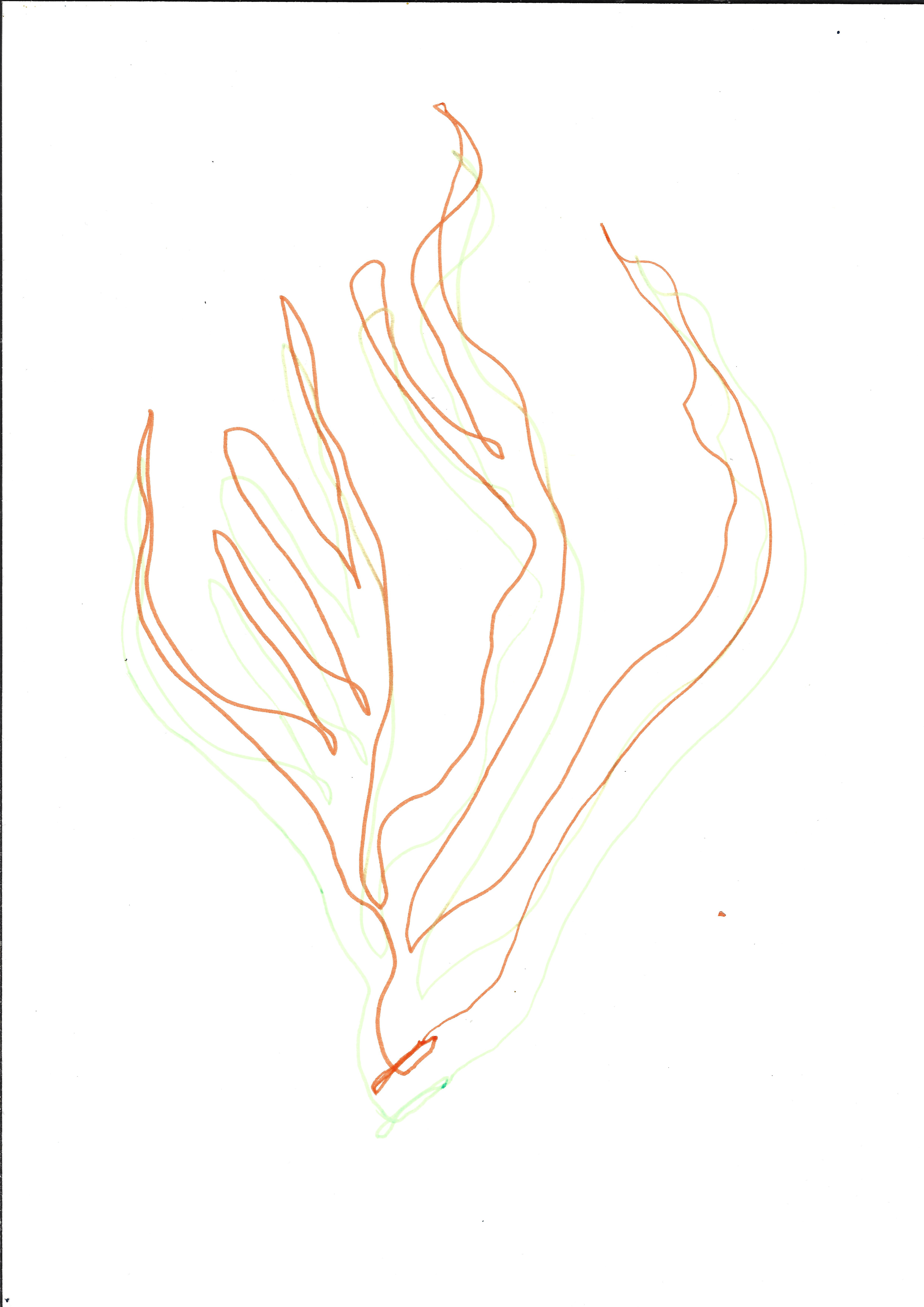
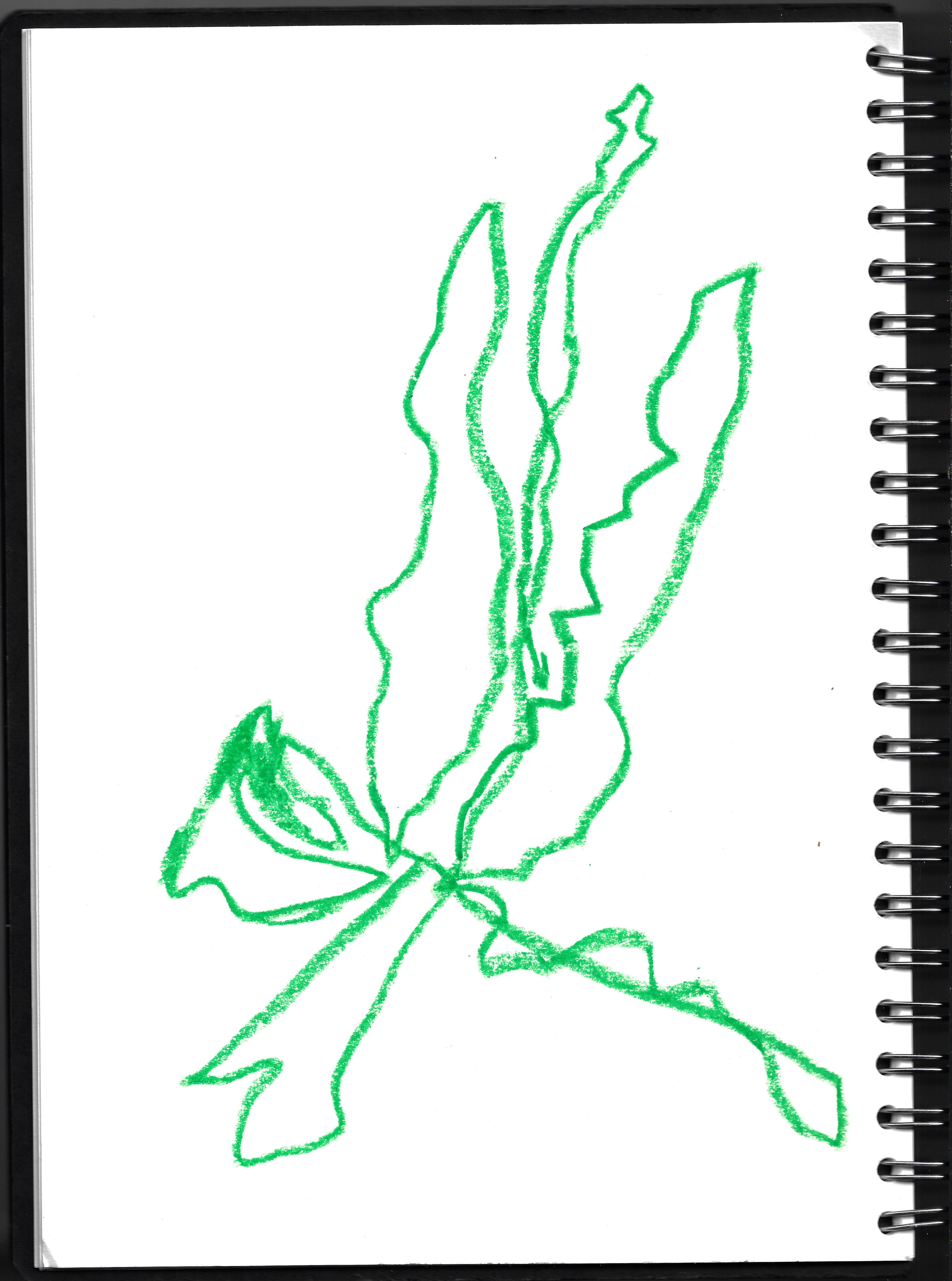
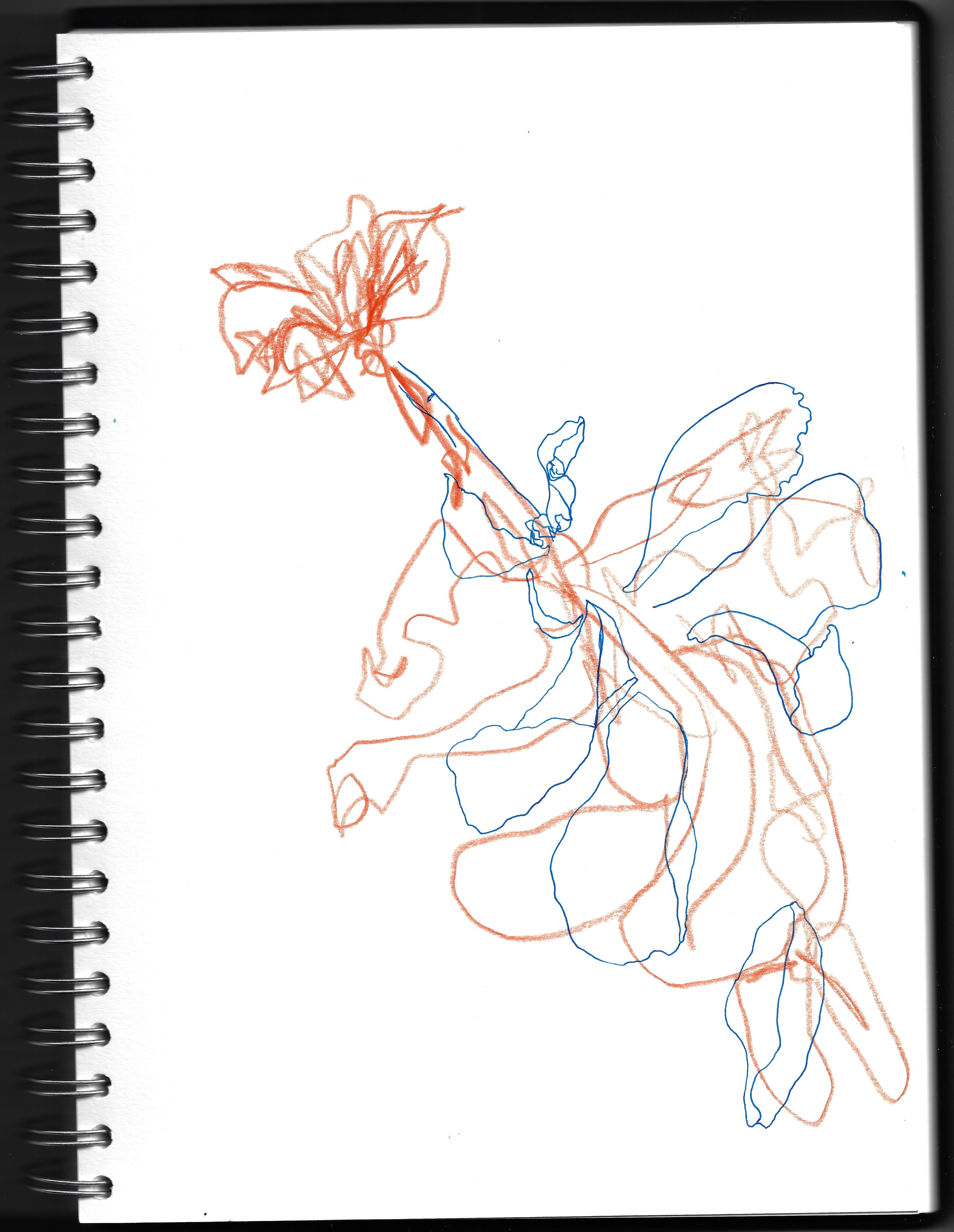
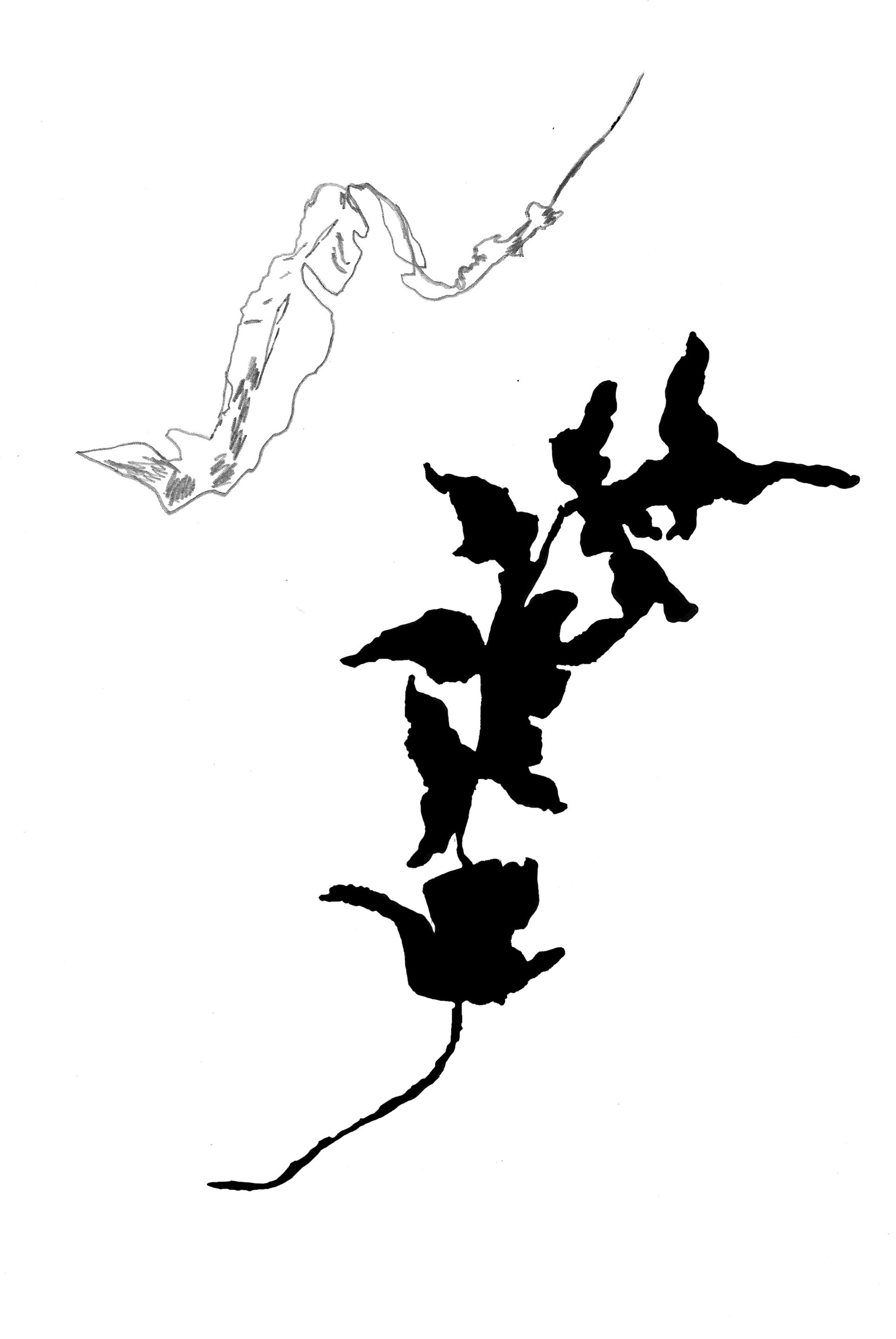
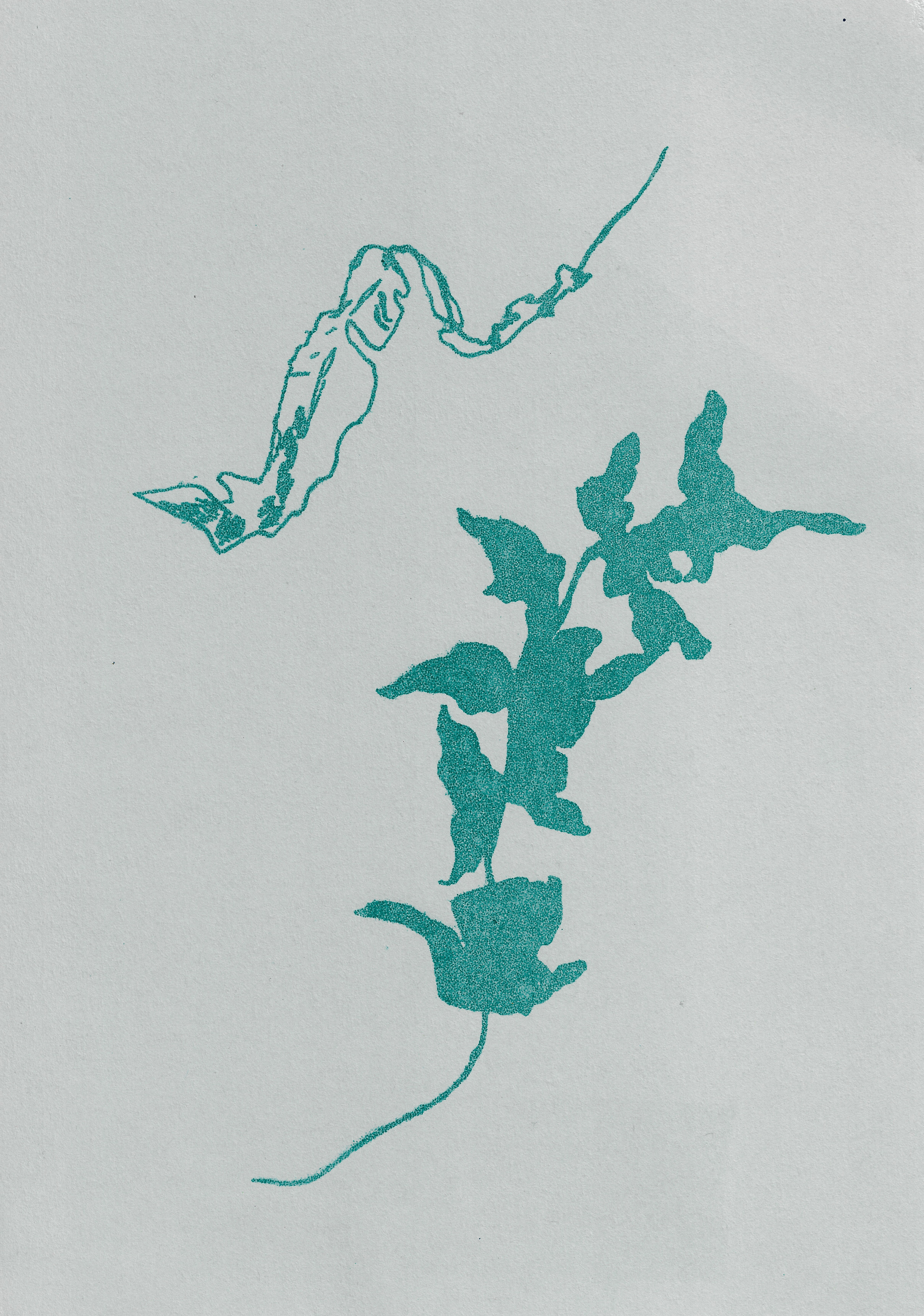
I draw the piece of seaweed, I was earlier photographing, in two different styles. I prefer the drawing on the left compared to the right because it felt more natural drawing the seaweed in that way. it felt true to its essence, although the drawing on the right does convey the intricacy and delicate nature of the plant.
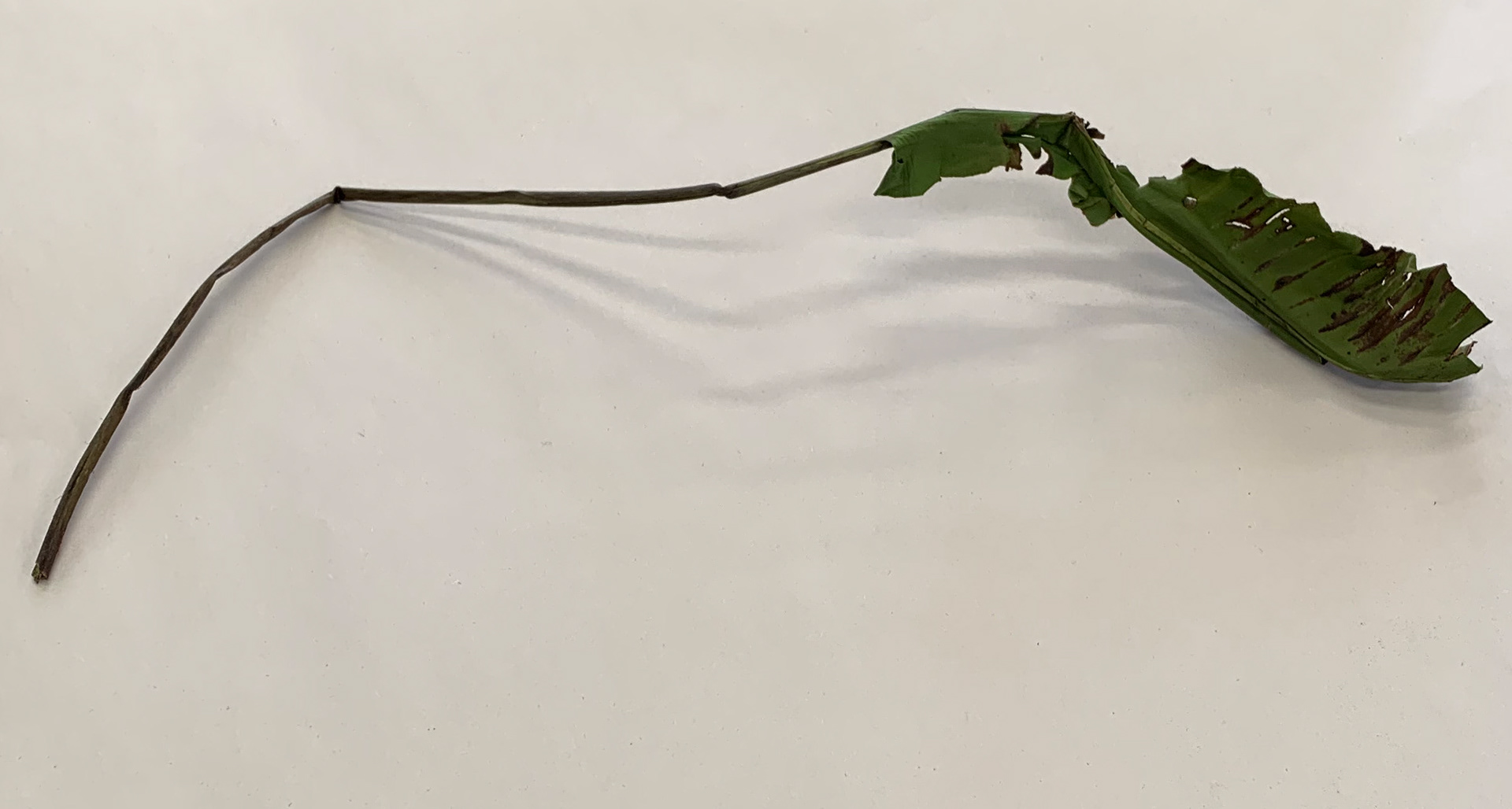


I draw a leaf from first-hand onto a lithographic stone. I use a red pencil to briefly sketch the shape and outline, which I readjust before I make my final marks in the greasy medium onto the stone.
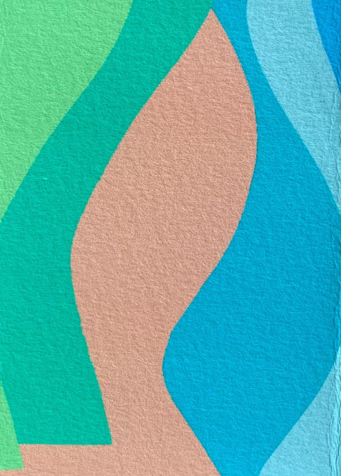
Monoprint on paper, 29.7 x 42 cm
Monoprint on paper, 32.5 x 50 cm
Monoprint on paper, 32.5 x 50 cm
Monoprint on paper, 32.5 x 50 cm

Monoprint on paper, 35 x 50 cm
Monoprint on paper, 32.5 x 50 cm
Monoprint on paper, 35 x 50 cm
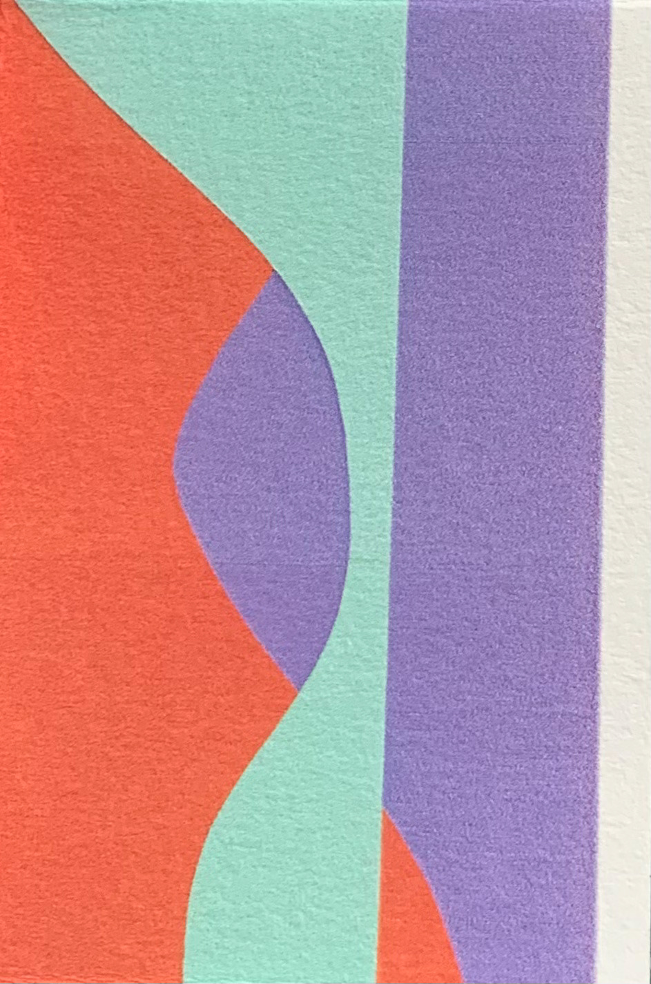
Monoprint, 22 x 70 cm
Monoprint, 22 x 70 cm
Monoprint, 10.5 x 54 cm
Monoprint, 12.5 x 64 cm
Monoprint, 15 x 44 cm
Monoprint on paper, 35 x 50 cm
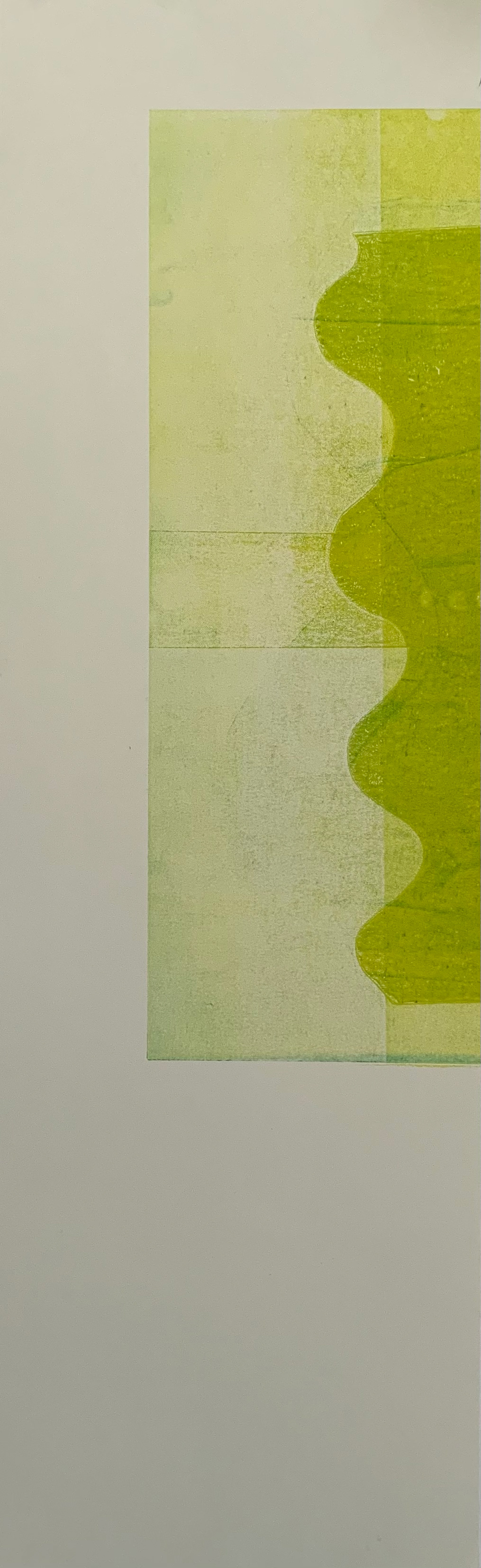
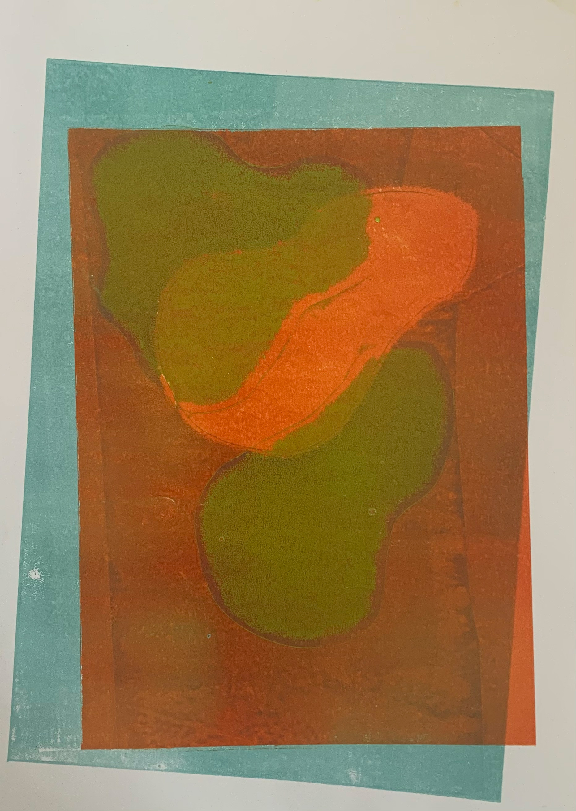
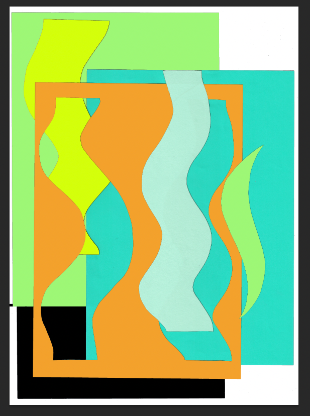
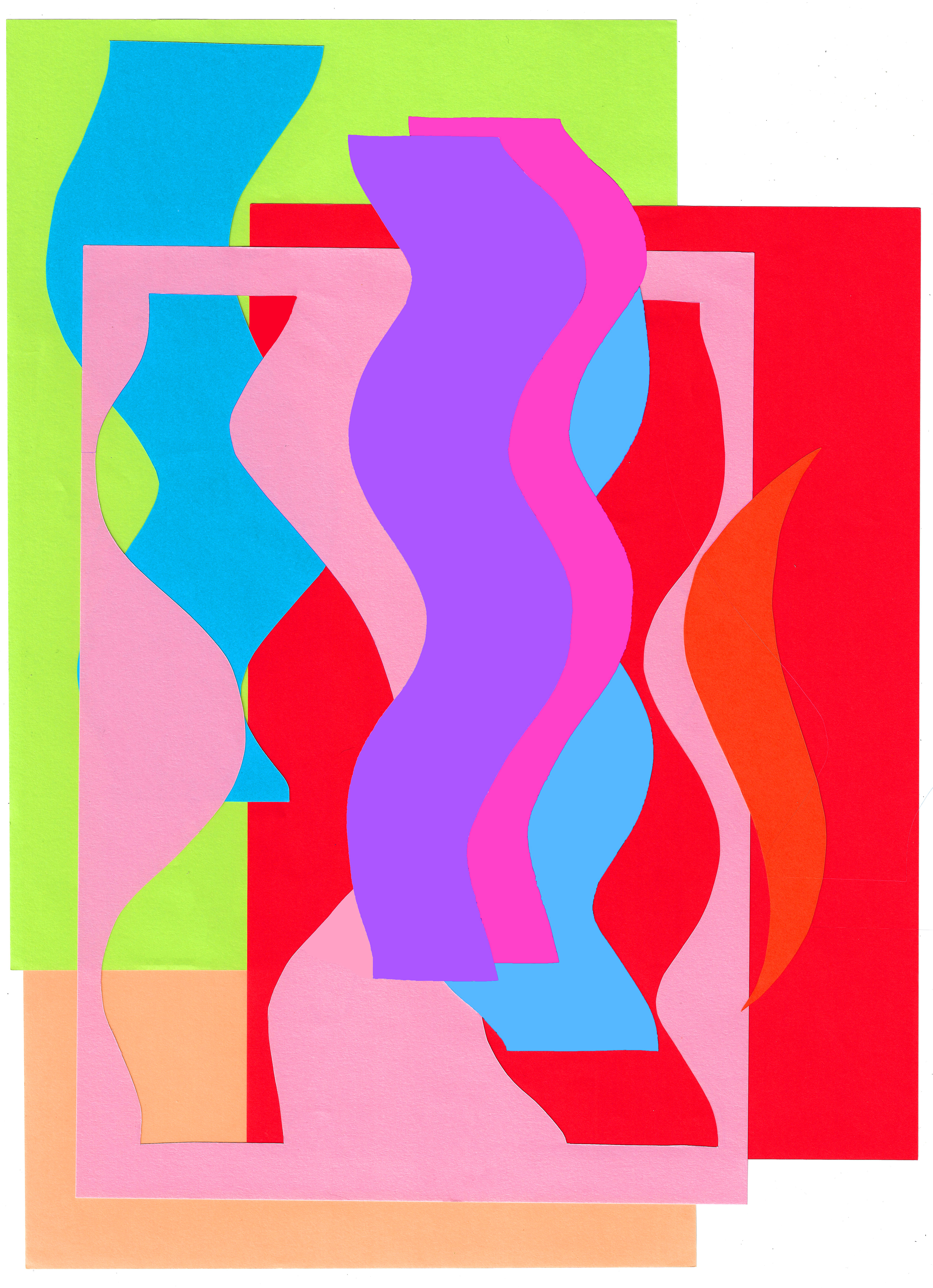
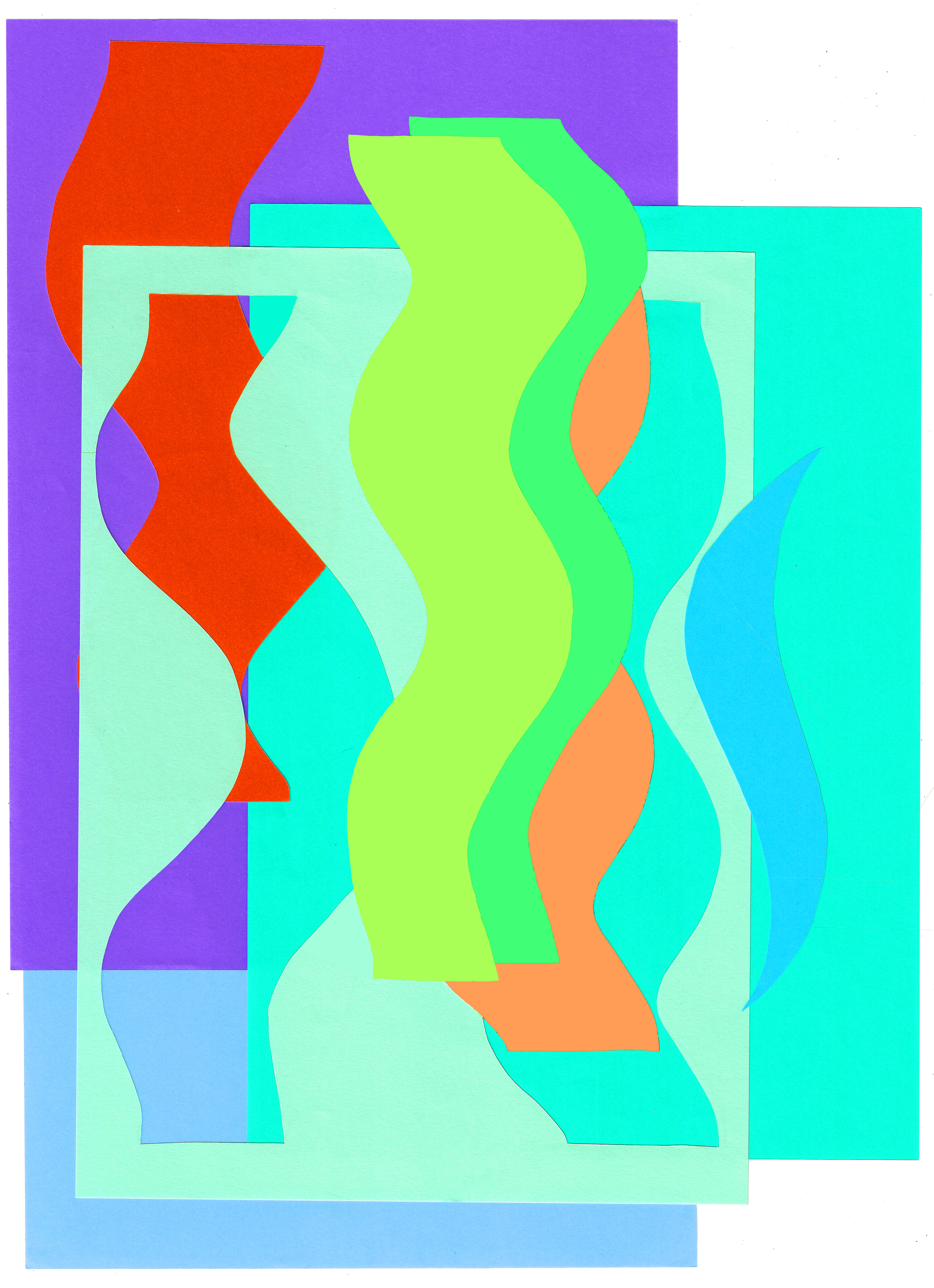
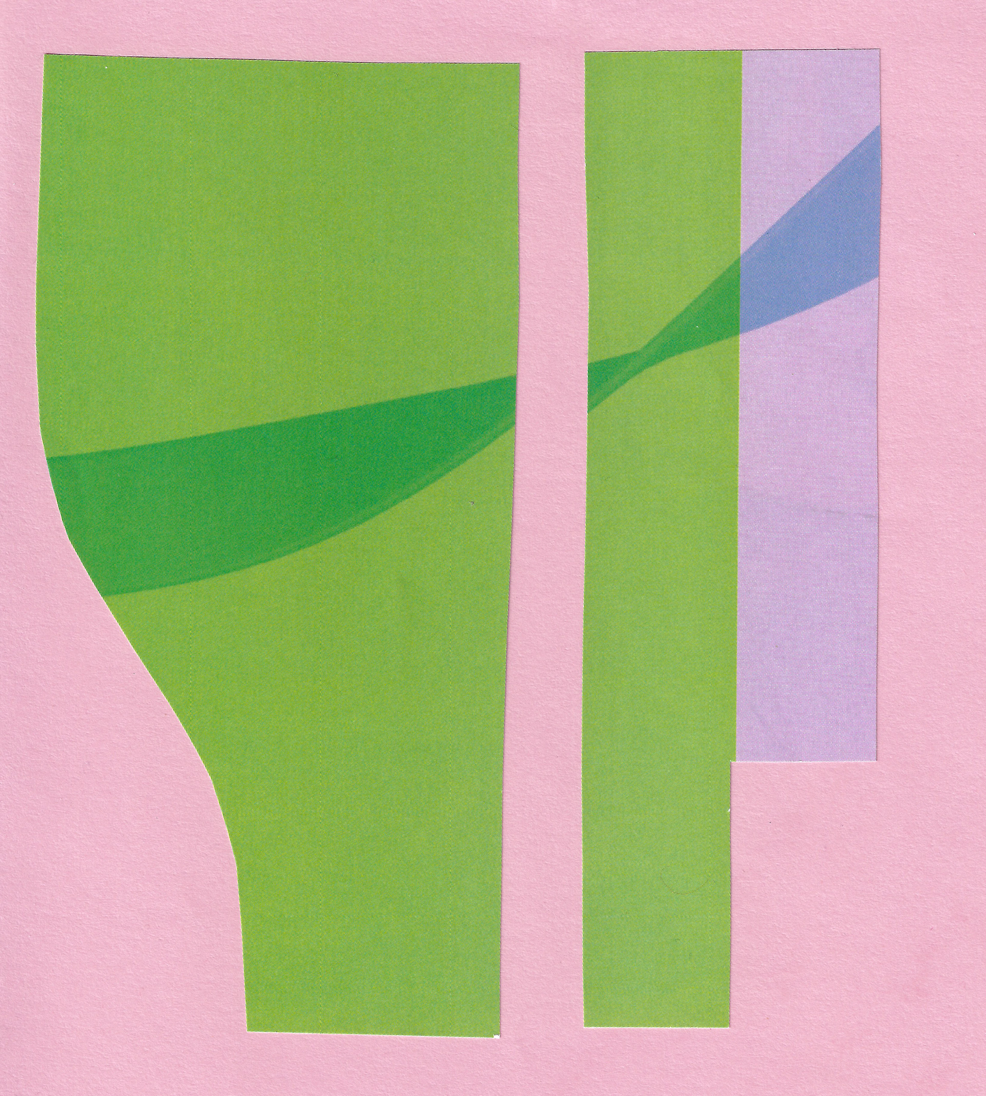
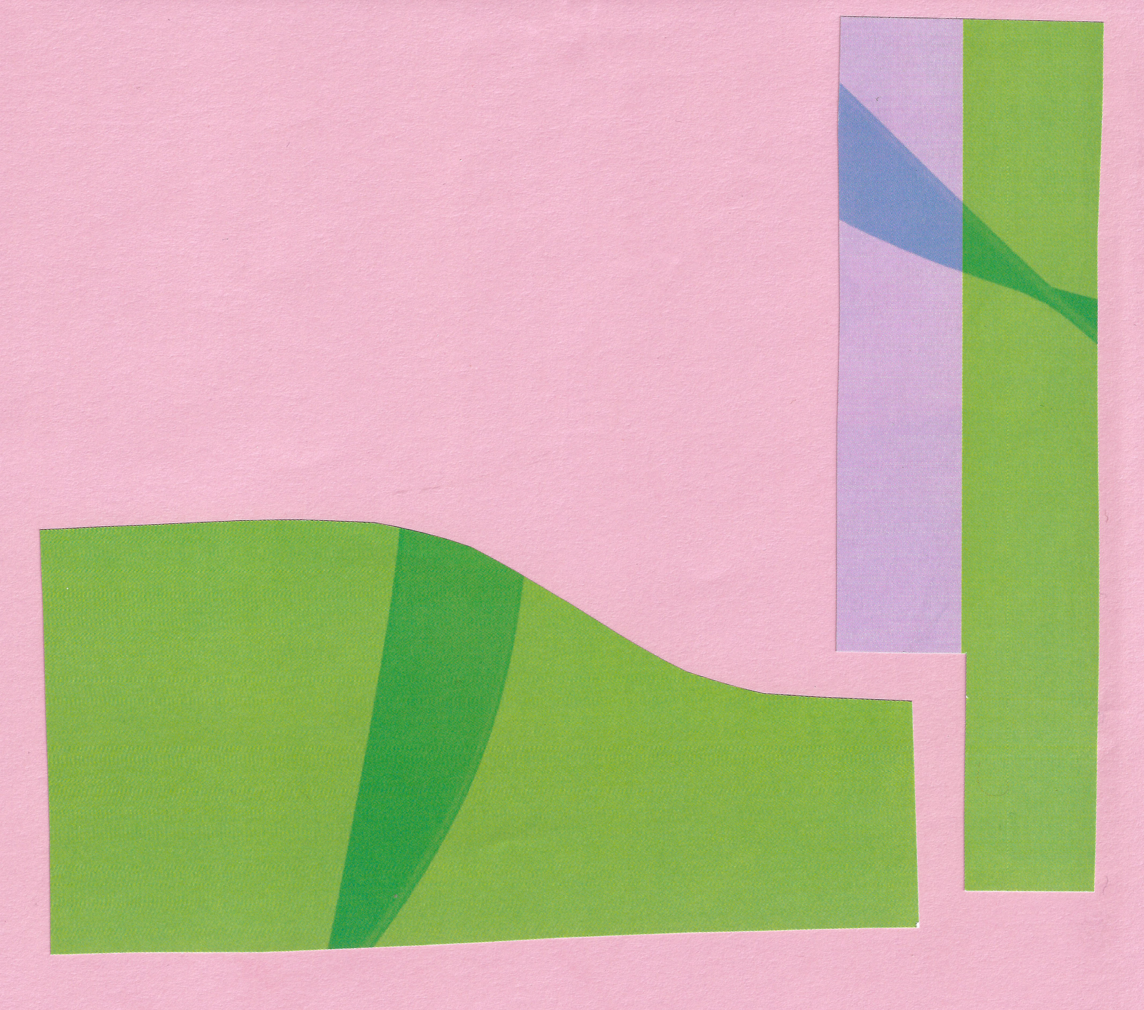
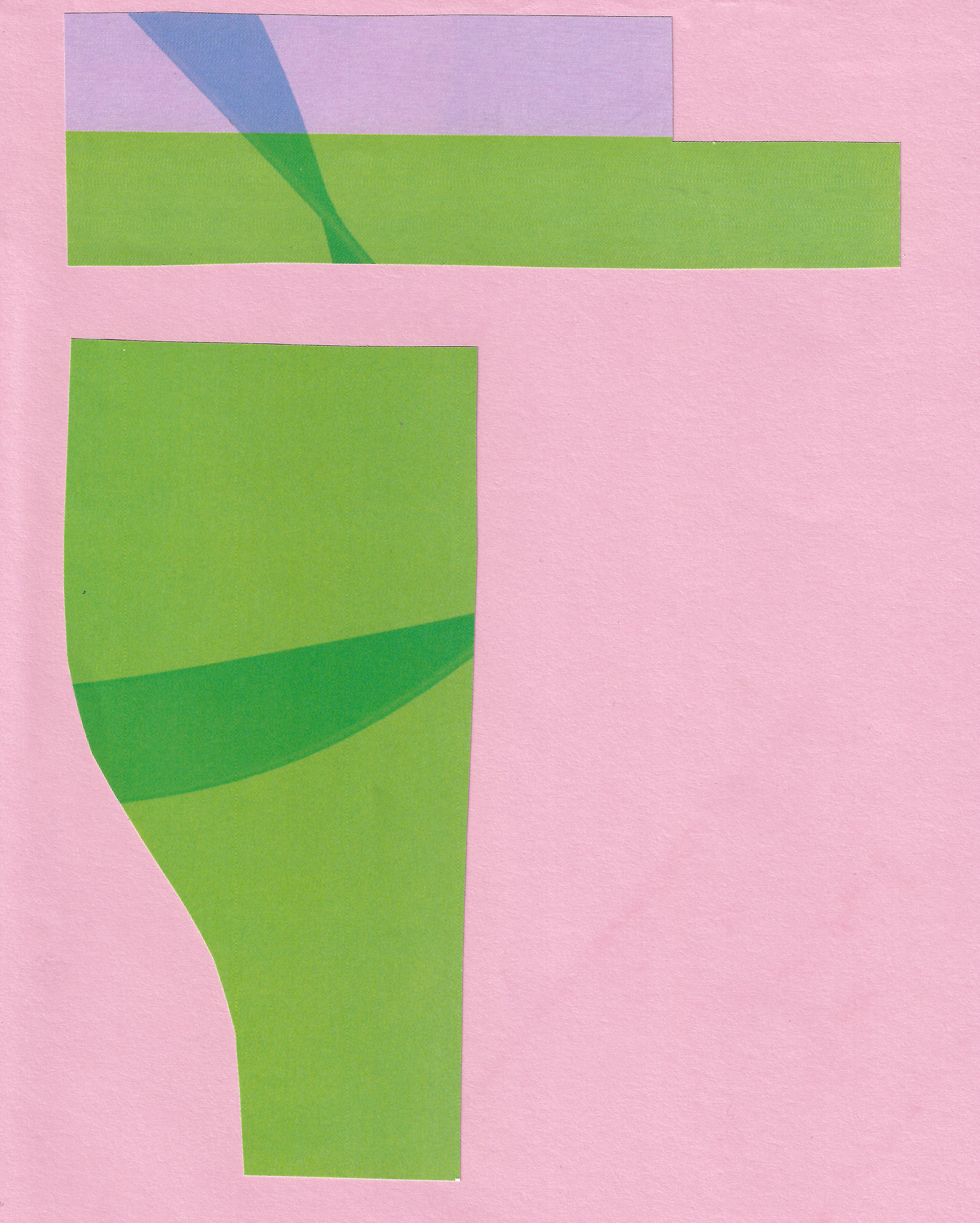
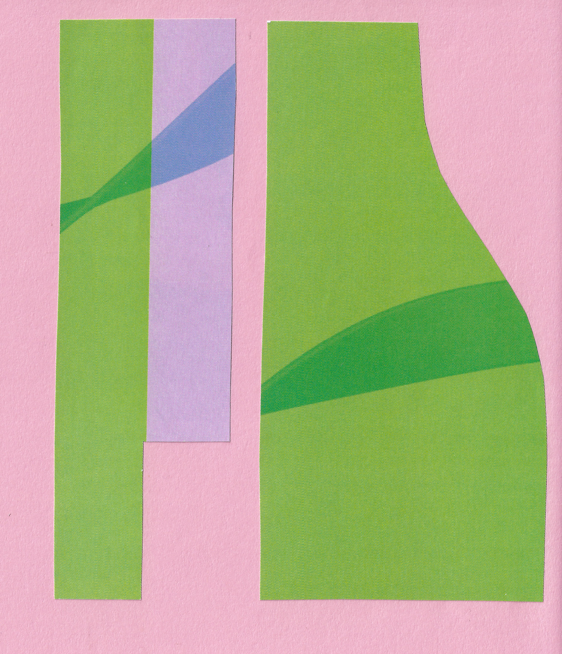
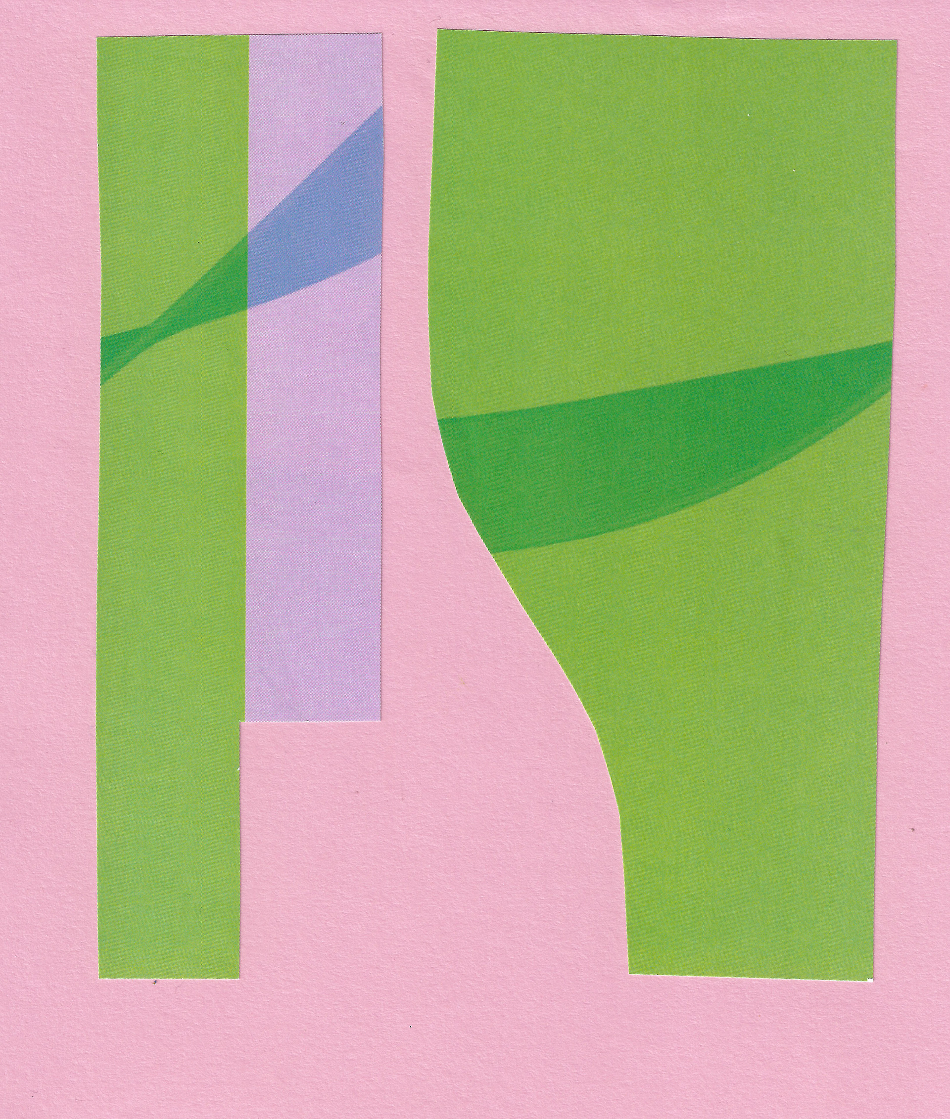
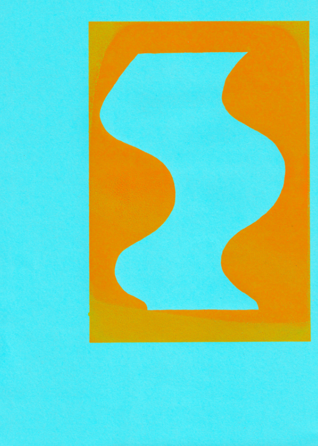
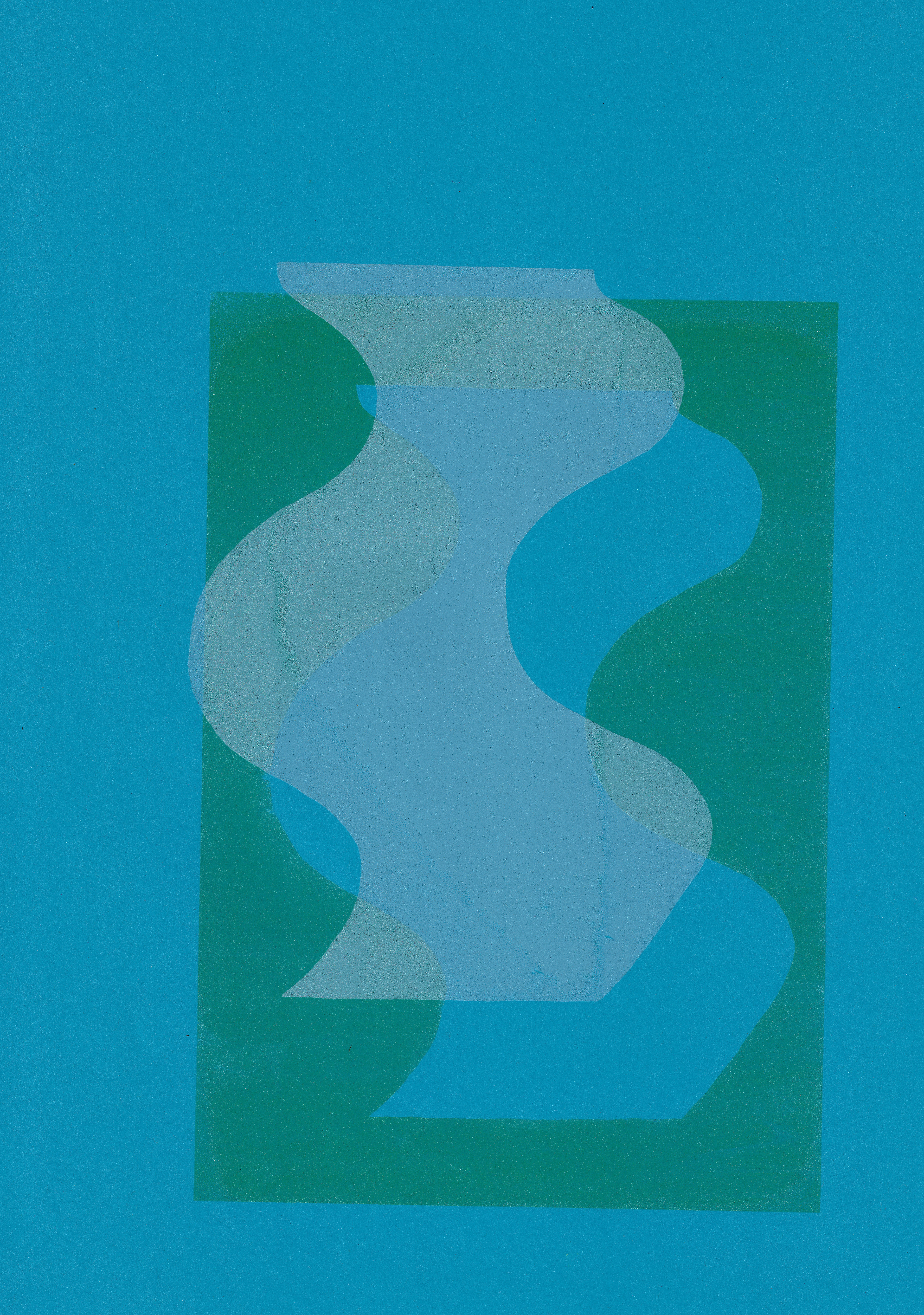
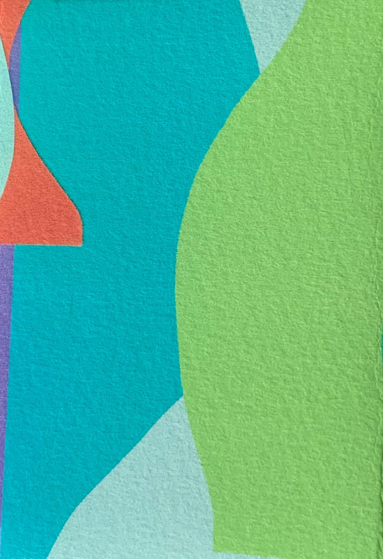
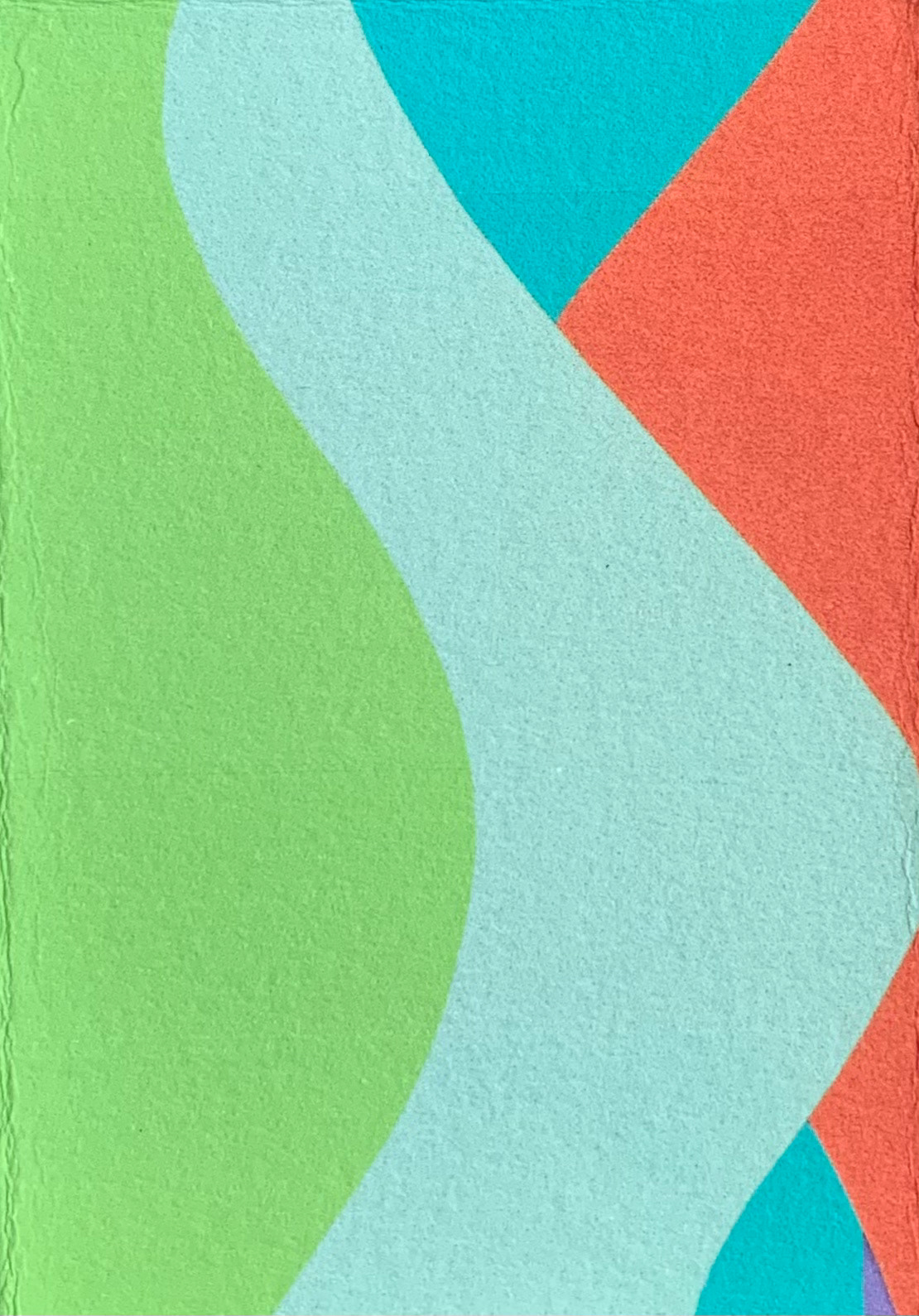
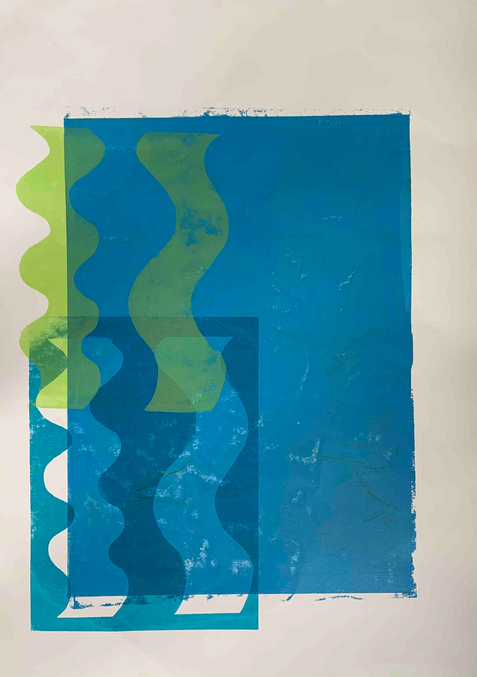
I monoprint with some paper stencils I have cut from shapes I have drawn. The unpredictability of the placement of the different layers means that new lines are formed through the unexpected, relating to my subconscious influence over the design.
I then monoprint with thin strips of paper, rather than using conventionally sized paper. This encourages the viewer to piece the work together in their mind and fill in the gaps between the pieces.

Sketchbook page, 21 x 29.7 cm
Sketchbook page, 21 x 29.7 cm
Photoshop image
Photoshop image

Photoshop image
Photoshop image
Illustrator image
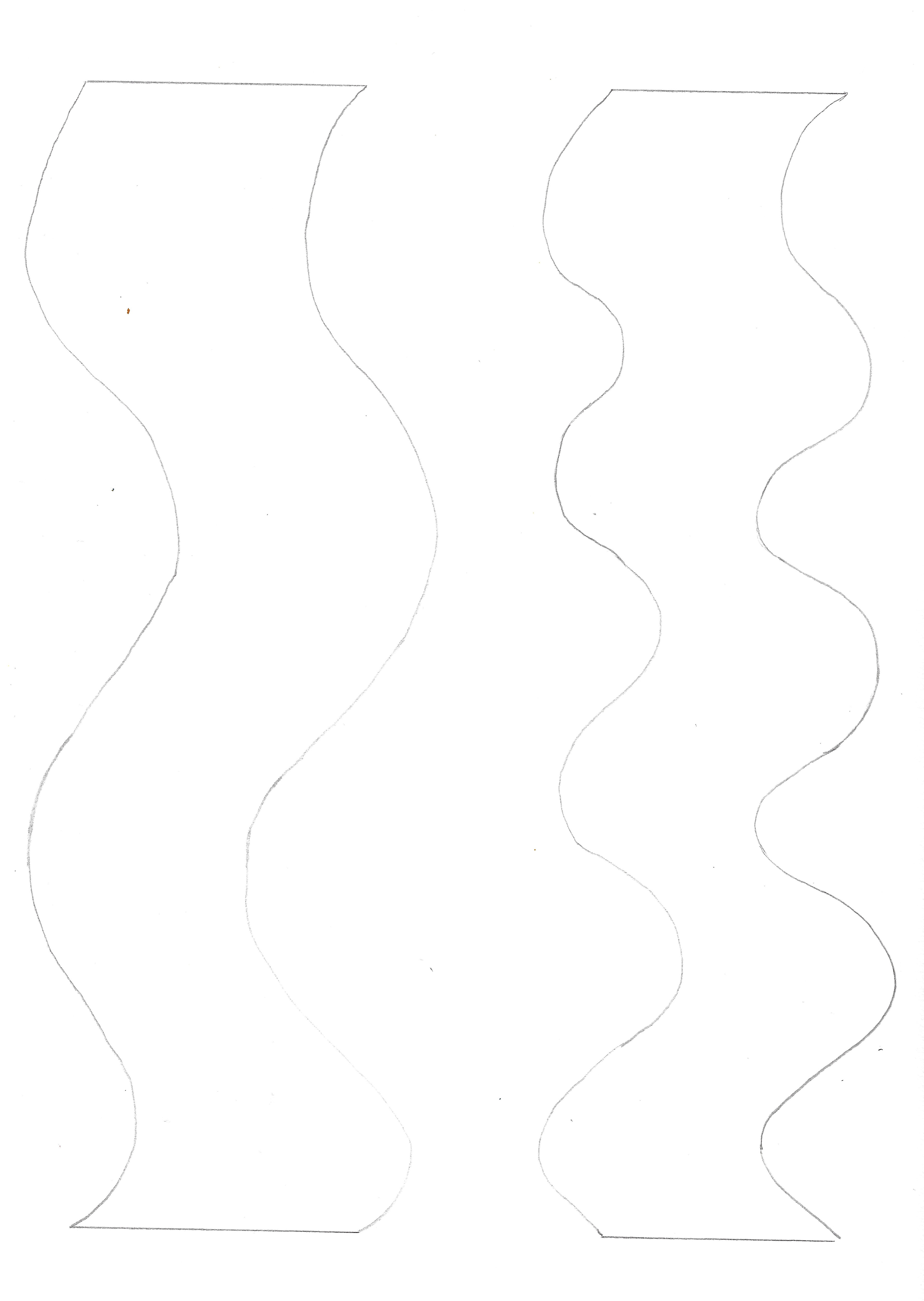
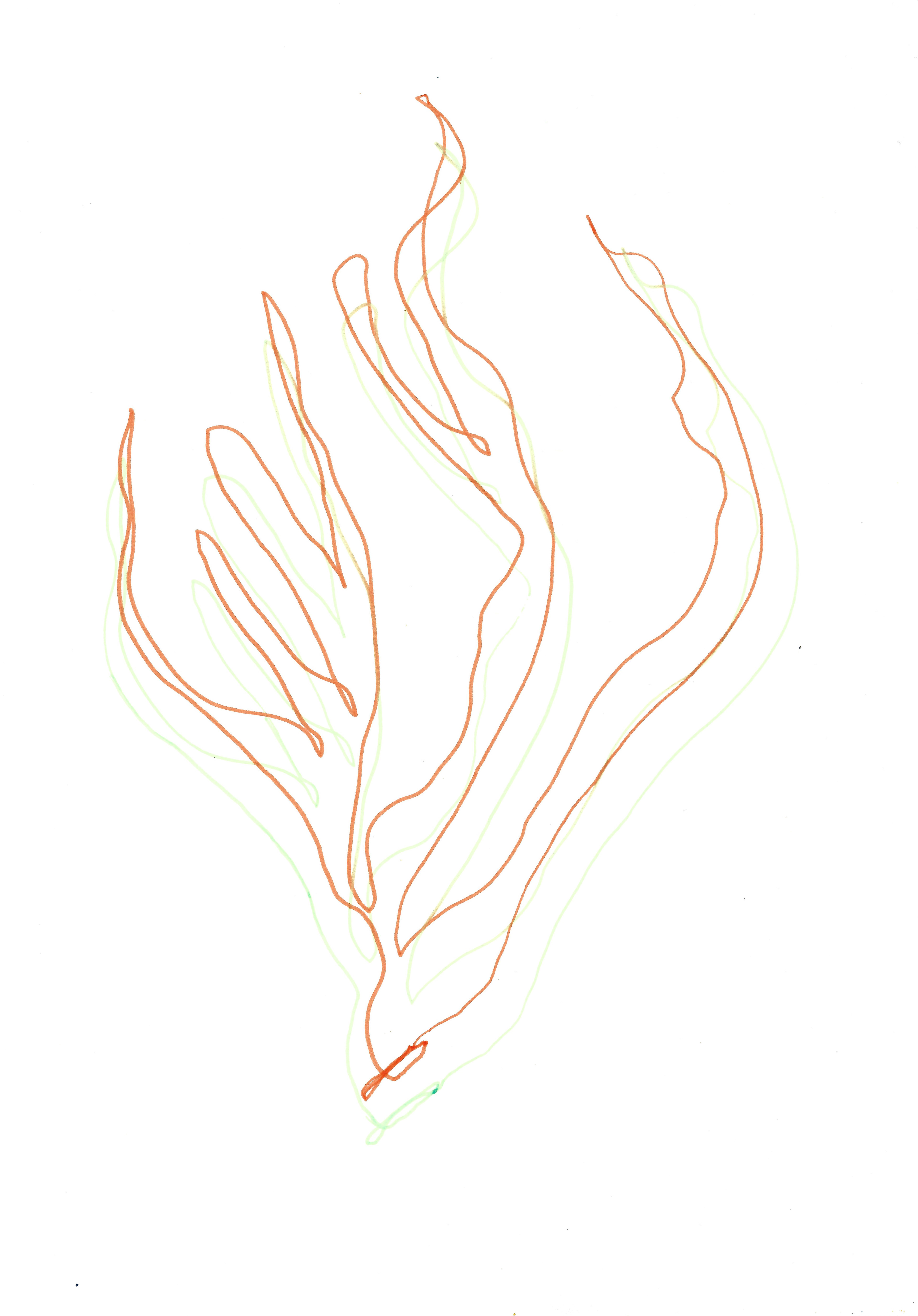
I create drawings of squiggles, using a variety of different rhythmic lines, both by hand and on illustrator. I prefer using hand drawn lines, rather than creating them on illustrator, experimenting with slight irregularity of using the hand drawn line. My recent observational drawings include a variation of different lines, which I then translate into larger abstract shapes. These lines of different natural forms subconsciously influence the lines then drawn to define the abstract shapes I produce.
Sketchbook page, 21 x 29.7 cm

Pen on paper, 21 x 29.7 cm

Pen on paper, 21 x 29.7 cm

Pen on paper, 21 x 29.7 cm
Pencil on paper, 21 x 29.7 cm

Pencil on paper, 21 x 29.7 cm
Pen on paper, 21 x 29.7 cm
Sketchbook page 21 x 29.7 cm
Sketchbook page, 21 x 29.7 cm
Sketchbook page, 21 x 29.7 cm
Sketchbook page, 21 x 29.7 cm

Sketchbook page, 21 x 29.7 cm

Sketchbook page, 21 x 29.7 cm

Sketchbook page, 29.7 x 42 cm
Sketchbook page, 29.7 x 42 cm

Sketchbook page, 21 x 29.7 cm

Sketchbook page, 21 x 29.7 cm

Pencil on paper, 21 x 29.7 cm

Pen on paper, 21 x 29.7 cm

Pencil on paper, 21 x 29.7 cm

Pencil on paper, 21 x 29.7 cm
Sketchbook page, 21 x 29.7 cm
Sketchbook page, 21 x 29.7 cm

Sketchbook page, 21 x 29.7 cm
Sketchbook page, 21 x 29.7 cm
Sketchbook page, 21 x 29.7 cm

Sketchbook page, 21 x 29.7 cm

Pencil on paper, 21 x 29.7 cm
Pen on paper, 21 x 29.7 cm
Pen on paper, 21 x 29.7 cm
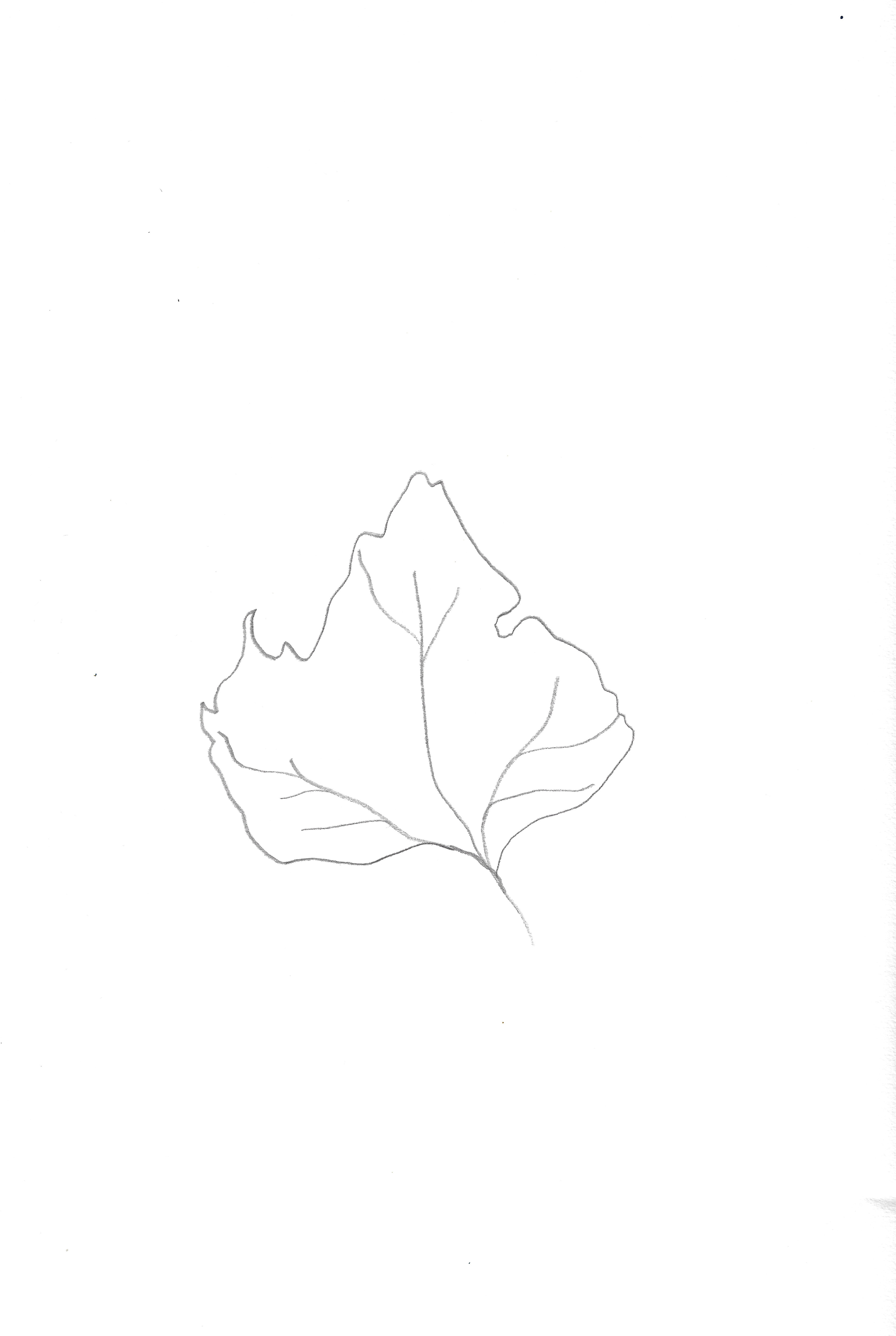
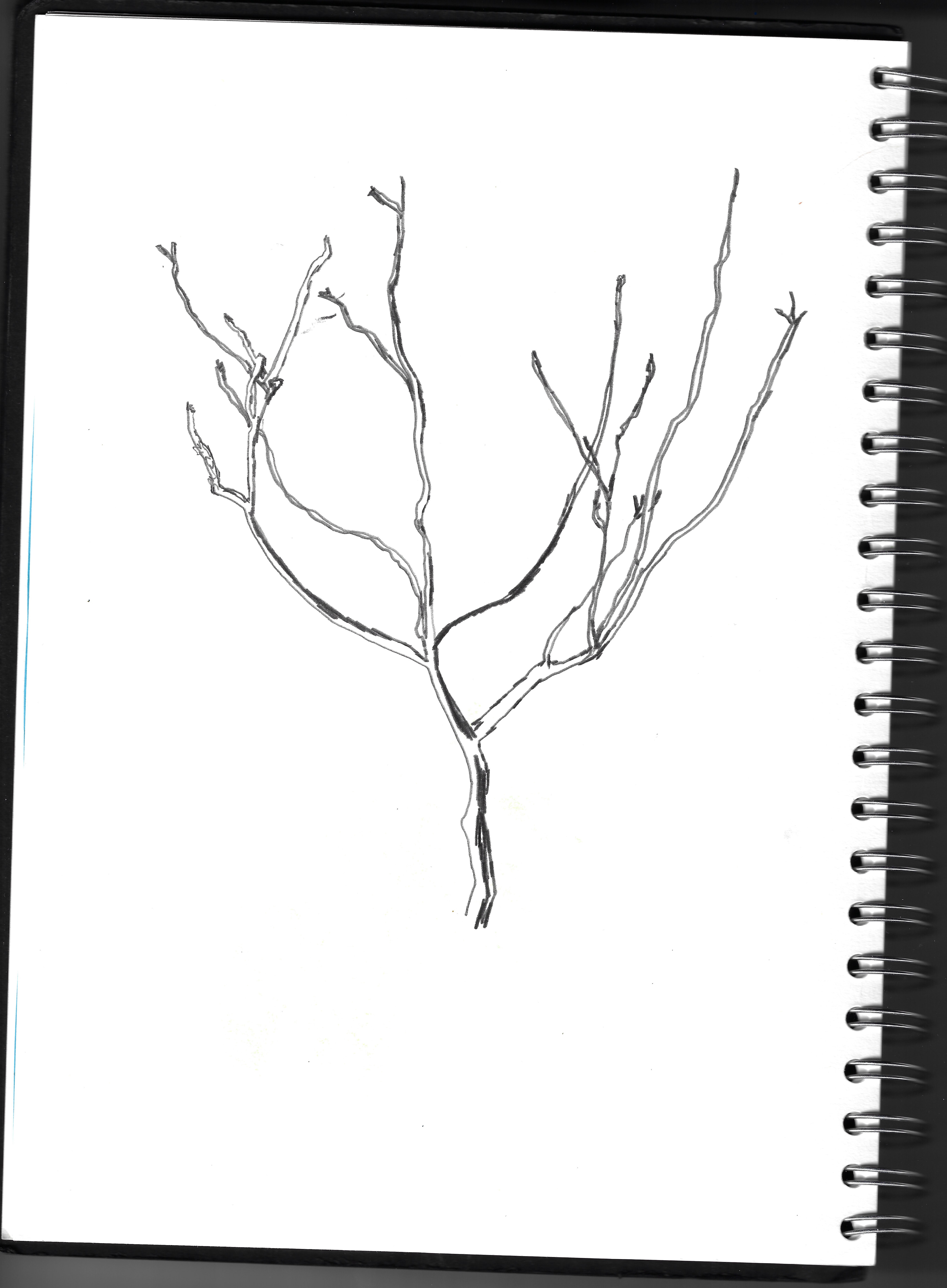
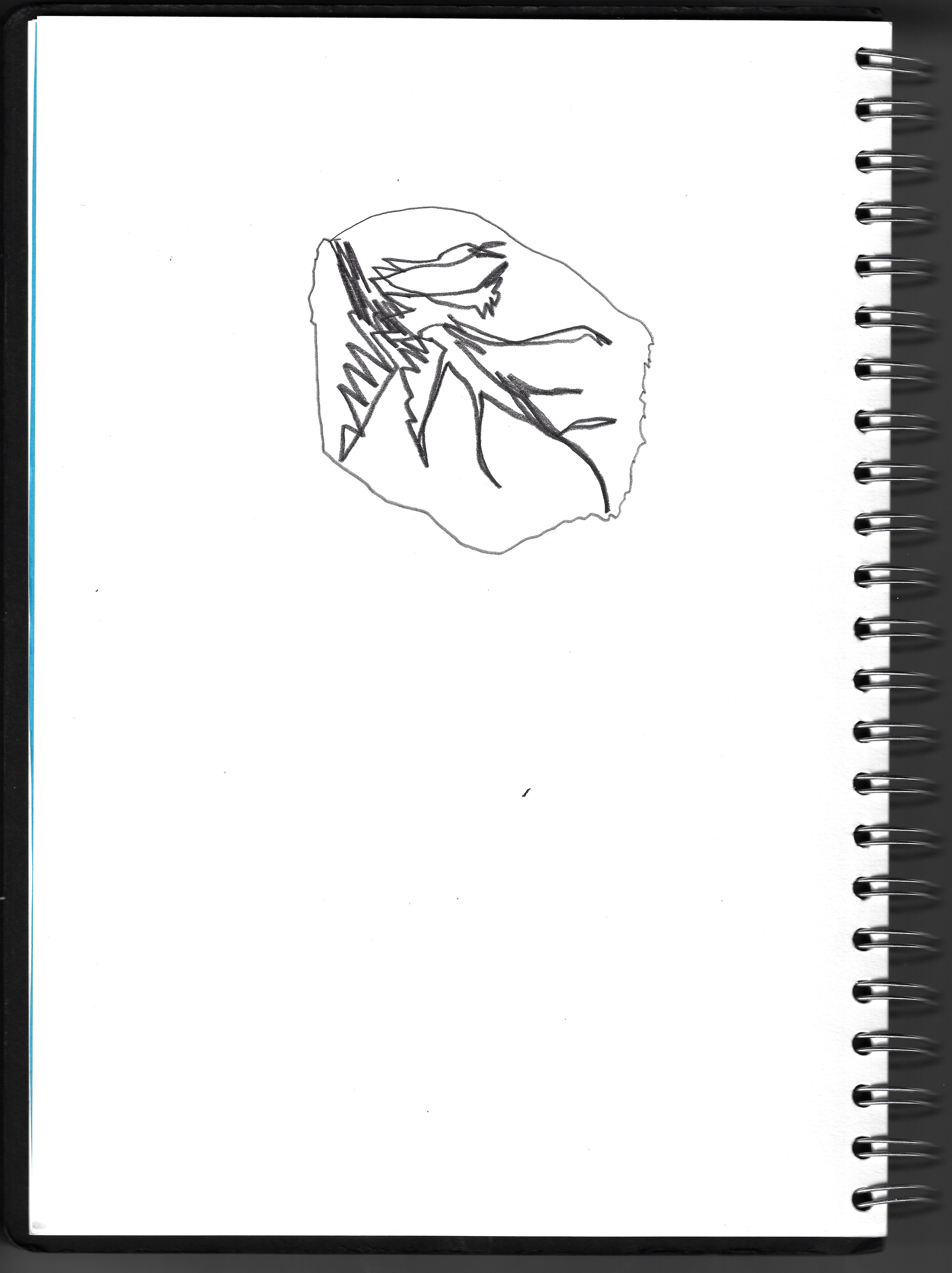
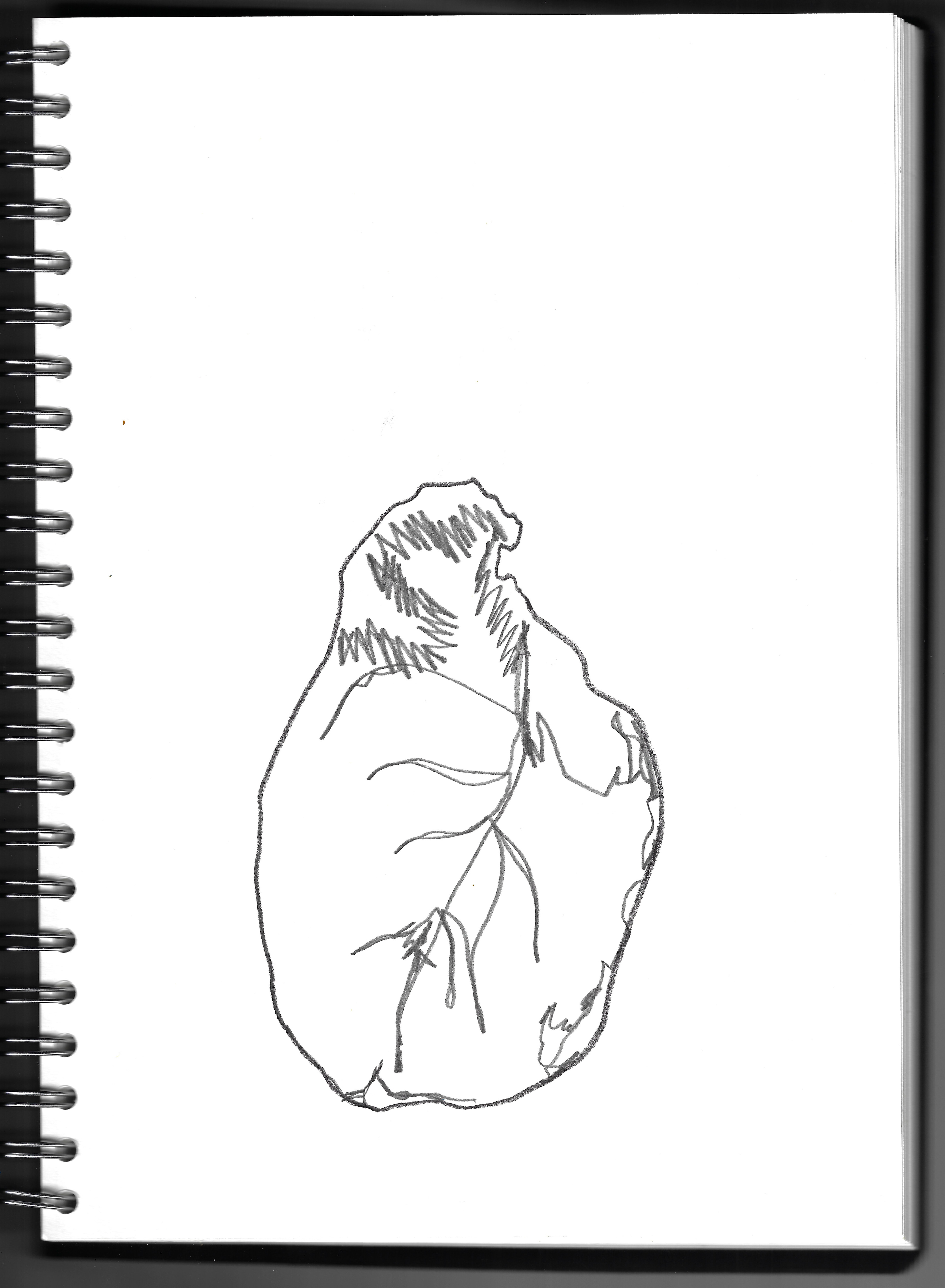
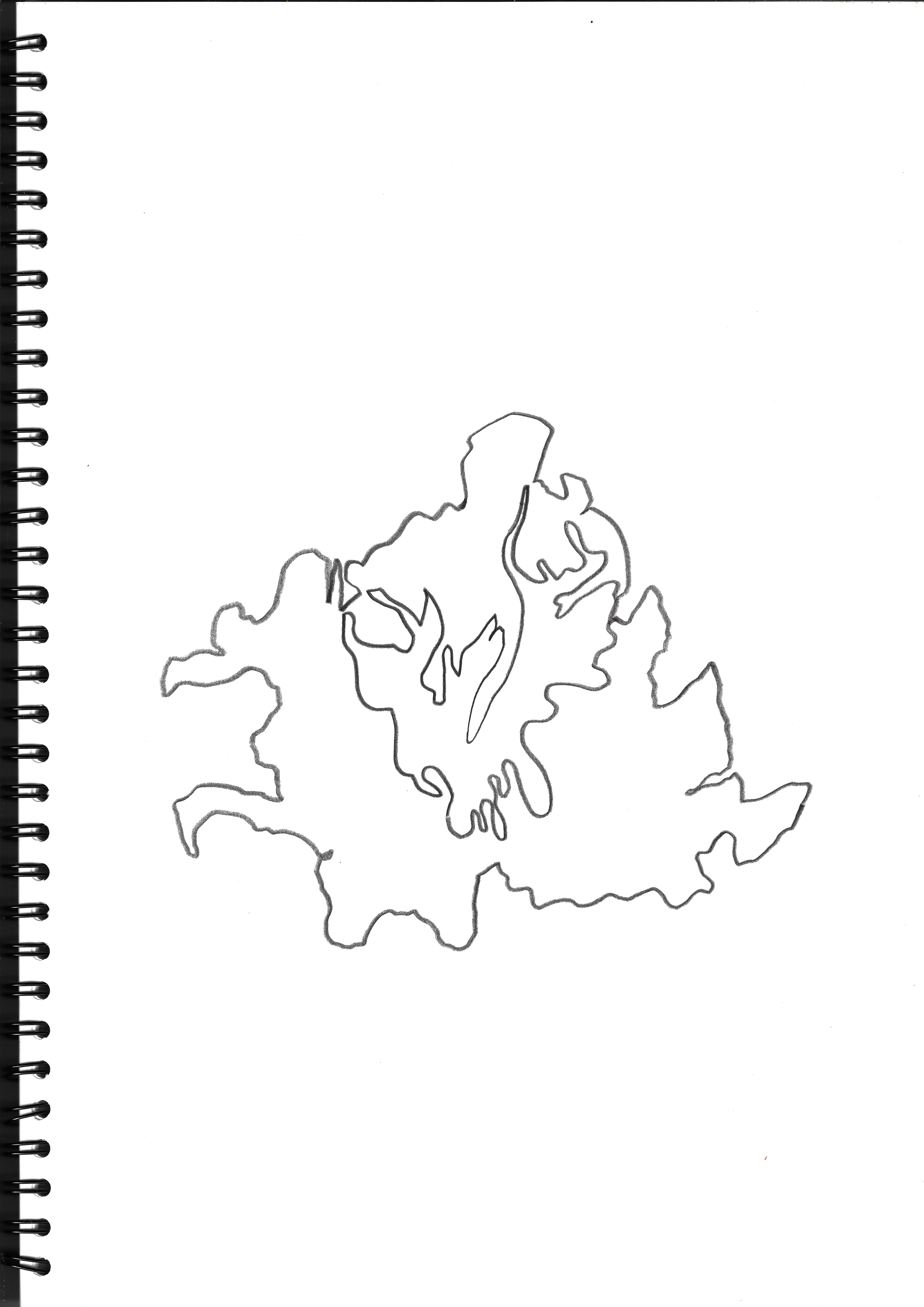
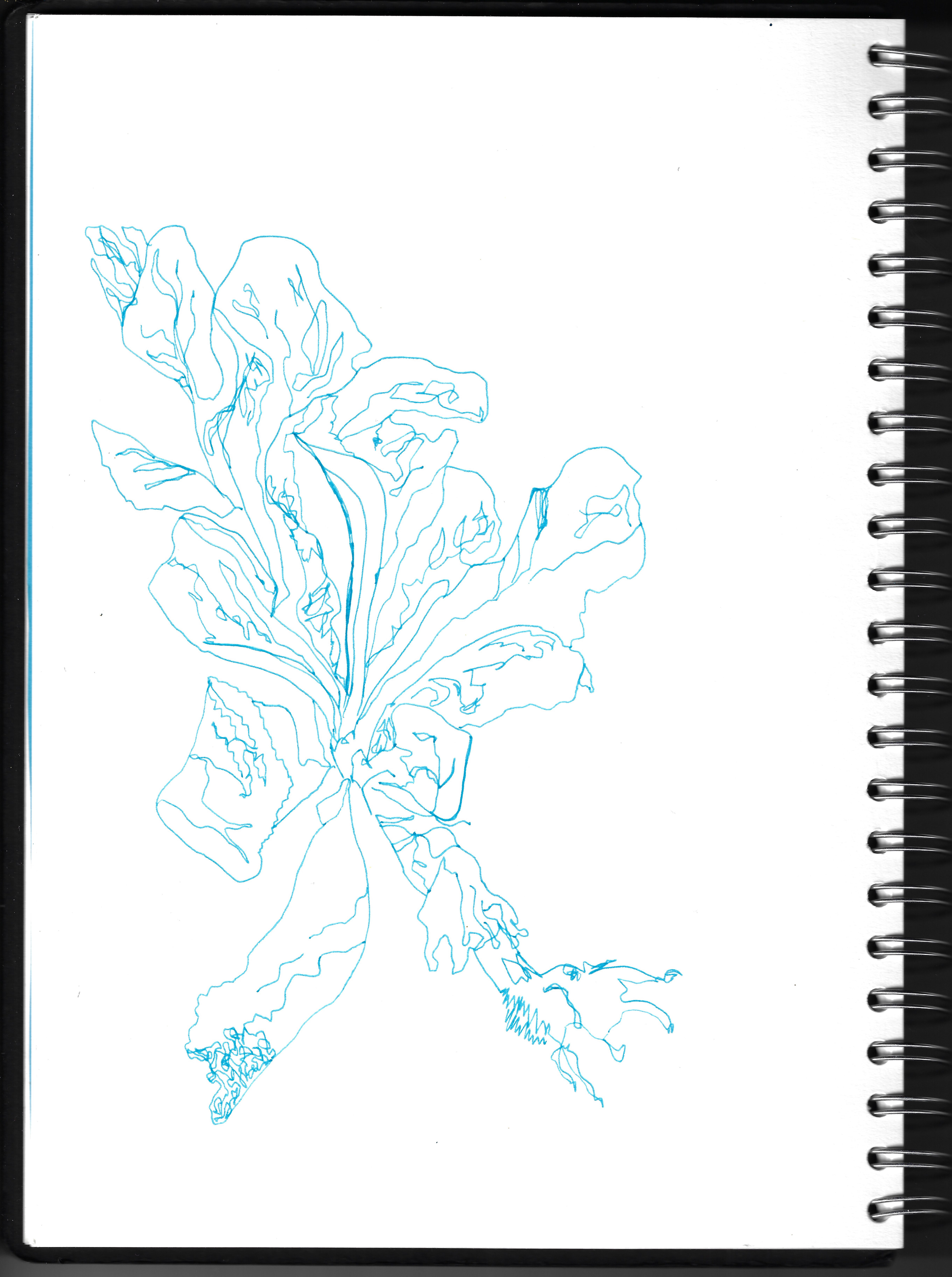
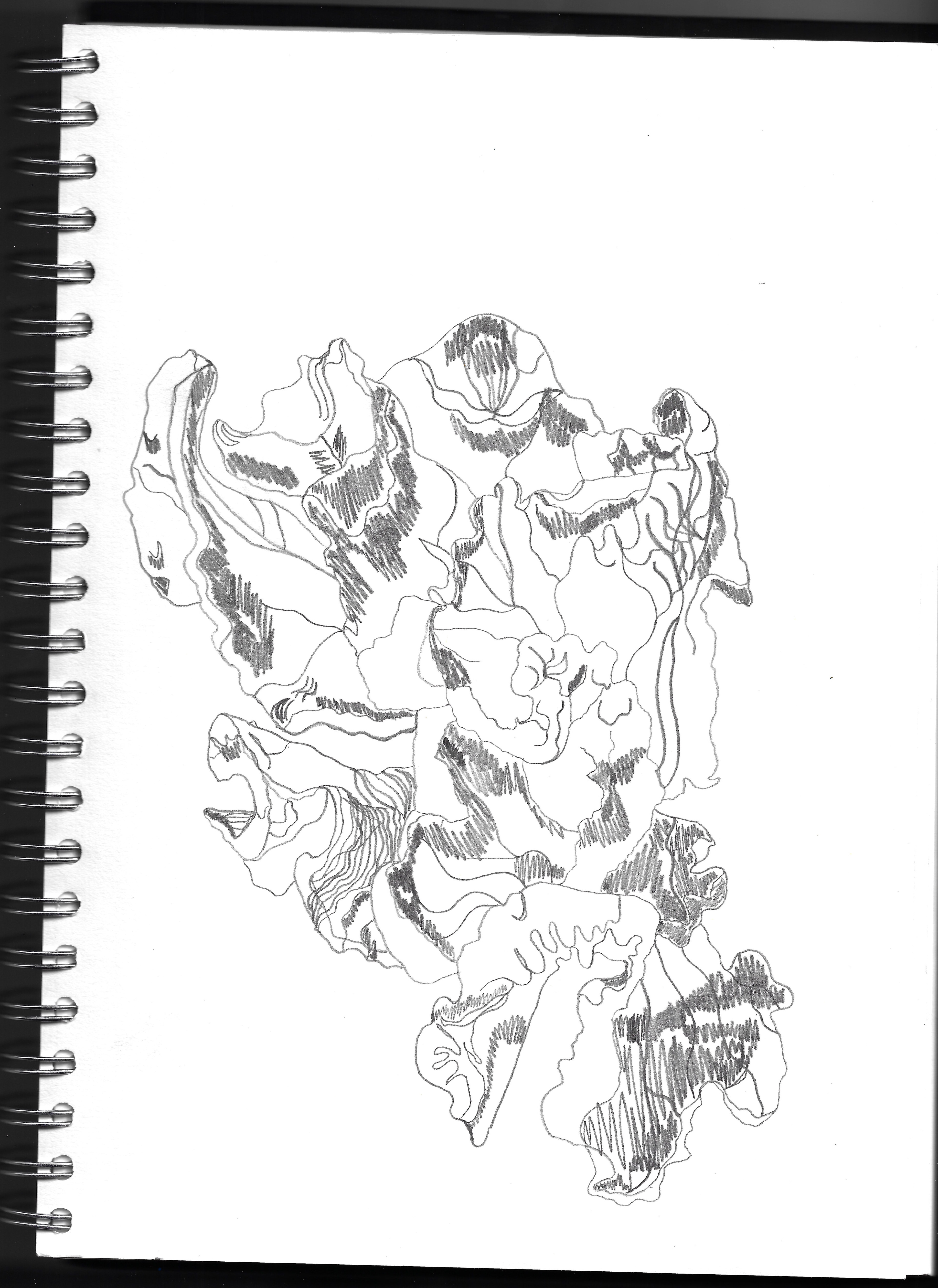
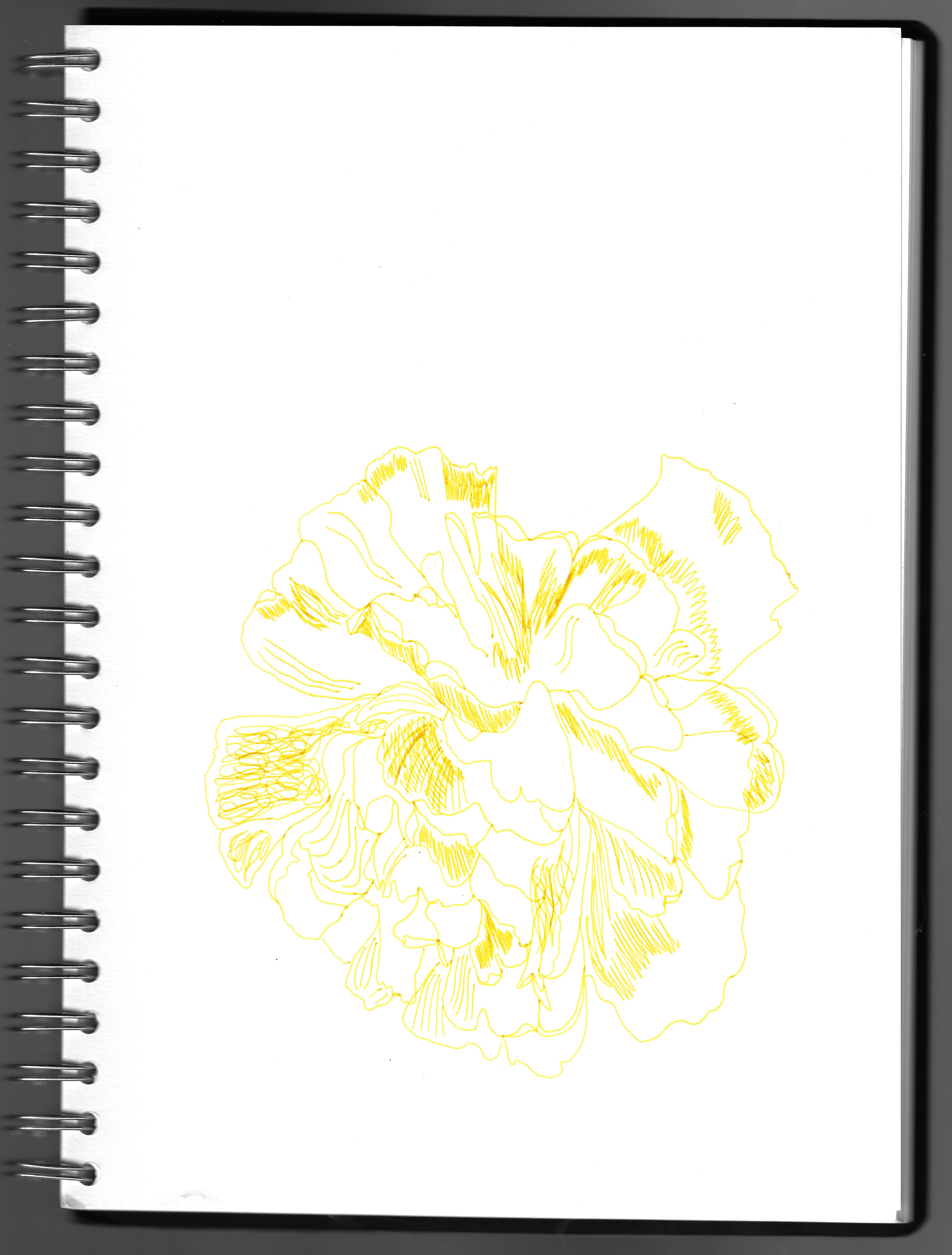
I create a variety of different observational drawings of organic matter focussing on the dominating line in the structure and the different ways of conveying this.
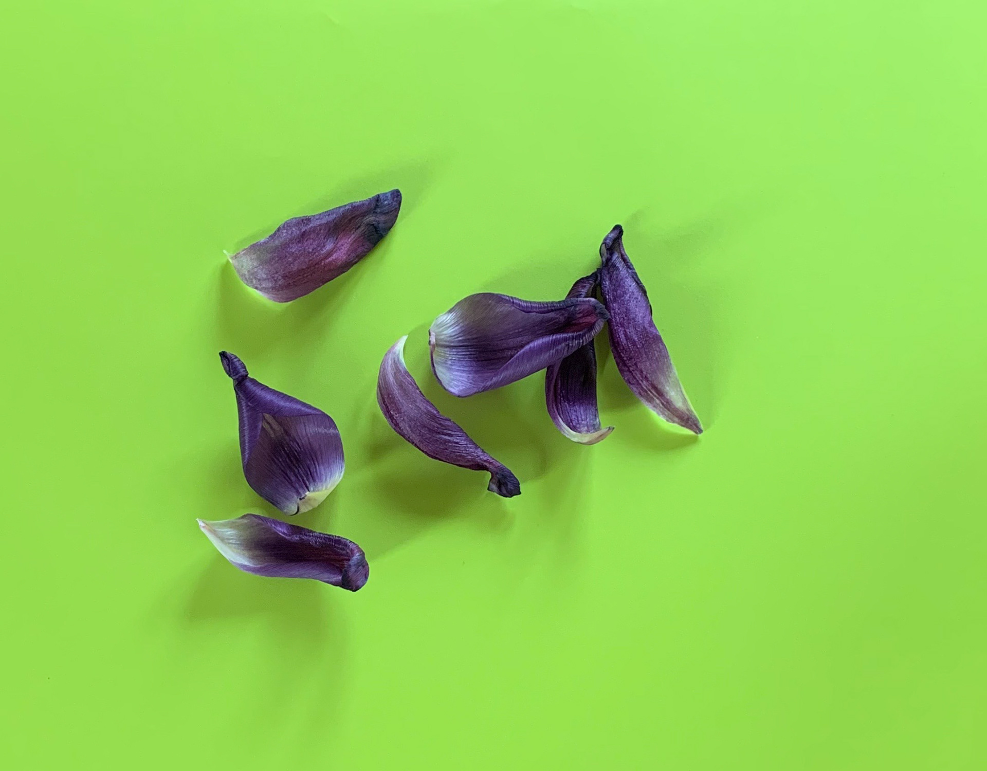
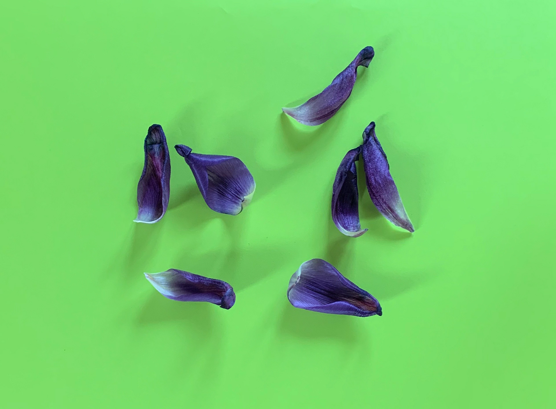
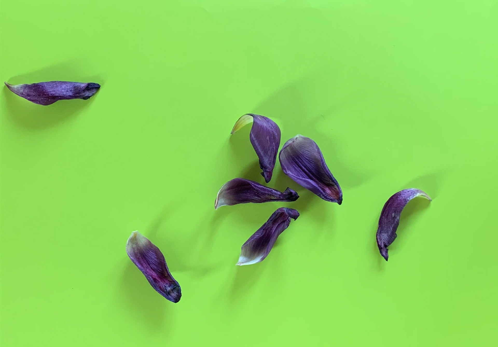
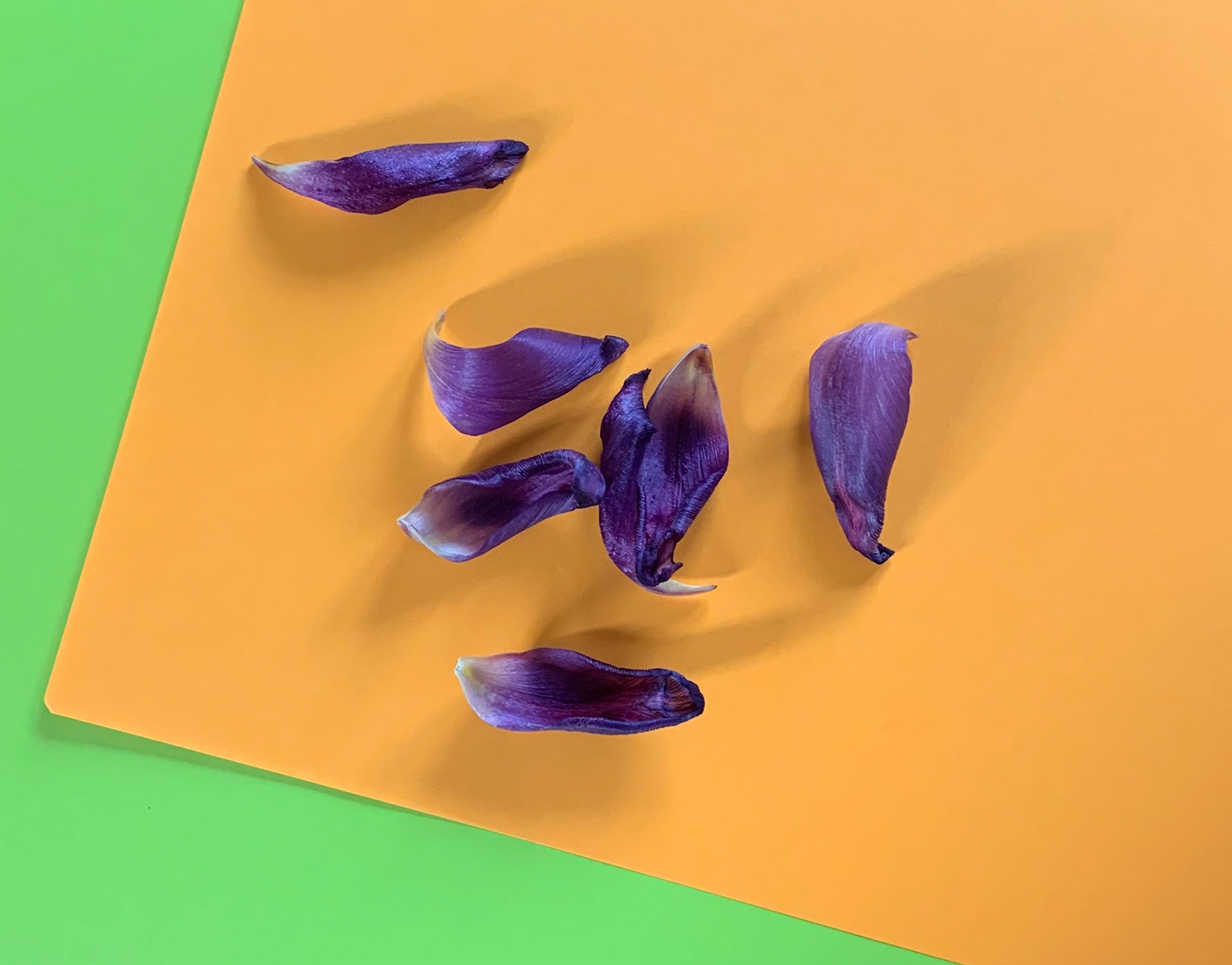
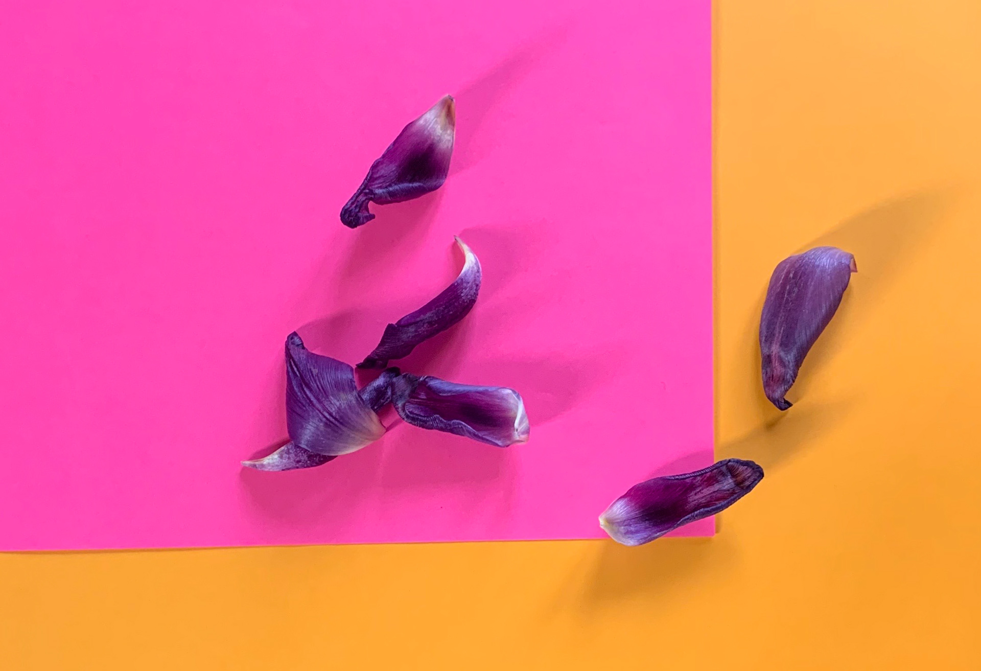
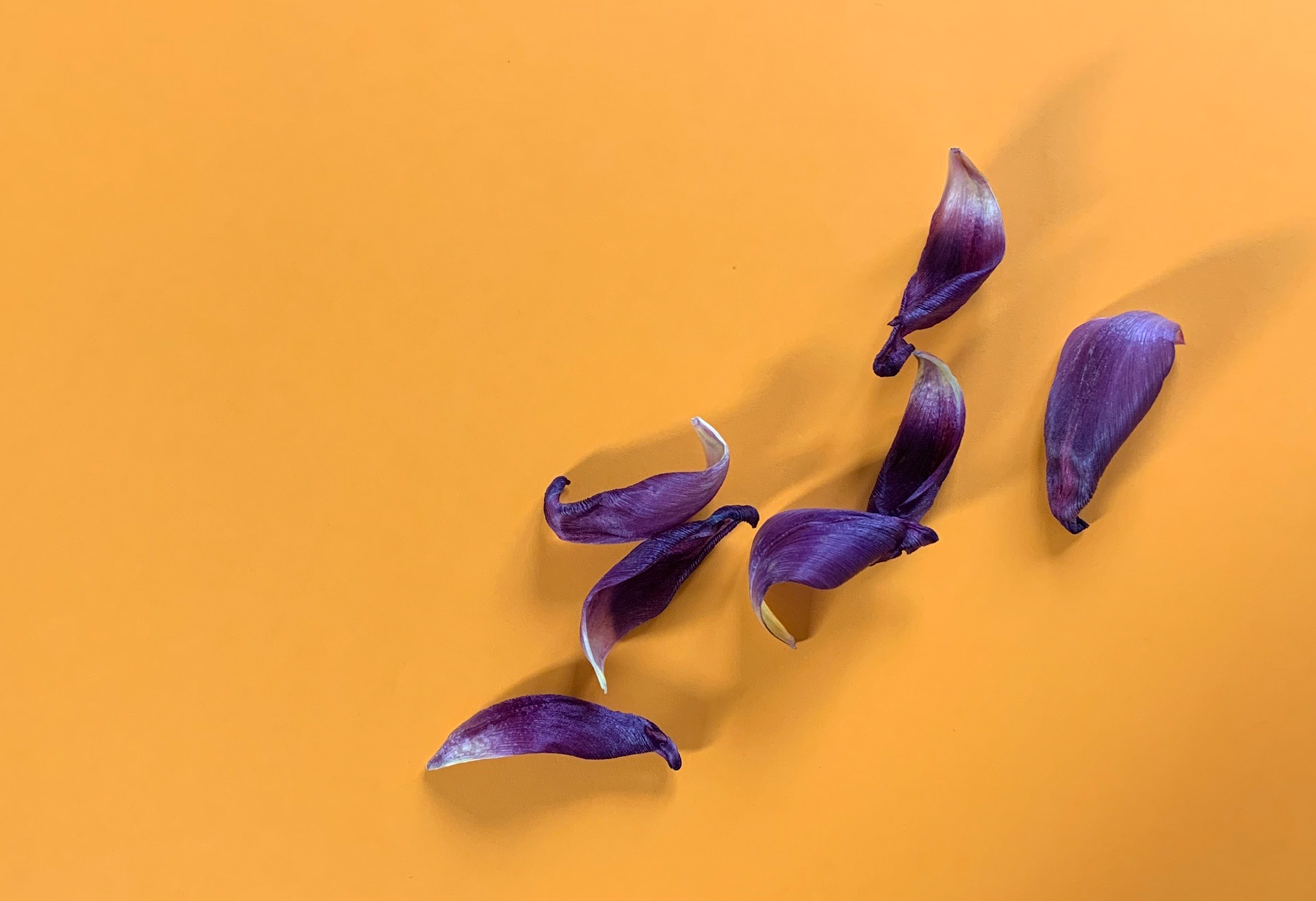
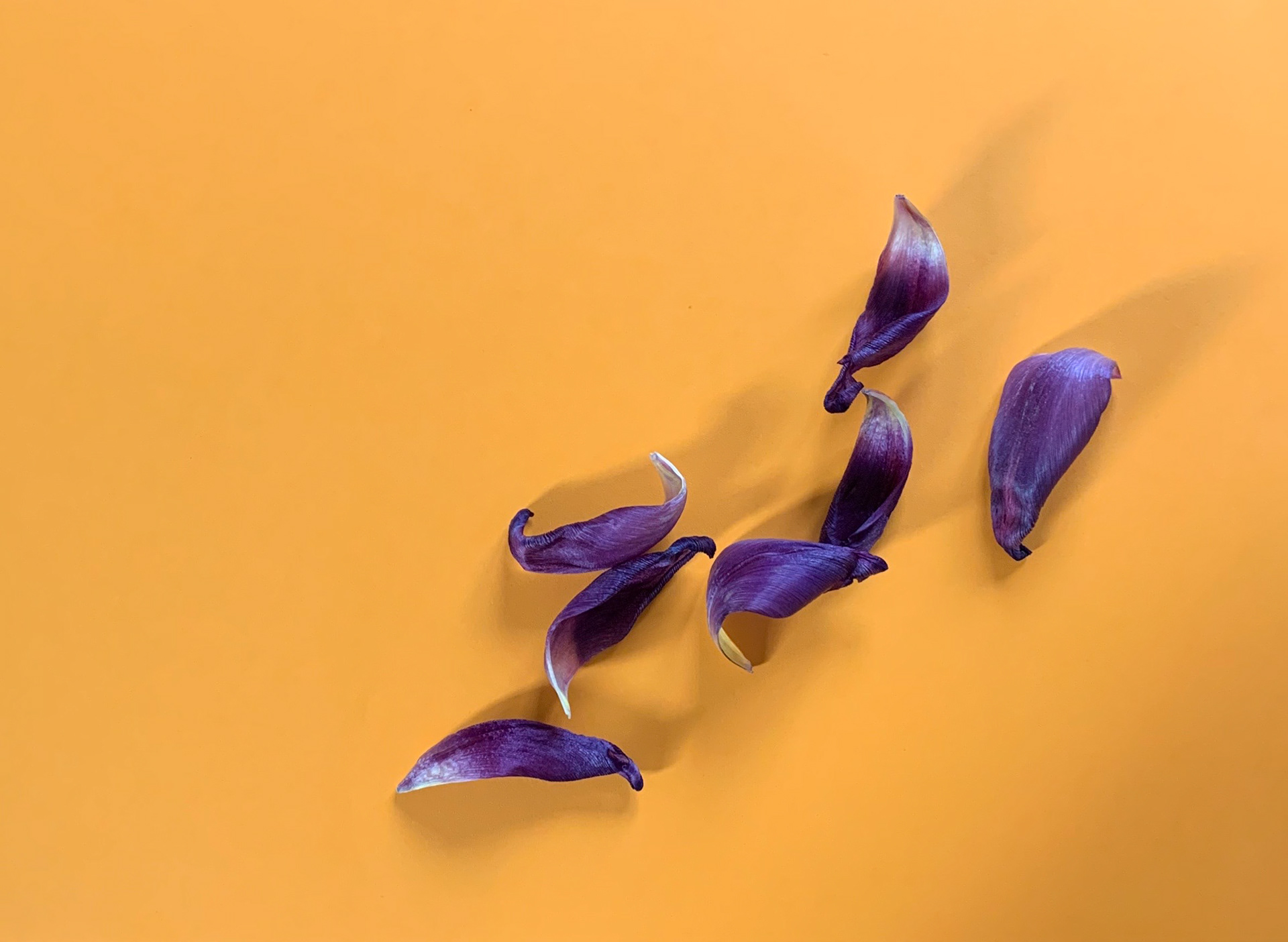

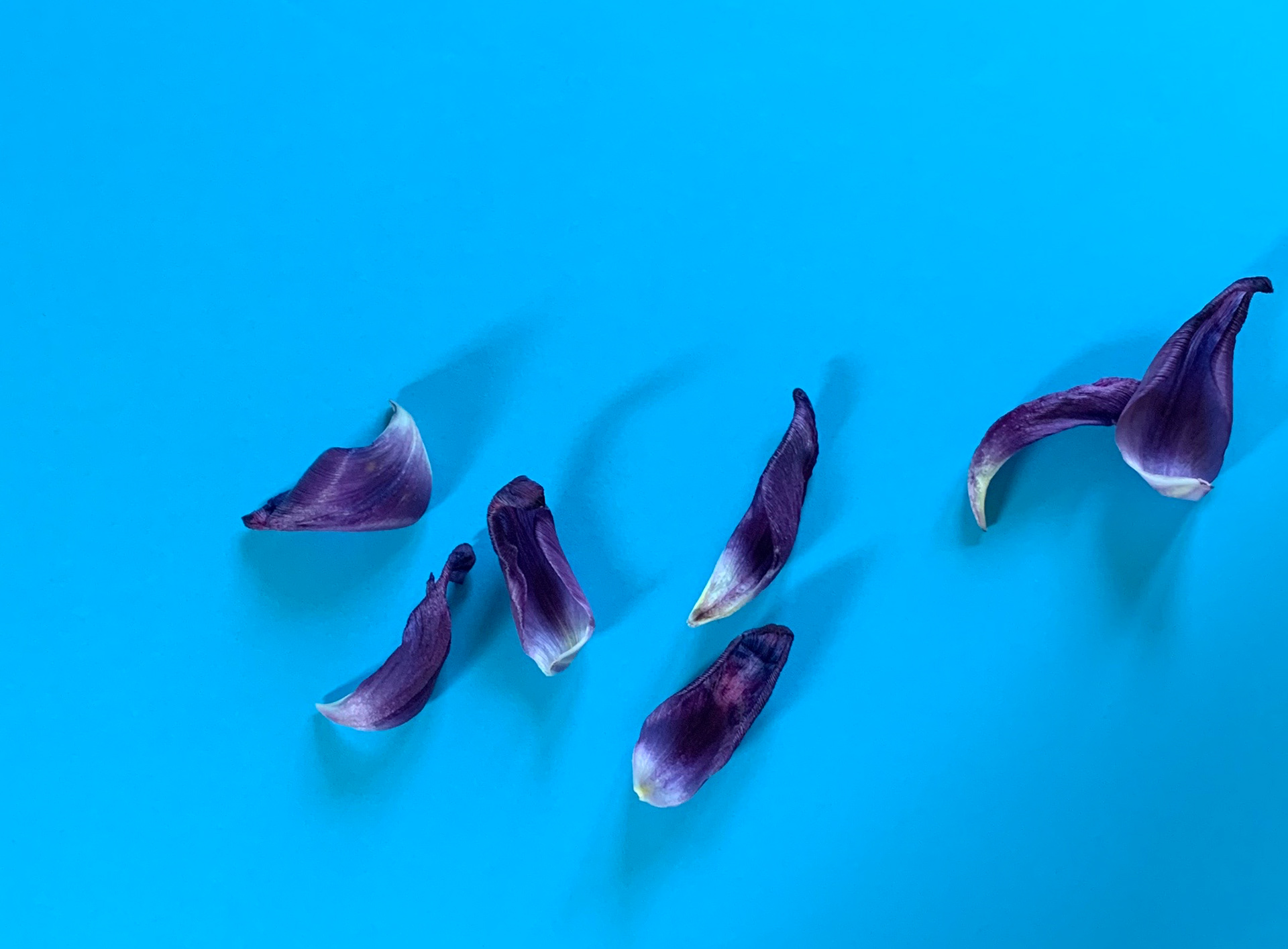
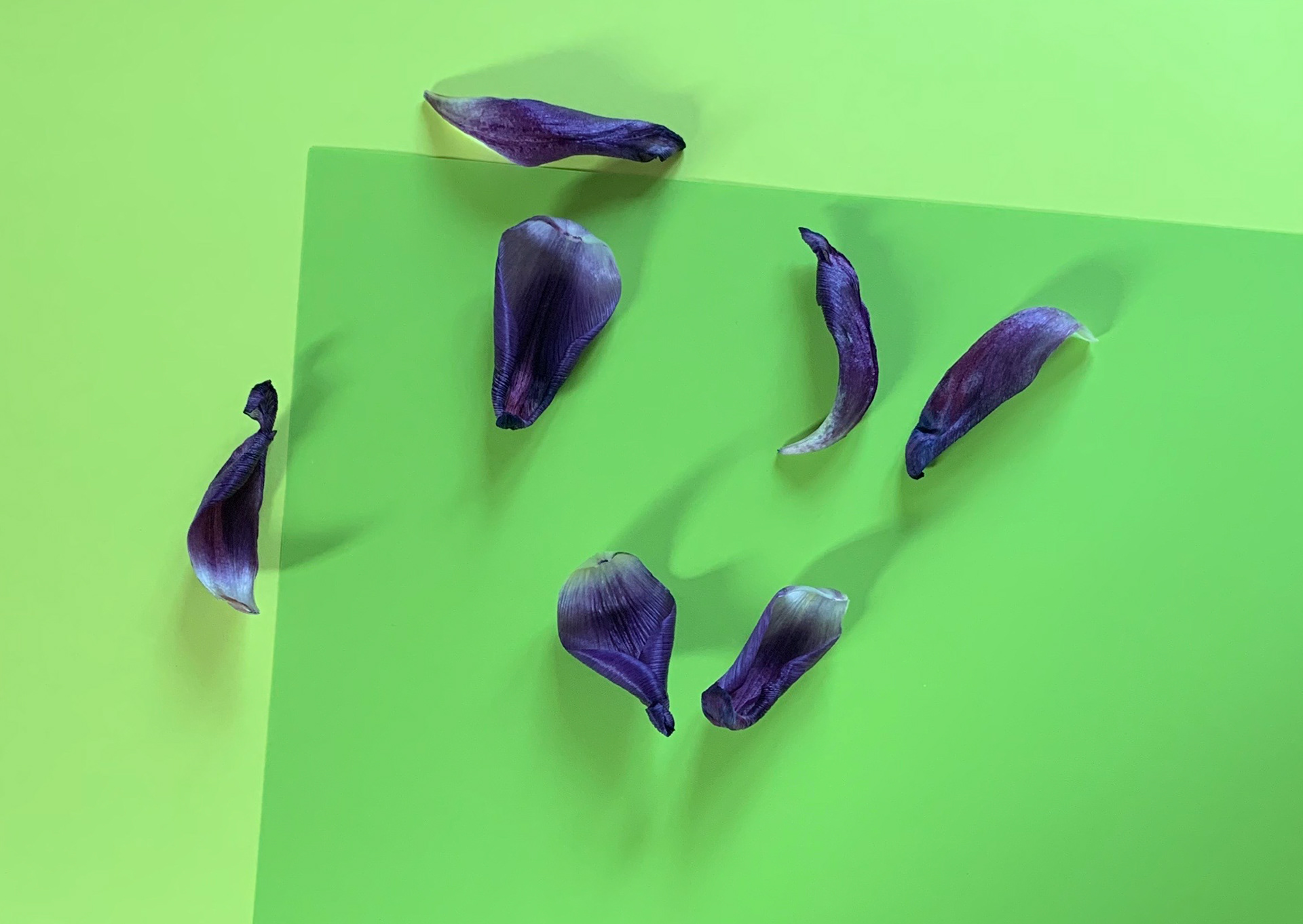

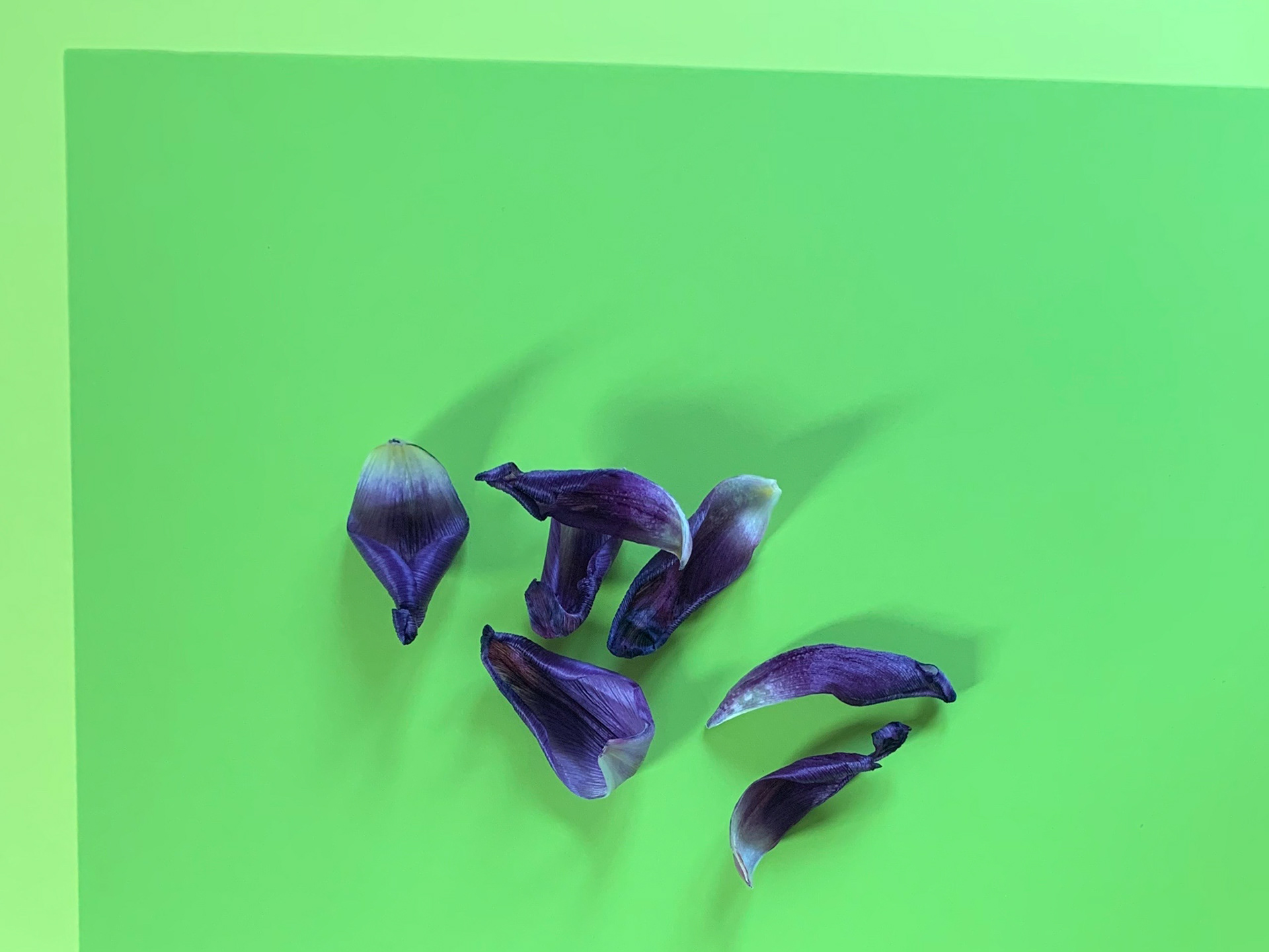

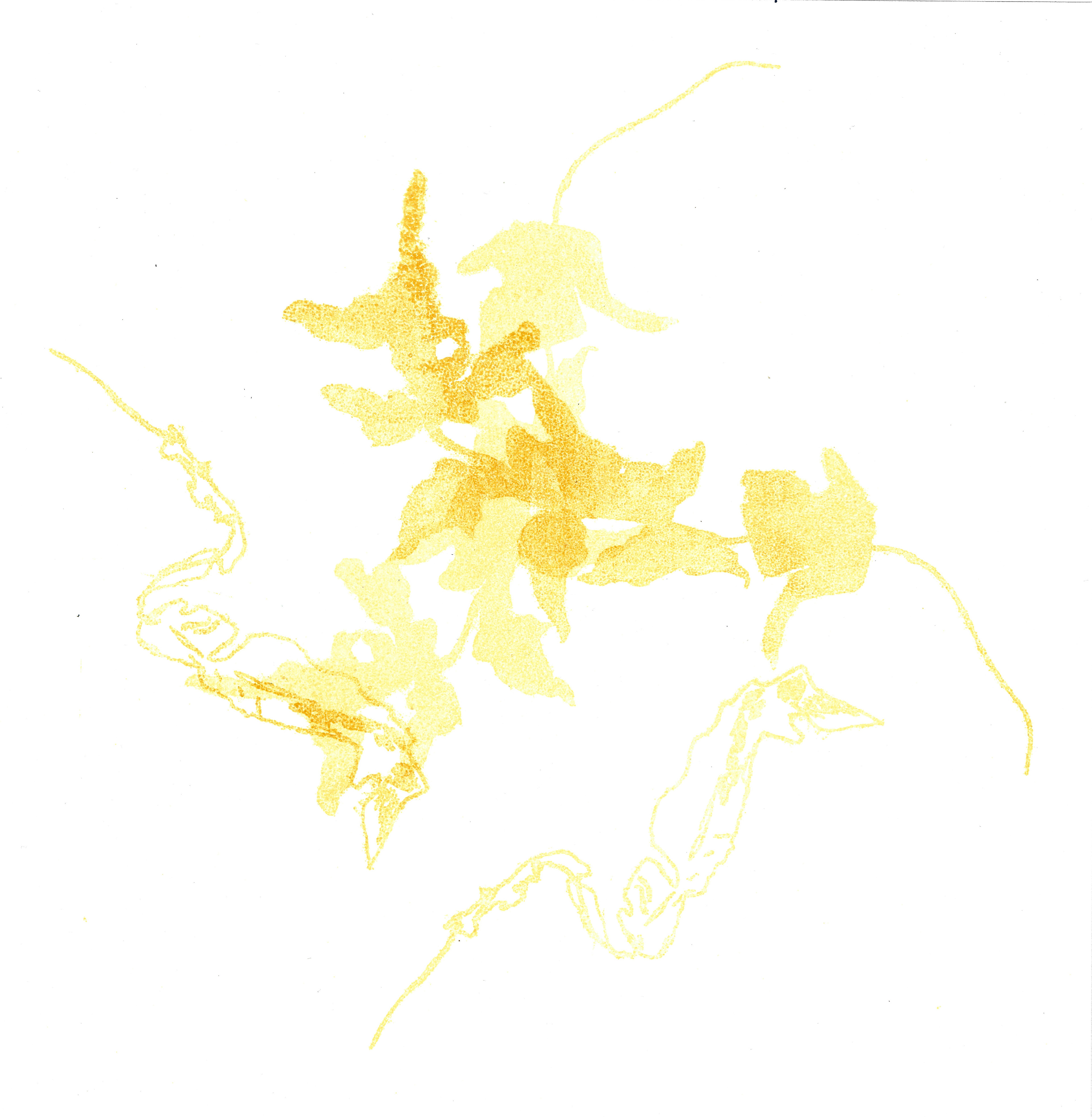
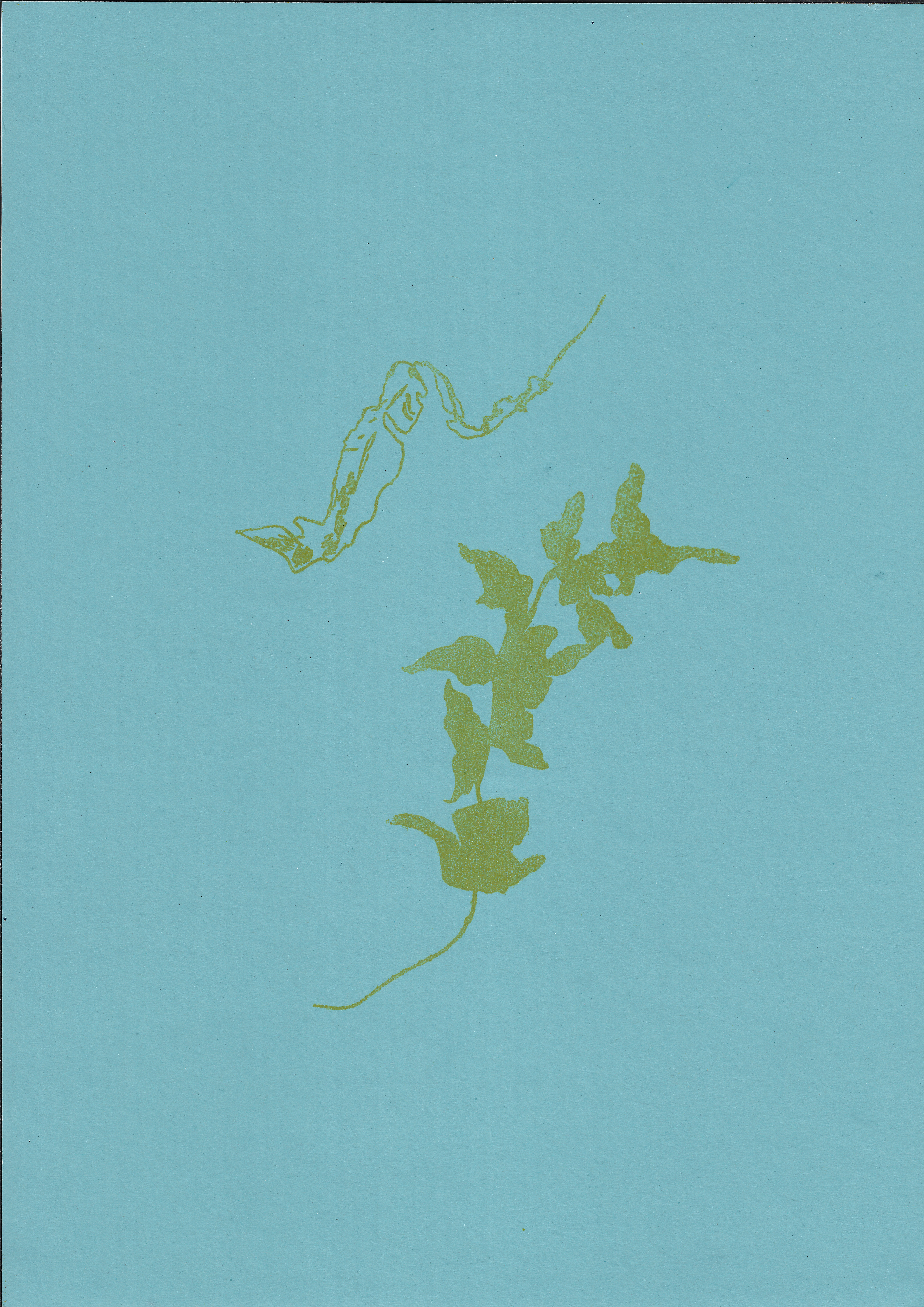
I scatter petals over coloured paper, moving them and the paper between each shot. I play with the interaction between the colour and form of the petals, and their shadows, with the sharp lines of the coloured paper.
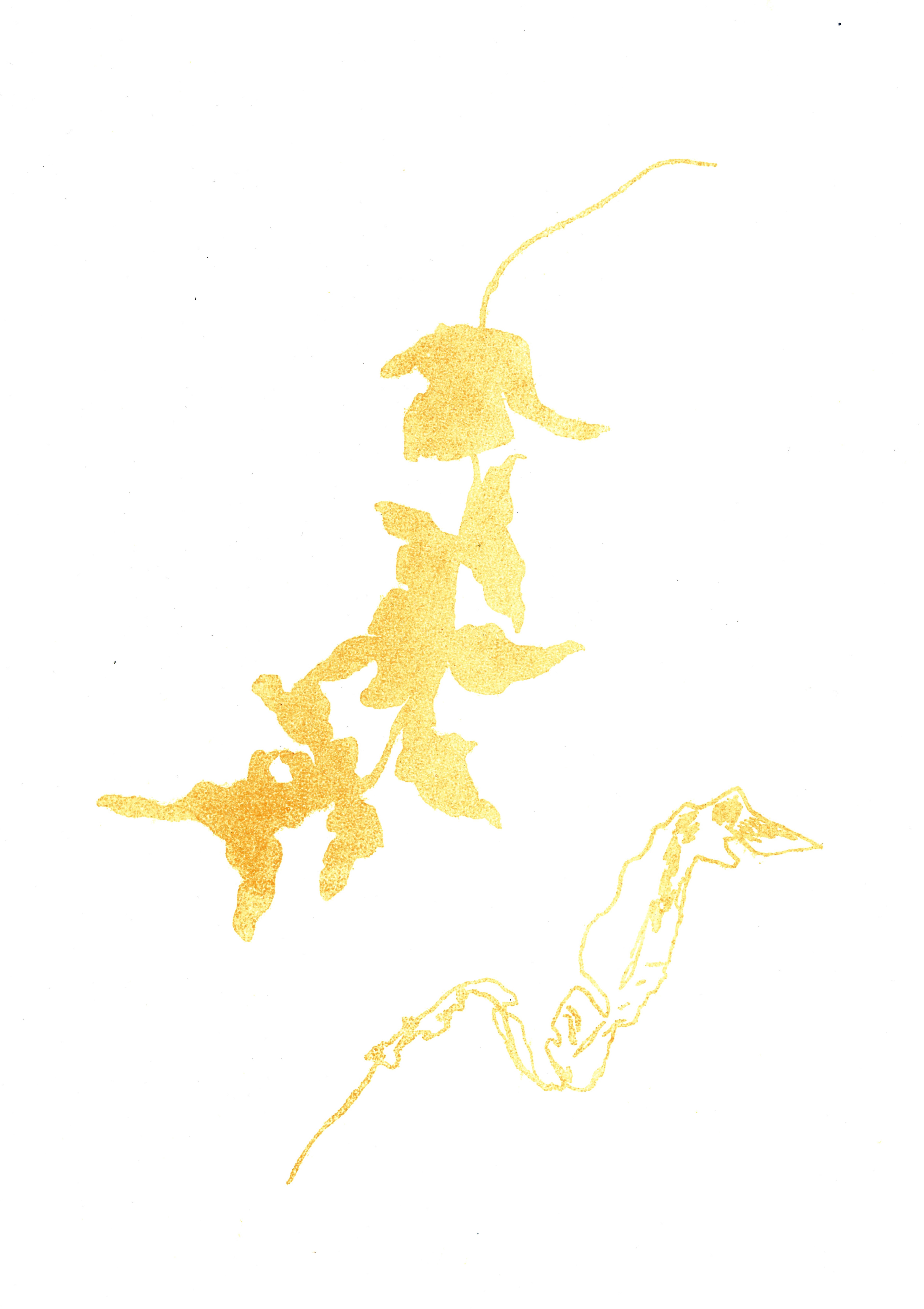
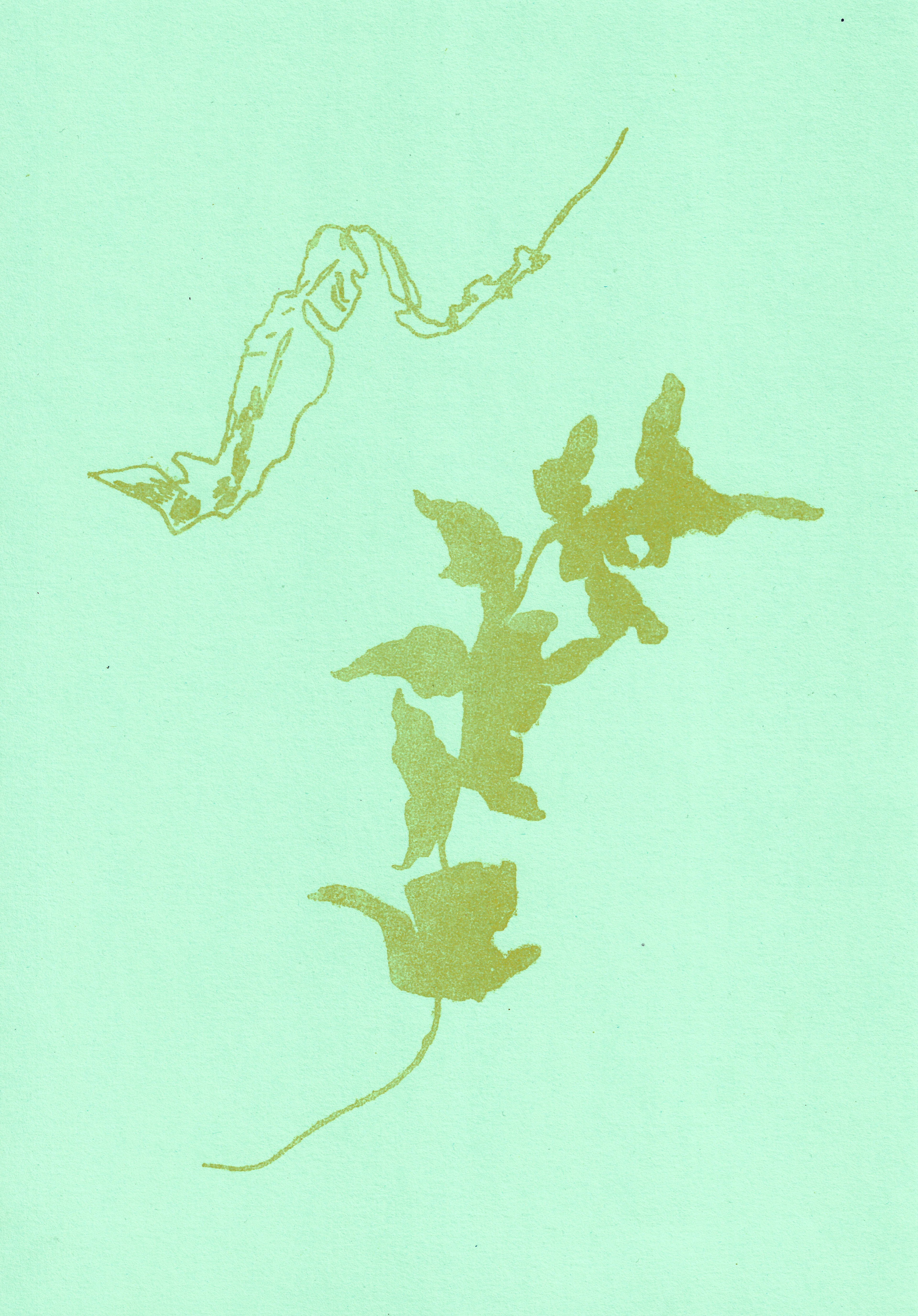
Lithograph, 54 x 39 cm
Lithograph, 52 x 39 cm

Lithograph, 29.7 x 42 cm
Lithograph, 29.7 x 42 cm

Lithograph Stone
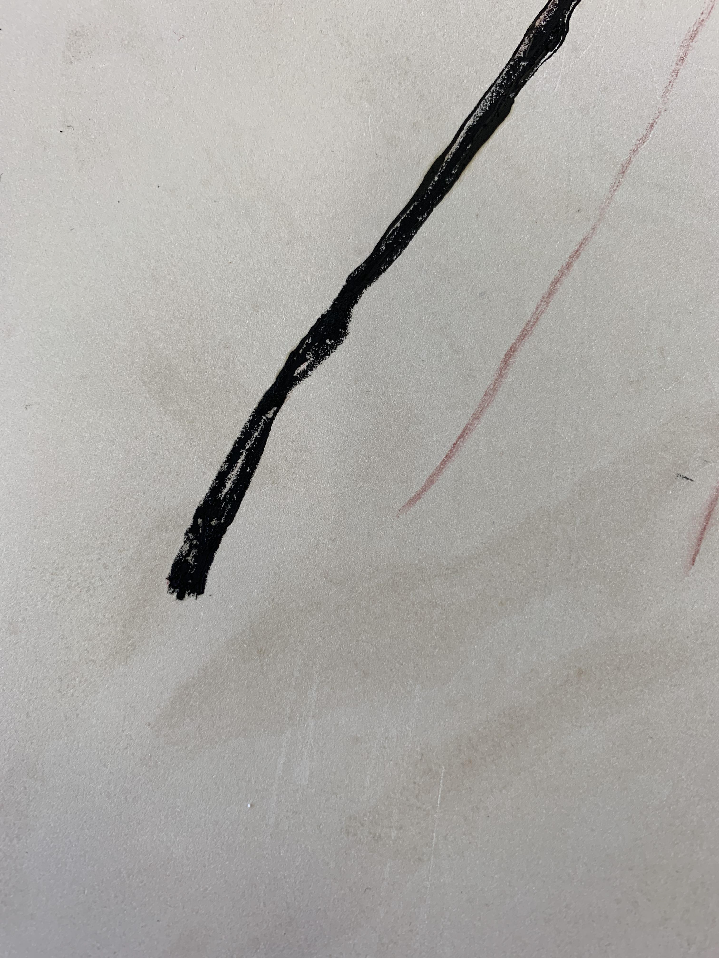
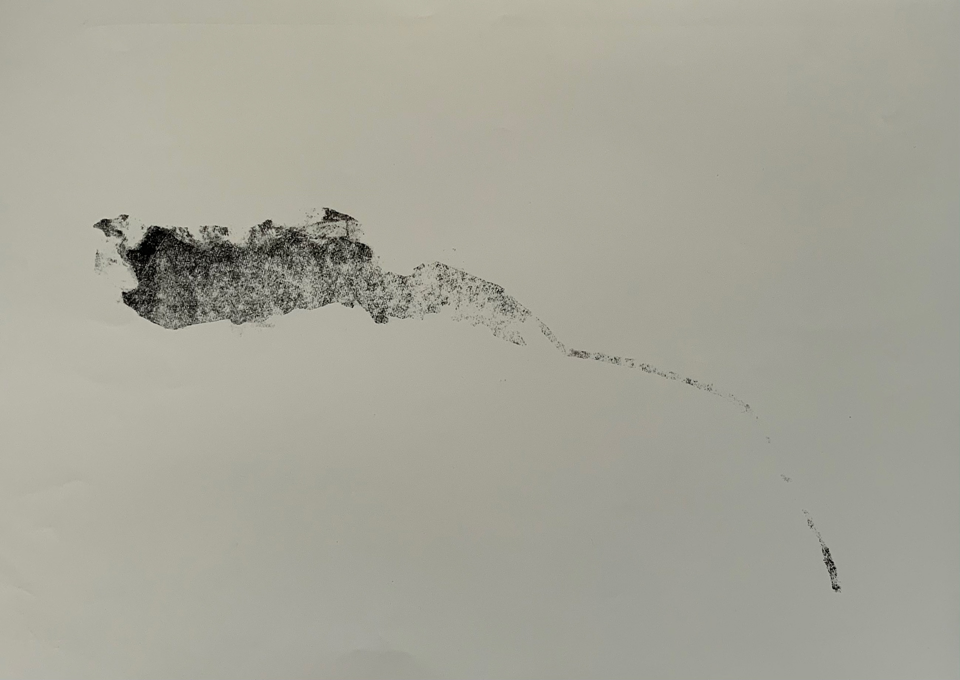
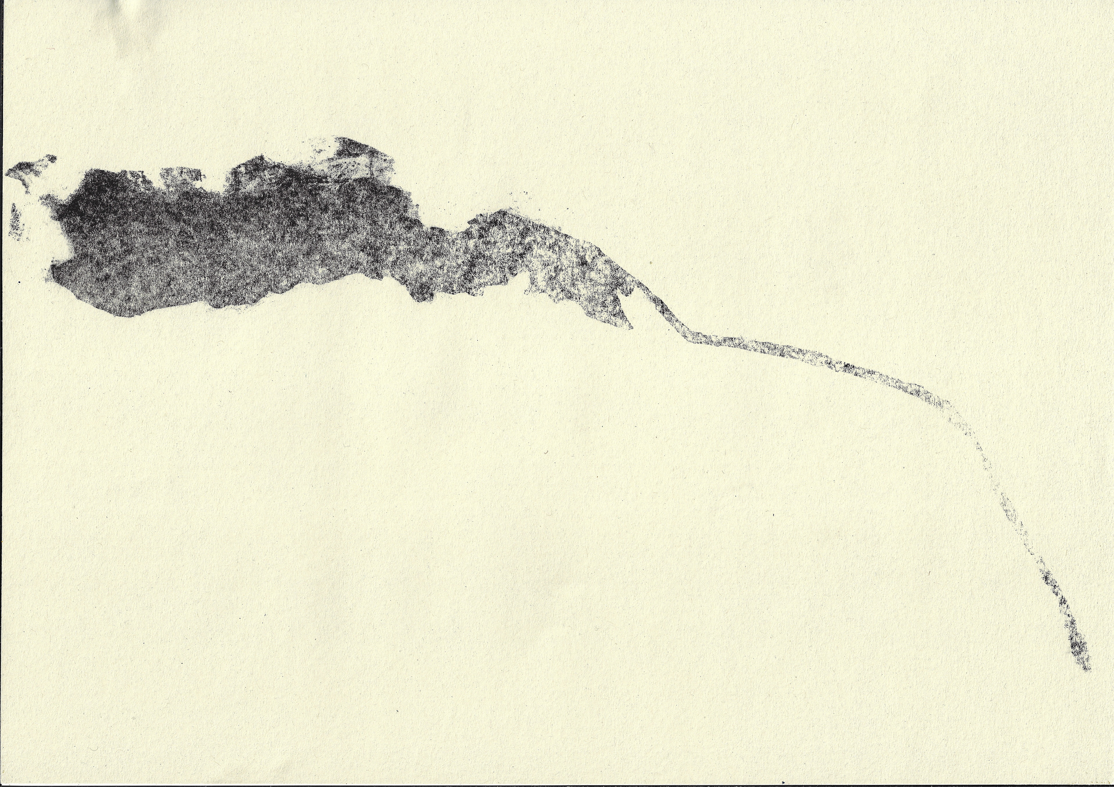
I print the leaf I drew on the lithographic stone in the previous week. There is a large amount of grease content around the edges of the stone, surrounding my drawing. This is either because the stone had been unknowingly handled from when I drew the leaf last week, or I did not prepare the stone correctly. There are interesting lines and marks in the unexpected background content. However, I do also create a stencil to mask these marks to solely define the solitary leaf. The original intention was to focus on the dominating line in the natural structure, yet the unexpected content relates to the concepts of the subconscious influence.
Screenprint, 21 x 29.7 cm
Screenprint, 21 x 29.7 cm

Screenprint, 21 x 29.7 cm

Screenprint, 21 x 29.7 cm
Screenprint, 21 x 29.7 cm

Screenprint, 21 x 29.7 cm

Screenprint, 21 x 29.7 cm
Screenprint, 21 x 29.7 cm
Screenprint, 21 x 29.7 cm
Screenprint, 21 x 29.7 cm

Screenprint, 21 x 29.7 cm
Screenprint, 21 x 29.7 cm

Screenprint, 23 x 30 cm
Screenprint, 27 x 32.5 cm
Screenprint, 29.7 x 42 cm
Screenprint, 29.7 x 42 cm

Screenprint, 29.7 x 42 cm
Screenprint, 29.7 x 42 cm
Screenprint, 29.7 x 42 cm

Screenprint, 29.7 x 42 cm
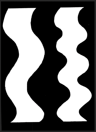
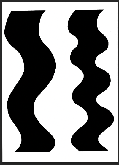
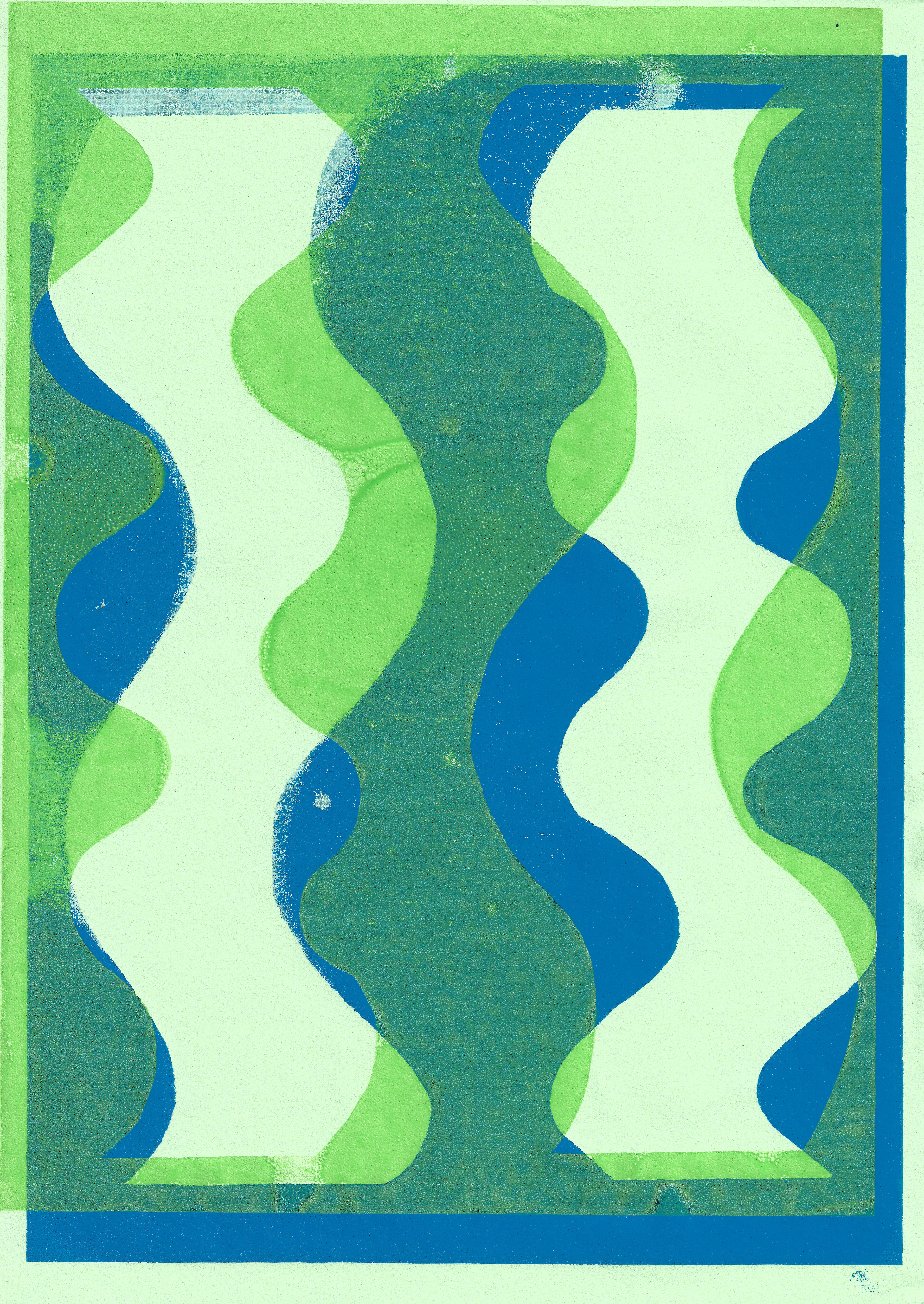
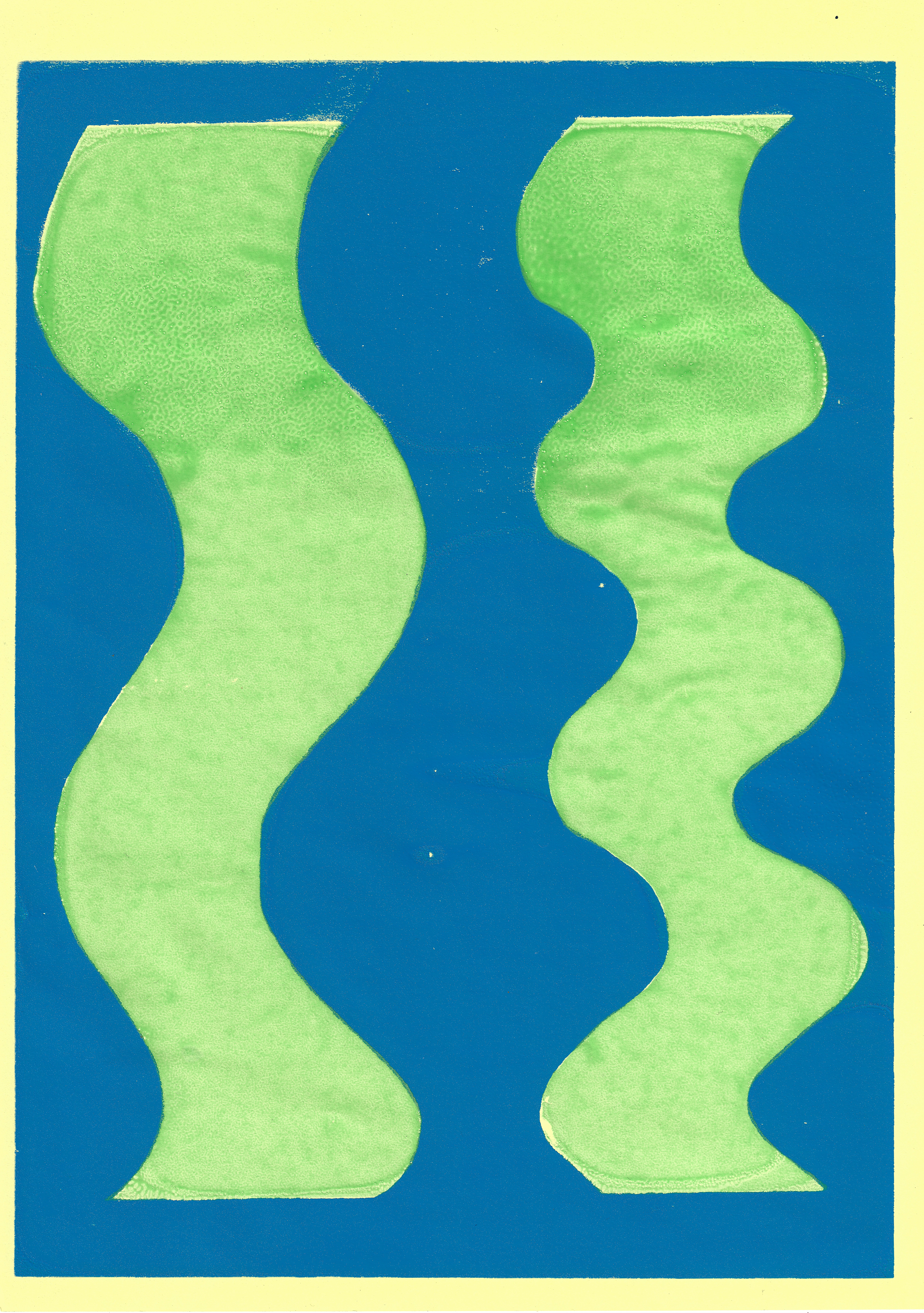
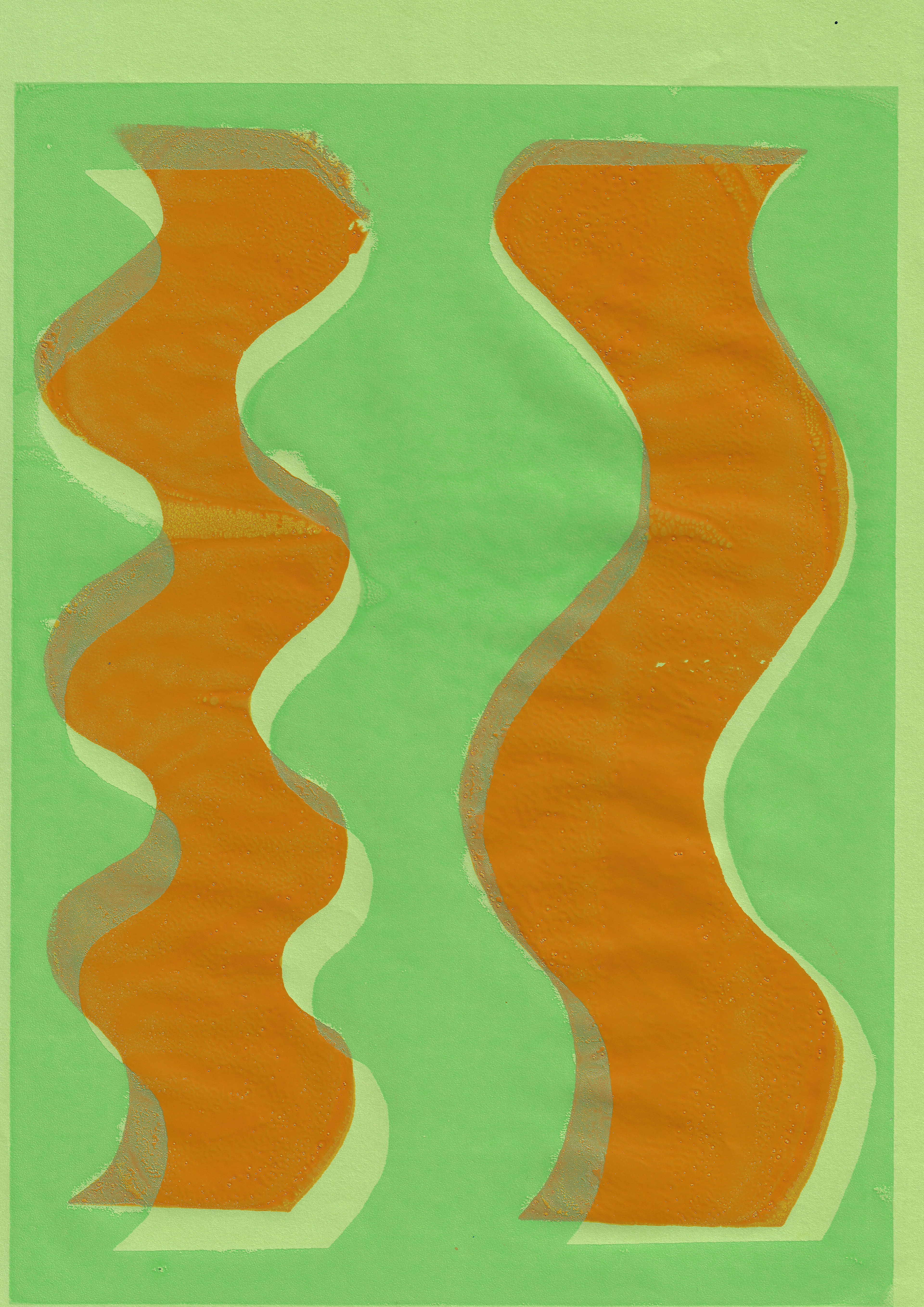
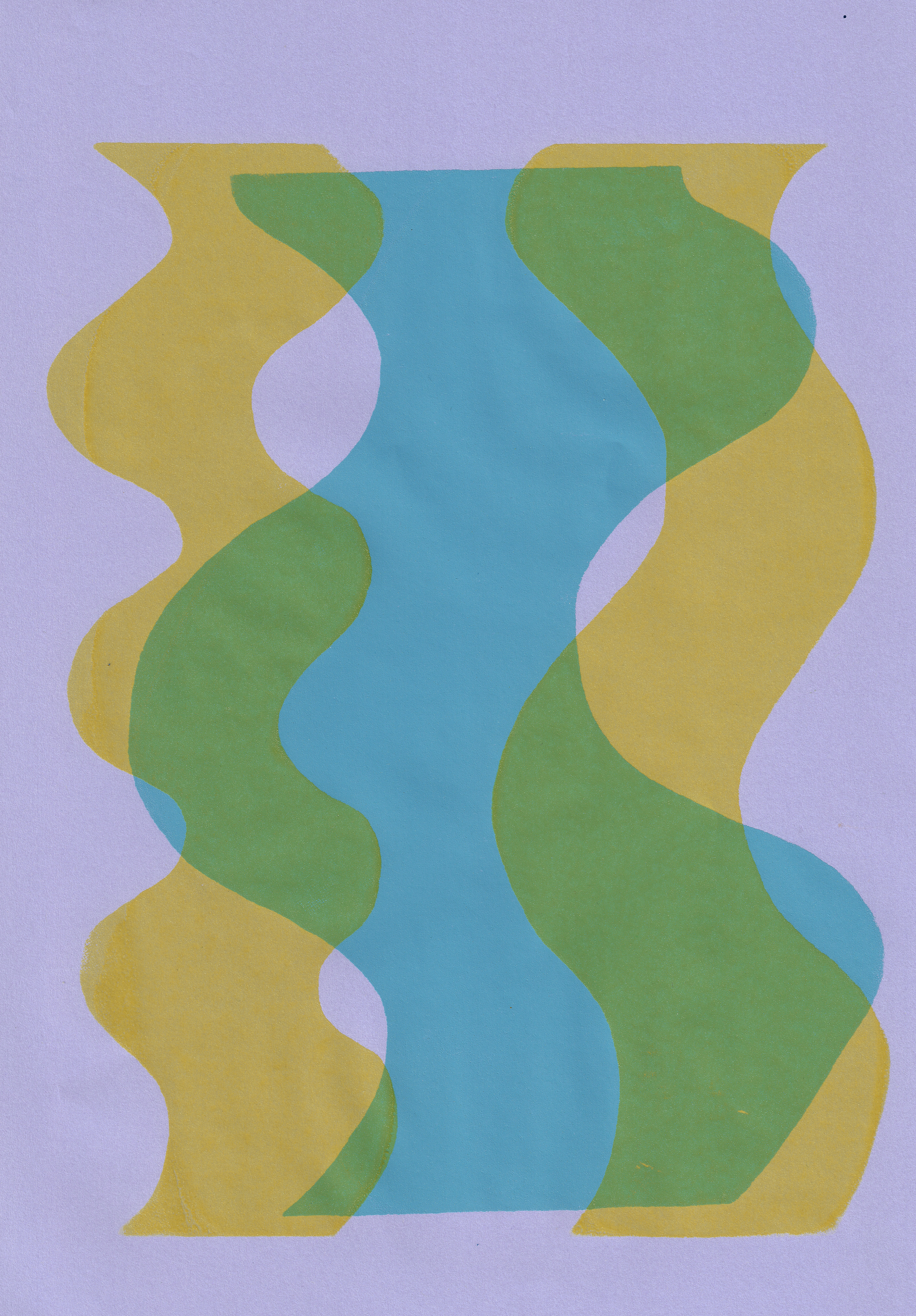
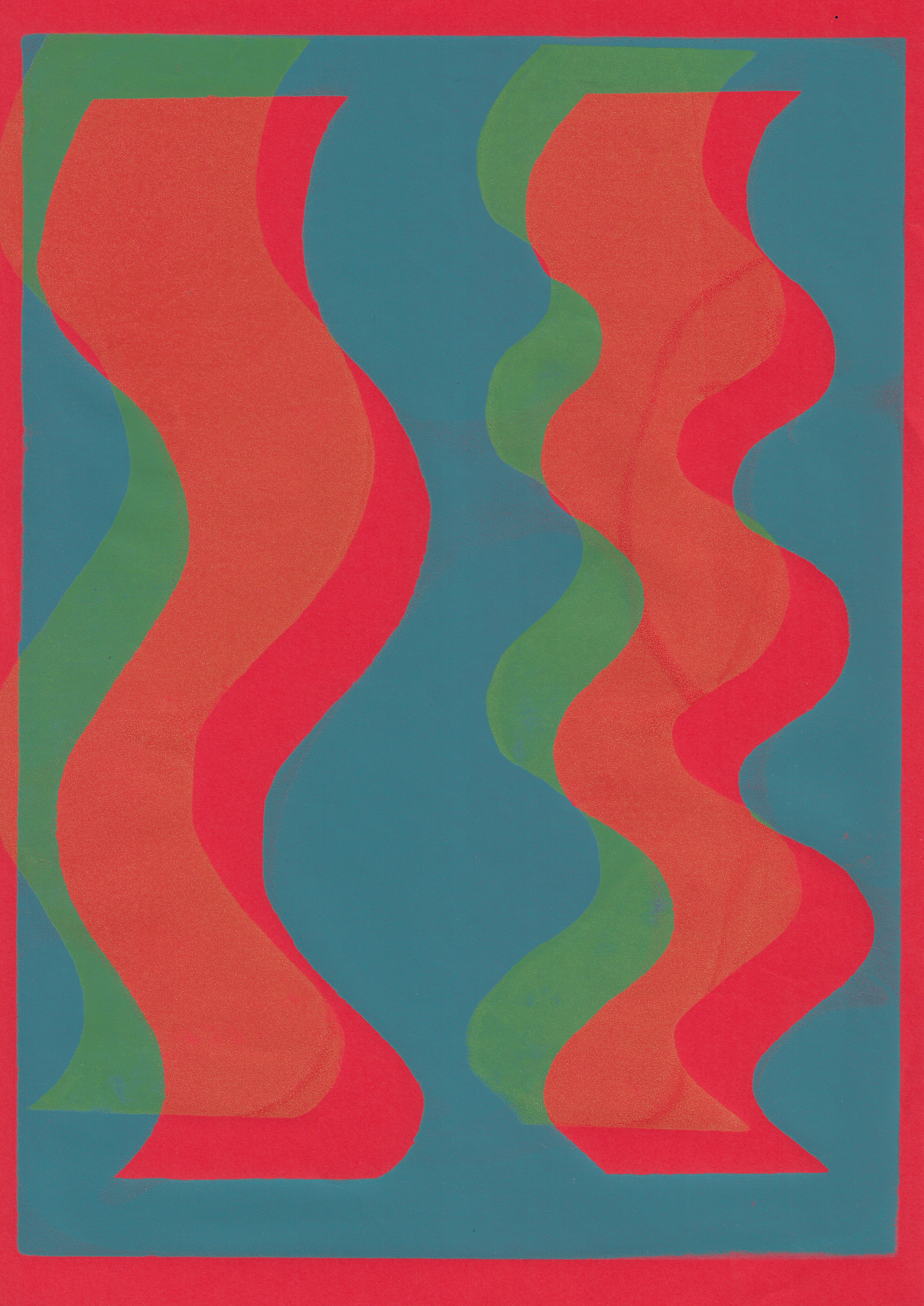
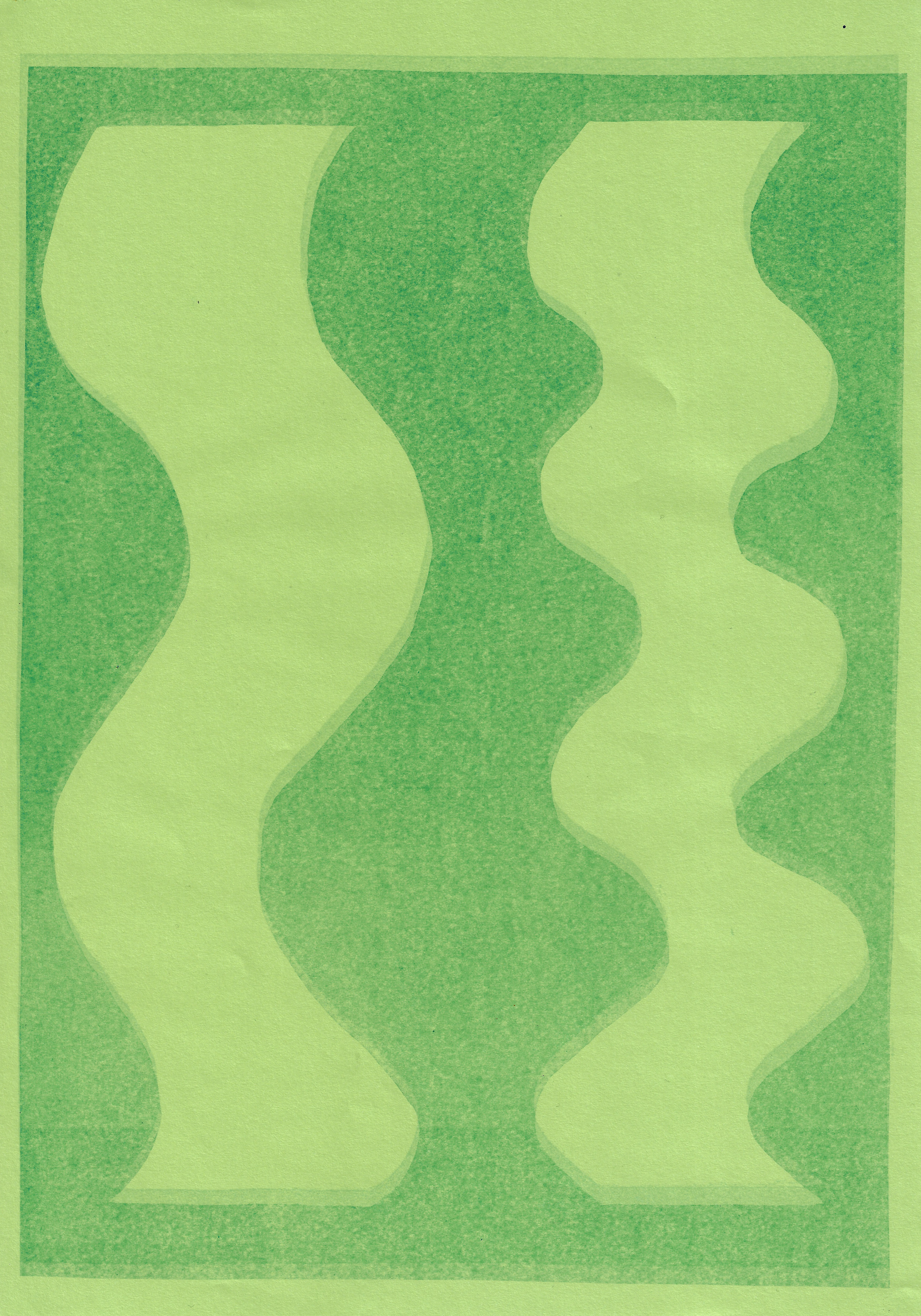
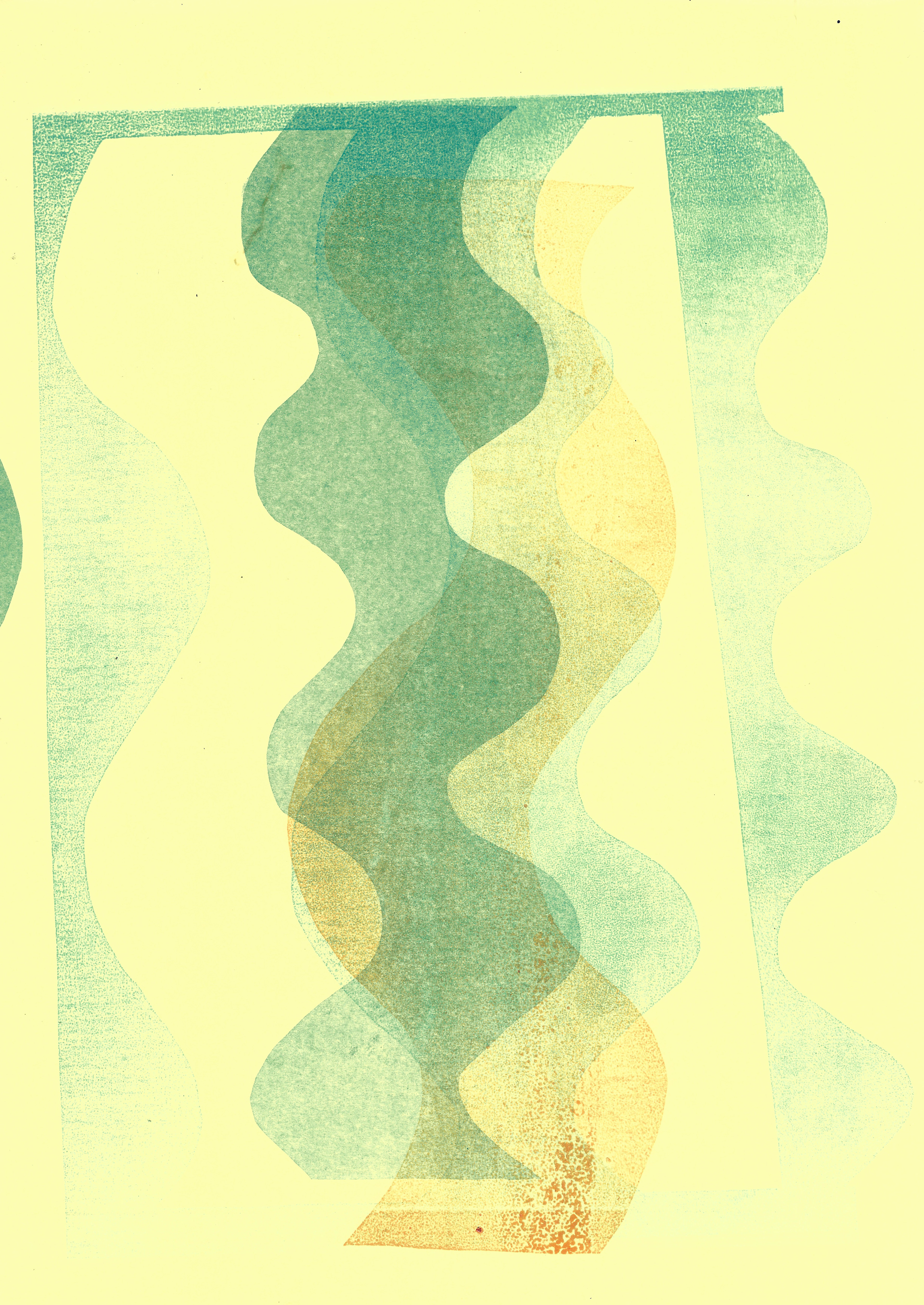
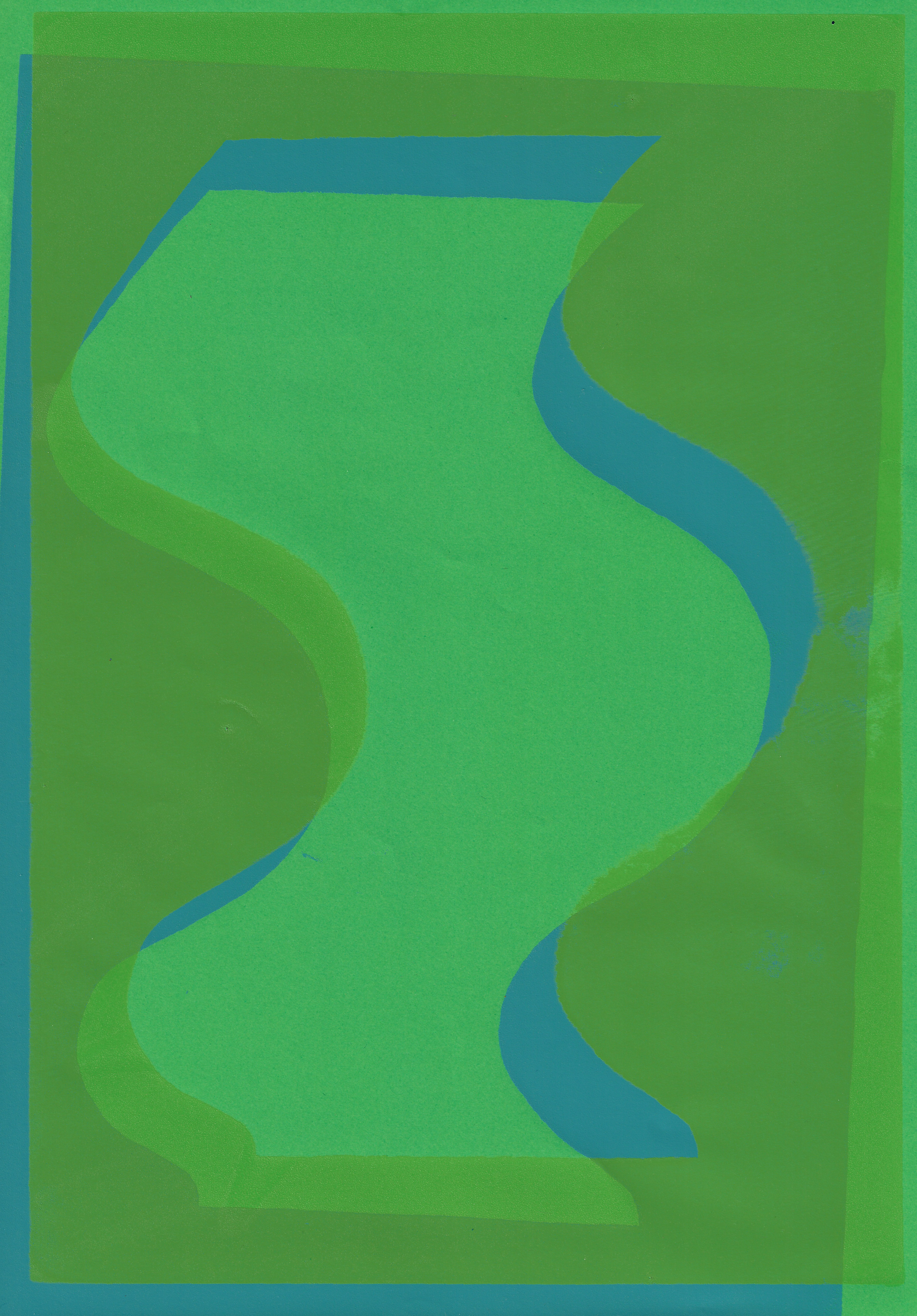
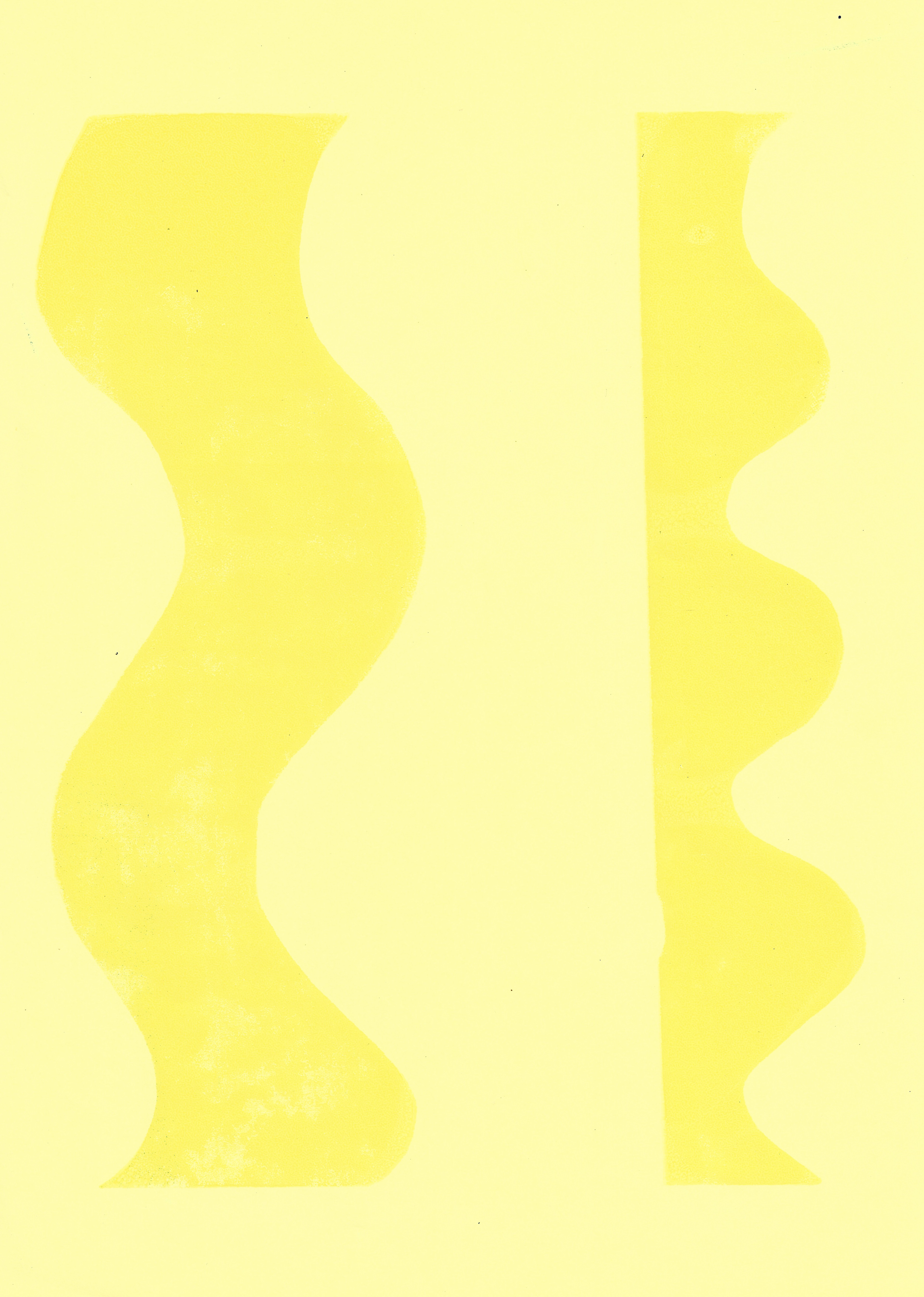
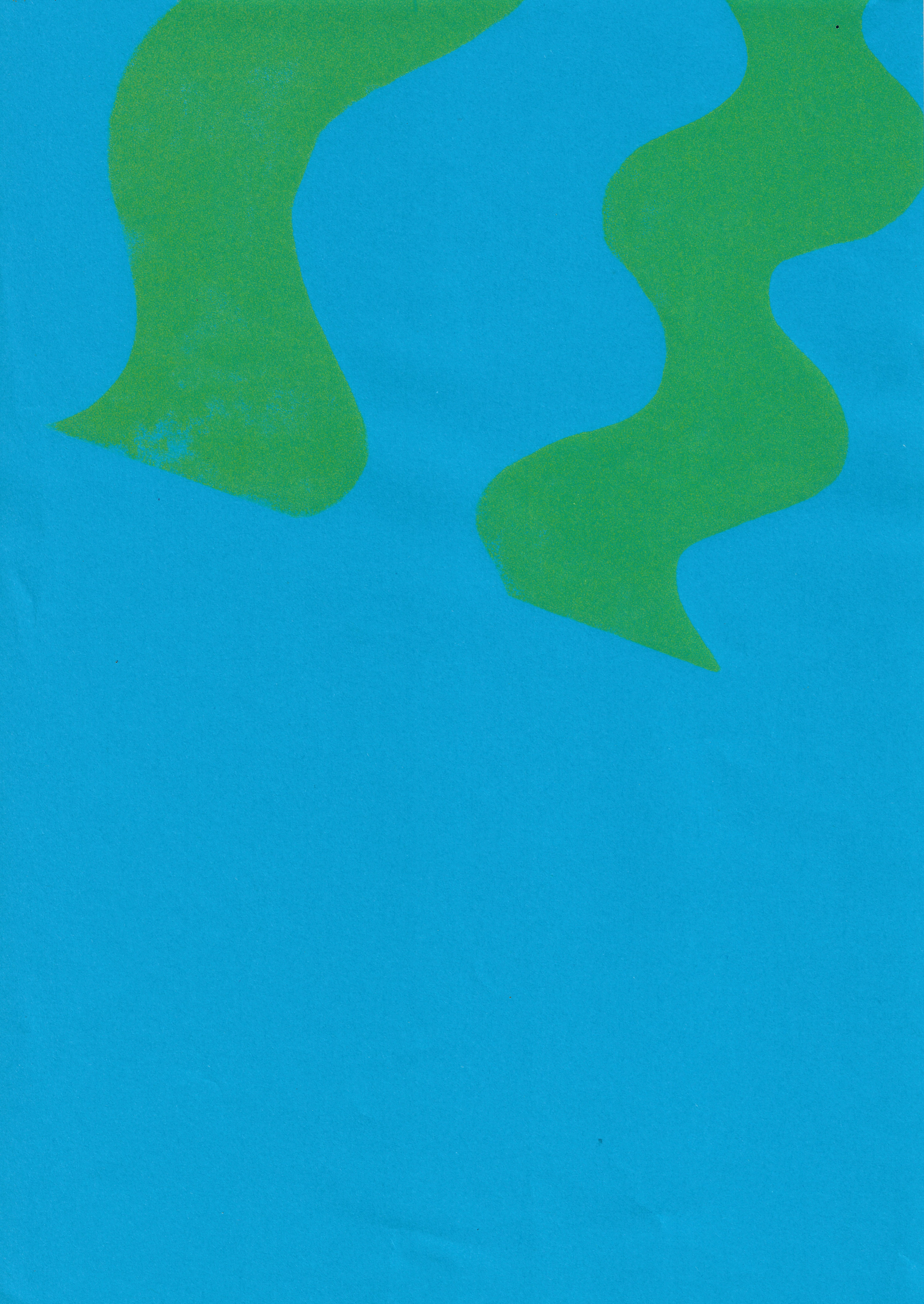
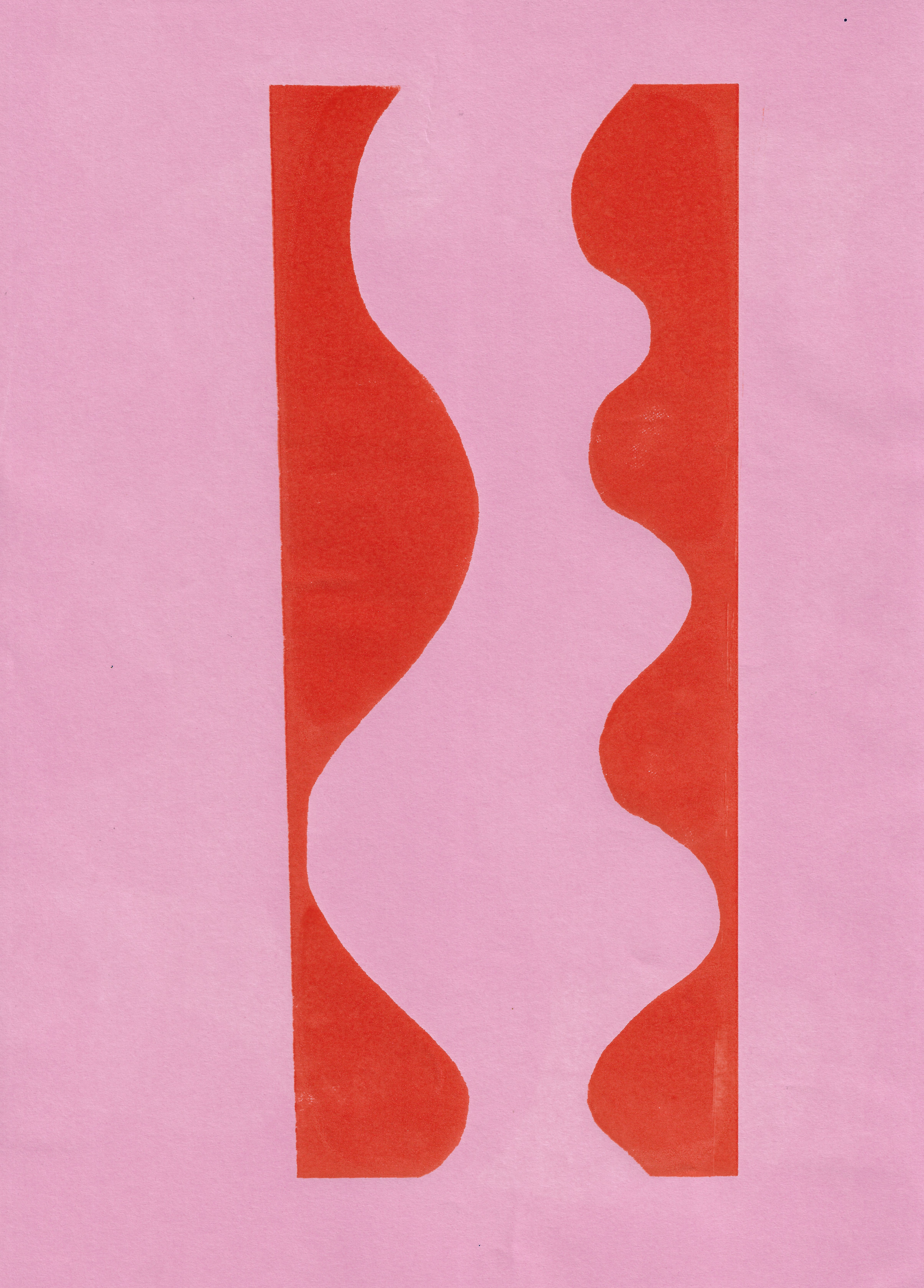
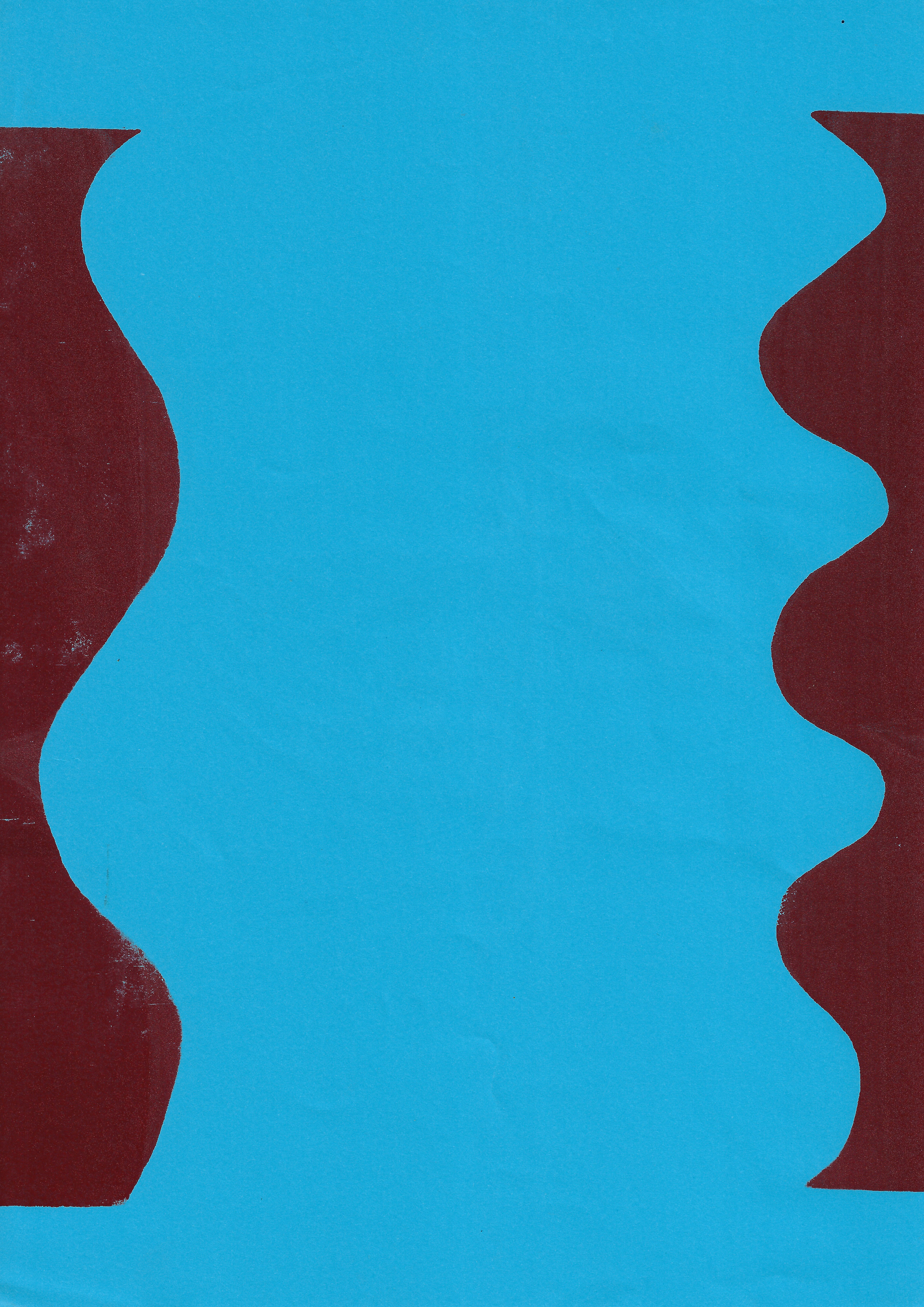
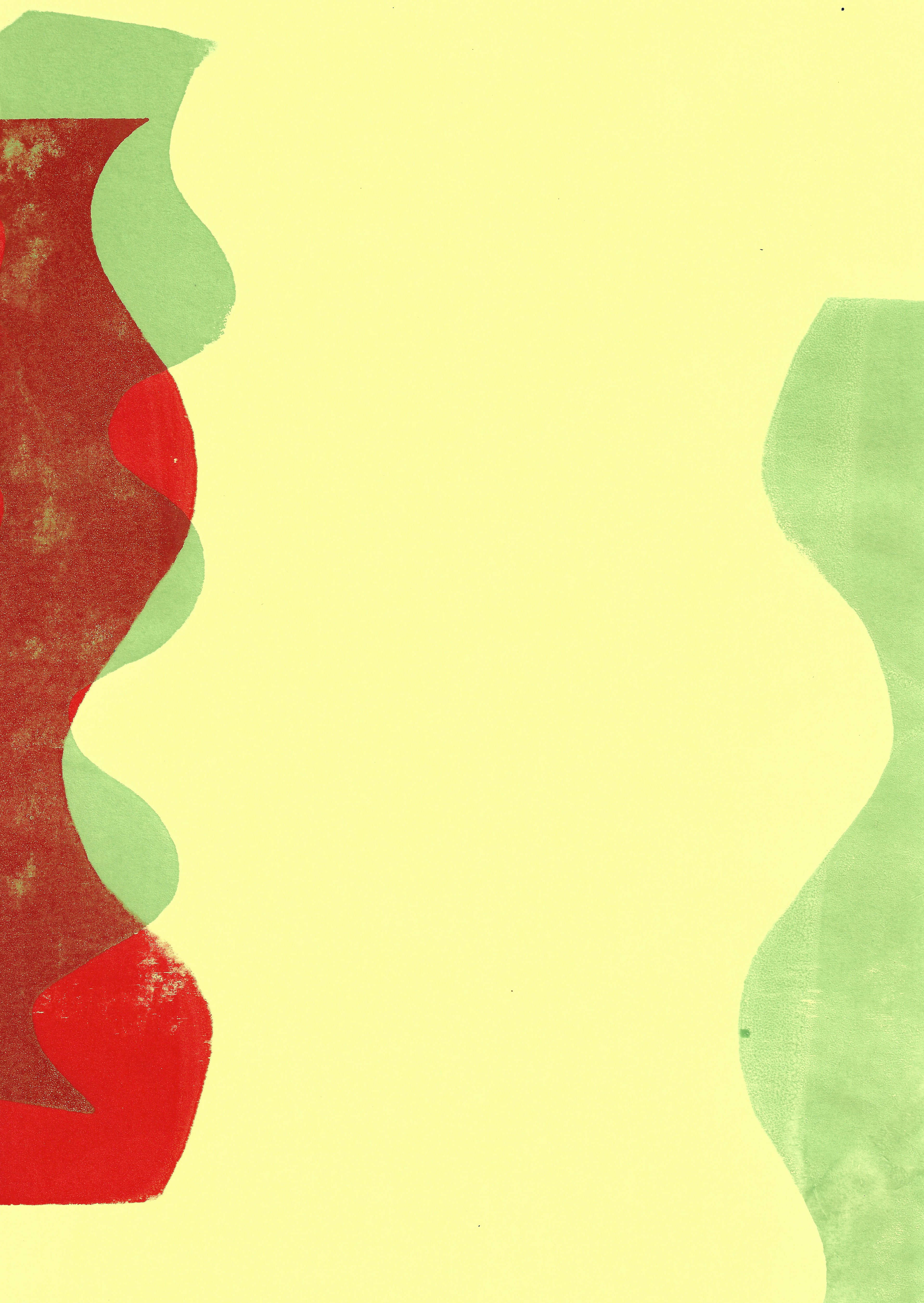
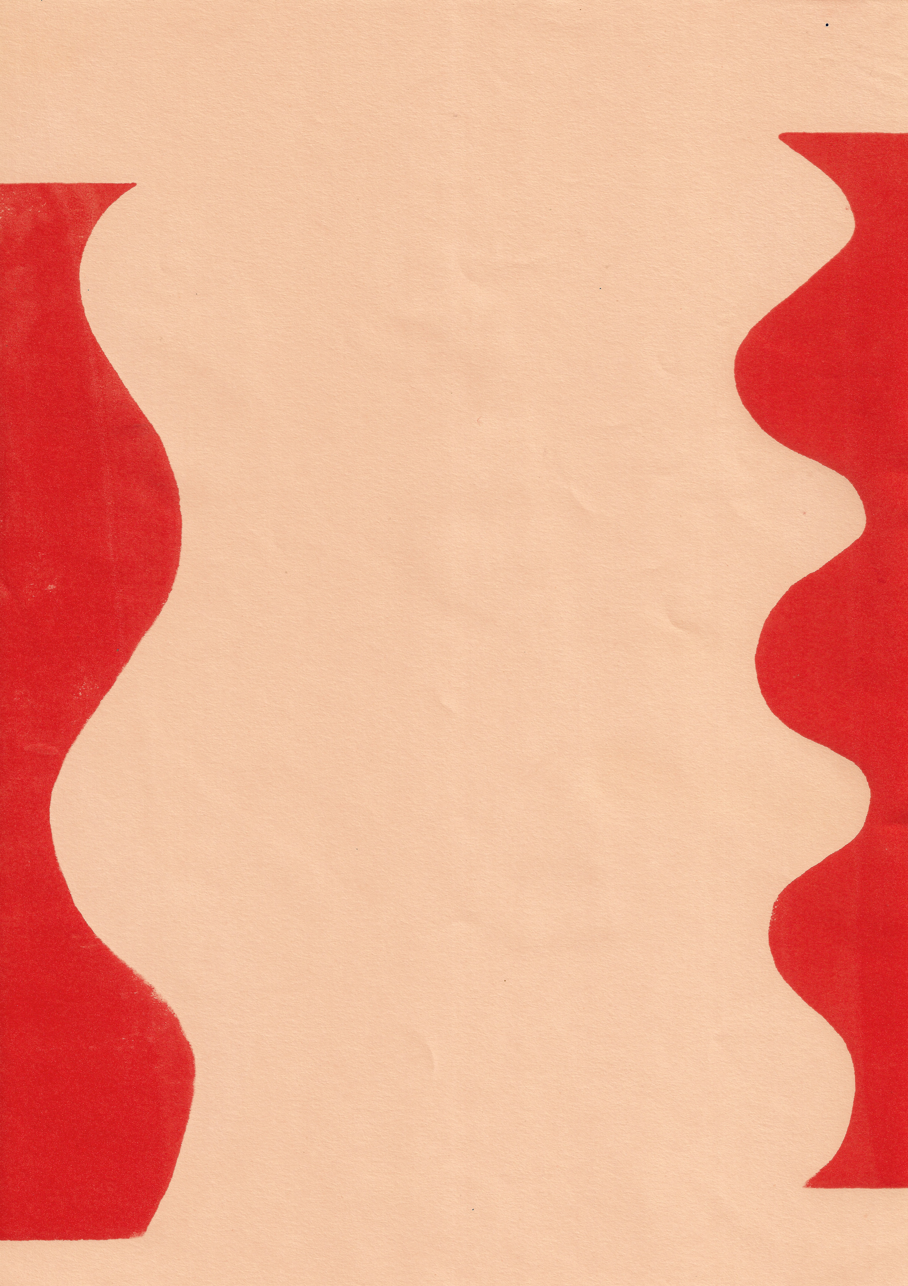
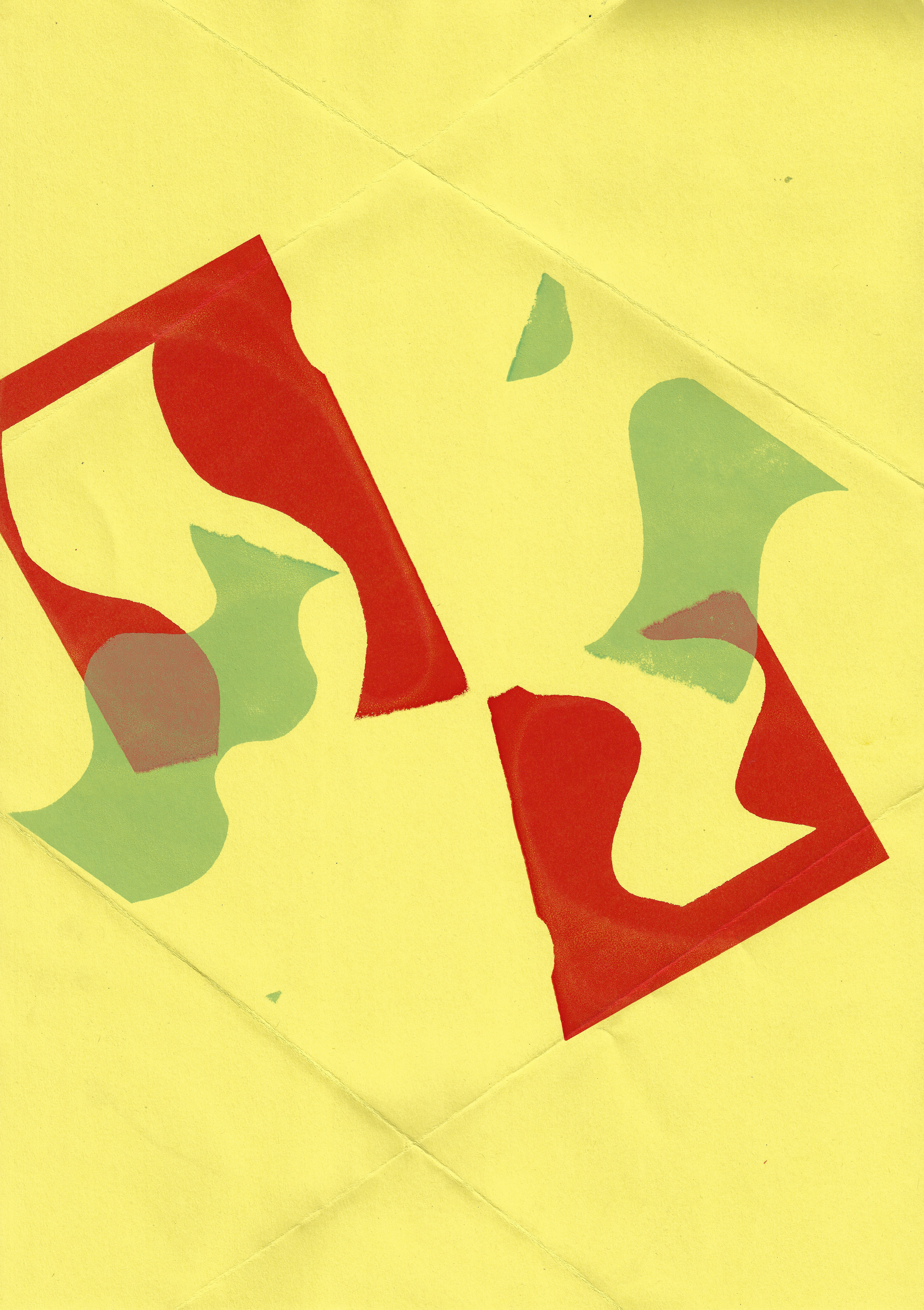
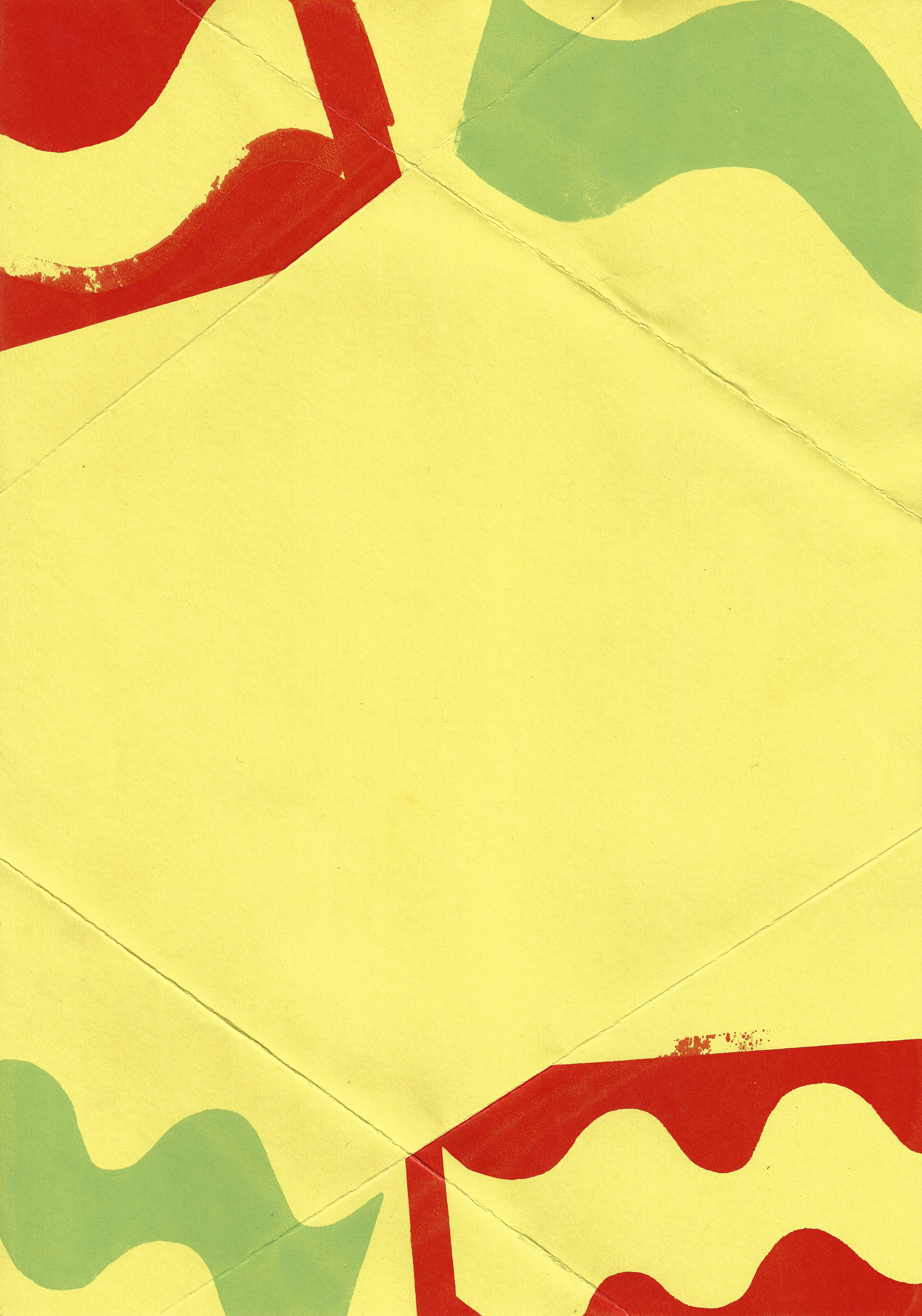
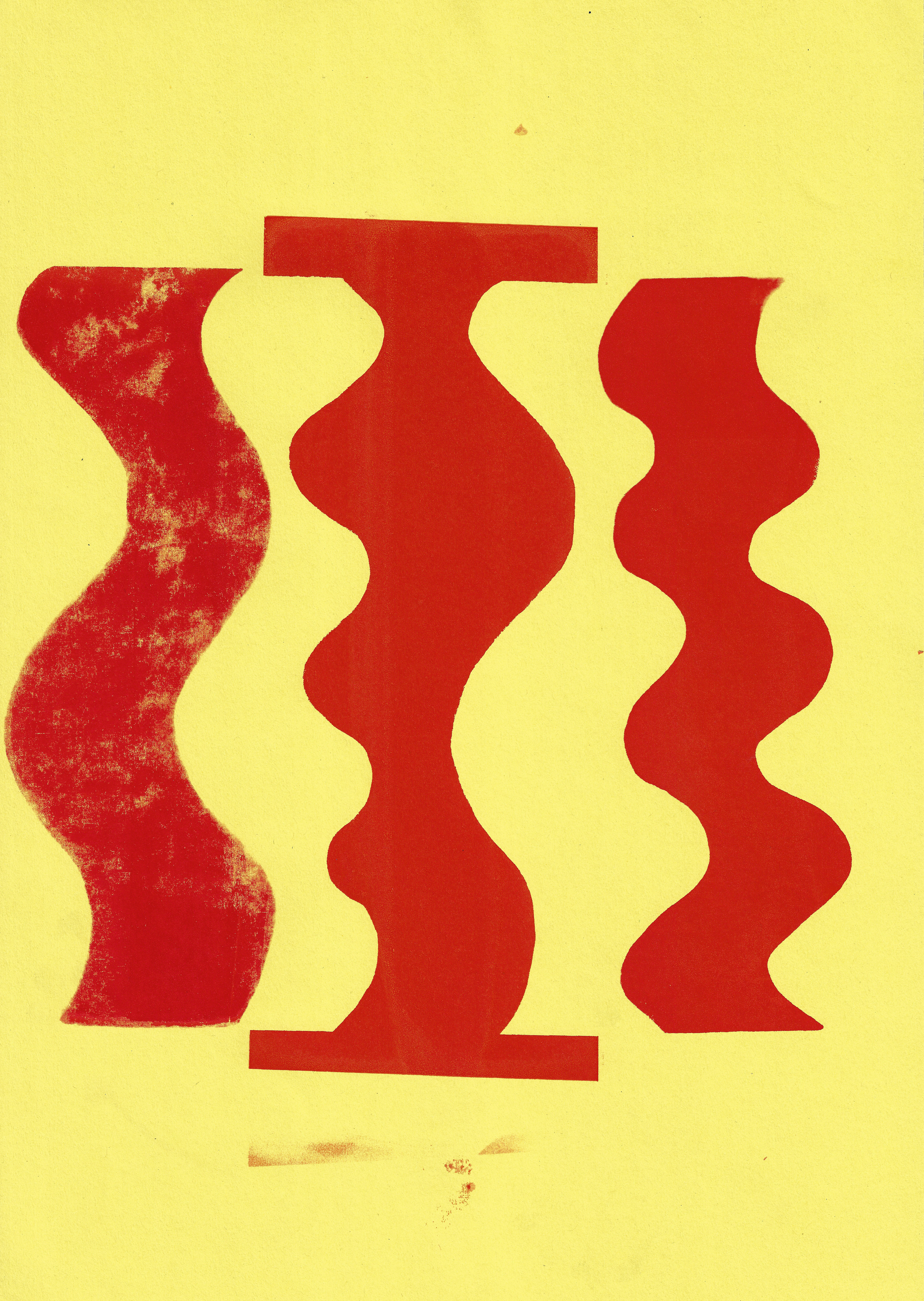
I screenprint positive and negative images of squiggles I have previously drawn. I intentionally do not always align the positive and negative of each image accurately, but rather I play around with the unpredictability and rhythmic sensation of the undulating lines. Additionally I use the squeegee in both directions, rather than just one, to emphasise the materiality of the image.
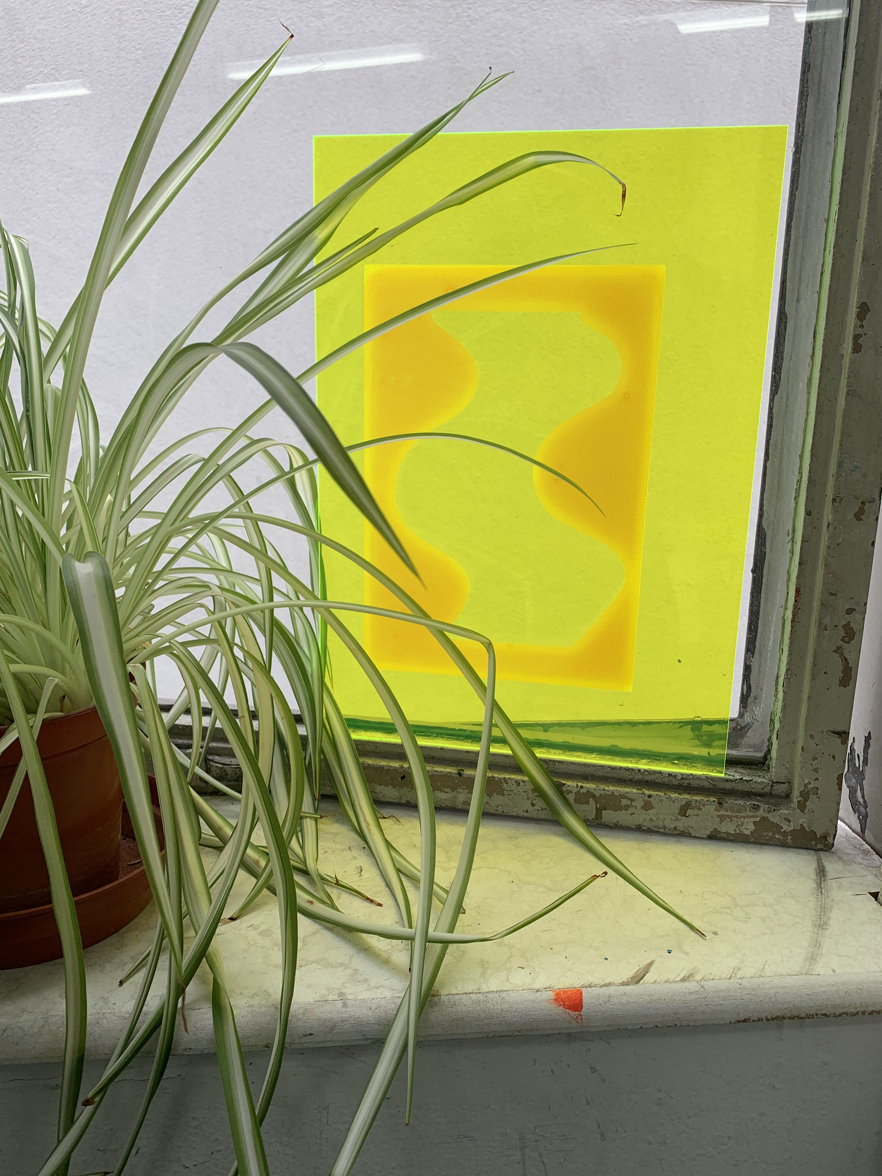

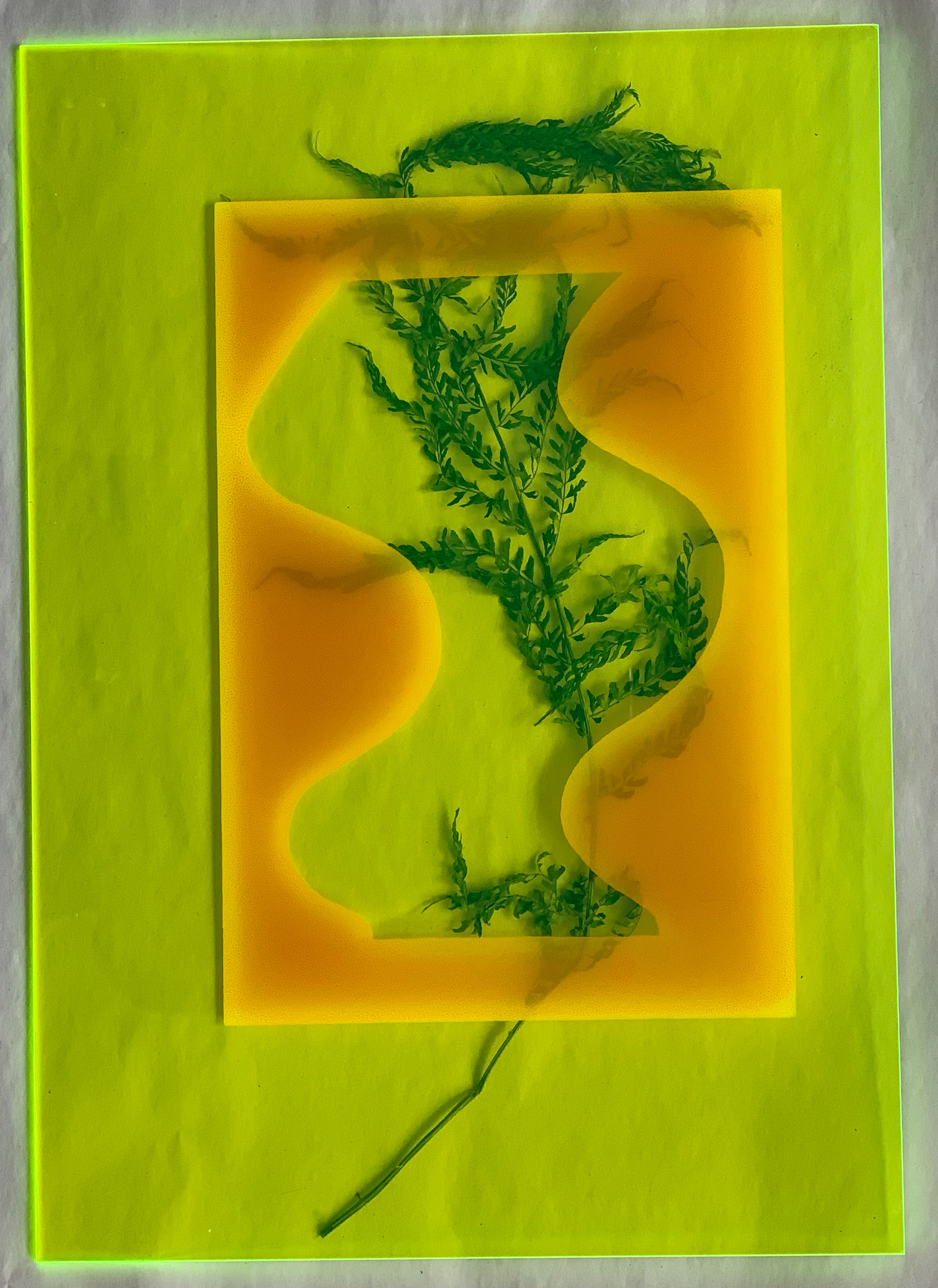

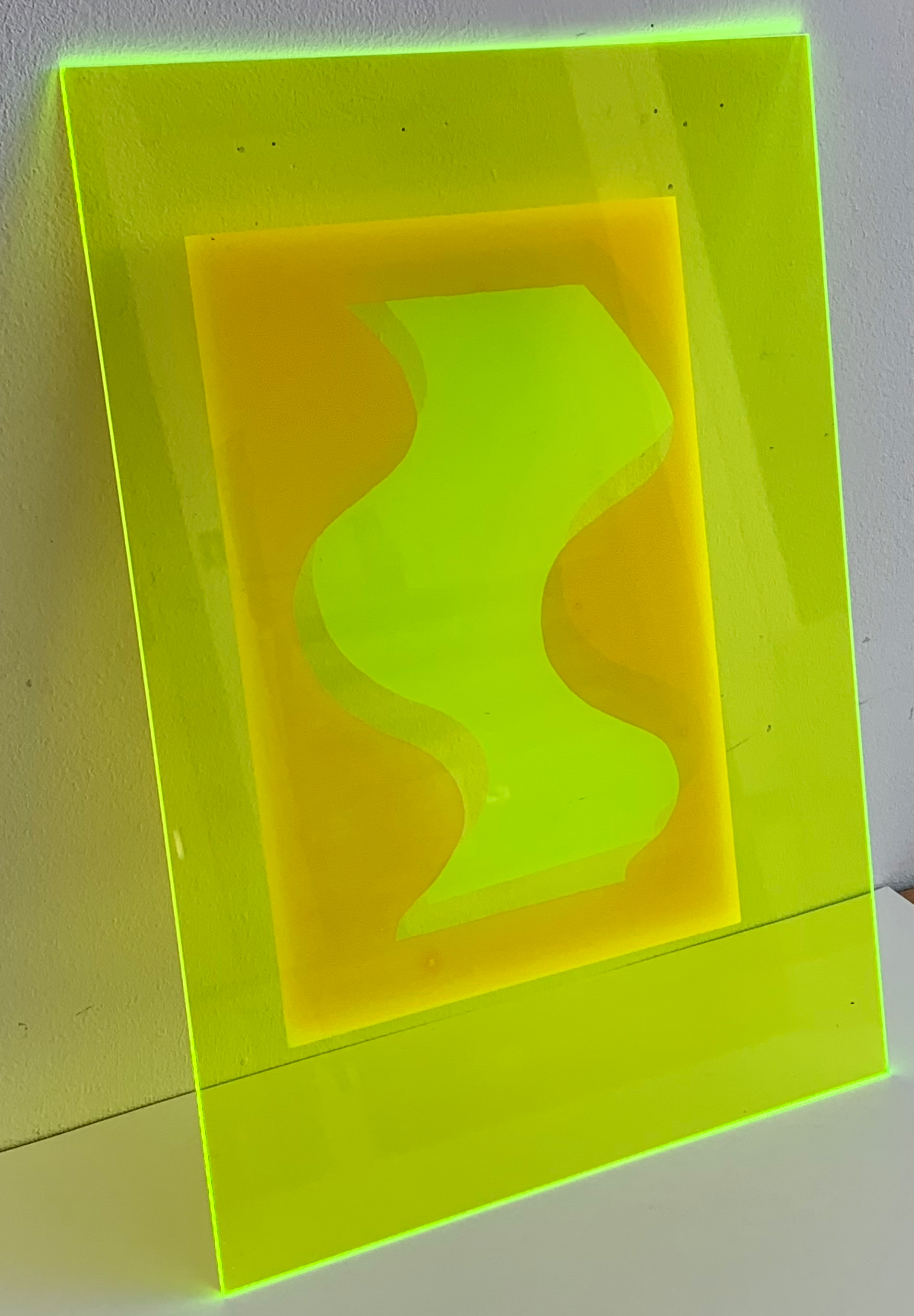


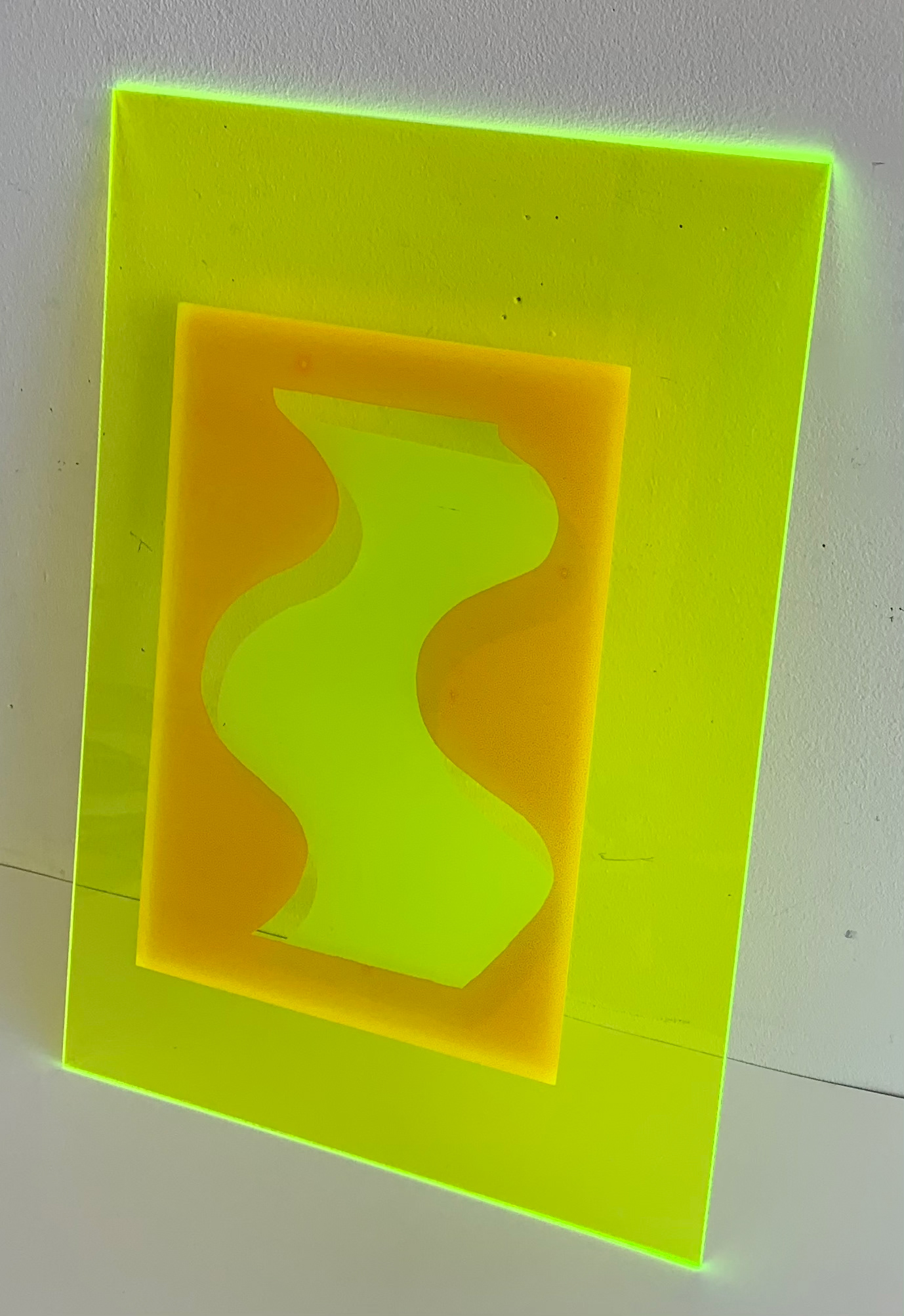

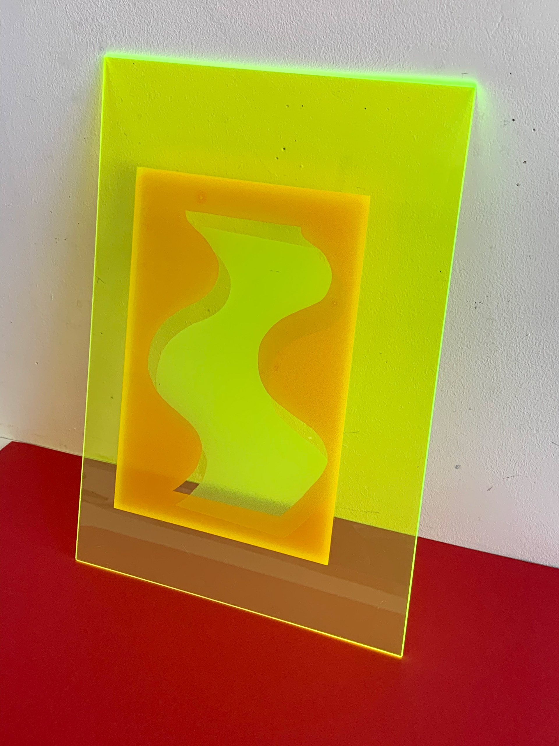
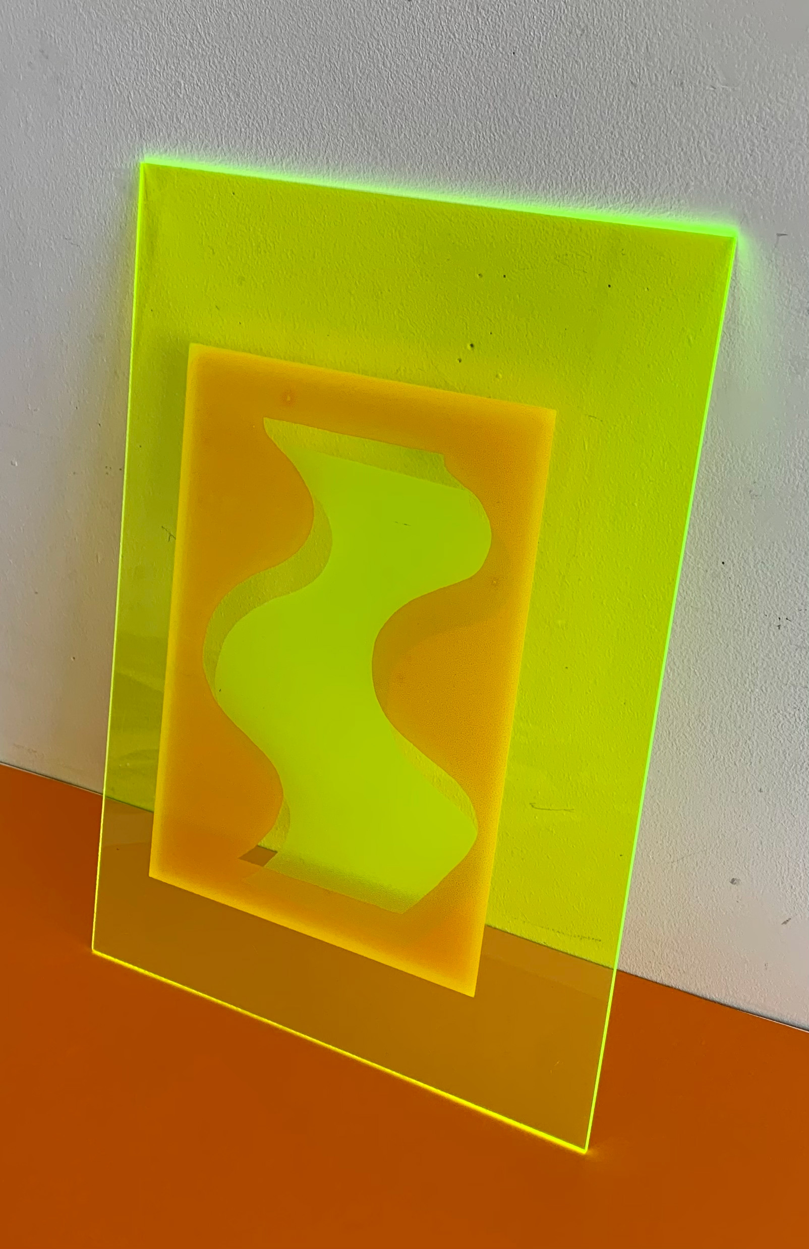

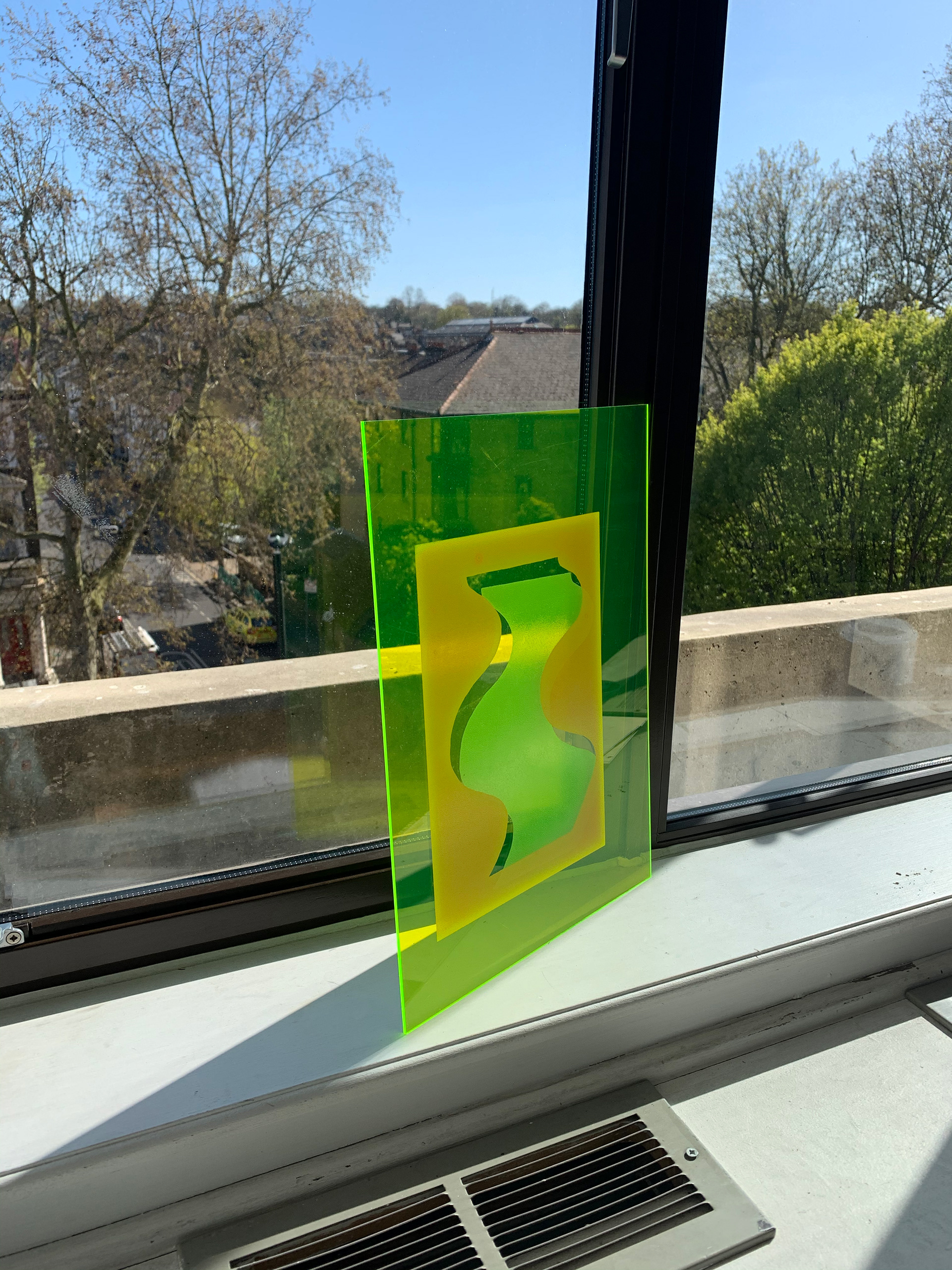
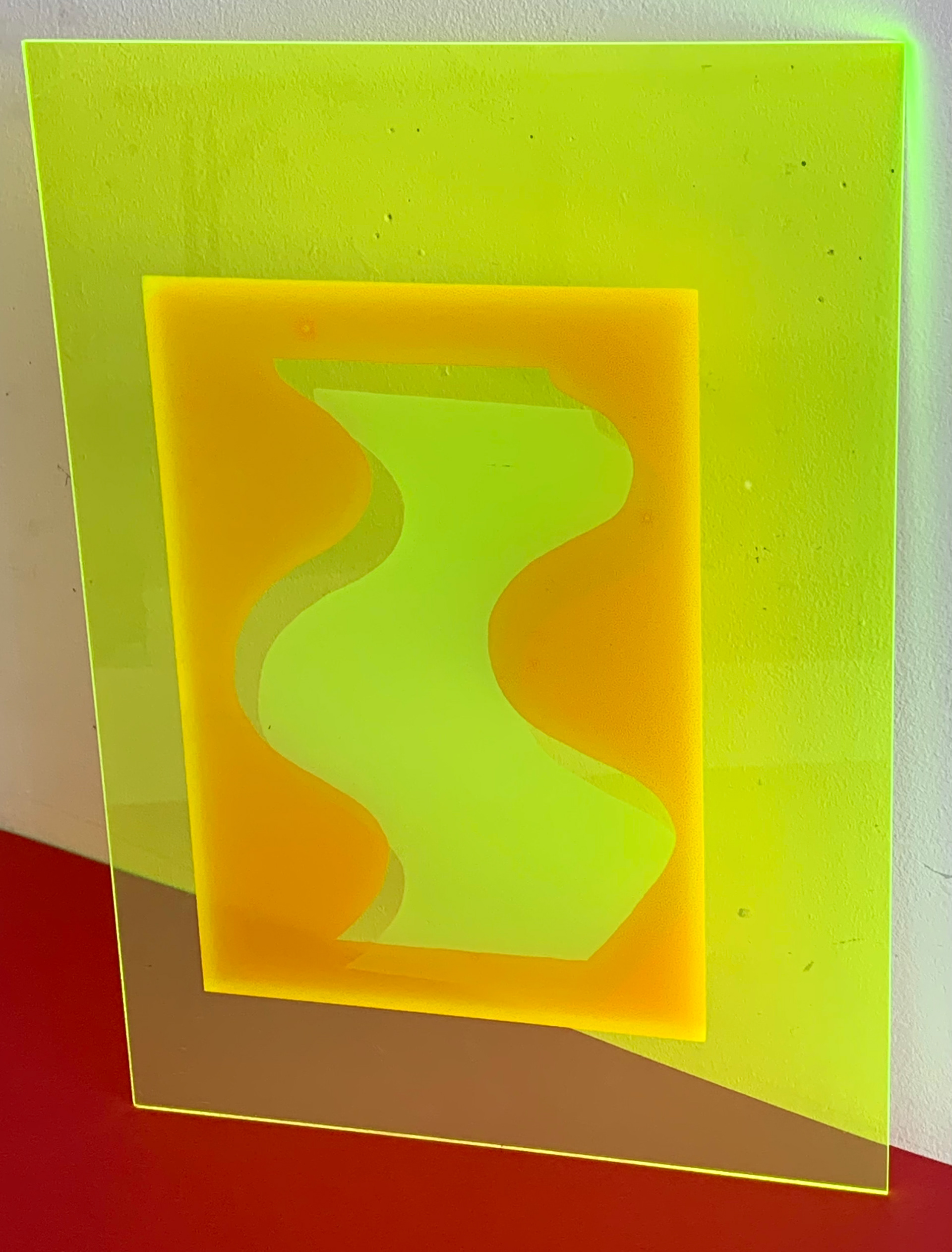

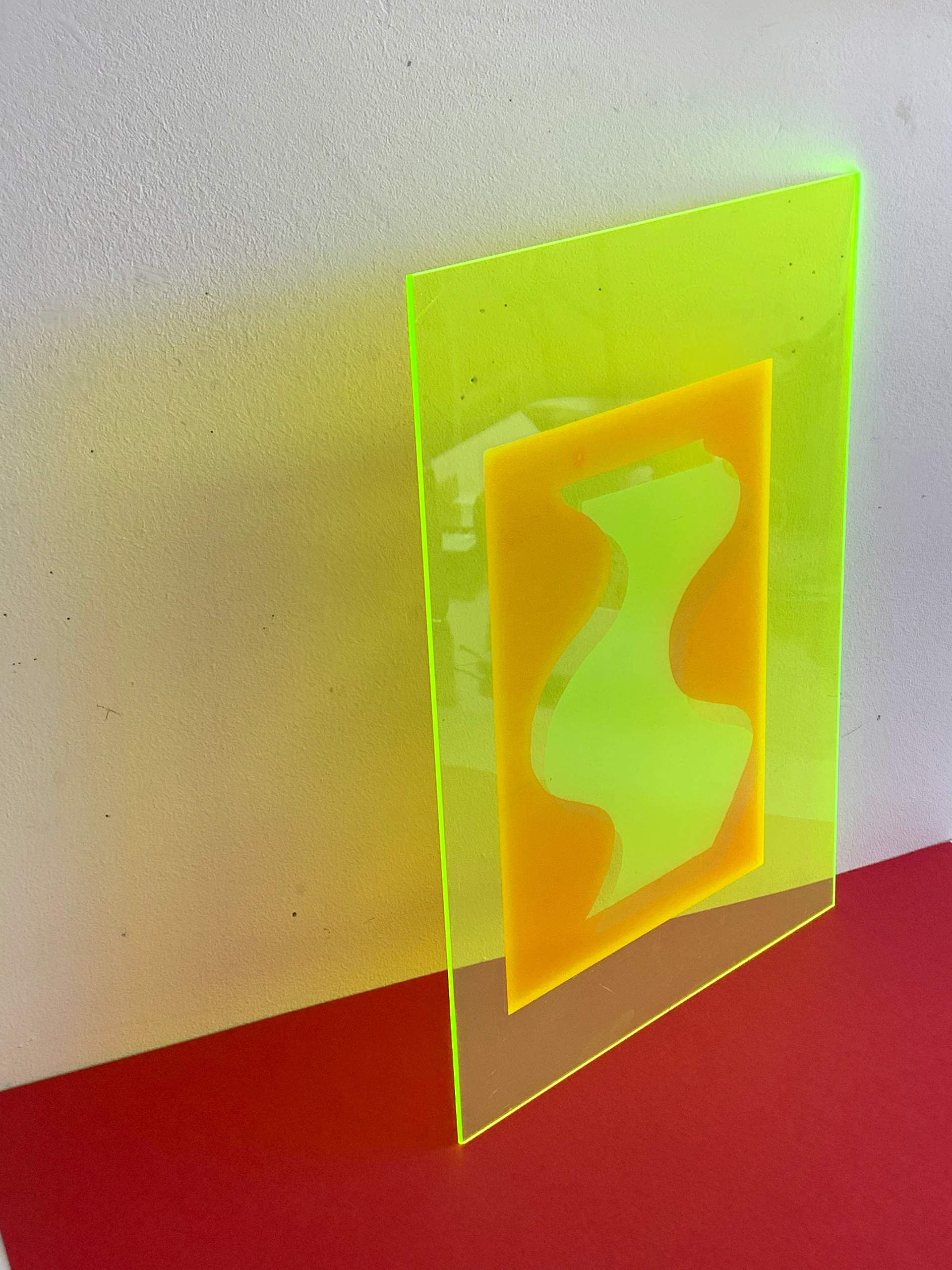


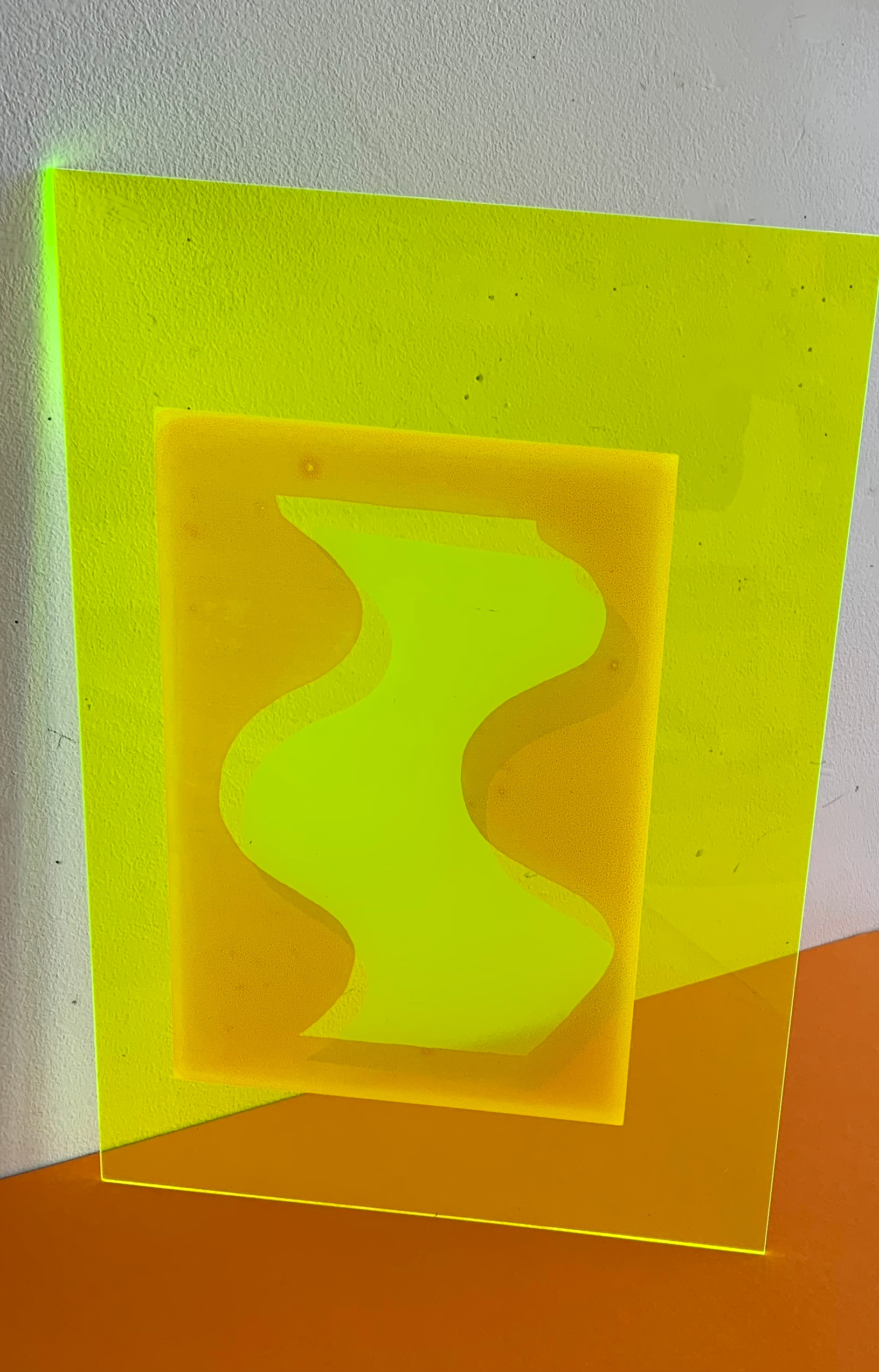
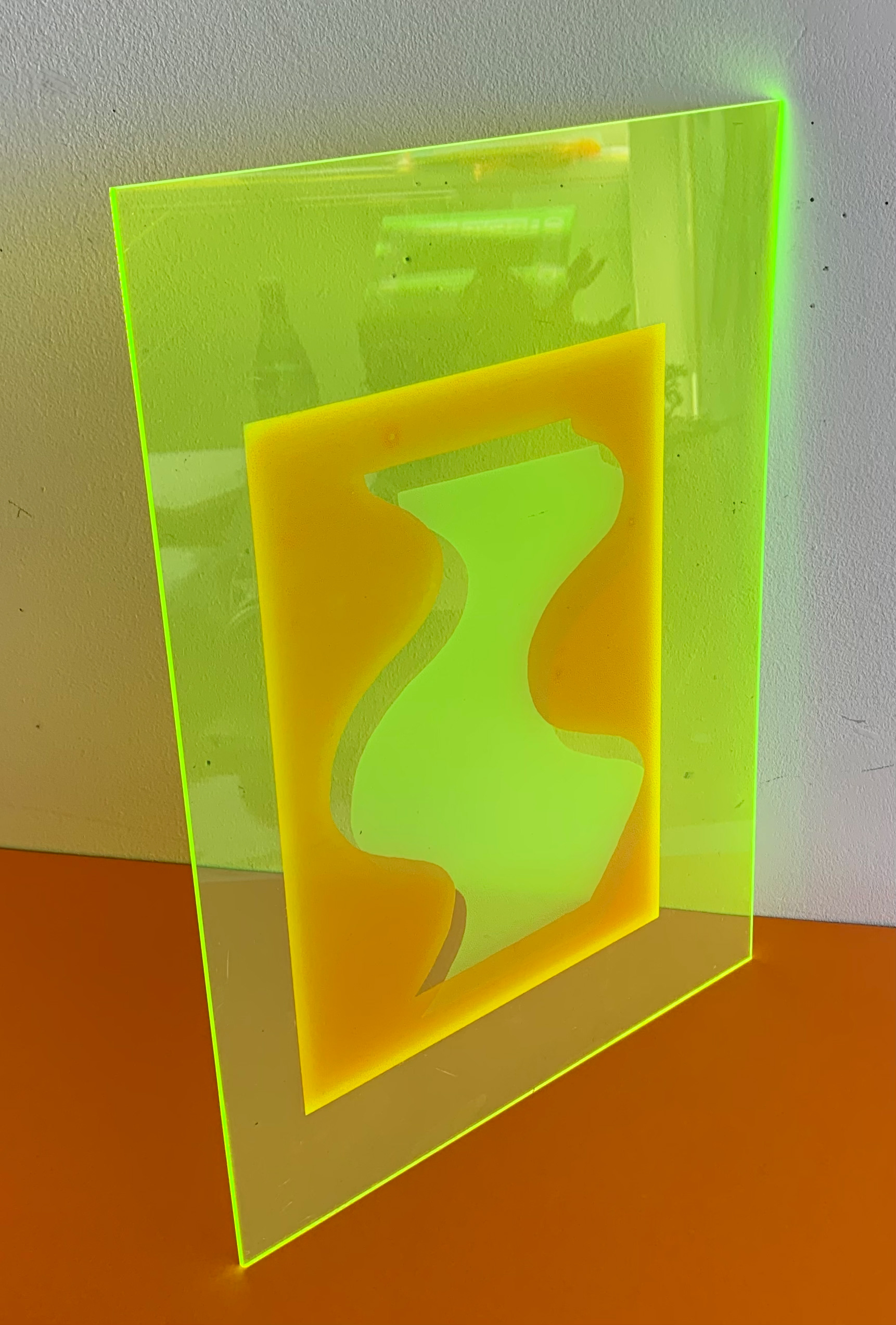
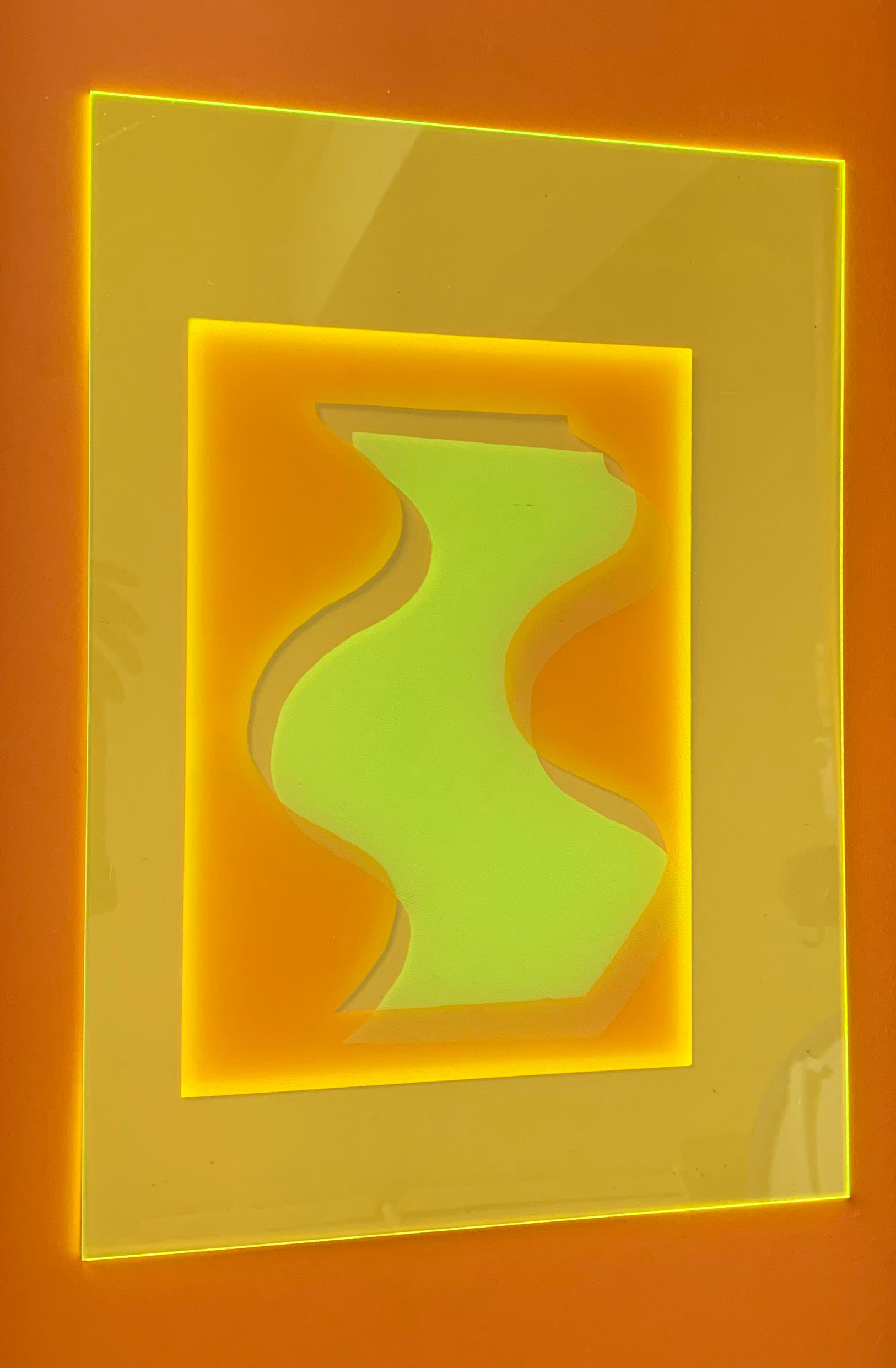

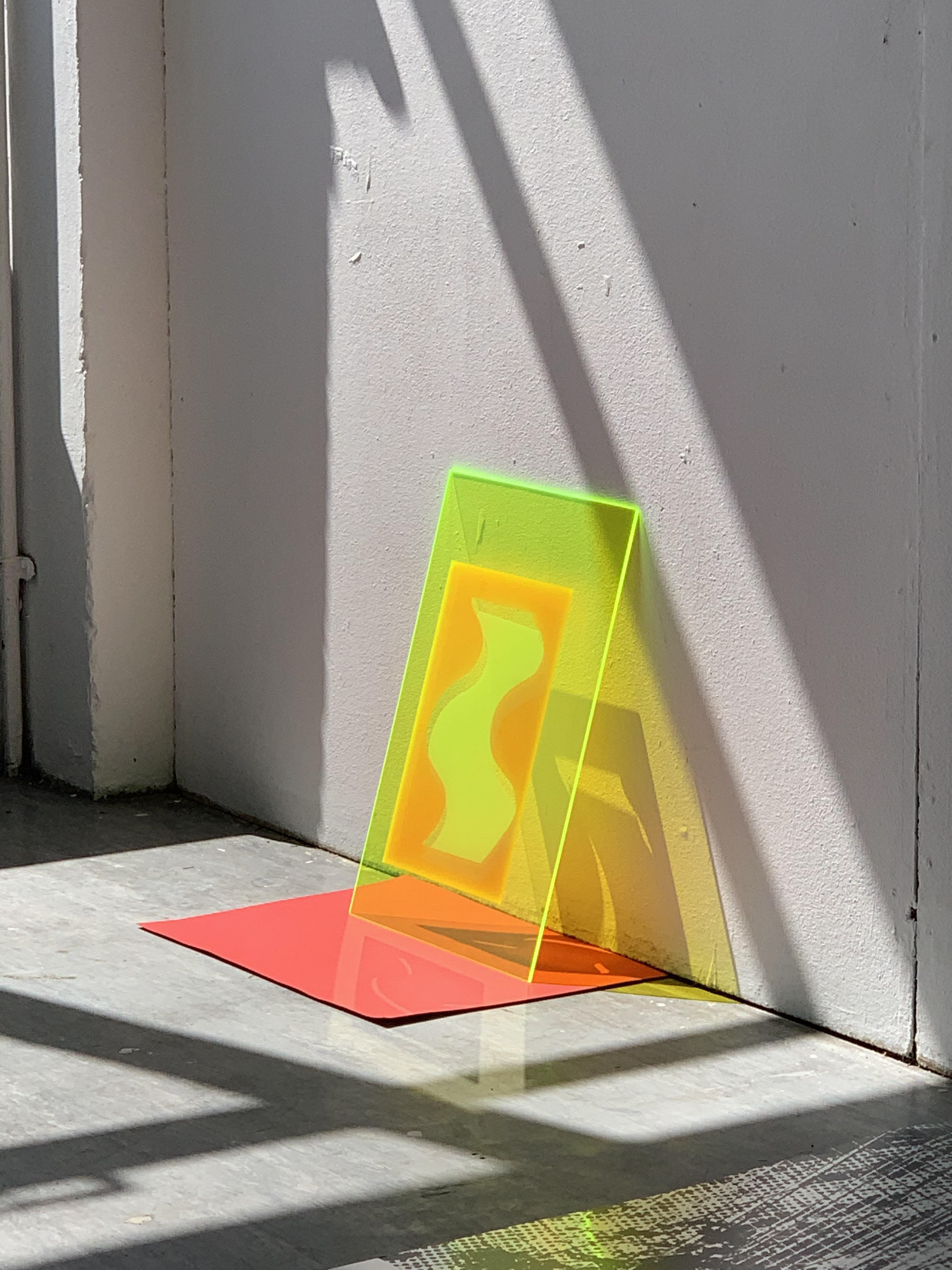
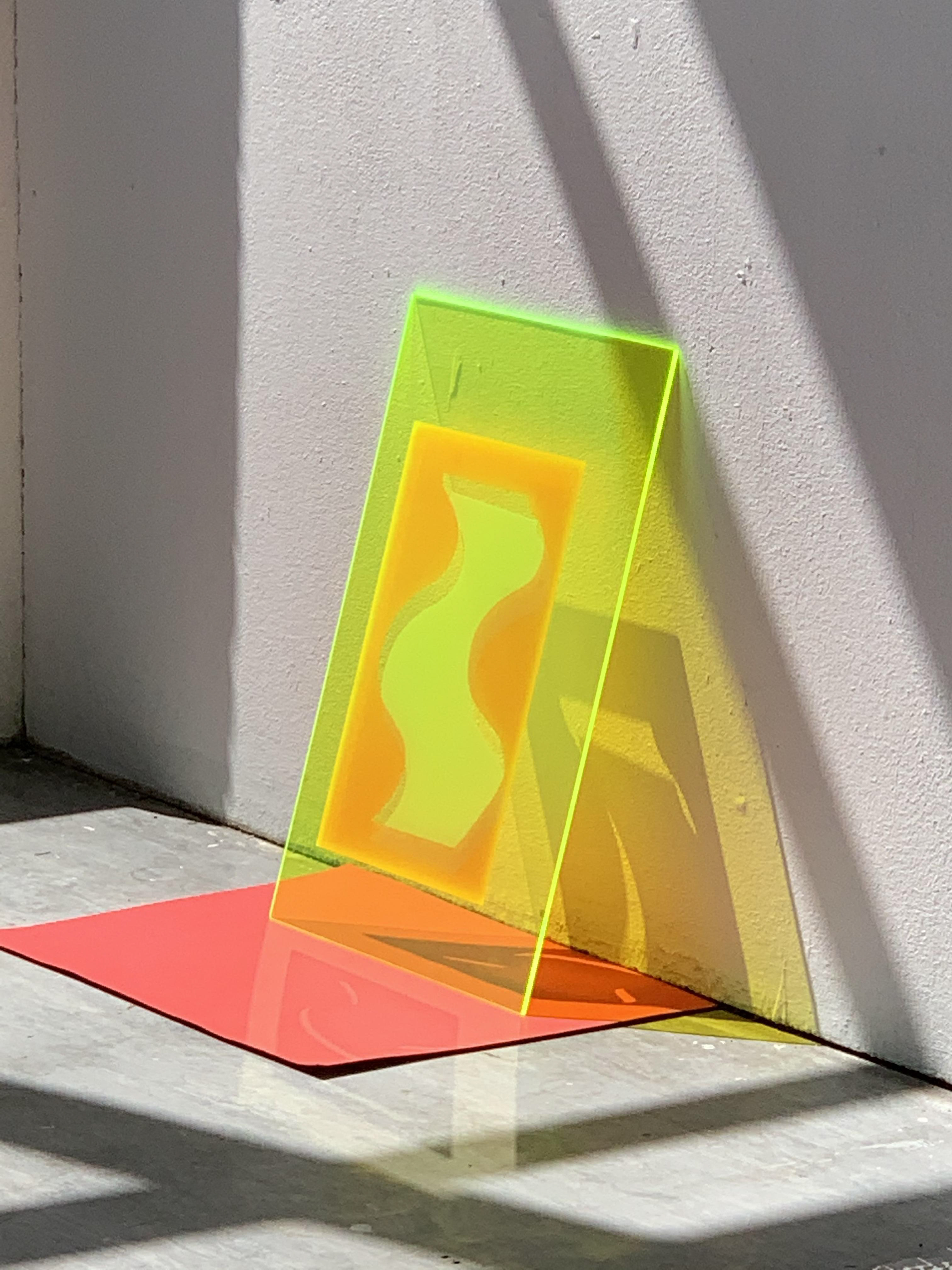
I screenprint the same images, experimenting with the formation of new lines that appear subconsciously. Also, I screenprint a positive and negative of a drawn squiggle onto a neon green acrylic sheet; the positive and negative are in different colours and I slightly offset them from each other. New lines are formed three dimensionally as the sheet leans against a wall. The viewer is displaced, perceiving these shapes three dimensionally and in relation to their own self.
The surrounding environment to the green acrylic squiggle has a relative effect to its appearance, being partly transparent. The colours surrounding the acrylic sheet affect the colours within. Also, wherever the viewer is in relation to the acrylic sheet, the image within adjusts itself relatively to the viewer’s perspective, making each viewpoint different. The viewer has an individual perspective, as no two are the same.

I spend most of a day drawing a rhubarb leaf in pencil. The majority of my drawings start off in pencil, as a statement of how this democratising medium has the potential to emphasise the power of individuality. My intention with this drawing was to focus, for a sustained period of time, on one leaf and be totally consumed in the process. I hardly take my eyes off the leaf when drawing. I am really focussing on the different lines and the different textures within the leaf.
I drew a cauliflower plant from observation; most of the plant matter I have encountered has not been in its original context. This is because it is logistically difficult to encounter the majority of natural forms in their original context. This plant is still alive, moving with the wind and changing ever so slightly with the shadows moving as time passes. It is never still. Drawing the cauliflower plant is interesting and different to many of my other encounters. I find that because I devote a large proportion of time to translating this plant onto paper, I get lost in my own drawing and the plant itself. I lose and regain focus within the drawing.
Sketchbook page, 21 x 29.7 cm
Sketchbook page, 21 x 29.7 cm
Sketchbook page, 21 x 29.7 cm
Sketchbook page, 21 x 29.7 cm
Pen on paper, 21 x 29.7 cm
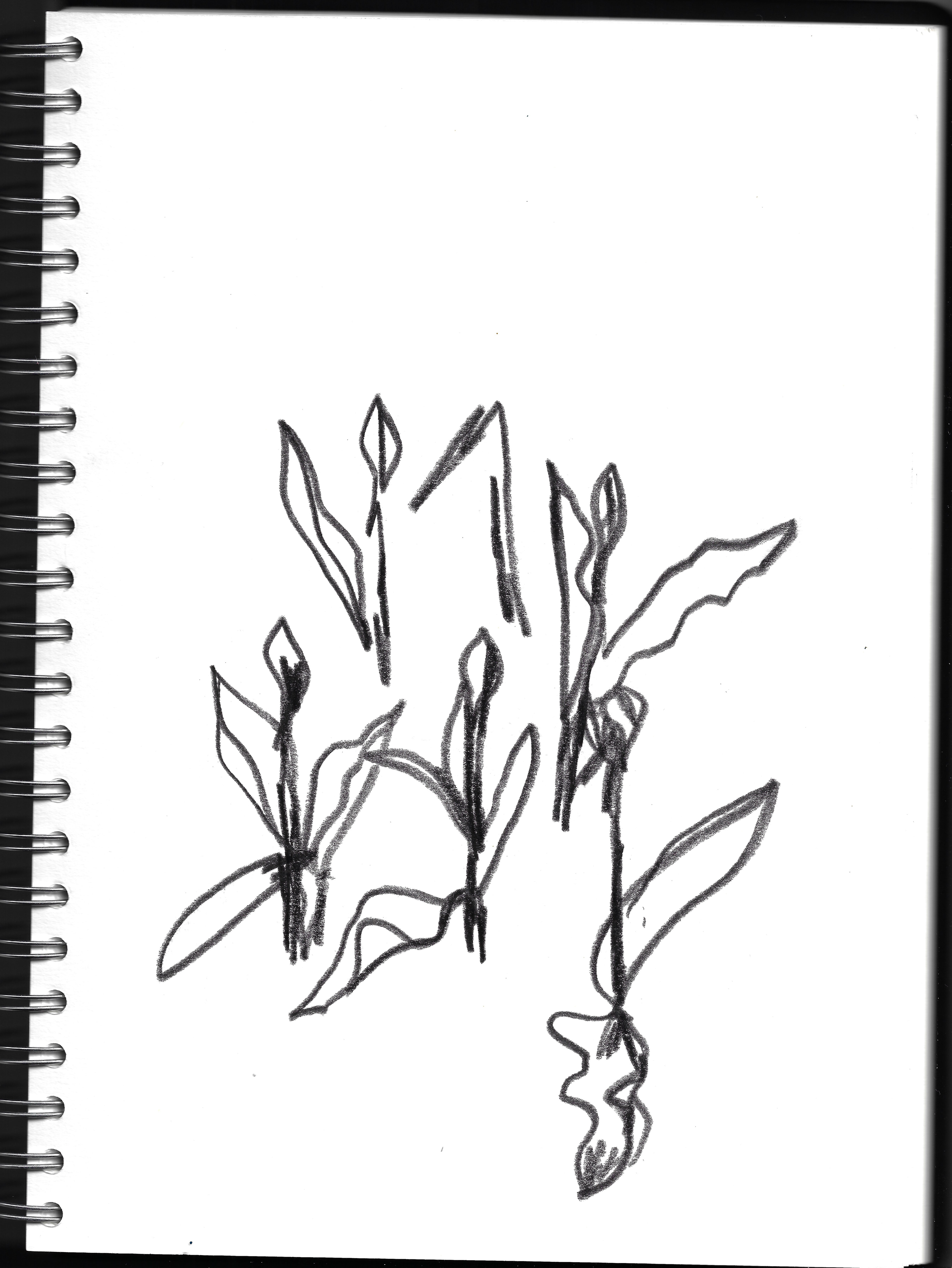
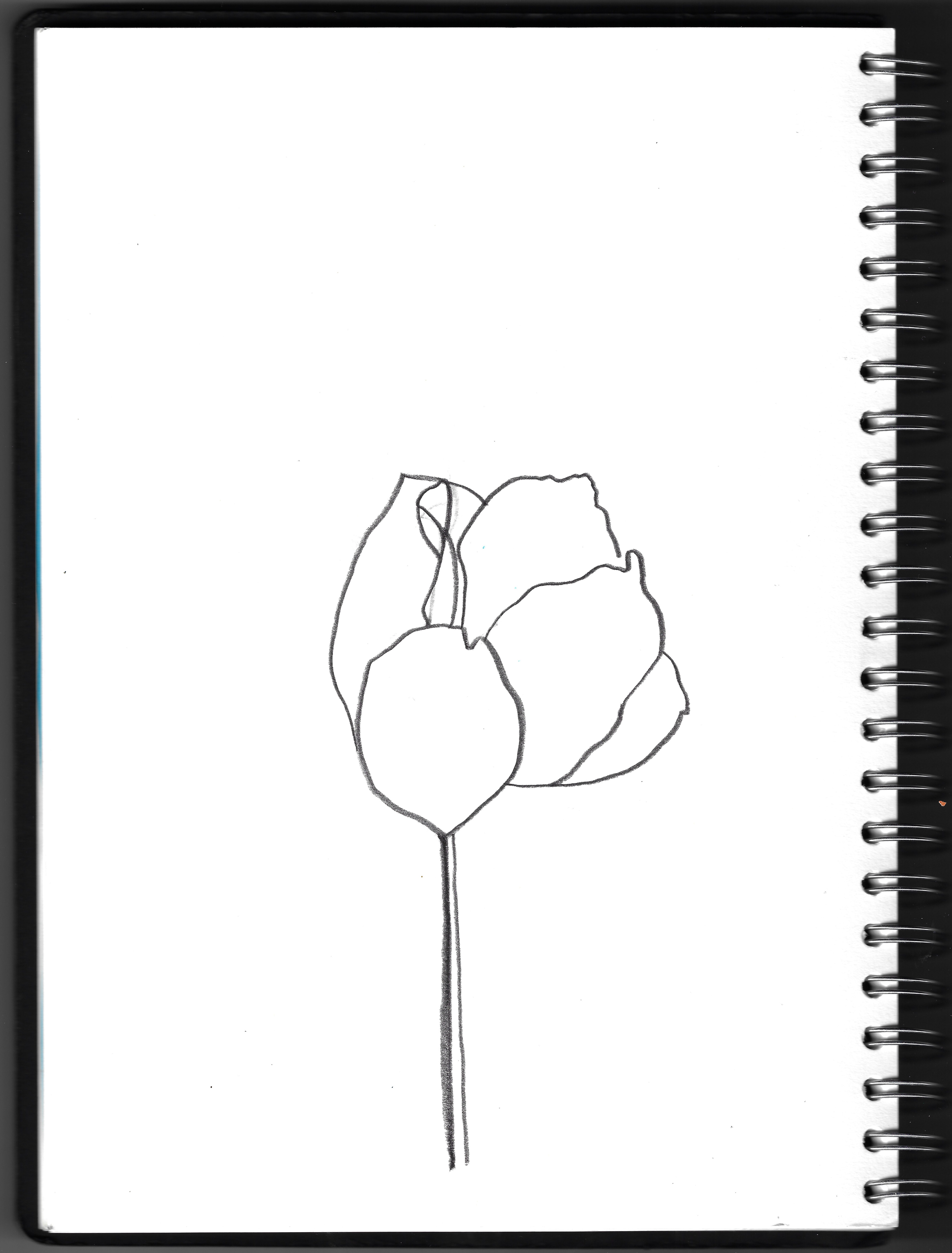
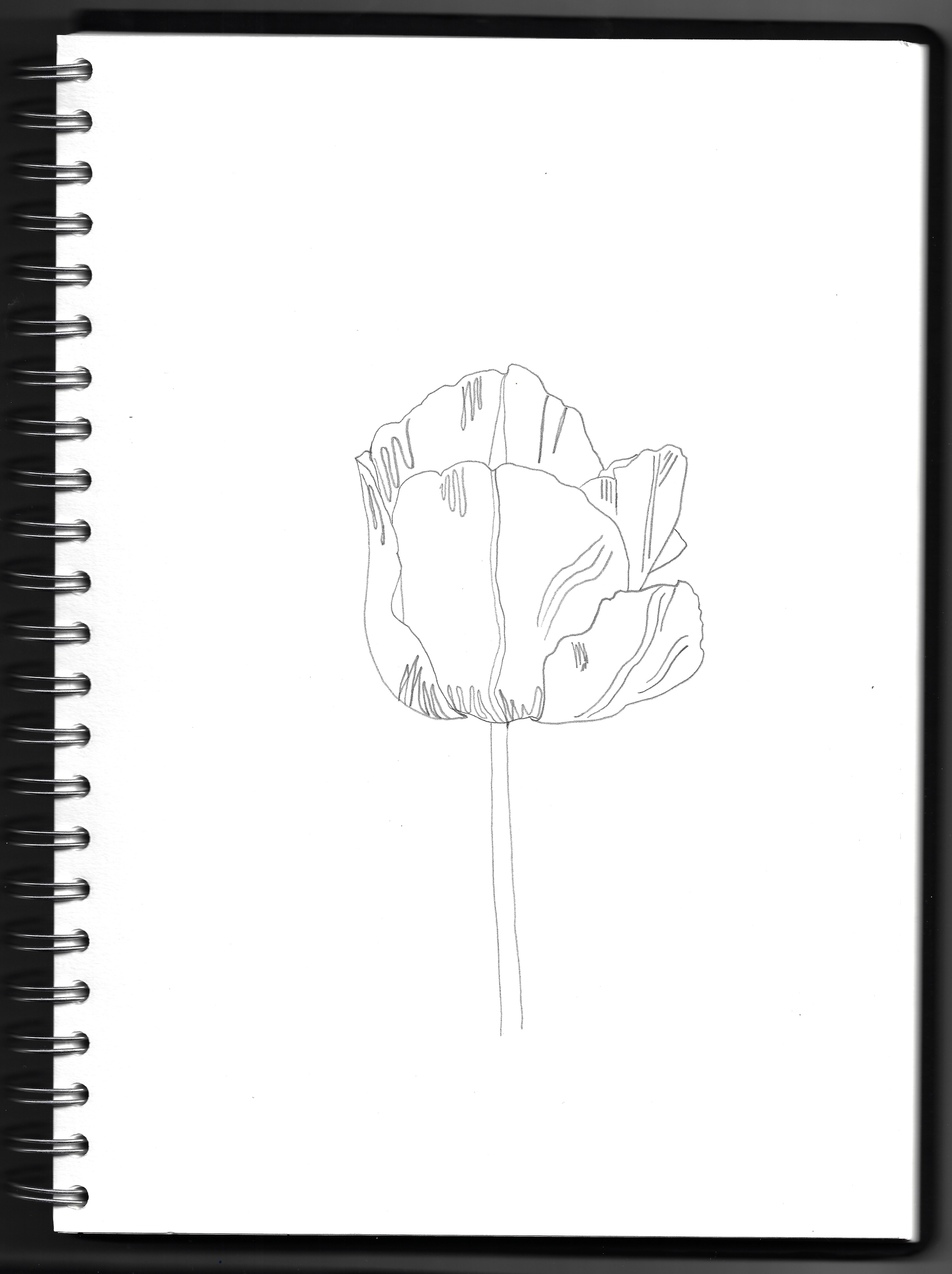
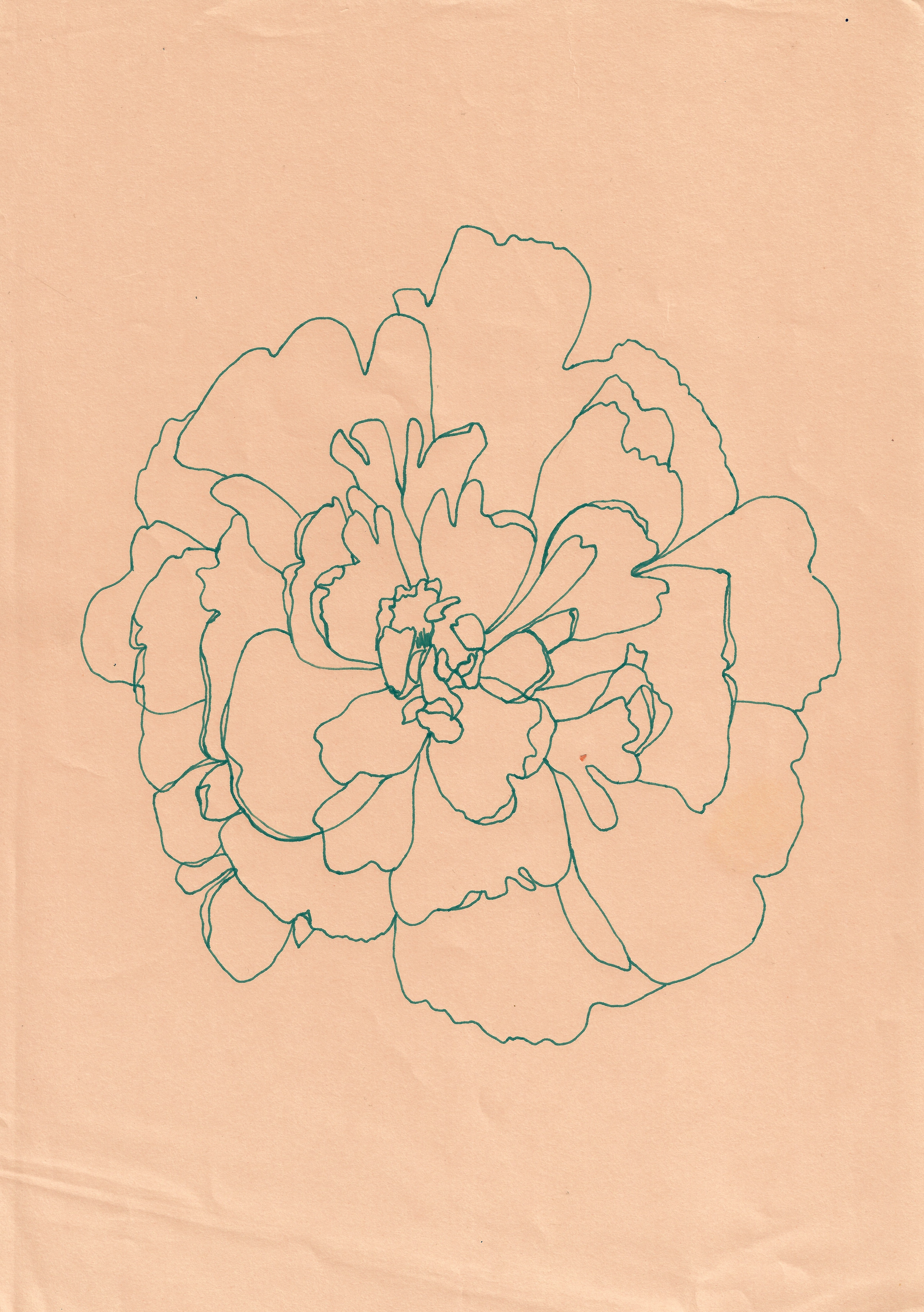
Drawing a tulip plant from different perspectives and using different mark making in the two different images of the same plant. There are different ways of seeing the same thing. I then move on to draw a different tulip, using just a pencil to draw the fundamental and structural lines that form the plant. This plant is much less textural that the yellow tulip I previously drew from different angles, lending itself to convey itself to the viewer with a few essential lines, which I then translate this onto the page. I reflect and translate the nature of each natural form I depict through the lines I use.


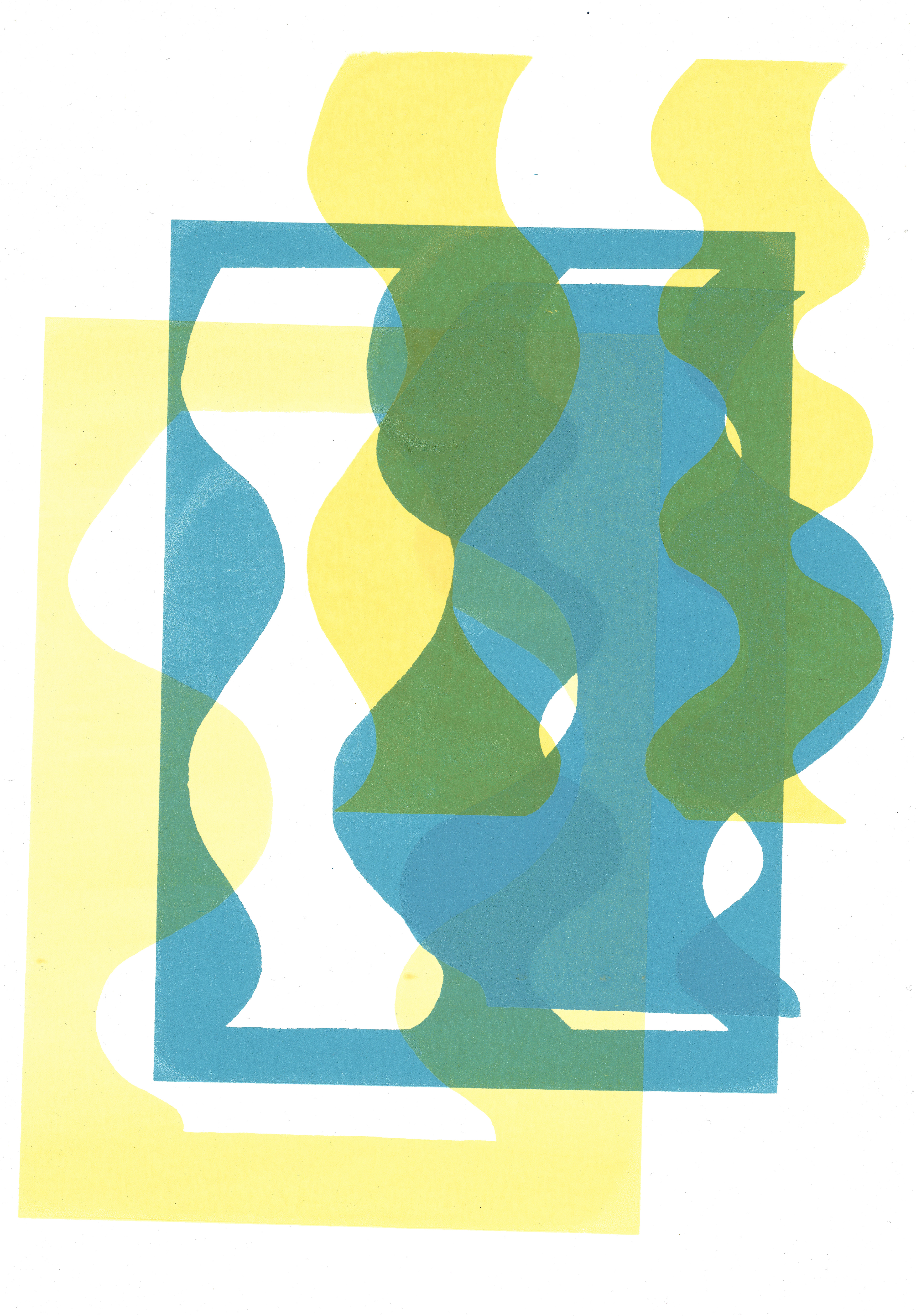
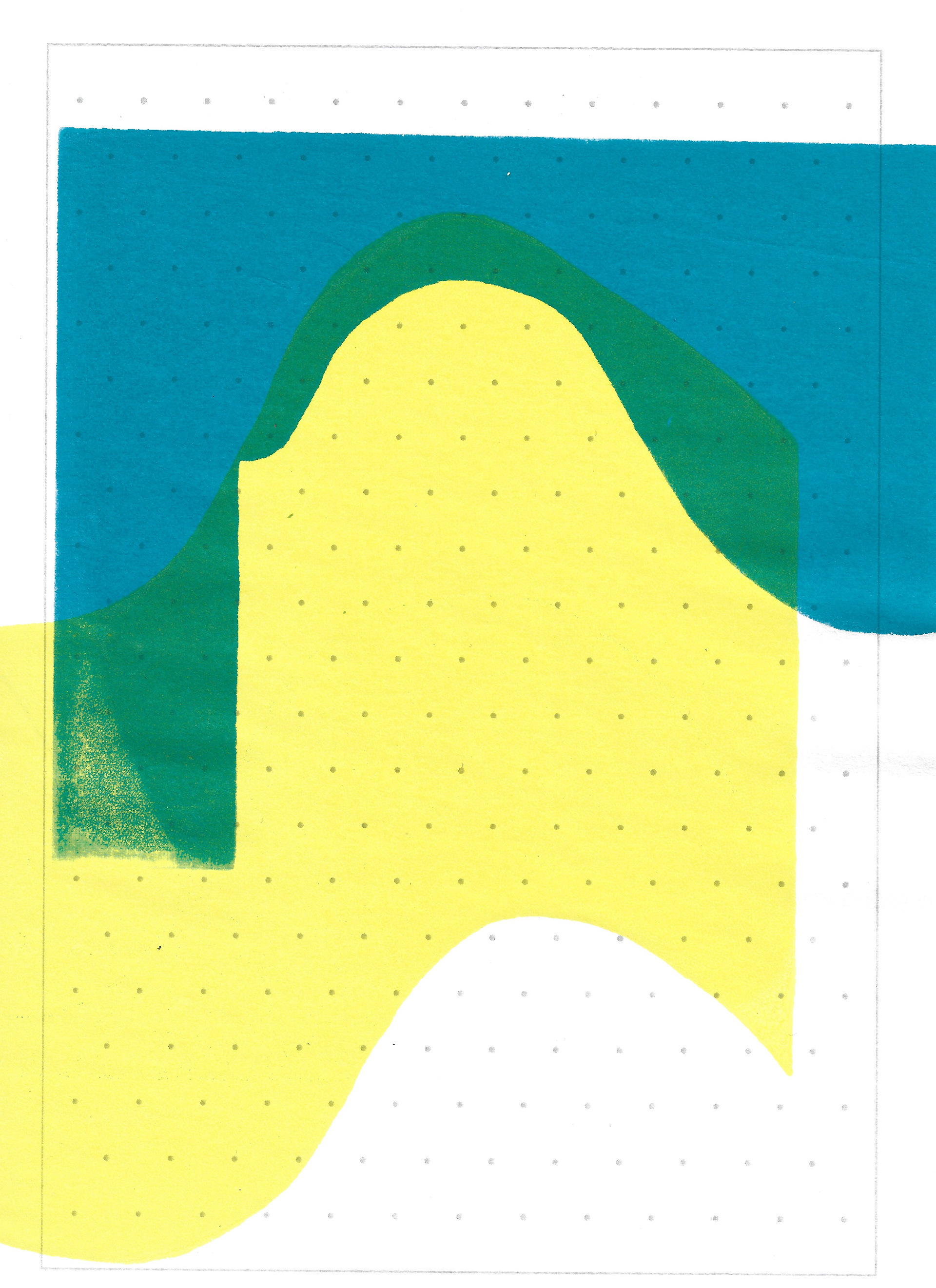
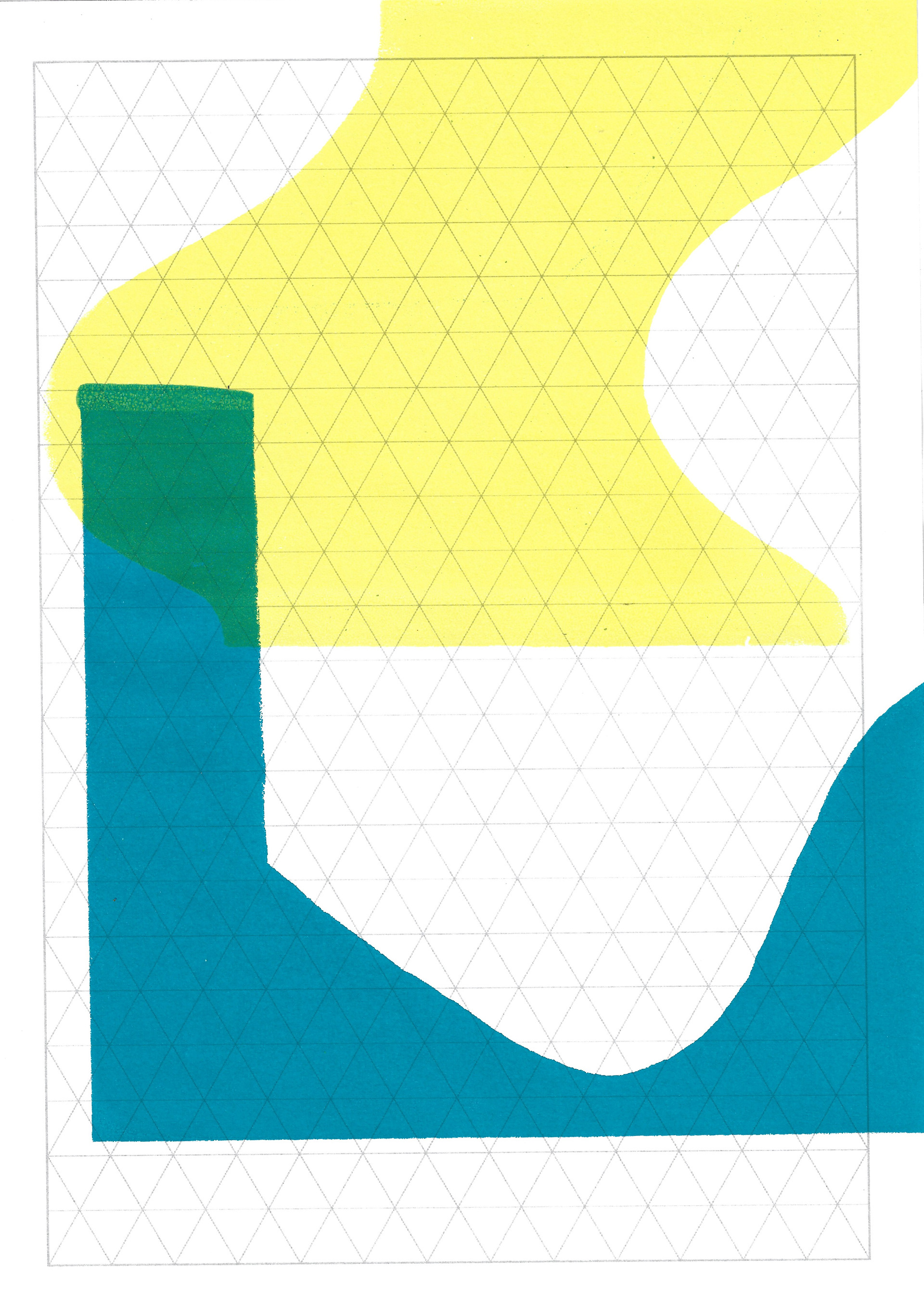
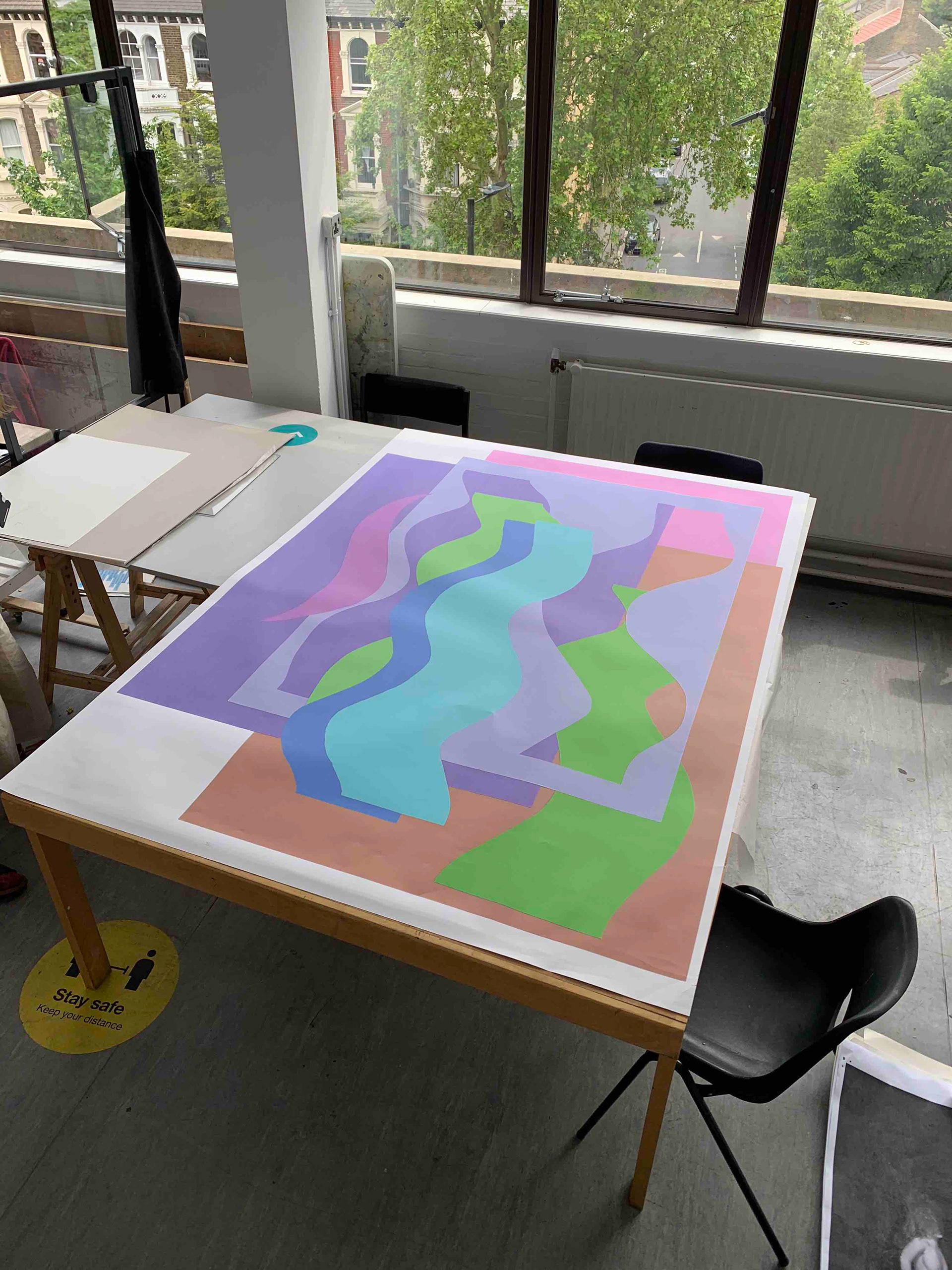
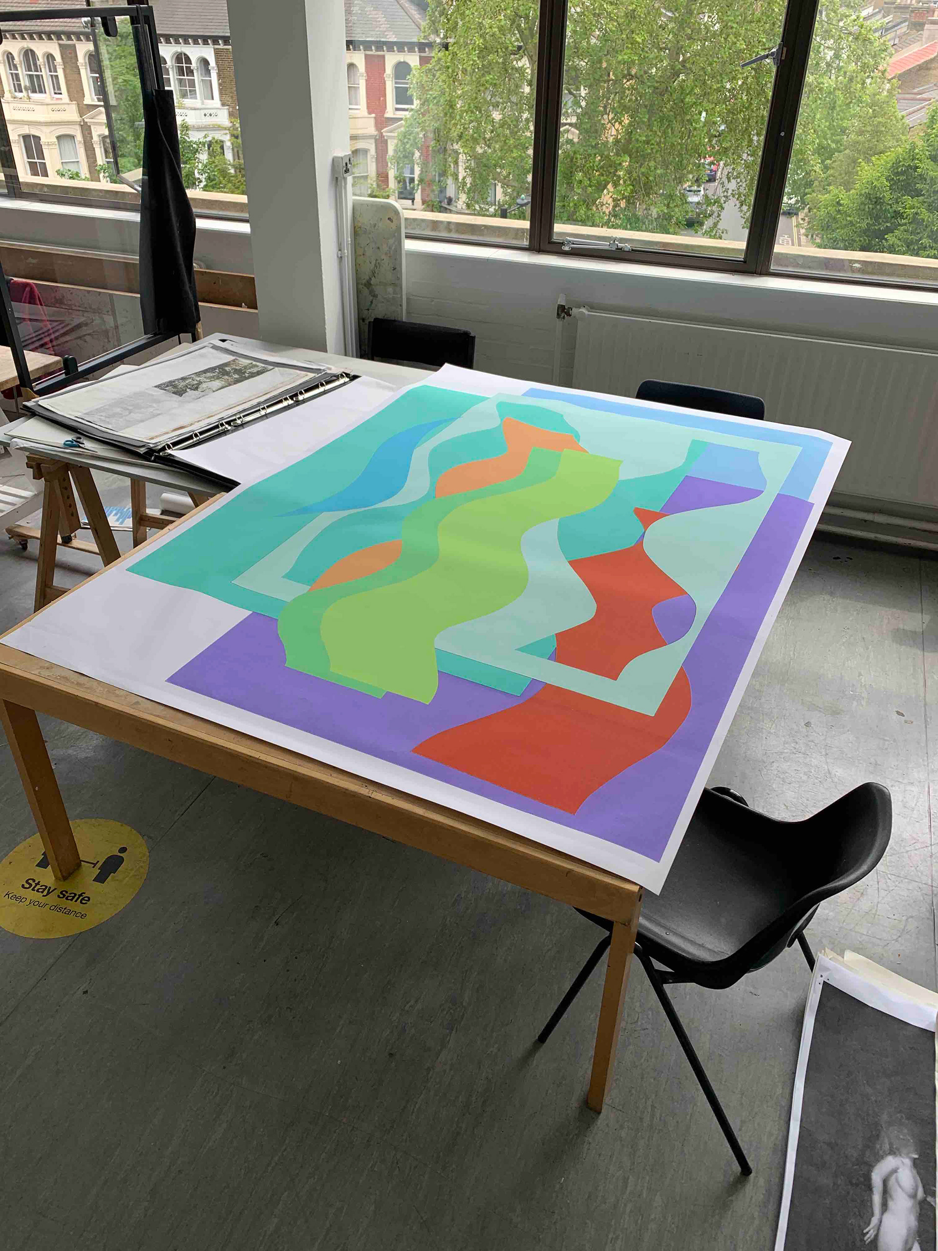
Changing the colours of a previously scanned in image of different cut out shapes. I split the image into different layers for the separate shapes and I change the colour of each form depending relatively on the previous layer. Each colour that is chosen, as the image is built up, is dependent on the previous colours chosen. There are different, interconnected, and dependent relationships that form from building up the image’s colours in this way.


Create various arrangements on my flatbed scanner of magazine images, focussing on the direction of the line. Each image is arranged and adjusted following the previous scan.
I create digital collages using images of the boustrophedon structure and adjust them to fill the images of unconventional gallery spaces. By enlarging the image of the boustrophedon to fill the space, the viewer would be forced to engage by having to move around the work by pulling unusual positions. The lines of the viewer’s body would mirror those in the work and they would be individual to the viewer, as everybody would move differently.

Sketchbook page, 21 x 29.7 cm
Photoshop image
Lithograph, 21 x 29.7 cm
Lithograph, 29.7 x 42 cm
Lithograph, 21 x 29.7 cm
Lithograph, 21 x 29.7 cm
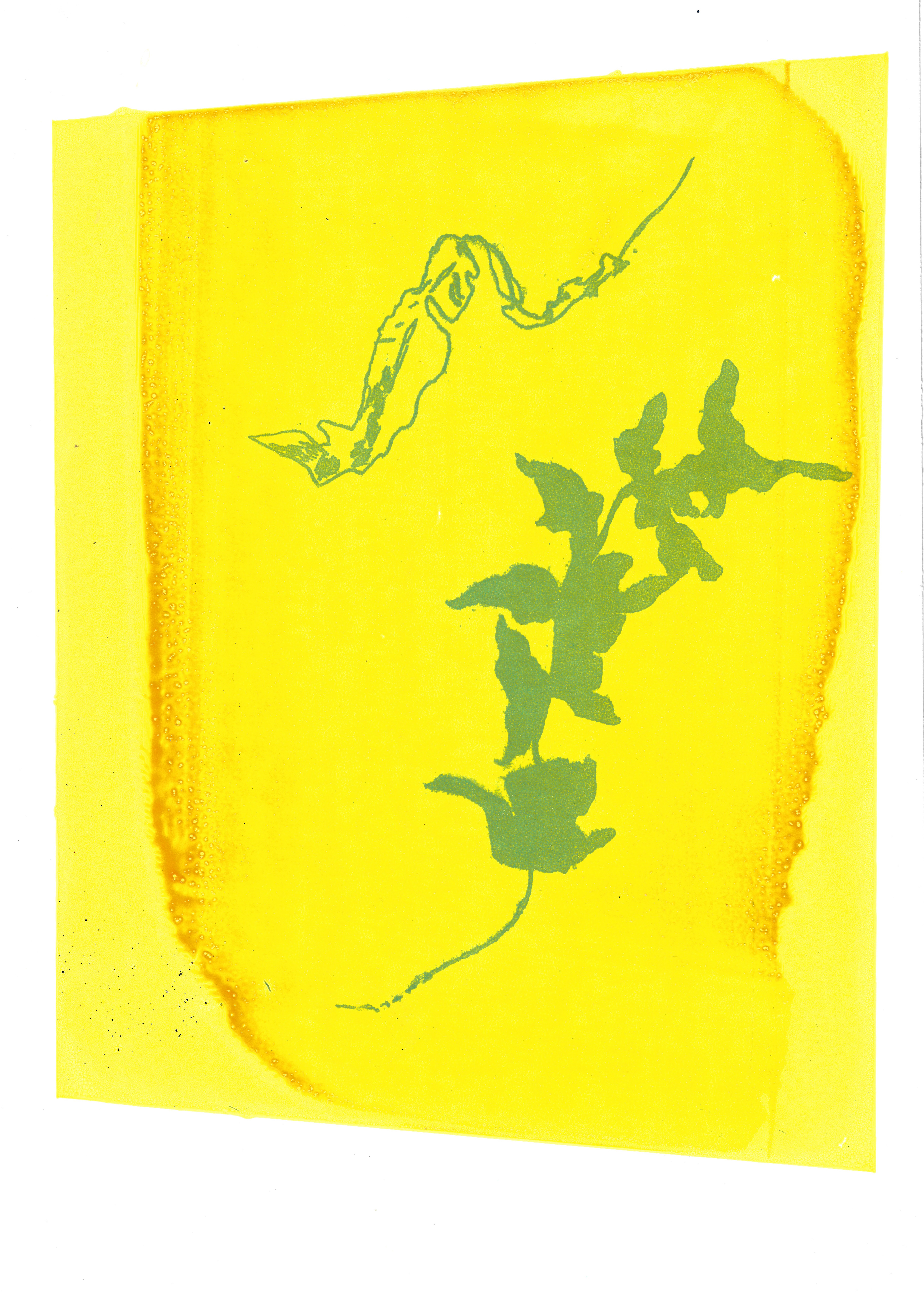
I print an image from my sketchbook (which I slightly edited on photoshop) onto film to then use in lithography with the offset press. I really enjoyed the process, but I am limited in scale, yet I can print detailed or edited drawings in rich colours. The colours are deeper and seem to give more depth compared to flat screenprinting inks which sit on the surface.

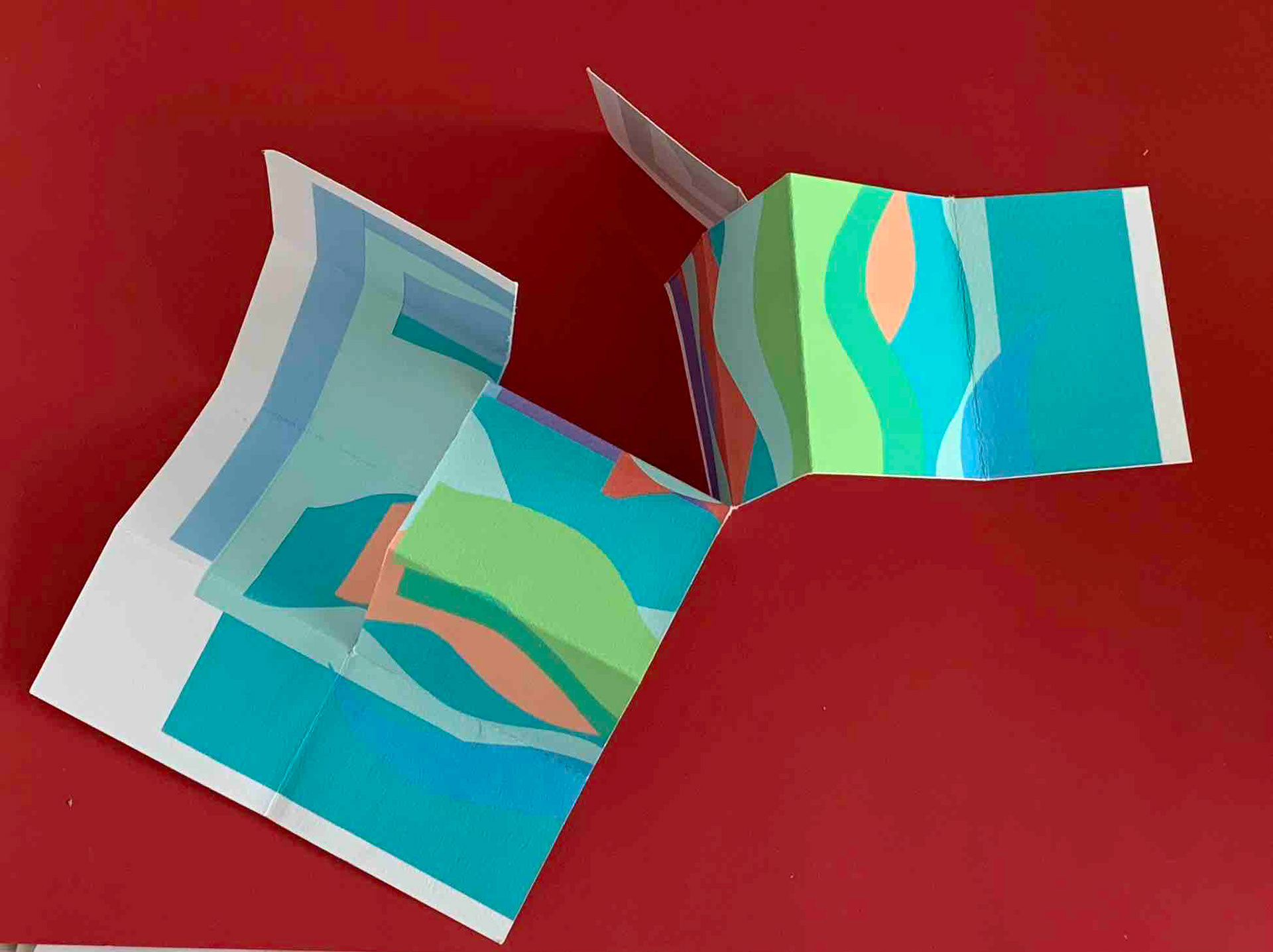
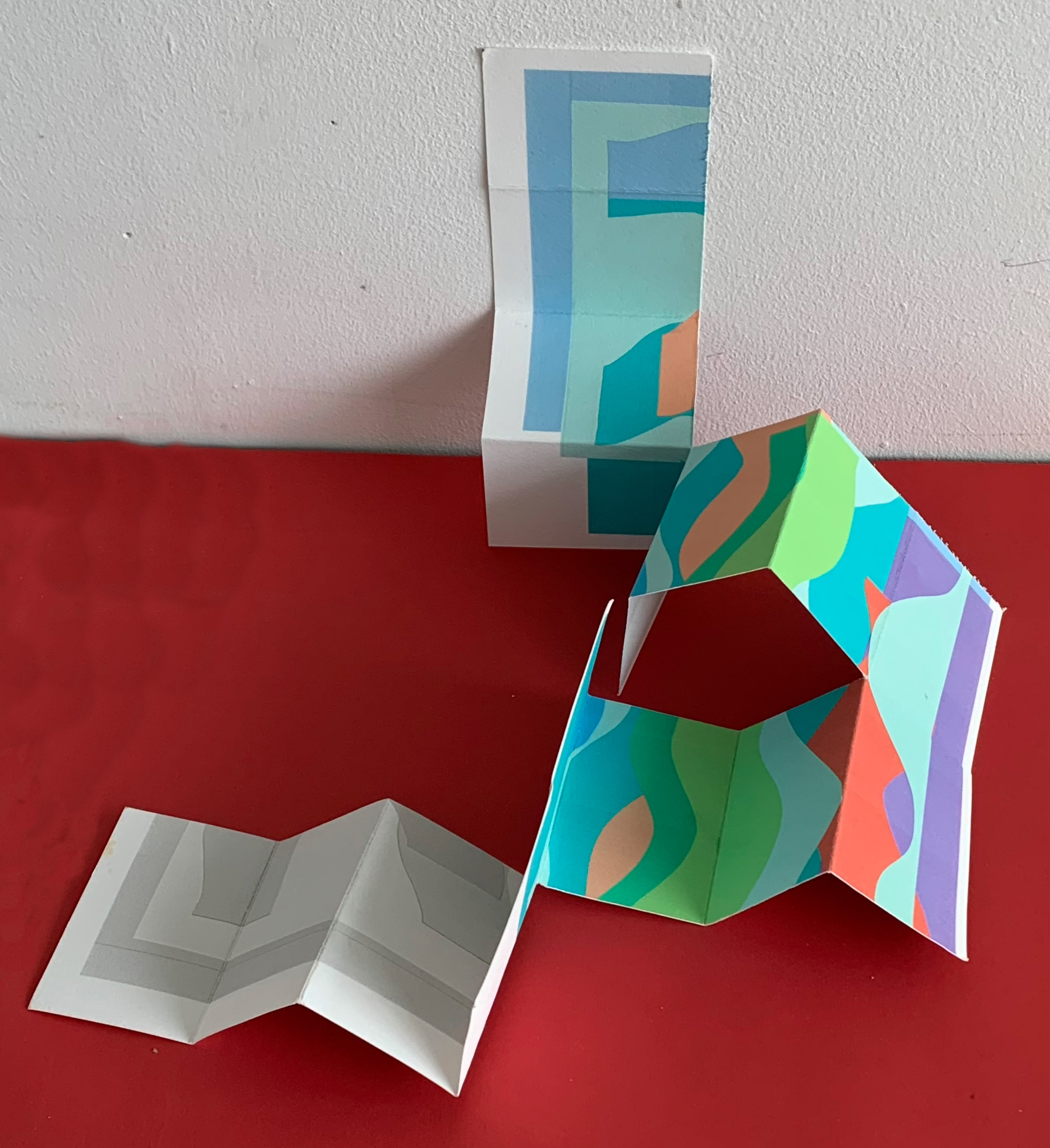


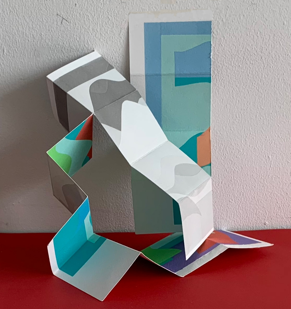


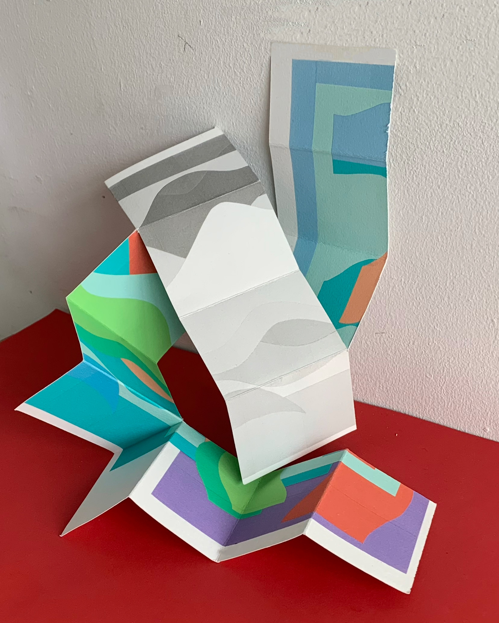


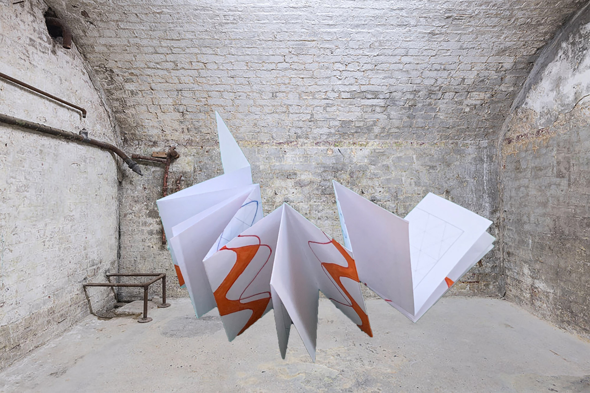
I consider and logistically plan to make a large boustrophedon structure with images digitally printed onto both sides of the sheet of paper before it is folded and cut. There are a lot of logistical considerations to be had in relation to the scale and weight but also how crucial this is in my aim to affect the viewer’s body, recognising and positioning their own sense of self by encountering this structure.
I make a boustrophedon structure using A4 double sided bockinford inkjet 190gsm paper. Although one side I print black and white by mistake.
I made two different boustrophedons using the same sized paper.
For the first structure I constructed, I used a ratio of 1:32, folding the piece of paper into 32 sections evenly. With the second structure I doubled the number of folds and cuts creating smaller and more faces.
I am unable to decide if I will make the first or second structure. If I was to directly scale up the initial boustrophedon, I would need stronger paper for it to stand independently whereas if the second structure was to be scaled up, I would still need strong paper, but it wouldn’t be so crucial as the weight would be distributed more evenly.
if I were to make the second structure the image would have to be repeated more often so that each of the faces would have a similar image to the first structure. The downside to the second structure is because it has smaller faces it will be more confusing for the viewer to engage with, as they would be overwhelmed by the amount of different faces, whereas with fewer larger faces the prominence of the line is far greater.
The aim of creating this structure is to create a dialogue with the viewer’s body and not just engage their eyes. This is achieved with the larger pieces, as the line is more prominent.
Lithograph, 26 x 25.5 cm
Lithograph, 29.7 x 42 cm
Lithograph, 21 x 29.7 cm
Lithograph, 21 x 29.7 cm
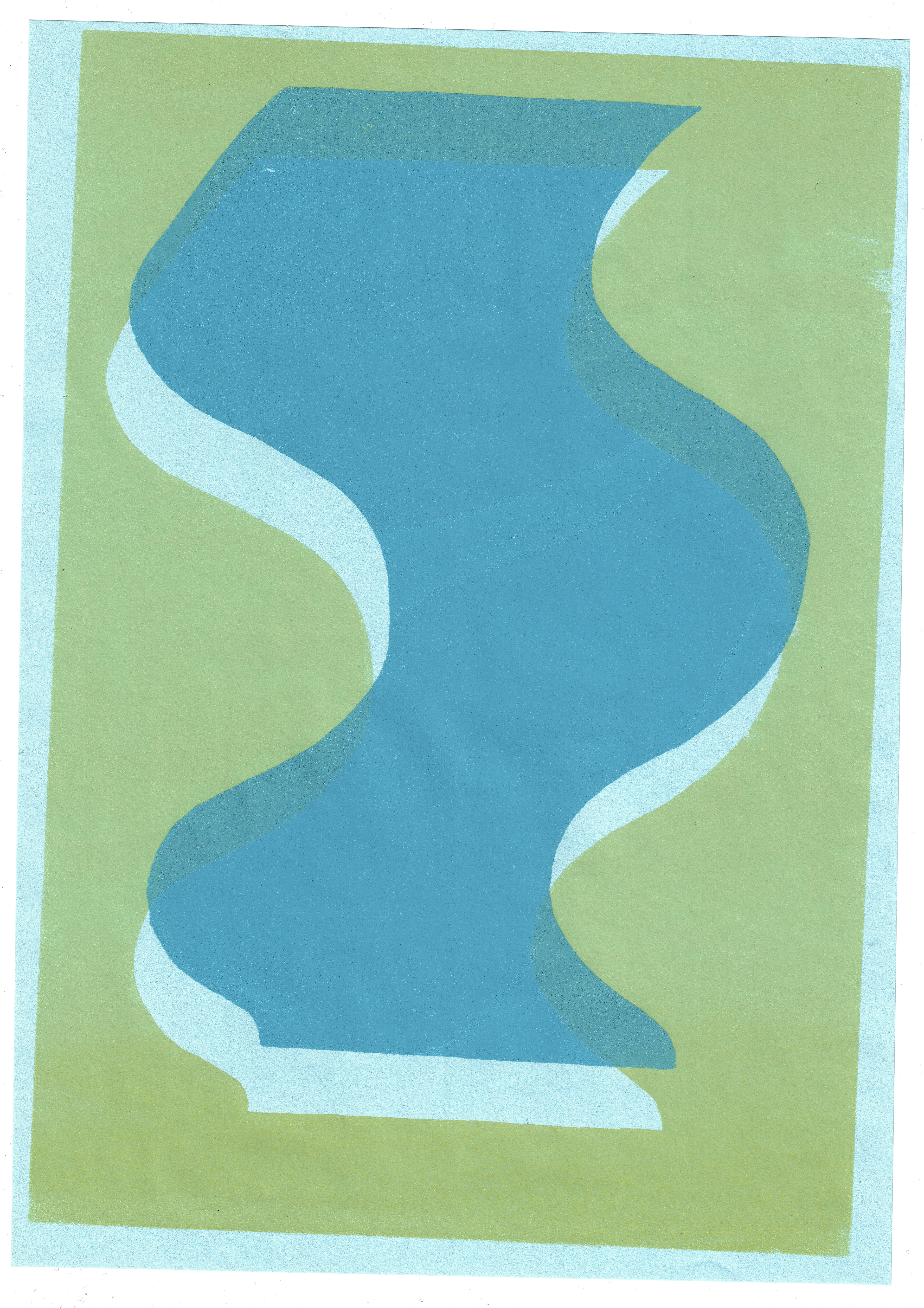
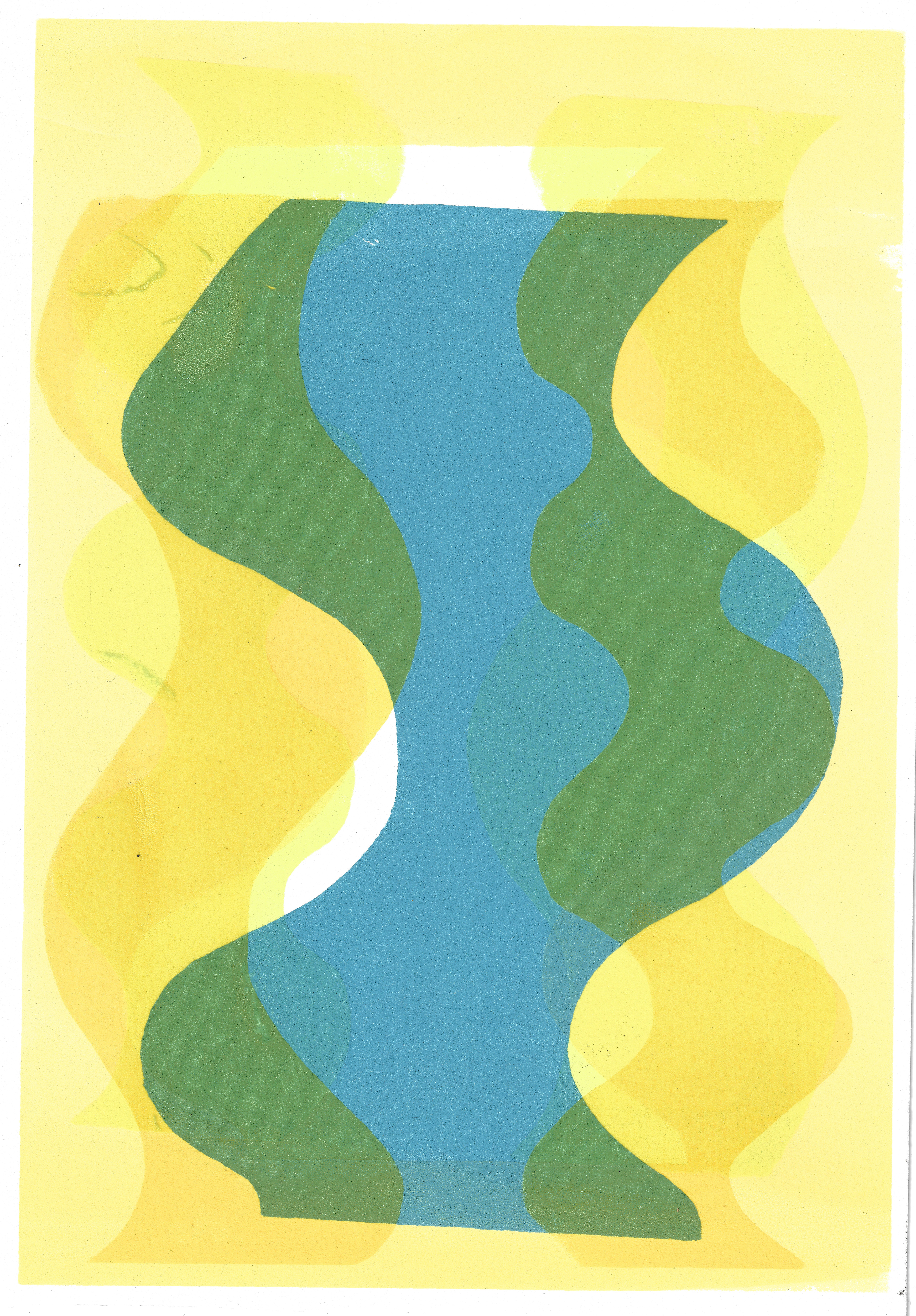
I use the offset press to print my photo litho plate, the colour paper and ink I use reflect the harmonious, subtle dialogue between line, form, and colour.
I layer the image, by printing twice on the same paper with the same image in the same colour, emphasising the symmetrical, geometric nature of the line and form.

Screenprint on paper, 21 x 29.7 cm
Screenprint on paper, 21 x 29.7 cm

Screenprint on paper, 21 x 29.7 cm
Screenprint on paper, 21 x 29.7 cm
Screenprint on paper, 21 x 29.7 cm

Screenprint on paper, 21 x 29.7 cm
Screenprint on paper, 21 x 29.7 cm

Screenprint on paper, 21 x 29.7 cm

Screenprint on paper, 21 x 29.7 cm
Screenprint on paper, 29.7 x 42 cm

Screenprint on paper, 29.7 x 42 cm
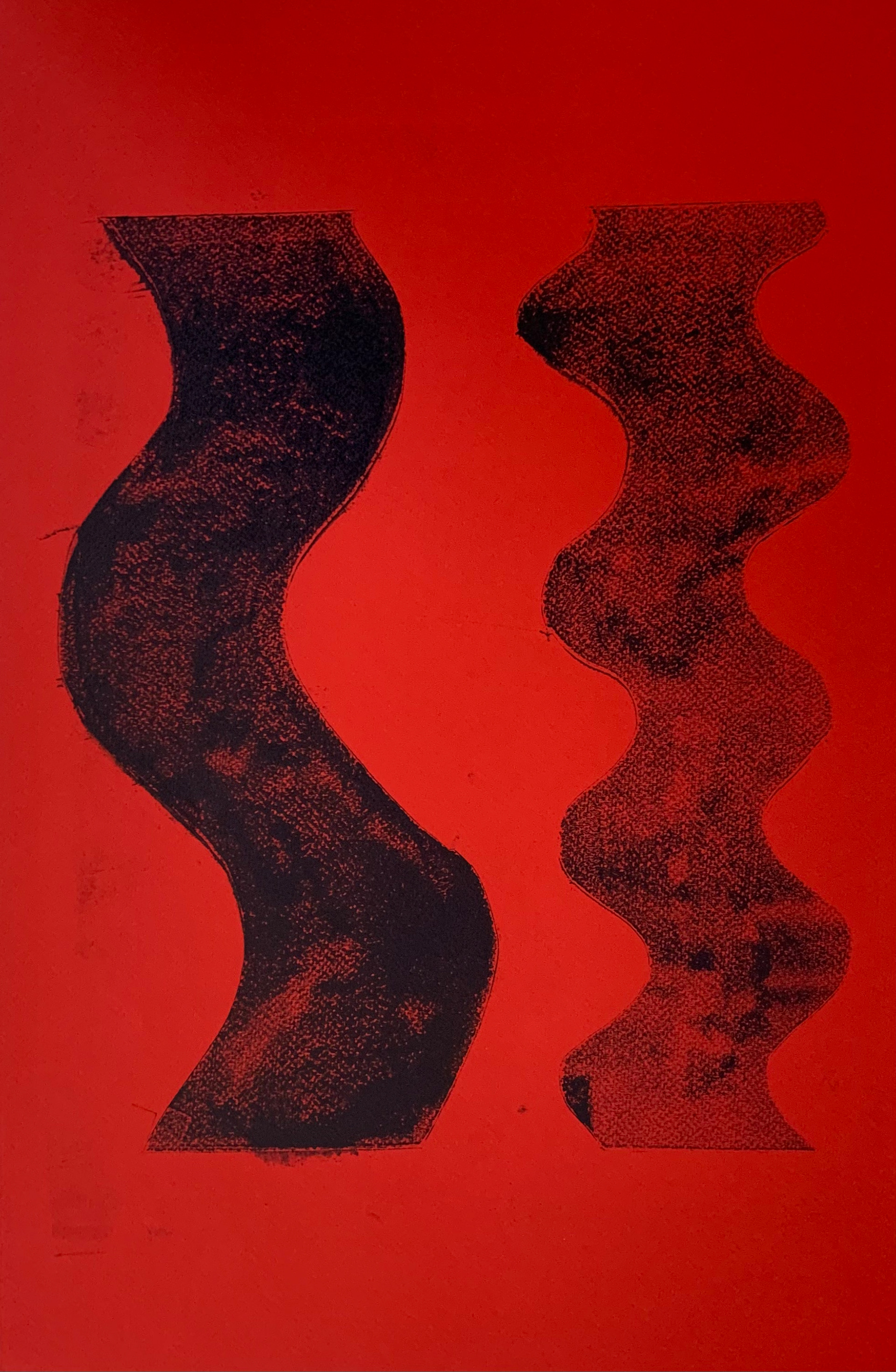
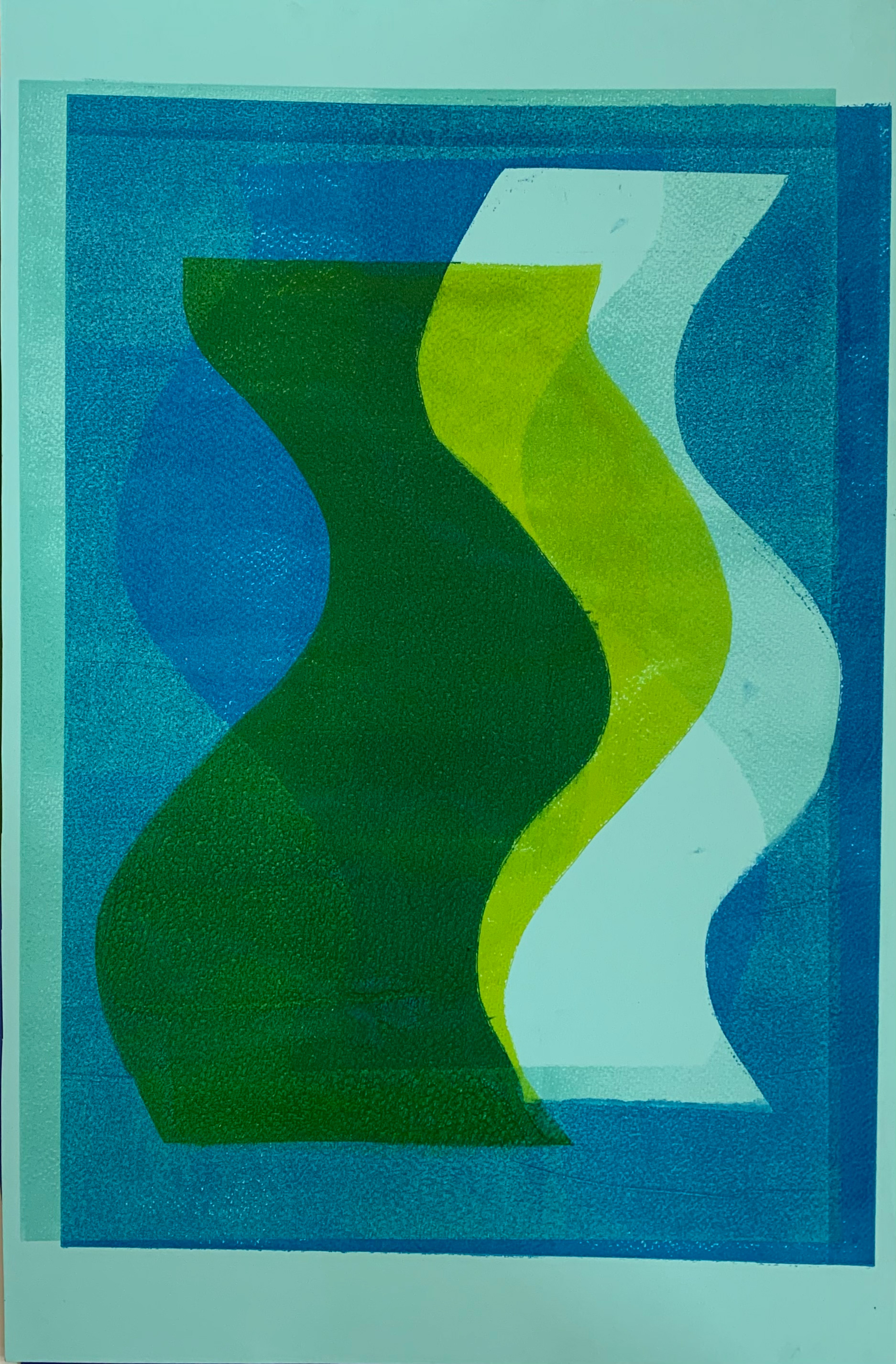
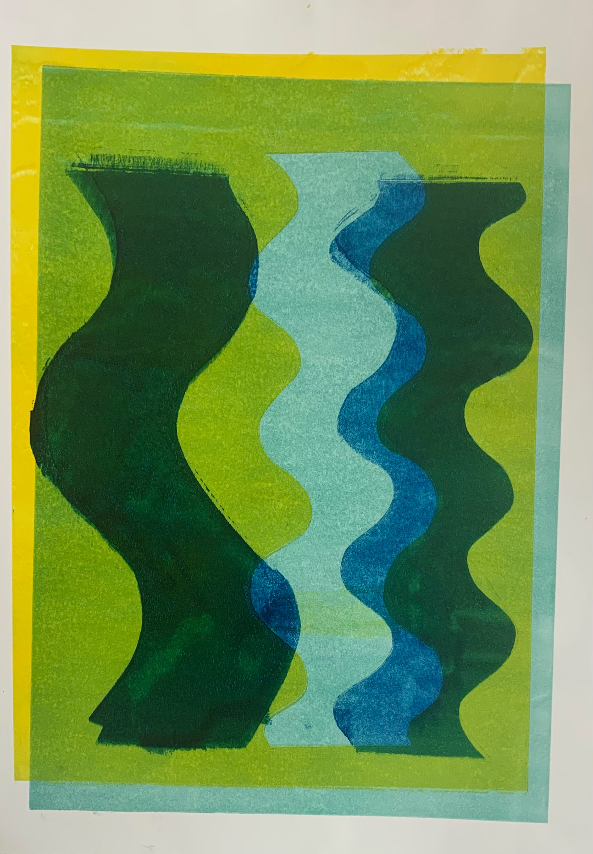
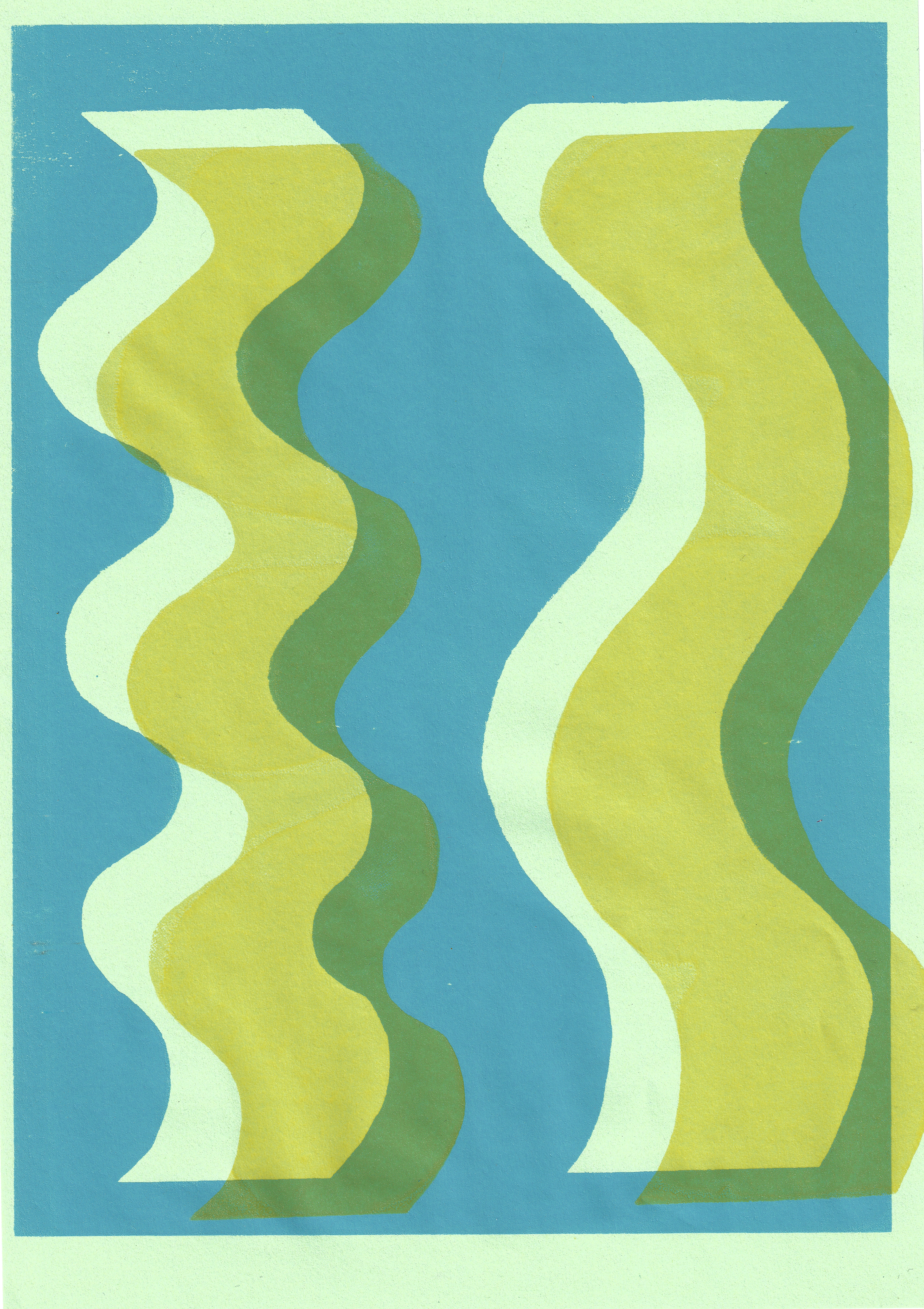
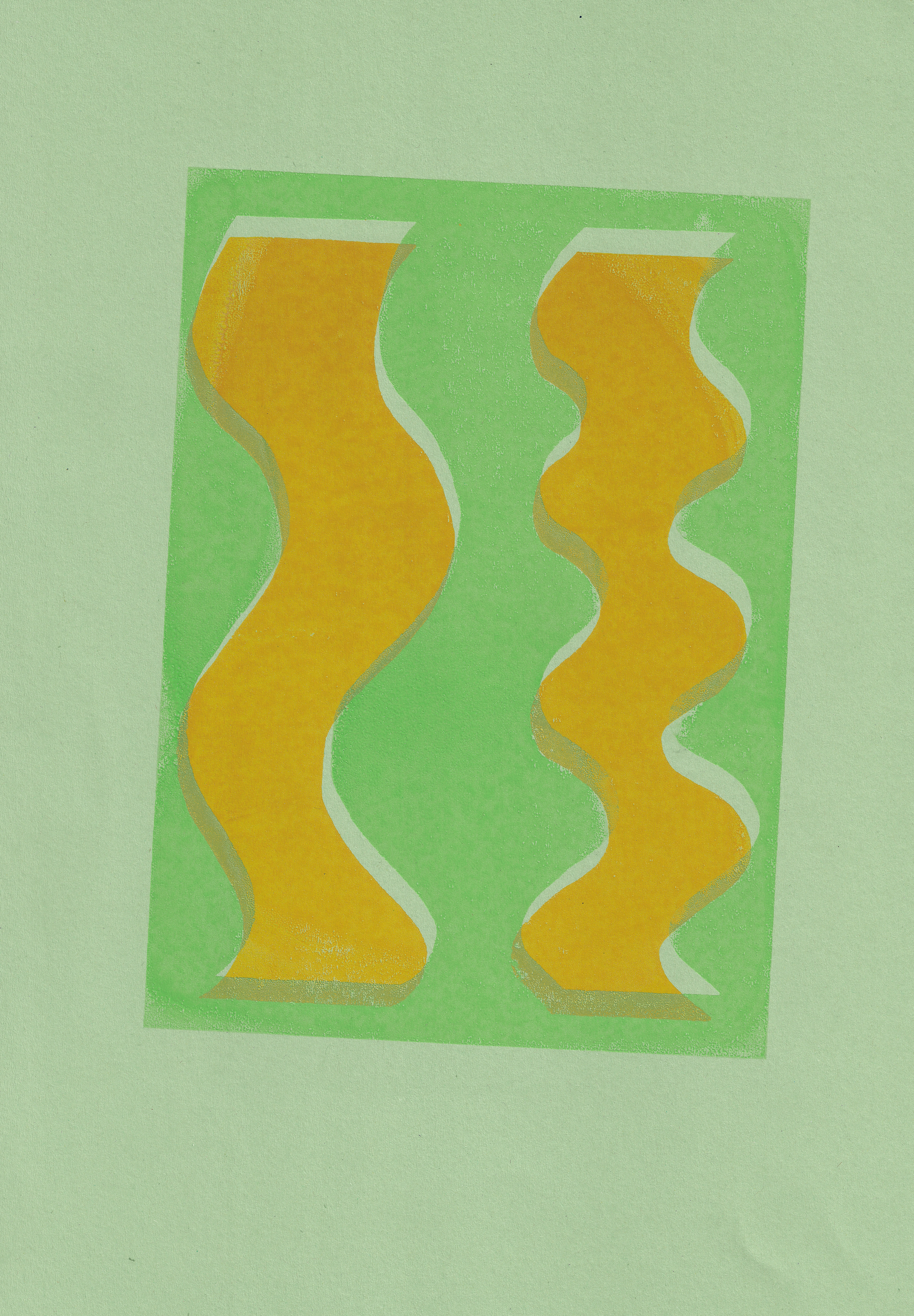
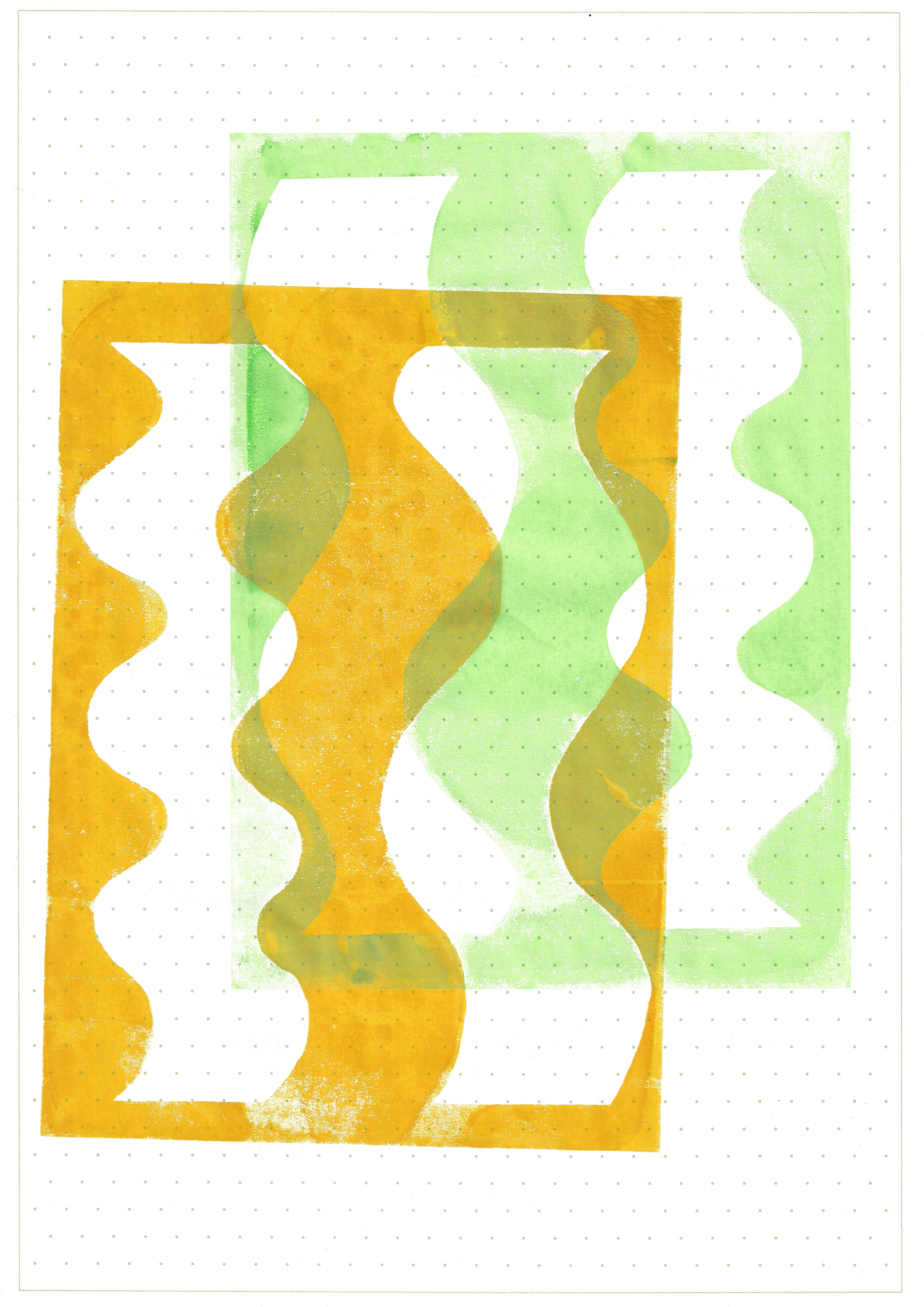
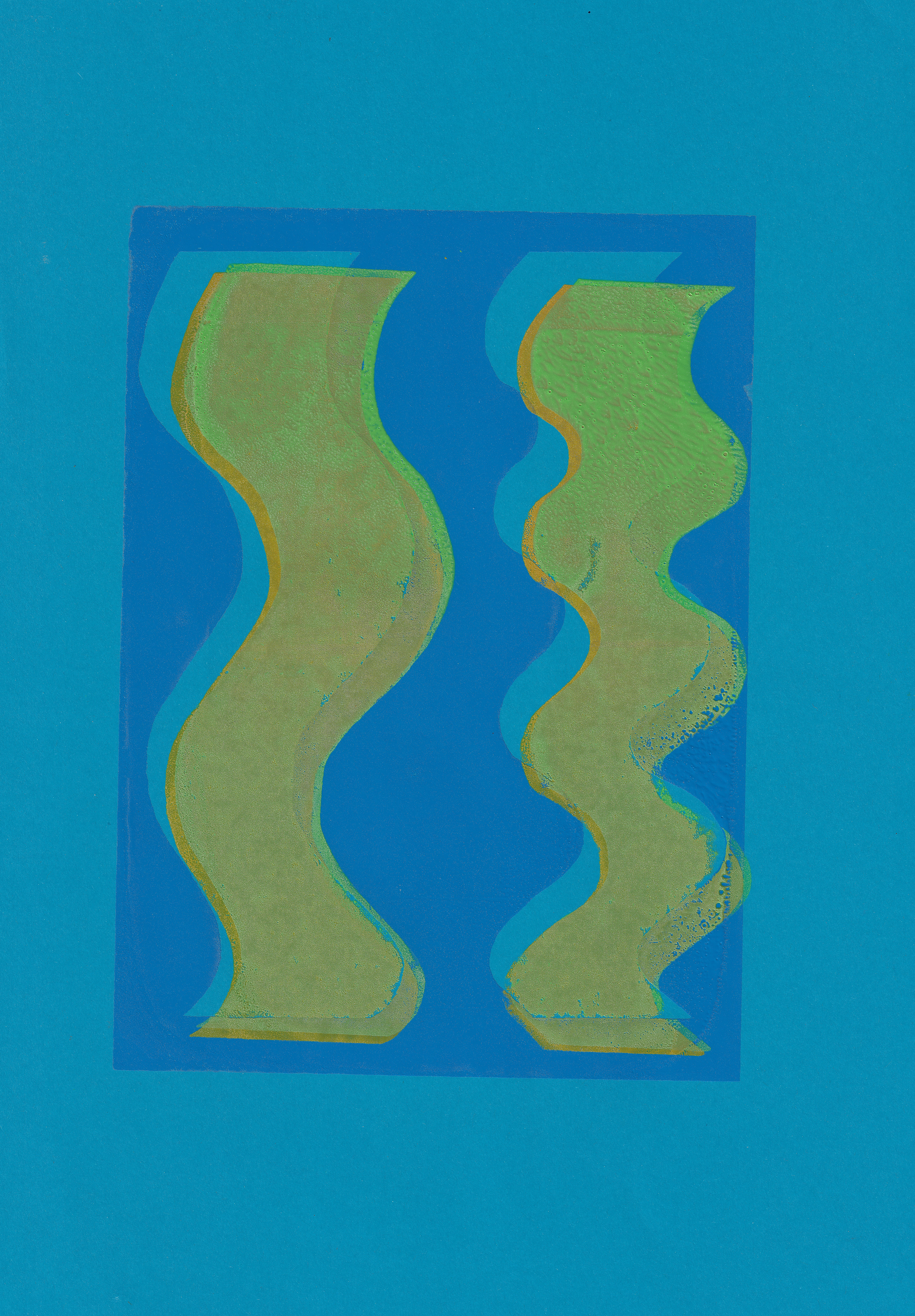
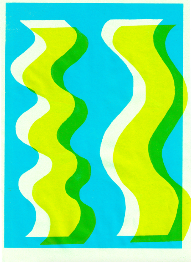
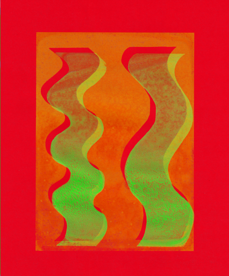
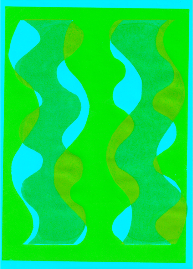
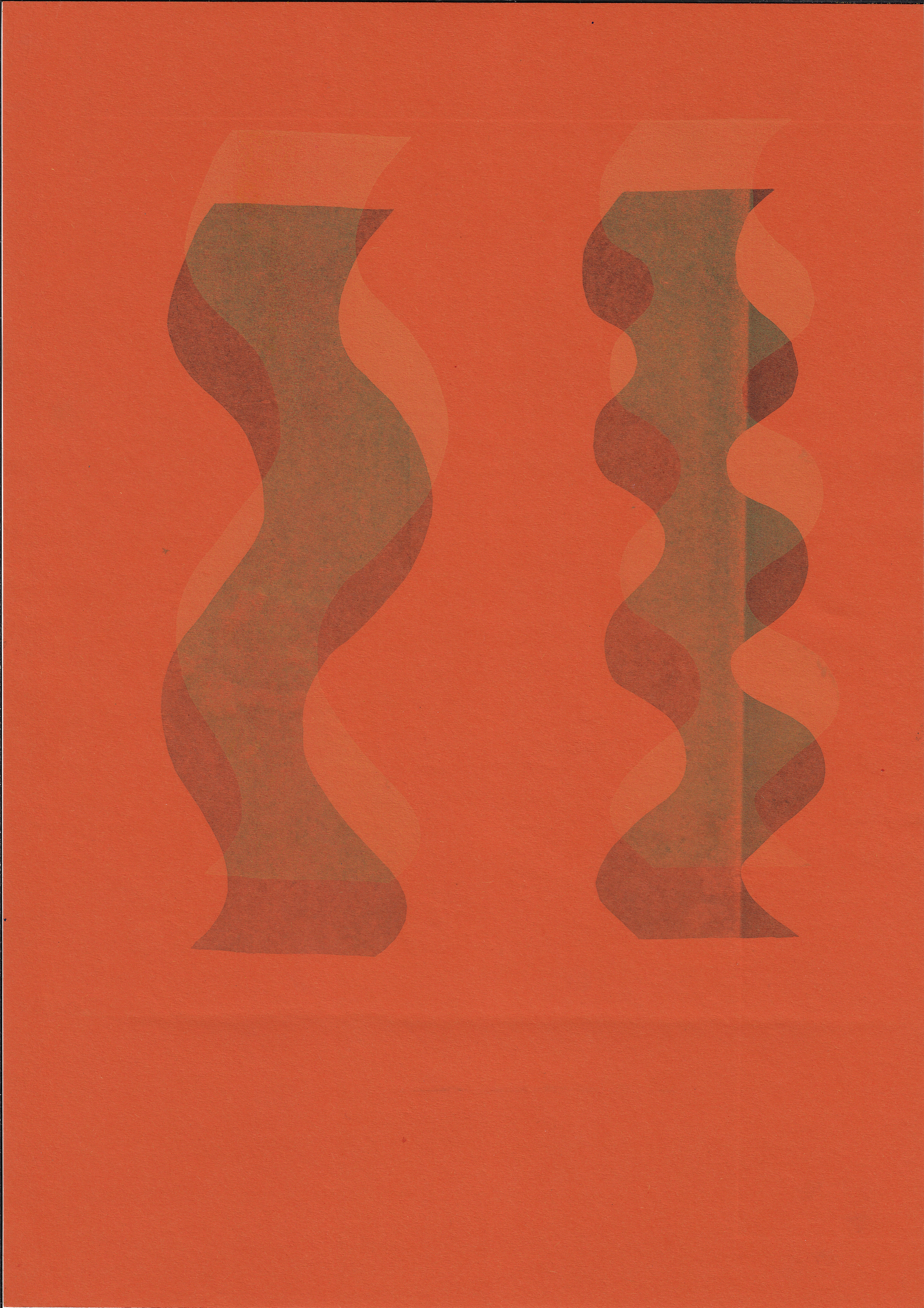
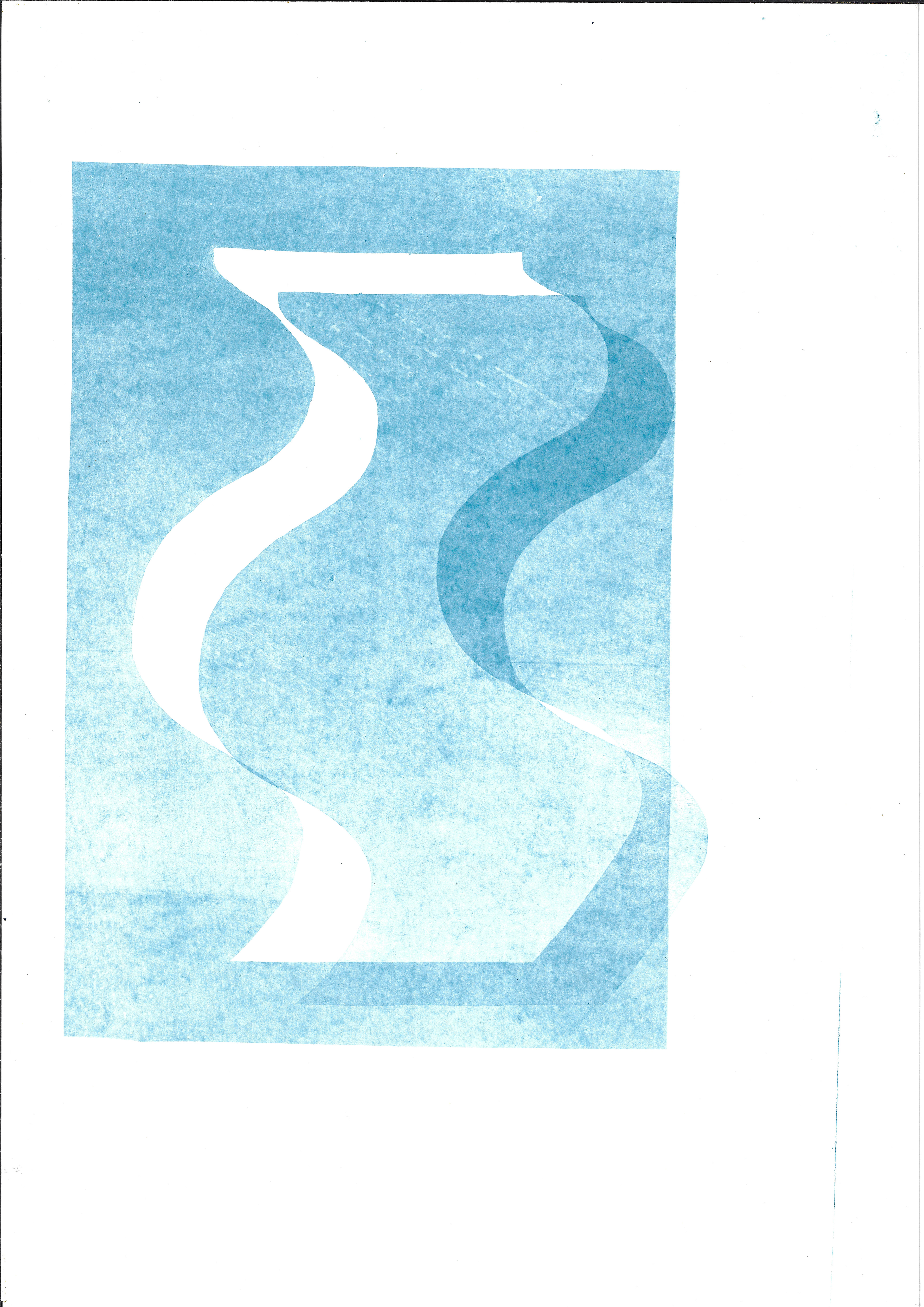
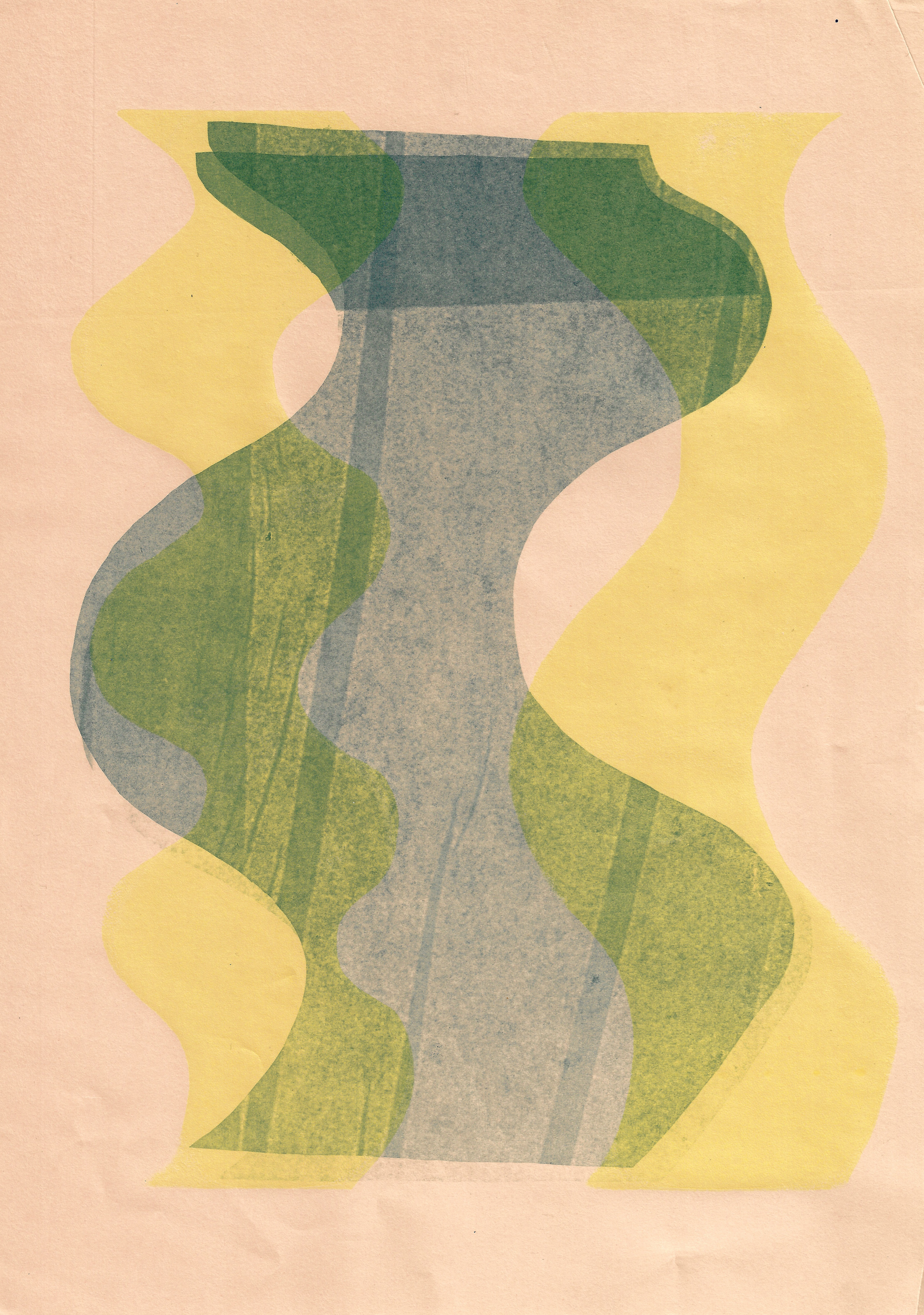
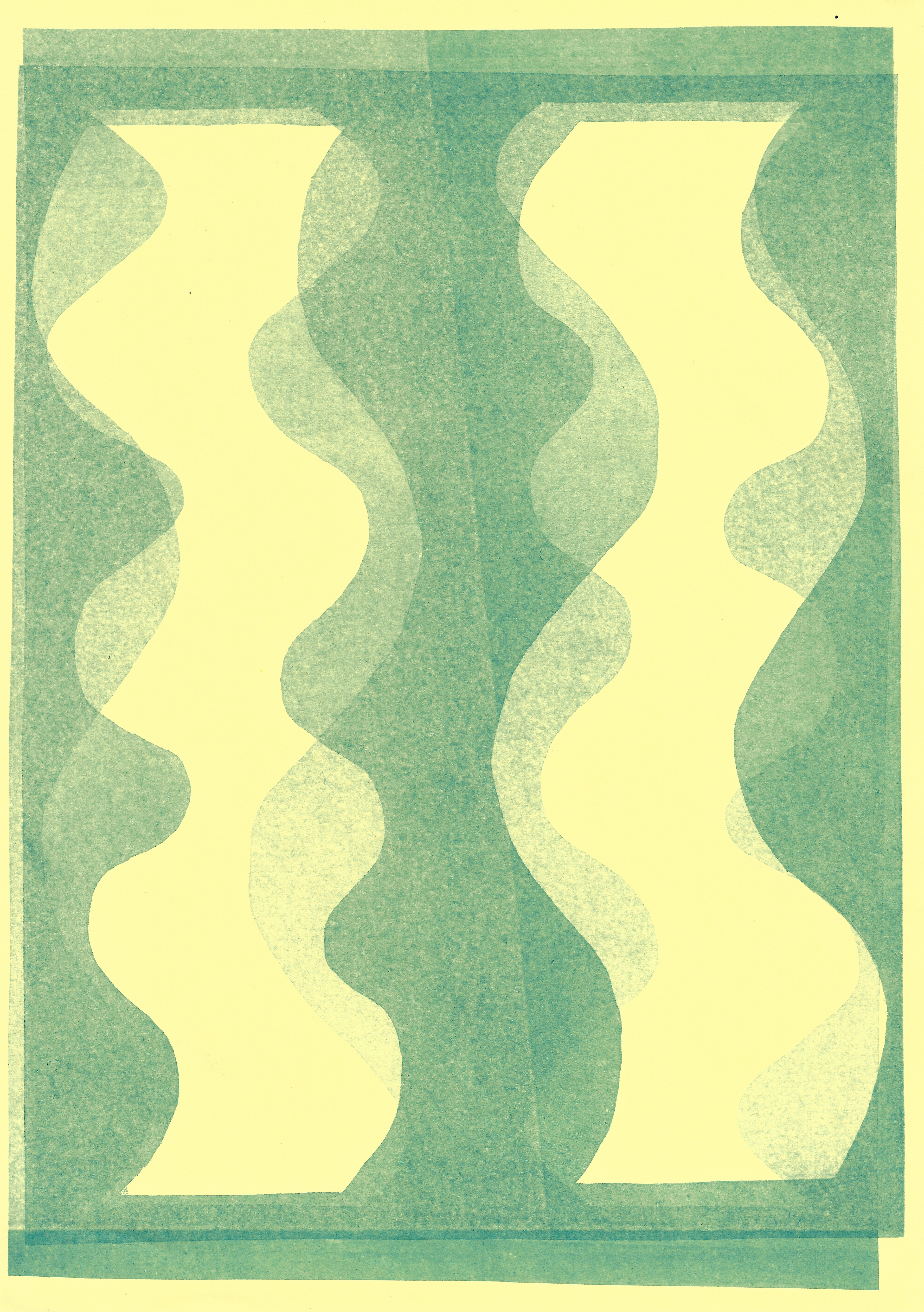
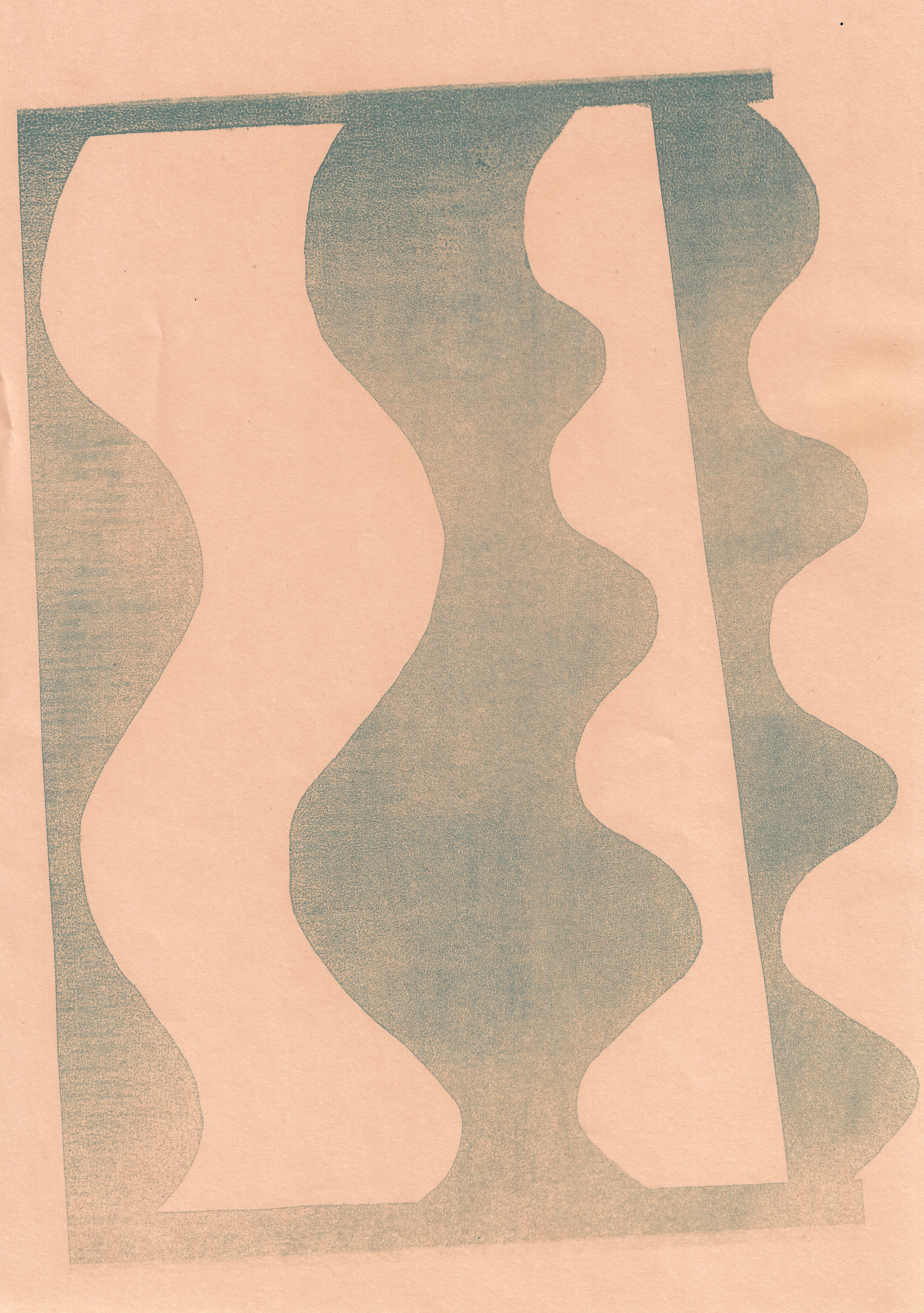
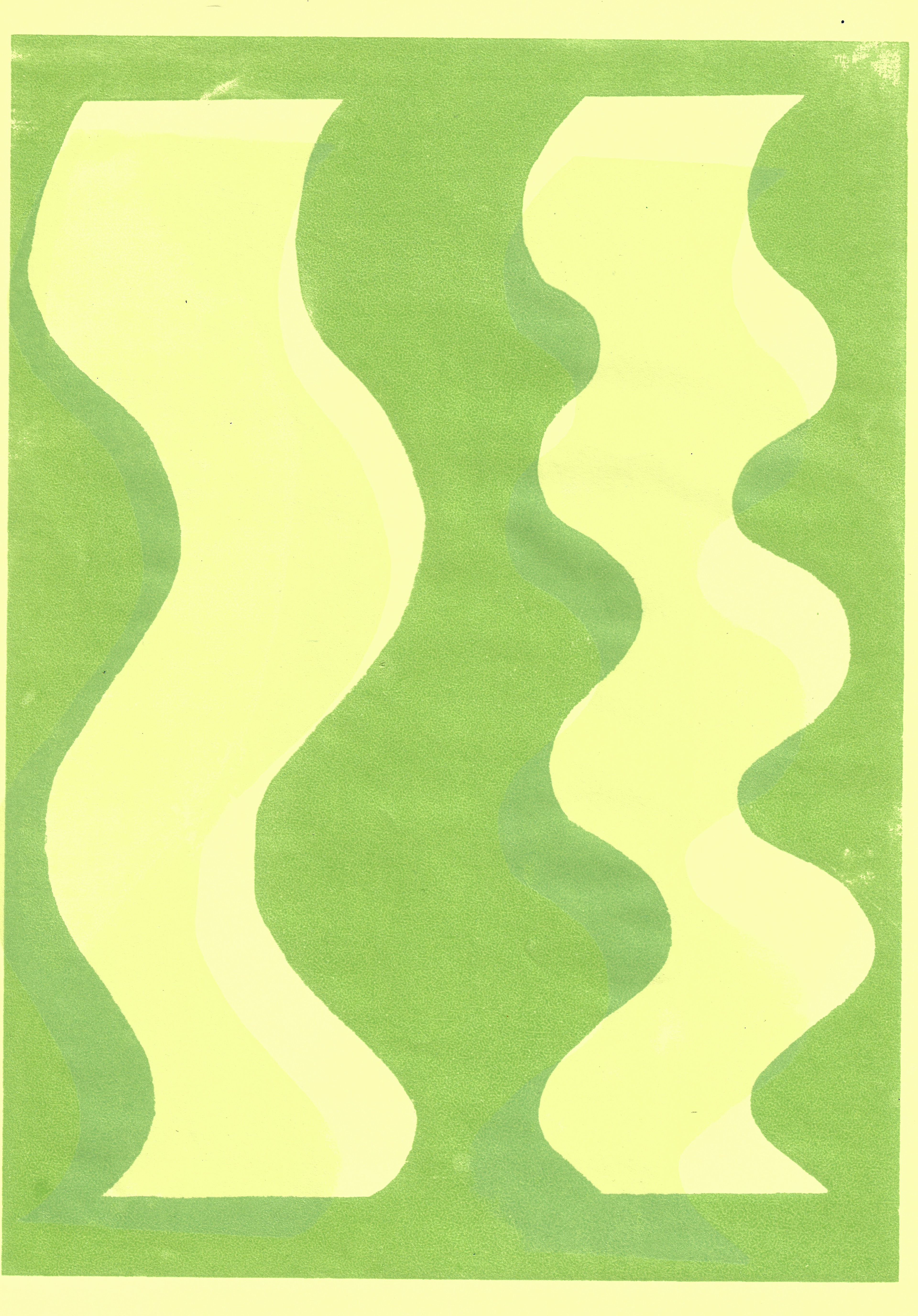
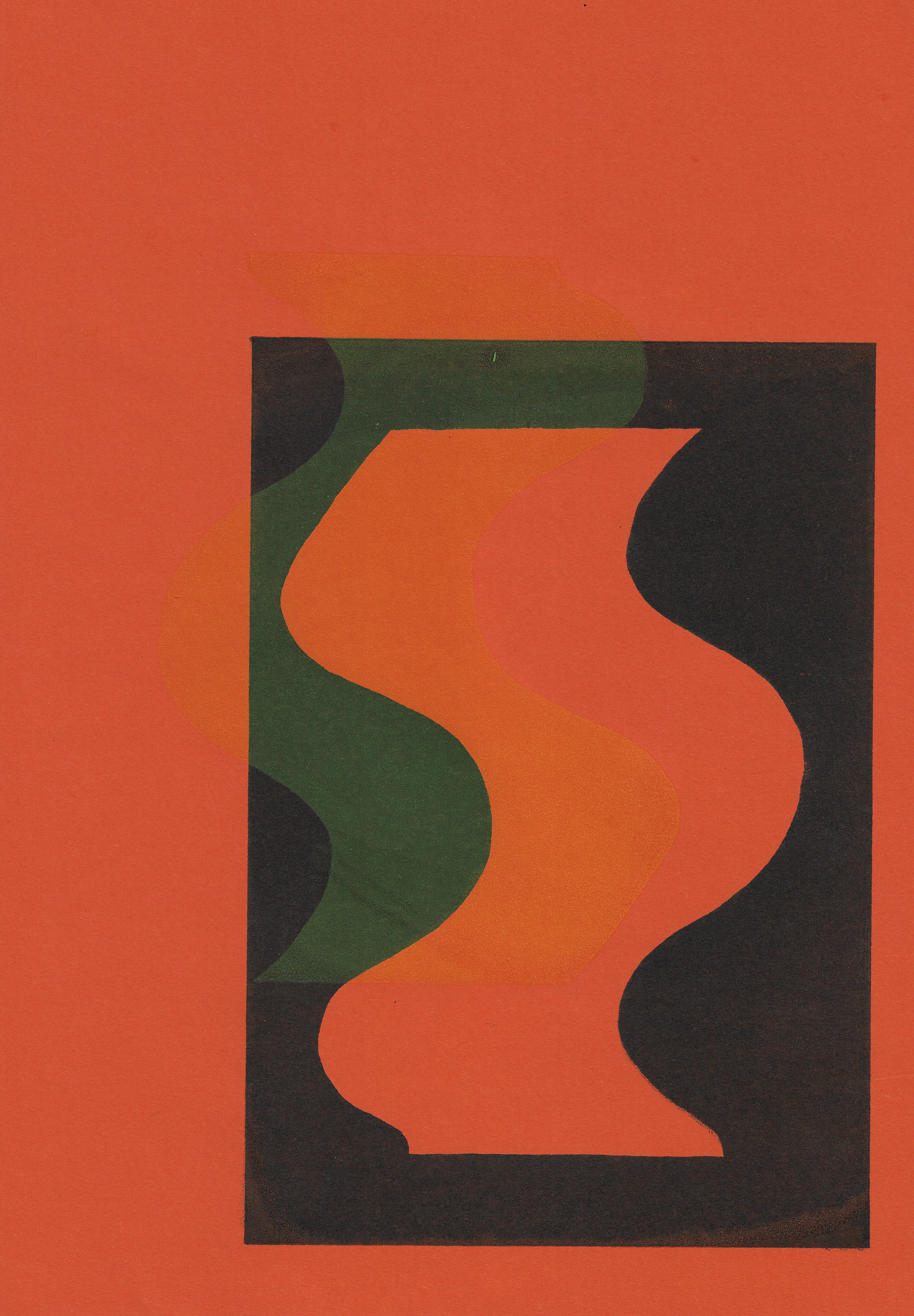
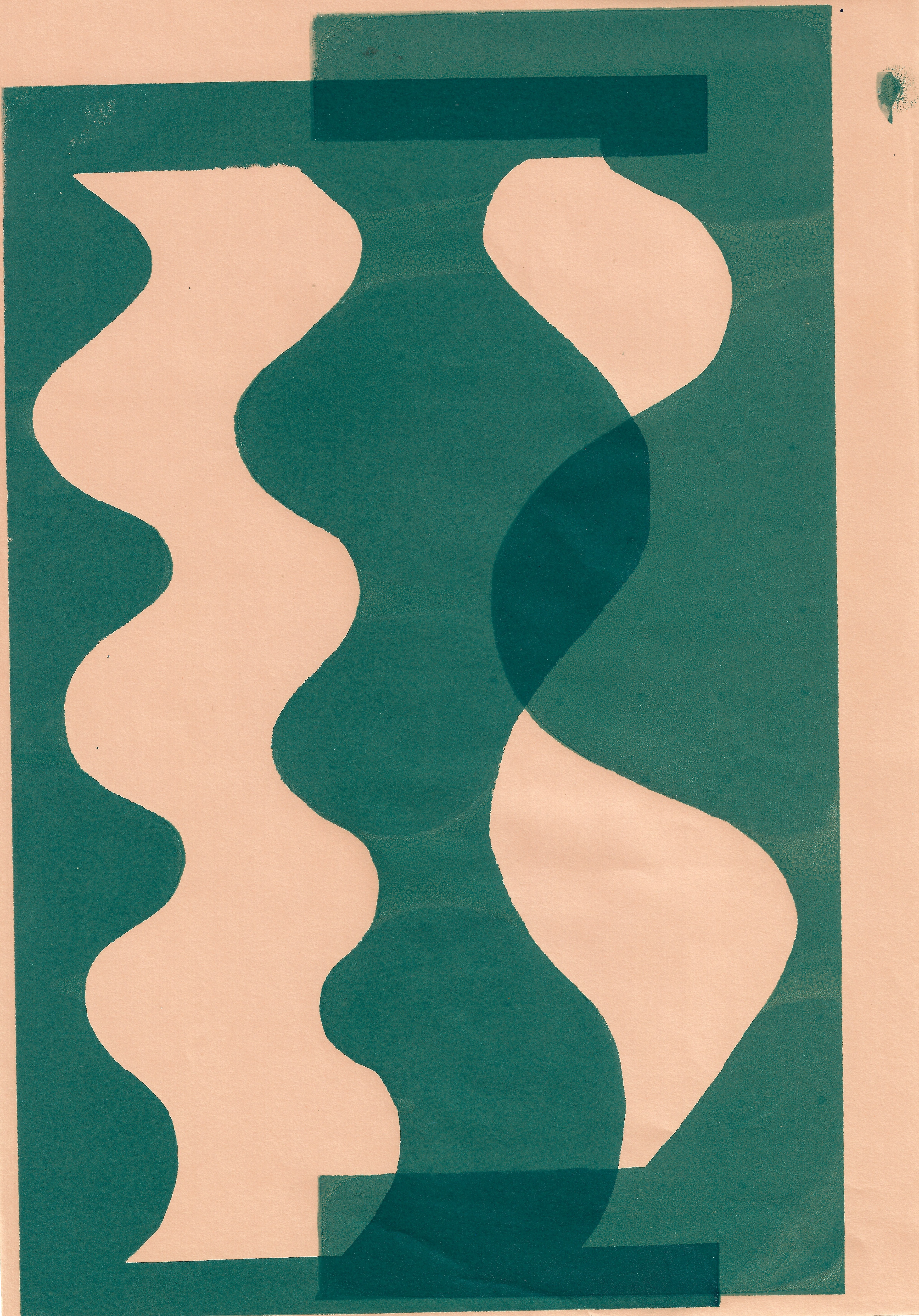
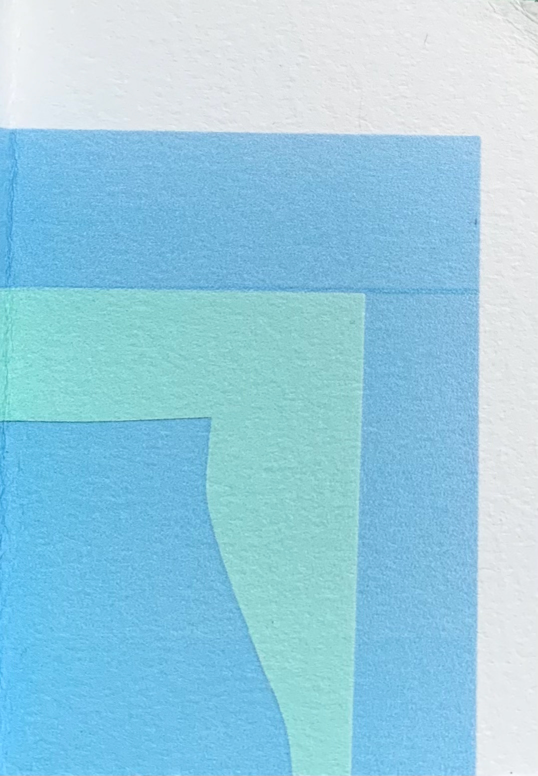
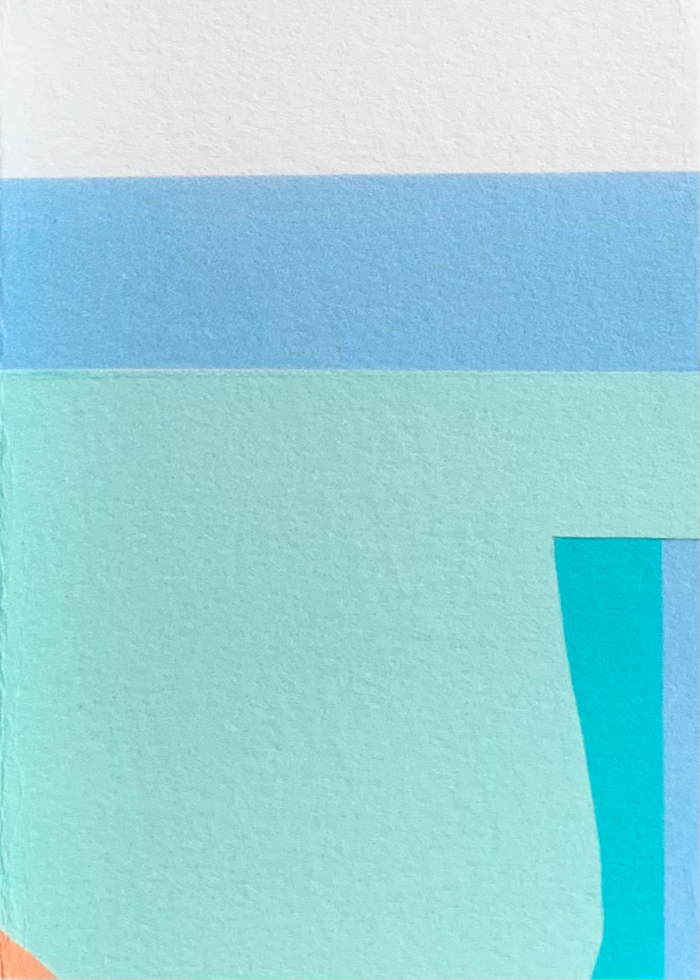
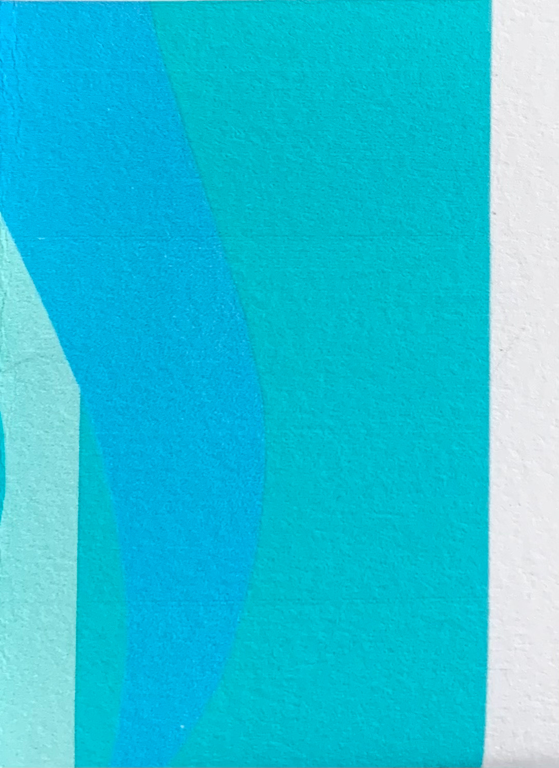
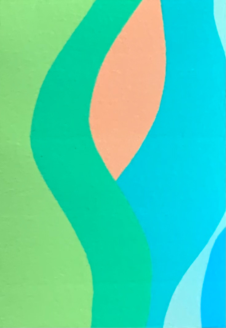
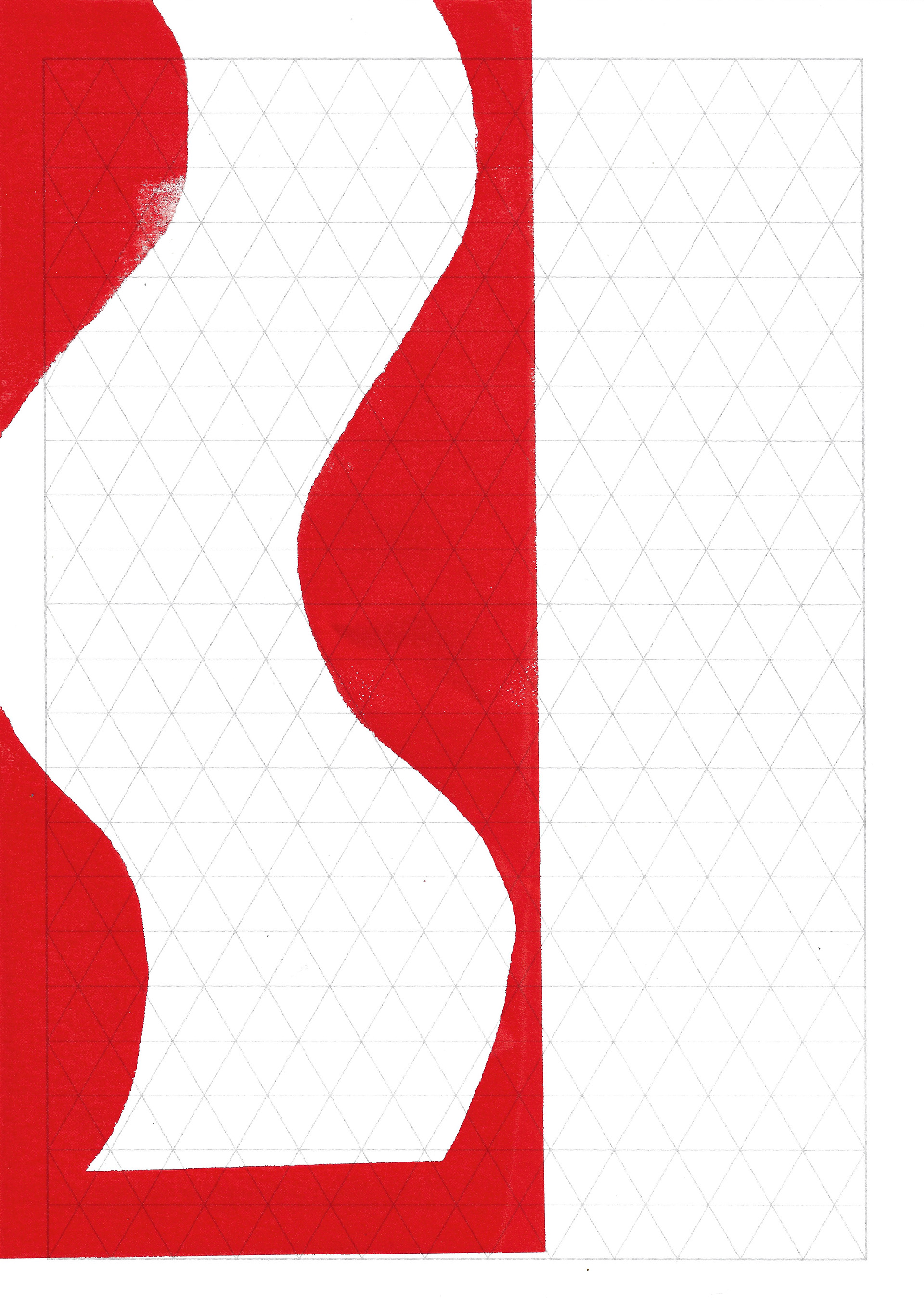
I screenprint various combinations of the drawn squiggles. No image is the same, the combinations echo the subtle differences found in natural forms. Even though two plants can be technically the same, nothing is ever identical or exactly repeatable.
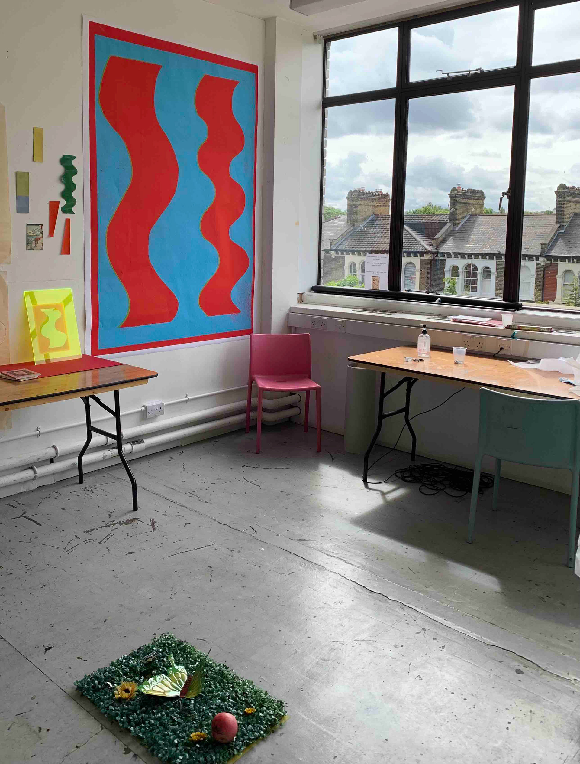
I have a silent crit about my screenprint on a3 fluorescent acrylic. This underlines my core aims in this unit of work. The dominant theme is to create a bodily, independent reaction to my work, which is based upon natural forms. The abstract forms I create are all based upon my observations and engagement with natural matter, but this is not necessarily obvious to the viewer, just as trees can’t talk, neither can I. I speak only through purely visual terms, and it is up to the viewer to draw their own conclusions from the work they are presented with.
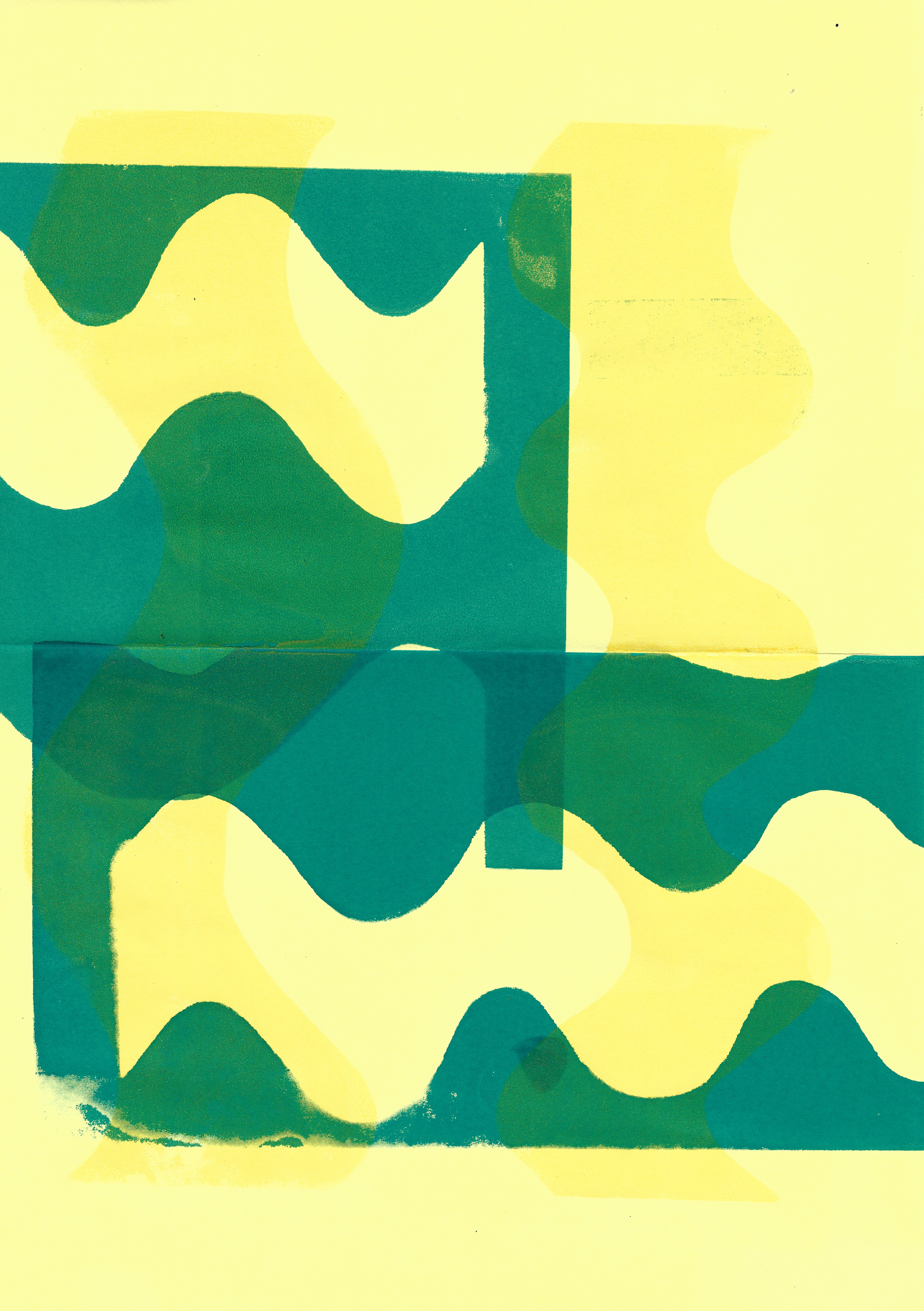
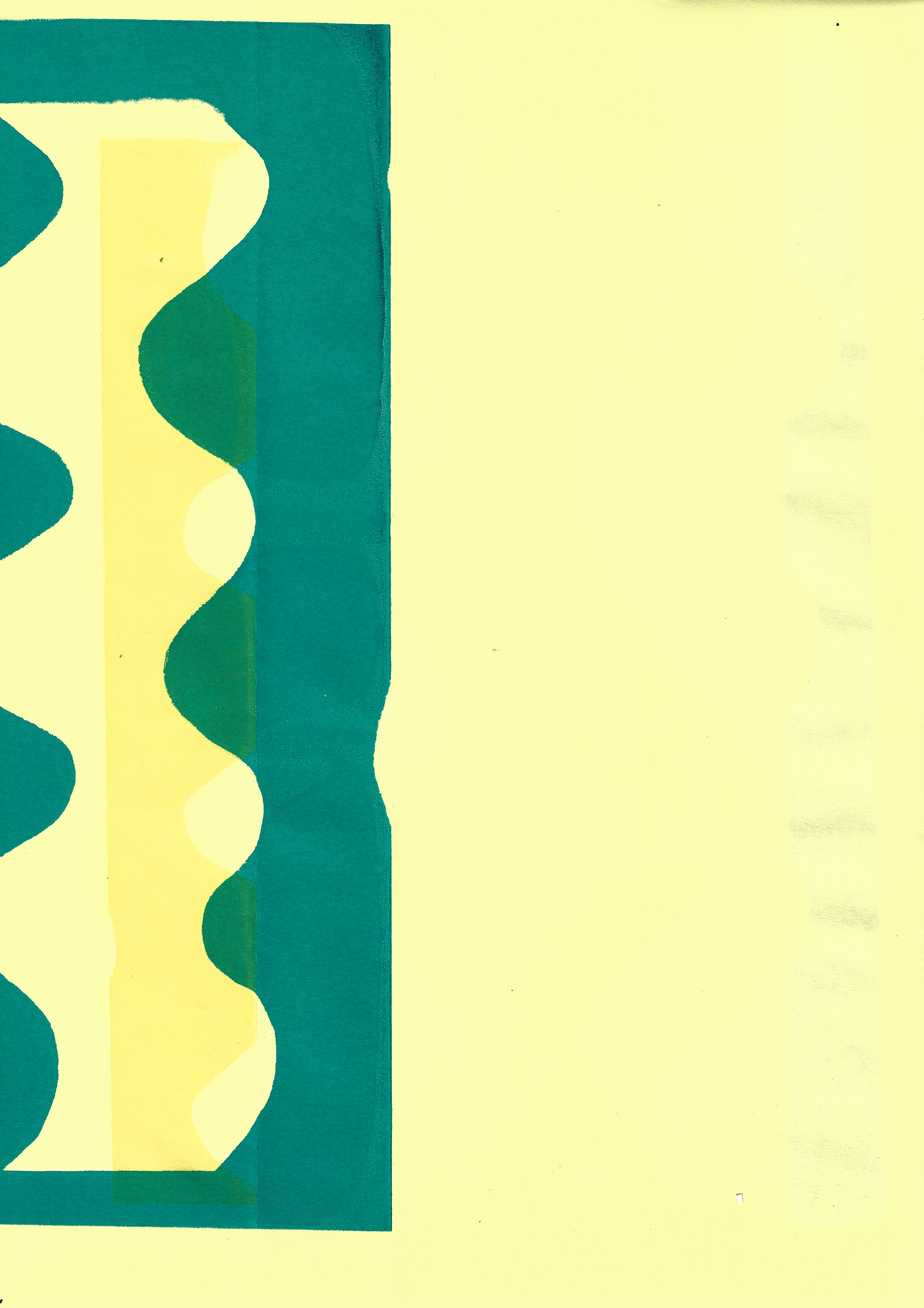
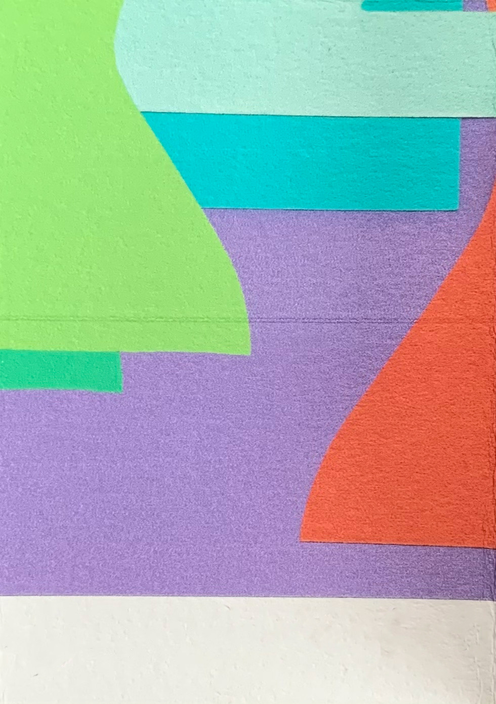
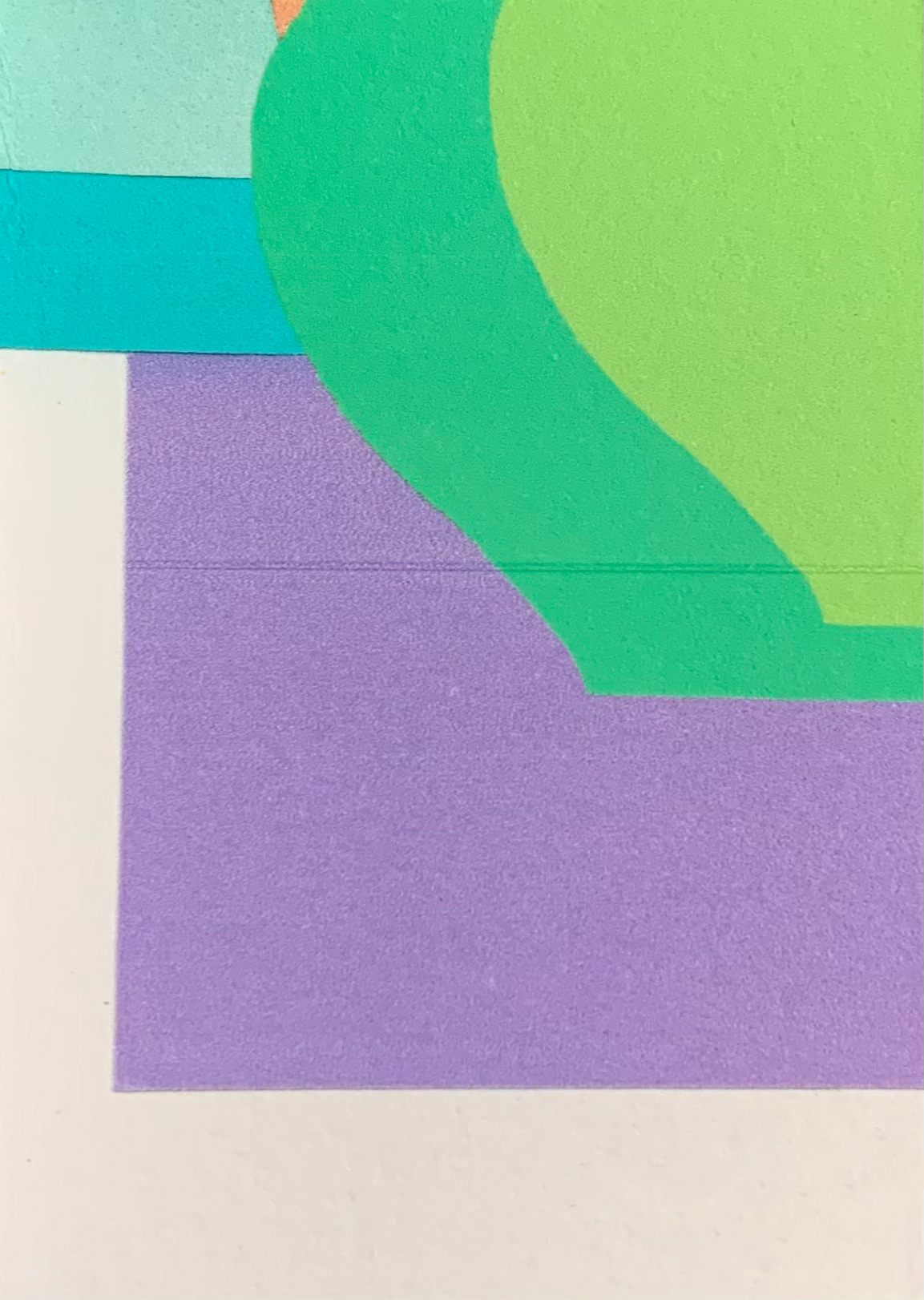
I edit the image, I have previously made which is a mixture of paper stencils and shapes made on photoshop, which I am going to print and use for the boustrophedon structure. The hue used will be different on both sides of the paper. The original colours used in the composition define and make certain forms and lines more prominent than others. Altering the hue allows the colours to mutate but the dialogue between the different elements is translated into another language, but it still means the same thing.

I scan in various recent screenprints, and I alter their contrast, vibrance and saturation on photoshop with the goal of digitally printing these out much larger. The slight inconsistencies in my method of screenprinting, make the handmade nature of these prints evident, which is even more noticeable after I have edited them. I mainly keep the same colours that I chose to screenprint with, I don't alter the images drastically. The relationship and dialogue between the different forms within the work still mean the same, the vibrance and saturation are just altered to enhance this.
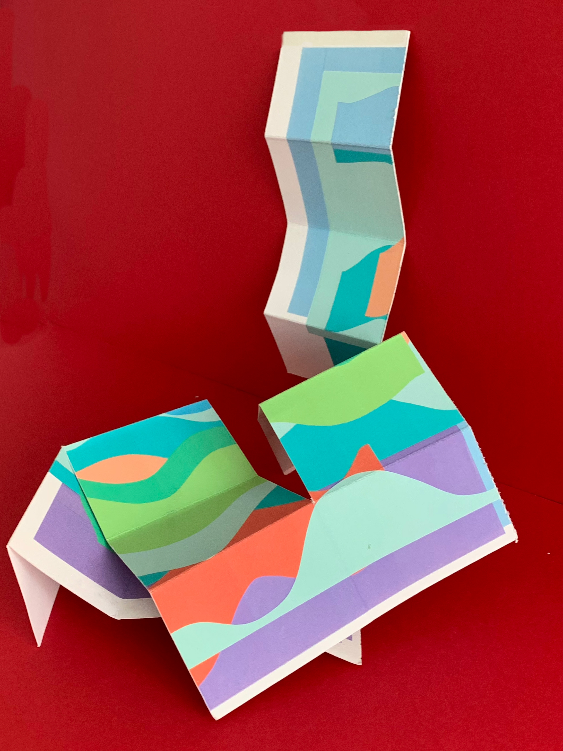
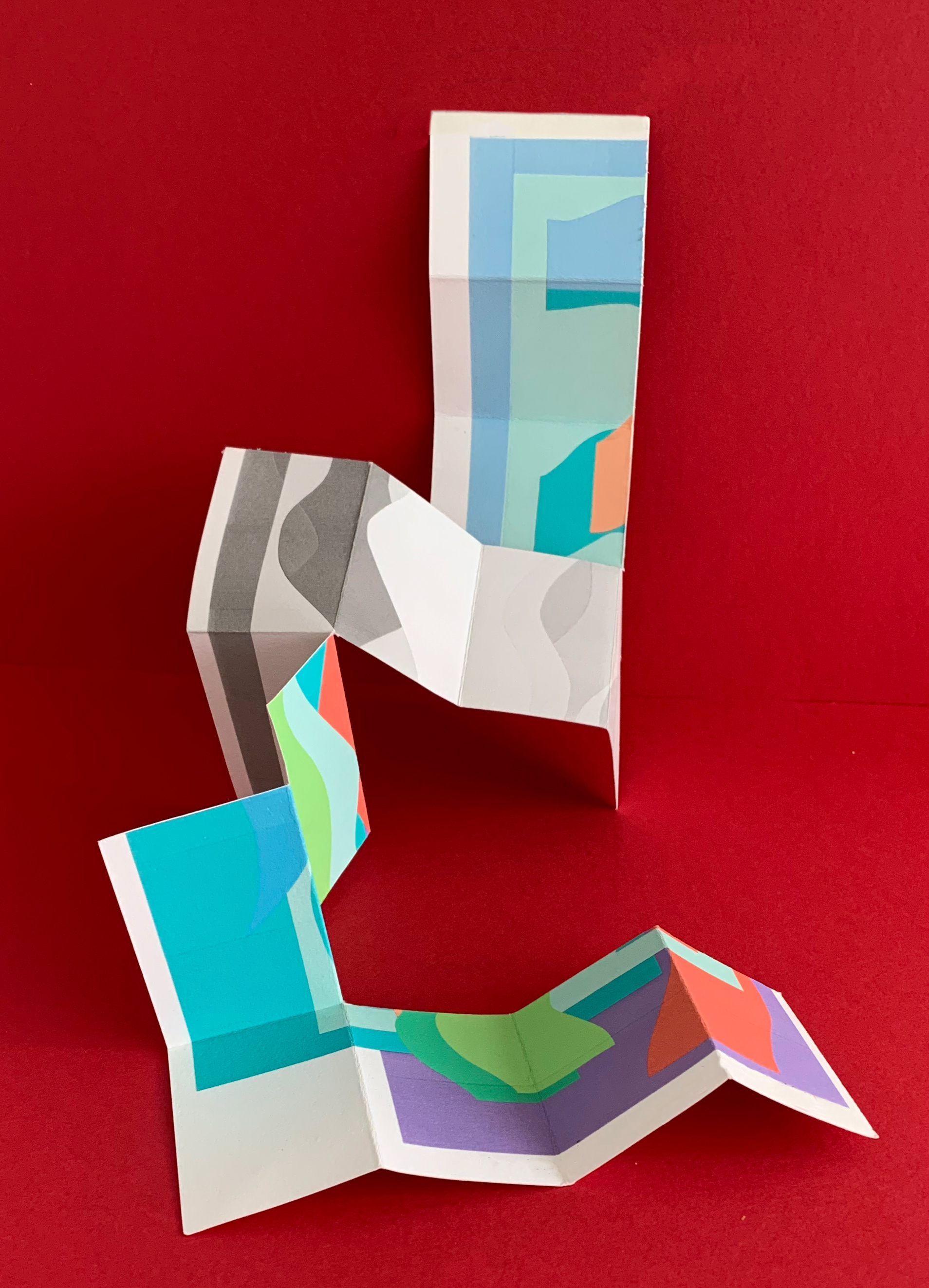


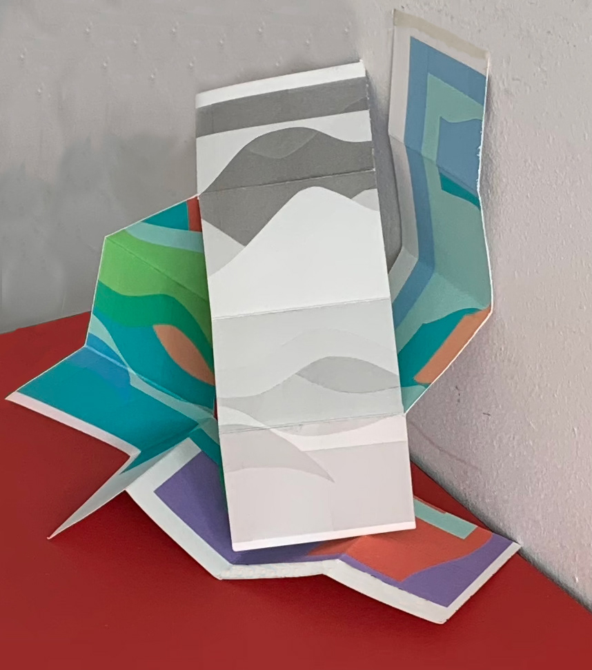
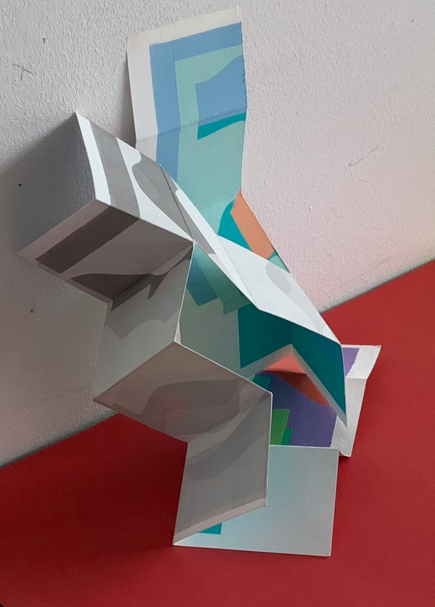
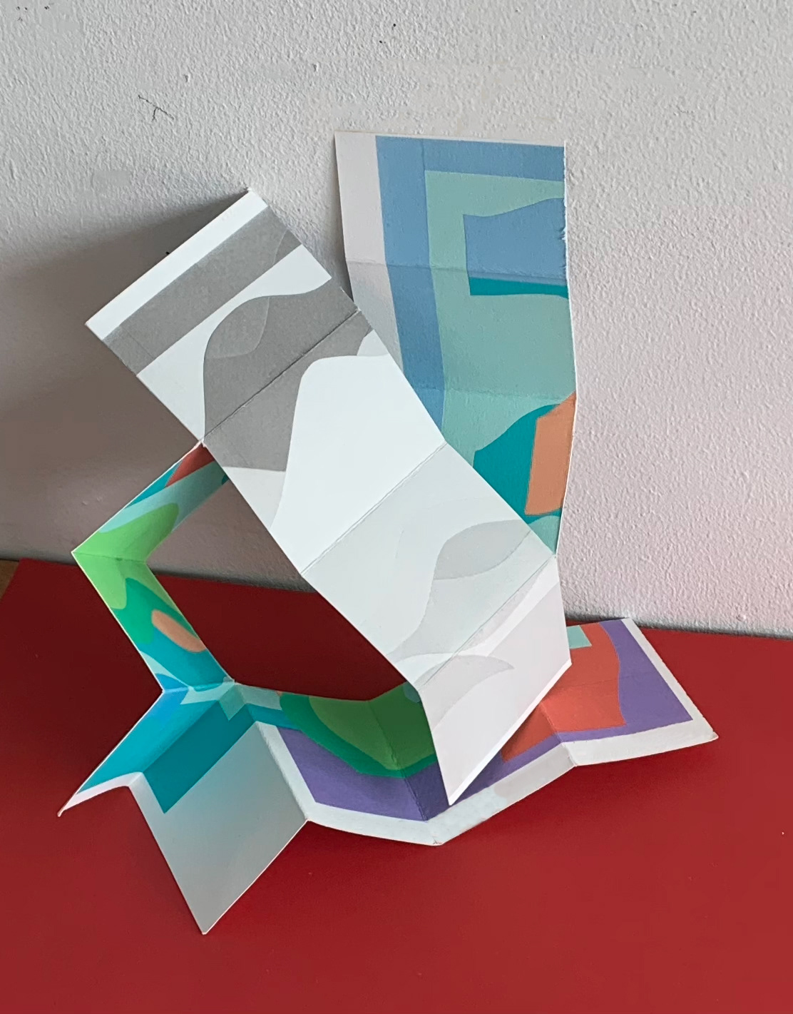


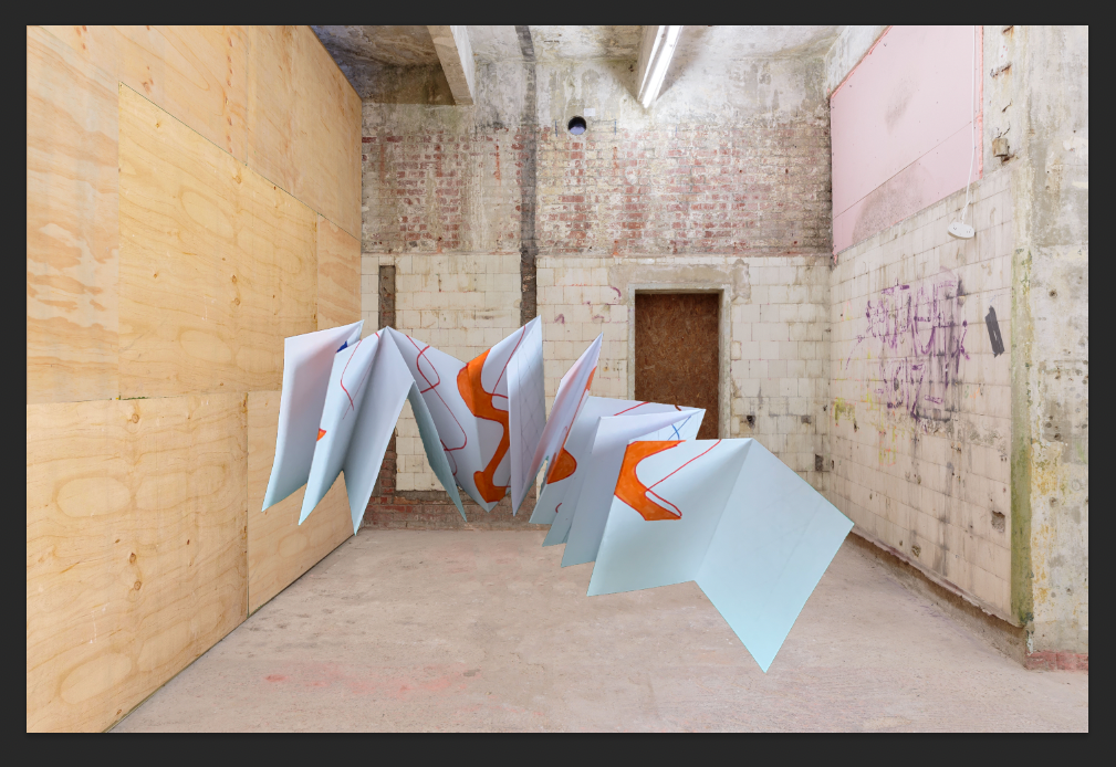
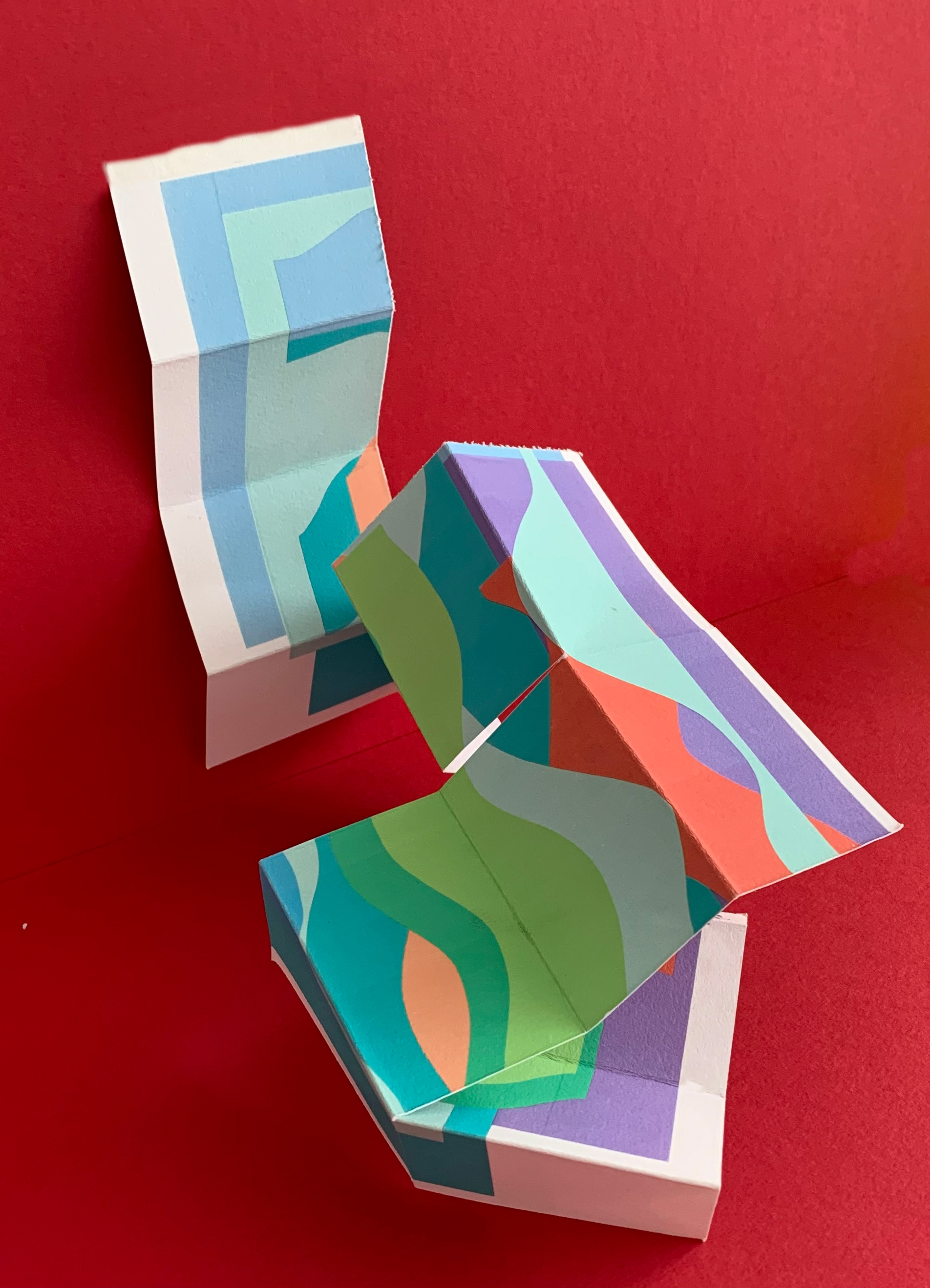
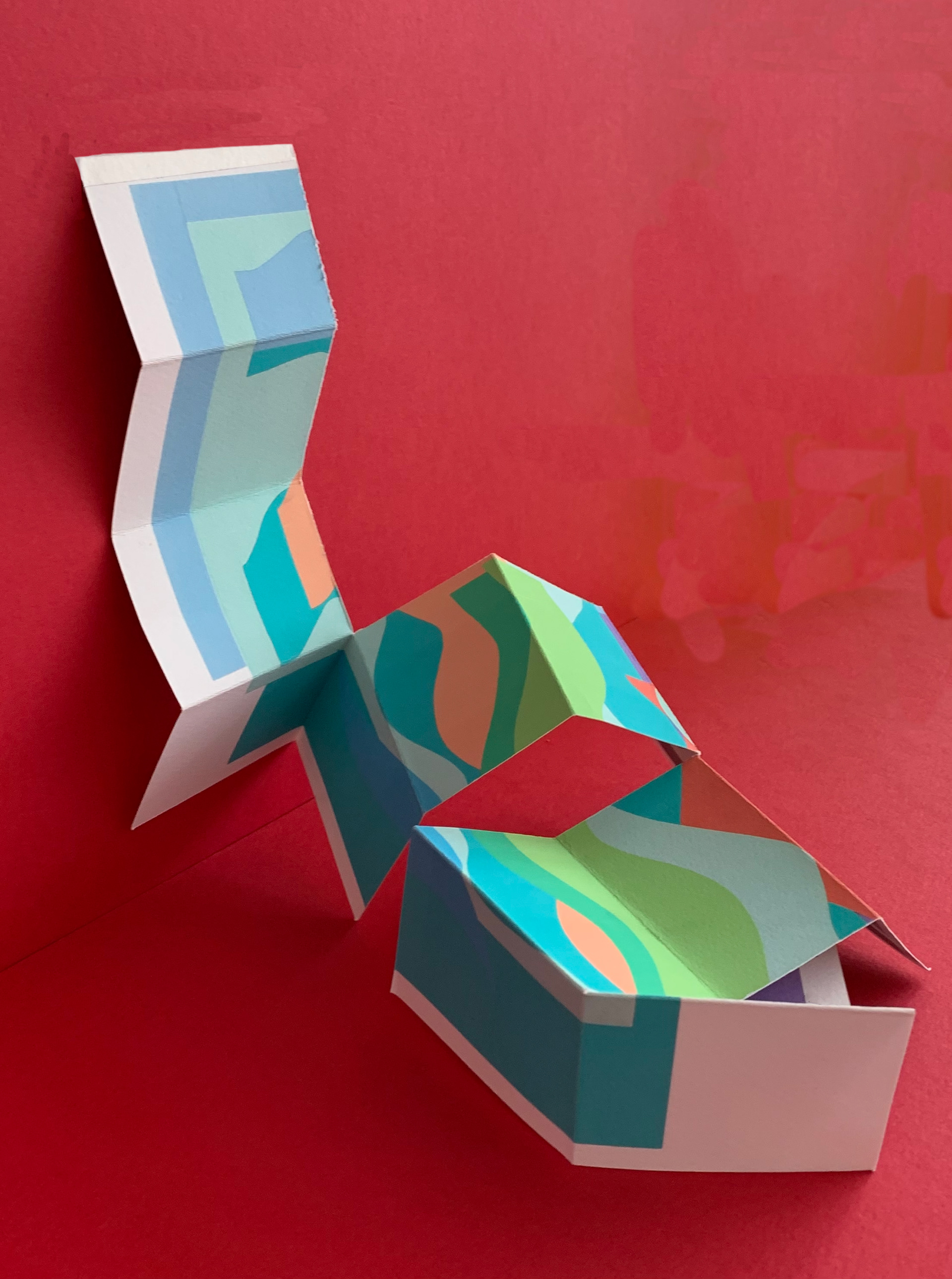
I attach the boustrophedon prototype to the wall, which it then cascades off. I prefer this display than just having the structure free standing. Not only does this give support to the structure but it allows the viewer to appreciate the departure from the traditional display of 2D work on a wall (each of the different faces could be separated and displayed in this conventional manner) and promotes a different engagement with the viewer.
Lithpgraph, 29.7 x 42 cm
Lithograph, 29.7 x 42 cm
Lithograph, 29.7 x 42 cm
Lithograph, 29.7 x 42 cm
Lithograph, 21 x 29.7 cm
Lithograph, 21 x 29.7 cm

Lithograph, 21 x 29.7 cm
Lithograph, 21 x 29.7 cm
Lithograph, 21 x 29.7 cm
Lithograph, 21 x 29.7 cm
Lithograph, 21 x 29.7 cm
Lithograph, 21 x 29.7 cm
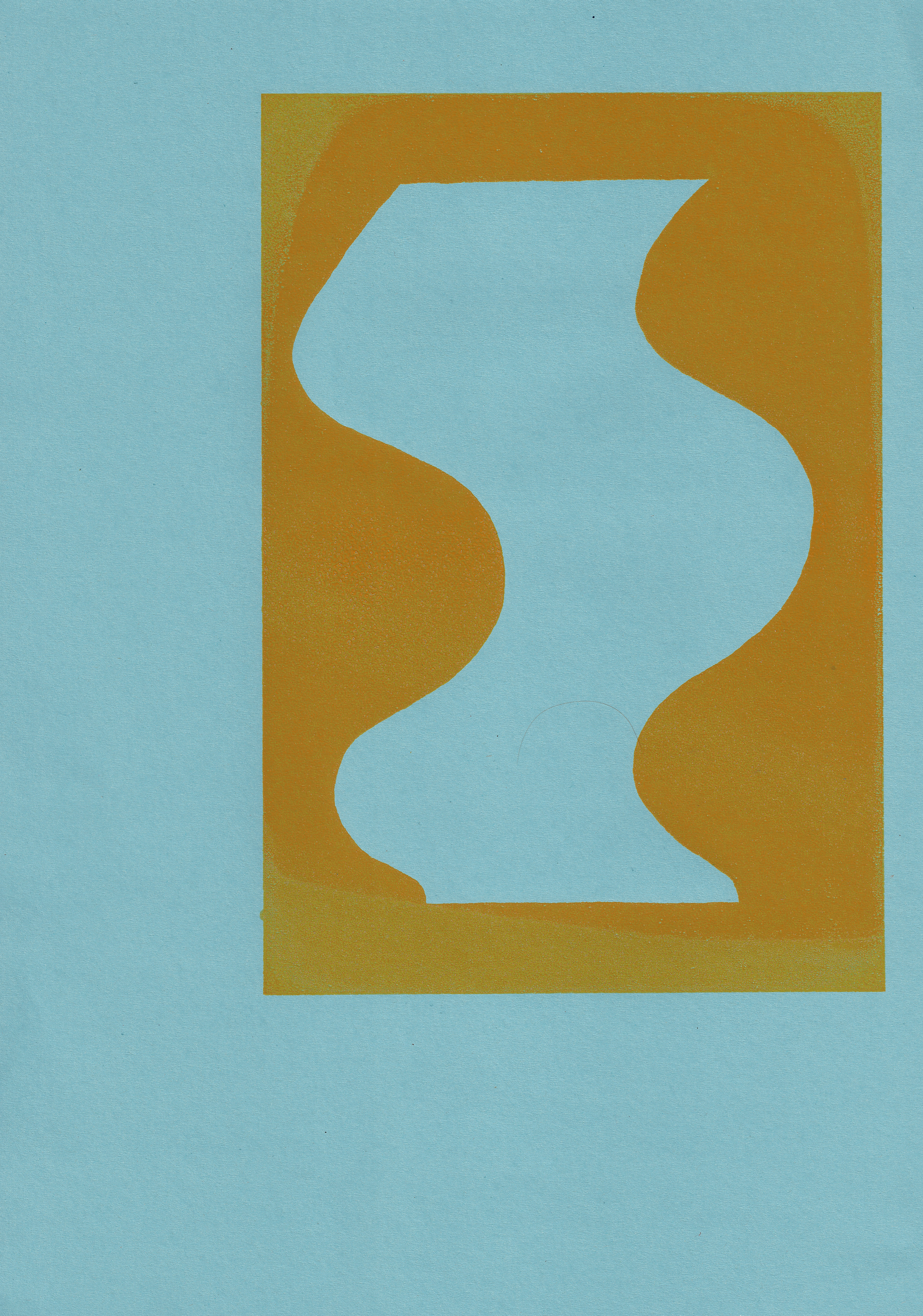
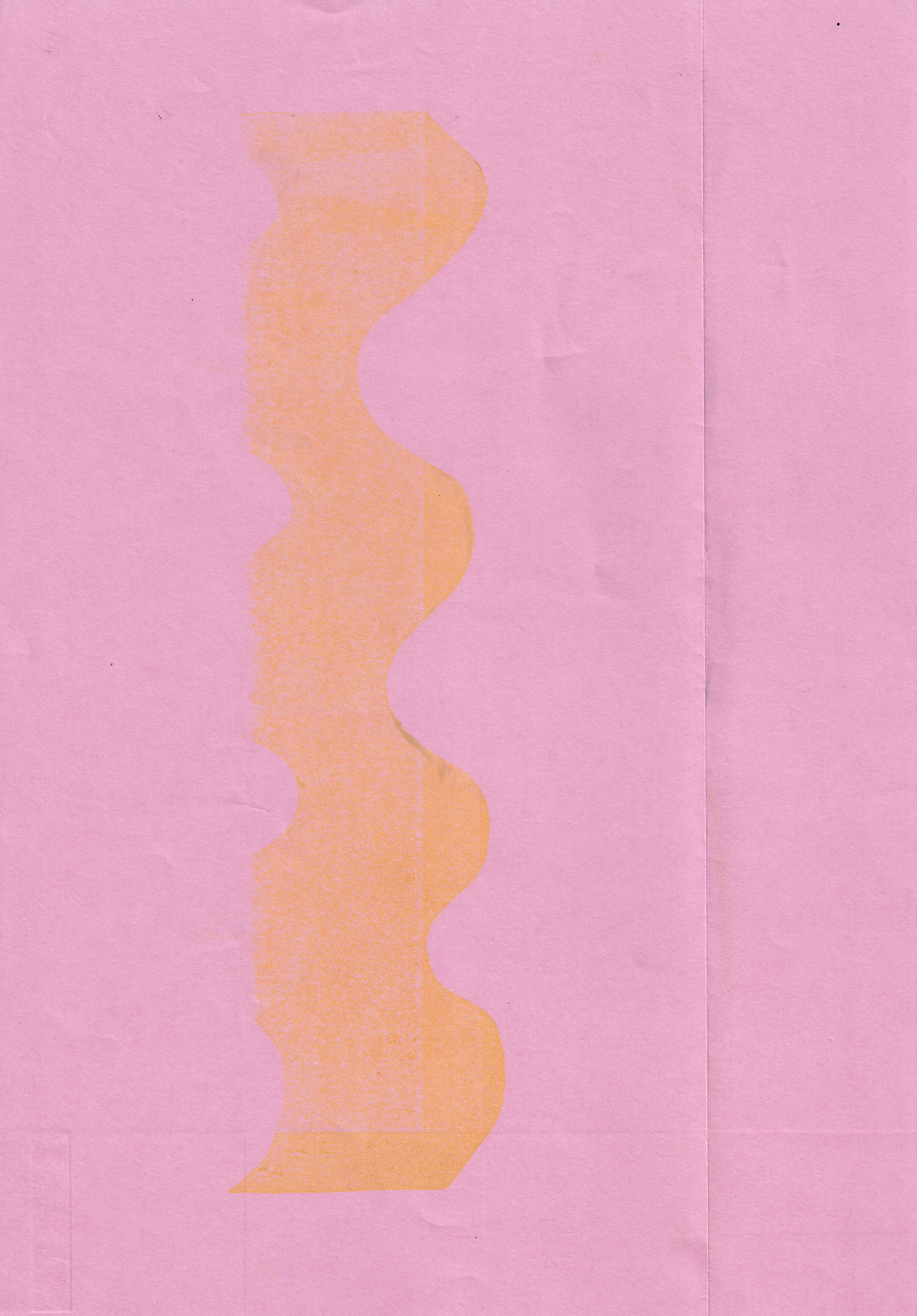
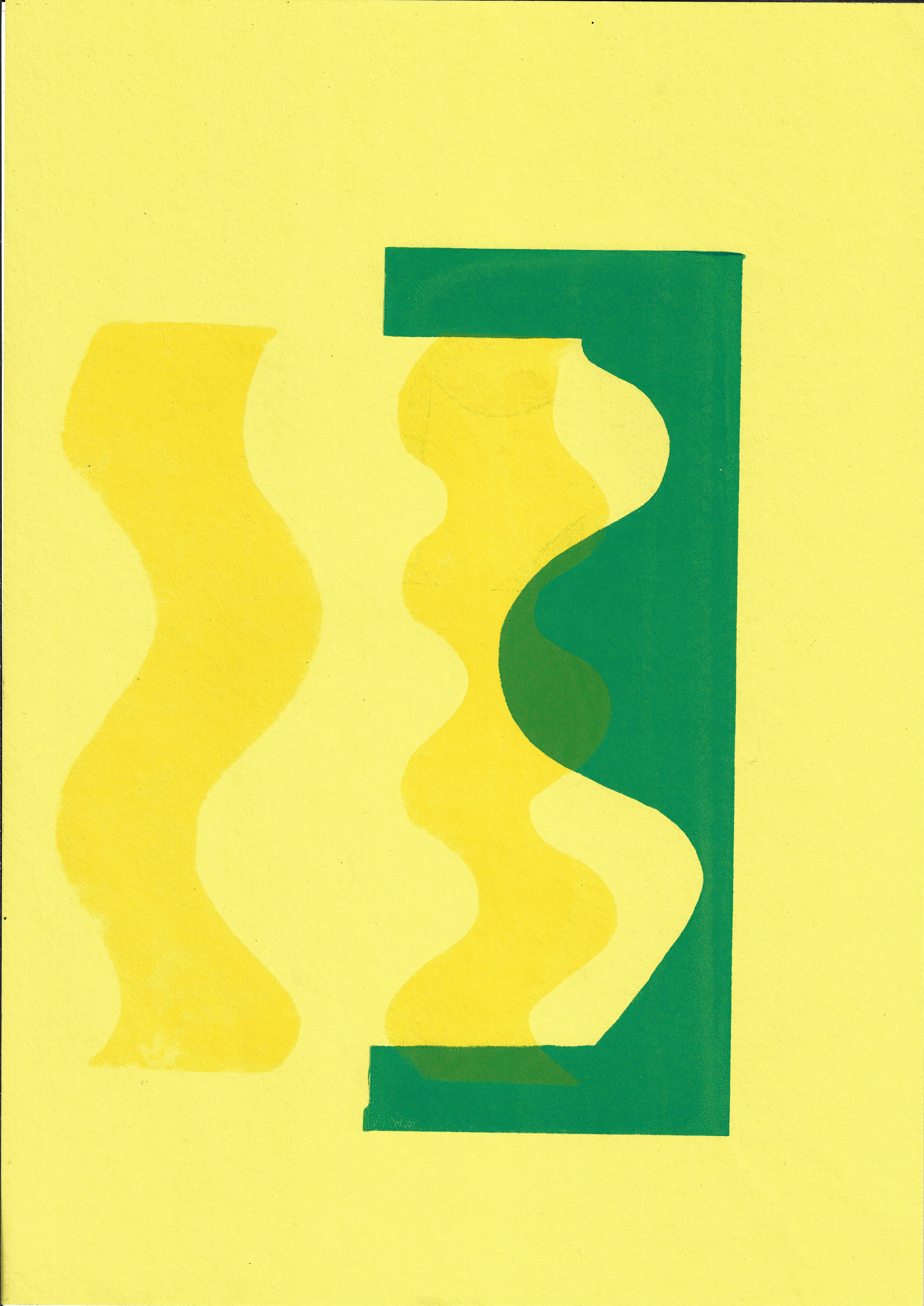
I use the offset press to print various combinations of the squiggles. The colour is not as deep and rich as I would have hoped. I am planning on combining lithographic and screenprinting as they both have different properties of the inks used, which will draw attention to the materiality of the image.

Screenprint on paper, 21 x 29.7 cm
Screenprint on paper, 21 x 29.7 cm
Screenprint on paper, 21 x 29.7 cm
Screenprint on paper, 29.7 x 42 cm
Screenprint on paper, 29.7 x 42 cm
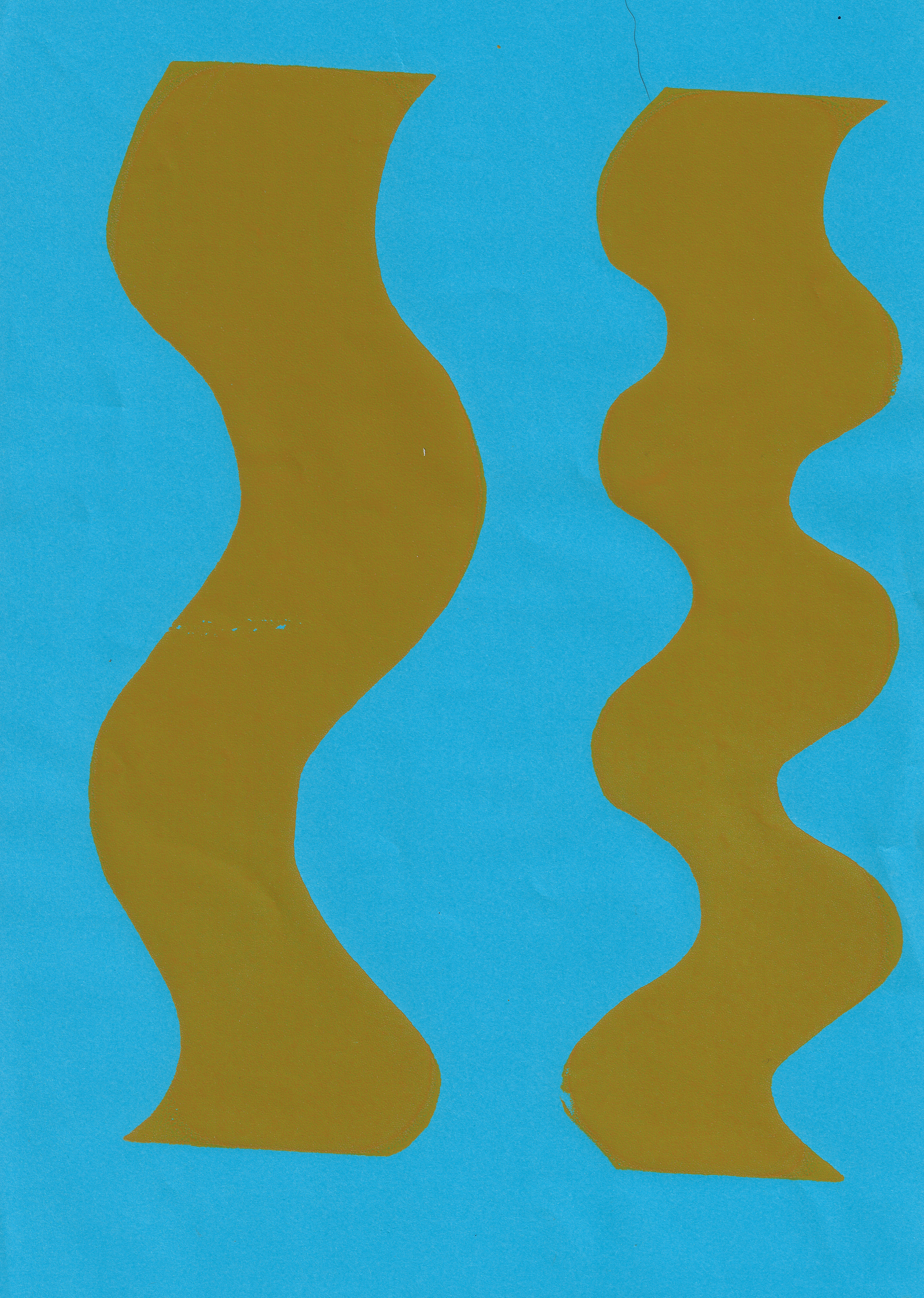
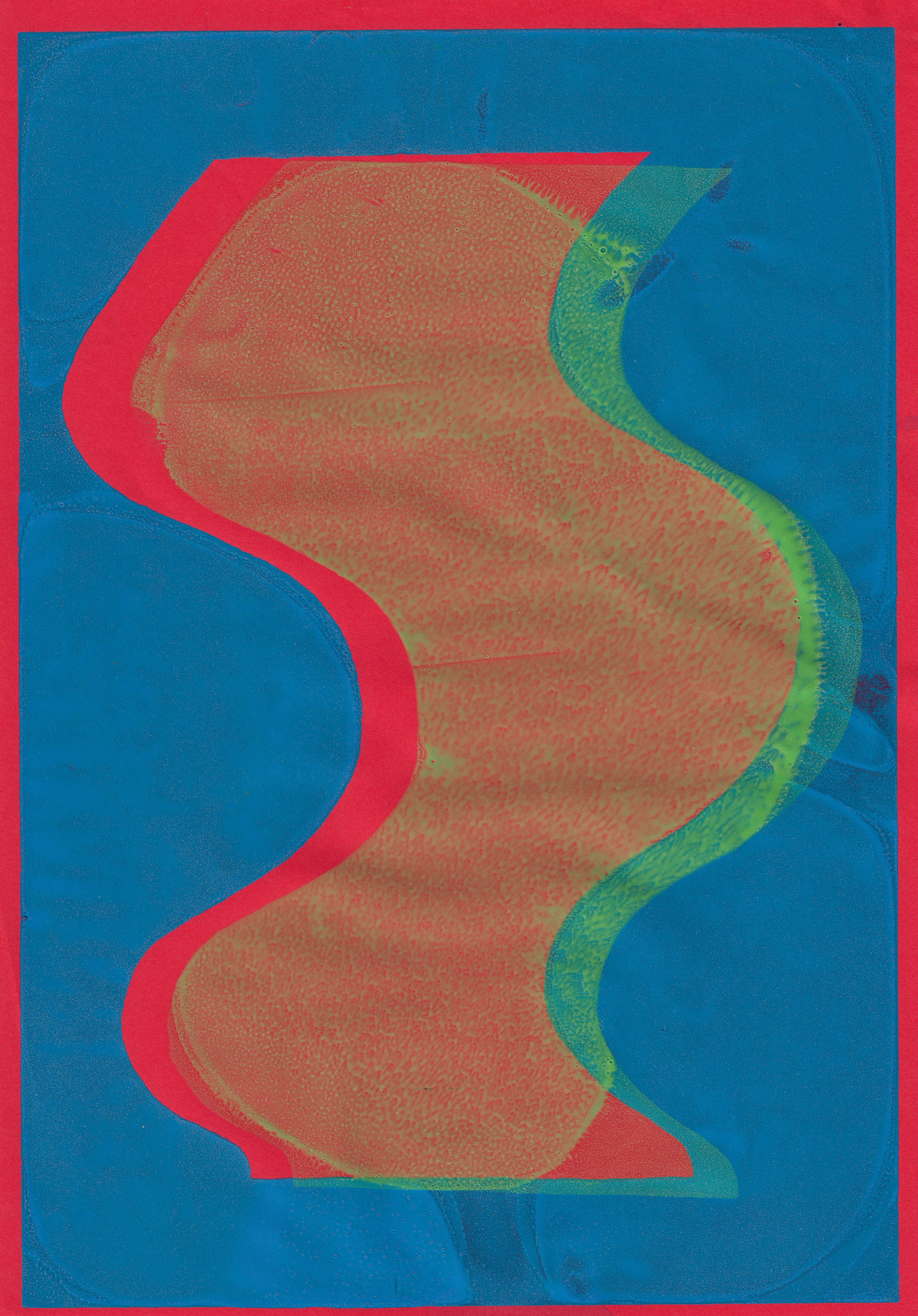
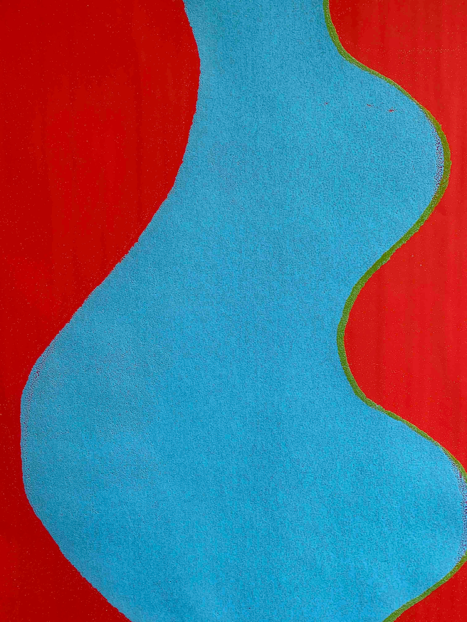
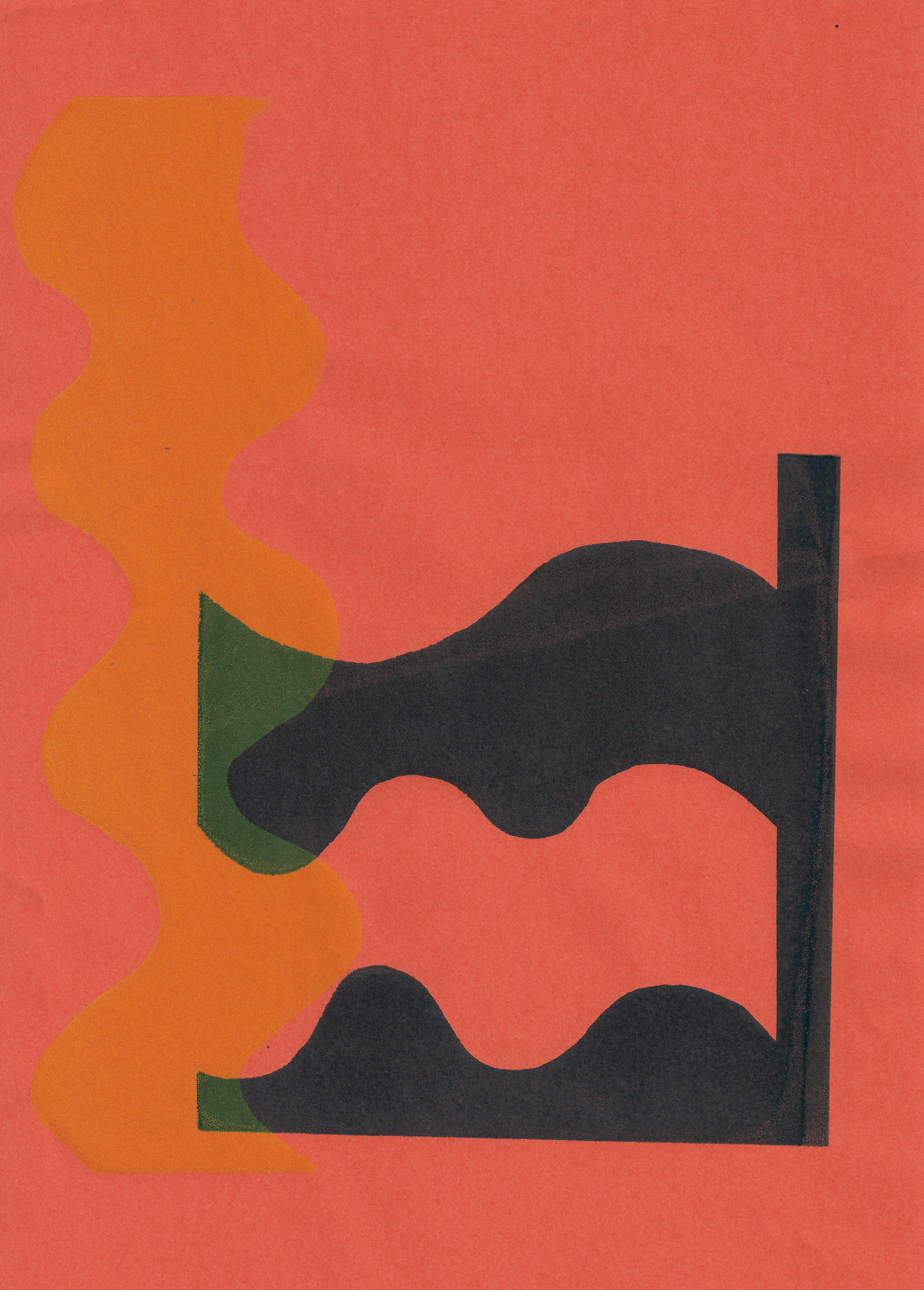
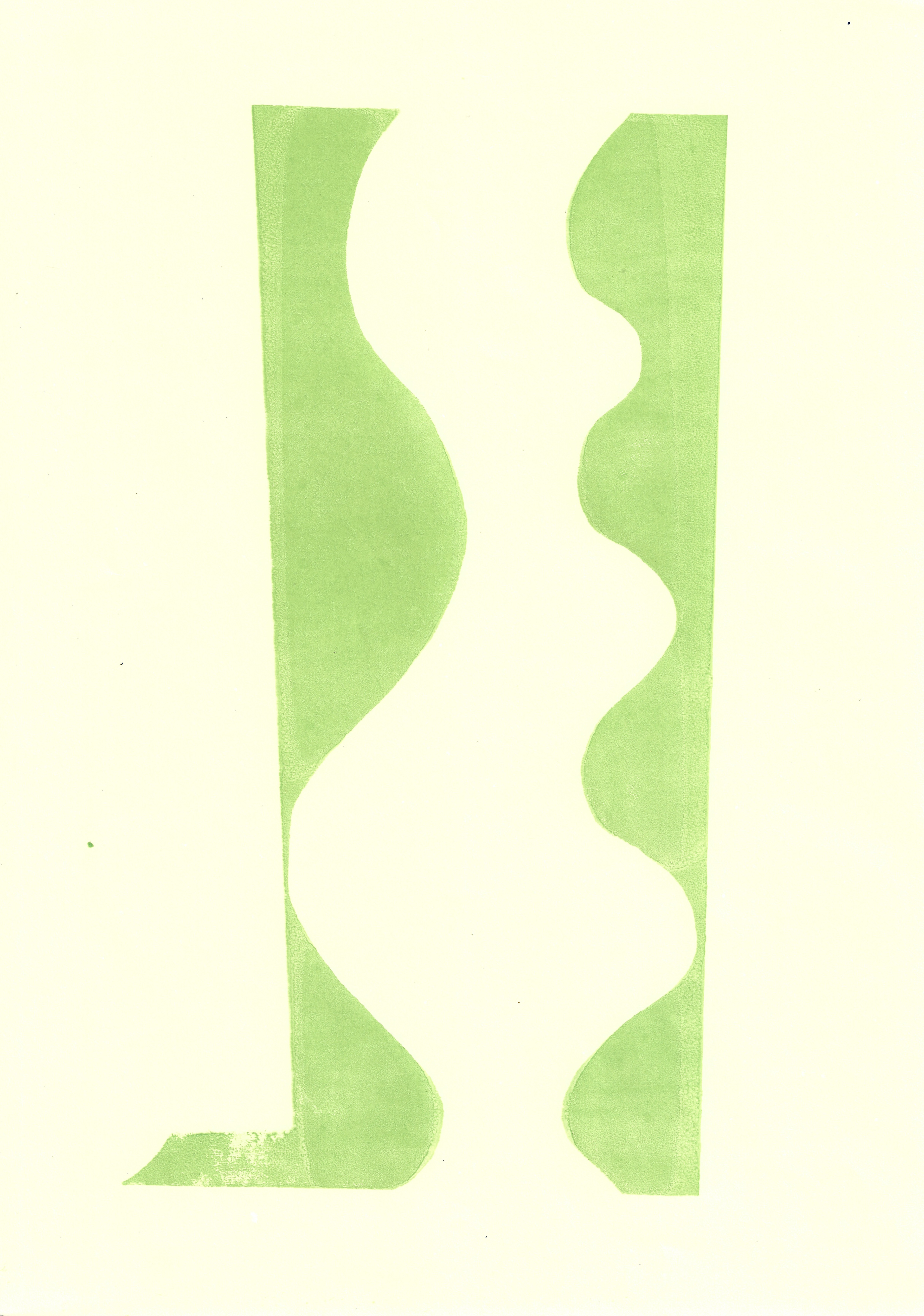
Screenprinting the squiggles again, in different colours this time and purposefully printing them as flat, even prints. Rather than altering the process, as I have done previously, the use of the squeegee draws attention to the material make-up of the image. My reason for printing them flat, is that I want the viewer to focus on the form, rather than its materiality.
Additionally, as part of broadening my printmaking knowledge and research into different types of line I prepare a hard ground plate for etching. I am also interested in this process as unexpected marks and lines will be made on my plate through its handling. The effect that the lines make on the final print will not be purposeful or completely accidental, it will just result from my interaction with the plate.
I draw a rhubarb leaf from life onto a hard ground etching plate, focusing on how the etching needle can be used at different angels to create different lines. I rarely take the needle off the plate to emphasise the fluidity of the line in the natural form.

original screenprint, 21 x 29.7 cm
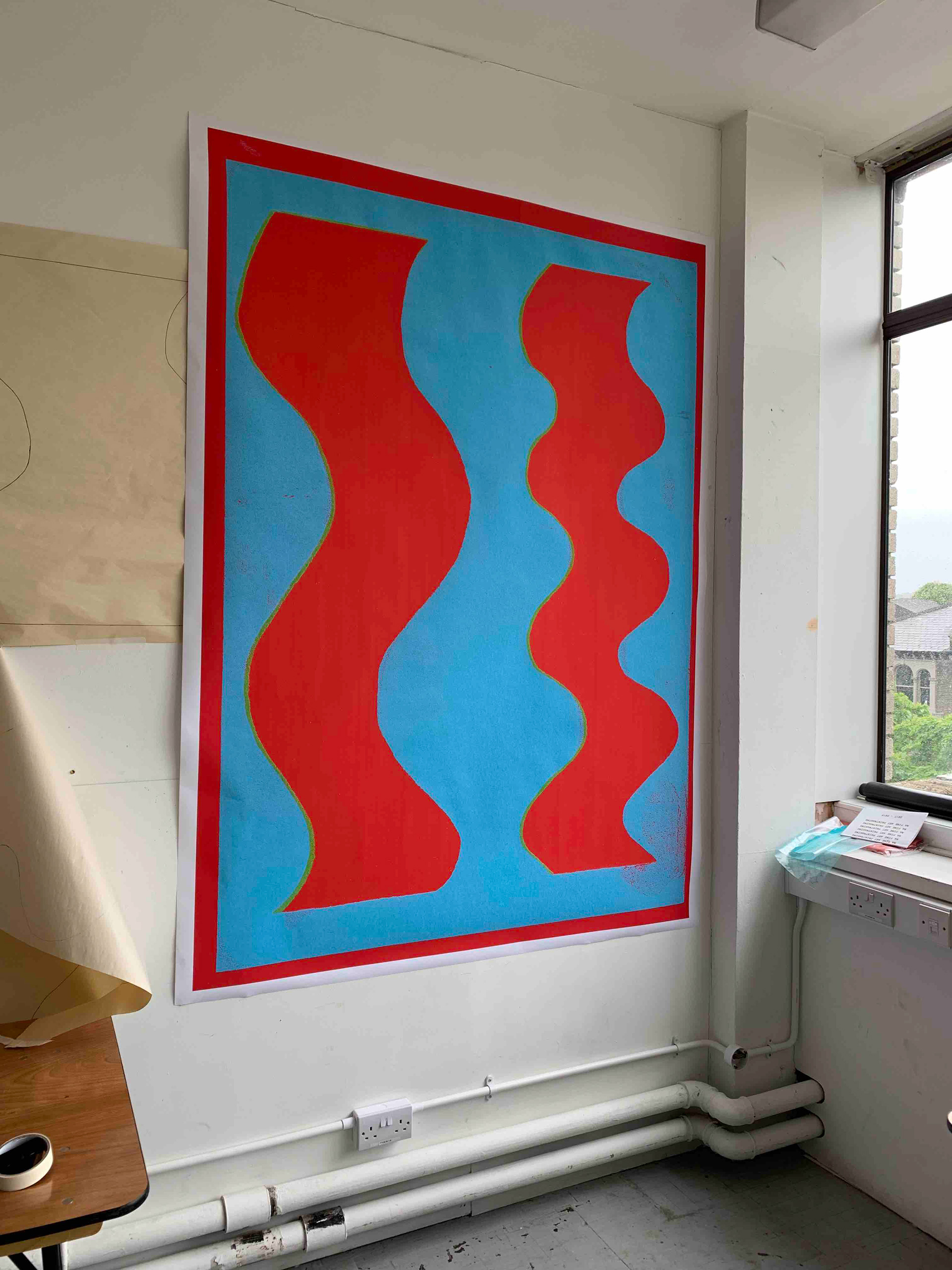

Enlarge and digitally print one of my earlier screenprints. Enlarging the image emphasises the construction of the image because small material details, which are not noticeable in the original screenprint (as you would need a magnifying glass) give the image a textural quality. This would not be achieved if I was to simply produce the image in photoshop and print out on the same scale. The trace of my hand is important because the process is just as important as the image.
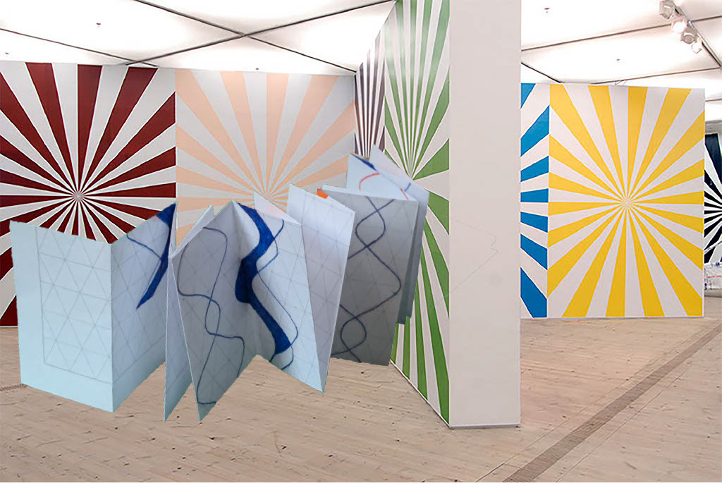
I hang up the digital print in the studio, as it is too large to be viewed any other way. There are a wide range of viewing positions, with no set prescribed way to look at the work. Being at a distance and close-up, but also being seated or standing, gives very different perspectives and allows the viewer to appreciate the work for different reasons, depending on their position.
Lithograph on top of a screenprint, 25 x 35 cm

Lithograph on top of a screenprint, 21 x 29.7 cm

Lithograph on top of a screenprint, 29.7 x 42 cm

Lithograph, 21 x 29.7 cm
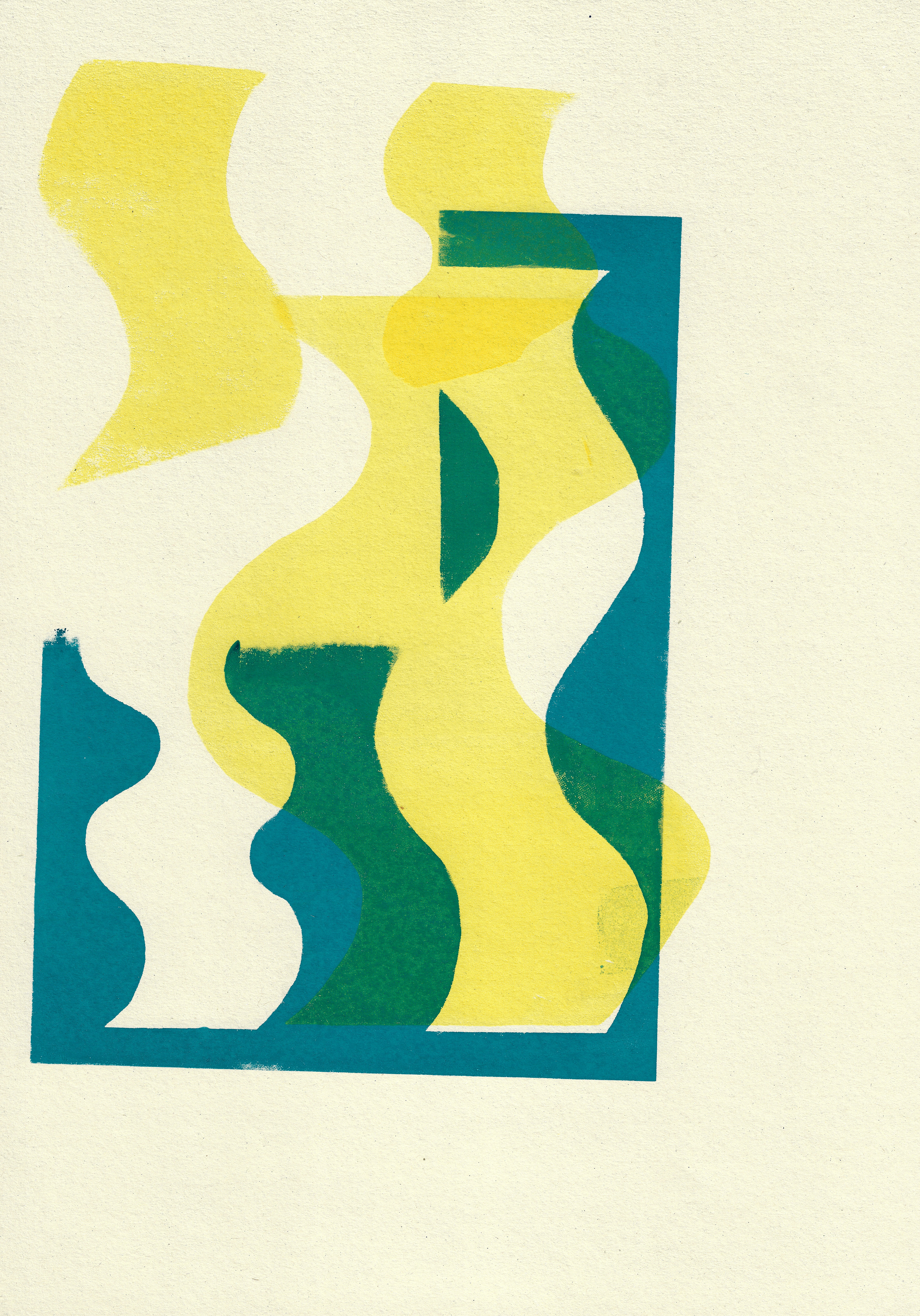
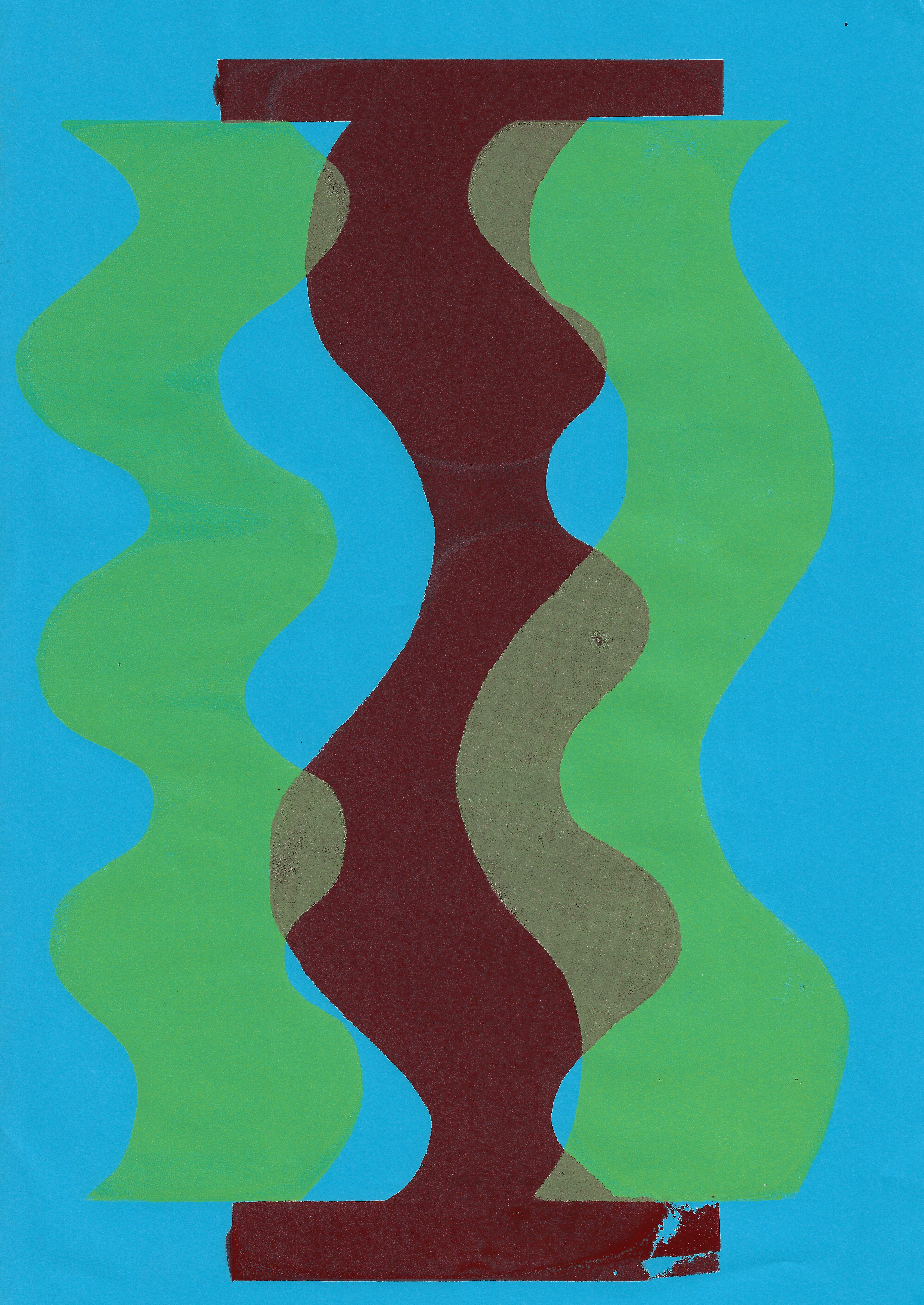
I use the offset lithography press to print onto my screenprints and lithographs I have previously printed onto. There is a different in the depth of the ink and line, as different parts of the image come into focus and become more prominent than others. I also use this same principle, using the offset press with the plate of squiggles and combining this with screenprinted shapes. It will be interesting to compare images printed the other way around, screenprinting on top of a lithographic print.
Screenprint on paper, 29.7 x 42 cm

Screenprint on paper, 29.7 x 42 cm
Screenprint on paper, 29.7 x 42 cm
Screenprint on paper, 29.7 x 42 cm
Screenprint on paper, 21 x 29.7 cm
Screenprint on paper, 21 x 29.7 cm
Screenprint on paper, 21 x 29.7 cm
Screenprint on paper, 21 x 29.7 cm
Screenprint on paper, 21 x 14.8 cm

Screenprint on paper, 21 x 29.7 cm
Screenprint on paper, 21 x 14.8 cm
Screenprint on paper, 21 x 29.7 cm

Screenprint on paper, 21 x 29.7 cm

Screenprint on paper, 21 x 14.8 cm

Screenprint on paper, 21 x 14.8 cm
Screenprint on paper, 21 x 29.7 cm
Screenprint on paper, 21 x 29.7 cm
Screenprint on paper, 21 x 29.7 cm
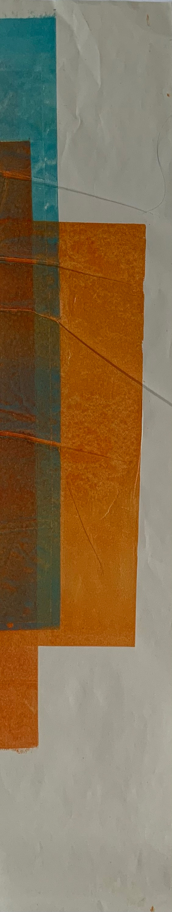
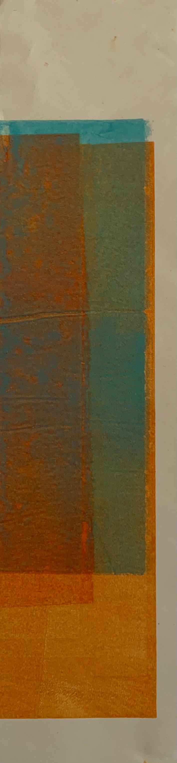
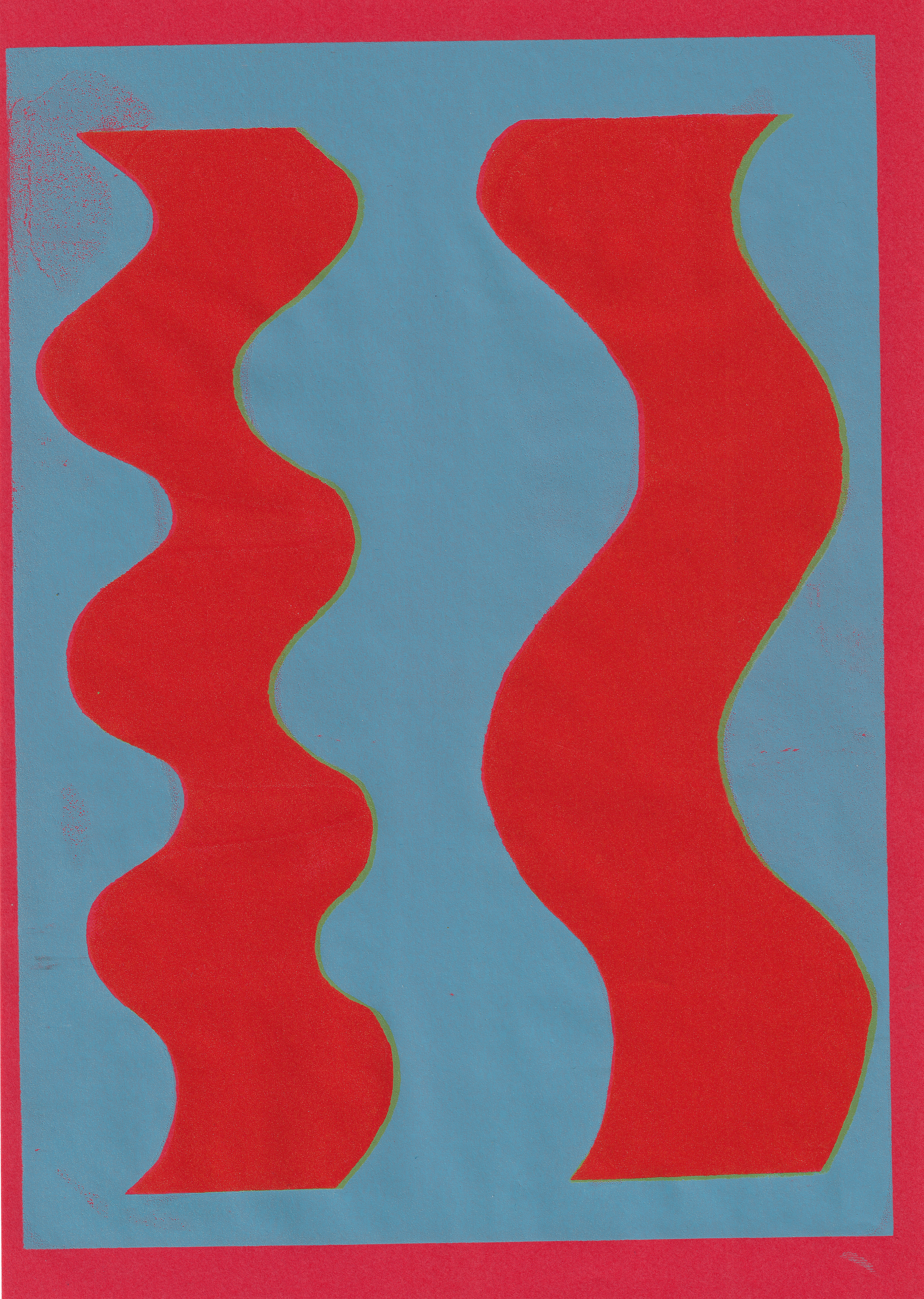
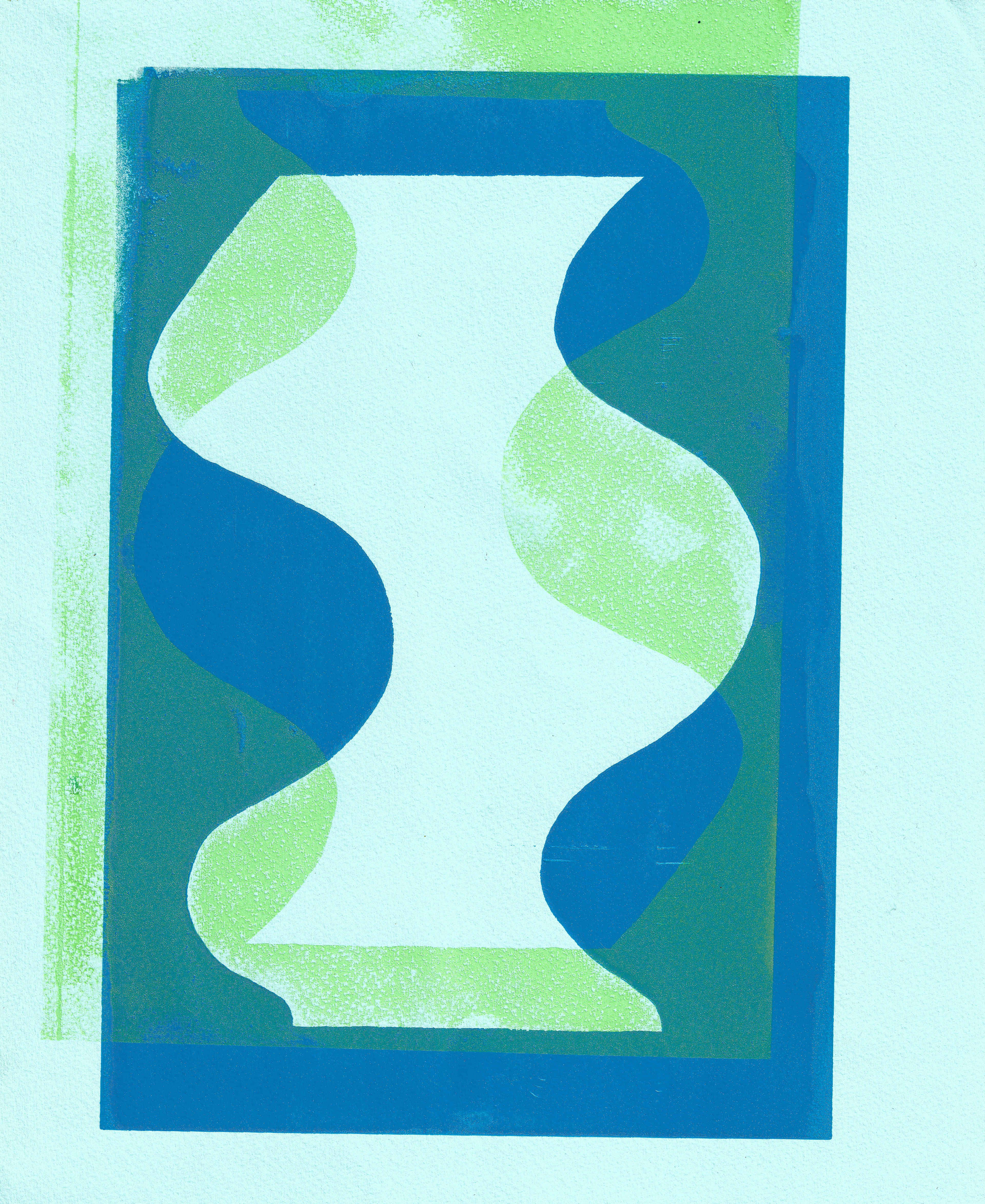
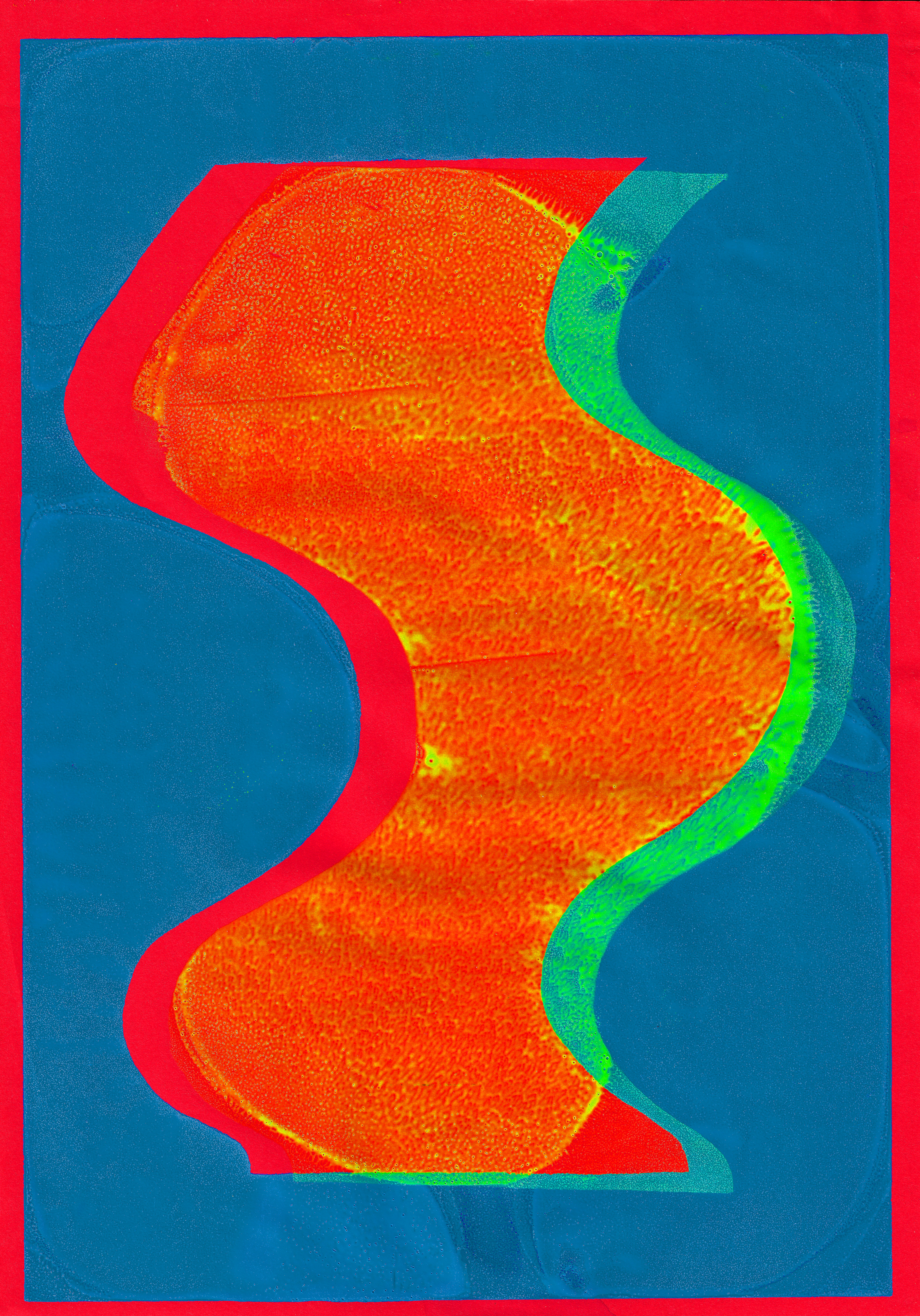
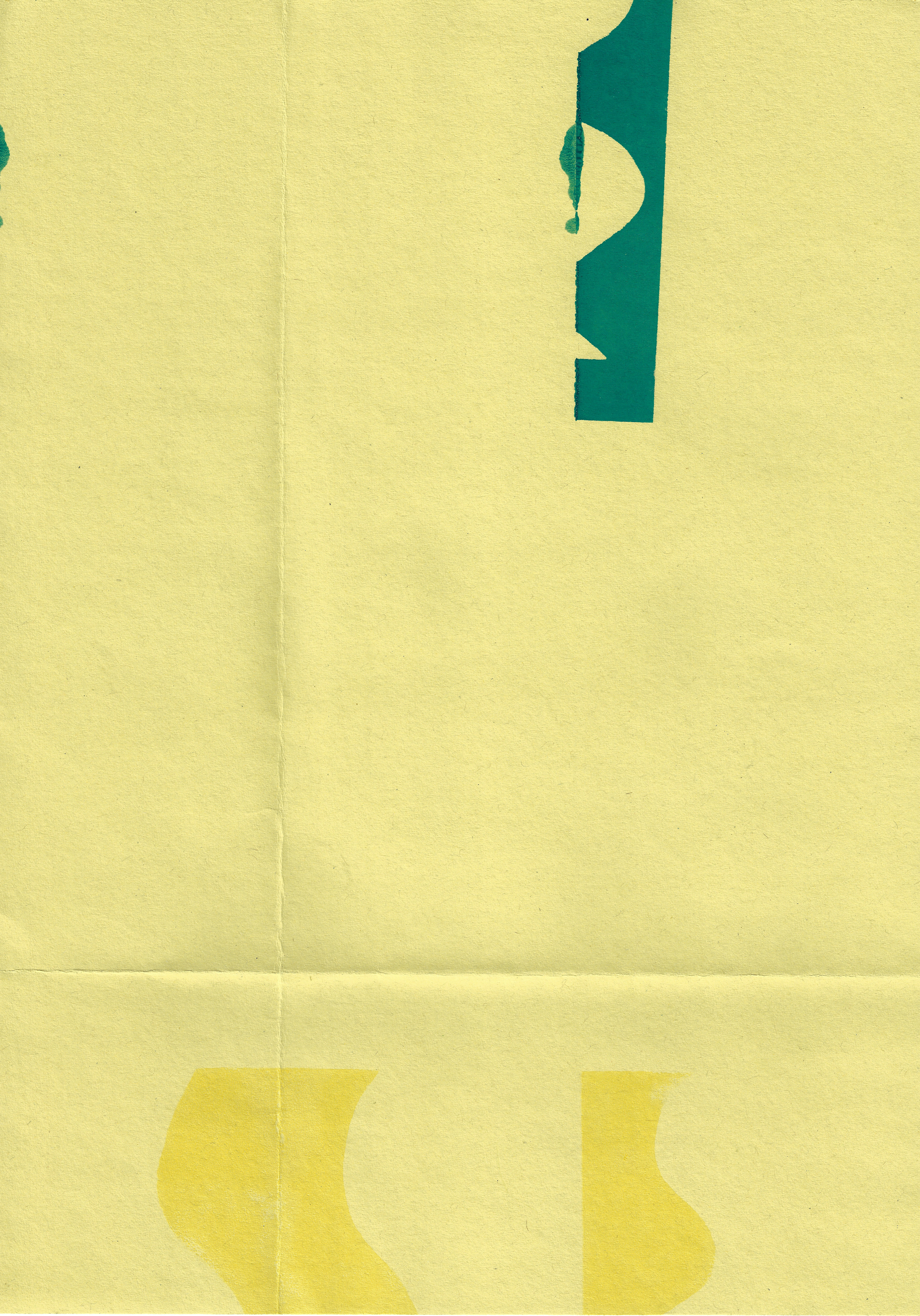
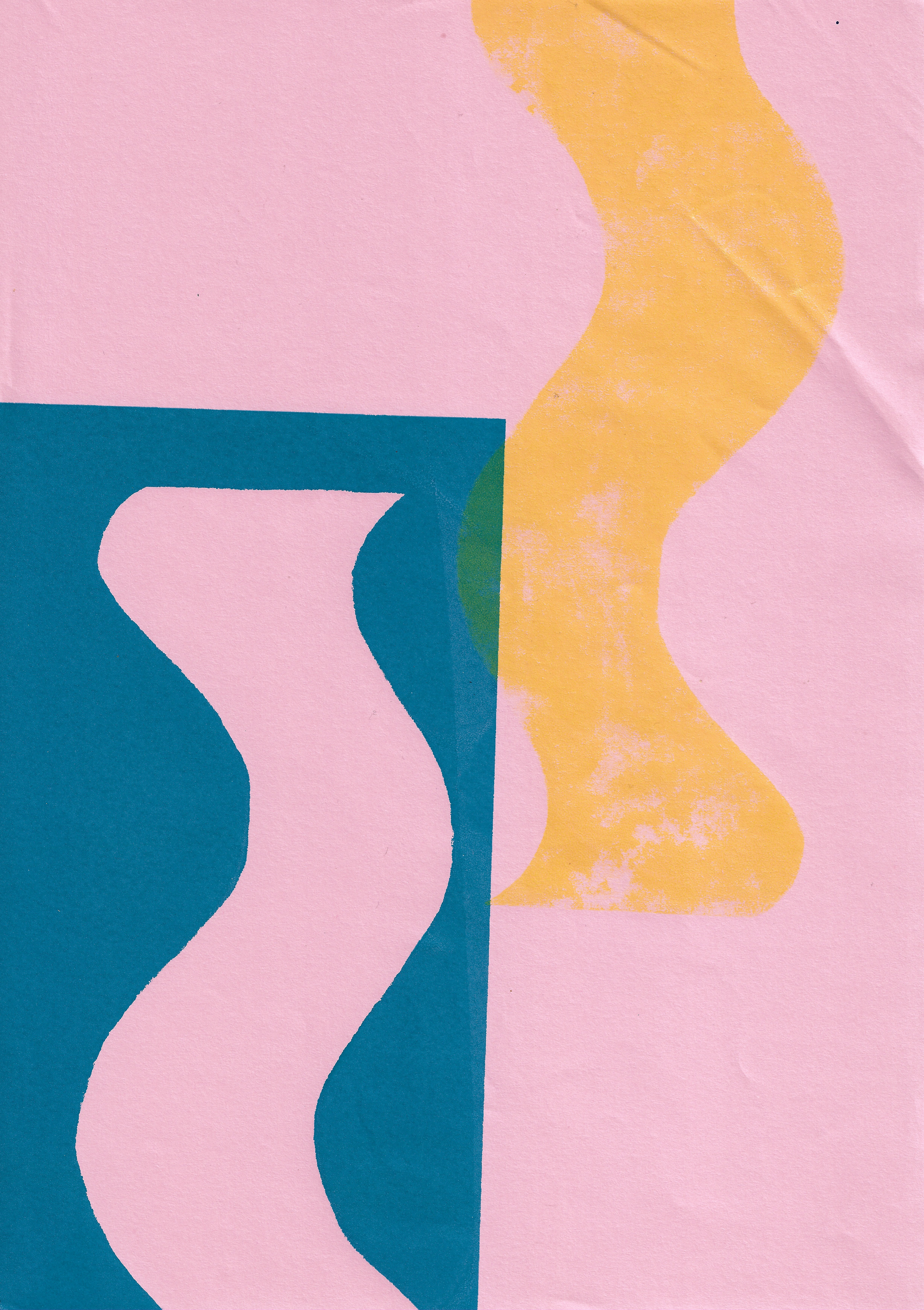
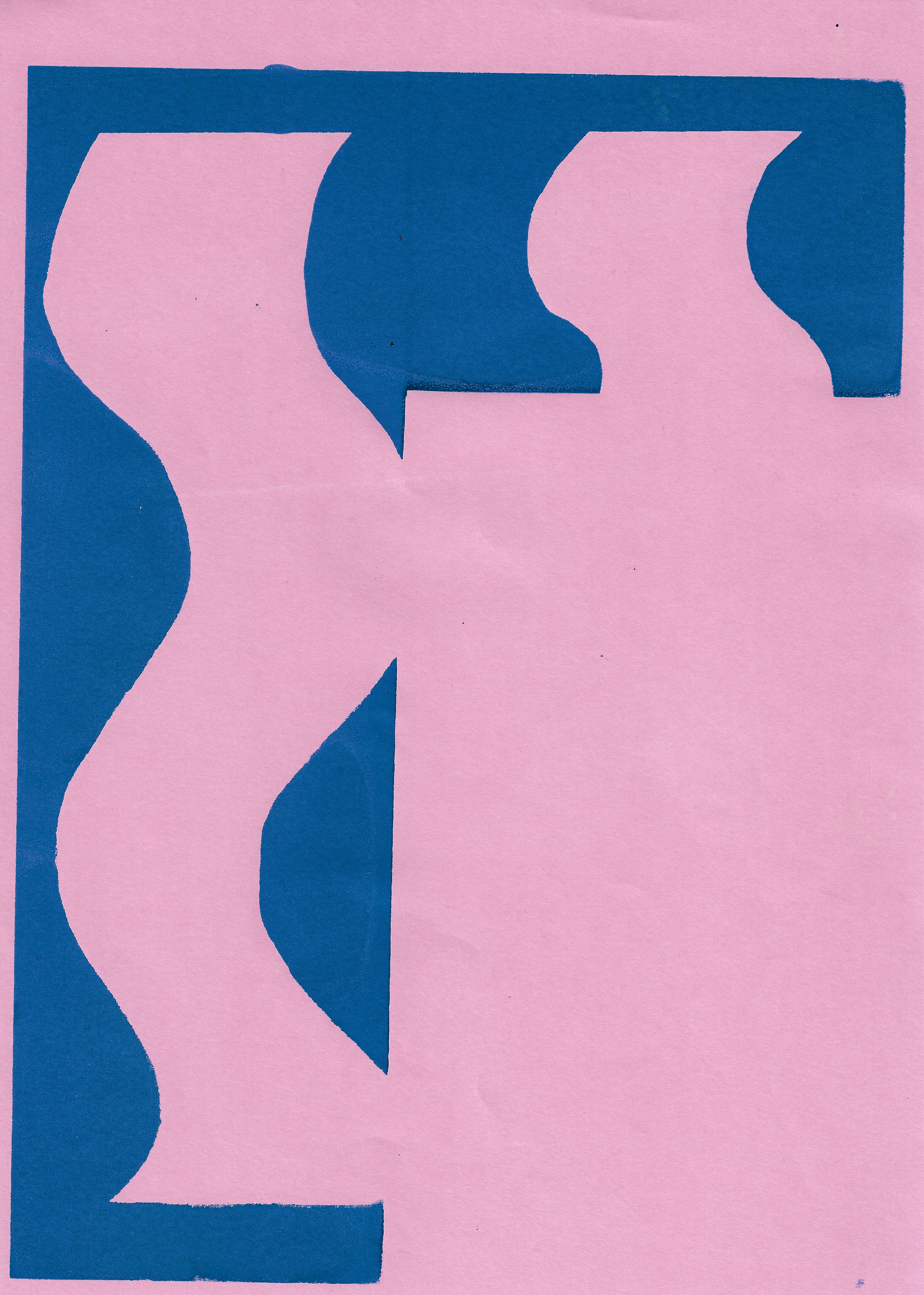
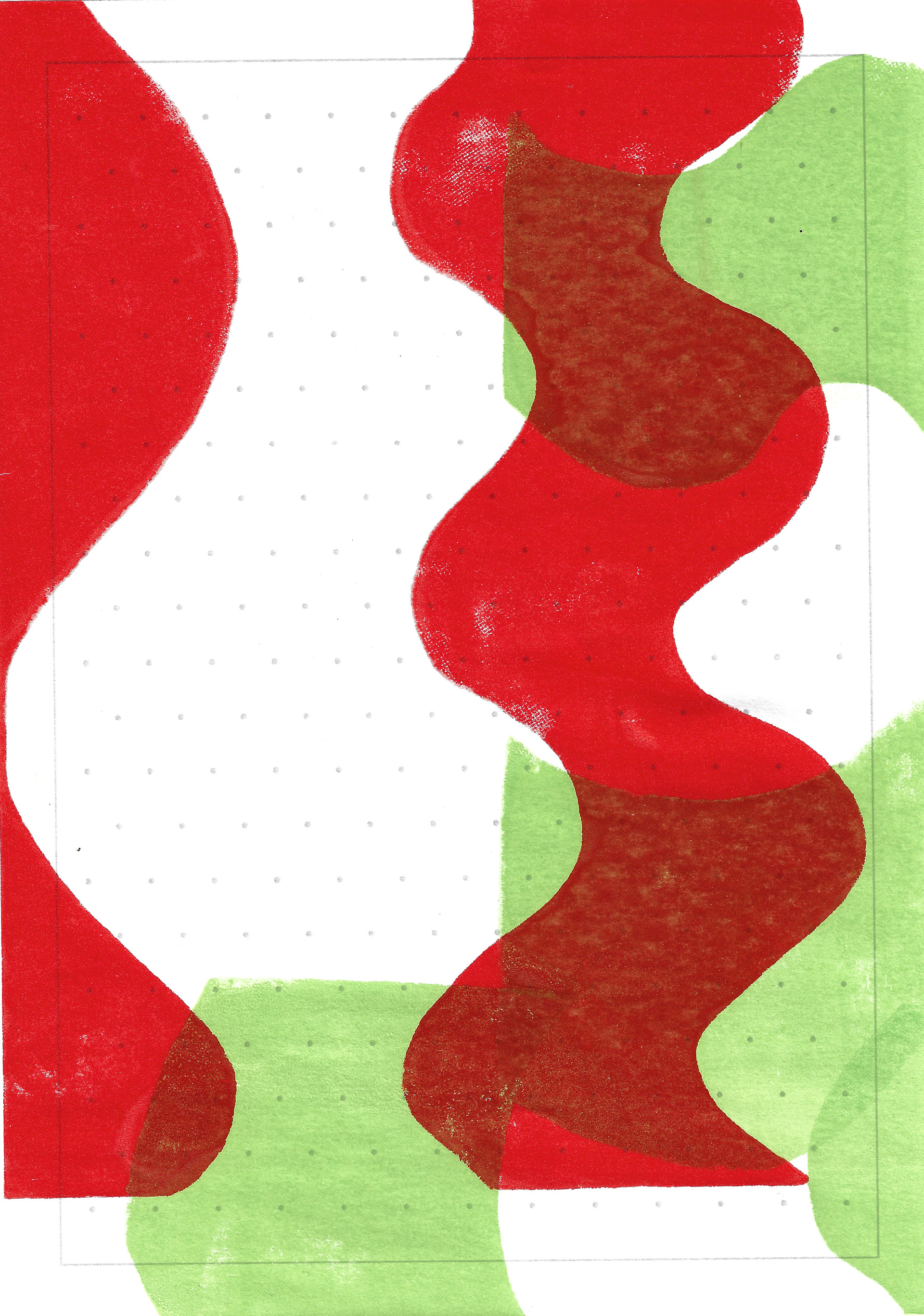
I screenprint the images of the squiggles but use vinyl tape to cover up parts of the screen randomly, letting my subconscious choose the elements which are visible and not. This allows unusual shapes and lines to be formed in my screenprints. As I have done previously in lithography, I use the same colour on top of one another. However, the depth compared to the same technique in lithography is different, as the ink is flatter and sits on top of the paper.
Further, I also fold the paper before I print onto it. There are images on the front and back of the paper, and then for the second layer I fold the paper in another way in another colour and using another image. There is no front and back, just like there is no positive and negative. The image becomes democratised in its presentation to the viewer, there is no wrong way to look at it.
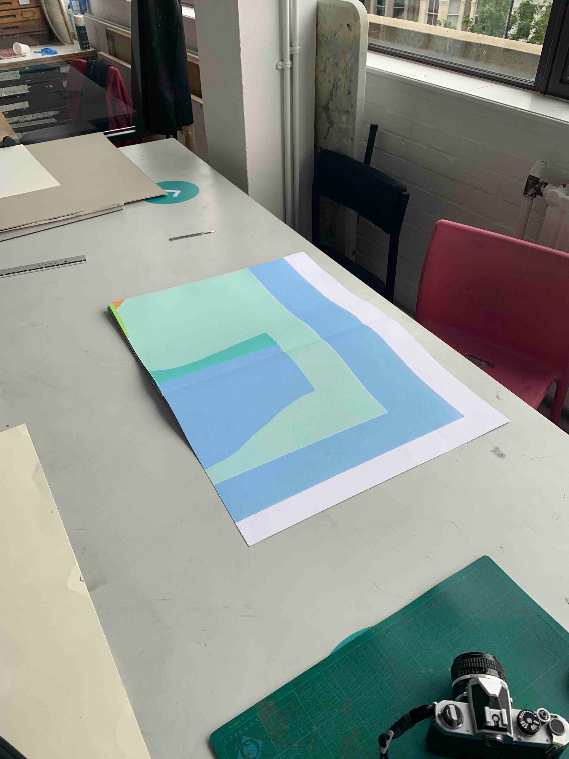
A section of one side of the boustrophedon structure is digitally printed as a test. I have edited the original scanned image on photoshop and illustrator. When digitally printed the difference in textures is more noticeable; there is a dialogue between the different shapes and colours but also between the flatness of a digital shape, compared to the textured surface of the paper.

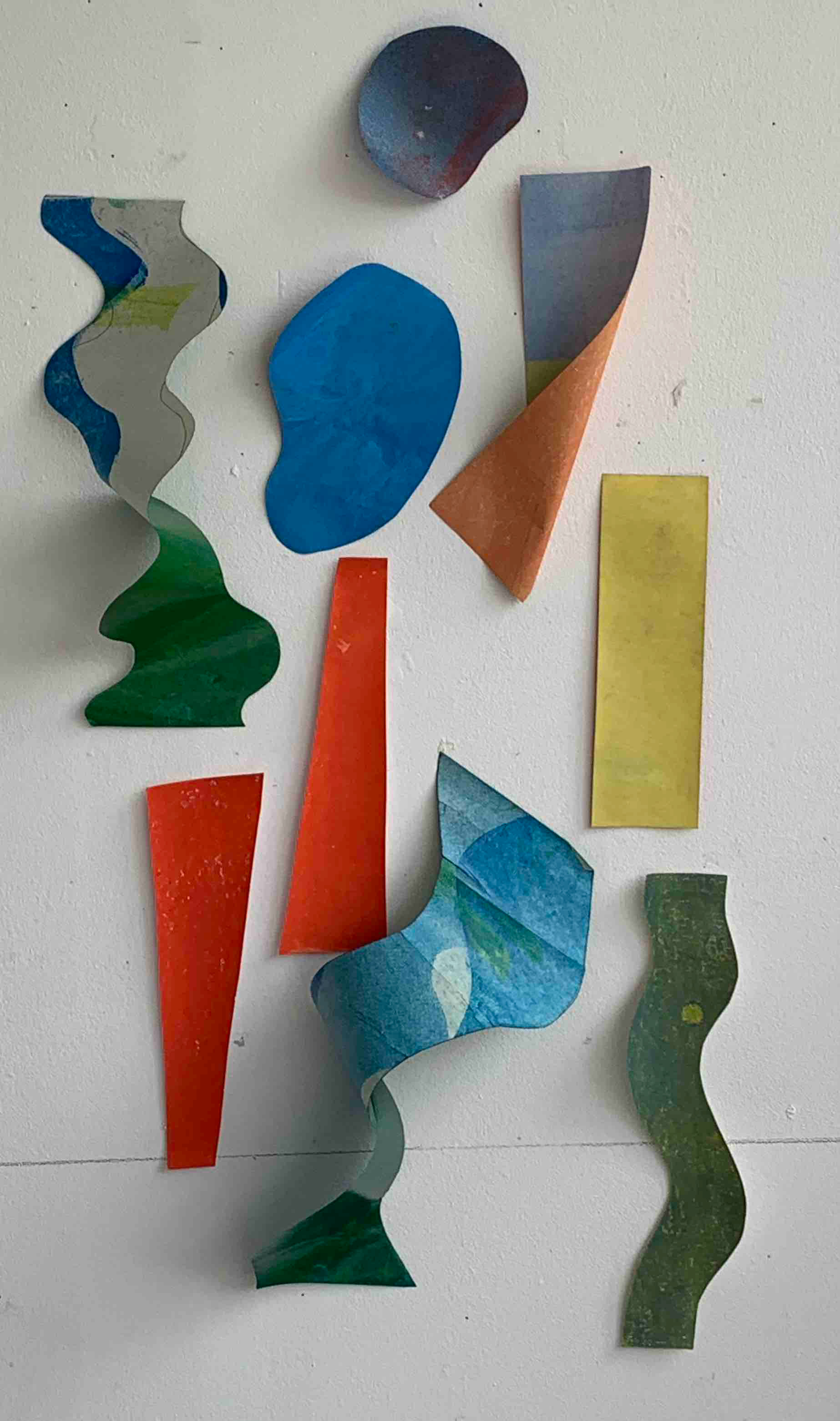
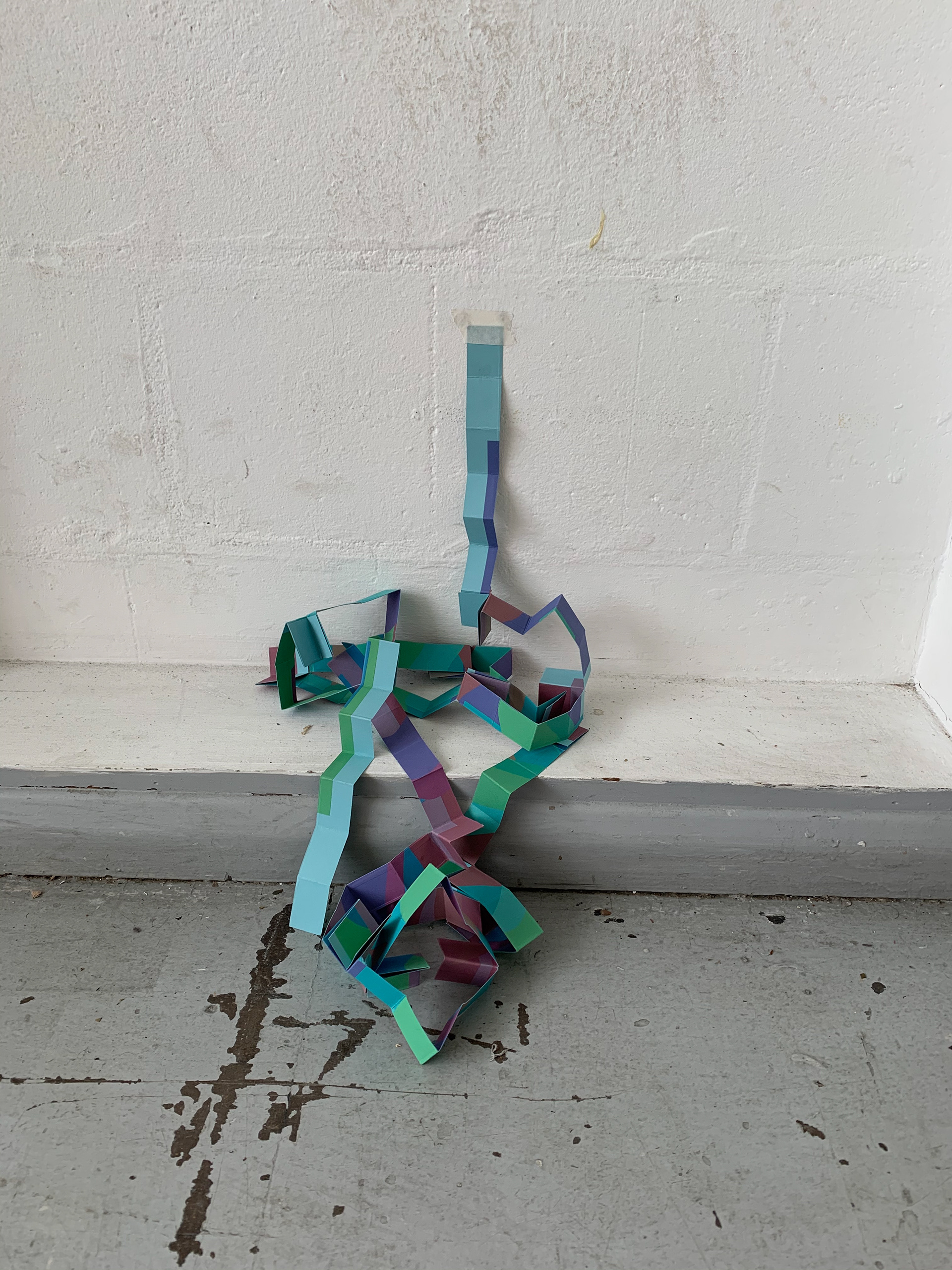
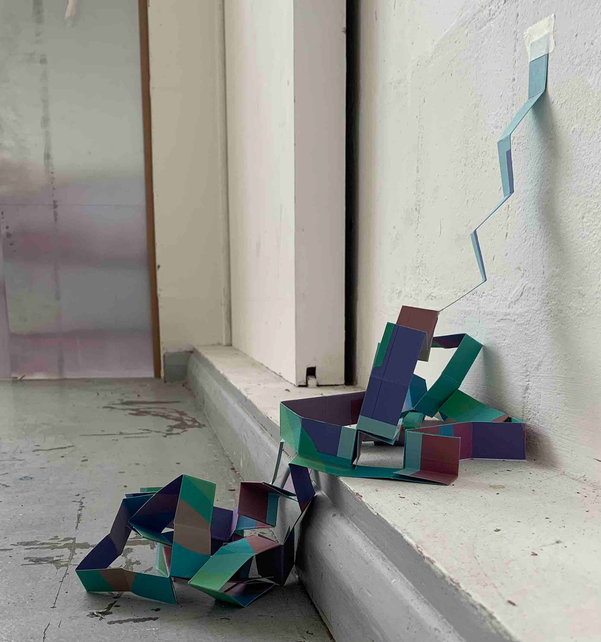
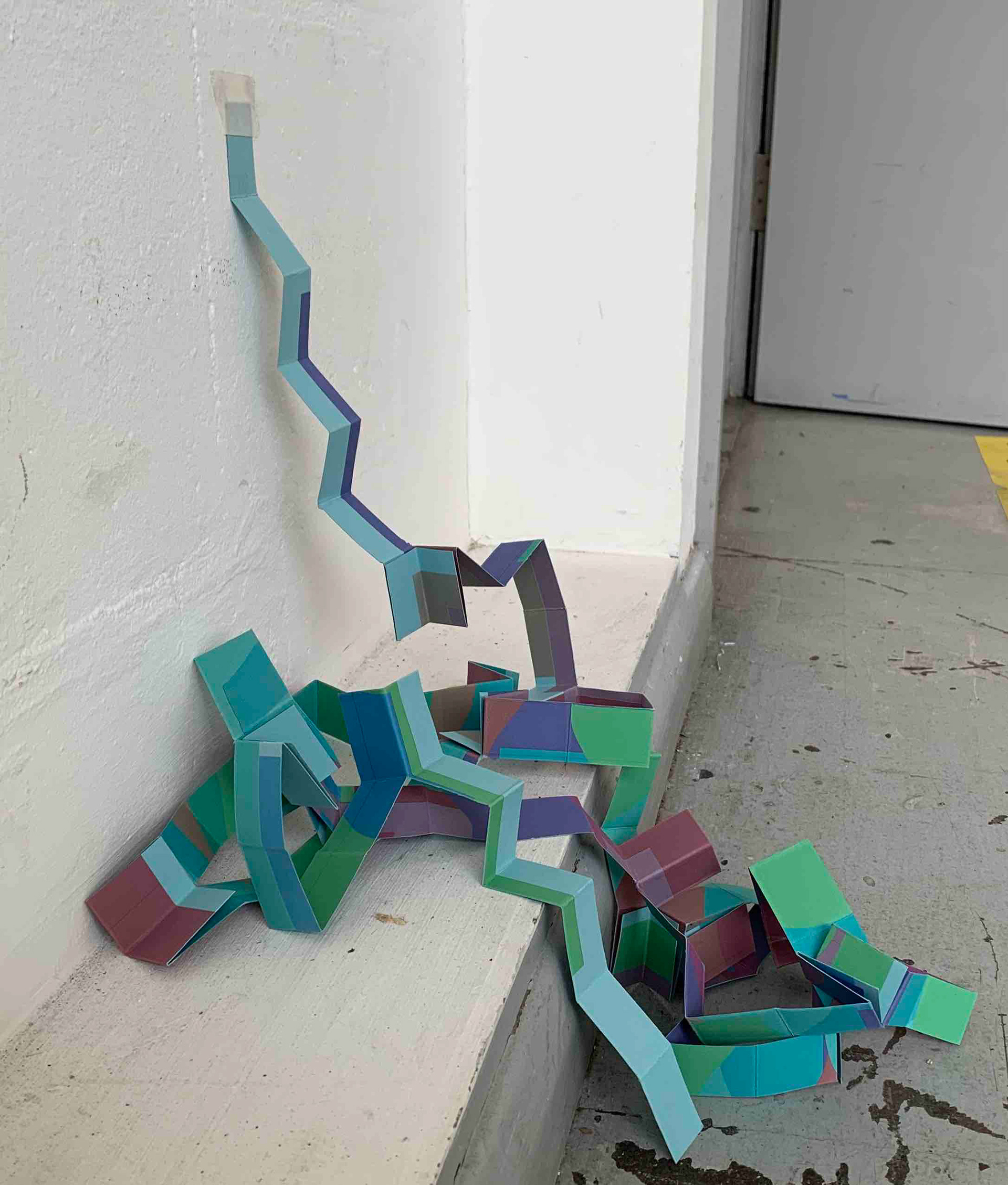
I arrange various shapes, previously used as stencils in monoprinting, on the wall. Although the pieces are limited in scale, there is an essential dialogue formed between them. The shapes are also double sided, with different textures and colours on the reverse. I have used different types of inks, water and oil based, and layered different colours resulting in a varied surface. When arranging these shapes on the wall, I twist and bend them. The shapes protrude and extend from the wall, they communicate in unison and do not act as individuals. The arrangement is dependent on the surrounding shapes and space, they do not all protrude and where they are bent is a result of the surroundings.
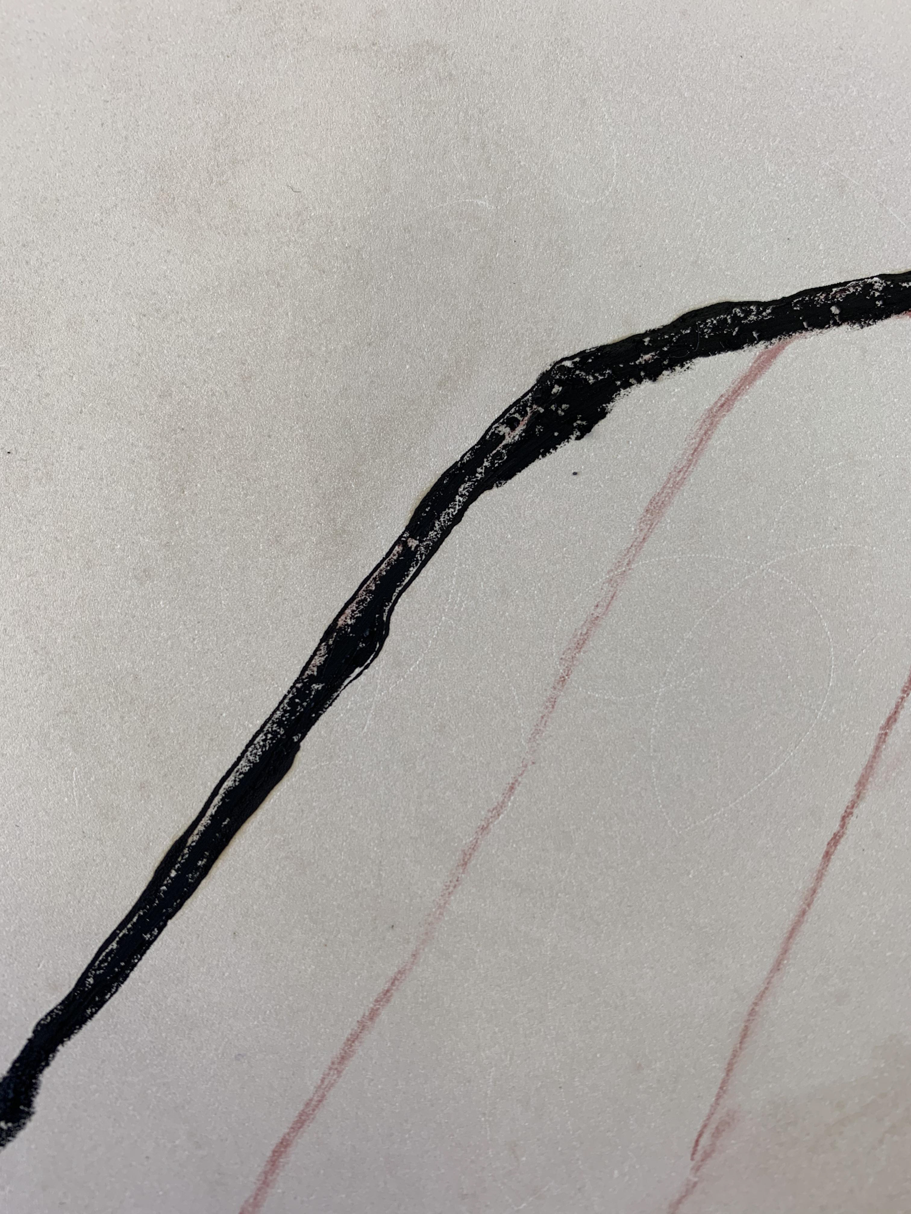
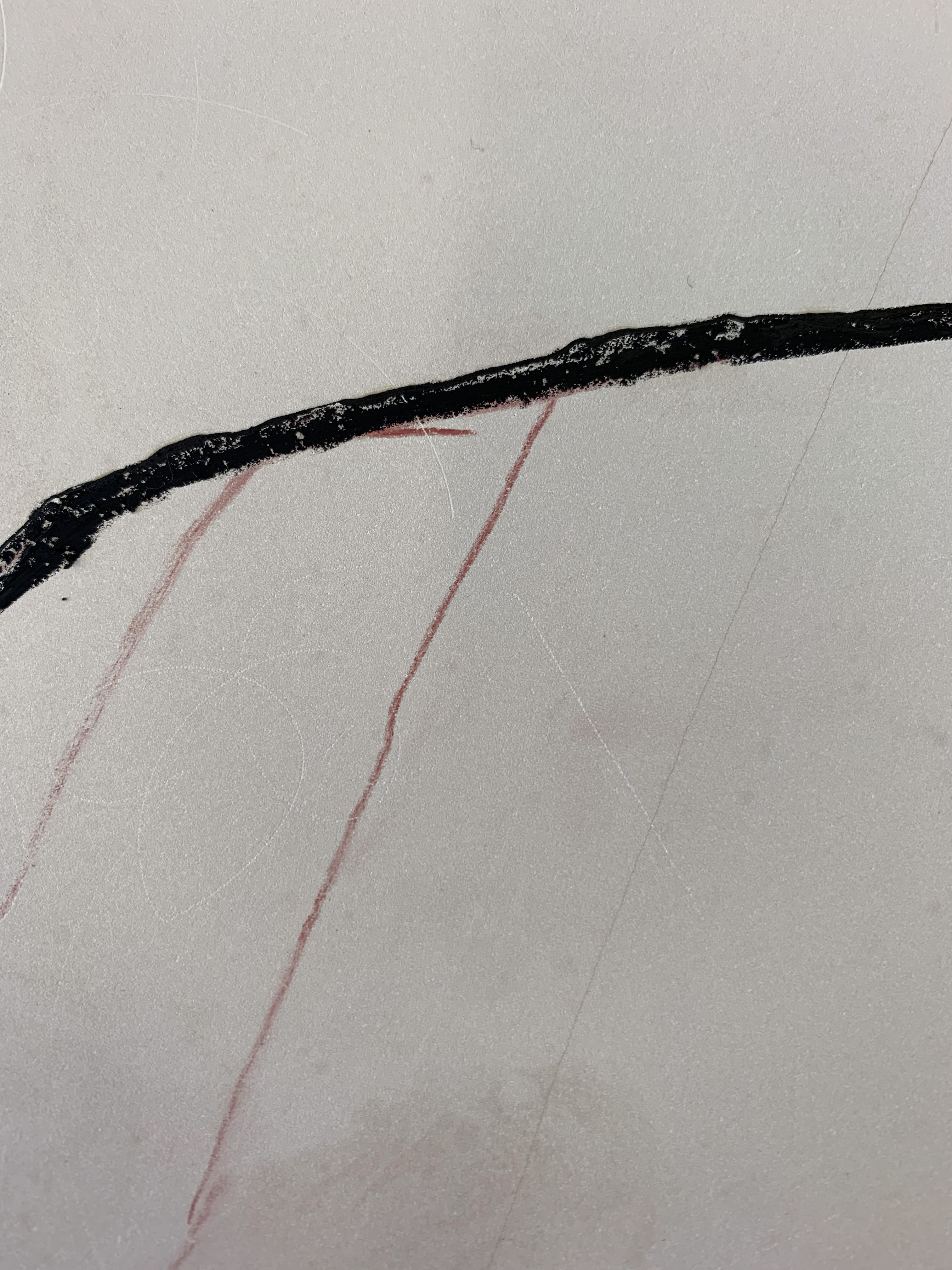
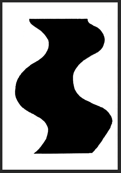
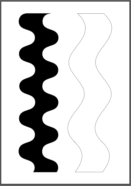
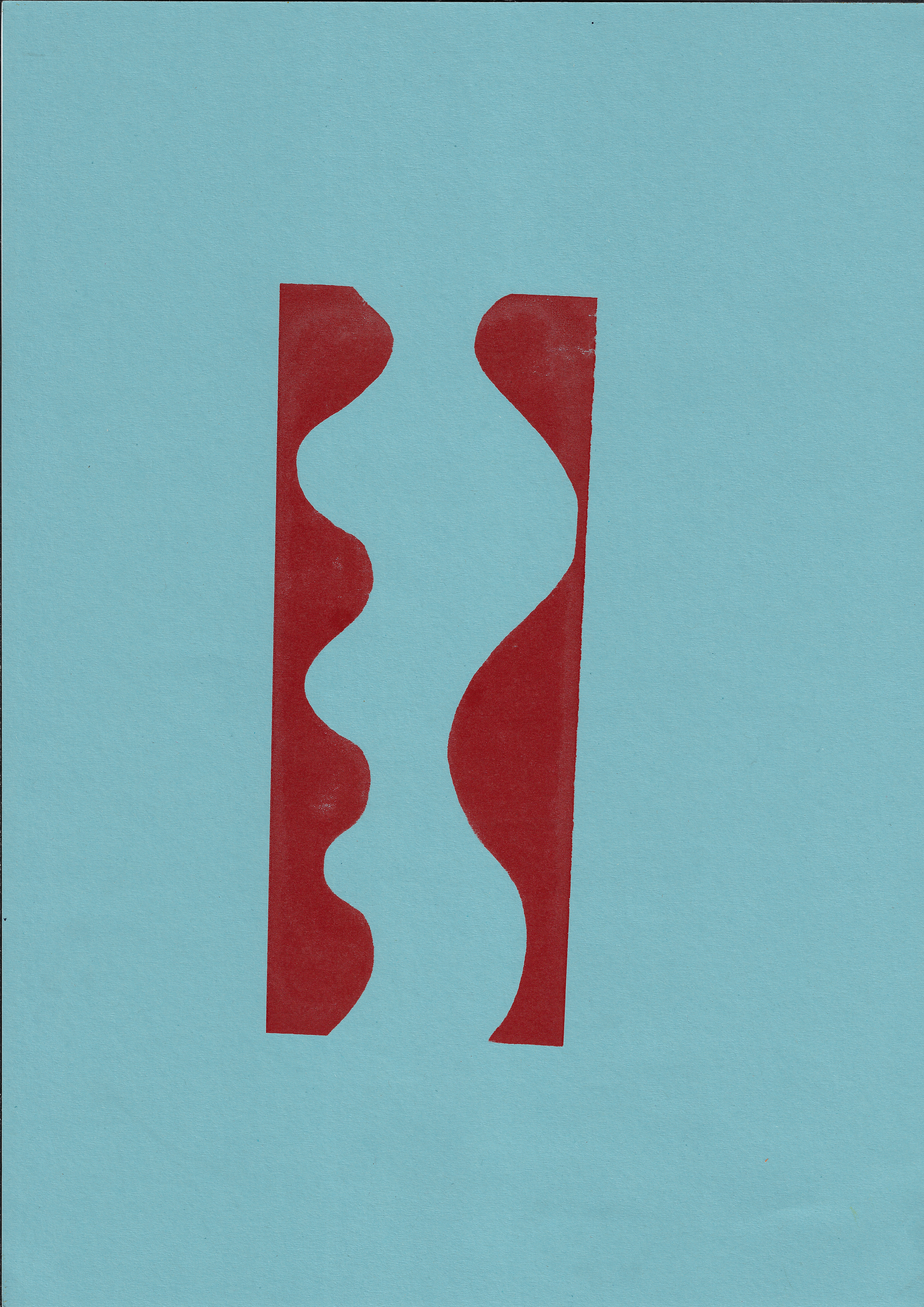
I use a ruler to divide up a drawn curved form, which then has varying undulations. This changes the rhythm and pace in the understanding of the shape. I also apply this to straight line forms, using a varying line to break up the pace of visual understanding.
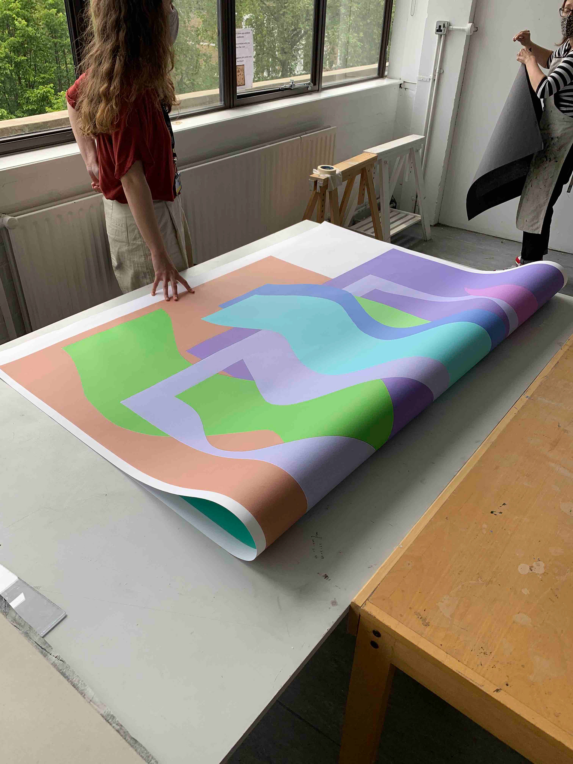
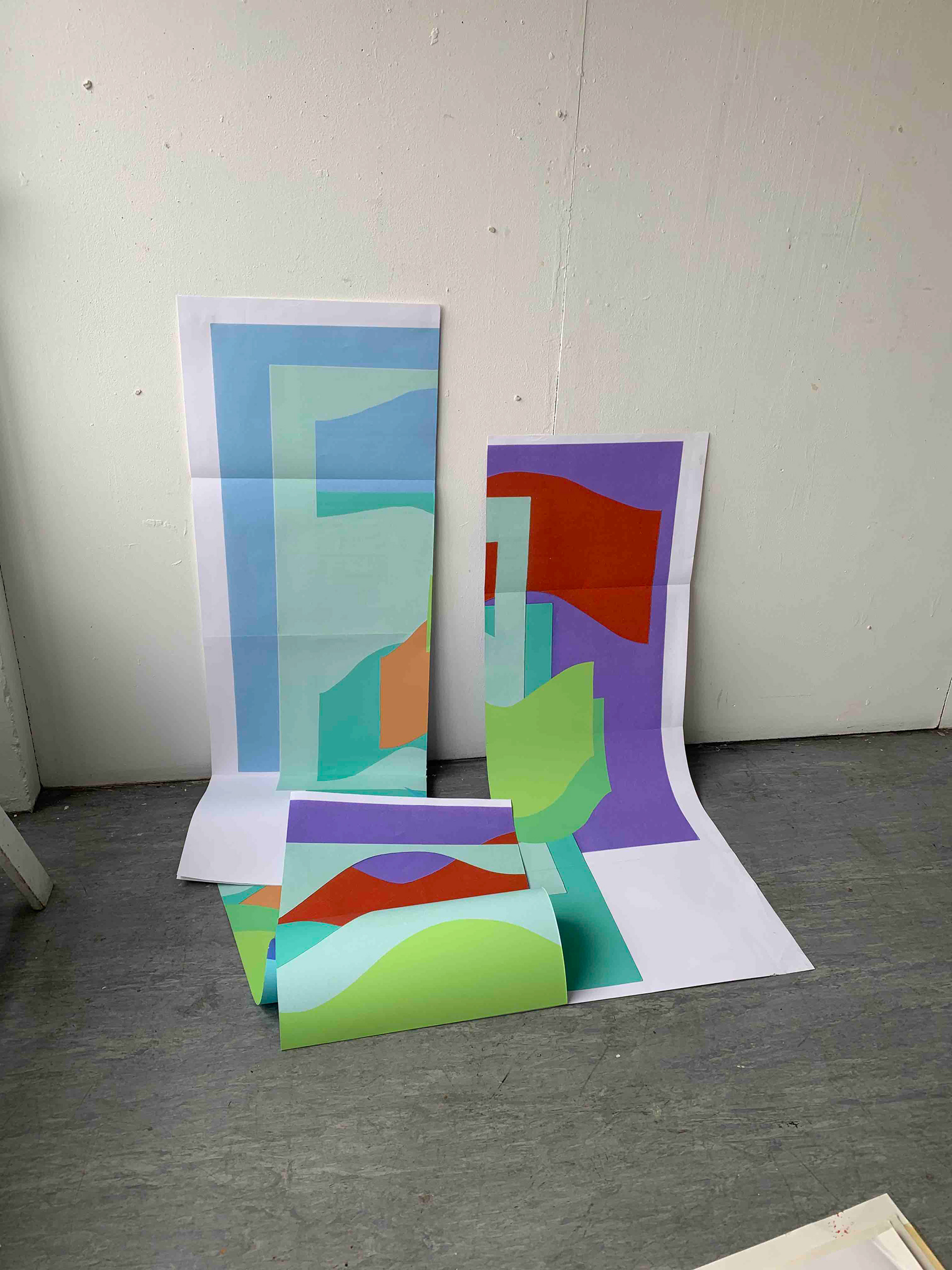
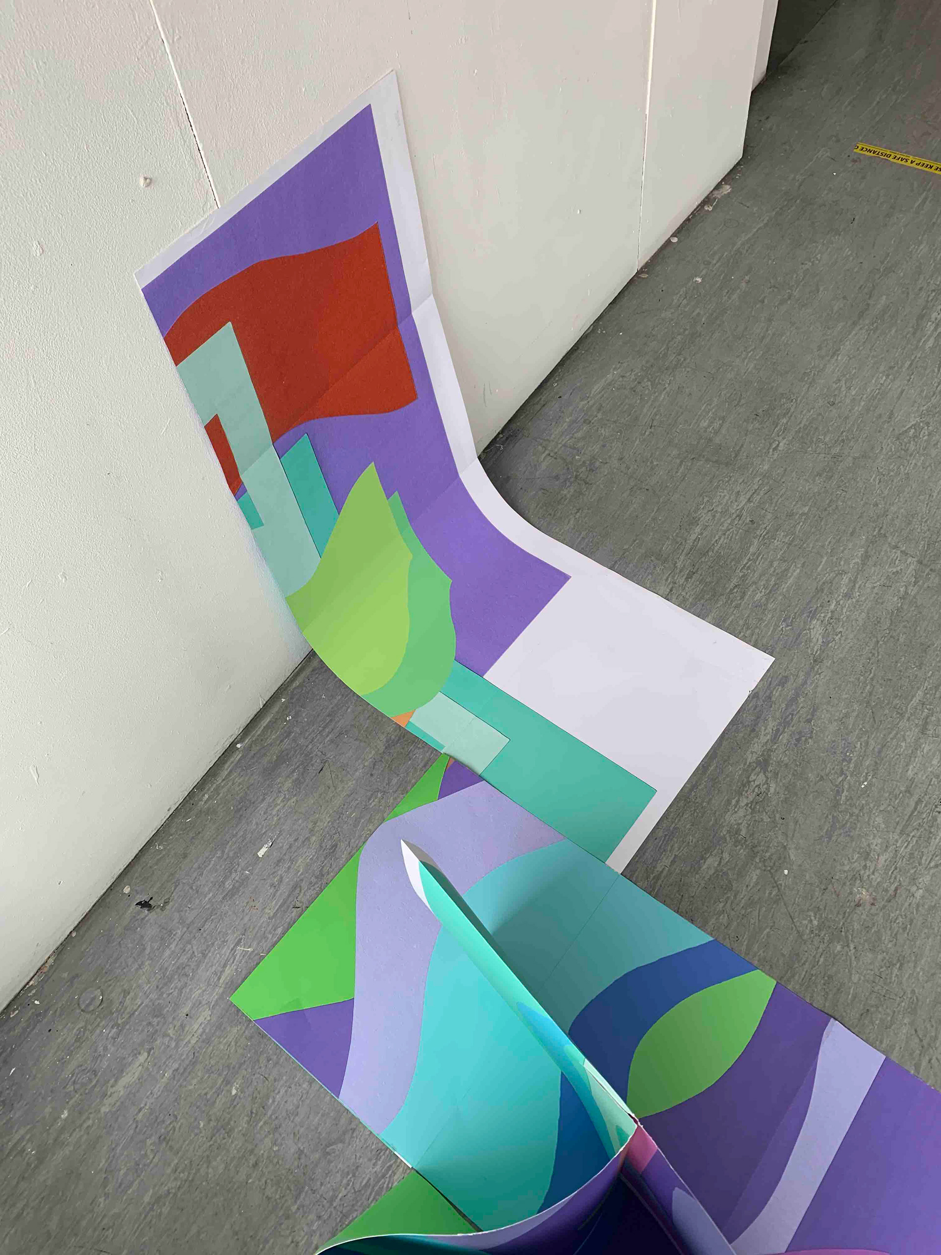
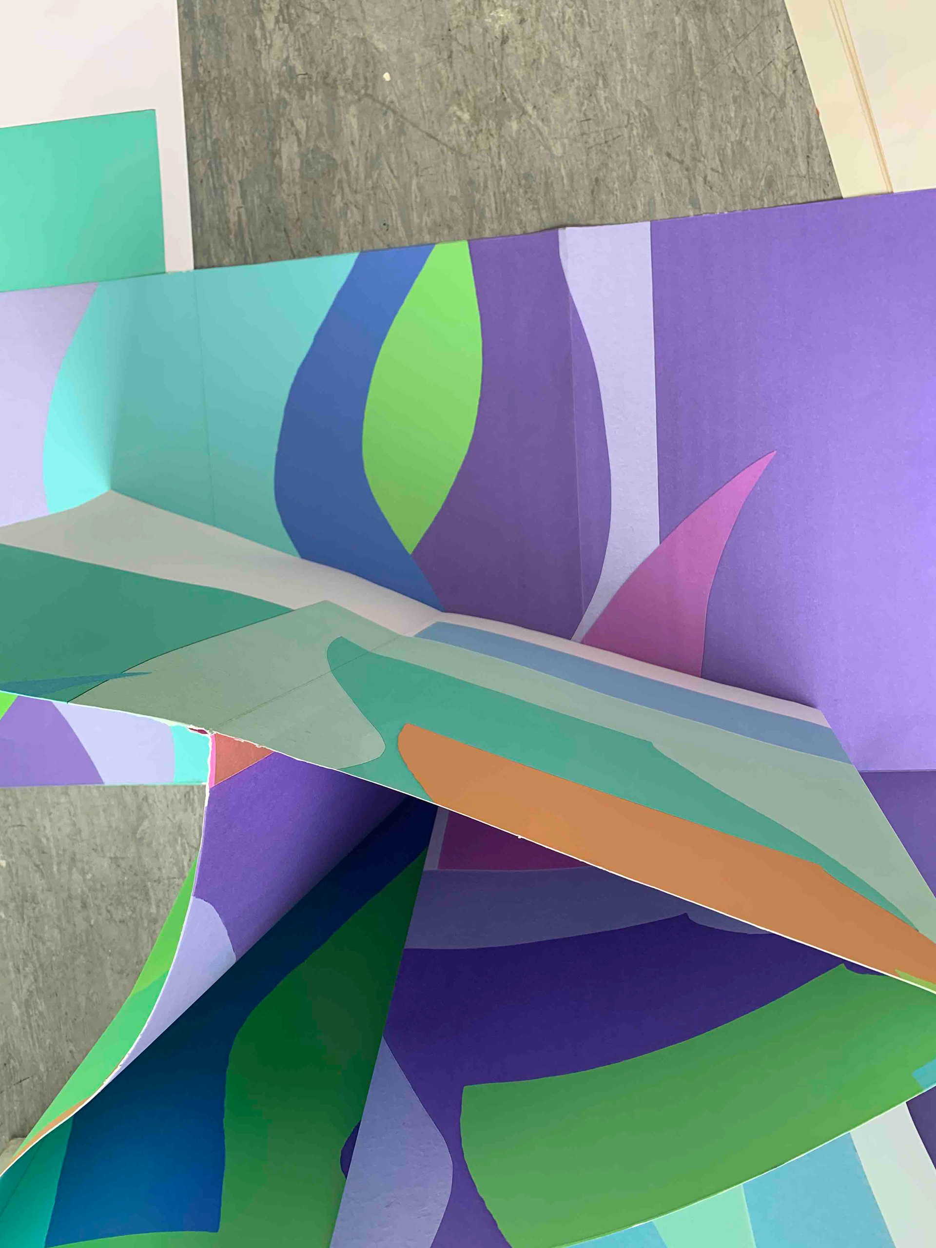


I digitally print the image created on the scanner and photoshop. On the reverse side I print the same image upside down and in a different hue. I then fold this and cut into a large boustrophedon structure. However, the paper is not strong enough to hold itself independently as I would have hoped. The structure is only possible on a small scale in paper format and cannot be upscaled. There are ways around this that I could pursue to make the structure possible at this size but that would involve using other materials and not just paper. The purpose of this structure being made in paper was because of the simplicity of materials but also in paper the structure could be rearranged easily, there was no definite way that it had to be shown. This would be lost if I were to construct this in an alternative material.


Each image is a separate face on the boustrophedon. When scaling this image to be printed larger, I decided to scale up the image in proportion to the larger piece of paper. Rather than repeating the image more often on the paper because it is smaller. This is because the defining lines and shapes on each face are clearer and speak to the viewer structurally.
Screenprint on paper, 14.8 x 21 cm 14.8 x
Screenprint on paper, 14.8 x 21 cm
Screenprint on paper, 21 x 29.7 cm

Screenprint on paper, 21 x 29.7 cm
Screenprint on paper, 14.8 x 21 cm

Screenprint on paper, 14.8 x 21 cm

Screenprint on paper, 21 x 29.7 cm

Sceenprint on paper, 21 x 29.7 cm

Screenprint on paper, 21 x 29.7 cm

Screenprint on paper, 21 x 29.7 cm
Screenprint on paper, 21 x 29.7 cm

Screenprint on paper, 21 x 29.7 cm
Screenprint on paper, 21 x 29.7 cm
Screenprint on paper, 21 x 29.7 cm
Screenprint on paper, 21 x 29.7 cm
Screenprint on paper, 21 x 29.7 cm

Screenprint on paper, 60 x 42 cn
Screenprint on a monoprint, 60 x 42 cm
Screenprint on paper, 29.7 x 42 cm
Reverse of previous screenprint on paper, 29.7 x 42 cm

Screenprint on paper, 29.7 x 42 cm
Screenprint on paper, 29.7 x 42 cm

Screenprint on paper, 29.7 x 42 cm
Screenprint on paper, 29.7 x 42 cm
I screenprint various arrangements of the curved line, not printing on the paper conventionally with a border around the image or being neatly contained. The paper is arranged in a mosaic on the table, so that when I pull the paint through the screen different parts appear on different places on the paper. I repeat this in another colour, but also, again I fold the paper to creating a disjuncture between the different elements.